These days by the time I see a double dip (or some call them lookalikes) it’s on someone’s else’s book cover blog. But here’s one I haven’t seen spotted. What amazes me about these is how similar the cropping can be. I mean… does this photo model have a really weird mouth or something?
And so often, the chosen background color is the same, too.
Brand-New Emily (by Ginger Rue, Tricycle 2010, c2009) is more tan than TMI (by Sarah Quigley, Dutton 2009). Hair and eye-color has been changed. I always wonder how hard it is to do that. Which one of these pictures is closer to the real girl?


TMI: Fifteen-year-old Becca has the habit of revealing too much personal information about herself and her friends, but when her boyfriend breaks up with her and she vows to stop “oversharing,” she does not realize that her blog postings are not nearly as anonymous as she thought. Ages 11+. Reviews 1, 2, 3, 4, 5.
Brand-New Emily: Tired of being picked on by a trio of popular girls, fourteen-year-old poet Emily hires a major public relations firm to change her image and soon finds herself “re-branded” as Em, one of the most important teens not only in her middle school, but in celebrity magazines, as well. Ages 12+. Reviews 1, 2, 3, 4.


When I was three years old, my dad took me trick-or-treating for the first time. I loved candy. Even so (the story goes), when I got home I dumped all my candy on the rug and separated it into piles, like with like. I couldn’t eat it until it was all sorted out.
This may have been the first hint that I would ultimately end up being a librarian. I loved categorizing and sorting things. Couldn’t play with them (or eat them) until they were in their proper order.
I’m guessing this is the same compulsion that pushes me to categorize book covers. The brain is a mysterious organ.
So I present you with another set – another mini-trend. It is a sly way to do the partial face thing – make the face unrecognizable by hiding a part of it behind a book (or a notebook, or a letter). The books: Sucks To Be Me by Kimberly Pauley (Wizards of the Coast 2008), The Rule of Won by Stefan Petrucha (Walker 2008), Does This Book Make Me Look Fat? edited by Marissa Walsh (Clarion 2008), and You’ve Got Blackmail by Rachel Wright (Putnam 2009).


I rarely see a book review blogger comment much on the cover, but a 20-something reviewer of Rule of Won had this to say: “I’ve always made a concerted effort to not judge books based on their jacket art, but I’m ashamed to admit that the cover of The Rule of Won is so uninspiring that I just couldn’t help it.” This reviewer was turned off by the brown-ness of the cover but is “happy to report that the contents of the novel are more appealing than falling in a puddle of sloshy mud.” (My advice to the reviewer: No need to be ashamed. Everyone does it…).
 For so
Take a look at this amazing set of double dips, sent to me by Kerry from New Zealand (Thanks, Kerry!), a reader of this blog. The photographer who took this photo has apparently captured an iconic war image. What’s funny about the use of this image here, is that they look like World War I or II boots, and two of these books cover more recent wars. All except the Morpurgo book are published by the adult market. At least two of the three are recommended for teens.
x
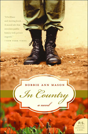

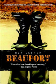
The cover of War: Stories of Conflict edited by Michael Morpurgo (from UK, apparently not in the US, Macmillan 2005) is a pretty straightforward use of the image. In Country by Bobbie Ann Mason (HarperCollins 2005, c1985), incidentally popular required reading for high school students, is a clear use of the Rule of Three. Hiroshima Joe by Martin Booth (Macmillan: Picador 2003, c1985) changes up the color of the photo by monochromizing it. And Beaufort by Ron Leshem (Delacorte 2008) intensifies the contrast and completely turns it upside-down. All except Hiroshima Joe, stay fairly true to the (probably) original colors in the photo.
Two of these are under the Macmillan umbrella, though one from the adult and one from the children’s market. And one available in the UK, but not in the US. So here’s the question. Is the use of an image tracked at least within a publisher and it’s houses? If so, are there rules of use?
War: Explores many aspects of war, featuring conflicts from the Crusades to 1970’s Beirut and the Falklands. (South Lanarkshire Council). Age: Teens. Reviews 1.
In Country: Vietnam War. Adult book, recommended for YAs by SLJ. Reviews 1, 2,. Censorship Attempt: Book Controversy at Delphi High (defeated).
Hiroshima Joe: World War II. Adult.
Beaufort: Set in Lebanon in 1999. Adult book, recommended for mature YAs by Booklist. Reviews 1, 2.


I’ve been hesitant to post a “double dip” that was brought to my attention by Jay Asher (though I thank him for sending it!). It feels a bit like cheating to put this book (you know the one) in a post. I love to see my stats shoot up, but HONESTLY – if you know what I mean.
So here’s The-Book-That-Must-Not-Be-Named, and a book that’s not YA, Words to Live By by C. S. Lewis (Zondervan 2007). It’s not the same photo, but the coloring is similar. The crop is a little different. But I can’t imagine who would walk by this face-out on a shelf and not do a double-take. The image seems pertinent for the subject. You wonder how deliberately made this decision was. The designer can’t not have seen the other book…
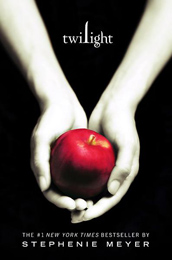
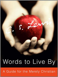
And while I’m at it, there’s another similar situation that’s been sitting around in my queue. The most recent book in The-Series-That-Must-Not-Be-Named is slightly different in lighting and focus. Both it and Taken by Edward Bloor (Knopf 2007) are black, white and red, though subjectwise they fit into different categories – Taken in the category of Crime/Murder, and the other book in the Horror (kinda?) category. In this case, the other guy had it first!


Not surprisingly, the paperback edition of Taken, due out in December, has a completely different cover. Hmmm. I wonder why? ;-)

Taken: In 2035 kidnapping rich children has become an industry, but when thirteen-year-old Charity M. is taken and held for ransom, she soon discovers that this particular kidnapping is not what it seems.


 For so


Nice! I did this one, but I found the girl in an advertisement, rather than a book cover. Gotta say, though, TMI does it better with the background. I think. http://stackedbooks.blogspot.com/2009/08/double-take-part-viii.html
Very interesting. As for changing hair and eye color, eye color is easier than hair. With hair you’ve got all the tonal variations to deal with. It’s not so much difficult as it is time-consuming.
Same cropping in the ad! The stock photo itself must be cropped this way.
Thanks for the link.
My graphic design days were before computers… so I never had to do this kind of thing. But I’d love to see a video (like the one here, of someone changing a photo like this!
And look closely at this jacket, the same season and publisher as TMI!
http://images.barnesandnoble.com/images/32580000/32589679.jpg
This makes me wonder why I’m not creating stock photography. One image, used four times (at least!) equals easy money?
Good eye!!! I’ve looked at this jacket several times and never made the connection.
Not so much, I think. If you look at a page from Getty Images you gotta think it’s a miracle if someone chooses your photo. Triply so if they choose it more than once!
[...] Linda at Jacket Whys has another set: Ginger Rue’s BRAND NEW EMILY and Sarah Quigley’s TMI. Share this [...]