new posts in all blogs
Viewing: Blog Posts Tagged with: paperback changes, Most Recent at Top [Help]
Results 1 - 7 of 7
How to use this Page
You are viewing the most recent posts tagged with the words: paperback changes in the JacketFlap blog reader. What is a tag? Think of a tag as a keyword or category label. Tags can both help you find posts on JacketFlap.com as well as provide an easy way for you to "remember" and classify posts for later recall. Try adding a tag yourself by clicking "Add a tag" below a post's header. Scroll down through the list of Recent Posts in the left column and click on a post title that sounds interesting. You can view all posts from a specific blog by clicking the Blog name in the right column, or you can click a 'More Posts from this Blog' link in any individual post.
Still looking at ’90s covers (more specifically, 1997 covers), I came across this title by Margaret Peterson Haddix. I read this pre-Among the Hidden title, Leaving Fishers, when it was first released. I have no vivid memory of the book, however the original cover (left) fits with my emotional memory of the story of a young woman feeling alienated, swept up by people who seem sympathetic (a cult).
The first cover makes sense, and draws me in. The girl on the cover looks unhappy. You can tell she is feeling like an outsider. The only iffy thing here is audience. This cover seems pitched a little young.
The 1999 paperback cover (middle) … what does it say?


You can tell we’re moving into the photography era here, even though this cover was in the earlier days of all-photography all-the-time. Do you get a sense of the alienation here? Yeah right. She looks like she’s part of the brat pack. The cover is disingenuous and would, I think, draw in kids just to trick them about the content of the book.
The newer cover (2004) is certainly of our era. It says nothing. A girl with her eyes covered… she’s blind? (okay, figuratively – a little). Is there really a clue at all about the book’s content? Should there be?
The thing about illustration is that emotions can be brought into the final work so much more effectively. I think that’s a very difficult thing to do with patching stock photographs together – difficult, but no, not undoable…
Leaving Fishers (Simon & Schuster 1997): After joining her new friends in the religious group called Fishers of Men, Dorry finds herself immersed in a cult from which she must struggle to extricate herself. Ages 12+. Reviews 1, 2, 3.


 8 Comments on Defining Fishers, last added: 7/29/2010
In my research, I came across this Scott O’Dell title, Zia (Houghton Mifflin 1976).
Cover #1 was the original cover, published in 1976. Cover #2 came out around 1981, cover #3, around 1995, and the 4th cover is upcoming – scheduled for release in January of next year.


Mulling this over… does it tell us anything about the evolution of cover design? The story is based on the true story of Juana Maria – the last surviving member of her tribe, who lived on San Nicolas Island, off the coast of southern California. One might expect her, then, to look like the Natives of that area. Which she does, on the 1976 cover.*
Six years later she looks much more European. The 1995 cover is pretty, but less focused on the character. It’s interesting that the photograph on the upcoming release looks very much like the illustration (by Ted Lewin) on the original edition. She’s lighter skinned, but it’s an amazing match in terms of her features.
An interesting group…
*I do not hold myself up as any kind of authority on any culture, so please take my opinion with a shovelful of salt… or so.


On the left, the hardback cover of Prism by Faye Kellerman and Aliza Kellerman (Harper 2009). On the right, the paperback cover to be released in June. This is another one of those cover changes that make me wish I could have been a fly on the wall of the room this was discussed in… While the overall look from a distance is pretty much the same, let’s look at the changes. The authors’ names shrunk. The title font changed and moved. And there’s this girl’s face looking over the horizon like a rising moon.
What’s strange, is that I prefer the paperback better. I don’t understand why, because I rarely lean toward face covers. Especially partial faces.
Don’t get me wrong - this won’t make my best of the year list – it’s still too busy for my taste. But I think more readers will be drawn to the paperback. The text change makes a big difference, both the change of font, and the shrinking authors. Maybe the names didn’t draw the teen audience like they might have drawn adult fans.


Prism: California high school students Kaida, Zeke, and Joy fall into a parallel universe in which all resembles their normal lives except that there is no medicine nor health care, which could mean big trouble for Joy, whose arm was injured in the accident that started their troubles. Ages 12+. Review 1, 2, 3.


When I first saw the hardcover jacket for Swim the Fly by Don Calame (2009), I thought it must be a draft. It didn’t have the look of a finished cover – none of the pieces seem to fit together very well. I’ve talked about green before – here’s one of those places where the green just doesn’t work well. One blog review said “If you are a boy, have boys, know boys, or enjoy boys … this book is for you!,” but I don’t imagine this cover was much of a magnet for boys.
But then what do I know? Another blog says “We love the final look–represents the contents very well and should be eye catching on the bookstore and library shelves for its target audience.” Hmm.
Fortunately, the paperback cover is much better. I like the water & bubbles effect. Colors are good too, orange and red – warm colors – against the cool blue of the water. Far more pleasing to this artist’s eye…


Swim the Fly: Swim team members and best friends Matt, Sean, and Coop, set themselves the summertime goal of seeing a live girl naked, and while the chances of that happening seem very dim, Matt’s personal goal to swim the one-hundred-yard butterfly to impress the new girl on the team seems even less likely to happen. Ages 12+. Reviews 1, 2, 3, 4, 5.


4 Comments on
Hardcover vs. Paperback, last added: 4/17/2010
In my last post, I matched covers to a particular artist without knowing for sure it was the same artist. Thanks to Lisa Chellman, who identified the artist in the comments, I have now taken a tour through David Frankland’s work. I want to share some more of it here, because I know you will recognize many of these – and you can have the aha! moment that I had. It’s fun to have these all connected.
The style here is recognizable. But it seems there is enough difference from cover to cover to keep boredom from setting in.


I find the U.S. editions of Paul Bajoria’s series (below right) pretty unattractive. Too bad they didn’t have the British covers (left)…


Frankland has also done covers (UK) for some of Diana Wynne Jones’ books (Charmed Life,
0 Comments on Recognizable Style: David Frankland as of 1/1/1900
I remember thinking “yuck, chicklit” when I first saw the cover of Suite Scarlett by Maureen Johnson (Point 2008). Nothing against people who like it, but it doesn’t draw me in unless there’s so much buzz about the book that I need to be in the know.
By now, my readers know that I’m not a big fan of girl (or woman as the case may be) photos on book covers unless it’s done exceptionally well.
I’ve been working on purchasing 2008 books for our extensive YA paperback collection, and found the paperback cover for Suite Scarlett. This, while not too far up in the “wow”-factor scale, is one I might pick up. So what makes it more interesting to me?
Things I like: The wallpaper background gives the impression of an upscale room. The darker red looks like velour, and I can imagine what it feels like. The setting-clue intrigues me.
It has the simplicity of the one centralized object which people tend to like (or at least I surmised that in this post). I agree with my web-designer son, simplicity is everything (almost).
The idea of a city-scape on a key is great. It’s probably been done before, but it’s novel to me. I don’t like the line of keys at the bottom (overkill), but it’s minimal, so it doesn’t take too much away.
Though I haven’t seen the spine, I’m guessing it’s red, so it may stand out on the shelf (if it’s not in a sea of other red books).


I love background stories for book covers, and on her blog, Maureen Johnson gives some backstory in response to someone who expressed dislike of the hardcover cover:
MJ, I’m sorry, but that cover is AWFUL. The girl looks like she ducked her head in peroxide and proceeded attempt to put her hair in curls.
Johnson responds:
While people might have varying opinions on the model and pose, a lot of work went into getting the basic facts straight. Scarlett is blonde, has curly hair of exactly the length described, and both that black dress and red lipstick play a part in the story. It may not look exactly as it does in my head, or how it might in yours . . . but it’s RIGHT!
She adds cover commentary:
Obviously, I want a nice cover, but the truth is . . . the cover has very little to do with what’s inside. In fact, it has nothing to do with what’s inside. I get annoyed by some covers too. Honestly, I just take them off. Feel free to replace them with the cover of another book. Or, even better, feel free to make your own!
I agree with her – many covers have absolutely nothing to do with what’s inside. STILL t
Here’s an interesting hardcover-to-paperback switch. At first glance, what do you see? Telescoping, yes… but what else?


Yeah, somebody didn’t like it that Ivy (by Julie Hearn – Atheneum 2008) was naked. Don’t worry – she’s covered now!
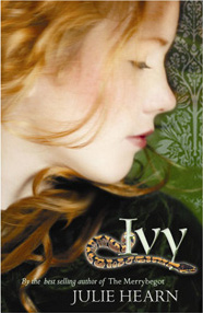 Here’s the UK cover.
Ivy: In mid-nineteenth-century London, young, mistreated, and destitute Ivy, whose main asset is her beautiful red hair, comes to the attention of an aspiring painter of the pre-Raphaelite school of artists who, with the connivance of Ivy’s unsavory family, is determined to make her his model and muse. Ages 12+. Reviews 1, 2, 3, 4, 5.


…and since it’s such a good book, these covers are equally disappointing. I think I must have read that book with the last cover — it made zero impact on me, and I picked it up because of the author.
Thank the buyers at B&N and Borders.
First of all, yay, Margaret Peterson Haddix! I read Leaving Fishers as the second cover and had no idea that wasn’t the original. The original is much better but also looks a bit young. Then again, I don’t remember how old the main character was. I think they have been redoing all of Haddix’s covers to make them say less. It’s sad, because she’s awesome.
The first cover is drastically better than the later two, I agree.
The middle one looks like a soap opera?
That is soooo distressing……………..
I have to say that aside from aesthetic considerations, I think that both the middle cover and the first cover work. The first cover only seems young in the sense that it lacks the glam factor that so many current covers seem to have. The second says one against the group and has an appropriately ominous atmosphere. I don’t know how much more information about the story could be effectively revealed by the cover. Indications of the religious content might be off-putting to potential readers. The third cover is just awful, conveying zip information about the story and juxtaposing ecclesiastical purple with that jaundiced complexion. It’s clear that the big red Haddix is supposed to sell the book.
I’m amazed that the covers keep getting worse and worse – the first one actually feels the most modern by far! The other two – blech.
It’s surprising, though, that there are major issues with Haddix’s newer covers. Her books have such interesting emotional material to work with, the visuals could be much better. Leaving Fishers, in particular, completely rattled and unnerved me in regard to cults and peer pressure when I first read it as a teen, and I don’t see any sense of that tension here.
Interesting and insightful post!
I find the second and third covers absolutely unappealing. The second looks like a cast photo for a television show I wouldn’t watch. The third could be slapped on almost any book with a young female protagonist–to the detriment of the book.
The foreground figure on the first cover *may* make it skew younger, but the background is very intriguing. There is narrative content here–emotional content.