This fun winter illustration was sent in by Illustrator Tracey Berglund. Don’t miss the snowman in the window. It makes me think of the photo Leeza Hernandez sent me a few weeks ago. Her daughter and her built the smallest snowman I ever saw. They made it small, so they could save it in the freezer. Now that is thinking out-of-box. Tracey was my first featured illustrator on Illustrator Saturday back in June 2010. Here is the link: http://kathytemean.wordpress.com/2010/06/05/tracey-berglund-illustrator-saturday/ I think you can see how much Illustrator Saturday has grown since then.
February was a record month for first page submissions. I did not look at all the submissions to see the percentage of people who did not submit properly. We are close to getting the First Pages correct for the monthly critique, but there are still problems which caused a number of people to be pulled out for critique and then skipped, when I opened their Word document and it was not correct.
I think everyone now understands how to format their manuscript when submitting to an agent or editor, so lets just zero in on how to submit for the monthly critique for this blog. You would only format your page this way when you submit a first page to me. If you are doing a first page for an SCBWI event, then they would probably would want a similar forma, but make sure you check. Why the difference? Because if you use the standard format for a first page, you can not show enough for a good critique.
I know I asked you to cut and paste your text into the email, but I sent the word doc to the editor or agent, so if the Word doc isn’t formatted correctly, I can’t send it. I state a first page can have 23 lines, but that doesn’t mean that every manuscript’s text will work out to 23 lines. Some may only be able to fit 21 lines. The first page, just can not be more than 23 lines. Please do not send more than one page.
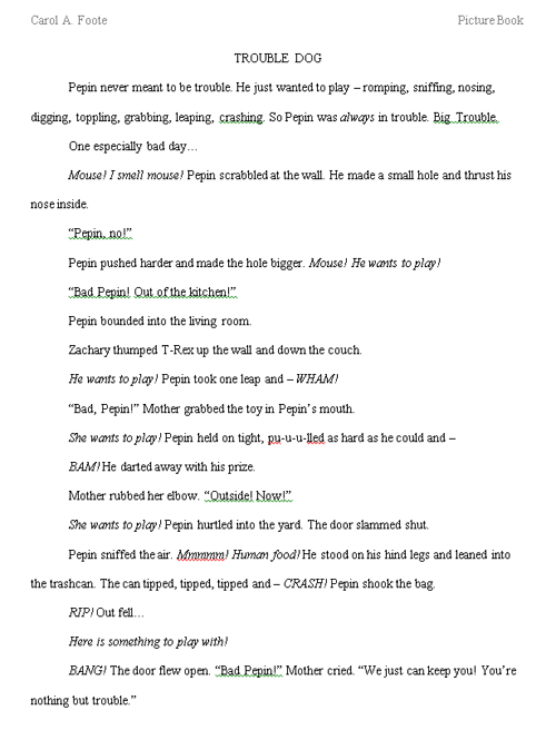
You don’t have room to put all your contact information on the page. Just your name, title, and genre at the very top. Then start your text on the next line. The example below from Carol Foote drops one line for her title. This is acceptable, but she could have gotten in the 23rd line if she had put everything across the top. The reason her page was not included in the drawing was due to her submitting it after the deadline.

So as long as you follow the guidelines and the example above, send it in before the deadline, cut and paste the text into the email and attach a Word document of the text, put the required title in the Subject area (I search for the submissions using that title), send it to the email listed, and do not include more than one page, you will be good to go.
Hope this helps. If you submitted a first page and did not have it critiqued, please send it in for review in March. Check back tomorrow to read the four that were critiqued. Next week I will announce our Guest Critiquer for March. Deadline for March is March 21st. Title in the subject area March First Page Critique. Email to: Kathy(dot)temean(at)gmail(dot)com
Links for more formatting posts:
Novel: http://kathytemean.wordpress.com/2014/02/13/formatting-novel-manuscript-example/
Picture book: http://kathytemean.wordpress.com/2014/02/02/first-page-critiquer-for-february-formatting-mistakes-call-for-illustrations/
Standards: http://kathytemean.wordpress.com/2009/03/16/formatting-your-manuscript/
Talk tomorrow,
Kathy
Filed under: authors and illustrators, Contest, demystify, How to, need to know Tagged: First Page Critique, Formatting problems, Tracey Berglund


When formatting a first page, can one alter the margins slightly to include 23 lines or would the editor prefer 1 inch margins and less than 23 lines? Sometimes it is difficult to do both and at conferences I recall 1 inch margins being the preference. Thank you.
Thank you Kathy for the step by step directions and also for sharing “Trouble Dog” as an example.
Oops! I forgot to attach it as a WORD doc too. Yikes. I thought I had followed the guidelines so closely too. Oh well. There’s always March…
You were one of the people that were drawn. I wanted so much to overlook that, but I had to follow the rules. Send it back in for March.
I guess a picture is worth a thousand words.
You can play around a little bit, as long as it isn’t noticeable. People seem to push the margins a little to get the last line to end where they want, but you don’t want it to look squeezed in.
Thanks for taking the time to ensure we grow in this process. Your blog has been a great learning experience. We appreciate your attitude of paying it forward.
I always love seeing Tracey’s illustrations. They make me smile every time!