The idyllic market square of two artisan stallholders is invaded by a slick fast-food vendor, set to steal all their customers.
Add a CommentViewing: Blog Posts Tagged with: Cartoon Modern, Most Recent at Top [Help]
Results 1 - 25 of 25
Blog: Cartoon Brew (Login to Add to MyJacketFlap)
JacketFlap tags: Robert Grieves, Cartoon Modern, Cartoon Brew Pick, Add a tag
Blog: Cartoon Brew (Login to Add to MyJacketFlap)
JacketFlap tags: Cartoon Modern, *Promote Video, Cartoon Brew Pick, National Film and Television School, NFTS, Daniel Permutt, Gervais Merryweather, Henry Lambourne, Add a tag
It's the roaring twenties and things are looking great for Frederick Frinklesworth II and the rest of the New York Stock Exchange, but when his daughter Betty is left in his care for the day can Fredrick and Wall Street survive the mayhem that ensues?
Add a CommentBlog: Cartoon Brew (Login to Add to MyJacketFlap)
JacketFlap tags: Disney, Classic, Cartoon Modern, Tom Oreb, Victor Haboush, Add a tag
A little Cartoon Modern inspiration for a Monday morning: these Donald Duck and Alice in Wonderland production cel/master backgrounds from mid-1950s Disney TV commercials are currently up for auction at Heritage Auctions. They’re affordable at the moment, but likely won’t be by the time the auction is over. The character designer on these spots was Tom Oreb (better known for his work on Sleeping Beauty, 101 Dalmatians, and Toot Whistle Plunk and Boom), and the background layout artist was Vic Haboush. (Disclosure: Heritage Auctions is an advertiser on Cartoon Brew.) Here are a few other characters and spots that Tom Oreb designed for Disney’s short-lived TV commercial unit:
Add a CommentBlog: Cartoon Brew (Login to Add to MyJacketFlap)
JacketFlap tags: KLIK! Amsterdam Animation Festival, Events, Cartoon Modern, KLIK, Add a tag

The KLIK! Amsterdam Animation Festival has announced the theme for their 2013 edition: The Fabulous Fifties, a major celebration of mid-century animation that will include programs such as The Nuclear Family, Cartoon Modern: The Essentials, and Contemporary Cartoon Modern. The festival will take place between November 12-17, 2013 at the futuristic-looking EYE Film Institute in Amsterdam.
KLIK! is a young event—this is their sixth year—and they’re quirky, fun and unafraid to push things further than the average animation festival. I’ve had the pleasure of consulting with them on the Cartoon Modern theme this year, and they’re putting together some awesome shows and events that reveal fresh insights on the ‘cartoon modern’ movement.
More from their official announcement:
Every year KLIK! dedicates part of the festival program to an exciting theme. This year it’s The Fabulous Fifties, taking you back to perfectly happy families, the magic of home automation and cheesy toothpaste commercials. But the fifties weren’t just that – at the same time animation encountered a groundbreaking change. Animation in that era was greatly influenced by modern design, with its use of graphic, almost abstract, forms and primary colors, earning its term ‘Cartoon Modern’. This turning point in animation history gave us beloved works like The Jetsons, The Pink Panther, 101 Dalmatians and those wonderfully cheesy TV commercials, and went on to influence contemporary animation such as The Powerpuff Girls, Ren & Stimpy, Samurai Jack and even the titles of Pixar’s Monsters, Inc.
Besides the Fabulous Fifties theme, KLIK! will also have a full slate of festival programming including short competitions, animated features, and panels and demos, and a special afternoon for kids.
Add a CommentBlog: Cartoon Brew (Login to Add to MyJacketFlap)
JacketFlap tags: Animators, Layout, Cartoon Modern, Chuck Jones, Maurice Noble, Add a tag
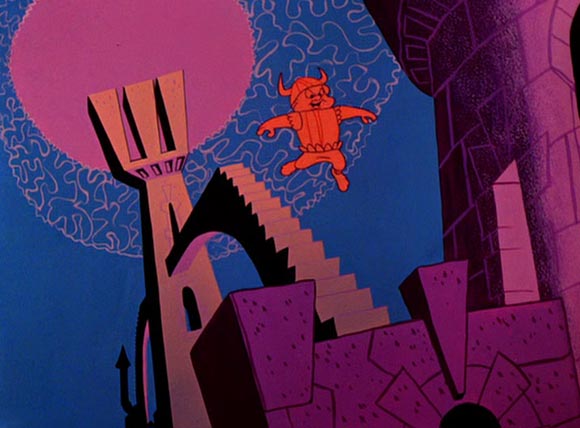
In their new episode, the podcast 99% Invisible profiles legendary layout artist Maurice Noble. Noble made significant contributions to Disney films like Dumbo and Bambi, but he is better known for his layout and design work with Chuck Jones on memorable Warner Bros. shorts like Duck Amuck, Duck Dodgers in the 24½th Century, Ali Baba Bunny, What’s Opera, Doc?, and the Road Runner/Wile E. Coyote series.
That’s why it may be surprising for many readers to learn in this podcast about the personality battles between Noble and Jones, and how the two men weren’t particularly fond of one another despite their frequent collaborations. The subjects who were interviewed for the podcast are reliable authorities on Noble: his biographer Bob McKinnon; Tod Polson whose upcoming book about Noble’s techniques will be a must-own; and Pixar artist Scott Morse, who worked with Noble early in his career.
(Thanks, Bob Flynn)
Add a CommentBlog: Cartoon Brew (Login to Add to MyJacketFlap)
JacketFlap tags: Cartoon Modern, UPA, Van Eaton Galleries, Tom Oreb, Victor Haboush, Bill Perez, Dick Tracy Show, Mike Van Eaton, Add a tag
A year or two ago, when I visiting Van Eaton Galleries in Sherman Oaks, the gallery’s proprietor, Mike van Eaton, showed me one of his then-recent acquisitions: a collection of drawings from the estate of animation veteran Bill Perez.
Throughout his career, Perez had kept a morgue file of animation character designs drawn by other artists. Most of these were random drawings that he picked up around the places he worked—quick sketches, discarded character model drawings, rough designs, and other ephemera that would have been lost if not for his collection. Many of the pages had multiple drawings pasted up of a particular subject, like old ladies or cats. There were few recognizable cartoon characters, but the collection was excellent reference for anyone who had to draw in a vintage TV style.
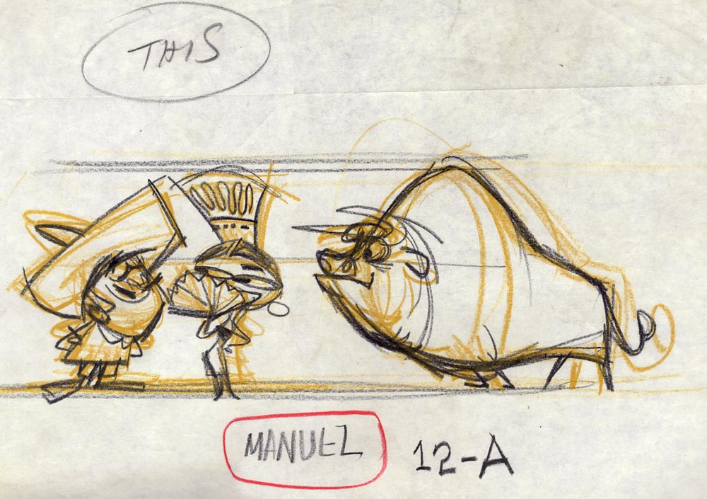
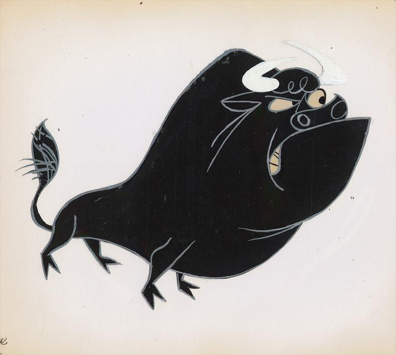
Mike generously allowed me to pick out a drawing of my choosing, and I chose this bull:
I didn’t realize what it was until a few months later when I was looking at another online auction site and saw this color model cel:
Of course, Manuel was Go-Go Gomez from UPA’s Dick Tracy Show (1961). Why I didn’t recognize this at the time is another question, but quickly flipping through hundreds of pages of similar looking artwork can fry your perception abilities. The only thing I knew is that I really liked the grouping of characters. What’s funny is that I had also unwittingly gravitated to a drawing that is almost certainly by my favorite designer of the Cartoon Modern period, Tom Oreb.
One of the last significant jobs of Oreb’s tragically short career was doing character models on the Dick Tracy series, a job he got thanks to his friend Victor Haboush, who was the show’s art director. Oreb commonly used colored pencils during this period, as he does in the underdrawing, but what really distinguishes it as his work is a flawless ability to boil down graphic concepts into the most basic yet dynamic forms. Even amongst the hundreds of other character designs in the Perez collection, this drawing popped out.
I don’t know if Mike van Eaton still has anything from the Bill Perez collection, but next time you’re there, be sure and ask him about it. You may find an affordable drawing or two in there that inspires you like this one inspired me.
Add a CommentBlog: Cartoon Brew (Login to Add to MyJacketFlap)
JacketFlap tags: Shorts, Disney, Mickey Mouse, Cartoon Modern, Joseph Holt, Stephen DeStefano, Clay Morrow, Paul Rudish, Add a tag
Disney unveiled a new Mickey Mouse short today called Croissant de Triomphe, that can be watched HERE. It is one of 19 new shorts that will begin airing on Friday, June 28, on the Disney Channel, Disney.com and other Disney-branded platforms.
Paul Rudish (Dexter’s Laboratory, Sym-Bionic Titan, My Little Pony: Friendship Is Magic) is exec producing and directing. Aaron Springer (SpongeBob SquarePants, Korgoth of Barbaria) and Clay Morrow (Dexter’s Laboratory, Chowder, Camp Lazlo!) are also directors. Joseph Holt is art director and Stephen DeStefano did character design.
If the first short released Croissant de Triomphe is any indication, this is a handsome and distinctive series, featuring a mixture of Cartoon Modern-styled backgrounds and loose, expressive cartoon animation. The three-and-a-half-minute running time of the first short is perfect. I’m glad that studios are awakening to the fact that there can be other lengths besides 7- and 11-minute episodes.
If I have any observation about the first short Croissant de Triomphe, it’s that it struggles to find the humor in its set-up, which is Mickey driving around Paris on a scooter. Outside of a couple half-hearted attempts at gags (nuns knocked into the air like bowling pins who then float down, an appearance by Cinderella), the cartoon emphasizes frenzied non-descript action sequences over slapstick. Even obvious gag set-ups—for example, Mickey dressed as a knight and lancing croissants—have no comedic payoff. Hopefully as the crew finds its footing, they are able to balance the accomplished action sequences with a more spirited comic sensibility.
Add a CommentBlog: Cartoon Brew (Login to Add to MyJacketFlap)
JacketFlap tags: Estudios Moro, Jose Luis Moro, Santiago Moro, Spain, Cartoon Modern, Add a tag
Estudios Moro was a Madrid, Spain animation studio started in 1955 by brothers Santiago and Jose Luis Moro. Their approach, while not strictly modernist, was heavily influenced by the Cartoon Modern approach of the era. There is little written about the studio in the English language, but from what I can discern, Moro appears to have been Spain’s leading producer of animated commercials. The studio’s success allowed it to open satellites in Barcelona and Lisbon during the Sixties.
Below are a few examples of theatrical commercials produced by the studio. If Spanish Brew readers know about Moro’s history or how to see more of their work, please share.
Add a CommentBlog: Cartoon Brew (Login to Add to MyJacketFlap)
JacketFlap tags: American Motors, Nash, Victor Haboush, Advertising, Disney, Cartoon Modern, Hudson, Tom Oreb, Add a tag
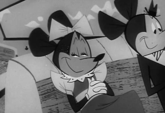
For a short period of time during the mid-1950s, the Disney company allowed corporations to use its characters to sell products. There’s some interesting history behind this, and if you’re interested in learning more, I’d recommend this two-part series by historian Jim Korkis (part one, part two).
Among the companies that took advantage of this opportunity was American Motors, maker of Nash and Hudson cars. (Interesting sidenote: the company’s president at the time was Mitt Romney’s father, George W. Romney.) Yesterday, YouTube user ZarakPhoto uploaded a fine collection of the American Motors spots featuring Jiminy Cricket and Mickey Mouse. I’ve seen other prints of these spots, but these are easily the crispest versions I’ve encountered and worth a look even if you’ve seen them before:
Here’s an upload from another YouTuber with a lower-quality version of one of the other spots featuring Song of the South characters:
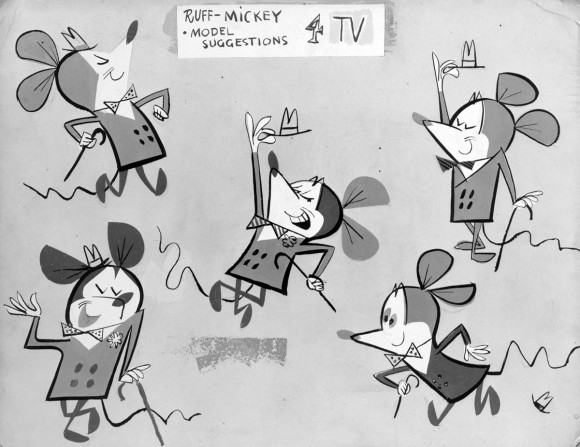
The commercials were designed by Tom Oreb, who in my humble opinion, was the most versatile and skilled designer during the Golden Age of Hollywood animation. Oreb’s assistant art director and layout artist on these spots was Vic Haboush, who was a dear friend and mentor to me.
This is Oreb’s model sheet of the “commercial” Mickey Mouse, which Vic and I discovered in his personal collection many years ago. Click for a larger version:
Add a CommentBlog: Cartoon Brew (Login to Add to MyJacketFlap)
JacketFlap tags: Cartoon Modern, Vincent Cafarelli, Vinnie Cafarelli, Add a tag

Courtesy of animation director Michael Sporn, here are some gems of “cartoon modern” design from the collection of legendary NY animator Vincent Cafarelli, who passed away in 2011.
If you like these there’s more HERE, HERE, HERE, HERE, HERE, HERE, HERE, and HERE.


Blog: Cartoon Brew (Login to Add to MyJacketFlap)
JacketFlap tags: Advertising, Cartoon Modern, UPA, Roy Morita, United Productions of America, Add a tag
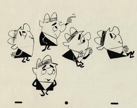
In the six years since the publication of my book Cartoon Modern: Style and Design in 1950s Animation, a lot of new artwork and films from the mid-century era have surfaced. The flow of material isn’t slowing down either. Animation director Michael Sporn recently came into possession of a trove of layouts and model sheets from 1950s United Productions of America (UPA) commercials. He’s generously shared them HERE and HERE.
Among the stash are a few drawings from an Aqua Velva Ice Blue aftershave lotion spot, which can be seen in this newly uncovered collection of UPA commercials:
These commercials are rarer than they might appear. Of the hundreds of commercials that UPA produced during the 1950s, I’ve managed to see just a few dozen over the years. UPA’s advertising work has proven more difficult to track down than some of the other major animated commercial producers of the era like Playhouse Pictures and Ray Patin Productions.
The same user on YouTube also posted this UPA commercial for Tang, which I believe was designed by Roy Morita.
Cartoon Brew |
Permalink |
No comment |
Post tags: Roy Morita, United Productions of America, UPA
Blog: Cartoon Brew (Login to Add to MyJacketFlap)
JacketFlap tags: Lluis Fuzzhound, Shorts, Australia, Cartoon Modern, Add a tag
Self-taught Australian animator Lluis Fuzzhound’s Marooned On Watango Island is a loving tribute to the Cartoon Modern style, complete with jazz and tiki.
Cartoon Brew |
Permalink |
No comment |
Post tags: Australia, Lluis Fuzzhound
Blog: Cartoon Brew (Login to Add to MyJacketFlap)
JacketFlap tags: UPA, Bobe Cannon, Shorts, Classic, DVD, Cartoon Modern, Add a tag

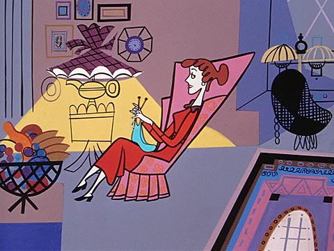
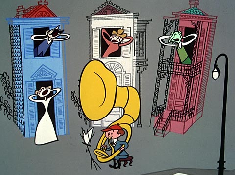
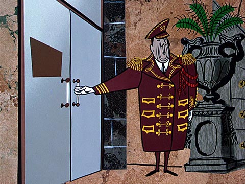
I watched all the UPA theatrical shorts back when I was writing Cartoon Modern, but seeing them restored on TCM’s new 3-DVD “Jolly Frolics” set has been an eye-opening experience. If there was ever any doubt about how progressive the studio was graphically, this set will dispel such notions. Immediately after UPA, the floodgates of animation design opened—by the mid-1950s, all varieties of graphic styles were being explored in TV advertising and industrial films, and soon after, European animation studios like Zagreb Film were out-UPAing UPA. The studio’s dominance lasted but only a short period, but UPA’s influence was lasting. It played a key role in pushing animation out of its cocoon, thus allowing it to evolve into the rich and diverse art form that it is today.
The director whose reputation will benefit most from this collection is Robert ‘Bobe’ Cannon. While his stories tend to be formulaic and thematically repetitive, often times it seemed like he was the only director at UPA who knew how to put together a coherent film. (A good deal of that credit also belongs to his close collaborator T. Hee, who wrote most of Cannon’s films.)
More than the stories though, it’s the way that Cannon animated characters, which looks even more refreshing today in light of all the generic Flash and After Effects animation. In Cannon’s work, the way a character moves is never separate from its design. Discovering a visually inventive way to animate a character from point A to point B is Cannon’s greatest strength. The two most famous films in the Cannon canon are Gerald McBoing Boing and Madeline, but his later efforts, especially Fudget’s Budget, Christopher Crumpet’s Playmate and The Jaywalker—all looking better than ever on this set—display remarkable confidence as a director.
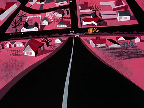
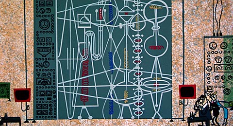
Below is some random visual eye candy from the “Jolly Frolics” shorts. We’ll be giving away a couple copies of the set this weekend so check back.

Blog: Cartoon Brew (Login to Add to MyJacketFlap)
JacketFlap tags: Animators, Classic, Cartoon Modern, UPA, T. Hee, Charles Eames, Eames Office, Ray Eames, Add a tag
I was digging around for some UPA photos the other day when I stumbled onto this photo that I’d labeled “Tee Hee and visitors.” Tee Hee is, of course, the gentleman on the right—a sequence director on Pinocchio and the “Dance of the Hours” segment in Fantasia, before moving over to UPA where he worked with director Bobe Cannon on shorts like Gerald McBoing Boing, Fudget’s Budget and The Jaywalker. When I looked at this photo again though, I thought, “Wait a second…these aren’t any ordinary visitors…they’re the legendary husband-and-wife design team of Charles and Ray Eames!” At least I’m fairly certain they are. If anybody can confirm this, please do.
The cross-pollination between creative disciplines was an essential ingredient of the “cartoon modern” era. I wrote a little bit about Charles and Ray Eames and their relationship to animation on the Cartoon Modern blog. The story goes that Charles Eames was so impressed after he visited the UPA studio that he bought stock in the company. The Eames later created some animated projects and hired animation artists like John Whitney, Dolores Cannata, Ed Levitt and Chris Jenkyns. Here’s a film they produced in 1958 called The Expanding Airport:
Cartoon Brew: Leading the Animation Conversation |
Permalink |
No comment |
Post tags: Charles Eames, Eames Office, Ray Eames, T. Hee, UPA
Blog: Cartoon Brew (Login to Add to MyJacketFlap)
JacketFlap tags: Cartoon Modern, Eyvind Earle, Disney, Animators, Add a tag
It’s been an Eyvind Earle kind of week. A couple days ago I stumbled onto an obscure post-Sleeping Beauty Chevrolet commercial that he directed and animated. And tonight I found this half-hour documentary that was written and narrated by him shortly before he died in 2000. The film contains lots of personal history, more of his rarely seen commercial and abstract animation, and a generous serving of his personal philosophies about life. Watch the entire program in three parts:
Cartoon Brew: Leading the Animation Conversation |
Permalink |
No comment |
Post tags: Cartoon Modern, Eyvind Earle
Blog: Cartoon Brew (Login to Add to MyJacketFlap)
JacketFlap tags: Ideas/Commentary, Cartoon Modern, Ted Parmelee, Add a tag
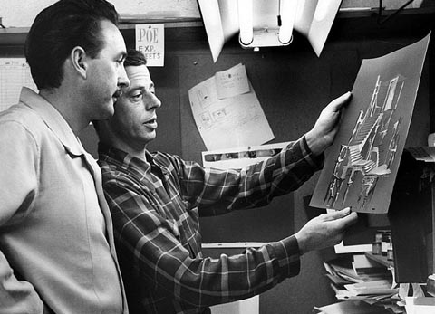
Ted Parmelee (pictured above, right) is perhaps best remembered today as the director of UPA’s The Tell-Tale Heart, but his career in animation stretched from Pinocchio through Rocky & Bullwinkle and included lots of fine work in TV commercials and industrial films inbetween.
While browsing through some files related to my book Cartoon Modern, I stumbled onto scans of an article that Parmelee had written in the mid-1950s. The piece, which I’ve reprinted below, smartly sums up many of the issues that progressive animation artists faced in the 1950s. For example, Parmelee argued that Disney’s heavy reliance on live-action was an artistic dead-end and countered every other development in art at the time:
All efforts were directed toward better drawing to produce a kind of reality from what had originally been a very simple and direct medium. They were so delighted to see it move, and pleased with a medium more plastic in the use of “time” that they became involved in trying to make it round, real and spacious as they could. This was exactly the same standard of “good” that made Aunt Matilda’s “real-genuine-oil painting” good. “The apples looked so sure-enough for real you coulda’ picked ‘em right out of the painting.” For this the artists to the Italian Renaissance for aid and borrowed the know-how of several centuries of draughtmanship. It was only natural and practical thinking. If you have a new gadget, don’t you take it out and try it on anything handy? Finally you have it doing the things it was designed for so well that it just gets monotonous, so you have it attempting things it never was built for.
There is a strong correlation between Parmelee’s critique of Disney in the 1930s and ’40s, and today’s art form — only the technique has changed. Contemporary big budget CG features exhibit increasing sophistication in lighting, textures, character animation and effects, but to what effect? Realism has again been cast as an end, when it is only a means for expressing a personal artistic vision.
Parmelee credits World War II as the impetus for animators experimenting with new filmmaking techniques, storytelling approaches and graphic styles. He also hails the arrival of the TV commercial, in which the form’s brevity allowed artists to explore different approaches for communicating with audiences.
Thankfully today’s animation medium is diverse enough that there is tons of experimentation happening, even moreso than in the 1950s. Parmelee, of course, anticipated this when he wrote that the single biggest improvement awaiting the industry “would be a decisive change in the actual physical means for making animated pictures, a more fluid kind of thing. . . a thing that provided quicker results.” Indeed, digital animation software and techniques have proven to be the savior, and offer an improvement over old production methods, especially when used by artists for the purpose of expressing themselves.
Read Parmelee’s article by clicking on the image below:
Add a Comment
Blog: Cartoon Brew (Login to Add to MyJacketFlap)
JacketFlap tags: Classic, Cartoon Modern, Add a tag
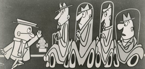
Sam Henderson has uploaded a rare, heavily illustrated article about UPA on his Magic Whistle blog. The article, by Catherine Sullivan, appeared in the November 1955 issue of American Artist. The text is rather slim, but the images are from a variety of UPA works including commercials and industrials, as well as theatricals like The Jaywalker (pictured above). Worth a look.
Add a CommentBlog: Cartoon Brew (Login to Add to MyJacketFlap)
JacketFlap tags: Animators, Cartoon Modern, Add a tag
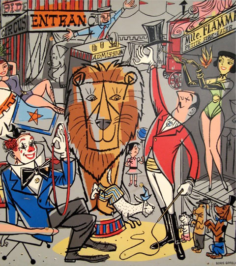
I don’t post links to eBay items frequently, but I can’t resist pointing out this huge, stunning Fifties silkscreen mural by Boris Gorelick (1912-1984), who painted backgrounds at UPA, Warner Bros. and Format Films. Gorelick’s animation work consists exclusively of paintings based on the layouts of other artists, so it is a pleasant surprise to discover that he was such a facile draftsman and that he drew characters so beautifully. The design is busy but never cluttered, and his use of color is bold and imaginative. With so many contemporary artists creating mediocre gallery paintings using a “cartoon modern” style, it’s easy to forget how exciting and interesting a stylized cartoon painting can be. Gorelick had it down.
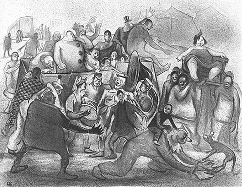
I’ve written about Gorelick before on the Cartoon Modern blog. He had a fascinating history. Born in Russia, his parents emigrated to the US when he was an infant. He was politically active throughout the 1930s, and hung out with artists like Arshile Gorky, Max Weber and Ben Shahn. In 1935, while creating art for the W.P.A., he made a lithograph of a circus scene that is much darker than the Fifties version, and shows his vastly different approach to drawing in his pre-animation years.
I checked with the eBay seller, and he said if the reserve isn’t met on the listing, the mural will be available for sale at Izzi Modern which is located in the Vintage Collective showroom in Long Beach, CA.
Add a CommentBlog: Cartoon Brew (Login to Add to MyJacketFlap)
JacketFlap tags: Cartoon Modern, Animators, Add a tag
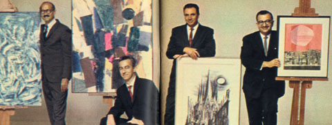
Internet broadcaster Stu Shostack has an almost complete collection of TV Guide magazine. While waiting for his radio show to start (which I was a guest on yesterday; rebroadcasts of the program run everyday at 7pm EST/4pm PST) I browsed through several back issues and found a few items of interest for Cartoon Brew readers.
For example, this three page spread from the December 30th, 1961 issue, on the fine art of Format Films animators Jules Engel, Bob McIntosh, Joe Mugnaini and Herb Klynn. Engel, McIntosh and Klynn are well known animation veterans, Mugnaini is best known for his illustrations for Ray Bradbury novels. It’s great they received this sort of exposure in a national magazine at a time when the perception of animation as an adult artform was waning. (Click thumbnails below to enlarge)
Add a CommentBlog: Cartoon Brew (Login to Add to MyJacketFlap)
JacketFlap tags: Animators, Cartoon Modern, Add a tag
Check out this self-produced mini-doc by film writer Matt Zoller Seitz about Peanuts director Bill Melendez — covering his artistic roots, his directorial style, and his influence on the films of Wes Anderson. The juxtaposition of Melendez’s art between Hitchcock’s and Kubrick’s presents a fresh and exciting way of looking at animation in a filmic context. Bonus points to Matt who writes in the YouTube comments that he used my book Cartoon Modern as a resource when preparing this film.
Add a CommentBlog: Cartoon Brew (Login to Add to MyJacketFlap)
JacketFlap tags: Cartoon Modern, Add a tag
The animation above aired on the 1962 ABC special “Stan Freberg Presents The Chun King Chow Mein Hour: Salute to the Chinese New Year.” It’s been rarely seen since then. It was directed by Roger Ramjet creator Fred Crippen, designed by Saul Bass, and the song is taken from Stan Freberg’s comedy album “Stan Freberg Presents The United States Of America.” Another important name involved with this piece was Bass Office designer Art Goodman, who Crippen remembers working with closely and who contributed significantly to the overall look of the piece.
Add a CommentBlog: Cartoon Brew (Login to Add to MyJacketFlap)
JacketFlap tags: Cartoon Modern, Add a tag
Since Cartoon Modern was published a few years ago, the most frequently asked question I’ve received about the book is, “Where’s the DVD?” While I was working on Cartoon Modern, we considered including a DVD that showed the animated pieces discussed in the book, but practical issues of time and money prevented it from happening. Since then, I’ve spoken to a few people about producing a DVD and while nothing has come of those discussions, it’s not out of the realm of possibility that someday I’ll put together a curated collection of commericals, shorts and industrial films related to that period.
Until that happens, let me point out the next best thing: a “Cartoon Modern” playlist on YouTube created by an awesome user who goes by the name of criticalmetrics1. I have no idea who this person is, but I want to thank them for putting so much effort into creating this playlist. They’ve even gone so far as to organize the films by the contents of my book. There are a hundred items on the list but because of copyright takedowns, only ninety-three are currently available for viewing. Still, that’s enough stylized cartoon animation to keep anybody busy for a while. If you know of other Cartoon Modern-related YouTube links, feel free to add them to the comments below.
The Cartoon Modern playlist:
Add a CommentBlog: Cartoon Brew (Login to Add to MyJacketFlap)
JacketFlap tags: Cartoon Modern, Books, Add a tag
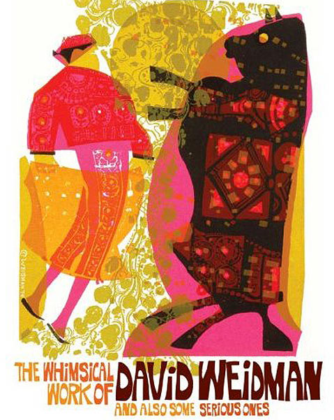
If you appreciate good design and color work, then you’ll want to add the new hardcover publication The Whimsical Work of David Weidman and Also Some Serious Ones to your bookshelf. While this career retrospective features mostly his silk-screened prints from the Sixties and Seventies, there is also a healthy sampling of Weidman’s animation artwork from studios like UPA, Storyboard and TV Spots (later Creston Studios). Some of his UPA art from 1955 is identified as being from the ’70s and the writing (what little of it there is) didn’t particularly impress, but the star of this show is the artwork and there is loads of nicely presented imagery throughout. To see some of David Weidman’s artwork online, visit WeidmansArt.com.
Add a CommentBlog: Cartoon Brew (Login to Add to MyJacketFlap)
JacketFlap tags: Cartoon Modern, Classic, Add a tag
Today’s entry from the UK is more curio than classic: the 1959 Halas and Batchelor cartoon The Christmas Visitor, directed by John Halas, designed by Ted Pettengell, and animated by Harold Whitaker and Tony Guy. The cartoon, like a lot of Fifties work by Halas and Batchelor, is an uncomfortable mix of ‘cartoon modern’ styling and traditional animation movement. Its rarity makes it worth a view.
(via the excellent Saturday Morning Blog)
Blog: Cartoon Brew (Login to Add to MyJacketFlap)
JacketFlap tags: Cartoon Modern, Add a tag
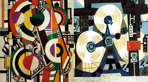
Oswald Iten’s blog Colorful Animation Expressions offers a nice post about the influence of Fernand Léger on Walt Peregoy, the color stylist of 101 Dalmatians. The comparison made between the work of Léger (left) and Magoo background painter Bob Mcintosh (right) is also quite striking.


