Some (older) sketches of Maddy's flying boat. Which is a sort of sentient steam powered thing of mysterious origin. With Henry finally in daycare and Julie back at work I'm having normal working days. I'm able to plan ahead now and set deadlines for myself, which I found hard to do with Henry at home and with so many odd projects going on. I'm also cutting back on stuff: less reading, games, TV, internet time etc. But more audiobooks and music.
It's all of the sudden Fall! Which is my favorite time of year. Best food, more energy, Halloween, sweaters. I look better in a sweater.
I received this amazing drawing of an aging Silvio by new artist
Gabe Gill. I think he captured something perfect and essential about the character. Something both cozy and a little dark and strange. Really wonderful. Gabe is going to be big.
Here's a little model I made of Silvio to help me work out shading, perspective and other drawing problems while I do the Maddy Kettle comic. I'm also planning on doing the other characters as well. He's a bit rough but he'll do the job well. I did him in Super Sculpey with a metal wire and aluminum foil armature. I painted it in black and white acrylics.
Gogi is an an air spirit that got stuck in cloud. Luckily it's a comfortable cloud.
A new face in the Cloudscape. Doppo is a cloud cartographer from 100 years before Harry and Silvio's time and he will have a major role in book 2 of Maddy Kettle ( if they let me do a book 2). Yesterday I found myself mapping out a huge overall story arc to the Maddy Kettle books. I'm sure this'll change as I go along. I'm so excited about these stories.
This is a character I think will be in the second Maddy Kettle book. He doesn't have a name yet (I'm thinking
Doppo) but he's a
Japanese Red Fox and he's an adventurer in the Cloudscape. I'm on a big Manga kick right now so bits of Japan are seeping into the Cloudscape. Another point of interest is that I drew this with
ShinHan Touch markers. I did some more with marker which I'll share over the next few days. And lastly I used
non reproducing blue pencil here. Which reproduced...Oh well.
I finished the thumbnails for the first Maddy Kettle book yesterday. Right now, the book comes out to 110 pages. It was a lot of work, even though I had lots of story notes and sketches the story went to unexpected places while drawing the thumbnails. I expect surprises while I pencil as well. Since every editor in the world is at San Diego Comic con for the next little while I'm waiting for the go ahead on this. In the meantime I'm starting work on a short story for
Oni.
I'm in the midst of things and there's not much to report. So far the part time job has worked. I'm getting more work done then ever with out any of the freelance pressures. Toronto is once again sweltering after a brief reprieve. I have started outlining the second Maddy Kettle book. It's still a small idea but I'm following it to see where it goes.
A sketch of Harry and Silvio's cloud-mapping balloon.
Here are some thumbnails from the first Flying Boat comic. I'm so busy right now with this and other projects ( including being a dad! ) that I'l scaling back my internet/networking time quite a bit. I think it's about time I recognizes that I am working on the jobs of my dreams right now and I don't have to anxiously be racing out to new clients etc. I also need more time to watch films and read comics.
 I found out yesterday that not only did I get into Spectrum 17 but I got the silver award in comics! It was for this page from the Cloud Cave comic.
Just found out I got silver in Spectrum's 17th Annual! I got in the comic book section. More on this tomorrow, I'm in pleasant shock. I do know it's from the Cloud Cave mini from the Flying Boat comic.
 Just an idea...In one version of the cover the boat is running across the clouds with extended metal feet, landing gear maybe?
 And here is the final cover painting! After the final watercolurs were applied, as seen in the last post, I decided to paint over the drawing in the sky with gouache. My initial plan was to just add some highlights with gouache but I ended up over-painting a lot of it and I think for the better. The gouache phase of a painting is always amazing to me; the way all of the sudden these colours are popping and everything becomes so vibrant. It's an amazing medium. I prefer it over oil and acrylic, really.
Top Shelf is already using it for promotion and I've already seen the comic mentioned in the same paragraph as Alan Moore, which is a real thrill.
Thanks so much for following along. More soon on the Adventures of the Flying Boat.
1

2

3

4
 One
One is the final inks again. This is on Arches 140 pound hot pressed paper which is great for both ink and watercolour. The drawback for using watercolour with hot pressed paper as opposed to cold pressed (or "non pressed") is that it's harder to do an even wash of colour. In cold pressed papers there is enough texture that the watercolour washes will fill large areas without any difficulty but this is harder in a paper with a smooth surface. However nibs catch and spatter in the tooth of a cold pressed paper making it less ideal for inks. I end up using gouache to solve this problem.
Two, three and four are the order in which I apply colour which is taken from
this book (
five) , more or less.
William Joyce is one of my heroes and his process in amazing.
Two: I start with yellow and then red. At this point I already have an interesting almost monochrome picture. With each successive layer of colour more of the image is revealed.
Three: I start to add blues to the mix, in this image just concentrating om making the boat and the clouds purple. This photo doesn't quite show the richness of the three colours but it's quite astounding what can be done with a minimal palette.
And finally four, the sky. This illustrates the difficulty I have in getting an even wash on hot pressed paper. Instead of an even wash I end up with whorls of colour and variations in the density of the pigment. Ins stead of worry about this too much I try and use it. The unevenness suggests a Van Gogh-like movement in the sky and clouds that I use. Here I see another "mistake" I've made; the ultramarine wash has obscured my inking in the sky to the point where it looks terrible. I worried about this for some time because I had spent a long time inking the sky and was quite attached to the way it had tur
1
2 This is seeming a lot more involved and methodical then it is. The reality is I'm a lot more halting and sloppy when I work and this process is pretty vague and open. I'm quite easily distracted and find I need some kind of structure so I use this method based on the methods of artists whose work I love.
Number
one is the tracing I used to transfer the
pencil drawing on to nicer paper, in this case
Arches 140 pound hot pressed watercolour paper. Arches has been my favorite paper since art school. It seems to have all the qualities to make it versatile and durable. I use pretty generic tracing paper and there is a fair amount of redrawing that goes on in the transfer. One thing Like about transferring a drawing this way is the opportunity it affords me to work on it in reverse where I can see if it's properly balanced and objects have enough symmetry.
Once the drawing is transferred and it is touched up and tightened on the Arches paper I ink it. Inking is probably my favorite part of the process, to me it's revealing the scene that's been hidden the whole time and it seems to develop like a Polaroid. I use a number of different tools for inking. Primarily I use a pen and nib. In this case I used a
Zebra Comic Nib in a
Tachikawa nib holder. For years I've been using
Speedball drawing products but have recently switched to Zebra pens. The ink I use most of the time and used for this piece is
FW Acrylic Ink, India ink and white opaque. I also used a variety of other disposable pens and brushpens.
Next step is the watercolours.
 For me this is where things begin to get interesting; the pencils. At this point I've done so much preliminary sketches that it seems to be already done, it's just a matter of making it visible. I do want to stress that the invention never stops, at every stage in the process there are surprises and things take unexpected turns.
I really like this picture. It has some pretty light hearted elements and some darker ones. It encapsulates everything about the story I want to get across.
This picture is done on Mayfair (I think) with 2B pencils.
 This is the final thumbnail before I move on to the final pencil sketch. I was ready to move on at this point so the thumbnail was done pretty quickly. I think over drawing comes when you start over rendering to soon not from drawing too much. Keep things loose as long as you can. So far I've been working on the cover for three days.
Tomorrow is the fully rendered pencil drawing.
1
2 I went through another afternoon sketching the revised cover. Here (one and two) are a couple of sketches of Harry and Silvio's official cloudmapping hot air balloon. Again, this set of sketches prompted me to explore this world further.
Tomorrow; the final thumbnail.
1
2
3 As I mentioned last post Chris said he thought the boat should be wonderful and magical. He was right, the story had changed so much it didn't make sense to have the same broken down, mundane boat. It also gave the opportunity to add a really cool steampunk engine. Playing with this design let me push the boundaries to Maddy's world even further. I started to realize that these stories can fit just about anything.
The day I had to do these drawings I had a friend visiting so I carried bits of paper with me all day jotting down all my ideas as I went. They even sat next to me over supper. I got really absorbed in this boat and imaging it flying across the sky, chugging along, leaving puffs of smoke.
One and two are sketches I worked on during the day and three is the final design. This was done over about twelve hours whenever I had a spare moment.
4

And
four is a painting by James Christensen whose work was a huge influence on this design. If you don't know his work check it out, it's wonderful.
1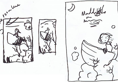
2
3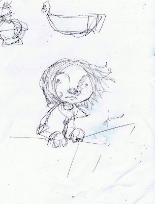
4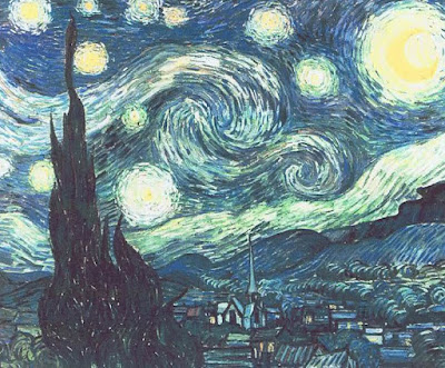
5
6 Today I'm starting a multi-part process series on the creation of the Flying Boat Graphic novel cover. Starting today from the earliest ideas to the final piece.
I've always been a bit embarrassed about the fact that I usually use one of my first ideas. That's bad design but I can rarely find anything I love more then the initial burst of creativity. Numbers one and two are my earliest thumbnails of the cover done in brushpen and it stayed very similar to this in composition. I try to work quickly at this stage, getting ideas out.
Three-When the idea seems to be evolving into something workable I start doing more detailed, exploratory sketches. You can see on the left side of number three I was toying with the idea of a lantern. This came back in the final design in another form. One reason I didn't like the lantern is that I didn't want to draw that type of light source all the time both for practical reasons and also I wanted the boat to be a bit stealthy looking.
At this point I have a healthy pile of loose sketches littering the floor of my studio. This is when I usually
 The cover is actually done for Flying Boat but this is a sliver of it during the process.
 Here's a small detail from the pencils for the cover of the Maddy Kettle graphic novel.
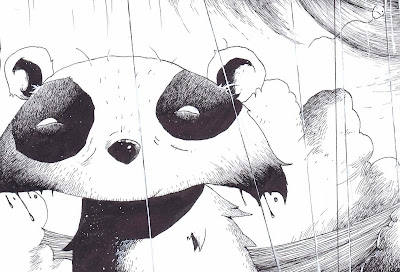
Working like mad to get the Maddy Kettle cover finished.
View Next 21 Posts
 I found out yesterday that not only did I get into Spectrum 17 but I got the silver award in comics! It was for this page from the Cloud Cave comic.
 Just an idea...In one version of the cover the boat is running across the clouds with extended metal feet, landing gear maybe?
And here is the final cover painting! After the final watercolurs were applied, as seen in the last post, I decided to paint over the drawing in the sky with gouache. My initial plan was to just add some highlights with gouache but I ended up over-painting a lot of it and I think for the better. The gouache phase of a painting is always amazing to me; the way all of the sudden these colours are popping and everything becomes so vibrant. It's an amazing medium. I prefer it over oil and acrylic, really.


 One is the final inks again. This is on Arches 140 pound hot pressed paper which is great for both ink and watercolour. The drawback for using watercolour with hot pressed paper as opposed to cold pressed (or "non pressed") is that it's harder to do an even wash of colour. In cold pressed papers there is enough texture that the watercolour washes will fill large areas without any difficulty but this is harder in a paper with a smooth surface. However nibs catch and spatter in the tooth of a cold pressed paper making it less ideal for inks. I end up using gouache to solve this problem.
This is seeming a lot more involved and methodical then it is. The reality is I'm a lot more halting and sloppy when I work and this process is pretty vague and open. I'm quite easily distracted and find I need some kind of structure so I use this method based on the methods of artists whose work I love.
For me this is where things begin to get interesting; the pencils. At this point I've done so much preliminary sketches that it seems to be already done, it's just a matter of making it visible. I do want to stress that the invention never stops, at every stage in the process there are surprises and things take unexpected turns.
This is the final thumbnail before I move on to the final pencil sketch. I was ready to move on at this point so the thumbnail was done pretty quickly. I think over drawing comes when you start over rendering to soon not from drawing too much. Keep things loose as long as you can. So far I've been working on the cover for three days.

 I went through another afternoon sketching the revised cover. Here (one and two) are a couple of sketches of Harry and Silvio's official cloudmapping hot air balloon. Again, this set of sketches prompted me to explore this world further.

 As I mentioned last post Chris said he thought the boat should be wonderful and magical. He was right, the story had changed so much it didn't make sense to have the same broken down, mundane boat. It also gave the opportunity to add a really cool steampunk engine. Playing with this design let me push the boundaries to Maddy's world even further. I started to realize that these stories can fit just about anything.
 And four is a painting by James Christensen whose work was a huge influence on this design. If you don't know his work check it out, it's wonderful.


 Today I'm starting a multi-part process series on the creation of the Flying Boat Graphic novel cover. Starting today from the earliest ideas to the final piece.
 The cover is actually done for Flying Boat but this is a sliver of it during the process.
 Here's a small detail from the pencils for the cover of the Maddy Kettle graphic novel.
Once you get enough of these guys made, you could even do a short, something ala Adam Rex's smekday stuff- http://www.smekday.com/
Very cute! :)
That's a great idea, Erin!
It's génial and I say : Go Stop Motion!
Very nice model. And a great idea for the shading reference. A stop motion film would be really cool too.
OH MY GOSH! Love it!! I'm having a problem with a character that has a very flat face so I may make a model for shading...
Thanks guys! Can I let someone else do the movie??