new posts in all blogs
Viewing: Blog Posts Tagged with: cover stories, Most Recent at Top [Help]
Results 1 - 25 of 111
How to use this Page
You are viewing the most recent posts tagged with the words: cover stories in the JacketFlap blog reader. What is a tag? Think of a tag as a keyword or category label. Tags can both help you find posts on JacketFlap.com as well as provide an easy way for you to "remember" and classify posts for later recall. Try adding a tag yourself by clicking "Add a tag" below a post's header. Scroll down through the list of Recent Posts in the left column and click on a post title that sounds interesting. You can view all posts from a specific blog by clicking the Blog name in the right column, or you can click a 'More Posts from this Blog' link in any individual post.
 Diva Janet Lee Carey's new book, In the Time of Dragon Moon, has a tagline that is irresistible: Beware the dark moon time when love and murder intertwine. Hello! Sold. She's here to tell the tale of her latest cover (my favorite part is a the glorious sunspot at the top!):
"Early on I thought the cover would show a dragon circling an eerie full moon. The trouble with that image is, it simply repeats the title and doesn’t show conflict or, more importantly the central characters. (Excellent example of why I was meant to be a writer and not a cover designer!)
"My editor, Kathy Dawson, was kind enough to ask for my ideas. Early on we both agreed we wanted a dragon on the cover, something that alluded to the powerful dragon on the cover of book 1 in the Wilde Island series..."
Hi readergirlz!
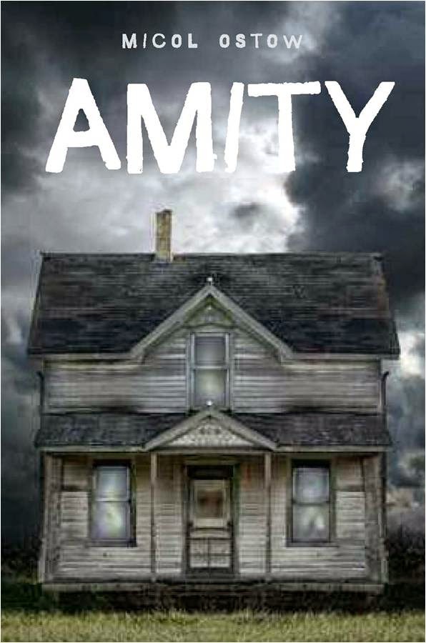
I'm super thrilled to be celebrating the release of my 12th (!) original novel, Amity, a haunted house story told in two separate perspectives, ten years apart. Diva Melissa was gracious enough to offer up a Cover Story slot to me, so here we go!
1. Did you have an idea in mind for your cover as you were proposing/writing the book? If so, what did it look like?
I think we all always knew Amity was going to have an image of a haunted house on the cover. It’s iconic and classic for a reason, right? We may have tossed around the idea of focusing in on one aspect of a house – a window, a door – or even doing something more modern and all type, but I don’t think any of those concepts were seriously on the table.
2. Did your publisher ask for your input on the cover design before the art dept started working? If so, what input did you give?
My editor at the time showed me an early mock-up with the image they were planning to use. But at the time, she did make it clear that everyone in-house was very enthusiastic about the image, which, as I know from my own days on the editorial side of the desk, is pretty crucial and not to be ignored.
3. What did you think the first time you saw the original version of your cover?
I liked the general idea and I really liked that Egmont was truly capturing that straightforward, “HORROR novel,” genre vibe. My main concern was only that the house itself looked nothing like the building that’s described in the book, or the original “Amityville” house. Specifically the half-moon windows are mentioned a whole bunch in the book, and are familiar to anyone who knows anything about the original Amityville crime. But I can appreciate that a strong cover can often outweigh the value of a literal cover. We talked a bit about how the house in the mock-up looked small and not quite menacing enough, and my editor assured me it would be tweaked.
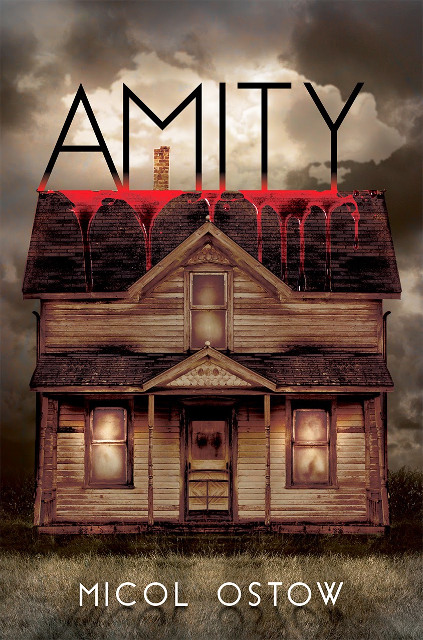
And it was! And it’s amazing and perfect!
As you can see, the final cover is the same original image. But with the color adjusted, a new font, and lots of creepy blood dripped, the terror factor is amped way, way up. I could seriously marry this new final cover, and I’ve been thrilled with readers’ reactions to it! The general consensus seems to be that it’s insanely scary. Which to me translates to: mission accomplished!
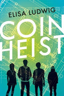
Elisa Ludwig's
Coin Heist is out this month, and we had to ask her about that cover! Here she is to share the story:
"I felt very very lucky to be part of the early cover design discussion. We shared some of our favorite covers for books out now, as well as some movie posters and went back and forth. My main input was that I wanted the cover to feel contemporary and fresh, to capture the fun and exciting pace of the story, and to appeal to boys and girls equally. No small feat!
"I got to see four rounds of comps, and it was fascinating to watch the ideas and inspirations evolve. I made some comments and suggestions along the way, but I also acknowledged that even though I have lots of opinions, I'm in the word business and not the image business, so I fully trusted the experts involved to come up with a great solution.
"I saw many 'original' images with different initial concepts. While they all shared a certain minimalist sensibility, some emphasized coins rather than human figures, others a 'plan notebook,' and still others had a tiled floor that represented the Mint at night. It's truly amazing how a seemingly simple design can communicate the plot, the mood, the characters and even the imagined reader of a book.
"When I first saw the final cover, I loved it right away. I'm a sucker for vintage graphics, and I thought the white font, bold green and stark silhouettes really evoked classic mystery/heist book covers while the background suggests the more tech-y, modern element of this particular plan. At the same time the details on the figures are emblematic of the characters in a way that won't limit the reader's imagination. My biggest takeaway: I'm in awe of designers! The silhouettes are an original illustration by Tahnee Gehm.
"I've already gotten a ton of positive feedback (from, it should be noted, both guys and girls). So yeah, I'd say it hit the mark."
Thanks, Elisa!
Watch the trailer here!
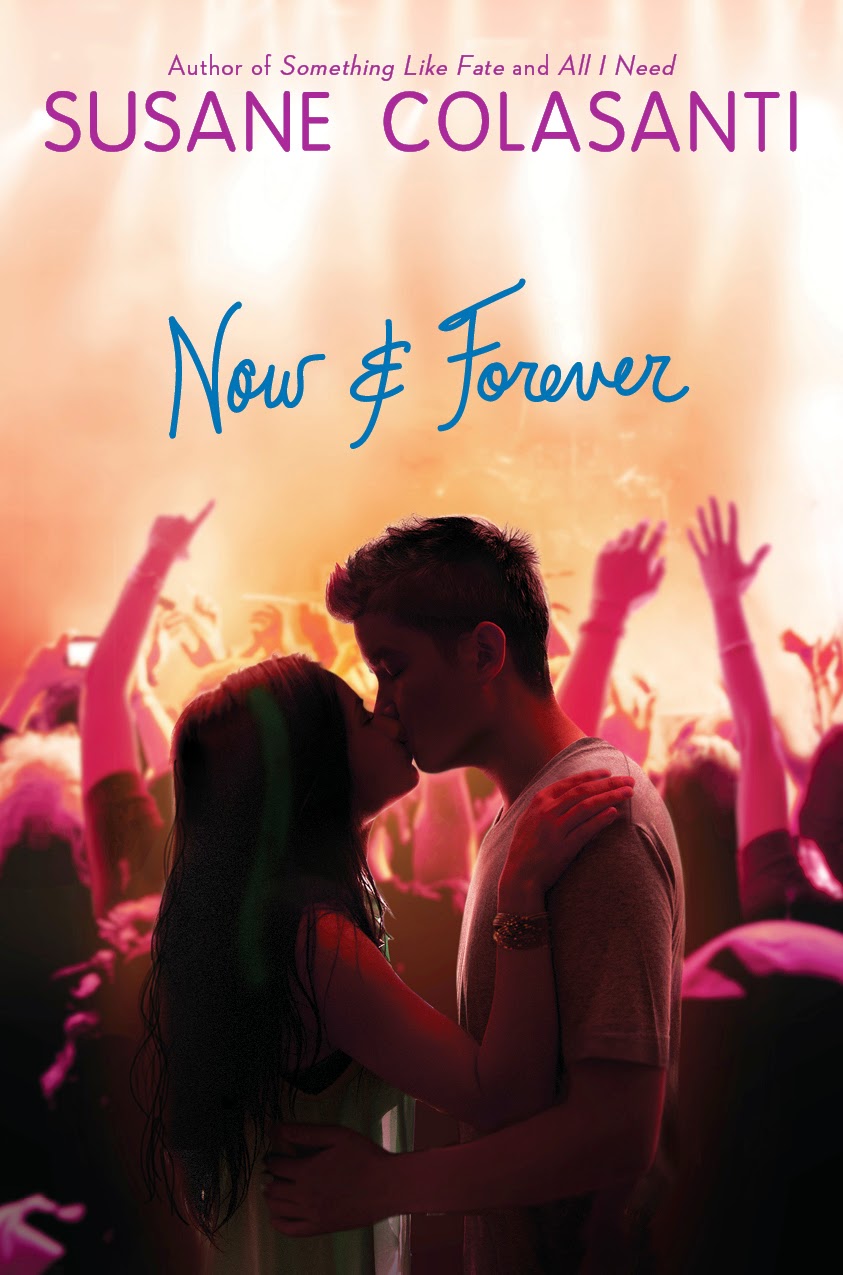
Susane Colasanti's latest novel (out next week!) has a great Cover Story. Here's a peek at it:"The hottest thing about the cover of Now and Forever might be that the models are a couple in real life.
"Or maybe it’s how the background image totally captures the excitement of a concert. And not just any concert. Now and Forever is about a girl whose boyfriend, Ethan Cross, is the world’s biggest rock star. So of course we had to do some kind of concert venue type design. I couldn’t wait to see which direction the art department would take.
"My contract says that I’m allowed cover consultation. When my editor sent me the first draft of the cover for feedback, something very obvious was missing in the audience..."
Read the full Cover Story at melissacwalker.com, and US residents can enter to win a signed copy of the book below!
a Rafflecopter giveaway
Shirley Reva Vernick's latest novel,
The Black Butterfly, is her third for young adults, following the award-winning The Blood Lie and Remember Dippy. She's here today to share her Cover Story!
"Designing the cover for
The Black Butterfly spanned several months and numerous drafts, and I think the effort really paid off. This is my third novel with Cinco Puntos Press, and while I immediately liked the initial designs for the first two books, I wasn’t crazy about the early renditions of
The Black Butterfly cover. I didn’t have a specific image in mind of what I wanted, but I knew it needed to evoke a sense of eeriness and otherworldliness.
"This novel is about ghosts, haunted mansions and strange dreams, after all. The original cover versions didn’t capture that, in my opinion. The early designs were all variations of the cover on the right.
"The designer was thinking that the hands resembled a butterfly. One of the thumbs is supposed to be see-through, like a ghost. But it just didn’t work for me. The typeface of the title is meant to look like a teen’s handwriting, since Penny, the main character, is something of a writer. But I felt the typeface didn’t match the mood of the story inside.
.jpg)
"Then the designer suddenly 'got' it. Out went the photos of hands, and in came an illustration of…something wonderful. Something dangerous, ambiguous and compelling. Part butterfly, part phantom, part human, part mystical. I love how the dripping streaks of color could be either tears or blood—or both.
"I consider this cover to be a true collaboration among the publisher, the designer and me. While I’m not the most visually oriented person (which is how I ended up with a green house when I thought I was picking out grey paint), I do appreciate being included and heard.
"In closing, I should mention that the designer gave birth a few days after coming up with the new prototype, and she jumped into the tweaking stage just three weeks after the delivery. Talk about girl power!"
"I love the cover of Torn, because by some amazing coincidence, the model looks like the friend on whom Stella, my narrator, is based (see the picture of 'Stella' and me in high school, below right). I also like the model because I can see both Latina and Eastern European characteristics in her face, and Stella is biracial Mexican and Croatian..."
Jennifer Echols has some great covers. (Remember the
makeovers of her illustrated-cover books into photographic covers? Love that!)
Her 2012 book,
Such a Rush, is no exception. Jennifer's here to share her Cover Story:
"When the publisher asked me for my input on the cover, I told them a big sky would be good, but we would also need to see the characters Leah and Grayson to make it evident to readers that the book is a romance. They came back with two possibilities. One looked like the back cover, showing the small-town airport with an airplane overhead, except that Leah and Grayson were also lying in the grass. The other looked like the front cover...."
Read Jennifer's
full Cover Story on melissacwalker.com.
Diana Peterfreund tends to have great covers, and when I saw
For Darkness Shows the Stars (a post-Apocalyptic take on Jane Austen's
Persuasion, hello!), I fell in love with the starry sky. So I asked her about it, and here she is:
"I always have an idea in mind for my covers, but since I’m not an artist it’s probably best that my publishers ignore me. They did ask me to send inspiration pictures, though. I sent in a lot of pictures of harsh seascapes and rocky cliffs and beaches beneath a sunset/sunrise and a starry sky. Sometimes there were forlorn women standing on these beaches. I think Harper and I were totally on the same page about the direction we wanted to go in, which mostly makes me feel like I’m finally getting a hang of this imagery thing.
"I asked for something very lush and romantic, to fit the feel of the book. Also, because this book has such a distinctive title that bucks the trend of the one-word YA book titles, I asked for a fun font treatment that really highlighted the title..."
I'm a sucker for bridges. And running. And flowing hair. So the cover of
Eve? Kind of up my alley. Here's
Anna Carey to talk about the cover of the first book in the
Eve trilogy:
"I had a vague sense of what the book might look like. The name--Eve--conjures so much. We all know Adam and Eve, and there's so much imagery associated with their story. Originally I saw the cover as having a lot of lush greenery. I sometimes saw a pale girl lost in the forest. It's funny, the book trailer captures a lot of those original images and ideas that were left behind as the cover evolved.
"The designer asked for a list of images or words that appear in the book. I can't seem to locate that list, though I'm 99% sure the designer came up with the bridge idea, which I love. It's hard to go back through your book and decide which imagery is meaningful and/or metaphorical--so much of that is folded into the manuscript unconsciously. I'm pretty certain all my suggestions were fairly basic. Thankfully she didn't put a wall or a cluster of trees on there. I don't think it would've had the same effect..."
Jessica Brody has shared two previous Cover Stories here (for
My Life Undecided and
The Karma Club). She's back to tell the tale behind the cover of
52 Reasons to Hate My Father.
"I’m terrible at envisioning covers. So no, I didn’t really have an idea in mind. But I knew I wanted it to show the contrast of my main character’s two worlds (spoiled heiress and working girl) which I think they ended up doing really well!
"Honestly, I was surprised when I saw the cover. It was SO different from the light, pastel, girly looks of my other YA book and my publisher had told me they were going to keep with the same look. So when I opened this, I almost thought that they sent me the wrong cover! It was all edgy and kind of punk rock-ish. I wasn’t quite sure how I felt about it..."

Jason Odell Williams is an Emmy-nominated producer, and his first novel was just optioned for a three-picture deal. Whee! Plus, Jason tells a good Cover Story. Here he is:
"I never had a cover in mind while writing
Personal Statement. I never really picture a cover or poster for any of my work (books, plays, films) until the writing is at least mostly finished. So with
Personal Statement, I never had a preconceived idea; I was so focused on just finishing the manuscript.
"So once I had a solid first draft, I sat around over dinner and drinks with my publishers
Carey Albertine and Saira Rao and we started brainstorming cover ideas. We thought about something hurricane-related, like a trashed backyard that could look like either the morning after a storm or a wild party. But that didn’t really say enough about the 'Personal Statement'-college application part of the book. Another idea we floated around was having a shot of the major players in some sort of pose like an album cover or action shot during the Hurricane prep, but again that felt too linear and only dealt with the volunteer aspect of the story.
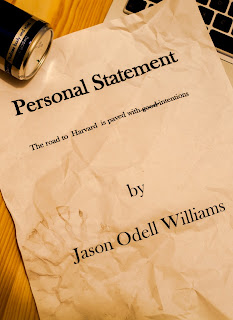
"So we came up with the idea of crumpled up paper, all of these false starts when trying to write a personal statement and succinctly tell strangers at college 'who you are.' The one we had sort of settled on was the one with the can of Red Bull and the 'cover' page of a personal statement with a boot print and coffee stains on it (right). And we were pretty happy with it and were going to go with that. But Carey & Saira wanted to punch it up a little, so they asked
Nick Guarracino, who had recently been brought on to do the illustrations for another book they were doing, to take a look at the cover and make it pop more.
"He read some of the book, looked at our cover, and instead of punching up the old one, he came up with 6 completely different options. My publishers looked at them all and knew right away it was the hand thrusting up from the pile of pages. They texted me the image and I took one look and was blown away. The last I knew, our cover was going to b the page with the coffee stain on it, so to then suddenly see this amazing, bright, dynamic, bold arresting cover, I was so excited and thrilled. I immediately texted back and said 'YES that’s the one.' (I may have used some profanity in my excitement... as in 'Holy SH*TBALLS that's amazing! I love it! Yes!')

"And I actually never saw these other options (left) until this week. And while the girl’s face was a close contender, there is something sad and melancholy about it that’s not quite right for the book. Also, it’s hard to put a real face (even half of a face) on a book cover. And I never liked the idea of 'casting' a character before someone reads the book. (What if the Rani on the cover doesn’t match the Rani in your head?) So in the end, I know we made the right call with the hand thrusting up from the pile of balled up pages.
"Nick told me the photo was made by taking a picture of a friend’s hand and then using photo shop to add the balled up pages and the color in the background. Then he made the hand look more feminine and ethnically ambiguous. What I like about that is then the hand becomes like a mirror… you see what you want to see. When I first saw it, I thought it was a white guy’s hand. Others see a white girl or an Asian or Indian-American girl. And now when I look at it I can't decide if it's Emily Kim's hand or Rani's. So it’s cool that the hand has that 'every-person' quality to it.
"And now, the more I look at the cover, the more I see how right it is for this book. The hand at first seemed to be simply frustrated to me, but now I also see defiance and breaking free and standing out from the crowd. The hand is coming up for air after drowning in expectation for so long. Of course, I’m reading a lot into it and people looking at the cover for the first time might never see any of that, but I think what the cover does convey, even at first glance, is a sense of being bold and explosive and exciting. It would make me stop twice if I saw it on a shelf (even a 'digital' shelf!) And for all of those reasons, I love this cover couldn't be happier!"
Diana Rodriguez Wallach has a fast-releasing trilogy of stories coming out this fall, and each has a different cover. Here's the story of #1, and the full-series cover:
"I told my publisher that I really wanted a mirror in all of my covers. I wanted that to be the element that tied the series together visually.
"My release is a little different from your average book.
Reflecting Emmy is the first short story in my
Mirror, Mirror trilogy. Each of my short stories—
Reflecting Emmy, Nara Gazing, and Shattering GiGi—will be released individually as ebooks in September, October, and November, respectively. Then they will be compiled together to create the
Mirror, Mirror trilogy, with an additional short story prequel and bonus material, to be released in December.
"So if you add it all together, that’s a whopping FOUR different covers for this series..."
Terra Elan McVoy has been here before to share her adorable covers for
Pure and
After the Kiss (
read those Cover Stories), and now she's here to talk about
Being Friends With Boys. How great is that title? Here's more about the cover, from Terra:
"I never have any idea about my covers; I’m so lucky to have been assigned to such smart, clever, amazing people at Simon Pulse to work on them. This team does such an incredible job, and I figure it’s best to leave that work in their capable hands!
"Admittedly, my very first thought when I saw the cover was, 'But there aren’t any coffeehouses in the book! They never drink coffee!' Very quickly though, I realized that was a pretty lame and limiting response.
"My editor was incredibly patient with me and let me just sit on my first reaction until I came to my senses and realized this was perfect.
"The cover did change, in one important way..."
Read Terra's full Cover Story at melissacwalker.com.
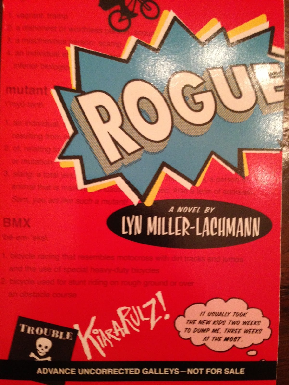
Rgz SALON member Lyn Miller-Lachmann has been the Editor-in-Chief of MultiCultural Review; the author of the award-winning multicultural bibliography Our Family, Our Friends, Our World; the editor of Once Upon a Cuento, a collection of short stories by Latino authors; and the author of Gringolandia, a young adult novel about a refugee family living with the aftermath of the Pinochet dictatorship in Chile. Her most recent novel, Rogue--has a very cool Cover Story, and she's here to share it:
"My YA novel, Gringolandia, had an unusual and powerful cover closely connected to the story, and I was heavily involved in the design process. A small press published the novel, and in general, small presses do give authors far greater input than large corporate publishers. Thus, when I signed the contract for Rogue, I knew I’d get a chance to see the cover beforehand but I’d have little or no role in the ultimate decision-making.
"That said, the result exceeded my wildest expectations. My wonderful editor, Nancy Paulsen at Penguin, commissioned Marikka Tamura, whose work has appeared in The New Yorker and other prestigious venues. We all agreed that the cover of Rogue needed a bicycle, because bicycles of all kinds play an important role in the story. Once we decided on the title of 'Rogue,' after the X-Men superhero with whom my main character, Kiara, is obsessed, we all knew the cover needed a comic-book superhero motif.
"When I first saw the cover design, the only thing that concerned me was the thought bubble that contained the novel’s first line: 'It usually took the new kids two weeks to dump me, three weeks at the most.' The reason is that when I was in school, I used to descend on the new kids, to make them my friends before the more popular kids stole them away. It never worked, and my own friendships never lasted more than a few weeks. So I was nervous about advertising unpopularity—Kiara’s and mine—on the cover.
"My editor did not agree with me. The one change that the publisher made from the galley to the finished copy was to change the thought bubble from pink to blue (see galley cover on the right). And here’s where we did have outside input—not mine, but my seventh grade student’s recommendation.
"When I told my seventh graders that my novel had been accepted, under the title KIARA RULES, and read them the first chapter, a student named Dan said, 'This is the kind of book I’d read, but not if it has a girl’s name in the title and pink on the cover.' So KIARA RULES became ROGUE, but the graffiti 'Kiara Rulz' on the cover recognizes the earlier title and Kiara’s generally fruitless efforts to be 'cool' and in control. And, of course, the pink thought bubble became a blue thought bubble. That was a good move because it turns out that boys do enjoy reading Rogue. It’s rare to have boys pick up a novel with a girl protagonist—The Hunger Games is a notable exception—so I’m thrilled that Rogue is in that company. At the same time, Kiara, like Katniss, doesn’t take on traditional gender roles, and every other character is a boy. Like many girls with Asperger’s syndrome, myself included, Kiara’s first real friends turn out to be boys rather than girls.
"The gender-neutral cover captures perfectly my main character, her tendency to get in trouble even though she wants to be good, her sense of being an outsider, and her superhero obsession as she struggles to find her own special power. It’s also an lively cover that hints at the outdoors setting and the action and suspense that should keep the pages turning."
Thanks, Lyn! I love the idea that seventh graders weighed in here and got a voice at the table! Can't wait to read it!
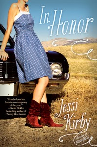
I had the chance to hang out with
Jessi Kirby in Houston last year, and I can confirm that she is fantastic and fun and smart and all the things she seems to be. Also, her book,
In Honor, contains a Tim Riggins type. SOLD. (Read a review from
A Book and a Latte.)
Here's Jessi to talk about the cover:
"My publisher asked for input before they got to work on the cover, and I said 'It’d be really great if you could somehow include the car, (which is a 67 Chevy Impala), and Honor in her dress and red cowboy boots.'
"When I saw the cover, I absolutely LOVED it. Truly, madly, deeply loved it. From the font, to the car, to the boots, it was EXACTLY what I was hoping for..."
But of course there were a couple of changes! Read Jessi's full story on
melissacwalker.com.
Jo Knowles is here to talk about her latest novel,
See You at Harry's. (Read a rave review on
Stacked, and note that it got a star from
Kirkus!)
"I think I imagined [the cover as] an image of the restaurant described in the book [as I was writing]. Or the family posing for their annual Christmas card. But… nothing really concrete. I was just hoping whatever it was, I would love it.
"My publisher didn't ask for input. But I gave a few suggestions when I was arguing to keep the title, which is another whole story.
"When I first saw the cover, I felt... Relief! I thought the image was perfect. I liked that the background was blue, not pink. I liked that it wasn’t an image of a sad or lonely girl. I loved that the empty dish had two spoons, not one. I felt that the image captured the mood of the book just right, without giving too much away..."
Read the rest of Jo's Cover Story, and see the cover that a big book chain didn't love, at
melissacwalker.com.
Susane was here last year to
talk about the original hardcover (pictured below) and now she's back to discuss the brand spanking new paperback version (left):
"Can I just say how much I adore the shiny new paperback cover of
So Much Closer?

"This is the first time one of my book covers changed from the hardcover to paperback edition. I loved that the photo shoot for the
So Much Closer hardcover was done on the High Line. The High Line is my favorite place here in New York. It plays a big role in the book and has a really unique energy. But my publisher received feedback that the original cover (right) was too street..."
Read the rest of
Susane's Cover Story at melissacwalker.com.
Jen Calonita shared a fun Cover Story here a while ago,
for Reality Chick, and she's back, yay! The first book in the
Belles series is, well,
Belles. Here's Jen to talk about the cover:
"Designer Tracy Shaw has worked on all my
Secrets of My Hollywood Life covers and did
Sleepaway Girls as well so to be honest, I wasn't really worried about the design--I knew she'd come up with something beautiful.
"The team is always nice enough to tell me what they're thinking, and I figure they know best so go with it! The only concern I had when they were doing this cover was who the cover model was going to be. I had hoped she'd resemble one of the two protagonists--Mira or Izzie. This cover definitely feels like Mira to me--a true Southern belle. There will be four books in the Belles series and each cover will feature a different girl from the series. Hopefully Izzie will get her turn at some point! The Winter White cover (Belles 2, out this October) features a girl who looks like Savannah, Mira's best friend (well, best friend when we start out in book one!).
"The girl on the cover is a real model! I know that because she actually friended me on Facebook and told me this was her first photo shoot..."
Read the rest of
Jen's Cover Story at melissacwalker.com.
The fantastic
Elizabeth Eulberg is here to share the story of her latest cover.
Take a Bow is told in four points of view (so hard!) and I've heard only raves about how awesome this book is (
MTV's Crush gave it a standing ovation). YES! Also, the cover is blindingly eye-catching, no? Here's Elizabeth:
"I usually don't start thinking about the cover until I'm almost done with the book. I didn't really have a clear idea of the cover until I had the title (the book was untitled for awhile). Then once we settled on Take a Bow as the title, I automatically envisioned a cover very similar to the final cover. It's really freaky how in sync the book designer (the fabulous Elizabeth Parisi), my editor (David Levithan), and I are. We've been on the same page for all of my books. Just the other day, I told David my thoughts on the cover for my next book and they were already mocking up covers with the exact same concept - scary! The only difference between my idea for
Take a Bow and Scholastic's was that I was picturing four people 'taking a bow' to reflect a key scene in the book, but I think the one person is more dramatic and personal.
"I really don't like having faces on covers of books, it's just a personal preference I've always had..."
Read the rest of
Elizabeth's Cover Story on melissacwalker.com.
And read about
her newly redesigned paperback cover here!
Congrats to Elizabeth on her new release,
Revenge of the Girl With the Great Personality! Read her
amazing twitter #GreatPersonality roundup.
Matthew Quick is here to talk about the cover of his latest (and incredibly great) novel:
"The idea I pitched for the cover of
Boy21 was a shot of Finley and Russ from the neck down. Finley would have been in his team uniform and holding a basketball. Russ would have been in his space costume and holding his makeshift astronaut helmet. I still think that would have been a good cover, but I have to admit that what the designer came up with was much much better. Maybe this is why I am a fiction writer and not a jacket designer!
"When I saw the design, I yelled, 'YES!' Alicia [his wife] came running into my office to see why I was yelling, looked at the image on my computer screen, and said, 'That's so much better than what you pitched them. That cover is amazing! Amazing!' It was a happy day.
"At one point they changed the photo of Russ, who is depicted on the cover. The photo they swapped in featured an older-looking teen who appeared harder and maybe even menacing. It didn't look like Russ at all. I immediately wrote an e-mail explaining why the original photo captured Russ perfectly. The teen on the cover now has an intensity--especially if you look into his eyes--but he also looks a little vulnerable and as if he would be a complex person. Russ is a very complex character, who is troubled, but is also wise and compassionate and intuitive. I believe there was a meeting regarding which photo to use and, happily, everyone at Little, Brown agreed..."
Read the rest of Matthew's Cover Story on
melissacwalker.com.
PS-Trailer!
Today, Shirley Marr is here to share her cover for
Preloved. It's such a sweet title, right? And the concepts are as emotional as the final cover. Here's Shirley:
"I'm a very visual and 'big picture' person, so with every new novel I start, after I come up with the storyline and title (which I make happen at the same time), I look around for an image which I think best sums up what I am trying to write.
Preloved is a vintage-flavoured romantic ghost story with themes of second chances and second hand things. I found a particular image with the theme, motifs (whimsical vintage bike!) and 'feel' I was going for.
"So yes, I make myself an 'unofficial' cover. I don't go as far as putting my own name on it, but the image itself is as influential to me as any notes and research I collect, I will often glance at it for inspiration.
"I didn't have any input into the covers that were created..."
Read the rest of Shirley's Cover Story at
melissacwalker.com.
Linda Joy Singleton has been here to share her
Cover Story for Dead Girl Walking, and she's back to talk about her latest novel,
Buried: A Goth Girl Mystery:
"For this cover, I actually thought they would show more of a Goth girl. I wanted something with a girl in dark flowy clothes, netting, piercings combined with a mysterious setting. "Flux usually asks me for suggestions and I did a search on Goth girls and sent some of my favorites in as examples. I wanted something beautiful, edgy and mysterious.
"When I first saw the cover, it was a surprise, not what I visualized but dramatic and mysterious...."
Read the rest of Linda Joy's Cover Story at
melissacwalker.com.
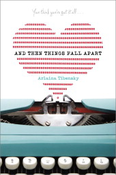
Arlaina Tibensky's debut novel sounds like something I need on top of my pile. ("Sylvia Plath and an old typewriter usher an angsty virgin through the worst summer of her freaking life.") Also, the cover spoke to me. So I spoke to Arlaina about it. Here she is: "I had this fantasy that the cover of
And Then Things Fall Apart was going to be a newer, updated version of a classic
The Bell Jar cover, like the one with the creepy letters and the rose, or the Victoria Lucas (Sylvia’s pen name) with the dark purple letters, or even the cool one with the spirals. Like one of those, but 'updated, for the youth of today!'
"I mentioned my 'Updated, for the youth of today!' idea to my editor… and we never spoke of it again.
"At first first first, I thought the cover was a little too cute. But too cute or not I fell in love, immediately, with the typewriter. The BLUE TYPEWRITER. And my huge ego loved that my name was right there in the middle. I was also happy there were no bodies on it, no anonymous 'teens' acting 'quirky' in stripped tights and pink hair..."
Read the rest of Arlaina's Cover Story on
melissacwalker.com.

The lovely
Laura Resau has a new book out! The Jade Notebook is the third in her beautiful series about Zeeta (read her
Cover Story for The Indigo Notebook).
Kirkus Reviews says, "In this third in a series of novels focusing on Zeeta and her wanderlust-stricken mother, readers are immersed in the details of a lovingly described coastal town in Mexico and an action-filled mystery surrounding the poaching of ancient sea turtles that make their home there... a graceful conclusion to Zeeta’s story."
Here's Laura to tell the tale of the cover:
"I'm happy and honored to be back on your blog, Melissa--I could spend all day reading these fascinating
cover stories!
"
The Jade Notebook is the third and final book in the travel-adventure-themed Notebooks series, each of which is set in a different country. The series went through a few different cover looks over the past few years. If you're curious, you can read the story behind the hardcover look of the first in the series,
The Indigo Notebook,
here. For that cover, my publisher, Delacorte, did a photo shoot of an open, vintage-style suitcase containing items that evoked each different setting..."
Read the rest of Laura's Cover Story on
melissacwalker.com.
Publisher's Weekly named
Jenny Hubbard's debut a
Flying Start last spring, and summarized the novel thusly:
"Set in the early 1980s,
Paper Covers Rock is structured as the journal of 16-year-old Alex No Middle Name Stromm, who is holding onto some secrets about the recent drowning death of one of his classmates."
The title and cover caught my attention, and here's Jenny to explain that gazing boy from
Paper Covers Rock:
"I didn’t envision a cover while I was writing, but after I found out it was going to be published, I envisioned a black-and-white photograph of three boys in silhouette on a rock, their backs to the viewer.
"All I said [to my publisher] was, 'Please don’t put a face on my narrator.'
"The cover that is currently on the book is not the first one that was designed for the book. The first one caused me to burst into tears--truly. It was entirely wrong, both in mood and character depiction. What the reader would have seen was a free-spirited, smiling, skater-dude boy in mid-jump over water..."
Read the rest of Jenny's Cover Story at
melissacwalker.com.
View Next 25 Posts


.jpg?picon=590)
 Diva Janet Lee Carey's new book, In the Time of Dragon Moon, has a tagline that is irresistible: Beware the dark moon time when love and murder intertwine. Hello! Sold. She's here to tell the tale of her latest cover (my favorite part is a the glorious sunspot at the top!):


