new posts in all blogs
Viewing: Blog Posts Tagged with: Portraits, Most Recent at Top [Help]
Results 26 - 50 of 295
How to use this Page
You are viewing the most recent posts tagged with the words: Portraits in the JacketFlap blog reader. What is a tag? Think of a tag as a keyword or category label. Tags can both help you find posts on JacketFlap.com as well as provide an easy way for you to "remember" and classify posts for later recall. Try adding a tag yourself by clicking "Add a tag" below a post's header. Scroll down through the list of Recent Posts in the left column and click on a post title that sounds interesting. You can view all posts from a specific blog by clicking the Blog name in the right column, or you can click a 'More Posts from this Blog' link in any individual post.
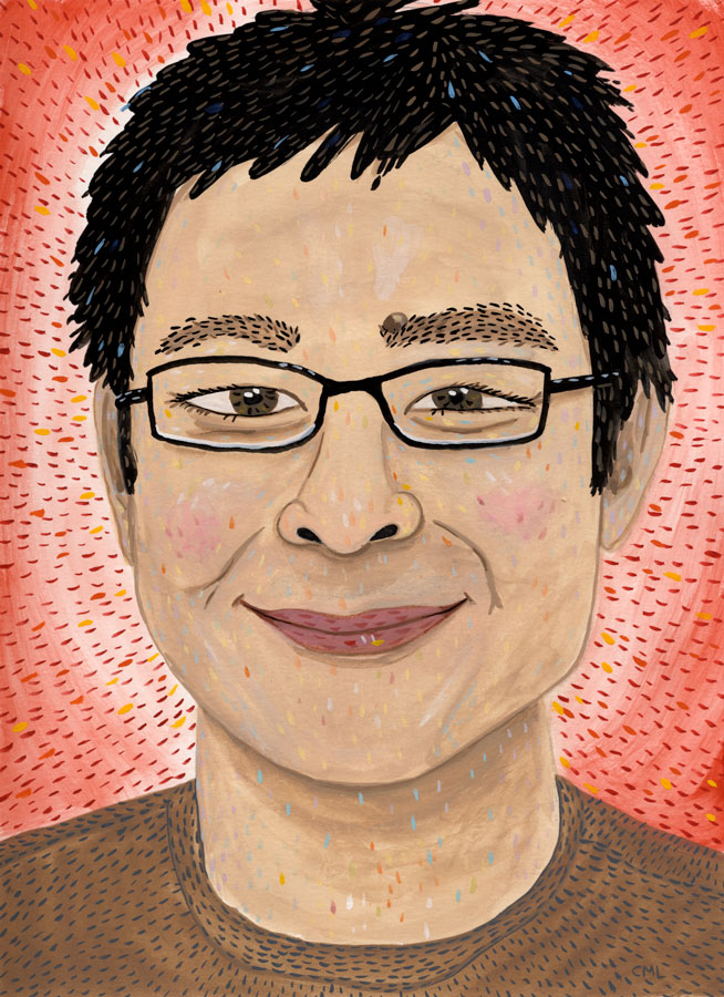
A portrait of Sonny Liew for The Seattle Review of Books.
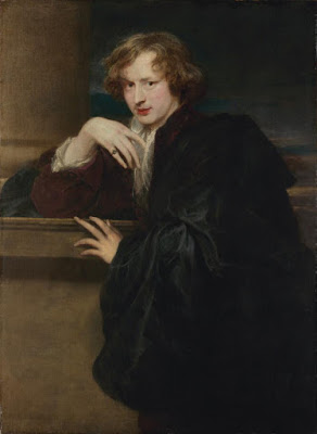 |
Anthony van Dyck (1599–1641)
Self-Portrait, ca. 1620–21
oil/canvas 47 1/8 × 34 5/8 in. (119.7 × 87.9 cm) |
The exhibition contains about 100 drawings and paintings, making it the largest US exhibition of his work in over 20 years.
The show includes many of his supremely elegant finished portraits from Italy, France, Flanders, and England. But it also delves into his sketches and drawings, with considerable scholarship devoted to his preparatory sketches and working methods.
 |
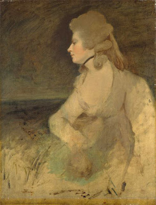
Anthony Van Dyck Portrait of a Woman, ca. 1640
29 7/8 × 23 1/4 in. (75.9 × 59.1 cm)
Speed Art Museum |
About the portrait above, for example, the curators note:
"The treatment of the face is highly finished and refined, but the woman’s bust and hand await finishing glazes, and there are extensive areas of unpainted canvas that suggest a shawl wrapped around her body. As with many other works from his London studio, Van Dyck must have painted his sitter’s face from life, resulting in a halo still visible around her head. A workshop assistant would probably have completed the painting of the background and draperies before Van Dyck applied a few final touches."
For larger and more complex group portraits, Van Dyck painted individual studies from life. This one was only rediscovered in 2000 during an
episode of Antiques Roadshow.
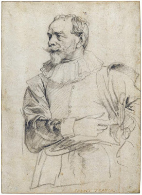 |
Van Dyck, drawing of Sebastiaan Vrancx, ca. 1628–31
7 x 10 inches, black chalk |
The show includes his informal sketches of fellow artists, which conveys the spirit of camaraderie that must have prevailed among working artists. Sebastiaan Vrancx was known for his landscapes and battle scenes, as well as being a poet, playwright, and book illustrator.
----
Catalogue:
Van Dyck: The Anatomy of Portraiture
Online:
Van Dyck: The Anatomy of Portraiture, March 2, 2016 to June 5, 2016
Survey the exhibition in expandable thumbnails at their
Visual indexVideo lecture by
Stijn Alsteens: "Drawing for Portraits"
 Today we'll continue Chapter 9: "Painting from the Life" from Harold Speed's 1924 art instruction book Oil Painting Techniques and Materials
 .
.
I'll present Speed's main points in boldface type either verbatim or paraphrased, followed by my comments. If you want to add a comment, please use the numbered points to refer to the relevant section of the chapter.
Today we'll cover pages 173-180 of the chapter on "Painting from the Life," where he talks about Sir Joshua Reynolds, Thomas Gainsborough, Frans Hals, and Rembrandt van Rijn.
 |
| Sir Joshua Reynolds unfinished portrait |
Reynolds
1. Reynolds executed his portraits in monochrome and then glazed the color over it.The unfinished portrait above shows how his portraits must have looked in progress.
2. Reynolds' business approach for portraitsHe'd charge half on commencement and the second half on satisfaction. But "he had a room full of rejected portraits in his house when he died." According to Speed, he produced 150 portraits per year.
3. "The smaller the source of light, the less half-tones you get."Sharp, small lights create a sharp division of light and shadow. Soft light, which comes from large light sources (large windows or exposure of sky) leads to a more gradual shift from light to shadow.
Speed argues that smaller sources are more flattering, but that's generally not the consensus among portrait painters and photographers. Photographers of women in particular routinely use softer or more diffused lights, that is lights that emanate from a larger area. This soft light downplays highlights and unwanted lines and texture in the halftones.
4. Simplifying the modeling will flatter a face, even without changing the features or proportions at all. Powdering has the same effect by reducing highlights."The artist is not obliged to catalogue all these details." He says that a "mean vision," (meaning one that focuses on small, trivial forms) misses out on the larger, nobler vision.
I think what Speed is recommending is using a relatively smaller source of light, but ignoring or downplaying the minor details of wrinkles and highlights.
 |
| Gainsborough The Painter's Daughters (with ghost cat) |
Gainsborough
5. Method: paint thinned with turps and linseed oil. Commenced by rubbing in with burnt umber cooled with terra vert (green).This produces cool half-tones, into which reds and yellows are added into the lights, followed by darker accents. Note the drawing with the brush on the toned canvas. Also note the ghost cat.
In ateliers, the coloring of the first painting is called "dead coloring," and it is brought to life with warm glazes later.
6. "Swift unity of impression is one of the secrets of the charm, a thing that must always be caught on the wing."Painting children is always improvisational, even in Gainsborough's day.
 |
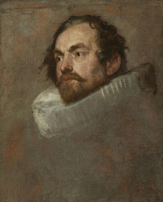
| Hals 30 Year Old Man with a Ruff, London |
Frans Hals
7. Spontaneous handling, painted with a simple palette. Painted with soft brushes, not hog hair (bristle). Speed speculates that a painting like the one above was accomplished in one sitting.
8. Blacks: thin painting over a warm ground.Note the brushwork in the ruff. Speed notes that it was painted with a gradated middle tone into which he has flicked lights and darks.
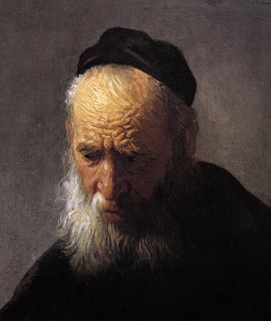 |
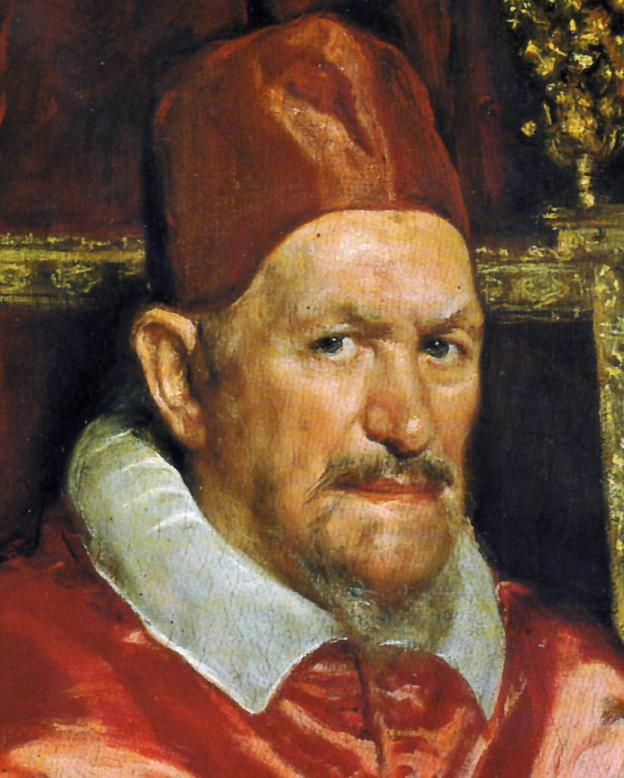
| Rembrandt Head of an Old Man |
Rembrandt
9. Analyzing R. is more difficult because of his variety of handling.Paint laid in with broken color and glazes, and sometimes with direct opaque handling. Generally Rembrandt reserves the thick paint for the lights, and keeps his darks smooth and transparent.
10. Color: "Rembrandt was a great master of getting the utmost variety out of a few earth colors."That was true of most of the old masters. Ultramarine blue, so common today because it has been chemically synthesized, was more expensive than gold, and was usually reserved for the cloak of the Virgin Mary.
Next week— Tone and Color Design
-----
----
GurneyJourney YouTube channel
My Public Facebook page
GurneyJourney on Pinterest
JamesGurney Art on Instagram
@GurneyJourney on Twitter
Today we'll continue Chapter 9: "Painting from the Life" from Harold Speed's 1924 art instruction book Oil Painting Techniques and Materials.
I'll present Speed's main points in boldface type either verbatim or paraphrased, followed by my comments. If you want to add a comment, please use the numbered points to refer to the relevant section of the chapter.
Today we'll cover pages 164-173 of the chapter on "Painting from the Life," where he talks about Velázquez.

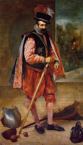
1. Velázquez Man with a Ruff
Notes of Speed's main points: Early Velázquez-- Simple handling of tuft of beard. A lot of searching and labor over the edges of the ruff.
V- "hasn't yet arrived at the largeness of perception." I think Speed means his tones are more choppy and modeled on a small scale rather then conceived as larger tonal unit.
2. Velázquez Portrait of young Philip IV
Speed's notes summarized: Head study. Added armor and costume later. Preoccupied with contours of tone masses, but larger effect accomplished. But still tight and "searched out."
3. Pope Innocent X
V. had been traveling in Italy studying painters there. Pope was a difficult subject; Italian painters hadn't succeeded. Painted a study first. Color richer than normal for V. Still interested in edges of tonal masses, but effect is subtler and richer and simpler. Preoccupation with overall visual impression. Very subtle touches to the corners of the eye. Many different brushes in evidence.
4. Court Buffoon (Don Juan de Austria)
Painted to please himself to experiment with new painting ideas. Simple modeling, but good knowledge of skull and structure. Keeps attention on all-embracing unity of impression. "Painted on the same scheme of working from carefully wrought middle tones up to the accents of the lights and the darks, which are the last touches put on."
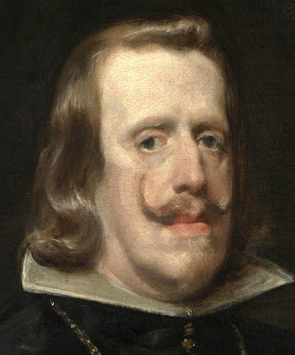 |
| Velázquez Philip IV of Spain (detail) |
5. Velázquez Philip IV of Spain
Speed calls this painting the "despair of painters." V had painted the king many times before. Knew his subject. Head well planted in collar. Lack of hard definition throughout. Vertical edge of hair at left and shadow line of eyelid on right echoes vertical structure.
Speed tries to analyze the method V. used: First sitting: rubbed in the head with simple colors, thin paint, and simple tones. Next sitting scumbled with bone brown. Scumbling all over.
6. Speed's allegation that the National Gallery overcleaned the painting.
Speed says that the conservators took away some key glazes and details, and shows comparative photos to demonstrate his charge.
JG again: Velázquez was the object of extreme interest among academic painters both in France and England at the time Speed wrote his book, and Velázquez was much admired when Sargent was studying with Carolus Duran. Much of the academic theory was based on his method. Check out the book The Art of Velázquez by R. A. Stevenson, also from the time of Speed's book. It's
available free online at Archive.org.
Next week— Reynolds and beyond.
-----
----
GurneyJourney YouTube channel
My Public Facebook page
GurneyJourney on Pinterest
JamesGurney Art on Instagram
@GurneyJourney on Twitter
Today we'll continue Chapter 9: "Painting from the Life" from Harold Speed's 1924 art instruction book Oil Painting Techniques and Materials.
I'll present Speed's main points in boldface type either verbatim or paraphrased, followed by comments of my own. If you want to add a comment, please use the numbered points to refer to the relevant section of the chapter.
Today we'll cover pages 144-157, "On Painting a Head."
1. "Before commencing, select the colors you will need and choose the fewest that will serve your purpose."This is good advice that will reduce confusion, eliminate habits of color mixing, and yield harmony in the final result.
2. Don't take the colors as they come from the tube; Mix your own colors.Also a good idea. You can create your gamut primaries, instead of using the colors as they happen to come from the tube. So here you're not mixing the particular notes of your scene, but rather you're mixing the
ingredients of your color scheme. Instead of using yellow ochre and cad yellow as separate palette colors you can mix the two, and then use that mixture as your gamut anchor. For example he recommends mixing Indian red and burnt sienna. This is what the manufacturers do, mixing pigments to get convenience colors.
3. "The paint as supplied in tubes is a little stiffer than is always comfortable to paint with, and it is as well to thin the white by mixing up some of your medium with it."I find the opposite is often a problem with modern paint. Paint often comes out of the tube too runny. In that case you can stiffen tube colors by first placing them on blotter paper (or other absorbent paper or cardboard) a few hours before you need to use them. As Speed suggests, it's good to have some "stiff white" about the consistency of butter always available on your palette for impasto-rich highlights.
4. Sequence: background, hair, forehead (middle tone), planes of lower face, eye socket, nose, highest light in forehead, etc.It might seem difficult to follow this procedure in the form of text, given that we're used to seeing videos that show the process much more clearly. But try to visualize it. This is close as we're going to get to a time machine back to the Royal Academy.
5. "In the case of a short portrait sitting...do not attempt any more complications in your tones. Keep them flat and simple at first."Put your work into refining the edges instead of refining the tones. I would say to think of the head as a roughly carved block at this stage, and rejoice that there aren't too many details to worry about.
6. "Always paint with the least amount of paint that will get the effect you want. Reserve thick paint for those occasions when you want to make a crisp touch quite separate from what it is painted into."For beginning painters there's a lot to think about when you mix a color: value, color temperature, hue, chroma, and now you've got to think about paint thickness, not to mention what brush to use, etc. As you read Speed talking about his thought process, note what considerations are foremost at each stage. Value judgments are most important at first, then edges become vitally important, then he's thinking about warm versus cool differences.
7. Carefully define the eye sockets before detailing the eye.Speed probably learned this method from watching Sargent, who was said to paint an eye in this way, like making a frying pan (eye socket) and dropping an eye into it (the egg). Later Speed says: "Remember the eye is a cavity, through which is pushed the globe of the eye, on which the eyelids are placed. The eyelids therefore partake of the spherical form, as do also the 'whites' of the eye."
8. "You should always talk to your sitters if you want to keep them alive."Many first hand sources attest to the fact that portrait painters of the past talked to their models while they painted them. This is one of the most important points that is generally missed by modern practitioners. It makes all the difference in the disposition of the face and the expression of the model. Sleepy, dull models yield sleepy, dull portraits. Talking models yield portraits that are alive. There's no getting around it. Here's a
previous blog post "Talking Models" on the topic and
another post "Speaking Likeness" on the same subject.
 |
| Detail of a portrait by Velazquez |
9. The under eyelid: "I know of no part of a head that so easily shows the hand of a master as the painting of the under eyelid."To find some examples of plane breakdowns as suggested in the detailed discussion on pages 153-155, such as the "three cherries" of the lips, etc. I recommend the anatomy books by Vanderpoel, Loomis, Peck, and others.
10. "Having laid in your work with the muted middle tones, you will be able to use much purer colour in the later stages, as they will be quieted by mixing with the middle tones already there."
11. "Finish is not necessarily the addition of details, but of refinements."Try to accomplish what Speed calls oneness of impression, and look for that quality in the great portraits of Sargent, Velazquez, and Rembrandt. Accents are last, and you can think of the whole head painting as a setup for those last highlights and accents.
Next week—we'll continue with the chapter with the section beginning on 157.
-----
----
GurneyJourney YouTube channel
My Public Facebook page
GurneyJourney on Pinterest
JamesGurney Art on Instagram
@GurneyJourney on Twitter
This week's portrait for the Seattle Review of Books is Judy Blume.
This week's portrait for the Seattle Review of Books is of Seattle icon Ivar Haglund.
It's a terrible habit, and I'm not proud of it. But sometimes while sketching at a restaurant I turn my friends into notorious outlaws.
"You made me look horrible," my perfectly nice-looking and generous pal said when he saw the sketch.
"But it's not you, it's a pirate relative of yours."
-----
Related posts:

.jpg?picon=1009)
By: James Gurney,
on 1/28/2016
Blog:
Gurney Journey
(
Login to Add to MyJacketFlap)
JacketFlap tags:
Portraits,
Add a tag
I often want to sketch a person at a meeting, a lecture, or a concert, but I'm sitting too far away to see their features clearly. Here's a quick tip if you ever find yourself in that situation.
These sketches are each just about an inch high. I was merely trying to capture: 1) The head shape, 2) The shape and color of the hair (if any), and 3) the placement of the features. The features are just dots and dashes.
Analyzing faces with this kind of shorthand is good practice for your more closely studied portraits. When you're sitting close enough to see the eyelashes, it's easy to overlook the big relationships. And it's the big simple relationships that are the key to likeness and character.
An inspiration for this kind of "dot-and-dash" thinking are the drawings of
Winsor McCay, a pen draughtsman who developed an idiom for capturing realistic figures during the early era of comic drawing before the standard cartooning conventions had been developed.
-----

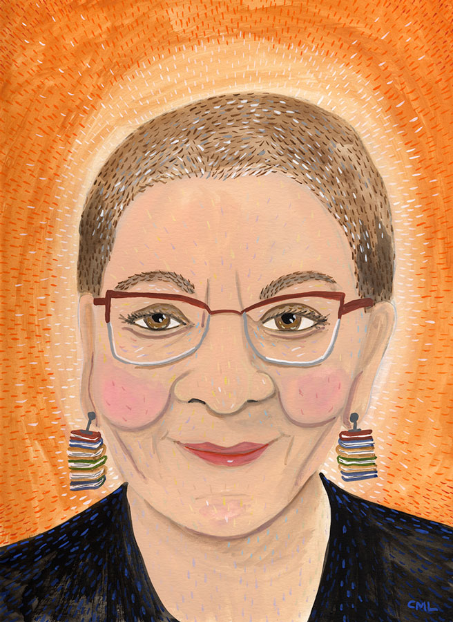
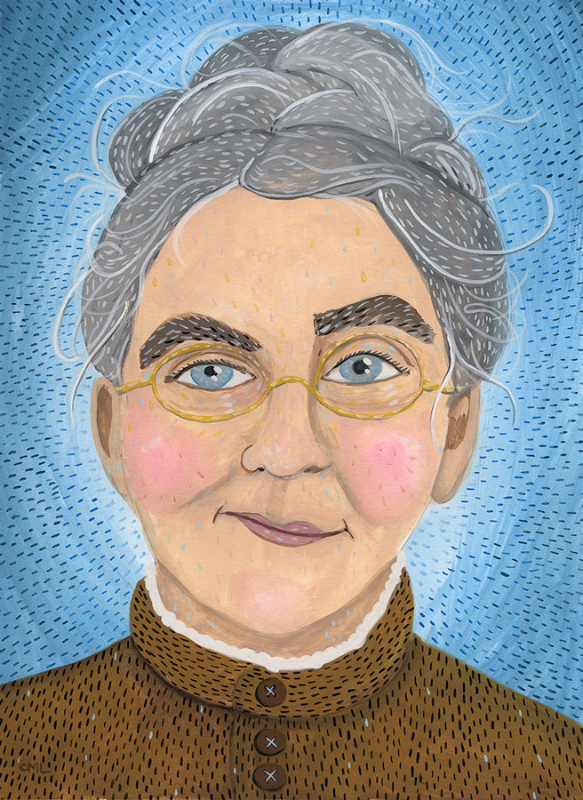
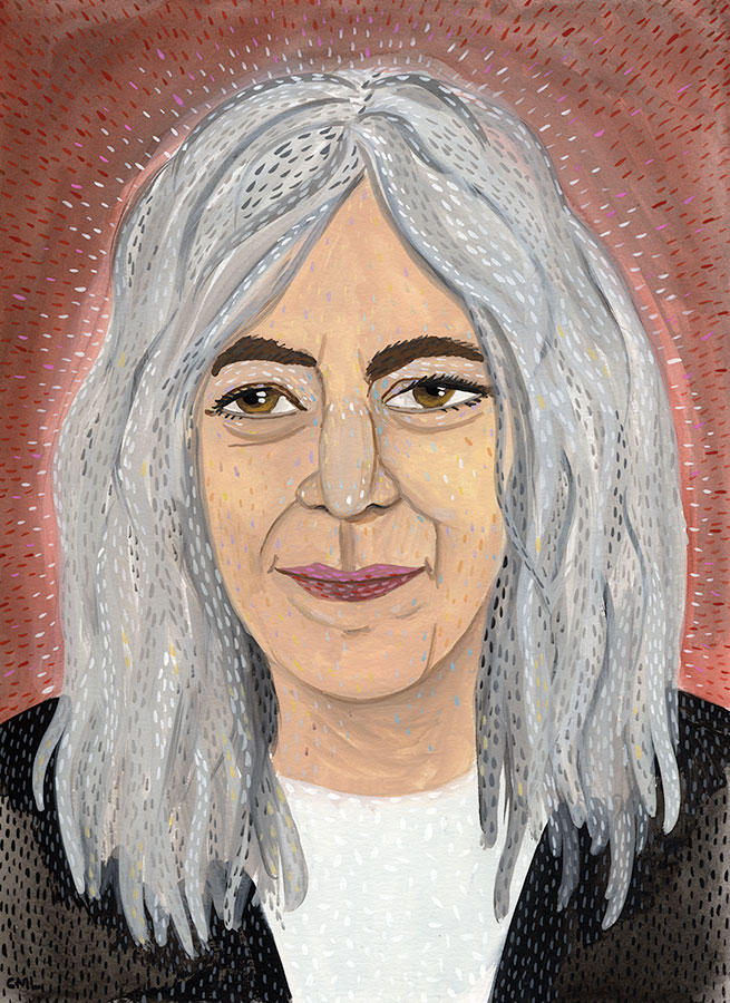
Each week I feature a different author portrait in this Seattle Review of Books column "Portrait Gallery."
By: James Gurney,
on 1/21/2016
Blog:
Gurney Journey
(
Login to Add to MyJacketFlap)
JacketFlap tags:
Portraits,
Add a tag
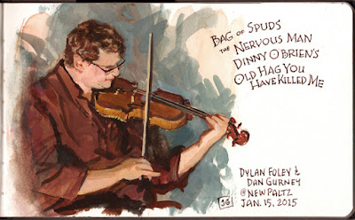 |
| Dylan Foley, gouache, 5x8 inches. |
I painted this gouache study at an Irish music concert last week. The subject is All-Ireland fiddling champ
Dylan Foley. Those are titles of tunes at the upper right.
The concert took place in a community center where it was totally cool to bring out the paints. The only problem was that there was very little light, so I was guessing on the colors.

Each week I feature a different author portrait in this Seattle Review of Books column "Portrait Gallery."
Big congrats to Frances Hardinge for last night winning this year's Costa Children's Book Award (and £5000, yay!) with her book The Lie Tree! I drew a little picture of her:

You can read more about the Costa Book Awards here. I loved Cuckoo Song, and The Lie Tree is already top of my reading stack!
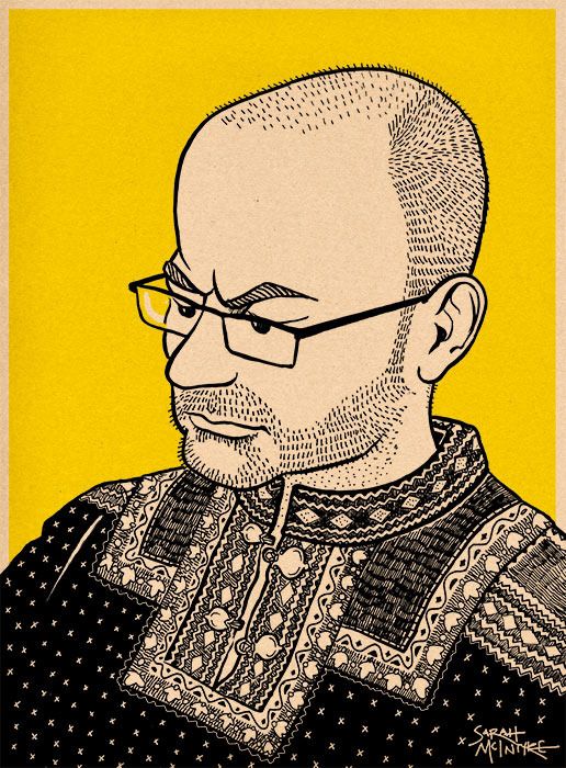
Here's a portrait I drew of Stuart in his Norwegian jumper. He's not grumpy, he's concentrating hard on his homework for Russian class. Also, he has grown a bit of a beard over the holidays.
Little portrait drawing, which looks a bit like Edith Sitwell and may or may not be based on certain jaunty photo of Philip Reeve, heh heh...


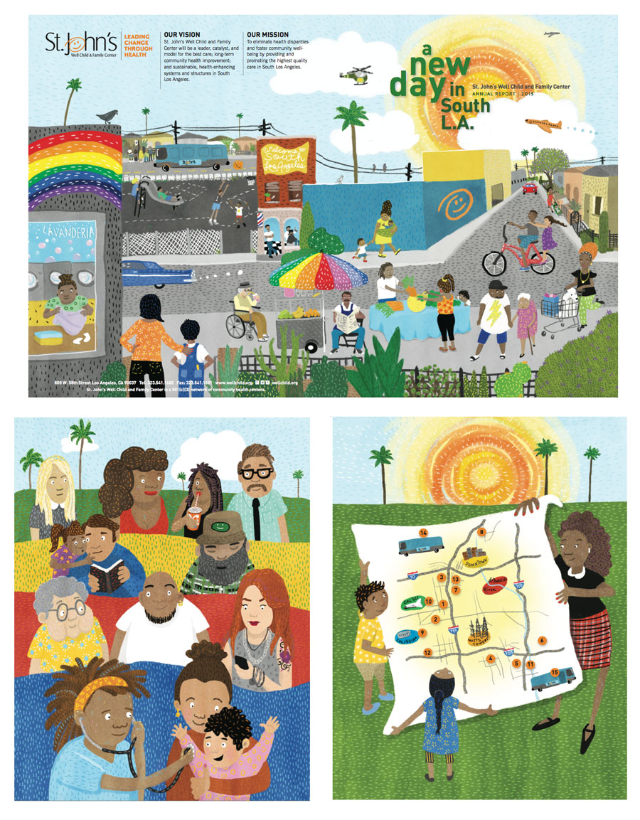
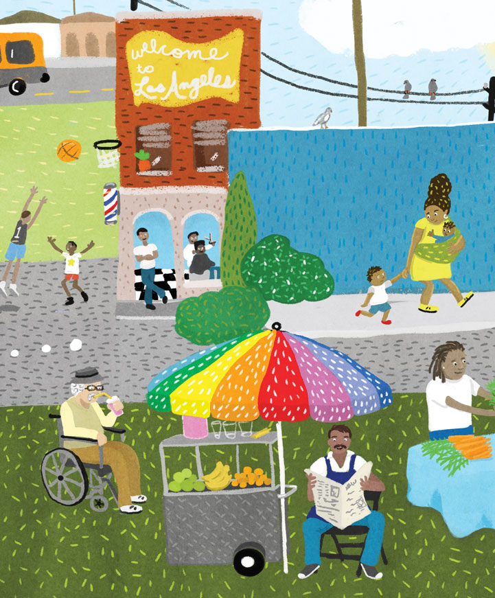
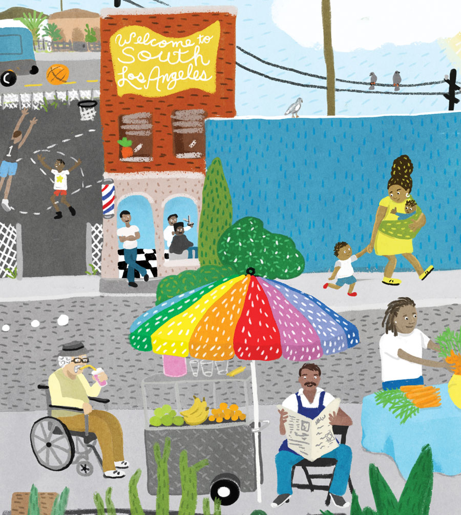
I was commissioned by AD Reyes Melendez to create illustrations for the St. John's Wellchild annual report. They wanted lively and colorful illustrations that reflected the spirit of their South Los Angeles neighborhood and clinic's clientele. The project included a wrapcover, a map, and a full page interior image.
The clinic provides medical, dental and behavioral health services with 13 health center sites (6 of them school based), and two mobile clinic units. Wellchild also has a Transgender Health Program, a program for unaccompanied minors who have fled to the US, and a program for Affordable House residents and the homeless-- programs that provide vital healthcare to these greatly under-served populations.
View the Annual Report
Learn more about St. John's Wellchild and Family Center
Each week I feature a different author portrait in this Seattle Review of Books column "Portrait Gallery."
I enjoy sketching people when they're talking and moving around. This is
Harmon Simmons (1931-2013), a tour guide at the
Vanderbilt Mansion in New York, back in 2001.
He described himself this way: "I'm Irish, Dutch, English, and Indian—Duke's mix. Open the can and I come out."
Doing a sketch of a highly animated person means choosing a characteristic expression and lock that expression in the short term memory as the person moves around.
----

Each week I feature a different author portrait in this Seattle Review of Books column "Portrait Gallery."
Each week I feature a different author portrait in this Seattle Review of Books column "Portrait Gallery."
View Next 25 Posts


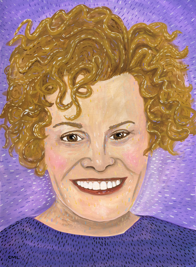
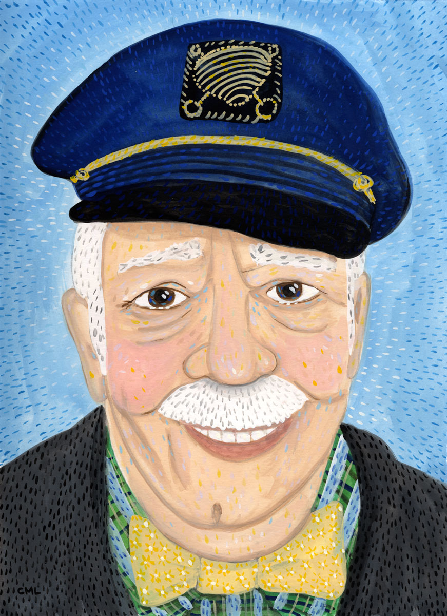
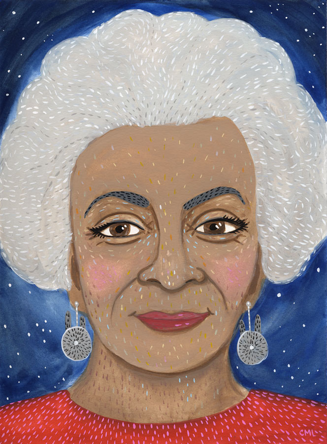
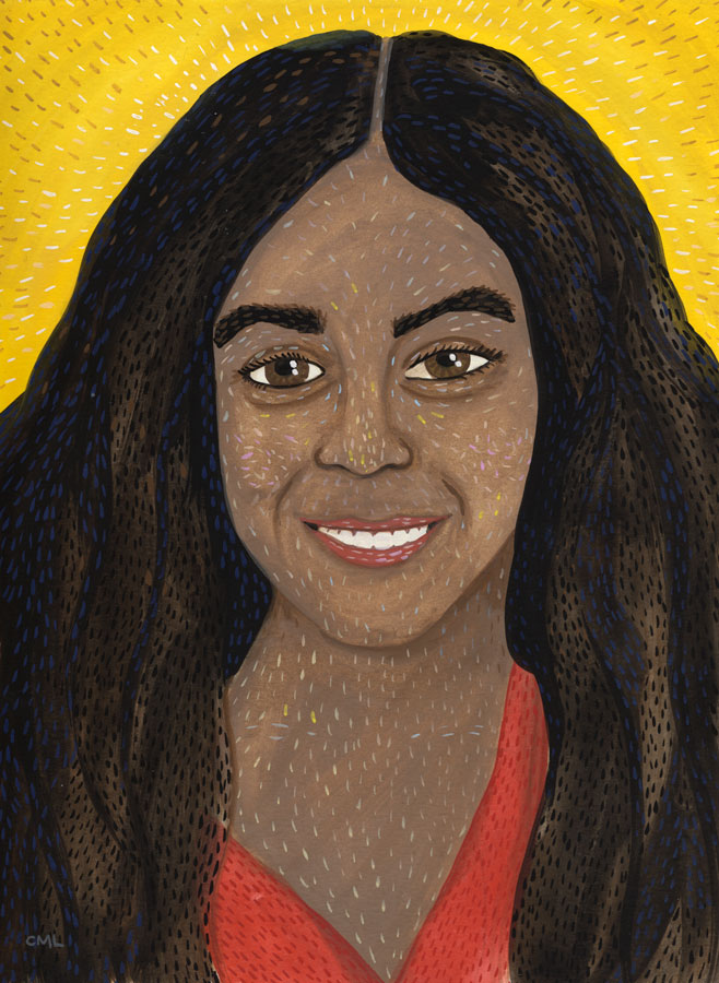
.jpeg?picon=2456) By: Christine Marie Larsen,
on 4/8/2016
By: Christine Marie Larsen,
on 4/8/2016
.jpg?picon=925) By: Sarah McIntyre,
on 4/7/2016
By: Sarah McIntyre,
on 4/7/2016


 Next week— Tone and Color Design