new posts in all blogs
Viewing Blog: Pixel Shavings, Most Recent at Top
Results 1 - 25 of 35
A group of children's illustrator/authors blogging together to create a GLOG!
Statistics for Pixel Shavings
Number of Readers that added this blog to their MyJacketFlap:
 RUSS COX - As 2013 comes to a close, now is a good time to look back and be thankful for what happened during the year.
• I am excited to be agented by Sadler-Cavarette Children’s Literary • Major Manners Nite Nite Soldier, which I illustrated, won several awards including the Benjamin Franklin Award• Freddy The Frogcaster, another book I did the illustrations for and written by Janice Dean, reached the top 25 in books sales on Amazon
• I just signed up for two more Freddy books
• Whatever Says Mark, a book I did with Capstone, was released
• I am illustrating a Christmas book written by Lynn Plourde that will be released in 2014
• In September I was selected to be a presenter for the NESCBWI’s spring 2014 conference
• My Mother Goose piece will be on permanent display at Boston Children’s Hospital
The biggest highlights of the year were more on a personal level. Our lovely daughter married her best friend and soul mate, Andrew Aho, in May. Lynn and I are so thrilled to have Andrew as a son-in-law. We look forward to see where the winds of life will take them.
DEBBIE OHI - I have much to be grateful for in 2013.
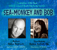
On the kidlit front, I did the illustrations for NAKED!, a new picture book written by Michael Ian Black, coming out from Simon & Schuster Books For Young Readers in May 2014. I was able to announce three new book contracts with Simon & Schuster: I'll be (1) illustrating SEA-MONKEY AND BOB by Aaron Reynolds, (2) writing and illustrating TWO more picture books.
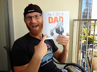 Had lots of fun at the SCBWI annual conferences. One of my highlights of the Summer conference: hanging out and chatting with Fred Koehler, plus getting a chance to see his HOW TO CHEER UP DAD f&gs (book comes out in March 2014).
And speaking of Pixel Shavings creativity, I so enjoyed Hazel's illustrations in ONE WORD PEARL this year! See Hazel's interview on Inkygirl about her process.
The more good things that happen, the more grateful I am for those who have encouraged me in the past. Like my Pixel Shavings friends. :-)Photo credit for Debbie-SCBWI-Montreal-UrveTamberg.jpg - Urve Tamberg.
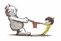
FRED KOEHLER - Greetings from Fred in the land of Fixin' To Publish a Book. Woot woot!My very first title, HOW TO CHEER UP DAD, debuts in March with editor Kate Harrison and Art Director Lily Malcom at Dial Books for Young Readers. I've been super-stoked to go through the publishing experience. You can check it out on Amazon here or buy it from your local bookseller in March 2014. Betsy Bird at the School Library Journal Blog got an early sneak peek at HOW TO CHEER UP DAD and had nice things to say about it. Oh yeah, and here's the final cover:
 I've gotten so many incredibly kind emails and questions about the process that I've put together a couple of pieces of general advice to share. The SCBWI published my success story, which I've posted to my blog at freddiek.com. I also posted an article for aspiring authors called You Wrote A Book. Yay! Now What? This piece is more for beginners just to help wrap their brains around the publishing process.So what else is new? I'm writing and drawing almost every day. I'm kind of stuck on monsters right now, and I wanted to share this concept illustration for a new book idea I'm working on. I know I've got a lot to learn, but that's what makes being an artist so doggone exciting. I keep making new friends and am so thankful to have a chance to be successful in this incredible industry. Cheers.
SHERALYN BARNES - Happy Thanksgiving!
It's been a year of lovely things to be thankful for... I spent a large part of the year working on a children’s book about our great national parks for the Sequoia Natural History Association. What a treat it was to take myself on a tour of the parks in my imagination. As a young adult, I worked in Yellowstone National Park for three summers and two winters, so it was an inspiring project for me. I’m happy that my artwork will help inspire kids to go out and experience our national treasures. The book will be released in March through Sequoia Natural History Association and the National Park outlets.
I had the pleasure of doing a couple more projects with Reading A to Z this year. “Silly Sarah”, which came out last year, had me drawing a lot of fun farm animals. This year, my imagination got to go to Africa with a retelling of a Nigerian folk tale “Why the Bat Flies Only at Night”. Currently I’m working on a project for 2014 that takes me on a Costa Rican rain forest adventure with a sloth. Just my speed! I love sloths!  The learning game flashcards that I designed for Gryphon Design Collective called “What We Wear” came out this year. I had fun drawing all kinds of fun animals for this project. It was a challenging project in that it highlighted clothes within a beach/sand/surf motif. Truly a challenge! (Pat on back)
This year also marks the year that I begin working with the (most excellent) agent, JoAnne Schuna. I am honored to be represented by such a wonderful person. www.schunagroup.com.

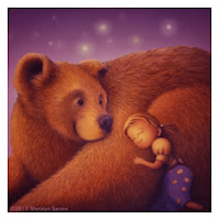 In May, I made a pilgrimage back to my home state of Indiana to attend the Wild, Wild, Midwest SCBWI Conference. What a great conference! Presenters included the great Peter Brown and the amazing Laurent Linn (art director for Simon and Schuster). I was very honored to be the first runner up in the juried art show with my Girl and Bear illustrations. It was a true milestone for me. It was four years ago this November that I was living in Louisville, KY and attended an SCBWI conference in Indianapolis where Laurent Linn was presenting. His amazing enthusiasm and stellar presentations reawakened my desire to pursue children’s illustration and led me to attend more national conferences. So it was even more of an honor that he was one of the judges for this art show. My heart seriously glowed realizing how far I’ve come, thanks to so many people who have inspired me along the way. The inspiration continues.
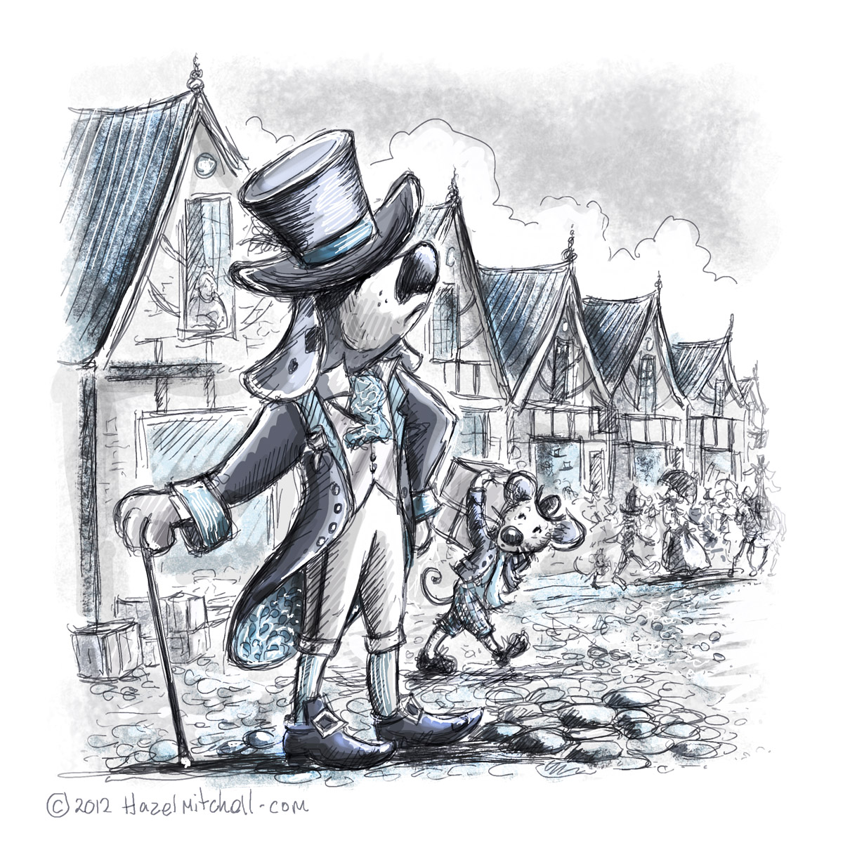
HAZEL MITCHELL - this year has flown by and I'm thankful for the opportunities that have come my way.
This year has been a busy one for books ... in Spring '1,2,3 by the Sea' from Kane Miller (by Dianne Moritz), in Fall 'One Word Pearl' from Charlesbridge (by Nicole Groeneweg) and 'Double Crossed at Cactus Flats' from Magic Wagon by Rich Wallace. Right now I'm working on a folktale for Charlesbridge called 'Imani's Moon' publication Fall 2014 (by JaNay Brown Wood). In between I've completed educational and independent projects. Whew! I am thankful for a sit down!
It's been a really great year for travel and for visiting with friends back in Europe and in the USA, and with so many great colleagues too! I was lucky enough to attend Bologna Children's Book Fair this year for the first time and to speak at conferences as far away as Paris and as near home as Massachusetts. I've visited book stores, spoken at schools and attended book festivals. I am thankful for the lovely people who have hosted and interviewed me on their blogs, and supported me in my career. And for all those people who have written to me on social media and through snail mail.
When you're in the midst of a lot of work and travel, with the highs also come the lows. Then it's helpful to reflect on what's been and what's to come. To think about what's important, and what's not. So I'm taking a little moment to look back and recall what I have to be truly thankful for this year ... friends - creativity - opportunity - my animals - the chance to continue story telling into 2014 and hopefully to find that I can finally add 'author' to my resume.
Oh also, thanks to my hubby for all his support!
Here's to you and to yours and THANK YOU for stopping by Pixel Shavings and catching up with our news.
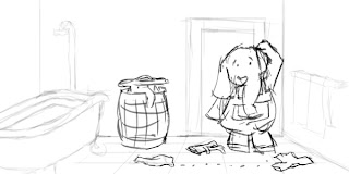
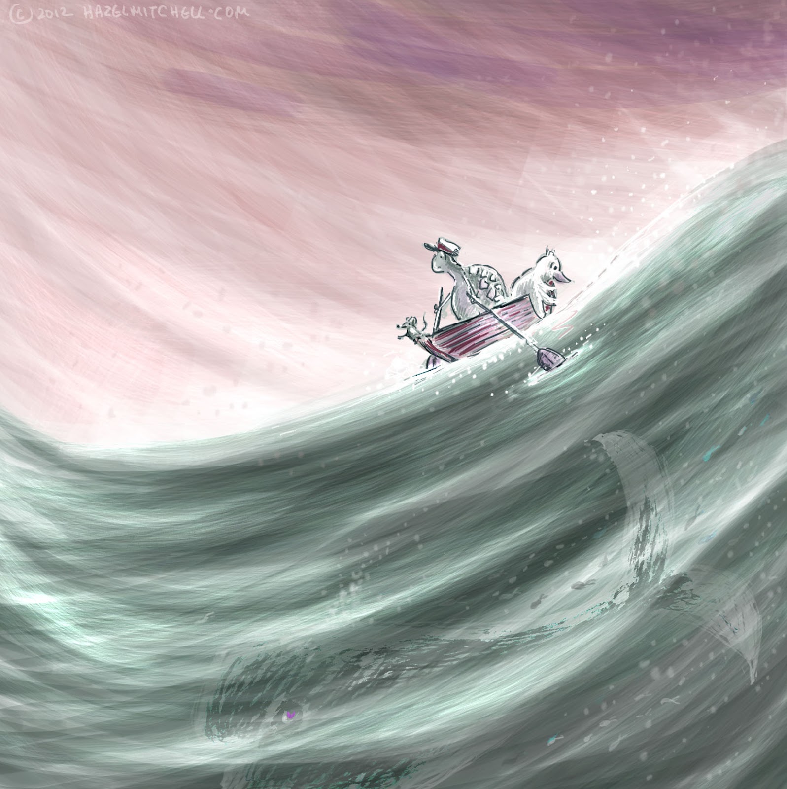
This whole weekend I was supposed to be writing, but all I could bring myself to do was draw. Oh well. Wherever the muses descend, right? I had a pirate story that needed some characters, and apparently I was hungry, so I drew this:
Unfortunately, it just didn’t work for the story, which was frustrating because I liked the characters. I ended up with my concept sketch looking something like this:
It didn't work at all the way I had hoped, and I’m thinking this is the point where most people give up. Or start from scratch. I saw it as a fun opportunity to stretch myself as an illustrator and see how I could take the intentions behind the illustration and make it work for the story. I redrew select parts of the characters, and ended up with these three sets of characters, and the last one worked perfectly for my story! (Yay!)
In case you haven't heard, I'm going to be illustrating another Michael Ian Black story:
NAKED! Yes, the exclamation mark is part of the title. :-) The news was first
announced on Entertainment Weekly site last week. I'm excited to be working with Justin Chanda (editor/publisher) and Laurent Linn (art director) at Simon & Schuster again.
Anyway, I'm a few weeks into the process and working hard on the first round of sketches so we have something to discuss at my Simon & Schuster meeting at the end of the month.
I learned a lot during the I'm Bored process, and am using some of the techniques that worked well for me before. As I finish a version of a drawing or sketch, for example, I use painter's tape to hang it from my office ceiling:
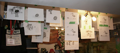 |
| Photo of my office ceiling last year during I'm Bored |
I do this for two reasons:
1. I like being able to see all the drawings I've done so far for a particular project, mainly so I can check for consistency but also for overall narrative flow (more on this later in the post).
2. Because it gives me a sense of accomplishment: the ceiling starts out bare, and then gradually fills up, which is satisfying to watch. Later on, I start replacing the rougher sketches with more polished versions. Tall people have to duck when walking through my office during this time.
One of the things I love about Michael Ian Black's stories is that they leave a lot of room for the illustrator. This is even more true for NAKED! Michael told me he did this for me on purpose. I love that: knowing the author trusts me enough with his story.
Above: my ceiling right now as I work on sketches for NAKED! Sorry for having to censor out part of the image -- some of my sketches were showing through the paper.
What I'm finding different about the process this time:
I do more staring at the sketches I'm taping up on the wall than actually drawing. Reason: I'm spending a LOT of time thinking about the overall narrative flow. Not just what's happening in the text, but also what's being shown in the illustrations, and how that can enhance the overall story.
There's an ebb and flow, I'm discovering, with the narrative in the illustrations sometimes diverging (but still enhancing the story) from the text but then drifting back, merging and then away again.
Hm, I'm not explaining this very well again, am I? I'll have to give it another go at some point in the future. In any case, I'm having even more fun working on NAKED! than I did on I'M BORED.
My advice for aspiring illustrators:
Before you plunge into sketches for your story, or someone else's text, think hard about the overall story. When you do start sketches, take regular time during the process to sit back and look over what you've done so far. Instead of just examining each image on its own, make sure you scan them in sequence to check for a smooth narrative flow. Then compare to the narrative flow of the text, and how you could adjust your images to improve how both work together.
I'm finding it an immensely satisfying process. I'm meeting with Justin and Laurent in a couple of weeks; we made a great collab team during
I'm Bored, and I'm so looking forward to getting their creative input.
But now it's time to take my own advice and get back to work. I'm looking forward to seeing fellow Pixel Shavings member
Fred Koehler at the SCBWI Winter Conference!
- Debbie
---------
Debbie Ridpath Ohi's illustrations appear in I'M BORED, a picture book by Michael Ian Black (Simon & Schuster Books For Young Readers) that was chosen by The New York Times for its list Notable Children's Books Of 2012. Writer's Digest recently chose Debbie's blog Inkygirl.com as one of the Best 101 Websites For Writers. Twitter: @inkyelbows.
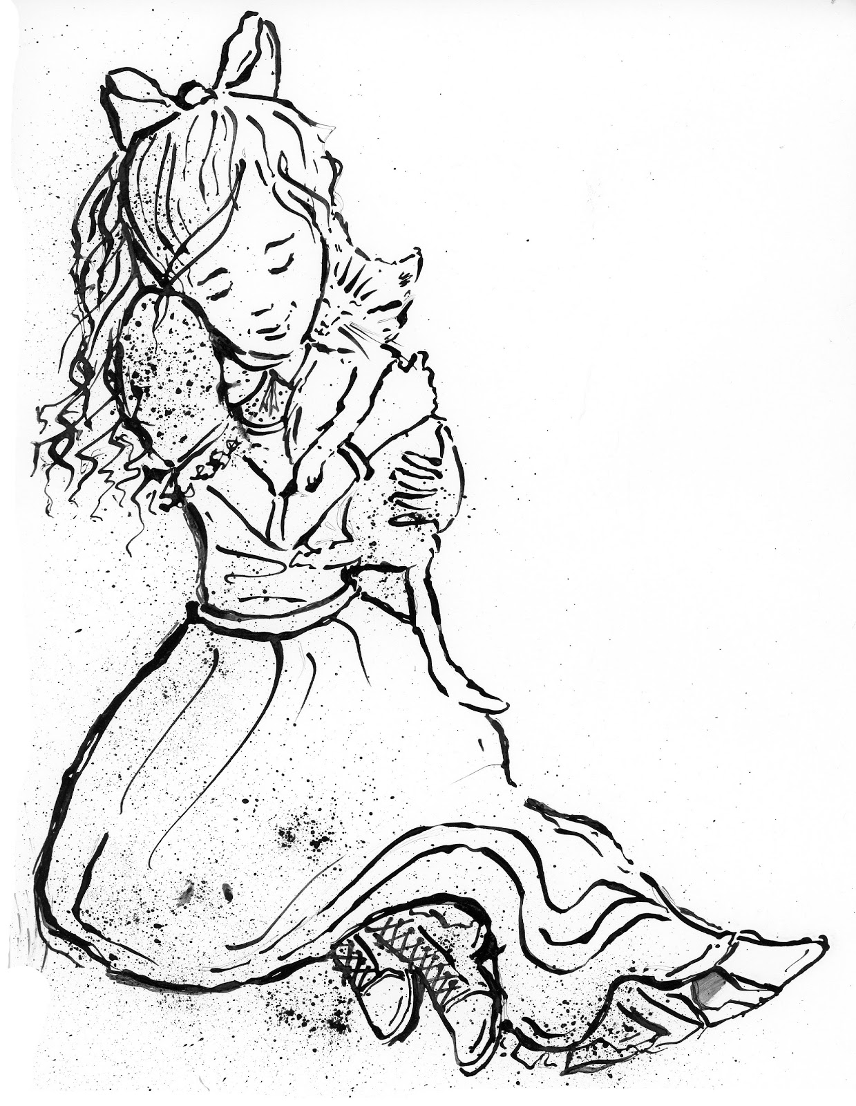
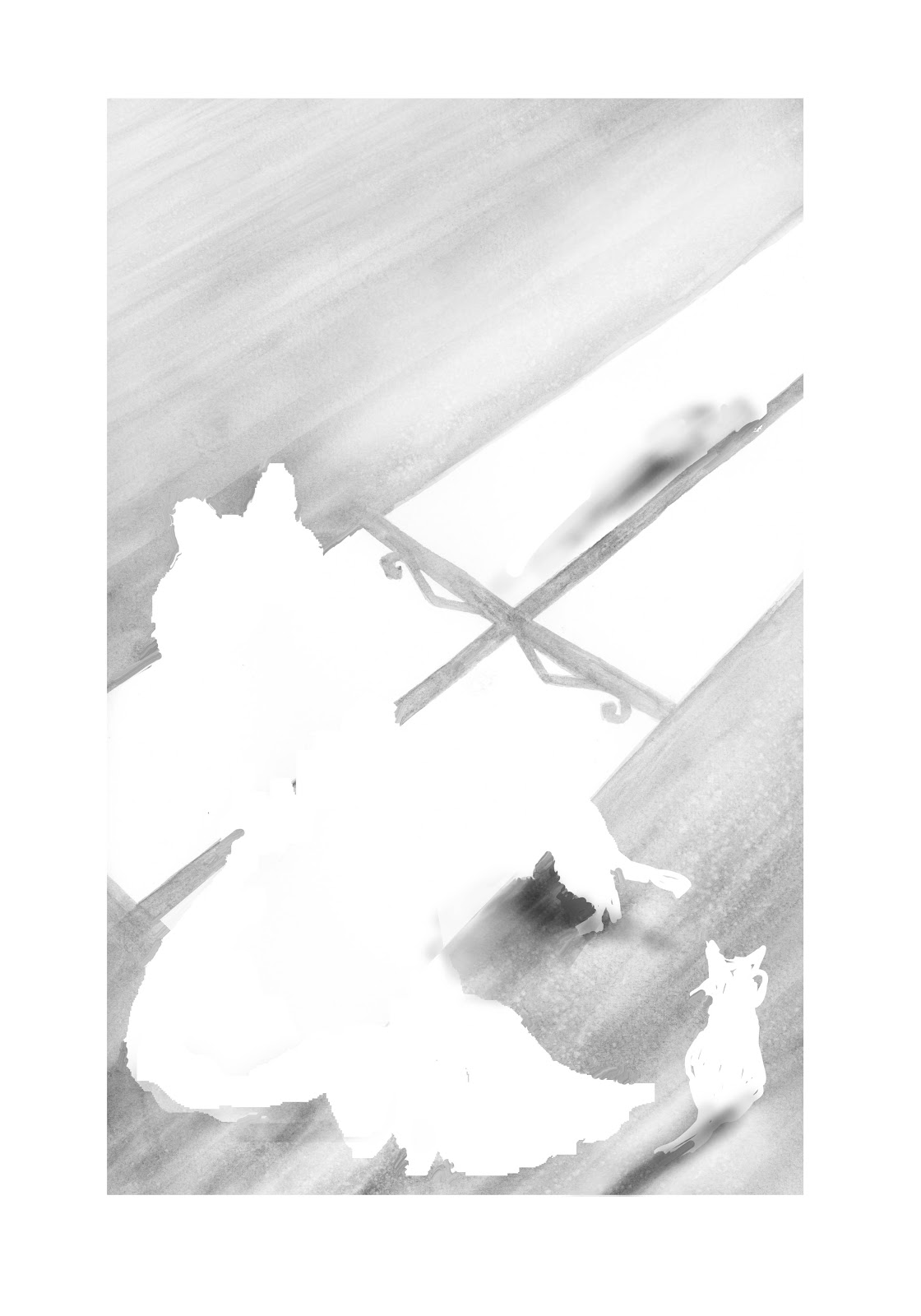
I'm sharing the thought and physical process of an illustration I recently created for the Tomie de Paolo SCBWI award 2012.
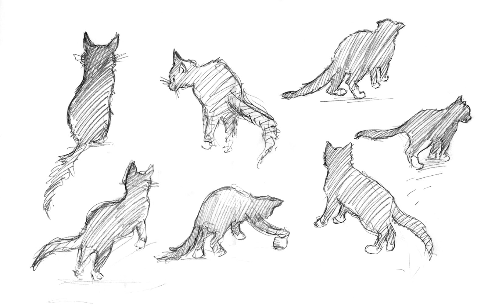
This year Tomie gave us three books from which to chose a passage to illustrate in black and white. Tom Sawyer, Little Women or The Yearling. I chose 'Little Women'. I have fond memories of reading it as a child. Beth and her kittens always touched me, maybe because I am crazy about animals and found solace in them always.
So that's where I started ... I found my favorite passage in the book and began to sketch ...
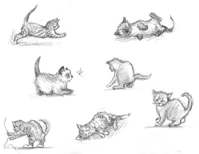
Here are my thumbnails. Immediately I knew I wanted Beth to be in the lower left with a slightly above few point and the kittens around her. I wanted to show the love she had for them and how that reflected her kind and loving nature. So, THEN I sketched lots of kittens ...
And more kittens ... (this was fun! I like drawing cats).
Thanks to a friend's cat (Smittens) for modelling).
I did a 'frame' drawing of Beth, curled up.
And then I did a more detailed sketch of Beth and the mother cat.
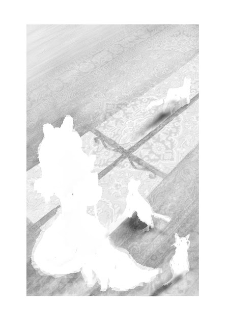
I wanted the drawing to show the sadness and foreshadowing of Beth's death. But somehow have that as a beautiful thing. What to do? I decided to work with imagery that suggested a light shining into the room ... Beth's room ... but not a fierce light, rather the light streaming through a sunny window.
Here's a montage in Photoshop, using the initial sketch and some of the kittens from the thumbnails. I liked the idea of the cats rhythm, and the shadows and their curiosity. What do they see in the light? Maybe they are a metaphor for Beth leaving us? It all seemed a bit stark though and I wanted to give the picture some cosiness, given that the descriptive passage by Louisa M. Alcott is so evocative.
I also wanted to use digital layering techniques in photoshop. I had been working digitally for ever, but I wanted to incorporate more of my painting skills and utilize the versatility of bringing a finished illustration together digitally.
I had just returned from a week of working by hand on a Highlight's Illustration workshop and being mentored by Eric Rohmann. I realised I missed the fluidity and happy accidents of working with paint and ink. How could I combine them with years of working digitally?
I had also just read 'A Monster comes to Call' illustrated by Jim Kay .. and was blown away by his powerful images!
Now I had my idea on paper, I wanted to try some different techniques and see what happened ...
Straight graphite outline.
Brush pen outline. (note the floating hand ... I forgot to ink it when I was working on the lightbox!)
The outline I went with finally ... dipping ink pen and spatter technique.
I did the same for the kittens.
And here's how I created the layers and put them together.
First I painted a base for the floor shadows, all the painting was in ultramarine, then I turned to grayscale in photoshop. I used salt for texture.
I painted the values for Beth and the kittens also in watercolour.
In photoshop I white blocked out the area of Beth and the kittens. Also, to give the whole thing that cosy feel, I scanned a photo of a rug and changed the perspective and value of it to give that homey feel. I made everything point towards the light.
Then I added in the grayscale values as a new layer.
Finally I dropped in the outline layer and added some shadows. I decided not to go with the very dark shadows of the original digital sketch, they seemed too dramatic.
Below you can read the passage from the book I illustrated. I could have gone the literal route and made this a very cluttered and overworked illustration (my worst fault). But I decided at the start I wanted it to be about emotion and not the things around her. They are all there .. but out of the image.
Was I pleased with the end result? Somewhat. I love dipping ink pen and I enjoyed getting more texture and a painterly feel into the drawing. I was not content in the end with the girl's position, and I think there are issues with the skirt. If I was doing it again I would have set up a model to get the folds of the skirt right and more natural. When I look at the first pencil sketch I did of Beth at the beginning, somehow I feel I lost the immediacy and the pure love in her face. Perhaps there is more unconsciousness in a pencil sketch
and those first moments of communication from brain to hand to paper.
I do feel the beauty of Beth here, and that's what I wanted.
I hope you enjoyed seeing the evolution of this piece!
Toodles
Hazel
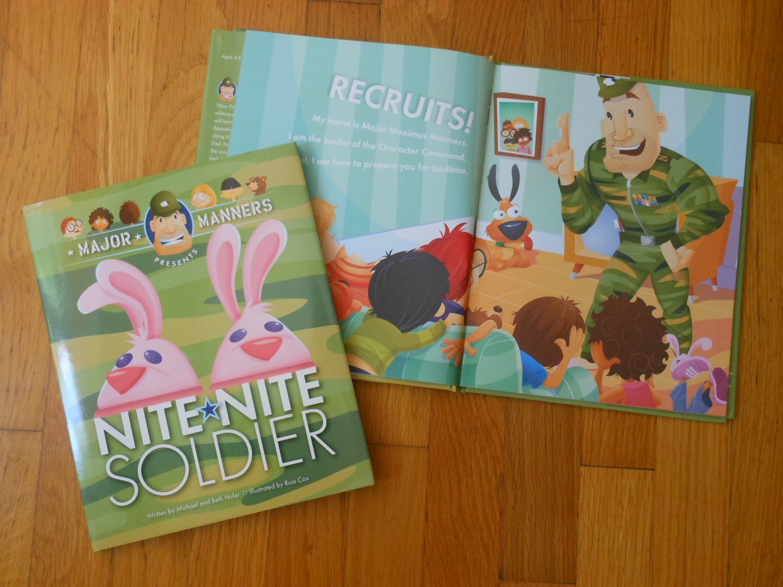
As some of you already know, our own
Russ Cox illustrated the recently published
Major Manners Presents: NITE NITE SOLDER, written by Michael and Beth Hofer and published by Outhouse Ink Publishing.
Russ's bright, fun illustrations really make this entertaining how-to story a great bedtime reading choice. It also comes with a CD with narration (fun military-style with a kid chorus) from Major Manners. I can SO see children and parents having fun with this just before going to bed.
One of my favorite lines: "Wiggle, jiggle, jump, and dry those toes..." (like many of the other lines in NITE NITE SOLDIER, it's just so fun to say out loud).
I've hung out with Russ at SCBWI events; he's knowledgeable, supportive of other children's book writer/illustrators and one of the nicest guys you could hope to meet. Plus he plays banjo!
Where to find Russ online:
Smiling Otis Studio -
Blog -
Facebook -
Twitter -
Google+ -
FlickrRuss kindly agreed to answer a few questions for the Pixel Shavings blog:
How did you become illustrator of NITE NITE SOLDIER?The publisher,
Outhouse Ink Publishing, found me through an online portfolio site and contacted me. I sent them some newer pieces and decided to use me. They are a great group to work with on the book.
What was the illustration process like?
The illustration process began with reviewing the manuscript with the publisher. We chatted about ideas for the pages but they pretty much left it in my hands.
What tools/materials did you use?
Everything was sketched out using traditional pencil and paper. The final art was created with Adobe Illustrator but I still used the scans as a template and built everything in layers.
Did you chat on the phone, online or in person?We chatted on the phone once or twice but mostly through email.
After initial contact, what happened next?
I did character studies of the Major character (every pun intended).
Once they selected a character, I did various facial expression to make sure he would be able to show different emotions.
I did a storyboard with basic elements in places to get or thoughts onto paper. Plus, it allowed us to check for flow, movement, and to make sure each page was interesting but lead to a page turn.
How many times did you revise the character sketches and storyboard before they were approved?
There were no changes to the character, which a rarity. I guess since I did several different head studies to find a direction, it saved some time in the long run. I did some quick basic storyboards to show them my thoughts which they tweaked and sent me their notes. From there, I did tight drawings for final approval. I think there were only a few minor changes.
After approval of the storyboard, I then worked up tight sketches which we sent to the designer to make sure the type would work with the layouts.
From there, I did the final art in Adobe Illustrator since they liked that look from my samples. There were a few slight adjustments but everything was worked out ahead of time.
How long did the entire process take?
From the initial contact to delivery of the final art, we spent around 6 months working on the illustrations. As you know, that is still not a lot of time for a book to be illustrated.
In retrospect, was there anything that surprised you about the process?
There were no real surprises with this book. I am working on a book with a different publisher and the approval process is taking longer than I expected. With the larger houses, I think this is the norm since the artwork has to go through several approval processes.
If you could go back in time and give your younger illustrator self some advice, what would it be?Good question. I would have told myself to read more in my younger days. Especially more of the classics instead of so many comic books. Even though comics really helped me with composition and storytelling.
I think reading helps expand your inner vision and creative process, You, the reader, are painting the imagery in your head. I told my students to read any and everything. It will fill that inner illustrator morgue that they may withdraw from.
What do you mean by "inner illustrator morgue"?
An "illustrators's morgue" is a file that we use to keep things that are inspirational, reference (hands, feet, facial expressions, etc.), color schemes, compositions we like, and other things that we might fin useful down the road.
Having an "inner illustration morgue" means keeping images in your head that are created from stories, articles, and conversations. A line from a poem can conjure up a beautiful image that you may want to use elements from in a future pieces.
Sometimes sketching or writing things in a journal and sketchbook is very helpful to remember those moments.
Would you like to share anything about your current/upcoming projects?
Sure, I am working on a new book for the same publisher. It is a different story but is very amusing. I also have a second book from a different publisher that is in the beginning stages.
These projects sound exciting! Do you have any release dates for either of your new books?They are very exciting! I hope they are stepping stones for working with larger publishers but I am really enjoying working with everyone in the smaller houses. As far as I know, they are hoping to get the books out my early summer of next year so my deadlines are very tight.
Plus I am trying to get my own story into the hands of a publisher or agent. I need to find some time to spend with my banjo. Oh, and my wife!
During this craziness, I am also working on a board game for
Gamewright.
What stage are you at now with the board game? How does the process of creating illustrations for a board game compare to that of illustrating a picture book? And how did you start working with Gamewright?
We have moved into final art with the game. It has now turned more into a card game but it still a fun game. I think kids and families are going to love it.
With anything in the commercial market, the deadline is much tighter. I am looking at less than two weeks to deliver the final art. I think the artwork has to go through more channels before being okayed. You also have more precise dimensions and size requirements to meet or the deadline for printing can be missed. Not a lot of room for trial and error.
Gamewright found me through my website via the portfolio site I am listed with. It might have been
chilldrensillustrators.com but I'm not sure.
Any advice for aspiring children's book illustrators?I am fairly new to the children's book world, and learning something new with each project or conversations with established illustrators and writers like my fellow Pixel Shavers.
I would say that joining
SCBWI is a great start and a good way to begin learning how the children's publishing world works. Also attend the regional and national conferences so you can network and meet people face-to-face.
I would recommend going to library and reading through as many children's books as possible to see what's out there and being published. The final thing to do is read Uri Shulevitz's
Writing With Pictures. It is packed with lots of valuable information.
----
Where to find Russ online:
Smiling Otis Studio -
Blog -
Facebook -
Twitter -
Google+ -
FlickrAlso see:
Joanna Marple's interview with Russ Cox
Lately I've been actively working on remembering my childhood. My main motivation for this (as my career in children's illustrations goes along and I find myself illustrating characters in different situations) is I that find myself thinking - 'what would I have done or felt in that scenario?'
I've never been a diarist. And especially not as a child. Life for me was somewhat topsy turvy and I never felt the need to write it down! When I learned to draw and record what I saw ... that was a kind of diary. But so few of those drawings remain. The memories, the places, the people, I am sure they were all there in the lines and marks I made. Just as they are now ... when I look at a drawing in a sketch pad it brings back what I was thinking or feeling and hearing and smelling. It's like a little memory capsule.
Then I read
Linda Barry's books 'Picture This ' and 'What it is'. Both a kind of stream of consciousness laid down in what at first seems a random way, and then, you begin to see into Lynda's mind. In the repetition of the characters, the marks, the train of thought. I was hooked!
Writer's, of course, often use exercises to jog memories, to reconnect with childhood thoughts and feelings. But, as I rooted around on line to find similar ways of jogging the mind, I found not so many ideas for illustrators.
I began my own experiment and I call it 'Look Back in Candour'. It's more like 'snapshots' than a diary, and sometimes the snapshots lead me somewhere I wasn't expecting to go. At times the memories are hard to recall, occasionally sad, but more often happy. There is so much hidden there, in my own story, it's like dipping into a fathomless reservoir. And it's bringing new significance to my other projects. Alongside the drawings, I have begun to make some abstract notes to noodle into my 'rememberings' so I don't forget again.
And the best thing? I am finding there are story ideas in there a-plenty!
You can find it online at
https://lookbackincandour.wordpress.com/.
Toodles
Hazel
http://hazelmitchell.com
I'm fairly certain that I am the least qualified illustrator on this blog in many of the technical areas of illustration. I could start to list my deficits, but I think you'd get bored and I'd get depressed. Instead, let's talk about something that seems to have carried over successfully from my career in advertising, and that's the concept of Voice.
Silly Fred, Voice is a writers' thing, isn't it? Yes it is. But it also has major implications for the marriage of words and pictures in the creation of successful storytelling. It's why the illustrator's name goes on the cover of the book. Because illustrators lend their Visual Voice to a project just as much as the author brings a Narrative Voice.
Here's an example from a follow-up book I'm working on to Dad's Bad Day (Penguin 2014).
"Little Gray helped his dad with the dishes."
If you gave this line to a hundred different illustrators, you'd get back a hundred completely different illustrations. And here's where illustrators with practiced Visual Voice can differentiate themselves as storytellers.
Sketch 1 - Little Gray is an elephant, his dad is an elephant, and the little guy is helping the big guy do the dishes. TA DA!!! Here's a sketch.

The Visual Voice of this image is sweet. It's cheerful and it's a great moment between father and son. But is it the right Voice for the illustration? See, I happen to know Little Gray pretty well, and I know he's quite a cantankerous little elephant. The scene pictured above is much less likely to happen than the following sketch.
Visual Voice. Get it? Same words + different images = completely different stories. Pretty cool, huh? Here's another example from the same story.
"Little Gray got extra-special dressed up for the occasion."Sketch 1 - I go with the words of the story.
Sketch 2 - I get inside the character's brain and draw what I think he might actually do.
Same words, completely different stories.
There are bunches of illustrators who do this really really well. Here are three for you to check out–all brilliant, all with compelling Visual Voice, and all with books on the shelf of your local bookstore.
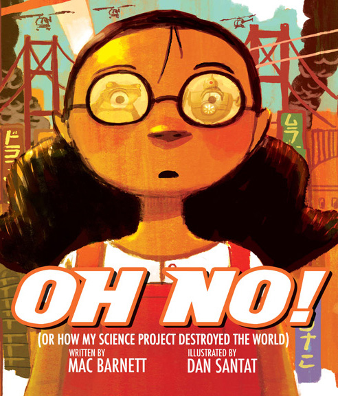
Dan SantatIn "Oh No," Dan takes a very short text and invents a gorgeous world to propel a fantastic concept into a really fun and adventurous final storytelling product. The nuance that he adds to his work is phenomenal.
Molly IdleIn "Flora and the Flamingo," we don't even need words to hear (and see) an amazing Voice. The story is told in simple expression and interaction between unlikely friends who make for great characters. Love it!
Jon KlassenIf you read "I Want My Hat Back" without the illustrations it might make sense, but it would be a completely different story. Jon uses visual nuance to imply a much funnier tale than the words themselves actually communicate.
That's all for today. Thanks for reading. Fred out!!
By:
Pixel Shavings,
on 9/3/2012
Blog:
Pixel Shavings
(
Login to Add to MyJacketFlap)
JacketFlap tags:
Illustration,
children's illustration,
new book,
childrens illustration,
book cover,
children's publishing,
bunny slippers,
smiling otis studio,
russ cox,
Outhouse Ink Publishing,
Major Manners,
Add a tag
©Russ Cox & Outhouse Ink Publishing
I would like to announce that
Major Manners Nite Nite Soldier (Outhouse Ink Publishing), which I illustrated, is now available through their
website or look for it at a bookstore near you. The story is about Major Manners who teaches children to brush their teeth, bath, get ready for bed, etc. all set to a cadence. The book comes with a fun cd in which the major and kids read the story in their own charming way. We are working on a new story together that will be out late next year so stay tuned for details.
Hello and Happy Summer!
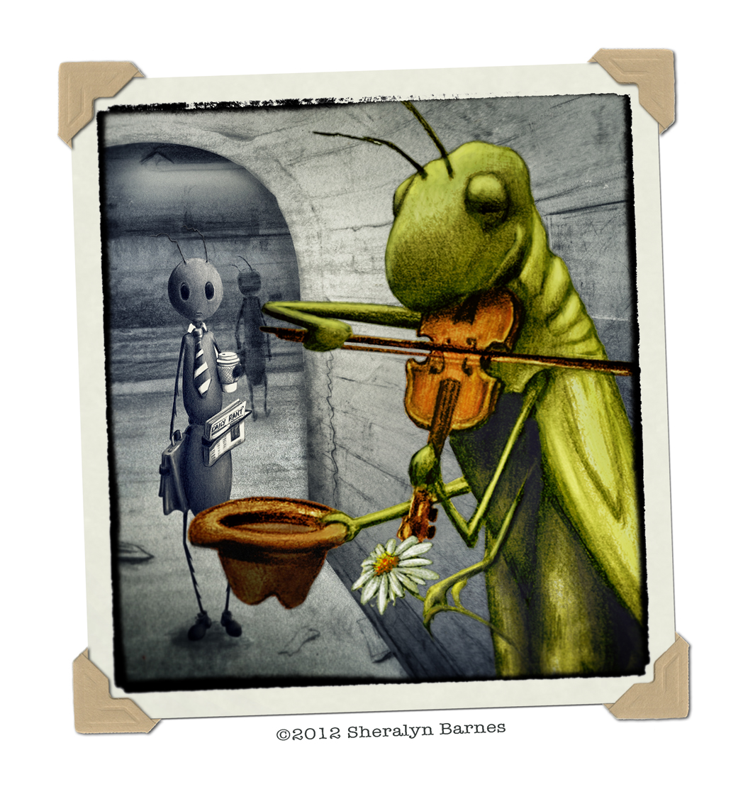
For this post I thought I would share some "snapshots" I've done recently. I've had the desire to do less actual digital painting on the computer lately and instead have felt the need to revisit my drawers of pencil, paper, and paints a bit more. I've recently had several projects come in that involve making illustrations that look like snapshots and postcards and so I've been experimenting with how I can use the computer as more a tool for design of my scanned in, hand drawn images. I found a fun filtering application called SnapSeed and here are some of the results of my experiments.
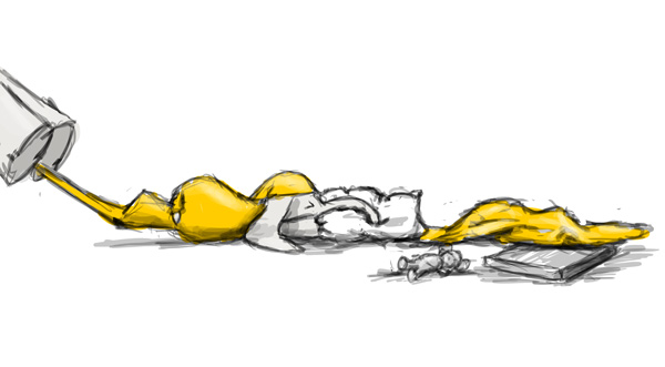
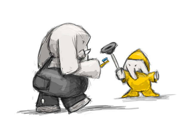
The first is an experiment using some existing pencil sketches. I've always had an issue with the Aesop fable of Ant and Grasshopper and have been working on a story that puts a modern twist on a fable I feel needs to be updated for our modern world. Being a working musician as well, I tend to resent Aesop's view that hours of practicing and playing a musical instrument is a lazy pursuit, especially in our current world where people are overworked and overstressed, arts programs are disappearing in our schools, and people are generally just not playing enough! So I've had these characters hanging out with me in my sketch book a lot lately to remind me of what's
important to me.
This image was composed of several pencil sketches, some scanned photo corners, and the magic of SnapSeed filters. It's truly an experimental piece and a bit raw. I'm also trying to perfect a technique that I'm happy with for adding color to my pencil sketches without washing out the original integrity of the sketch. I'm getting closer, but still have a ways to go before I pin it down to a true system.
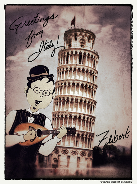
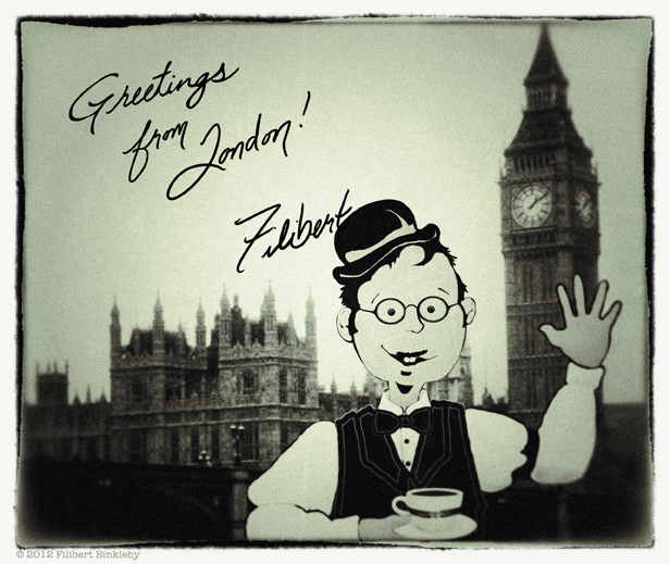
Speaking of my love for music, here is a photo I recently designed for a world music project that my husband and I have started for kids called Filibert Binkleby and the Travelers. Filibert is our fictitious friend who likes to share his adventures of traveling the world through the songs that he writes (and we perform since he's always off somewhere new and can't make the gigs). I've been having some fun with some of our old travel photos and a simple Filibert two dimensional "puppet" I created.
Again....a work in progress...but it's all fun!
Hello friends!! Lots of wonderful things going on in the world of Pixel Shavings, which is a testament to both the value of forming a group and the hard work of each of its members. I think every single member has a project in the works, and that's seriously awesome.
My great news is that I've signed with Josh and Tracey of Adams Literary, rising stars themselves in the world of literary agencies. When I met them the first time, I arrived at our poolside meeting in Orlando wearing a bathing suit and cowboy hat. When they didn't even flinch, I knew it was meant to be. They even shared their french fries.
Check out Adams Literary at adamsliterary.com. They are OPEN TO SUBMISSIONS!! By the by, that's how I was able to set the meeting. I sent a compelling email through their website. They had no idea who I was before that email.
Also very cool is that I've been featured on author Rob Sanders' blog. He's running a fantastic series of success stories from other authors he's met. For sure check it out at: http://robsanderswrites.blogspot.com/2012/07/fred-koehler.html
On to the Sneaky Peeks. Dad's Bad Day (Penguin, 2014) is going through a fair amount of sketch revisions. While I'm anxious to move on to final art, I am stoked to be working with a team dedicated to making this the best book possible.
Here are a few sketches that may or may not make the final cut. But I like 'em (and so should you!!). :-) As always, thanks for checking in with us and let us know if our collective wisdom can shine a light for you.


Cheers,
-Fred
freddiek.com
flickr.com/superfredd
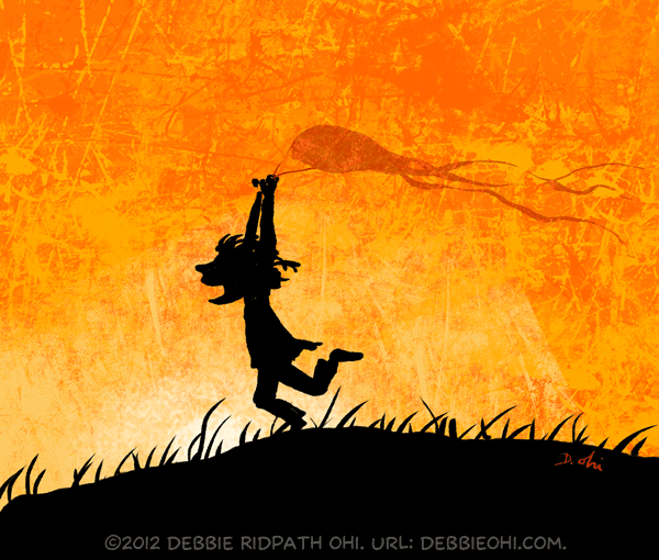
To you Americans out there: Happy July 4th! Today I'm going to show you how I created one of my Daily Doodles (some of which I post on
DebbieOhi.com). As I've mentioned before, I try to draw purely for the fun of it every day.
Sometimes I start with a blank digital canvas and just start drawing the first thing that comes into my head. Other times I'll do an image search for a word or phrase for inspiration. In this particular instance, I looked for "
kite child" Google Image search and settled on the image at the top of a
Flow Psychology page.

 |
Richard Jesse Watson during an Illustrator Intensive
at the SCBWI-LA conference last year. |
©2012 Russ Cox | Smiling Otis Studio
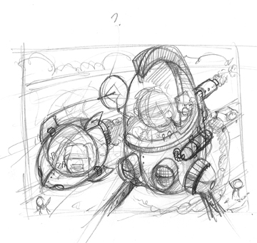
Since returning from the NESCBWI Conference in late April, I have been heeding the advice I have received from friends, agents, and art directors who have told me how much they love my drawings and sketches. With that advice, I have started playing around colorizing my sketches and drawings so that the looseness and energy does not get lost in the final art. I have been doing a doodle a day (and filled up one sketchbook since returning) which has lead me more down this path. This is the first "official" illustration I did with this looser style. The idea came from a conference doodle that I liked and thought would make a good promo piece.
I quickly worked out a composition based on the doodle. I wanted a slight over the head perspective that would focus on the characters and their "vehicles".
I then refined the sketch a bit more, developing the characters and the space crafts.
Once I got the characters heading the right direction, I did a final, tighter drawing that stilled kept the freshness of the previous sketches. This was scanned in at 300 dpi so that I could render it digitally. I left room at the top left for my contact info.
I imported
I've been looking more at historic characters and settings lately. Maybe it's because I love historic films, documentaries and costume dramas ... it is definitely something I feel comfortable drawing!
This little guy turned up in one of my morning warm up sketches, and he features on my next postcard mailout.
I draw these digitally, in photoshop using only a couple of colours (usually inspired by a colour inspiration website). I don't do any underdrawing ... that way I can't overthink, plus I keep the freshness of the line.
See more of my work at
http://hazelmitchell.com or on my blog at
http://hazelmitchell.blogspot.com Next up on Pixel Shavings in June will be Russ Cox .. fresh from his clean sweep in the Poster Contest at NESCBWI!
Toodles!
Hazel
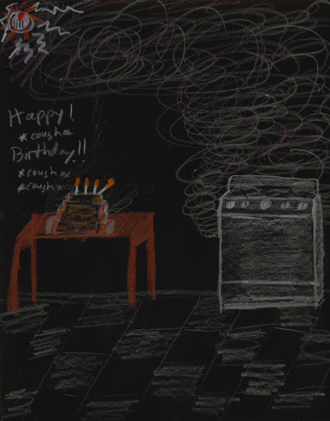
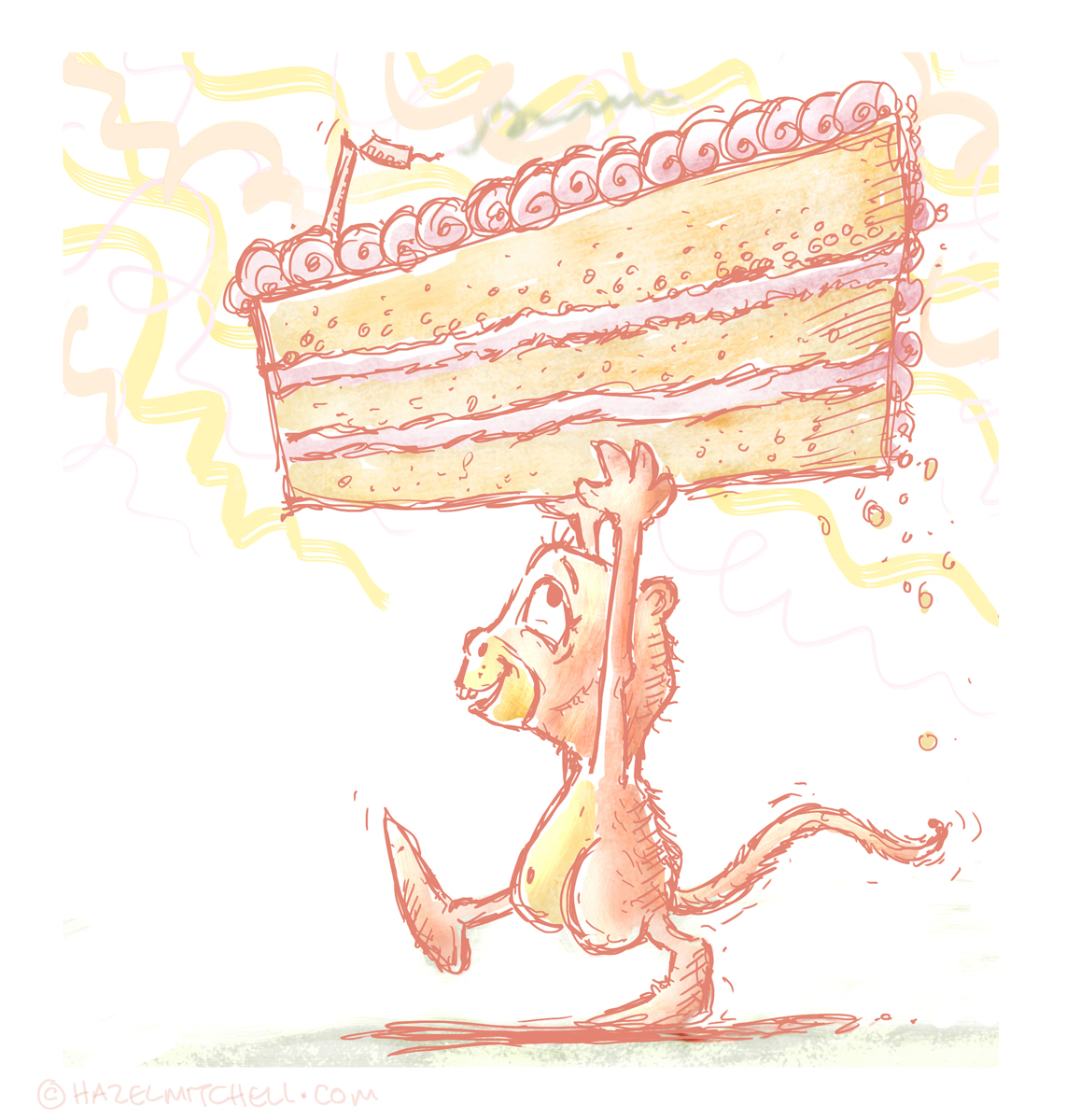
Today is my birthday and I’m halfway to ninety should I get there.
I really wasn’t planning to make a big deal of it, especially because I’ve been feeling older in body and spirit in the last few months. Also, I am allergic to a lot of foods. I can’t eat gluten, sugar, or dairy. This is terribly inconvenient for my poor husband who probably has one of the hardest wives to try to do something special for on her birthday. We usually just go out for Indian food.
So a thought occurred to me the other night. I was thinking about this upcoming post and how I’ve been feeling rather “un-fun” with my art lately. I was thinking how ever since I started creating art for money (and on the computer), a lot of the fun has gotten overshadowed by anxiety about doing a good job, my obsessiveness that accompanies working digitally, and navigating contracts. I started thinking about what a BIG deal your birthday is to you when you’re a kid and how you let EVERYONE know. So I told my husband we should definitely have cake for my birthday this year....on paper. I went out and bought crayons and some construction paper. I spent 3 hours literally sprawled out on the living room floor, crayons all around me, making myself a birthday cake. My husband made me one too (he burned it, but it’s still lovely). And my Pixel Shavings mates were incredibly kind enough to take time out of their (very) busy schedules to make me cakes as well. Debbie even took up my challenge of not doing it digitally for the thrill of it.
It was great to not have Control-Z as a safety net. It was great to linger aimlessly over paper on the floor using stubby little sticks of waxy color that seem to work best when held fist first. It was great to realize by middle aged body can still manage to sit on the floor for hours. But most of all, it was great to feel like a kid again and get lost in coloring for a few hours for no reason whatsoever.....except...
IT’S MY BIRTHDAY!!!!!!!!!!
©2012 Sheralyn Barnes
©2012 Brian Barnes
©2012
Dan Santat illustrated like seven books in one year. My friend Janeen Mason told me she can have a dozen projects at various stages of development all up in the air at once. At a recent SCBWI conference I heard repeated again and again that successful writers and illustrators are idea factories.
So while book numero uno, DAD'S BAD DAY, is in full swing, I'm keeping up the writing and the sketching and the concepts. Here are a couple of recent ideas that I think have some promise.
The Pink Princess Problem - wherein a poor little giant is pestered by princesses who are kinda snarky, mean, and evil.
The Happiness Emporium - wherein a penniless boy encounters a curious shopkeeper with the secret to lifelong happiness, and it's for sale.
Thanks to all of the friends of pixelshavings, and check in with us next month!
-Fred Koehler
freddiek.com
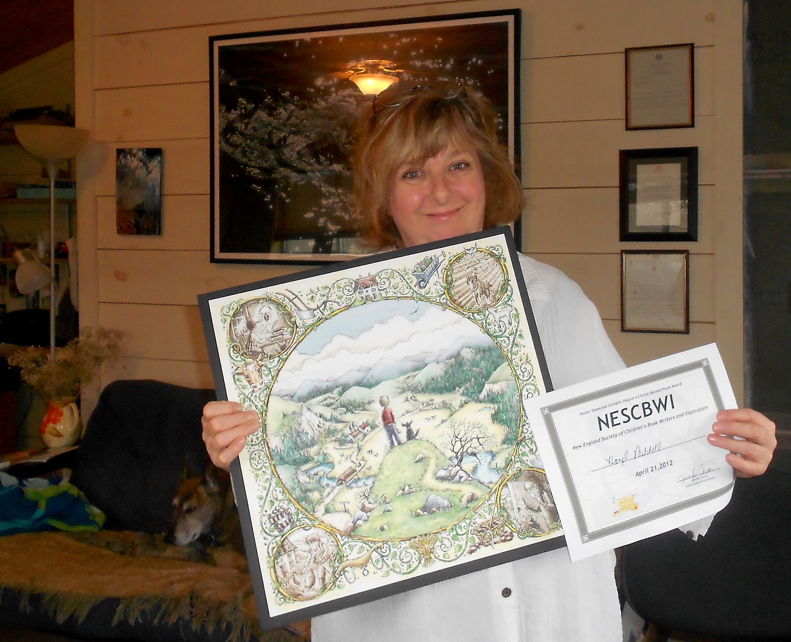
I'm interrupting the usual Pixel Shavings illustration process blog postings to post some special news about two of our members, Russ Cox and Hazel Mitchell. Both came back with awards from the New England SCBWI Conference!
Congrats to Hazel on her second-place win in the People's Choice Award with her "Boy and World" image:
 |
| Hazel Mitchell with her print and NESCBWI award. |
 |
| ©2012 Russ Cox. |
Russ won first place in the "Published", "People's Choice", and "The Richard Michelson Emerging Artist" categories, and his print will be hanging in the
DZain Gallery and the
R. Michelson Galleries in Massachusetts.
You can read Russ's post about the event in his blog. Russ also posted about the critique he received from HarperCollins creative director Martha Rago...fascinating insights, and I strongly urge illustrators to read his post.
I've already heard so many good things about the
NESCBWI conference, but both Russ's and Hazel's posts (plus everyone's
#nescbwi12 posts on Twitter) have convinced me that I really need to try attending this event next year. According to Harold Underdown, the event is scheduled for May 2nd weekend in 2013, so I've marked it in my calendar.
![]()
All images © 2012 Russ Cox | Smiling Otis Studio
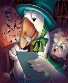
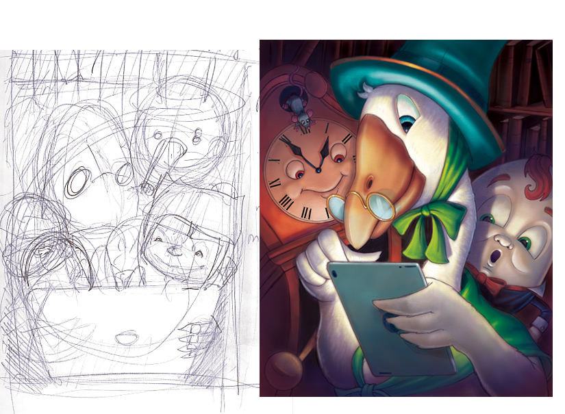
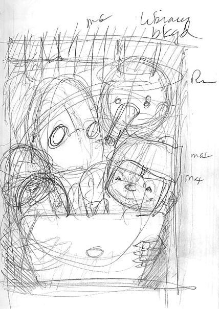
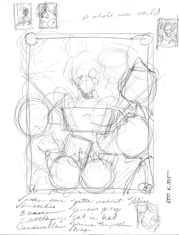
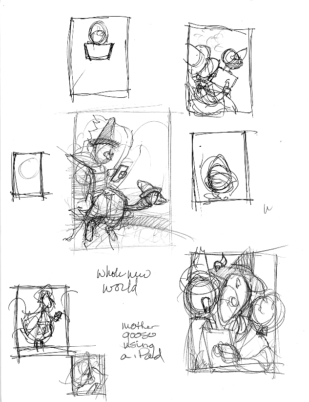
Hello everyone! For my post I thought I would share how I developed the idea for a poster contest. Sometimes an idea gets stuck in your head and you need to pursue all avenues to see if it is a good one. This illustration was created for the NESCBWI Conference poster contest. The theme for this year's poster is "A Whole New World". The idea that hit me right away was to use Mother Goose, since she is a standard symbol for children's books and stories, using an iPad which is being used more and more by children to read and interact with stories.
Originally I wanted to use other iconic characters from children's books. The first sketch shows Mother Goose with Max (Where The Wild Things Are), Pinocchio, and The Three Little Pigs. I liked the idea of them being crowded around the iPad but the overall composition was too busy.
The next idea was a straight on view. I felt it is too direct and lacked a warmth that was needed to tie the "old" and "new" together. You can see the little doodles on the outside of the sketch as I played with composition. At one point, the iPad was very large with the characters staring at it. That composition had too much of a "Big Brother" feel to it.
I went back to Mother Goose as the focal point and had the characters sitting around her and the iPad as if she was reading to them. This was getting better but it lacked the interaction I felt was needed and it needed everyone viewing the device.
![]()
Lately I've been working a lot more with digital sketching, getting my thoughts right onto the screen with no premeditation or thumb-nailing. Really this has been an exercise to stop me overworking, to play more and to have some fun! I have also been limiting my palette by using online palette suggestions (I use http://design-seeds.com, although there are many others out there).
It's been taking me in a different direction and got me out of my standard tools/colours/process. So I thought I would share a few of the sketches I have worked on this last month. Most of them were 15 mins to an hour and I draw on a Wacom tablet and use photoshop CS5.
Thanks for stopping by Pixel Shavings! Stop by next time to see what Russ Cox has on the menu.
Hazel Mitchell
I loved Fred’s post last week.
I think he hit the nail on the head about what it takes to be a children's illustrator and it made me think a lot about my own learning curve on becoming a children’s illustrator over the last two years. So I thought I'd touch upon some of his points...the ones about attending conferences, learning as much as you can, and being open and relaxed to what comes your way.
I find myself constantly trying to convince fellow writers and illustrators who truly want to publish children’s books to take the plunge and go to not only the regional SCBWI conferences, but also either the New York or LA ones if they can. To attend one of the larger conferences is a pretty big financial commitment, so it’s understandable why people hesitate. I still find it hard to believe that I ignored my doubts and dire financial situation and went to my first New York conference back in 2010 . But I did, and it is probably one of the best decisions I have ever made in my life. Since that time I have attended two more conferences in LA, one in Nashville, and one in Minneapolis. As the time to commit to going to the LA conference this year grows nearer, again I find myself doubting whether it is important to go.
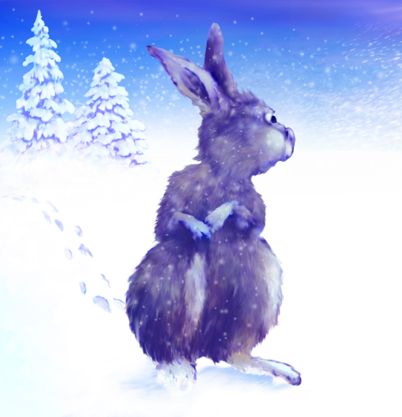
So, to reassure myself, I put together this Bunny Timeline.
This little furry guy is someone that I've been experimenting with since my first New York conference. I've used him as a gauge for what I've learned in the last two years as I've dedicated myself to becoming a professional children's illustrator. Some of you may recognize the first three images from previous posts. When I look at these illustrations now, I can see how with each conference (and the workshops, keynotes, and critiques that go with them) I have learned so much more about what it really is to illustrate for children. Every conference has been important in giving me new insights as to how to be a better. Not to mention the daily influence, support, and inspiration of the great illustrators that I have met at these conferences. When I attended my first regional conference in 2009, I was naive enough to think I knew what I needed to know to be a good children's illustrator. I thought with a few tips, tricks of the trade, and connections, I’d be working in no time. What I learned is that I had a lot to learn if I truly wanted to be good and get published. I could draw well (my degree is in fine art, not illustration), but I didn’t really understand everything that went into a great illustration...especially aspects of story and character development. Attending conferences has continually given me the inspiration and information I need to make illustrations and children's books that I can be proud of, not to mention given me an incredible community to be a part of.
So here is the set up for this first page scene:
A bunny is anxiously awaiting a mouse friend to go find shelter in a barn as an impending snow storm looms large and threatens their very existence!!!
Rabbit 2010
Okay, okay. So perhaps that title was a bit deceiving. But, after reading this humorous post on How to Win the Caldecott, I thought I might give it a shot as well. This is a general description of how I sold my first two books to Penguin USA. The first, "Dad's Bad Day," will be out in 2014.
Step 1. Get Really, Really Good at Something. Whether it's writing, illustrating, or even concept and storyboarding, put in the 10,000 hours you need to become successful at your craft. Because all work feeds your art, it doesn't matter where those hours come from. You want to be a writer? Blog. Volunteer to write press releases for a local charity. Write letters. Just write a lot. Same deal with illustrators. Start a sketch blog and add to it daily. Doodle in meetings instead of paying attention (and convince everyone that you listen best while doodling). One day it's going to click. Something original is going to emerge from your work. You'll stop in the middle of what you're doing and say "Whoah. Where did that come from?" Congrats. You've found your voice.
Step 2. Hang Out and Be Cool. For "big people" publishing, I don't know how to be cool. Grown-ups frighten me honestly. For children's publishing, join SCBWI and just go and hang out. Invest some dollars. Sign up for multiple classes and critiques at the conferences. Bring your "A" game. Bring the work that embodies that original voice and still makes you say "Whoah" when you look at it. Be proud and be excited about it. And don't be creepy or stalker-y with the agents and editors you meet. The ones I've met still talk to me because my attitude has always been that "I'd love to sell something, but I'm really just here to learn and make friends."
Step 3. Listen, Learn, and Repeat. At a conference I heard an editor say, "Anyone who submits work to me in the next two weeks hasn't been paying attention." The purpose of attending conferences is to learn how to improve our craft for revision. It's not about landing the deal. When you get that one-on-one time, offer yourself up completely defenseless. Demonstrate your ability to listen and accept advice. And for some people, that's the hardest part. You're sitting across from the person who could give you your break, so whatever they tell you to do, DO IT!!! Now go back to Step 1 and repeat until successful. And remember, the equation for success is "Every Single Miserable Failure + One More Try."
Cheers,
-fred
freddiek.com

This piece began as one of my Daily Doodles, where I experimented with a very loose and very sketchy line (no initial sketch/shapes) in Photoshop CS5:
I initially envisioned the little girl and her monster to be on a rooftop, but decided to put her on a hillside looking up at clouds in the sky instead:
I added some subtle shading in the bottom part of the hill to add a feeling of depth. I also used more than one pale grey for the clouds...again to add some texture and depth.
Next, I colored in the girl and the monster. Then, to make the hill look more like a natural part of the illustration, I added grass and flowers:
I drew in the stalks of grass by hand (digitally, that is) but did some cheating -- I only did a few sections, then copied and pasted those sections around the hill, altering the rotation a bit so it wouldn't look so obvious I was cutting and pasting. Then I added in some extra blades of grass here and there by hand.
Here's a screenshot of my layers, for those curious:
© 2012 Russ Cox | Smiling Otis Studio
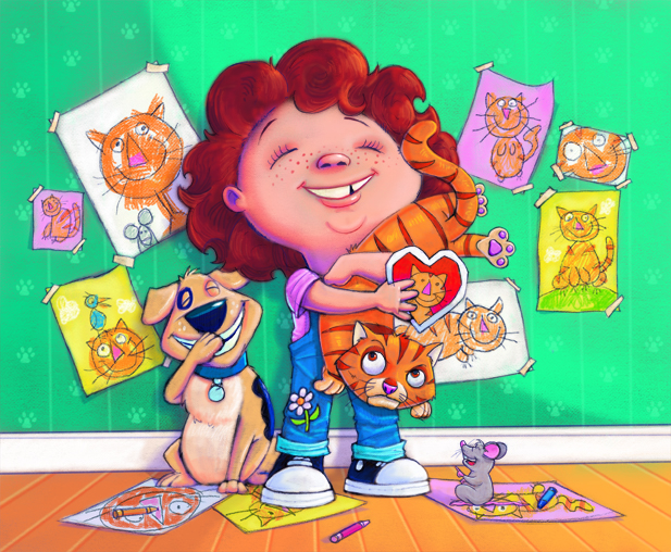
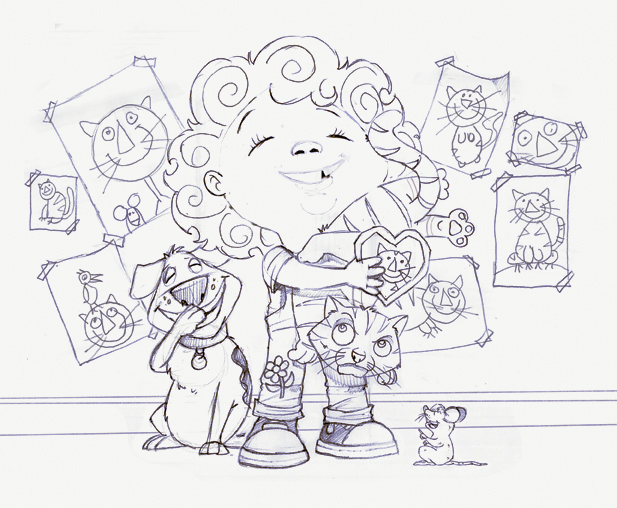
In celebration of Valentine's Day, I decided to work up a sketch I had lying around my studio that I called "Gladys And Her Cat". It is based on how children usually carry a cat around the house. I though adding the drawings hanging on the wall would help emphasize her love for her cat.
This is a tighter version of the sketch. I lightened the nose and mouth on Gladys so the line work would not stand out in the final art. The line work was converted to a dark purple to give it a bit more life than using black.
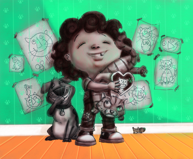
Using the multiply layer in Photoshop, I did a grayscale underpainting which I duplicated and then added a red tint. This makes it a two layer toned underpainting so that I have a dark value to paint on which helps the final art colors pop.
Working like a traditional painting, I started from the back by painting in the walls, patterns, baseboards, and floor. This helps me decide what colors to use for the main images and prevents color revisions later on by trying to get a background color to work with all of the main elements. The final art layers are set to "normal" but have my brushes set to 20-45% opacity. By doing this, it allows me to build up the color.
0 Comments on Gladys And Her Cat by Russ Cox as of 1/1/1990
This month saw the publication of a book I illustrated for Charlesbridge Publishing' imprint Mackinac Island. The book is 'Hidden New Jersey' and it's the third in a series featuring the States.Written by Linda J. Barth (of New Jersey), it's the first non-fiction book I've worked on - and it was quite a challenge! I thought I'd share some of the process looking at how I tackled the illustrations.
The book's a 'search and seek' concept with hidden objects on each page for children to find. There were a LOT of facts to incorporate on each double spread, each featuring a different area of the state. This book came to me in an unusual way ... the developer, Anne Lewis, saw my work on my Facebook Fan Page and emailed me to ask if I'd be interested in doing the book. Hurrah for social networking! I received the m/s in January 2011. At this point I realized just how much research was involved - I took a big gulp. Each area of the book was broken down into a list of facts and suggestions for hidden objects. The developer suggested I write notes on how I saw the images for each page before I started sketching. This was a great idea and saved me a bunch of time ... I spent a couple of weeks looking at images for each page and making rough notes on how I saw then working as a whole. The first thing I realized was that the objects suggested for 'hiding' took away many of the options for great compositions ... so I asked if I could choose what to hide instead. I began files of images for each illustration, making sure I had many different reference and bearing in mind the copyright restrictions on images. I made my own references sketches and often merged many different views, or worked from out-of-copyright photos. This kind of book is hard - there isn't time or money to go round taking your own photographs, which would be the ideal situation! When I felt I'd researched enough I began to make rough sketches of each layout. In this case the rough sketch was pretty much how the finished image turned out. I also researched the items I would hide on the page (which are all mentioned in the 'facts'). I also laid out a page to scale with the hidden objects and blocks for the text.
It's January. That time of year when the winter doldrums set in. So this week, as the grey skies were bringing me down, and I was feeling a bit small, I thought to myself how nothing beats the winter blues like a hot cup of tea, a friend, and my imagination.
©2012 Sheralyn Barnes
And then I pulled out this old friend again, who despite appearances, should be getting us closer to spring here soon..... ©2012 Sheralyn Barnes
Happy Groundhogs day on February 2nd!
Spring will be here before we know it....
Thanks for checking in! You can see more of my work at
Look for another great post by John Deininger next week!
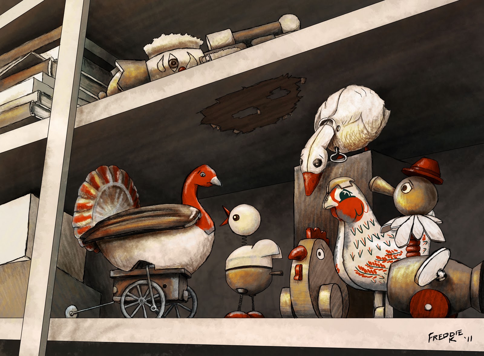
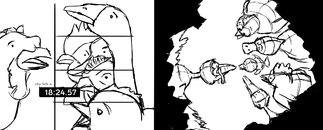
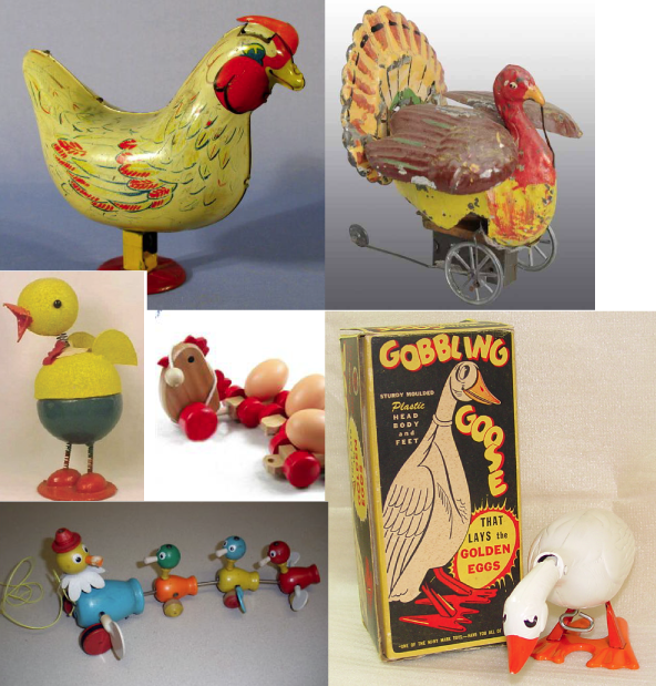
For this week's post I thought I'd use a recent piece that was entered in the SCBWI Tomie DePaola contest based on the classic tale of Chicken Licken. (The sky is falling! The sky is falling!) You can see everybody's entries here. My entry did receive a good number of comments, and a lot of them talked about an appreciation of the "concept" or "idea." So I thought I'd try and share a little bit as to where and how I find concepts and ideas for illustrations. To be honest it all starts in a text document before I even pick up a pencil. I ask myself the question "What would make this funny? Or different? Or cool?" That list of answers might hit 30 or 40 before I'm start to go back through and decide which one(s) to research further. A lot of times I try to take what's expected and do the exact opposite. (Instead of "eating pancakes for breakfast," try "pancakes eating their breakfast.") For the Chicken Licken story, my list included "looking through a hole in the sky" and "24 [the tv show] cut-scenes." Those two stood out and I sketched them, but wasn't thrilled with the results. But here's the cool part. In doing the sketches and researching the characters, I kept my eyes open for other concepts to add to the list. I talked through the sketches with friends and colleagues and my list of concepts grew even bigger. During this process, lo and behold I encountered a vision of the holy grail of comic iconography – a rubber chicken. And where do rubber chickens live? In a toy box. From there I started wondering if there was an iconic toy counterpart to all of the other characters. Lo and behold there was! As I finished my research I never even ended up using the rubber chicken, but that's where it all started. Then, after all that, I did sketches. I decided on a vintage palette and a toy shelf instead of a toy box (so it would be easier for the "sky" to be falling). The result, I thought, was successful. I titled this blog "Concept is King" because I honestly believe that the work we do before ever setting pencil to paper is the most important. The magic of our character interactions, the reaction we hope to get from our viewer – we can document those intentions and work till we achieve them. Best of luck to all of ya, and keep up the good work! ~Fred flikr.com/superfredd
View Next 9 Posts
|


 RUSS COX - As 2013 comes to a close, now is a good time to look back and be thankful for what happened during the year.


 Had lots of fun at the SCBWI annual conferences. One of my highlights of the Summer conference: hanging out and chatting with Fred Koehler, plus getting a chance to see his HOW TO CHEER UP DAD f&gs (book comes out in March 2014).
 SHERALYN BARNES - Happy Thanksgiving!
 Oh also, thanks to my hubby for all his support!
 I've gotten so many incredibly kind emails and questions about the process that I've put together a couple of pieces of general advice to share. The SCBWI published my success story, which I've posted to my blog at freddiek.com. I also posted an article for aspiring authors called You Wrote A Book. Yay! Now What? This piece is more for beginners just to help wrap their brains around the publishing process.


 The learning game flashcards that I designed for Gryphon Design Collective called “What We Wear” came out this year. I had fun drawing all kinds of fun animals for this project. It was a challenging project in that it highlighted clothes within a beach/sand/surf motif. Truly a challenge! (Pat on back)


 2 Comments on Say Cheese! By Sheralyn Barnes, last added: 8/3/2012


 0 Comments on The Evolution of the Bunny by Sheralyn Barnes as of 1/1/1990


How very exciting, to start a new project like this. Congrats, Debbie. I have a similar process where my sketches are spread over a double bed (my studio doubles as a guest bedroom). Great advice too!
How fun to have your illustrations hanging from the ceiling. I guess that IS a good way to get an OVERall sense of the story!
I think you describe the flow thing pretty well, Debbie.
I noticed flow overall one year at the Bologna Children's book fair. I saw beautiful posters showcasing work, and was surprised when I picked up the book to feel disappointed - eventually I realized (after picking up hundreds of books) that I was looking for something I can only think of as 'musicality' - the satisfying shape of a tune, a symphony, a chord. And strange as it was, though excellence was bursting from every seam at the fair, finding this musicality - or flow - was a rare thing. Really made me think and rethink text and illustration, portfolio, all visual flow, really. Great post.
Debbie hi, actually, reading your post today comes hot on the heels of a piece I read last night from 'illustrating Children's Books' by Martin Salisbury which perfectly echoes your description. It is definatly something to consider seriously for a novice like me. Thanks! Nicky