new posts in all blogs
Viewing: Blog Posts Tagged with: Pencil Sketching, Most Recent at Top [Help]
Results 1 - 15 of 15
How to use this Page
You are viewing the most recent posts tagged with the words: Pencil Sketching in the JacketFlap blog reader. What is a tag? Think of a tag as a keyword or category label. Tags can both help you find posts on JacketFlap.com as well as provide an easy way for you to "remember" and classify posts for later recall. Try adding a tag yourself by clicking "Add a tag" below a post's header. Scroll down through the list of Recent Posts in the left column and click on a post title that sounds interesting. You can view all posts from a specific blog by clicking the Blog name in the right column, or you can click a 'More Posts from this Blog' link in any individual post.
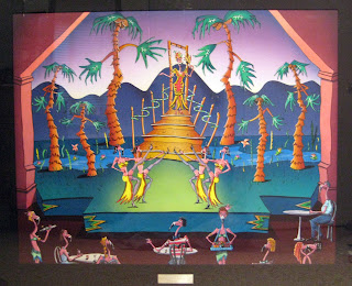
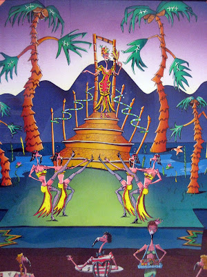
sorry for the fuzzy pix, this painting is large and behind plexi-glass.

On a hike deep in the forest I found this strange tree and sketched it as I saw it.
I have a theory about how it came to be. Maybe you do too. So here’s a Comment Contest.
A prize pack (a World Beneath audio CD and signed "Visitor Permit" bookplate) goes to the best explanation in each of two categories. Deadline: 9pm Eastern Time Monday. Please, 100 words or fewer, one entry per person.
1. Best scientific explanation.
2. Best fantasy explanation.
Tomorrow: Deleted Scene
If you listen to National Public Radio, you’re probably familiar with the velvety voice of commentator Daniel Pinkwater. He’s also the author of many brilliant absurdist books for young people, including The Big Orange Splot and Fat Men from Space.
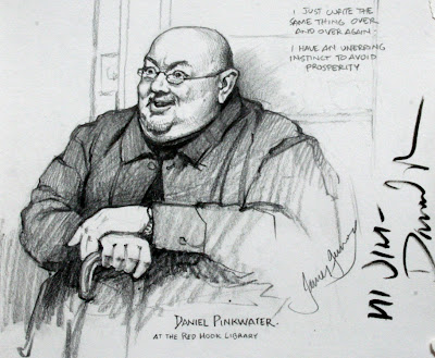
According to Wikipedia, “Pinkwater tends to write books about frequently obese social misfits who find themselves in bizarre situations, such as searching for a floating island populated by human-sized intelligent lizards.” I sketched him from life at an author event in the basement of a nearby library.

The enlargement shows his characteristic expression when he’s talking: wide eyes, raised eyebrows, and smiling mouth. He was constantly moving during his talk, charming the audience with his anecdotes, but he kept returning to a basic pose, with both hands resting on his cane.
Tomorrow: Juste Milieu
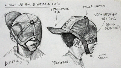
When you’re seven years old, an ordinary mesh-back baseball cap takes on new life as a space helmet with a rear stabilizer fin.
Tomorrow: The Shapes of Color Schemes
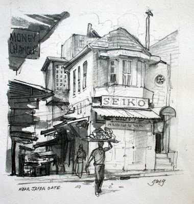 Here’s a sketch from Jerusalem. It’s an example of the “line and wash” technique, a favorite with travel sketchers.
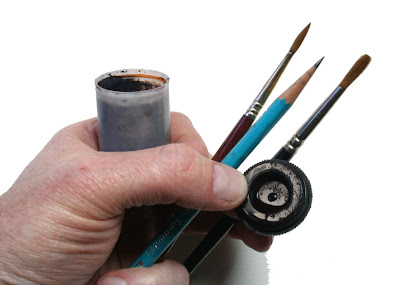
The line is pencil, and the wash is ivory black watercolor mixed with water in a film can, whose snap-on lid never leaks. It’s one of the easiest ways to get started with painting on the spot, because the tools are so simple. It all fits in your pocket.

May I show you a page from my wife Jeanette’s sketchbook? The line is from a ballpoint pen, and the washes are raw sienna, ultramarine, and burnt umber watercolors. She was thinking of the colors that John Singer Sargent used in his Venetian watercolors. To see more Sargents, visit the post on “warm and cool.”
Tomorrow: Taboret
I first met Sean Andrew Murray twelve years ago when he was an art student at Syracuse University. He held still long enough during our pizza dinner to let me sketch a quick portrait.
 I ran into him again recently. I was pleased to learn that he’s one of the most sought-after concept designers in the game industry, working for Big Huge, EA, Turbine, and MindEngine.
I met a lot of amazingly gifted and hard-working art students during the recent book tour. Who knows where each one of them will turn up a dozen years from now?
Tomorrow: Moving Mountains
Sometimes when I’m sketching a portrait from life I just try to draw the person the way they appear to me, without exaggerating anything too much.
Here’s a pencil study of the accordion player Terry Winch performing a concert of Irish music.
Other times I use my sketchbook to experiment. Instead of drawing the way these two musicians actually appeared to my retina, I wanted to try to capture the way their personalities struck my mind. That meant exaggerating a few things and leaving out some details (it helped that I was sitting pretty far away from the stage).
Another time I heard a lecture about Beethoven by Harvard professor Robert Levin. He talked about how Beethoven stretched the limits of the piano keyboard, and pushed the boundaries of the musical forms. Without thinking about it, I found myself stretching his face like a piece of kneaded eraser.
Tomorrow: Overcast light
Here’s a page from my “Face Book.” The faces are from the Bard College Symphonic Chorus in New York State. The figure is the conductor, James Bagwell.
 Maestro Bagwell is the dynamo behind Bard’s choral music program. He paces across the stage with all the brooding intensity of Beethoven. When he turns to face the audience, he bends forward stiffly, mouth tight, cheeks puffing out, unable to mask his passion for the music. When the music turns lyrical, he melts and looks as if he were holding a baby.
Sitting in the audience with my sketchbook in my lap, I was nervous that sketching might be as distracting as coughing, so I tried not to bob my head up and down, and I worked very small. I had only a few seconds to observe his pose, remember it, and then try to jot it down in the tiny book.
Thanks for the comments to yesterday’s quiz. You all explained flag behavior better than I could. The seven flags are all variations on the “wavy ribbon” idea, which is how we think flags should look.
In fairness, there’s nothing wrong with this way of drawing flags—if your goal is to represent the mental image of a flag. A cartoonist is usually after the mental image, not reality. It’s also a good way to represent a flag if you want to show the flag's graphic design clearly.

But if your goal is realism, it’s worth observing that flags never actually appear with undulating folds parallel to the flagpole. Instead, as many of you pointed out, a set of folds radiates diagonally downward from the upper point of support.
 I was unaware of this principle until a day in 1995 when I was stuck in rest stop during a long bus trip through the midlands of England. There was nothing to do but sketch and nothing to sketch but a flag. I drew a page of variations as the wind changed from a zephyr to a stiff breeze.
Here are some YouTube videos, which show waving flags better than my sketches.
Medium size flag in diminishing wind: Link
Small flag in stronger wind: Link
Small flag in heavy wind Link
Big flag in heavy wind: Link ; (In this last one, the diagonal rule breaks down a bit, and the wrinkles are more complex billows. They actually start to look a bit like the flag pictures from China and France, above. I have a feeling the math behind all this is pretty complex.)
Perhaps one of our CG animation friends might be willing to say a few words about the challenges involved in modeling this kind of action in 3D on a computer.
Well, it's hard to pick. The grand prize has to go to the first Anonymous (theartistsmith.com) who got the basic answer right away. The next four runners up who really described the action are: Kevin H, Dan G., Orlando M., and Meredith D. But I'm going to give the last runner up prize to Big E, who expressed the larger truth that there's no single correct way to represent reality; it depends what you want to communicate. If you’d like to collect your prizes, please email your mailing address to me at [email protected].
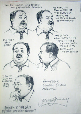 I did these sketches of our district superintendent during a school board meeting. He's a lively speaker, with great facial expressions. He was in constant motion, so I tried to pick a few characteristic expressions, just the way an animator might look for key frames.
As I sketched, I wrote down the quotes verbatim.
 I met Joe at a family gathering and did this sketch while he told me his life story. He saw so many terrible and wonderful things in his life, fleeing from Hungary, leaving all that he loved behind him.
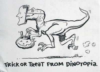 Today it's Off to Oshkosh. We start the long drive west toward Wisconsin. Sorry to miss Halloween back home, but I'm looking forward to the next part of the road tour.
Two more lectures yesterday yielded two more portraits.
First was Jack Levin, Ph.D., a leader in the study of violence in the media.
He started off his talk saying he is often mistaken for: Albert Einstein, Gene Shalit, David Crosby, Captain Krunch, Mr. Monopoly, Ben&Jerry, Mark Twain, Jerry Garcia, Juan Valdez (without the coffee), Grandpa Joe in Willy Wonka, Mr. Kotter (25 years later), Don King (with white skin), or even Beethoven.
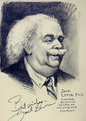
My sketch, made during his hour-long presentation, looks no more like him than anyone on that list does, because I rushed the layin stage, and spent all the time modulating the tones. I arbitrarily introduced the dark backgound to dramatize his white hair.
The second lecture was by Robert Kraft, chief executive of Fox Film Music, Inc. He described his job this way: “At 20th Century Fox we have lots of film entertainment flooding your multiplexes and small screens, much of it garbage…I never imagined myself in the bosom of Hollywood.”
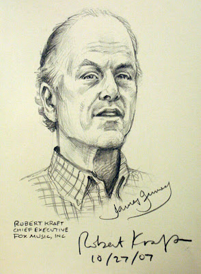
Unlike Professor Levin, who had a great many rounded forms and soft edges, Mr. Kraft had strong planes and straight lines. There were three sources of light—window light from the left, and two fluorescents from the right. With such complex lighting, I knew the form wouldn’t carry with tonal modeling. So I kept the shading light and tried to concentrate on the subforms around his eyes and mouth.
Here's a pencil portrait of Mike Dukakis that I made a few hours ago in my Moleskine drawing sketchbook. I was sitting about five feet from him as he gave a lecture. It was a bit of a challenge, because it was an upshot, and he was constantly moving during his hour-long talk.
 Mike Dukakis was a three-term governor of Massachusetts, won the Democratic nomination for President in 1988, and has been a professor of political science here at Northeastern University in Boston for sixteen years.
Following on the previous post, and Eric’s point about how this all this applies to drawing, I thought I’d share a couple of studies from life where I was trying to pursue this idea of shape welding using high contrast form lighting.
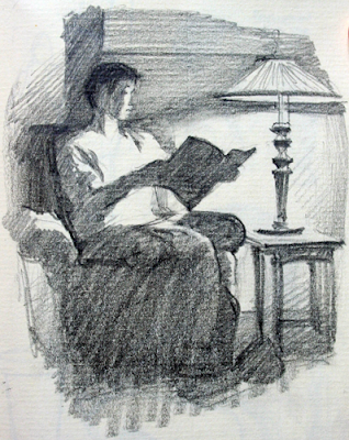
I did this little pencil sketch in a room lit by a single lamp. The goal was to squint down and just state the biggest masses of light and shadow, shapewelding all the lights together, and the same with the darks.
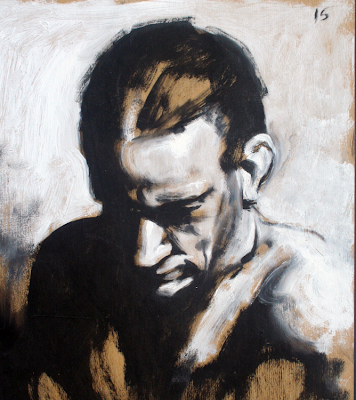
On this one I experimented with painting from a model with just white and black oil (on chipboard sealed with shellac), ignoring all the middle tones and transitions. The shadows are all shapewelded together. I could have even left off that hint of an outline on the shoulder. It’s amazing how much the brain automatically seeks out unseen contours.
Tomorrow, another of Pyle's compositional devices: "Clustering."


.jpg?picon=1009)


It fits the concept perfectly!
Wow, that is pretty intricate. The color and characters are great.
Great illo! And love these happy colors.
Hee hee, love the flamingo ladies! How original.
Check out the legs on those birds! Vavoooom! And who doesn't love a flamingo in a fruit hat! Really fun illustration Val!
girl, your stuff is great! this one makes me much happy ;)
Hhahahha...the first two seconds I saw this, I thought it looked like the set of "Flamingos-Survivor Season Finale!" Beautiful bright colors and very animated...I love it!!
dOoD!
Hi Val...this is a wonderful painting! love all the detail and the wonderful colours...
great work...
I'm sure I heard Carmen Miranda singing ...so did those trees! Gorgeous scene *!*
Oy! These Flaming-"O"s can kick. I am glad you call them Flaming-"O"s too! I love the cigarrette girl's bra. Fun.
Ha ha ha too funny!!
That IS a show I'd go and see, thanks for the preview!
ha ha are you getting paid for advertising this?
Nice composition!
The thing I love about your work the most is they are so cheerful and animated. There is also a ton of humor in this one!
beautiful!
Not only can your flamingoes stand on one foot, they can dance on one foot too. What a wonderful composition and color. The stage is set!
thank you so much for my 100 wfs. they warmed my heart.
Hahaha.. I love those flamingos guys and those dancing palms.. great job!!..
PS: my lips? yes they are.. =D
Great Can-can, Val!
LOL at the flaming'o' s! I love the way you always manage to fit the current theme. Just goes to show the diversity of your subject matter. So much detail in this.
what a fun illustration! love the dancing flamingos :)
That is awesome. You have done every kind of illustration ... wow!
This is so fun, great colors and great characters, I love the hold-ups of flamingo ladies!!!!!!!
it has made me smile valerie!
Holy cow, look at the gams on these fine feathered flamingos. This is so much fun, Val. I love it!
Primitive scene, but definitely a grand show! Cheers!
Woah! Very funny, Val :)
I laughed, and laughed at this piece! I am loving the flamingos!!!!
Wonderful! This one really had me laughing! Love all the detail especially those flamingo legs.
hehe, this is great. I can hear the drums pounding, and I love the dancing trees.
Hi Val, love the Carmen Miranda flamigo. Fun colorful painting.
oh man this is SUCH fun to look at, explore! great job, val! :))
Super Val! Great again!- john
How'd I miss this one? Great layout and colors with this...gives a very 'real' feel to a wonderfully absurd moment!