Viewing: Blog Posts Tagged with: Miniatures, Most Recent at Top [Help]
Results 1 - 24 of 24
How to use this Page
You are viewing the most recent posts tagged with the words: Miniatures in the JacketFlap blog reader. What is a tag? Think of a tag as a keyword or category label. Tags can both help you find posts on JacketFlap.com as well as provide an easy way for you to "remember" and classify posts for later recall. Try adding a tag yourself by clicking "Add a tag" below a post's header. Scroll down through the list of Recent Posts in the left column and click on a post title that sounds interesting. You can view all posts from a specific blog by clicking the Blog name in the right column, or you can click a 'More Posts from this Blog' link in any individual post.
Two recent cover curiosities have me perplexed for the same reason – characters described as decidedly not Caucasian in the text are presented that way on the book jacket. Both are unacceptable.
The first, concerning Jaclyn Dolamore’s YA title Magic Under Glass, has already been nicely discussed and fully linked at Abby (the) Librarian and Chasing Ray. Basically, it breaks down like this. Read the following excerpt from Magic Under Glass (courtesy of Charlotte’s Library):
“I knew how the men of Lorinar thought, what they wanted. To him, I was dark and foreign and crude.” (page 4)
And then take a look at the cover:

It ain’t a match. Not even close. A very disappointing sight to see. Be sure to visit the links above to learn more.
The second controversy is about The Mysterious Benedict Society series, and has been bothering me for a while. A Fuse #8 Production pointed it out a while back, and a post this week at Bookshelves of Doom got me riled up again. The character Sticky Washington, described in the book as having brown skin, has appeared on the covers of the three Benedict titles as such:

Exhibit A

Exhibit B

Exhibit C
No, it wasn’t enough to make him white, they made him albino with rosy cheeks. Seeing as how this has happened three times, I’m wondering why it has barely made a ripple. Is it due to the fact that it’s a book for younger readers? Probably not. Is it due to the fact that it’s an illustration rather than a photograph? There might be something to that. Or is it just because Sticky is one character out of many and isn’t the focus of the cover? The most likely explanation?

 9 Comments on Cover Controversy: Benedict Society Under Glass, last added: 1/22/2010
For the first Cover Controversy of 2010, we’ve got a pair of titles that match up more than most. It’s almost… controversial. Let’s have a gander at the first cover:

Minders of Make-Believe: Idealists, Entrepreneurs, and the Shaping of American Children’s Literature by Leonard S. Marcus.
What’s that, you say? Not a children’s book? Oh, come on, this one counts. Now the twin:

The Runaway Dragon by Kate Coombs.
Side by side:


A curious assortment of similarities here. Both have the paper-bag brown background, the red dragon (facing the same way), and an arched title type. They also both employ what appears to be a block printing technique that gives off a pleasingly imperfect vibe.
The Minders of Make Believe illustration is indeed a classic, created in 1899 and originally appearing in L. Frank Baum’s Father Goose, His Book (view the original here). Could the Runaway Dragon artwork be an homage of sorts? Or is it just a coincidence?


When it looks like someone’s about to hand you something, you tend to pay attention. Unless it’s a roll of Necco Wafers or a copy of the recent Peyton Manning picture book, both of which are so offensive they’re easy to ignore.
Two recent covers use this attention-grabbing device, and in doing so appear to be cut from the same cloth. Let’s take a look at the first cover:

Winnie Finn, Worm Farmer by Carol Brendler.
The twin:

The Zippy Fix (Calvin Coconut #2) by Graham Salisbury.
Side by side:


A match?


Looking to set an ominous mood? Look no further than the iron gate. I haven’t checked, but I’m pretty sure that it’s a scientific fact that anything written in wrought iron is 10x more spooky than if it were written on paper. Take a look:

See what I mean? Okay, bad example. Three recent books covers seem to understand this phenomenon much better than I:

School of Fear by Gitty Daneshvari.

Rapacia: The Second Circle of Heck by Dale E. Basye.
But there is another…

Ruined: A Ghost Story by Paula Morris.
Side by side:


The similarities are hard to deny. Confirmed Cover Controversy. I feel like there’s more of these. Any to add?
(Top Image: ‘“You’ll Never Walk Alone”, Shankly Gates, Anfield,+Liverpool‘
www.flickr.com/photos/56951432@N00/76672246)


Few things can build anticipation like a curling wave. Where’s it going? What’s going to happen? Hokusai captured the mood perfectly in his iconic The Great Wave off Kanagawa (above). A trio of recent children’s book covers understand this and in doing so give off a distinctive separated-at-birth vibe. Let’s have a look:

Necks out for Adventure! by Timothy Basil Ering.
Number two:

Alistair and Kip’s Great Adventure by John Segal.
And to complete the trio:

Missing the Boat by Wayne Chinsang and Justin Shady.
Side by side by side:


Characters atop big waves, the nontraditional lettering – it’s a match folks. Hokusai would be proud.


As far as I know, it began in ’07.
A close up of sock-covered feet.

Pretty memorable cover, right? I would say so. That opinion must have been pretty wide spread, because the socks bandwagon got crowded pretty quickly.


Numerous times, I thought the trend had run its course. I wouldn’t see a sock-covered book for a few months and assume that I wouldn’t see one for a long time.
But they kept popping up.


I really thought ‘09 would mark the end, but based on the following evidence, I see this trend continuing well into 2010.

Friend Me by Cathy Hopkins.
But that’s not all…

The Total Tragedy of a Girl Named Hamlet by Erin Dionne.
Where will the collection stop?
(Thanks to A Fuse #8 Production for the cover tip)


Scene: A doctor’s office, early in the morning.
Doctor: Good to see you! How have you been feeling?
Cover Designer: I’ve been a bit stressed lately, Doc. I want to put some foliage on this cover, but it seems kinda played. You know, leaves, flowers – I don’t know if they’re going to stand out. I’ve been wracking my brain about it.
Doctor: Let me give you some advice. Whenever I can’t figure out a diagnosis, you know what I do?
Cover Designer: What?
Doctor: I x-ray it.
Cover Designer: Doc, I think you’ve solved my problem.

The Everafter by Amy Huntley.

If I Love You, Am I Trapped Forever? by M. E. Kerr

Bones of Faerie by Janni Lee Simner.
Side by side by side:


Okay, so maybe they didn’t x-ray the plants on these covers (although I do think that the flowers on the Everafter cover saw the inside of a radiologists office), but they certainly give off a similar vibe.
Do I see a negative-image cover trend taking hold?
(Top Image: ‘Roentgen IV control panel‘
www.flickr.com/photos/16339684@N00/2361897135)


Now usually in these posts, I put up a couple books that look alike, we all laugh (oh, wait, that was just me?), and move on.
Today is different. I’m not sure if two covers have ever been as similar, yet so different.
You may be familiar with the first cover:

Animal Families.
I like this book. Kids like this book. I’m not sure what to think about it’s evil twin.
Click here to read more Cover Controversy posts.


This just in…
It happened again.

Standing for Socks by Elissa Brent Weissman.
It shall be added to the ever-growing gallery of sock-related covers.


As always, I vow to keep you updated with any new sock-related cover art developments.


Clothes and accessories say a lot about a book cover. How many times have you seen a book where a character on the cover is wearing glasses like this:

or shoes like this:

or a haircut like this:

or a combination of all three and thought, “Ooh. That one ain’t gonna get many second looks.”?
I find this pretty often. So what can you put on a book cover that won’t seem laughably out of date in a couple years? Apparently a dress is the way to go. Oh, and to eliminate the threat of bad hair or ugly shoes bringing the whole operation down, let’s just go ahead and remove the humans. Just the dress. Two such covers recently popped up, let’s take a look, starting with this:

Lucky by Rachel Vail.
Now, the twin:

The Goodbye Time by Celeste Conway.
Side by side:


The title font and author name placement even match up pretty closely.
Coincidence or controversy?


So different, yet so similar. This could be called the first Bizarro cover controversy. If you are familiar with Superman (or the television show Seinfeld), then you know that a Bizarro version of something is closely related, yet completely opposite in many ways. Let’s take a look at the book covers in question and I think you’ll see what I mean.
First up:

Kendra by Coe Booth.
And now, its Bizarro counterpart:

Hattie Big Sky by Kirby Larson.
Side by side:
While the positioning and perspective are the same, the setting is decidedly dissimilar.
A side note: Is it just me, or does there seem to be a lot of sky on book covers these days? Further investigation my be needed…


There’s something about big machines that captures the imagination of kids. I can identify. When I was a youngster, my county fair held a monster truck show and parked all of the massively-tired vehicles in the church parking lot across from my house. I almost lost it. I mean Bigfoot? Come on.
Two recent titles featuring various forms of trucks, diggers, and other construction-related machines struck me as similar. Eerily so. First up, one that you’ve been seeing a lot of in these pages of late:

Roadwork by Sally Sutton. (100 Scope Notes Review)
And now, its match:

Machines Go to Work by William Low.
Side by side:


I’m not making things up here, right? The middle of the page placement of the vehicle, the full-on profile view, the massively bold font work – the resemblence is pretty clear. As an added bonus, they are also similarly awesome books.
On a related note, if you are interested in seeing how William Low created the amazing digital art for Machines Go to Work, click here to head over to A Fuse #8 Production, where you’ll find an outstanding video of the process and get the down Low (pun 101% intended) on the author/illustrator’s appearance at the New York Public Library.


Most of the time, I don’t believe that two books having similar covers is intentional. There are trends that come and go, and when two covers end up looking the same, I usually chalk it up to fate. Visit a local high school and you’ll see what I mean. No one is trying to dress exactly alike, but similarities are inevitable when everyone is following the same fads.
In this case, however, chance played no role. Cover controversy? Nay. Entire book controversy. Let’s take a look at the book in question. See if you can call its twin before you see it.

Watch Me Hop by Rebecca Young.
Looking familiar? Got any guesses? Let’s see if you’re right…

Gallop! A Scanimation Picture Book by Rufus Butler Seder.
Side by side:


Man, where do we start? Similar font, similar punctuation, similar… whole idea for a book. The animal placed in the middle of each page, the gimmick to make the animal move – the twin status is official.
Gallop! uses the scanimation technique (which you may or may not know I am pretty infatuated with), while Watch Me Hop! goes the lenticular animation route (it has a big name, but you’re probably familiar with it – you tilt the page to see the motion). Indeed, what we’ve got here is a wholesale knockoff. I can understand why, as Gallop! has been a huge bestseller since it was released (and is currently #4 on the New York Times list). What’s next – Journal of a Cowardly Youth? The Cemetery Book? Onset of Darkness at End of Day?


(Waving a rickety old cane in the air) I’m not naming any names, but it appears that the author of this here web log thinks it’s pretty fascinatin’ when he finds two book covers that resemble each other, as if he just invented the latest in automatic garment laundering devices! Well dust jacket contention is nothing new, friends. Allow me the honor of showing you what I mean. Here are a couple covers previously presented in one of them dreadful “Unfortunate Covers” features:

Dancing Carl by Gary Paulsen.

The Lion, the Witch, and the Wardrobe by C.S. Lewis.
And now the similar one:

The Kipling Reader by Rudyard Kipling.
These all have what the artistic types call “perspective” going on. Don’t let the author of this web log fool you - there is nothing new under the sun, folks. Also, the original Beverly Hills 90210 is far superior to the new version.


No doubt influenced by the JabbaWockeeZ meteoric rise to hip-hop dance crew fame (I’m kidding) (sort of), children’s and YA book covers are seeking to pop and lock their way into readers hands by taking long words, capitalizing the letters, maxing out the font size, and breaking them into chunks. Lovers of phonics everywhere are calling this technique MAG NI FI CENT!
First, the inspiration:

And now the covers:

Zorgamazoo by Robert Paul Weston.

Castration Celebration by Jake Wizner. Yes, this is actually the title (Thanks to the blog Pinot and Prose for bringing this one to my attention).
Side by side:


A resemblance?
For the uninitiated, a JabbaWockeeZ video:


I thought the socks cover art trend had met its demise in ‘08, but I was wrong. We are firmly in 2009, and the socks don’t stop:

Confetti Girl by Diana Lopez. Hitting shelves June 1, 2009.
Let’s add it to the growing gallery of ‘07 and ‘08 titles:


I vow to keep you updated with any new sock-related cover art developments.


Pointing out similar book covers is not the hard-hitting children’s lit knowledge that I feel you deserve. It’s just fun. So don’t worry about it and take a look at the latest similarity that came to my attention:

Firegirl by Tony Abbot. And…

Carlos is Gonna Get It by Kevin Emerson.
Side by side:
Firegirl is a great book, and sports one of my favorite covers of the last couple years. I’m guessing I’m not alone. While F.G. did it best, with the burnt, disconnected link, the Carlos version is also rather attention getting.


Not being much of a geologist, I’m not sure what it was I picked up along the shore of the Hudson River.
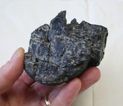
I’m guessing a chunk of coal? Charcoal? Maybe you know. But what attracted me was the wonderfully complex form, with all the intricate planes and cracks.
I brought it home and spray-painted it with flat gray primer. The paint unified the surface, and made it photograph clearly. Below is how the same little rock looks in real sunlight. Now I’ve got a great reference tool for the future, whenever I need to paint a jagged rocky mountainscape.
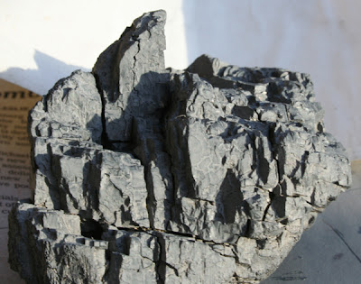 It’s hard to sculpt such forms from clay or foam, and hard to find existing photos that meet your specific lighting needs. Why bother, when you can find great rocks everywhere? I got this idea from Maxfield Parrish, who had a small collection of "bonsai" rocks to help him imagine his mountain backdrops.
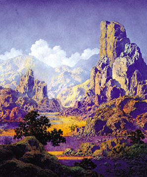
Next time you take a walk in a rocky place, keep an eye out for mountains underfoot.
Tomorrow: How About a Book?
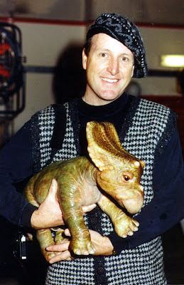
When you are drawing and painting main characters you need really detailed miniatures for reference. It’s worth putting a little extra time to sculpting these “hero maquettes” until they look just the way you want them.
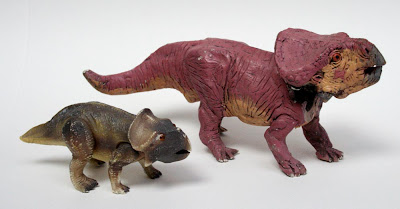
On Dinotopia: A Land Apart from Time, I used the little plastic model from Dino-Riders (left) as a reference model for the Protoceratops Bix. But it really wasn’t adequate for such an important character, and the art suffers as a result. So for Dinotopia: The World Beneath, I sculpted the larger maquette of Bix (above, right). I made this one out of Sculpey and painted it with acrylics. The head is a separate piece and attaches it with a swivel joint so that it can be set to any angle.
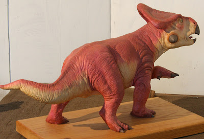 My favorite Bix maquette is this one (above), sculpted by Jim Henson’s Creature Shop. It’s about 36 inches long (about half the size of a real Protoceratops), cast in resin from a clay original.
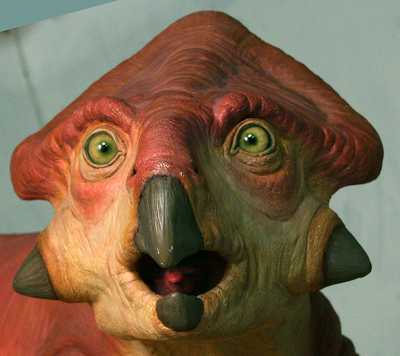 It has wonderfully expressive glass eyes. The Henson sculptors are masters at capturing a creature’s charm and personality.
 The Henson shop also created the hatchling character “26” for the Hallmark miniseries, which was done as a remotely controlled animatronic puppet. It weighed about as much as a watermelon. They handed it to me on the set at Pinewood Studios in London, and all at once it started wiggling its feet, blinking its eyes, and moving its jaws. I almost thought it was alive until I saw two or three guys in the shadows with radio control sets.
Maquettes can be made roughly and quickly, and still provide plenty of useful information.
Here’s an architectural maquette made of foam core board assembled with a glue gun. It only took about two hours to cut out and stick together. The whole thing is about six inches long, with toothpicks for the windmill spars. As a maquette, it's no beauty!
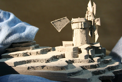 I spray-painted it gray to make it photograph better. White tends to bleach out in the photo. You can see how the bumpy texture of the paint and the ragged inner surface of the foam board really shows up in the “halflight,” or the area where the form is turning into shadow. The textural effect is strongest on the tail fin and on the side plane of the tower.
There’s also an interesting cast shadow to the right of the cluster of buildings, with cool upfacing planes, and little slivers of light on the edges of the buildings and the terraces.
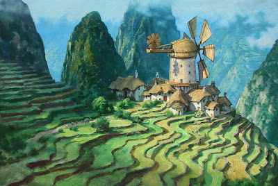 This is the kind of information I needed from the maquette as I developed the final painting, even though the form and design ended up quite different.
Please check back again tomorrow, and I'll explain more about texture in the halflight, because it's the key to painting dinosaurs convincingly in direct sunlight.
This painting from the Dinotopia: Journey to Chandara shows Will Denison flying through the mists of Waterfall City on his giant pterosaur Cirrus. I wanted to give the painting a feeling of lightness and airiness, so I stuck to pale tones in the distance, and a warm palette of color overall. It’s another example of the weird principle of reverse atmospheric perspective brought on by edge lighting in a moisture laden environment.
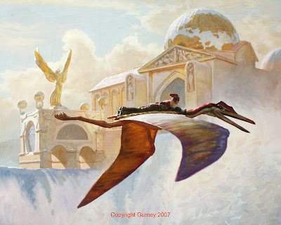
To figure out how the edge lighting would appear on the architecture and the flying figures, I put my maquettes to work in real sunlight. Here’s a little model of Will flying on Cirrus that I've used many times before. The pterosaur model is made from a variety of materials: Sculpey, wood, pipe cleaners, and cardboard. It has poseable wings, which are made from a pair of old stockings that have been painted with latex to give them a membranous surface.
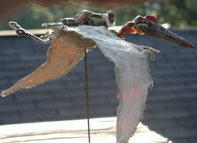
With the model set up in the real sunlight you can see clearly how the top side of the near wing picks up the cool of the sky, while the far wing is warm from the transmitted light shining through it.


.jpg?picon=1009)


I noticed Sticky’s light skin on the Benedict Society cover, too, Travis. And I don’t think that I mentioned it in my reviews. I’m thinking now that I should have. It is ridiculous. I would think that it would ADD to the appeal of the book, to have some diversity in the set of kids.
This is also a pet peeve of mine. I know that many times the illustrators of covers have usually not read the book. I would think the publishers would be motivated to have covers reflect the characters of the books as accurately as possible.
I’m with you Jen. It just doesn’t make sense. It’s also strange how Sticky gets whiter as the series continues.
I’m so glad you guys have caught this one – I totally missed it. It is absurd that this was done – what were they possibly thinking? Who on earth would think this was a good idea?
God, I’m glad you brought this up. I was assured a while ago that the fact that Sticky was white on the first cover was a printing error. I never looked at the subsequent books. Betsy angry!
To me, the Benedict Society situation makes less sense than the whitewashed covers for Liar or Magic Under Glass.
Betsy – Were you assured that this was a printing error by your own reasoning, or by someone associated with the book?
Good news! This was posted to Child_Lit.
From a statement sent out by Bloomsbury:
“Bloomsbury is ceasing to supply copies of the US edition of *Magic Under
Glass*. The jacket design has caused offense and we apologize for our
mistake. Copies of the book with a new jacket design will be available
shortly.”
I have not heard anything from the publisher regarding the Benedict covers, but I think it’s work making a fuss over. It’s ridiculous.
Thanks for sharing this – I’m glad to see it.