new posts in all blogs
Viewing: Blog Posts Tagged with: trial, Most Recent at Top [Help]
Results 26 - 50 of 202
How to use this Page
You are viewing the most recent posts tagged with the words: trial in the JacketFlap blog reader. What is a tag? Think of a tag as a keyword or category label. Tags can both help you find posts on JacketFlap.com as well as provide an easy way for you to "remember" and classify posts for later recall. Try adding a tag yourself by clicking "Add a tag" below a post's header. Scroll down through the list of Recent Posts in the left column and click on a post title that sounds interesting. You can view all posts from a specific blog by clicking the Blog name in the right column, or you can click a 'More Posts from this Blog' link in any individual post.
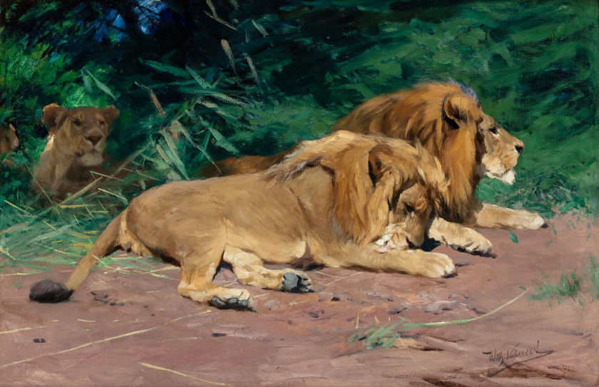 |
| Wilhelm Kuhnert, Lions at Rest, courtesy Heritage Auctions |
One of the works in the upcoming
May 2 Heritage Auction is this oil painting
Ruhende Löwen (Lions at Rest), by Wilhelm Kuhnert (German, 1865-1926).
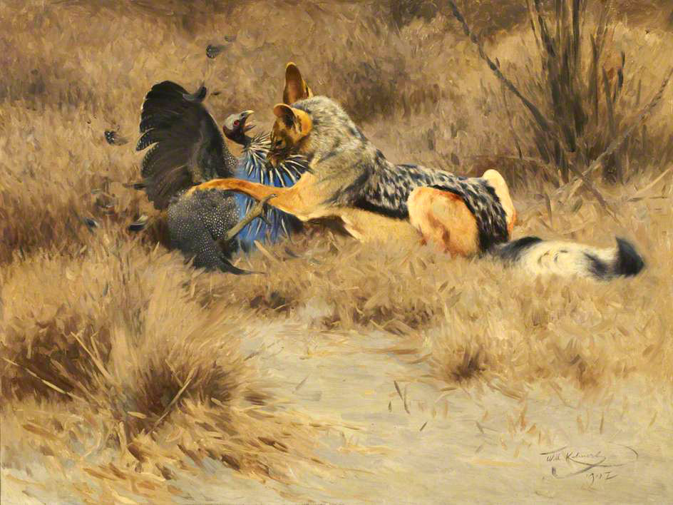 |
| Wilhelm Kuhnert Jungle Life, BBC Images |
Kuhnert was one of the pioneers of early 20th century wildlife art. According to the auction website, "he developed his passion for animal painting during the 1880s in the classroom of Paul Meyerheim at the Royal Academy of Arts in Berlin, who taught the importance of sketching from live models at the zoo."
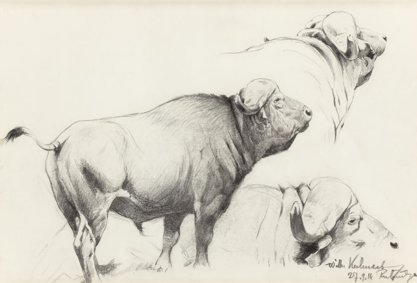 |
| Wilhelm Kuhnert, Cape Buffalo, Heritage Auctions, May 2, 2015 |
In Meyerheim's class, students learned to draw animals "from the inside out—the skeletal structure, lay of muscles, and finally the depth and texture of the skin and fur."
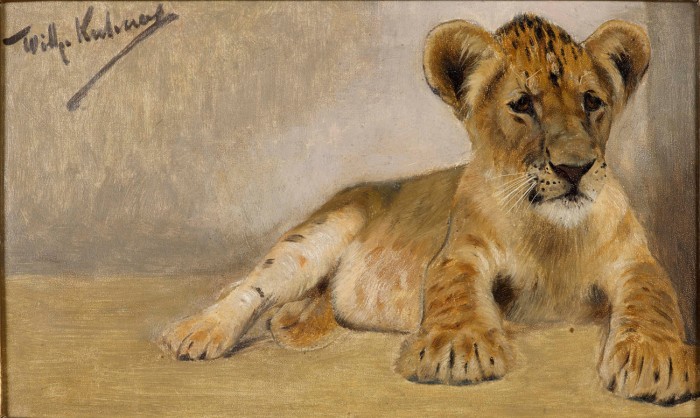 |
| Kuhnert, Lion Cub study, 6 x 9 inches, courtesy Delahunty |
On trips to Egypt, East Africa, and India, Kuhnert took Meyerheim's lesson one step further and began to draw animals in the wild - a feat especially challenging, as he was not a professional hunter or tracker."
 |
Wilhelm Kuhnert, African Crowned Eagle, pencil, 12 x 9 ½ in.
courtesy Delahunty |
"Kuhnert withstood adversity in attempting to observe the animals as thoroughly as possible, maintaining his concentration through torrential rainstorms, wildfires, severe drought, and heat, not to mention the courage it took to confront a savage, hungry beast."
-----

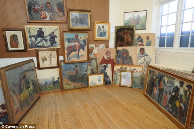
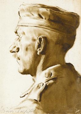
His stepmother had died 20 years earlier, and he completely forgot that he had stored away more than 100 artworks by his stepfather, a German artist named Erich Wolfsfeld.
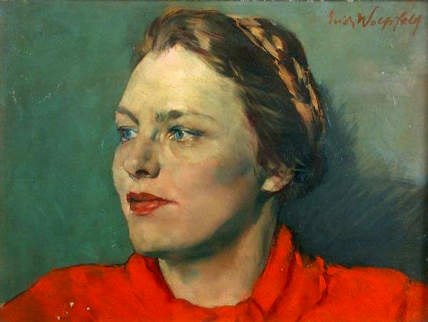
Wolfsfeld was born in Western Prussia in 1884. He studied at the Berlin Academy of Arts with Konrad Böse and continued with Jules Lefèbvre at the Académie Julien in Paris. He worked in Rome with other expatriate German artists Otto Greiner and Max Klinger.
During World War I, he spent two years in the army, and he took the opportunity to draw portraits of soldiers.
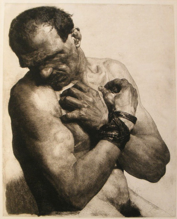
He won acclaim for his etchings of nudes, bound prisoners, and beggars. He taught at the Berlin Academy in the 1920s, but he was fired in 1936 by the Nazis because of his Jewish religion.
He was deeply inspired by a series of travels to Egypt, Palestine and North Africa. When he relocated to England, he often posed his models in exotic costumes to reconstruct scenes he had sketched in his travels. His customary painting garb was a long white Arab robe.
Wolfsfeld died in 1956. The works found in the attic were auctioned off in 2009. Some of his paintings have been exhibited at London's National Portrait Gallery, the British Museum, the Imperial War Museum, and the Victoria and Albert Museum.

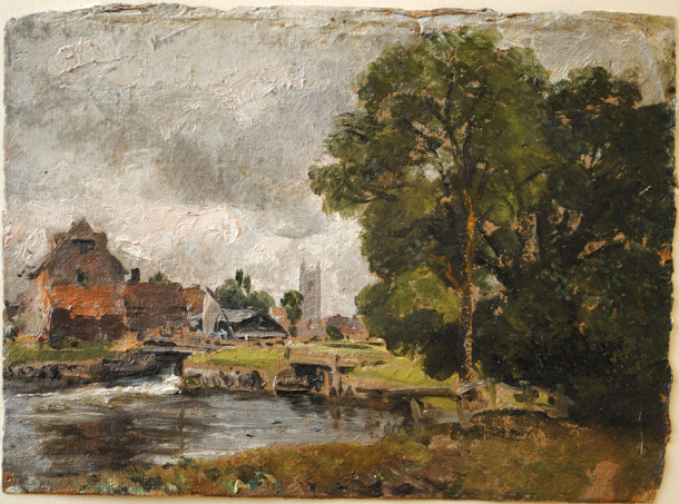
John Constable (1776-1837) was one of the pioneers of plein-air oil painting in England. He became convinced around 1802 that he should paint in oil outdoors, believing that Claude Lorrain had done so, even though Claude actually used only water-based media or drawing tools in his outdoor work.
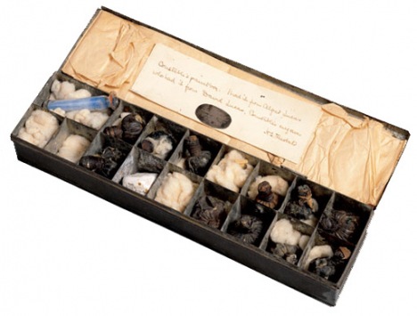
Paint BoxesHere is one of Constable's surviving oil sketch boxes. The glass vials were a way to carry medium and pigment, as tubed paint didn't come along until 1841. Another way to carry mixed paint was the urine bladders from pigs or other animals, something you could pick up from a butcher.
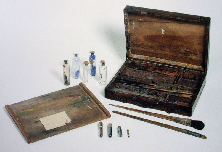 |
| One of Constable's wooden sketching boxes, 9.25 x 12 inches. |
According to an
exhibition catalog of his oil sketches, this paint box "shows the removable panel that fits into the lid, creating a separate compartment, that Constable used for carrying small pieces of paper, canvas and board. Wet sketches were piled in here on the homeward journey. The panel could also be used as an impromptu palette or as a flat surface for standing bottles of oil, turpentine, and other materials during painting."
I don't know if I would agree with the authors that wet sketches were "piled in" to such a box. My guess is that Constable would have used a box like this open in his lap with the lid away from him as he sat on a tripod stool. The sketch would be pinned into the open lid, and kept pinned there until it was dry enough to handle. This was how Americans, such as Thomas Cole, Albert Bierstadt, and William Trost Richards did it.
Here's another paint box, divided into "seventeen compartments and contains a cork-stopped glass phial with blue pigment, a lump of white gypsum probably used for a variety of purposes including drawing and roughening paper, and various bladders with the artist’s own or commercial ready-mixed paint." Try getting this one through the TSA.
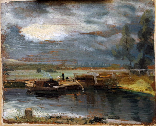 |
| Constable plein-air study showing red-brown colored ground |
SurfacesConstable's studies were usually painted on heavy paper or millboard. Millboard was made from a mixture of cotton, flax, wood, and other fibrous material. The priming was a "viscous medium-rich oil ground containing a small amount of red and black pigment."
(Source)The priming, prepared in batches in advance of his painting sessions, saturated and sealed the sheets. I couldn't tell from my research whether he sized his surfaces before applying the oil ground. Later painters typically sized (or sealed) the paper or board with shellac or rabbit skin glue. By the 1820s, Constable was using commercially-prepared millboard or "Academy board," which was specially made for artists.
(With modern materials, I would use
acrylic matte medium
to size the paper or board before applying an
oil ground
. You can use the matte medium over brown- or gray-toned paper to keep that natural paper color, or make up your own toned oil-based ground over the sizing. Allow time for it to dry thoroughly.)
Color PaletteOne of his surviving plein-air palettes was analyzed for paint ingredients, including vermilion, emerald green, chrome yellow, cobalt blue, lead white and madder, ground in a variety of mediums such as linseed oil mixed with pine resin.
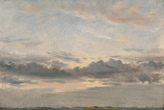 |
| Constable sunset study, probably painted all in one session (or alla prima) |
Working MethodAt times it can be hard to tell whether a given sketch was done entirely on location or whether he touched them up after returning to the studio. Chemical sleuths have found that some sketches contain slow-drying mediums, such as poppy oil, which would have allowed him to rework his surfaces over extended periods of time, but that doesn't prove anything. To my eye, based on the efficiency and urgency of the paint handling, the ones shown in this post look to be done entirely on location.
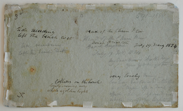
Written NotesConstable often jotted notes on the back of his paper or boards. For example: "Very lovely evening—looking Eastward—cliffs (and) light off a dark grey sky –effect-background-very white and golden light."
Sources and further readingBooks:
Constable's Oil Sketches 1809-29
, edited by Hermine Chivian-Cobb, Salander-O'Reilly Galleries, New York, 2007
The Painted Sketch: American Impressions From Nature, 1830-1880
. Well researched exhibition catalog which focuses on American plein-air practices.
Websites:
Constable Sketches Up Close and Personal (Victoria and Albert Museum, London)
Constable's Techniques (Tate Museum, London)
Lines and Colors Blog "
Constable's Oil Sketches"
Constable paintings at the
Yale Center for British Art 
A couple weeks ago, the Grand Palais in Paris opened one of the largest exhibitions of Diego Velázquez in recent years. The exhibition contains 119 works borrowed from public and private collections around the globe.
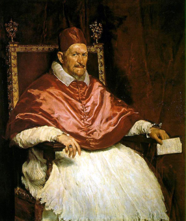 |
| Diego Velázquez, Pope Innocent X, 1650 |
Velázquez held a unique position of reverence among many academic painters, especially Carolus-Duran, who encouraged his students to travel to Spain to see the originals and to make copies from them.
The reverence for the Spanish master was so great that a "cult of Velázquez" emerged in 19th century Paris, where some artists mystically appealed to his ghost to guide their hand.
The key to Velázquez, Carolus-Duran said, was strict simplicity of tone and careful attention to half tones, those planes that move the form from light into shadow.
A book from the period called "The Art of Velázquez" by R.A.M. Stevenson, student of Carolus-Duran, can be downloaded for free at
Archive.org.
----
----

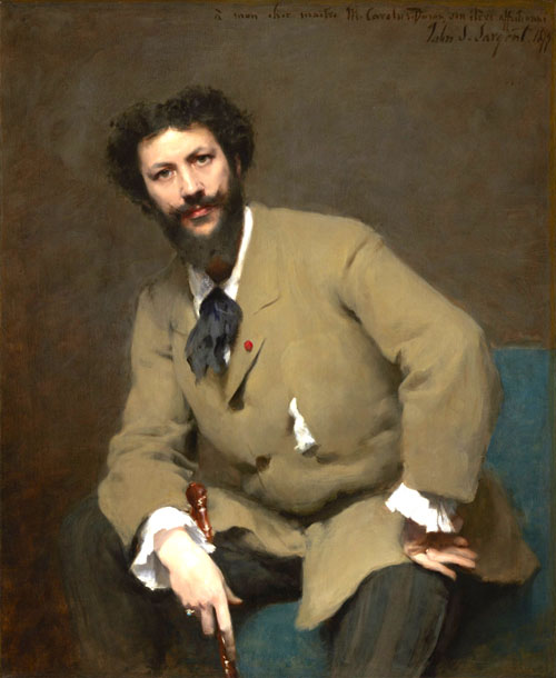
In 1879, at the dawn of his career, John Singer Sargent painted his teacher Carolus-Duran. Soon after, Carolus-Duran sat for a photograph.
Since the two images share a similar pose and lighting, it's possible to compare them for some insights into the subtle choices that Sargent must have been making.

1. Values of the skin tones are simplified and organized.
2. The principle highlights are reserved for the forehead and the nose.
3. The values of the hair are greatly simplified.
4. The mustache is twirled into up-facing points.
5. The face is slightly slimmer.
6. The eyebrows and eyes are drawn with more definite angles.
7. Throughout, there's a visual theme of the heart- or chevron-shape.
People who watched Sargent paint a portrait marveled at the process: "The lightness and certainty of his touch was marvelous to behold. Never was there any painter who could indicate a mouth with more subtlety, with more mobility, or with keener differentiation. As he painted it, the mouth bloomed out of the face, an integral part of it, not, as in the great majority of portraits, painted on it, a separate thing. He showed how much could be expressed in painting the form of the brow, the cheekbones, and the moving muscles around the eyes and mouth, where the character betrayed itself most readily; and under his hands, a head would be an amazing likeness long before he had so much as indicated the features themselves. In fact, it seemed to me the mouth and nose just happened with the modeling of the cheeks, and one eye, living luminous, had been placed in the socket so carefully prepared for it."
The painting won an Honorable Mention at the Salon, and an observer noted, "There was always a little crowd around it and I overheard constantly remarks in favour of its excellence."*
Adapted from "
John Sargent
" by Evan Charteris (New York: Scribner's Sons, 1927).
* from
John Singer Sargent, Complete Paintings, Volume 1: The Early Portraits (Vol 1)
Previously: A similar comparison with his portrait of
Coventry Patmore

Count Robert de Montesquiou (1855-1921) was a French aesthete, poet, and art collector.
He was spiffy dresser. At a concert of music by von Weber, he showed up with a mauve suit and a cluster of pale violets held at his neck in place of a necktie, saying, "One should always listen to von Weber in mauve.”
 |
| Giovanni Boldini, Portrait of Robert de Montesquiou |
He was at the center of a group of artists and actors that included Sarah Bernhardt, Gustave Moreau, Gabriel Fauré and James McNeill Whistler.
_-_Robert_de_Montesquiou_(1891).jpg) |
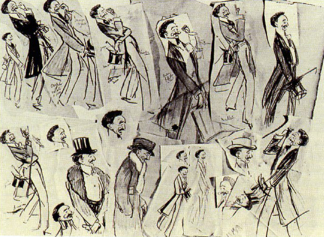
| Montesquiou as caricatured by Sem aka Georges Goursat |
If you wanted to be successful in the art world of Paris in the 1890s, you had to know him. If he didn't like you or your art, he could destroy your reputation.
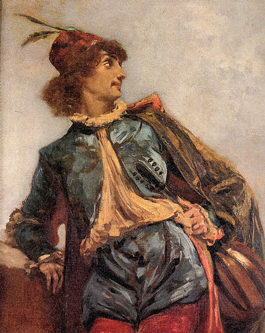 |
| Carolus-Duran, Portrait of de Montesquiou as a traveler |
According to Cornelia Otis Skinner on
Dandyism.net, he "had a constantly shifting set of mannerisms. At the beginning of any conversation, he’d remove one glove and start a series of gesticulations, now raising his hands towards the sky, now lowering them to touch the tip of one perfectly shod toe, now waving them as though conducting an orchestra. His conversation was hardly conversation at all but long monologues filled with exotic anecdotes, mysterious allusions and obscure classical quotations, all told with a rich vocabulary 'at the end of which,' according to Léon Daudet, 'the count would burst into the shrill laughter of an hysterical woman, then suddenly, as though seized with remorse, he’d clap his hand over his mouth and bark until his inexplicable glee was controlled… as though he were coming out of laughing gas.'"
-----

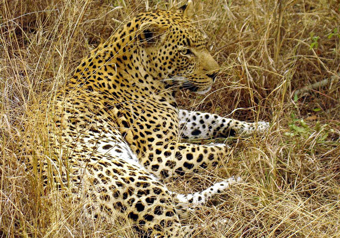 |
| Male leopard in South Africa, Wikipedia photo by Lukas Kaffer |
Disruptive coloration is a type of camouflage that makes an animal disappear against its surroundings. It appears in nature on both predators and prey to interfere with their perception of each other.

It can not only disguise a subject against its background, but also against others of its own kind, making the boundaries of the form hard to see. The effect would be especially powerful when these zebras are running off in all directions.
 |
| Abbott Thayer with Richard Meryman, Peacock in the Woods, 1907. |
Early in the twentieth century, a group of artists and scientists developed an interest in this topic, including Abbott Thayer, a student of Jean-Léon Gérôme. His book called
Concealing Coloration in the Animal Kingdom contributed to the use of camouflage in World War I.
Doing a painting like this goes against our artistic instincts to separate forms from the background, yet the effect presents a powerful appeal to the viewer.
Other painters took up the idea around the same time, including John Singer Sargent. In his painting "The Hermit," he posed an old man in the foothills of the Alps and lit him with sun-dappled light, which nearly loses him in the the background.
In the left center of the picture are two well-hidden gazelles. The animals were based on a stuffed gazelle that Sargent brought with him as a prop on his alpine travels.
------

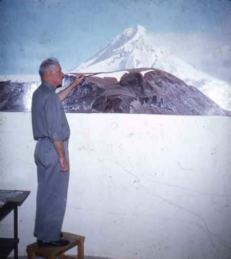
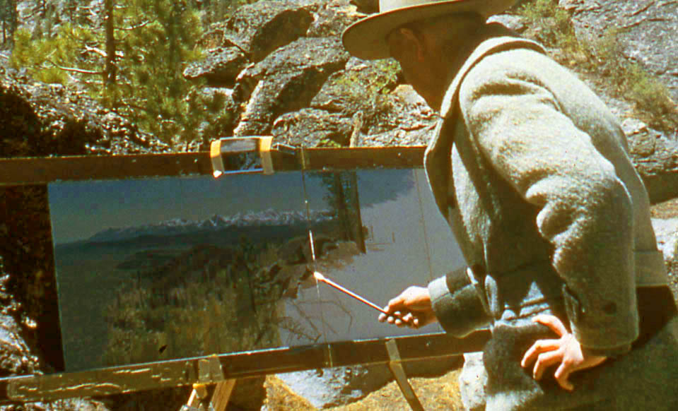
This small oil study by James Perry Wilson was left unfinished, allowing us to see how he did it. After a careful line drawing, he painted from background to foreground, completing each area before moving on to the next.
This photo shows J. P. Wilson at work on an outdoor study, with two panels side by side in a special frame so that he could paint a panorama. This one also seems to be completed area by area.
The method is sometimes called "window-shading," because it resembles unrolling the final canvas like pulling down a window shade. It was a common practice for painting museum dioramas, for which Wilson is best known.
 |
Francis Lee Jaques painting the Peabody Museum's Alaskan Brown Bear diorama,
Courtesy Peabody Museum of Natural History and Michael Anderson |
According to
Michael Anderson of Yale's Peabody Museum, Wilson would have seen the practice used by his colleagues, such as
Francis Lee Jaques: "From the horizon, Jaques would typically paint down and from left to right, though not always. Sometimes he would skip around painting an area to completion and then going to another area, painting it to completion and so on. Jaques typically painted the birds first and painted the background around them later."
Both artists would have done a tight color comprehensive of the overall scene first, and used that as a guide.
Frederic Church painted this study of the view from his home Olana in winter. I would bet that he painted it area-by-area from background to foreground.
Window-shading is a fast way to work, and it can yield almost photographic results. It's a good way to paint fast under challenging conditions, such as winter landscapes or sunsets.
Ilya Repin used a similar method in this study from costumed models. Over a preliminary line drawing, he applied the paint to achieve a finished effect area by area, like a coloring book or paint-by-number. There's no block-in.
There are several advantages to this method. In oil, especially with an oil-primed board, you can make use of the white of the board for small highlights that show through thin textures of paint.
------

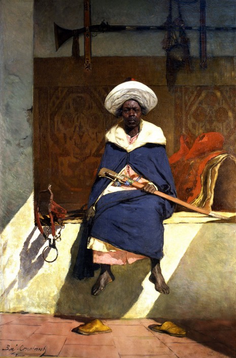 |
| Benjamin-Constant |
The Montreal Art Museum has opened an exhibition of Orientalist painters, focusing on
Jean-Joseph Benjamin-Constant (1845-1902). A journey to Morocco when he was a young man inspired him to paint exotic scenes of harems and desert soldiers.
The show includes works by other Orientalists, including José Villegas Cordero (above), Henri Regnault, Mariano Fortuny, Georges Clairin, Jean-Paul Laurens, and....
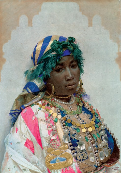
.... a watercolor portrait by
José Tapiró y Baró, who was featured on GurneyJourney last year.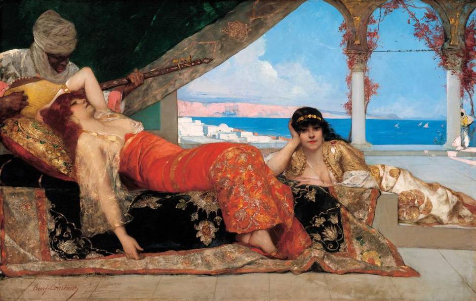 |
Benjamin Constant, The Favorite of the Emir, (Washington, National Gallery of Art)
|
The sexual and cultural politics give the contemporary art historians plenty to write about. The show is arranged thematically, with such topics as: "Colonial Diplomacy in Morocco" and "The Harem, Fantasies and Lies."
Leaving all that aside, for artists attending the exhibition, the works have a lot to offer in purely painterly terms. Benjamin Constant's paintings were mostly large-scale works, often seen from a low eye level, with bold colors and patterns.
A
1902 article in Brush and Pencil about Benjamin Constant gives an example of how art historians a century ago were more attuned to subtleties of the picture-maker's art:
"His skill was devoid of trickery, which may not be truthfully said of the skill of such men as Fortuny and Madrazo of the Spanish school, Boldini of the Italian, or Makart of the Austrian. His methods were always 'legitimate,' but there were few subtleties of brush work which were not revealed to him. While he received most of his art instruction in the Atelier Cabanel at the Ecole des Beaux Arts, he was the pupil of Rembrandt more than of any other master. His painting of flesh had often the 'fatness' and firmness noticeable in most of the work of the great van Ryn. The peculiar technique obtained by dragging one tone of a color over another, or one color over another, is identical in many instances in the painting of both. The modern artist, however, seemed to strive to obtain brilliancy of effect through variety of color and through the contrast of varied textures more often than his seventeenth-century master. In this he was signally successful."
Links
Museum website
Marvels and Mirages of Orientalism: From Spain to Morocco, Benjamin-Constant in His Time January 31 to May 31, 2015
The Globe and Mail describes the show as a "spectacular must-see."

Catalog:
Benjamin-Constant: Marvels and Mirages of Orientalism

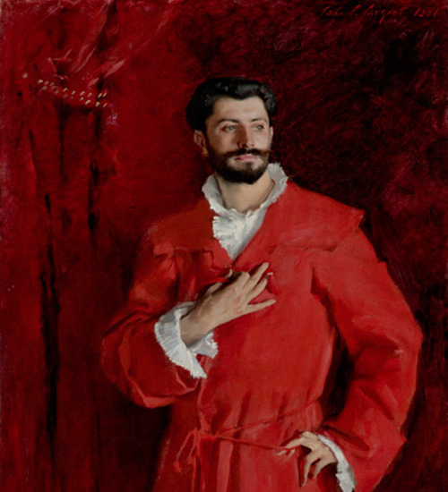 |
| Sargent, Dr. Pozzi at Home (detail), 1881. Hammer Museum, Los Angeles |
A new exhibition of John Singer Sargent's paintings of friends and fellow artists just opened at the
National Portrait Gallery in London, where it will continue through May 25.
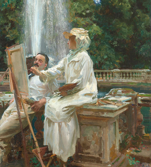 |
Sargent, The Fountain, Villa Torlonia, Frascati, Italy, 1907,
Art Institute of Chicago |
Curated by Sargent expert Richard Ormond, the show includes Carnation, Lily, Lily, Rose and many other landmark paintings.
"John Singer Sargent (1856-1925) was the greatest portrait painter of his generation. Acclaimed on both sides of the Atlantic, he was closely connected to many of the other leading artists, writers, actors and musicians of the time. His portraits of these friends and contemporaries, including Auguste Rodin, Claude Monet and Robert Louis Stevenson, were rarely commissioned and allowed him to create more intimate and experimental works than was possible in his formal portraiture.
"This major exhibition of over seventy portraits spans Sargent’s time in London, Paris, Boston and New York as well as his travels in the Italian and English countryside. Important loans from galleries and private collections in Europe and America make this an unmissable opportunity to discover the artist’s most daring, personal and distinctive portraits."
Good news, Statesiders! It will expand to 90 works when it continues at the
Metropolitan Museum in New York, June 30-October 4. And yes, there's a catalog:
Sargent: Portraits of Artists and Friends

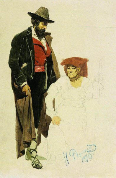
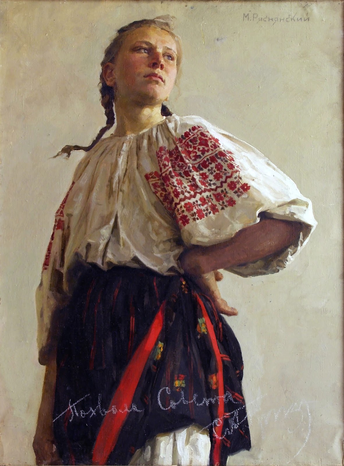
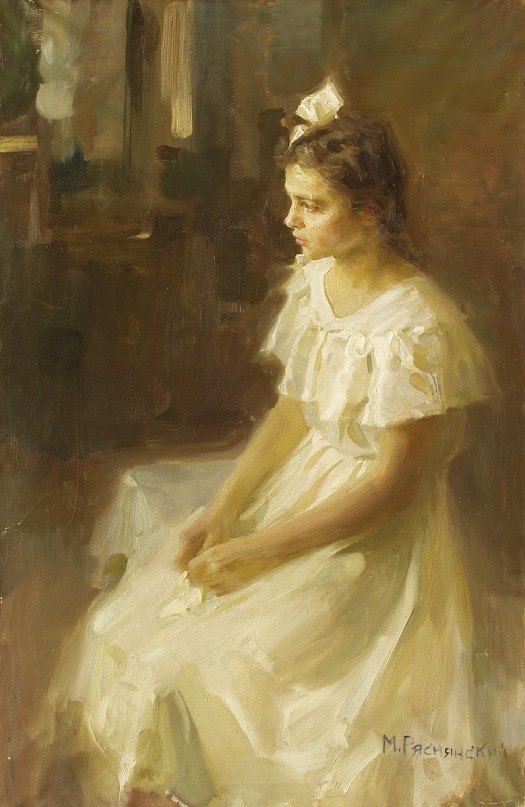
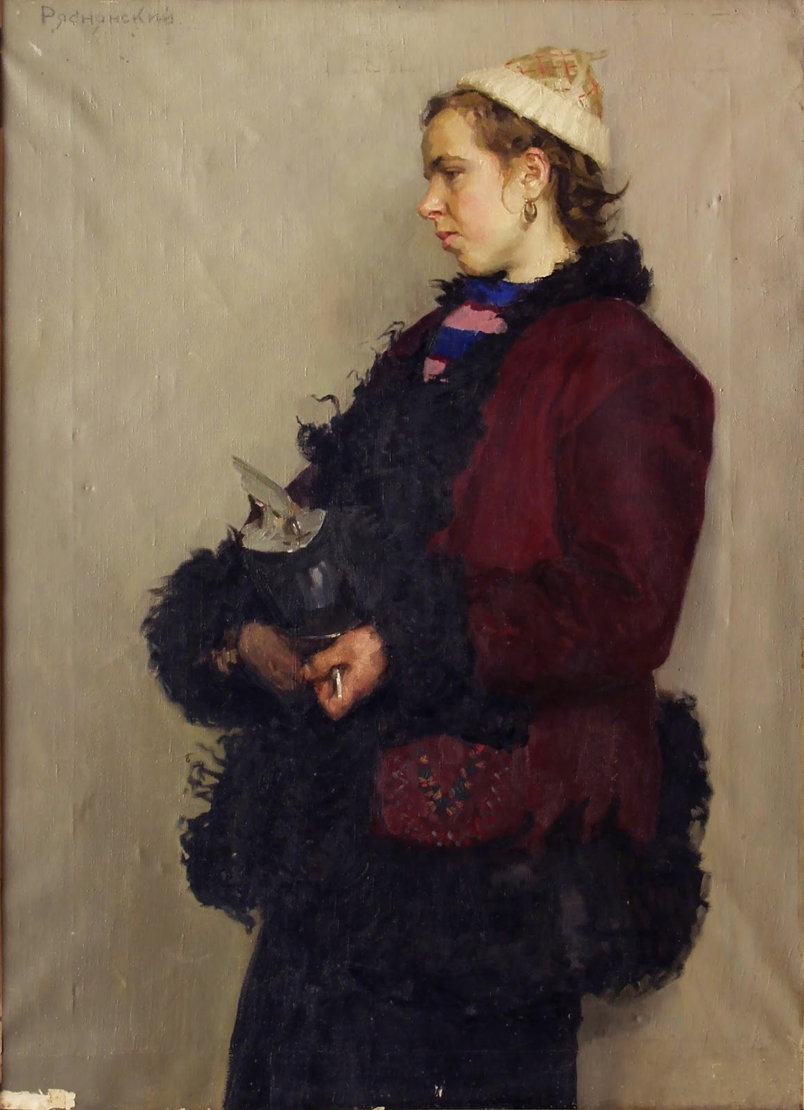
Mikhail Ryasnyansky (1926-2003) was a painter from Ukraine. He fought in World War II but was discharged in connection with serious injuries and a concussion.
Ryasnyansky's first name is written either Mihail, Mikhail or Michael.
His portraits have simple backgrounds and a controlled focus on the face and hands, with other areas handled more softly and broadly.
His drawings are soulful, with a keen sense of tonal values.
He was an avid outdoor painter, and his on-the-spot landscapes are painted with bold colors and thick paint.

The painting "Une première" was one of Anders Zorn's first experiments portraying nude models in the open air. He was fascinated by the waves, the water reflections, the shifting weight, and the colors of the flesh as the woman and child wade into the shallow water.
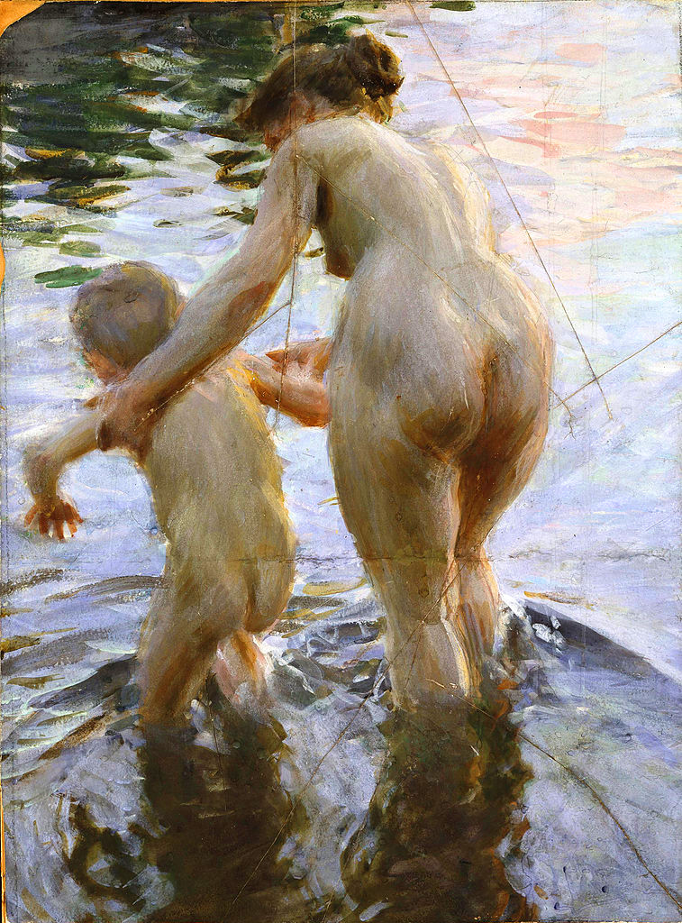 |
Anders Zorn, Une première, gouache, 1888, 76x56 cm,
(29.92 in x 22.05 in), at the Nationalmuseum, Blasieholmen, Stockholm. |
Zorn said, "My model was in Stockholm staying at a shoemaker's family with many children when I came along and asked to borrow a boy. The shoemaker had nothing against being rid of one for a while. The boy that suited me was sickly and close to death anyway. But what an effect fresh air had on a naked body. A couple of weeks later, I returned the boy and he was so healthy and rosy-checked that his parents hardly recognized him."
The original version of this gouache painting won a medal, but Zorn decided to rework it. He became so dissatisfied with the outcome that he angrily folded it and hacked it to pieces. A fellow artist, Christian Eriksson, gathered the fragments and put them back together. It is now considered a masterwork of figure painting.
-----
Books:

Early and late work by artists who went through a Modernist style shift.
Klimt
 |
| Gustav Klimt, Sitzendes junges Mädchen 1894 |
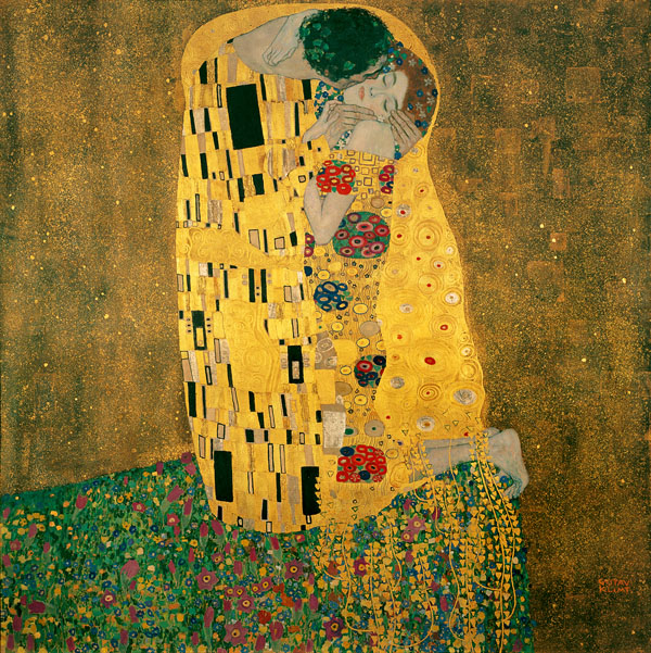 |
| Gustav Klimt, The Kiss, 1908-1909 |
-----
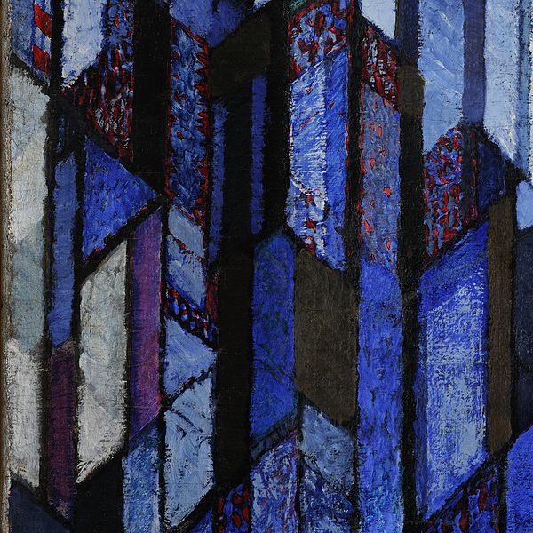
Mondrian
 |
| Piet Mondrian, Fen Near Saasveld 1907 |
 |
Piet Mondrian, Composition II in Red, Blue, and Yellow, 1930
-----
Kupka |
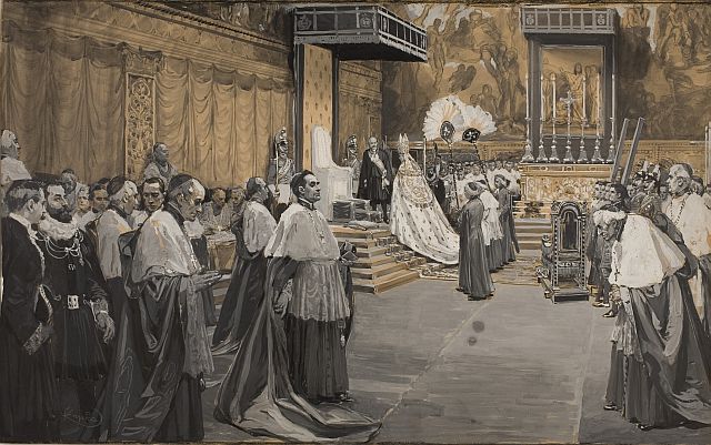 |
| František Kupka, Papal Ceremony, 1904. |
 |
| František Kupka, Katedrála, 1912-1913 |

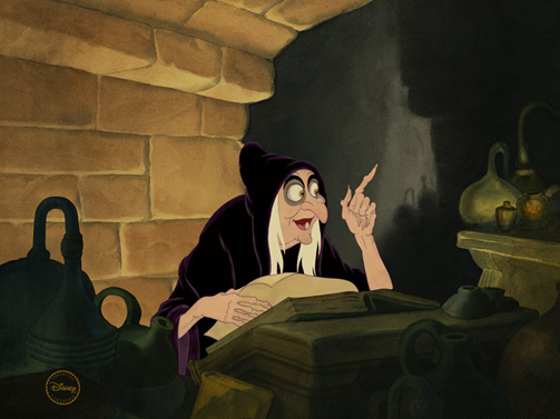
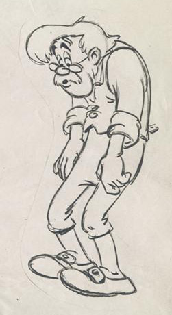
The "
line of action" is a simple, usually curving, line that travels through all the forms of a pose. A Disney animator, possibly Bill Tytla or Art Babbitt, used an S-shaped line passing through the pose of this character model drawing of Geppetto from Disney's
Pinocchio.
Other artists have applied the principle, including the cartoonist
T. S. Sullivant (1854-1926), who was a big influence on the Disney animators.
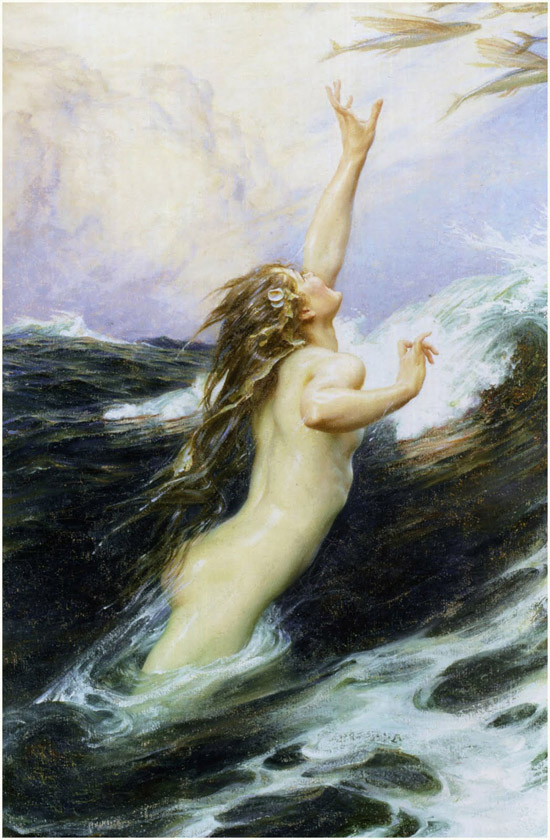
Here's another example from a Victorian painter,
Herbert Draper (1863-1920), in his canvas "Flying Fish."
Feel free to leave links of other examples in the comments.
-----
More in the books:

Merry Christmas and Happy Holidays, everyone. Art by Ivan Shishkin (1832-1898) "In the Wild North," 1891, oil on canvas, 161 cm (63.4 in) x118 cm (46.5 in).

This small study of armor by Adolph Menzel sold at auction last month for two million Euros. The pre-sale estimate was estimated between €100,000 and €150,000.
Menzel did several studies of armor in the 1860s, and they all have a lifelike quality, as if they're animated and looking at you.
Link to articleThanks, Christian

Let's take a look at the watercolor "Escutcheon of Charles V of Spain" by John Singer Sargent (1856–1925) compared to a photo of the actual thing. Here are a few of my takeaways:

|
The heraldic insignia or escutcheon of Charles V of Spain,
part of a sixteenth century fountain at the Alhambra in Granada.
1. Take your time on the drawing. Comparing the painting a photo of the actual subject Sargent was looking at, it's clear he was very careful and patient with his preliminary drawing. Since the shallow raking light must have lasted a very short time, he might have done the drawing on one day, and painted it on another day, or drawn it in the morning, waiting for the light to be perfect to paint it.
 2. Flatten the lights, open the shadows 2. Flatten the lights, open the shadowsFor a feeling of brilliance, unify the areas directly lit by sunlight. Limit the range of modeling and tonal value to keep the light areas very light. Instead, put the variation and chroma in the shadows.
3. Keep cast shadow edge dark, cool, and sharp. Note the darkness and coolness of the area of cast shadow right as it turns to light, especially in the upper left of the picture. The step from that cast shadow to the adjacent light should be striking enough to be very noticeable. As long as this value relationship is held at the cast shadow edge, the inner areas of shadow can be considerably lightened.
4. Push the warm and cool variations. Down-facing planes, or planes receiving reflected light from illuminated stonework are warm. Up-facing or open front-facing planes are cool, suggesting that they're receiving mostly blue skylight. The soft blending between warm and cool requires having pools of each color on the palette and work wet into wet. Watercolor is very fast and ideally suited to such rendering.
5. Put the detail only where you want it. Use the biggest brushes possible but vary the touch. The outer areas are stated very broadly with a big brush. Much smaller touches are used for the details of the coat of arms, and might have been done with a smaller brush.
I'd love to hear what you take away from looking at the picture. ------- The painting is called "Escutcheon of Charles V of Spain" by John Singer Sargent (1856–1925)Date: 1912, Medium: Watercolor and graphite on white wove paper. Dimensions: 12 x 18 in. (30.5 x 45.7 cm) in the collection of the Metropolitan Museum. |

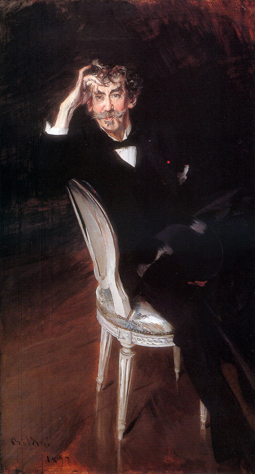
Portrait painters have often observed that the more faithful the likeness, the more the subject will hate it.
Sir John Lavery, who knew
James Abbott McNeill Whistler well said that
Giovanni Boldini's portrait of him was a speaking likeness.
But Whistler didn't think so. He said: "Well, they tell me it is very like me, but, thank God, I am not like it."
Lavery painted a word portrait of Whistler:
"When he got in front of the [mirror] to brush his hair he behaved exactly like a woman settling her permanent wave, placing individual locks, moistened to keep their form, in their allotted places so that they did not interfere with the gray wisp of which he was so proud that stood out of the damp shiny curls on his forehead. His eyebrows were thick and black, his eyes sharp as needles, while a sensitive nose and mouth with prominent chin made up his features."
 "He had beautiful hands, though somewhat claw-like, especially when he would clutch one by the arm to drive home a point. A low, turn-down collar with a narrow black-ribbon bow adorned his wrinkled neck, and his general appearance was that of a small alert ringmaster, whip in hand. I can never remember seeing him, even in the country, in anything other than what are known as court slippers, causing him to be very careful where he stepped out of doors."
From
The Life of a Painter by John Lavery The painting is in the Brooklyn Museum
, but is not currently on view. Artist:
Giovanni Boldini, Italian, 1842-1931 Oil on canvas, 1897, 67 1/4 x 37 1/4 in.

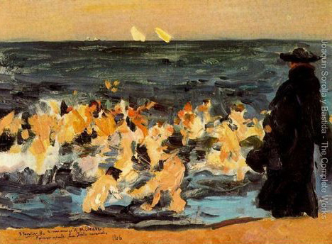
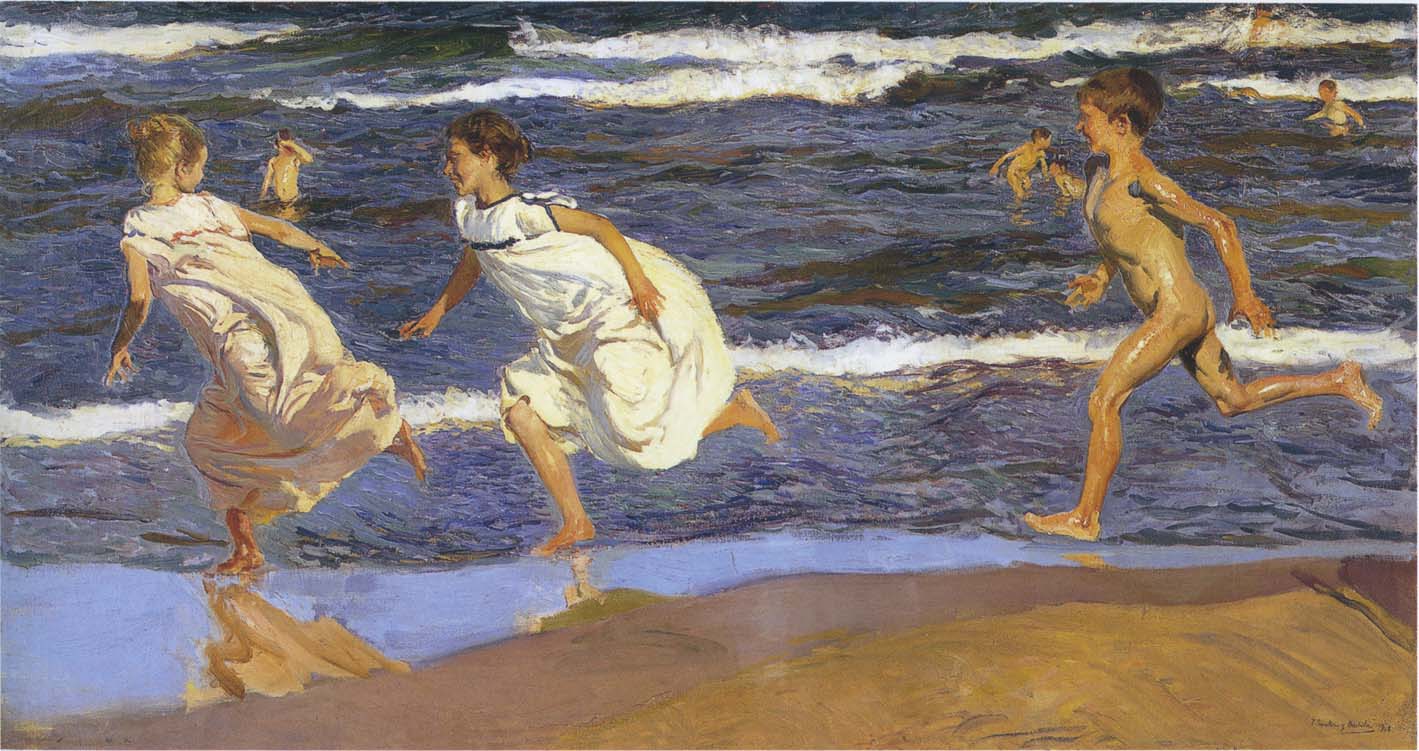
Blog reader Haden asks: "Everyone is familiar with the rule - the darkest light in the light has to be lighter than the lightest dark in the shadow. Keep the light and dark tonal ranges separate to show realistic form. But I've seen a lot of paintings when an object with a dark local value is pretty dark even though it's in the light."
Haden continues: "Take for instance the Sorolla (painting above). The coat and the kids flesh are very different local values. According to that rule, the coat in the light should be lighter than the shadows on the kids (reflected light would be lightening their shadow sides a touch). But still the coat in the light is almost black, shouldn't it be a mid-grey?"
"If the answer is paint it as you see it, then it's not really a rule, is it? Isn't it more just a general guideline for scenes with objects similar in local value? "
Reply: Haden, you are very observant to notice that the Sorolla painting breaks the rule. I believe you are right. If this scene were actually staged outdoors in front of the sea with real people, the monk's cloak would be much lighter in the sunlight and the sea would be lighter and bluer.
I found an alternate scan of the image which I would suppose is closer to the original, but even in this scan, the values of the cloak and the sea are still very dark.
The best answer I can give is that rules are made to be broken. The rule should be understood first, and then ignored whenever the story demands. Here, because the form of the monk is not as important as those of the children, a simple dark shape suffices.
This is what Andrew Wyeth and other artists describe as "going beyond the facts." The painting "Sad Inheritance" is about the frailty of the human condition, the triumph of the spirit, and the gift of compassion. These are all fairly sober themes, calling for a sober palette of color and value.
Sorolla tells a very different story in this painting of children running along the beach. It communicates pure exuberance and energy. Like the other painting, the figures are front-lit, with the sea behind them. But (assuming these scans are accurate) here the blue colors are stronger, and the foam is purer white, creating a more carefree mood.
 |
| Sorolla's first sketch for "Sad Inheritance" |
This is why it's so important to allow a composition to grow in the imagination or the memory before facing facts, regardless of whether those facts come from observation or photography.
----

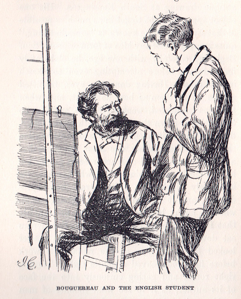
Students at the French academies didn't get a whole lot of instruction from the teachers. Most of the masters came into the drawing and painting classes once a week at most, and sometimes their feedback was brief and enigmatic.
John Lavery (1856-1941), A Scottish art student who spent three winters under William Bouguereau's supervision at the Academy Julien, recalled that he received just one sentence from the master.
After looking at his drawings from the nude and asking him a number of questions, Bouguereau kindly said: "
Mon ami, ça c'est comme bois; cherchez le caractère et les valeurs" ("My friend, it is like wood; look for the character and values.")
Lavery admitted that he had a tough time learning French, so he probably missed out on a lot of the art talk in Paris. But looking back on his training, he said, "The rest of my training came and continued to come from what I saw rather than from what I heard."
-----

How do you convey the bustling motion of a city street in a painting?
Jules Bastien-Lepage attempted the effect in the background of "The London Bootblack" from 1882. Bastien carefully observed the action on the street and sketched his impression. He told the Irish painter John Lavery,
"Always carry a sketchbook. Select a person—watch him—then put down as much as you remember. Never look twice. At first you will remember very little, but continue and you will soon get complete action."
In his book "
The Realist Tradition," Gabriel Weisberg notes that:
"Bastien-Lepage seems to have been anxious in the bootblack picture to convey a sense of the movement and flashing color of the setting. Areas of white priming on the canvas were left exposed and others were scraped down 'according to a new method.'....'His idea was to lay on the colour rather more than an eight of an inch thick, and when it was quite dry he would shave off the surface, and thereby obtain beneath a delightful quality of surface."
For the figure, Bastien-Lepage found a suitable—but fidgety and reluctant—model on the streets of London, and prevailed on him to pose. He painted the figure with a
premier coup method that observers likened more to Whistler or Sargent:
"I was much surprised to see how very near Bastien-Lepage stood to his model, who was not even raised on a platform. The boy was only six feet from the canvas. Bastien-Lepage walked backwards and forwards a great deal, using very long brushes, which he held at the extreme end."
Another painter who tried to capture the impression of a busy street scene was Giovanni Boldini in his large painting "A Night on Montmartre." More about Boldini and this painting at my previous post "
Boldini at the Clark Institute."
-----
From the book:
The Realist Tradition: French Painting and Drawing 1830-1900
by Gabriel Weisberg
Book:
Jules Bastien-Lepage, 1848-1884

A 19th century painting manual describes a technique called "dry touching" where lighter tones of oils are scumbled over a middle tone base, with a result something like pastels.
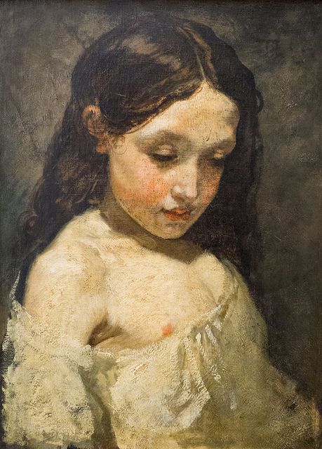 |
| Thomas Couture (1815-1879) "Bust of a Young Girl," Oil on canvas, 46 x 34 cm. |
The manual says: "Dry-touching or Dragging,—is nothing more than going over certain parts of the picture, when it is dry, with light delicate finishing touches, in order to improve the character, and to relieve or give surface texture to objects requiring it. The tints used for this purpose may, as occasion dictates, be either lighter or darker than the parts to which they are applied; it must be dexterously done with a light free hand; in some places holding the brush loosely between the finger and thumb, so as to leave the colour contained in it, only partially adhering to the former more projecting touches."
 |
| Thomas Couture, (1815-1879) "Study of girl's head, oil on canvas |
In this Couture sketch, the dry paint is used for modeling all the light tones, not just the finishing touches.
For contemporary painters, the white paint coming from the tube may not be stiff or dry enough for this technique. If you squeeze out the paint on blotter paper (or newspaper or paper towels) the night before the painting session, the oil will be sucked out of the paint, making it drag nicely.
--J.S. Templeton,
Guide to Oil Painting, 1845
Images from Flickr and
Pinterest


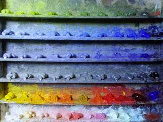
Frank Mason (1921-2009) was a painter and teacher at the
Art Students League who used a shelf-like palette arrangement for his oil paints called "The Prismatic Palette." One of Mason's students,
Keith Gunderson, explained it to me this way:
 |
| Prismatic Palette by Leslie Watkins |
"The value scale was the essence of the shelf arrangements, with emphasis on “Orange Value” as the unifying tone of the lights. The shelves were arrayed with a string of greens made from “Parent Green”; premixed value strings of Blue, Violet, and Grey to calibrate atmospheric perspective; a shelf for pre-mixed tints for the sky; and a “Control String” of pure colors squeezed from the tube, arranged by value from light to dark."
"Modulating a color with it’s complement was often substituted by mixing grey or brown into that color... perhaps an influence of Frank’s teacher [Frank Vincent]
Dumond (1865-1951) and Dumond’s teacher, [Jules Joseph]
Lefebvre (1836–1911)."
I have also heard "parent green" referred to as "vegetable green," the color of transmitted light through backlit young leaves.
 |
| Landscape by Frank Vincent Dumond |
Here are a couple of paintings by League instructor and link to the French tradition, Frank Vincent Dumond, showing his very sensitive approach to color.
 |
| Dumond, Christ and the Fishermen, 1891 |
Leslie Watkins, another Mason student, describes the prismatic palette this way:
"It clarifies several strings of colors into even steps, with the lightest or highest values descending to the lowest or darkest tones."
"The steps are based on pure colors from cadmium lemon yellow to alizarin crimson. The different strings of colors consist of grays, violets, blues and greens."
Another Art Students League teacher (and another Frank),
Frank Reilly (1906-1965), also taught a value-based system of premixing palette colors, but it was different from Mason's. Reilly's lineage connects him to
Gérôme,
Delaroche and
Boulanger.
Both systems are descendants of a common practice among painters before the 20th century to premix colors in sequences of stepped values, analogous to the keys and manuals of a pipe organ.
I'm obviously no expert on the League instructors' systems, so I welcome further insights and discussion in the comments.
Previously on GJ
Premixing ColorMore on the Prismatic Palette by Leslie Watkins at the Art Times Journal
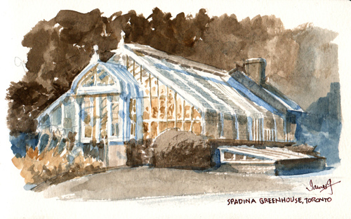
In the "Greenhouse" segment of my new video,
Watercolor in the Wild, I mentioned that I ignored the green colors and painted the scene with browns, ochres, and blues instead.
Why would anyone want to do that? Why not paint what you see? Let me explain that decision a bit more.
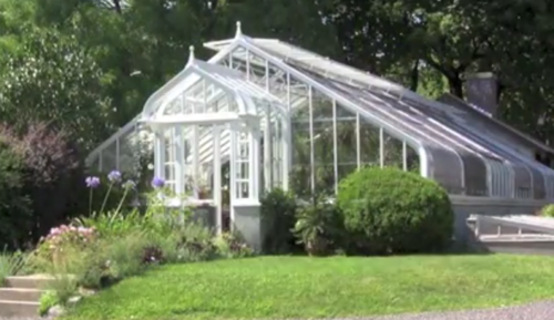
Here's a photo of the scene as it appeared to the camera, with fairly strong greens.
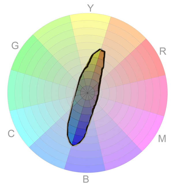
This was the gamut, or range of colors, that I was interested in painting instead. It's a complementary slice of the color pie that ranges between blue and yellow-orange. Greens and reds are excluded.
What I was after was the most basic color scheme possible, just one step away from a monochromatic rendering.
I wanted to focus on the most basic dimension of color, warm vs. cool.
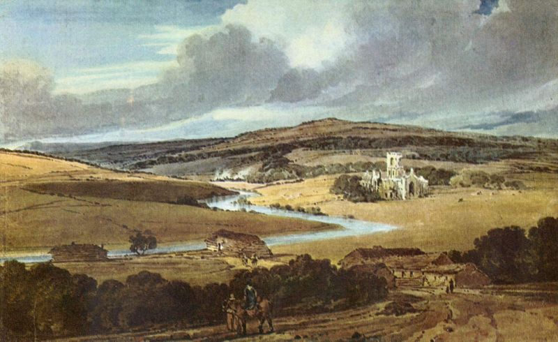
As I was painting, I was thinking of (though aware that I was falling far short of) one of my favorite English watercolorists, Thomas Girtin (1775-1802). Girtin was a friend and rival of J.M.W. Turner, but, sadly, he died young, just 27 years of age.
 |
| Thomas Girtin, Interior of Lindisfarne Priory, 1797 |
His skills were so formidable in his short life that Turner said, "Had Tom Girtin lived I should have starved".
Girtin's paintings have a wonderful otherworldliness that I adore. Part of his appeal is the way he restricts his painting to those bones of color.
 |
| Thomas Girtin, Guisborough Priory, Yorkshire 1801 |
How did he arrive at that? He must have been looking at greens and ignoring them.
But wait—Is it possible that he used a wide range of bright colors, and that the greens have faded? Well, yes, there might have been some color loss, especially in the reds.
 |
| Thomas Girtin, Ouse Bridge, York |
Copper arsenates, Emerald green, Viridian, and Phthalo green all came into use after Girtin's death.
 |
| Girtin, Dover |
More than that, artists of the day were quite deliberate about restraint of color in landscape. Here Girtin gives just the barest hint of green. The painting's reserve gives it a quiet dignity, a storybook quality.
You can find this chromatic reticence in the work of Claude Lorrain and Richard Parkes Bonington and so many others. In our own time, artists such as Andrew Wyeth, Erik Tiemens, Alan Lee, Brian Froud, and J.B. Monge have worked in very restricted palettes with wonderful emotional effects.
The way to get those effects is to either 1) Bring fewer paints in your sketch kit or 2) Ignore the colors you see and paint the colors in your head.
------
Resources
To watch the greenhouse segment and the rest of my new video, pick up your copy of "Watercolor in the Wild":
HD download: (Credit Card) HD download: (Paypal) buyDVD: (NTSC, Region 1) Digital creators:
Learn more about selling content on Sellfy.
Previously on GurneyJourney:
Watercolor MaterialsThe Green ProblemRead more about Girtin and Turner's colors in
"Palettes of the Masters: JMW Turner, via the Tate"Winsor and Newton's essay about Turner's paletteCatalog to 2002 Girtin Exhibition:
Thomas Girtin and the Art of Watercolor

John Singer Sargent's (1856-1925) biographer Evan Charteris tells the story of one of the oddest episodes of the artist's career, which occurred while he was staying in England shortly before Christmas, 1891. 
Towards the end of the day he was riding homeward. He found himself in a field of winter wheat, a part of which he had to cross in order to reach a bridle path.
He was no agriculturist; he probably would have found it difficult to distinguish between a field of potatoes and a field of turnips. In all ignorance and innocence, therefore, he continued his way. His movements had been observed; through the twilight the owner of the winter wheat advanced upon him and without preliminaries launched out into a torrent of low abuse. Sargent was completely surprised.
He dismounted, and as the man drew near, [Sargent] began to apologize for his mistake, offering to make good any damage he had done. Far from being pacified by his courtesy, the farmer became more incensed. He worked himself into a frenzy of rage and loaded Sargent with every variety of threat and malediction.
He was well known in the neighbourhood as a surly and foul-mouthed fellow, and Sargent, deeply agitated, mastered his temper and moved away, mounted his horse and rode home. That evening he described what had happened; Mrs. Abbey states that he was obviously in the grip of an agitating distress. At intervals he would return to the subject and discuss what he ought to do.
For two days he was uneasy and silent and could do no work. Late on the second day he went out. Towards evening of that day Mrs. Abbey was returning from a walk. Her road led past the gate of the house where the farmer lived. As she approached, a figure walked rapidly down the path; drawing nearer she saw in the dusk that it was Sargent. When he joined her he exclaimed: "I've done it — I've done it."
He was calmer than he had been at any time since the adventure. He went on to tell her that after looking at the thing from every side and turning it over and over in his mind he had settled what he ought to do; he had gone to the farmer's door, knocked, and when the farmer appeared, had said:
"Come outside and defend yourself, I am going to thrash you." The farmer called on his household to witness the assault, and then, answering the challenge, engaged in a struggle in the course of which Sargent appears to have carried out his threat. Such was the amazing story told as he and Mrs. Abbey walked home.
The farmer at once sought the help of the law. It was doubtful at first whether he would proceed by summons before a magistrate or by a civil action for damages. Sargent put the matter in the hands of Sir George Lewis. On January 21 Sir George wrote that the farmer had issued a writ for damages.
He advised payment into court. £50 was considered adequate. The farmer accepted the sum, and proceedings went no further; and there, so far as Sargent was concerned, this curious episode ended.
Later an unexpected turn was given to it by an invitation from the farmer to Sargent asking him to dine. Sargent declined, but as a reconciliation was in the air [Sargent's friends] de Glehn and Finn took his place, and found the farmer if not ready to forgive, at any rate determined effectually to achieve forgetfulness by conviviality. Legend has it that Sargent spent the interval between the insult and the assault in taking lessons in boxing. This scarcely needs denial; he spent the interval, it is true, in deep perplexity.
His sense of justice, always lively, but balanced, had been outraged, but his indignation had cooled and had been replaced by a reasoned view of what under the circumstances it was right to do. He acted in a manner which was unspeakably distasteful to him, driven forward by the conviction that no other course was honourably open to him. It was in no spirit of revenge that he acted, it was probably with no sense of personal grievance, but on a conclusion of judgment arrived at on a point of honour.
------

View Next 25 Posts


.jpg?picon=1009)


