


There is just something about holding a new, shiny book in your hands. I think it's because every book has a different feel, a different mood. When I went to make my vlog for YA Rebels, I decided to take a closer look at book covers and their designs. It amazed me how each book had its own distinctive look.
Some book covers have raised lettering, others with font that fits with the time period of the text, some have specific paper that fits with the storyline, while others even have reversible covers.
I also think it's fun to check out the people who bring those covers to life. A famous illustrator for the cover design of Percy Jackson series is John Rocco. Then there are photographers who do amazing work such as Aurora Crowley who did the photography for SHATTER ME by Taherah Mafi. Check out an interview here with Aurora.
I also have a Pinterest page here that shows all the covers that I really like.
I suppose it's because I'm a visual person that I love how books come out. Someday I'm sure ebooks will have their own cool additions brought to them. I can't wait to see what will come out of those in the future.
Check out my vlog on the books that I choose to highlight.
Viewing: Blog Posts Tagged with: ya covers, Most Recent at Top [Help]
Results 1 - 2 of 2
 By: Christina Farley,
on 8/9/2012
By: Christina Farley,
on 8/9/2012
Blog: Chocolate for Inspiration (Login to Add to MyJacketFlap)
JacketFlap tags: YA books, cover designs, ya covers, YARebles, cover photographers, cover illustrators, Add a tag
Blog: JACKET KNACK (Login to Add to MyJacketFlap)
JacketFlap tags: Debby Dahl Edwardson, YA covers, artistic covers, cover art, Add a tag
(Or, “See the Signs—Part Two.”)
A few weeks ago, at back-to-school night, I browsed the Scholastic book fair and this cover caught my eye:
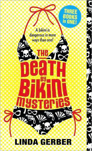
(Penguin Group (USA) Incorporated: January 2011)
I love that the words are part of the artistic design. Then last week, I was excited to see that Deirdre had also found some similar covers, using signs for her post, See the Signs. I thought I would continue with this subject, but it wasn’t as easy as I thought it would be.
I started hunting for similar covers that incorporated the title into the art. I found a few at the book fair, and none at the library. Even my online bookstore search didn’t produce many results. I was surprised to find this device is not used as much as I thought it would be.
Here’s what I found:
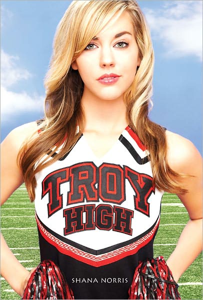
Troy High (Abrams, Harry N., Inc.: August 2010)

And coming soon,

So here’s a JACKET KNACK challenge: How many other clever covers can you find?
What qualifies: any covers that mix the words of the title into the art, as an artistic element. (Covers that wer
Covers are getting more and more beautiful these days, especially for YA. Love the vlog!
You're so right about so many elements that can enhance a cover and make it stand out. I'm so impressed with some the beautiful covers out there.
That's an excellent vlog! Thanks for sharing those covers with us and each one's unique aspects. Did you add your vlog to a Pinterest board? I'll have to check out your board. Sounds like a good one.
Thanks guys!
LynNerdKelley- that's a great idea!
I love the cover and interior of Silver Phoenix, too. :)
One of my favorite covers is The Starry Rift edited by Jonathan Strahan with cover art by Stephan Martiniere. Anything with an SF/space feel attracts me.
I haven't read or seen The Starry Rift. I'm going to have to check that out. Thanks!
This is why I prefer hard copy books over ebooks (though I still buy ebooks).