-
Chris Sheban is an enormously talented illustrator who has very possibly done the covers to some of the books that you know and love — all without notoriety or fanfare. You probably didn’t realize it was him, if you even thought about it at all.
Here’s just a few you might recognize:


I was very happy when my editor, Liz Szabla, told me that Chris would be doing the cover of my 2008 book, Six Innings. I was eager to see it, and nervous, too, since I couldn’t imagine what he and art director Rich Deas might come up with.
I waited and hoped until one day a jpeg of the cover art arrived in my email.
I was relieved, ecstatic, verklempt. Or go ahead, Dear Nation of Six Readers, insert your own baseball metaphor here. It was a home run. A stand-up triple. A squeeze play, um . . . oh, whatever. I loved it. That luminous blue-green.
Sad to say, I failed to thank Chris. Because I had never met the guy, and we had no interaction whatsoever, and I was raised by wolves. We were only connected by this one book, still clinging to semi-obscurity, and that was it. I should have reached out to Chris, sent a card or box of HoHos, but I didn’t.
 Recently Chris appeared on Facebook, sharing a trove of rough sketches in addition to samples of light-infused finishes. I don’t know how Chris achieves it, but his work glows. He was also, I realized, a process guy. Organized too; he saves everything. I wrote to Chris and said, more or less, you may not know me, but I want to thank you for that terrific cover.
Actually — I just looked it up — and I wrote exactly this: “I’ve always been grateful to you for that beautiful cover of Six Innings; it only make sense that we don’t know each other on FB too.”
Chris wrote back and said something I didn’t expect. He said that he loved the story and loved working on it.
I was like, “You actually read it?”
Because up to that point, I didn’t realize that illustrators could read. Kidding! (A little.) But I honestly didn’t expect that he read the whole entire stinkin’ book. When I commented on that, Chris explained, “Absolutely read it. Yes, and read the others, too. Trying to get a feel for the story. Never easy to make one image sum up a whole book.”
So that’s when we got the idea to take this conversation to another level, complete with sketches and rough drafts.
Here you go, sit back and relax . . .
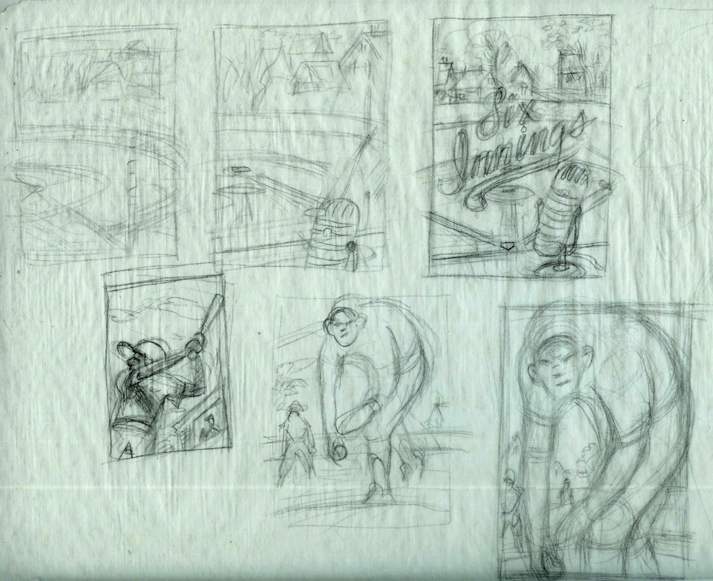
CHRIS SHEBAN: So after reading the manuscript, the first rough thoughts look something like this.

JAMES PRELLER: I like that, “rough thoughts,” not “rough sketches.” Would it be accurate to say that you see them more as ideas than as drawings?
-
CS: Absolutely. At this “thumbnail” stage, I’m more concerned with the idea. What will make the most impactful cover. Composition is important. Should I focus on the pitcher, the batter, how big should I make him, etc. I’m not thinking about color yet. That comes later. You usually don’t know where the title type will go, but you want to consider that as well. Looking at some of these sketches, I’m not sure I was following my own advice. The pitcher in this sketch at the bottom right looks a bit more like a sasquatch than a human. I’ll worry about that later.
-
JP: Sasquatch would have made a great closer. Or designated hitter (he can mash, but he can’t field.) Anyway, yes, this is like a writer’s sloppy copy. You don’t want to get bogged down with confining notions of quality.
-
CS: I work by attrition…if I just do 112 sketches, one is bound to be decent, no?
-
JP: That’s exactly how I write haikus. I start with 112 syllables and whittle down from there. While the ultimate goal might be finding “the right word,” when I start out I’m pretty much looking for “any word.” And by “any” I mean: ANY. Just trying to defeat that blank, white page.
-
CS: When I was working on the cover art for Because of Winn-Dixie, I inadvertently left a great big hole in the middle of the art. The girl and dog were down below, with the mobile homes above. And in the center? Not much. There’s no hard and fast rules about title placement, but generally it’s towards the top or bottom. Generally. You don’t want to draw the eye dead center, where there’s nothing going on but dirt. But I did. The solution? Put the title there!
-
JP: How big are these sketches?
-
CS: Each thumbnail is roughly an inch and a half to two inches. Easier to see the whole picture quickly. I sketch on tracing paper.
-
JP: Tracing paper! I have such happy memories of tracing paper. My father had his own insurance business and I used to go to his office on rare weekends — he had a new-fangled “electric” typewriter and boxes of tracing paper. I drew and drew and drew, usually copying from the Sunday comics. What else have you got, Chris?
-
CS: Well, here’s a few more rough sketches:
-
-
JP: Too cool. As you delve deeper, you seem to be zeroing in on the drama between pitcher and batter, as opposed to other sketches that are more pulled back. A tighter focus.
-
CS: Yes, maybe a little more. Sometimes pulling in close can add a bit of drama. I’m not sure why I had the kid sweating in that one sketch. Was there sweating in your story?
-
JP: My characters never sweat; they perspire. This is literature, after all.
-
CS: I’m sorry. The sweat may have been a reaction to how I was feeling at the time, worrying about making a half-decent cover. Yes, now I remember. That was me.
-
-
JP: Wow, look at this sketch. It has a sculptural quality, as if baseball had been around in the 1500s and Michaelangelo was, say, a season-ticket holder at the Colosseum, chasing foul balls, shoeing away cats.
-
CS: The pitcher looks a little disjointed to me. And is that an oven mitt on his left hand?
-
JP: Why yes, I believe that is an oven mitt. Obviously this was before the game had evolved, back when players such as Ty Cobb and Three-Finger Brown wore oven mitts. Ho-ho, I digress, a little levity there folks, free of charge. I love this glimpse into your process, Chris. Any number of these would have made terrific covers.
-
CS: After a little back and forth with the art director, a direction is chosen, then I’ll work up a rough color comp which I’ll use as reference for the finished piece.
JP: How much back, and how much forth, exactly? There must be times when you think, “ACK, they picked the wrong one!”-
CS: That’s the danger of sending too many sketches. Inevitably, most will be mediocre, some awful, but maybe there’s one or two that are decent. You hope they go for the best one. If they pick an awful one, you have no one to blame but yourself, because you did it in the first place. Sometimes I’m an idiot.
JP: Actually, once upon a time I packaged books for Scholastic. My art director and I had to go through the “approval by committee” process many times. It’s a lovely experience if you enjoy water torture. There’s a skill in the choices you present, as well as the ones you hold back. Sometimes you try to direct the response; other times, you honestly don’t know.
-
CS: I tend to fall into the latter category, the “I honestly don’t know if it’s a good cover idea, or just plain bad” category. Sometimes having that second (art director) or third (editor) pair of eyes and opinions really helps if you feel like you don’t have a clue. When sending multiple sketch ideas, I gently suggest which one or two I feel are the best . . . then they pick a different one.
JP: At this point, you turn to color.
–

-
CS: These rough color sketches are just pencil sketches that I photocopy to a larger size, then paint with watercolor and some pastel.
JP: Isn’t that cheating?
-
CS: Yes, probably so. It would really be cheating if I photocopied the sketch up to size, painted on it, and sent it in as finished art. Actually, that’s something I’m hoping to pull off some day. Cut out all the in-between steps and finicky final art stuff that you worry and fuss over for too long, and end up with a lifeless piece of art.
-
JP: Well, that’s the constant danger, isn’t it? The over-worked, over-wrought piece of art, like a late-period Steely Dan album. When it gets too polished, you might lose the raw vitality. Refine it to death.
-
CS: Haha. Steely Dan, Paul McCartney, Stevie Wonder. It’s frightening and depressing to think that with age comes your artistic “Muzak” years. I’m currently working on using the actual rough sketch, with all its grainy, searching lines, as an underdrawing. By working over the top of that, you can keep some of the looseness of the line work showing through. I do this while listening to early Steely Dan.
-
JP: I’ve seen that strategy before, though my mind is drawing a blank on good examples. It sort of honors the layers of process while also, as you say, keeping the looseness. It’s not something you typically see in cover illustration. In musical terms, it’s the punk aesthetic, where they felt that something powerful had been lost during the refinements of the genre. Down with Pink Floyd! Up with the Sex Pistols! And yes, let’s value the mistakes! It’s that core belief in raw energy at the expense of, cough-cough, revision and improvement. The trick is finding that elusive balance.
-
CS: I doubt the author ever gets to see the sketch ideas. This is awkward . . . maybe there’s one here that you like better than what we ended up with. Sorry.
-
JP: No, no, I love the cover you ultimately came up with — except, of course, my name should have been bigger (but I always say that). Every time I look at that book, I feel grateful to you. Seriously. Also, I respect and understand the process. I’m the boss of the words, not the cover. There comes a point where the author needs to get out of the way in order to allow the visual artists to do their work without interference. Not me chiming in with, oh, “I imagined him with freckles!” or whatever other suffocating, literal-minded idea I might have.
-
-
CS: Anyway, from this point the final drawing/painting is done on watercolor paper. The graininess happens with the addition of Prismacolor pencils on the rough surface of the paper.
-
JP: You know, when people describe Disney World as a “magical” place, I always groan inside and think, How about commercial? Or, I don’t know, admirable in its efficiency? But when I look at your work — and the journey it takes to reach the final cover — it really does feel like something almost magical has occurred. Not awesome, in the cliched, verbal tic sense of the word, but awe-some. Or awe-full, full of awe. Thanks for sharing this with me and my Nation of Six Readers. We’re like the Iroquois that way, btw (but not at all). I’d love to talk more about your books another time, where you live, your picture books, your favorite music, hobbies, whatever. Just basically get to know you better. Can you come back soon?
-
CS: I would love to. However, after I read what we’ve discussed, it may send me into a mild depression. I may be reluctant to expose my pedestrian nature again.
-
JP: I hear you, Chris. All of my favorite artists and writers are filled with self-doubt. Can there by any other way? Otherwise you are dealing with raging egotists, and I hate those people. I like your modesty and self-effacement. But know this: Your talent shines forth in everything you create. I admire and respect your work.
-
CS: As George Gobel famously told Johnny Carson, “Did you ever get the feeling that the world was a tuxedo and you were a pair of brown shoes?” Thanks for inviting me. I really enjoyed it (I think).
-
The writing life has its ups and downs, and more downs than I’d prefer. No, it’s not coal mining, and I’m not an ice road trucker . . .

. . . .but this job can be full of doubt and disappointment. Still, and here’s the thing: I’m grateful for this career, thankful for this writing life, because it is literally a dream that came true. How many people can say that?
I published my first book in 1986. From then to now, more than half my life, I’ve done all sorts of work, from desperate, pay-the-rent stuff . . .


. . . to books that I’m proud of.


Today, 7/17/2012, my first Young Adult novel, Before You Go, will be available in bookstores near you. That’s the hope, anyway. I don’t expect it to sell well. Or for long. I don’t even know if many readers will like it. It’s not a book for everyone. But this is absolutely the book I wanted to write, the book I needed to write, and I am grateful to my editor, Liz Szabla, and my publisher Jean Feiwel, for giving me the artistic freedom to do the thing I wanted to do.
It’s a rare license these days. And a great feeling, like wind at your back.

And it’s not something I take lightly. It’s taken me a long time to arrive at that moment, to find that I’ve got good people who have my back. Hopefully Before You Go finds some appreciative readers along the way, whatever their number.
I don’t control what happens now.
Look, I want sales, I want to earn a living, I want my publisher to do well, I want great reviews, I want readers. But try as I might, not every book is going to be popular, acclaimed, beloved — these things are impossible to predict. My sense has always been that Before You Go is a quiet book, a slow story, not a whole lot of plot, and one that might be swimming against the tide of popularity. That’s okay. Sometimes as a writer you have to answer a different call. What’s amazing is to have such unbelievable support along the way.
 Recently Chris appeared on Facebook, sharing a trove of rough sketches in addition to samples of light-infused finishes. I don’t know how Chris achieves it, but his work glows. He was also, I realized, a process guy. Organized too; he saves everything. I wrote to Chris and said, more or less, you may not know me, but I want to thank you for that terrific cover.


