


.jpg)
.jpg?picon=1009)

Frank Mason (1921-2009) was a painter and teacher at the Art Students League who used a shelf-like palette arrangement for his oil paints called "The Prismatic Palette." One of Mason's students, Keith Gunderson, explained it to me this way:
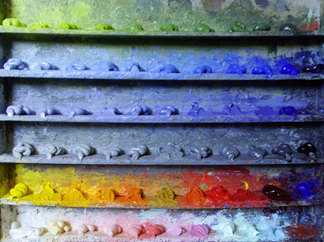 |
| Prismatic Palette by Leslie Watkins |
"The value scale was the essence of the shelf arrangements, with emphasis on “Orange Value” as the unifying tone of the lights. The shelves were arrayed with a string of greens made from “Parent Green”; premixed value strings of Blue, Violet, and Grey to calibrate atmospheric perspective; a shelf for pre-mixed tints for the sky; and a “Control String” of pure colors squeezed from the tube, arranged by value from light to dark."
"Modulating a color with it’s complement was often substituted by mixing grey or brown into that color... perhaps an influence of Frank’s teacher [Frank Vincent] Dumond (1865-1951) and Dumond’s teacher, [Jules Joseph] Lefebvre (1836–1911)."
I have also heard "parent green" referred to as "vegetable green," the color of transmitted light through backlit young leaves.
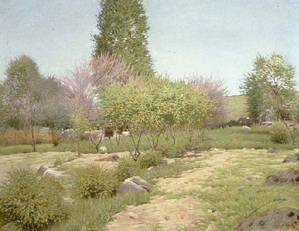 |
| Landscape by Frank Vincent Dumond |
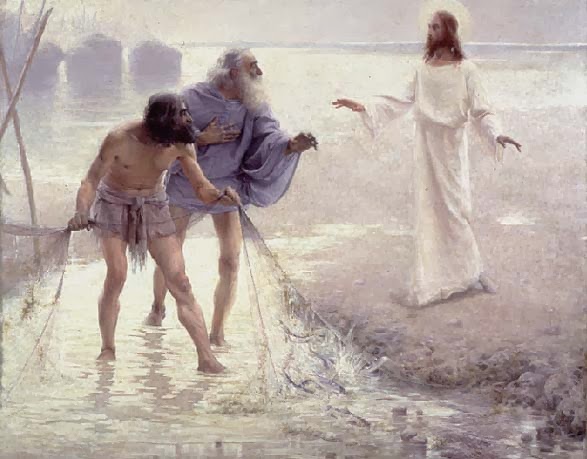 |
| Dumond, Christ and the Fishermen, 1891 |
Leslie Watkins, another Mason student, describes the prismatic palette this way:
 |
| From Pinterest via Outdoor Painter |
"It clarifies several strings of colors into even steps, with the lightest or highest values descending to the lowest or darkest tones."
"The steps are based on pure colors from cadmium lemon yellow to alizarin crimson. The different strings of colors consist of grays, violets, blues and greens."
Another Art Students League teacher (and another Frank), Frank Reilly (1906-1965), also taught a value-based system of premixing palette colors, but it was different from Mason's. Reilly's lineage connects him to Gérôme, Delaroche and Boulanger.
Both systems are descendants of a common practice among painters before the 20th century to premix colors in sequences of stepped values, analogous to the keys and manuals of a pipe organ.
I'm obviously no expert on the League instructors' systems, so I welcome further insights and discussion in the comments.
Previously on GJ Premixing Color
More on the Prismatic Palette by Leslie Watkins at the Art Times Journal
0 Comments on Prismatic Palette as of 9/2/2014 10:08:00 AM
Add a Comment