new posts in all blogs
Viewing: Blog Posts Tagged with: Watercolors, Most Recent at Top [Help]
Results 1 - 25 of 37
How to use this Page
You are viewing the most recent posts tagged with the words: Watercolors in the JacketFlap blog reader. What is a tag? Think of a tag as a keyword or category label. Tags can both help you find posts on JacketFlap.com as well as provide an easy way for you to "remember" and classify posts for later recall. Try adding a tag yourself by clicking "Add a tag" below a post's header. Scroll down through the list of Recent Posts in the left column and click on a post title that sounds interesting. You can view all posts from a specific blog by clicking the Blog name in the right column, or you can click a 'More Posts from this Blog' link in any individual post.
.png.jpg?picon=3640)
By:
Sara Burrier,
on 10/27/2016
Blog:
warrior princess dream
(
Login to Add to MyJacketFlap)
JacketFlap tags:
artist,
art,
drawing,
painting,
watercolors,
original,
sara burrier,
sara b illustration,
flash sale,
Add a tag
What to do when your drawers and portfolios are overflowing with original paintings?
You have a flash sale of course!
ONE DAY ONLY
Friday October 28th
9am - 9pm CST
All original paintings and drawings on www.sarabillustration.com will be hugely marked down!
There's a new chapter in my life coming, and I am pretty certain I will be inspired to make much of it through drawing and painting. I have also been wanting to play with working larger, which will require more room!
So in celebration of the arrival of our son Jaxon (and the crisp cool holiday season! My favorite!), I am holding this ultra rare sale, marking my original art for almost half the price! This is a great way, I hope, for those of you who have been wanting an original piece but haven't been able to afford it, are able to find something that resonates with you and is within your reach.
All of the paintings available demonstrate my progression as an illustrator...I have original paintings from ten years back when I was still inking my lines with microns because I feared loosing my lines and didn't like getting graphite all over my hand.
All the way through to the most recent, finished just a couple weeks ago. No inked lines but instead using erasable gray pencil, showing more confidence in my values, and creating far more inviting atmospheres that help tell the story.
Each step in the process is vital for the following step. Without experimenting and playing, I would not be where I am today as an illustrator.
Most of my work is small for those little areas of the house that need some magic.It is very well known that I prefer to work small, usually smaller than 8x10. I enjoy the challenge and quite possibly have always been interested in the miniature (LOVE dollhouses and all things small). Most of the larger works I create are requested commissions, but there will be a range of sizes available at the sale.
From a few of the smallest....
The many in the middle...
 |
| "July" 8 x 10 inches |
To a couple of the largest....
I know each piece has a soul mate, created just for them.
I pray that some of these pieces will find their match tomorrow. It's bittersweet to let go of your creative works. I am always so blessed to see how the work inspires and deeply touches those who purchase it, but then also sad to see them go. Each piece has a story for me, what inspired the imagery and why I created it...yet when I see them sitting in my studio I see a bird caged, waiting to be free and serve as inspiration for another.

By:
Melissa Wiley,
on 3/21/2016
Blog:
Here in the Bonny Glen
(
Login to Add to MyJacketFlap)
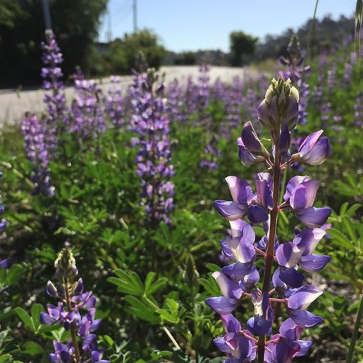
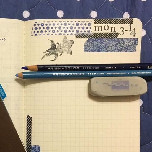
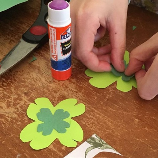
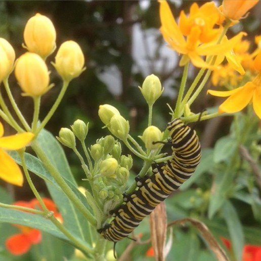
JacketFlap tags:
Assorted and Sundry,
Paper & Desk,
bullet journal,
Jane LaFazio,
lupines,
Photos,
Art,
Butterflies,
Nature Study,
Monarch butterflies,
watercolors,
Miss Rumphius,
Add a tag
By:
Floating Lemons,
on 1/30/2016
Blog:
Bit by Bit
(
Login to Add to MyJacketFlap)
JacketFlap tags:
2016 FREE PRINTABLES,
Hope text design,
Hope typography,
text illustration,
TYPOGRAPHY,
watercolour pencils,
watercolors,
WATERCOLOUR PENCIL,
Floating Lemons,
free printable,
Add a tag

This is probably the longest I've gone without blogging. The final month of 2015 and this first month of 2016 have been spent taking a (much-needed) break and reassessing everything in my life after the numerous changes and challenges of last year. I've had to make decisions on what to prioritise and what to cut out completely, and have been surprised by the choices I made.
So I'm starting this year out full of Hope, and I'm passing that along to all of you. I've decided to carry on with the free printables to subscribers of the Floating Lemons monthly newsletter although it almost didn't make the cut. But despite my extremely full schedule now that I'm back in college, I do find pleasure in producing a text-based illustration every month, and anything that makes me feel good is staying for the coming year! This year I'm going for just one word, every month, that will express some form of inspiration or just good energy, and I think that "hope" is the perfect way to begin, even if it is a wee bit late ...
Here's a step-by-step progress of the illustration, from trying to figure out which text design I should use:

I was helped immensely by friends on my facebook and instagram pages who voted almost overwhelmingly for number 6, thank you! I then scanned it in, cleaned it up and printed it out very faintly so that I could roughly draw the flowers intertwined through it, and experiment with colours:

Once I decided on what I liked, I scanned the whole thing in again, made small changes in photoshop, reversed it and printed it out so that I could draw the outlines out in pencil and then transfer them onto a sheet of watercolour paper, then start colouring it in with watercolour pencils:


I then added water, painted over the pencils, worked in extra layers, and kept going:

Here's the final illustration before I scanned it in and cleaned it up in photoshop:


It took me a lot longer than expected but it was a pleasure getting 'into' a piece of art again, and a wonderful beginning to a creative year full of hope. I'm expecting more changes and challenges this year and look forward to tackling them all. Cheers.
PS: To get the Hope design as a free printable please do sign up for the Floating Lemons monthly newsletter and you'll get a text illustration available for you to download and print out at home every month. To subscribe just click HERE. Thank you!


A quick painted sketch of a raven holding a dying flower (I think it's a rose but can't quite tell), just in time for me to wish you a Happy Halloween! Be safe and have fun. Cheers.

Its been a while since I've done any real painting with watercolors. I've been busy being a colored pencil artist for a while now, with some detours into digital, but have been wanting to go back to watercolors, so here I am.
This piece is my Christmas card, a little behind schedule, but on its way now. I'm working on illustration board (Strathmore 500 series) which is my all time favorite surface to work on. I get cranky with watercolor paper because I can't stand when it warps when wet (even if its stretched and taped down), and illustration board doesn't do that. The only drawback is that you can't transfer art onto it with a light box (its too thick to be 'see-through'), so its back to old-school transferring methods - tracing the drawing down over a graphite transfer sheet.
Here is my glamorous set-up. That's a fancy ceramic yogurt cup for the paint water, held steady by a roll of packing tape. Hey, it works. My drawing table is at a slant, so I have to keep stuff from rolling down. The parallel ruler on the bottom keeps most things from rolling off altogether.
I use a combination of Winsor Newton, Holbein, Daniel Smith, and Turner watercolors. I'm not really a purist - whichever brand has the color I need is what I use. I tend to stay away from the really grainy ones if I can help it, unless I'm doing something with special effects. I like a more even kind of pigment. Sometimes I use gouache (opaque watercolor) too if I need to. Here I've squeezed out some Winsor Newton Hooker's Green, Permanent Sap Green, and Green Gold. So far all I've use on this piece is the Permanent Sap, in various strengths.
And here we have some Christmas tree needles. There will be a lot more of them by the time I'm finished. A LOT.
We're due for an apocalyptic storm tomorrow and the next day. 60-70 mph wind gusts, and 3-4" of rain. This, after years of drought. I think last December it rained one day for about 10 minutes, and the rest of the time we had sun sun sun. The year before, too. Now, we're getting the opposite, and its too much! They're warning the power will go out, trees will fall over and all sorts of awful things will happen, so I thought I'd better blog something in case I'm offline for a while. Let's hope its not as bad as they say!
From my sketchbook:
"Open Space Farm Land." Watercolor Pencil.
Last week I finished the year-long revisions to my WIP, The Abyssal Plain. As in: finished, complete, all done. I can't believe this journey is finally over, at least the writing part of it. Soon I plan to begin my marketing, and after that I'm sure there will be more editorial changes to be made at some future date prior to publication. But for now, the book is written and ready to go. Which means I am now officially free to explore some new directions for awhile. So how apropos that I would recently visit a place called Open Space?
Open Space is 30,000 undeveloped acres of land situated throughout Albuquerque with the intention that these acres stay wild and free and forever open to the public. Set somewhat in the center of it all is the Open Space Visitor's Center where I met up with the Colored Pencil Society for an afternoon of plein air drawing and painting.
At first I was a bit nervous--plein air painting has never really been my thing, a topic I wrote about in my post Adventures in Travel Journaling. However, this time I remembered to bring a hat, sandwiches, water, and a sweater, and I was fine. More than fine--I sketched without getting a single bug bite, dirt smudge, or having to run to my car for refuge!
It was good to be outdoors after all these weeks and months cooped up with my Alphasmart and more red pens than you can count. And it was also good to think about "open space" in more metaphorical and personal terms. For instance, what parts of my creative life can I keep open for new ideas, new methods, new subjects and mediums? Where do I want to stay open in my artwork, and why? And when do I have to follow the rules without neglecting my own individuality?
These are good questions, and ones that I found myself thinking about while I was sketching the sun on the trees and watching the clouds float by. I also found myself thinking about what I want to do with the rest of this year. Some plans include:- Writing a children's picture book set in Barcelona.
- Designing and painting illustrations for the book, even if it's just for my own fun. (Note for the curious: Sending a picture book manuscript with illustrations to a publisher is never recommended. Still, that doesn't mean I can't have some input at the end of the day, and the drawing does help me with the writing process.)
- Preparing and completing a piece of artwork for the upcoming Colored Pencil Society 2015 show here in Albuquerque--my first ever!
- Attending the October SCBWI conference, also here in Albuquerque. (I've signed up for all the picture book workshops.)
- Reading. Lots of reading.
- And of course, drafting my query and synopsis for The Abyssal Plain so I can begin submitting it to agents and editors early next year.
Looking at my list I almost feel like I'm embarking on a 3-month vacation. So what's on your Open Space list? Drop a line and let me know!
Tip of the Day: Collage can be an excellent way to cultivate and explore your own vision of creative open space. To give yourself plenty of room, try working with a format larger than your usual journal-sized page, for instance, a full-size piece of poster board or construction paper. Don't be in a rush to fill the paper, but do think of what will fill your spirit. Take your time to see what evolves, and what inspires you the most. Keep in mind that this isn't so much about being a "to-do" list as it is about finding what will keep you inspired and happy over the coming months. Enjoy!
Rockin' the Moon
watercolor (13" x 21") on Rives BFK

By:
Valerie Storey,
on 2/26/2014
Blog:
Valerie Storey, Writing at Dava Books
(
Login to Add to MyJacketFlap)
JacketFlap tags:
Creativity,
Poetry,
Inspiration,
Collage,
Pottery,
Watercolors,
Freewriting,
Polyvore,
Magazine Cut-Outs,
Art Journaling,
Add a tag
I'm a big fan of morning pages, but there are definitely times when I need a break. It's not that I don't find the pages useful, but every now and then I need to shake up my routine and make life more . . . exciting.
One of the ways I thought of doing that was to start my day with a "mini-project" instead of the usual three handwritten pages Julia Cameron recommends in The Artist's Way. I got the idea from a gardening book that mentioned how Renoir painted a single rose every day before tackling his main work-in-progress. I don't know if I could stick to a regimen that centered on a single subject, but I can certainly appreciate the need for a warm-up exercise. With that in mind I sat down and brainstormed what might work for me--and for you, too! - Write a structured poem such as a sonnet, pantoum, or ghazal. Base the poem on last night's dream.
- Cut three pictures with a similar theme or subject from a magazine. For example, 3 pictures featuring purple. Or three pictures of dogs, or children, recipes, etc.
- Collage a three-page character bio--for either an existing character or a new one.
- Play with watercolor brushstrokes: random colors, patterns, feelings.
- Sketch one item only, e.g. a cup, an apple, a toy--using a single medium.
- Write three pages of dialogue.
- Place an artist's mannikin in a fresh pose every day. Record the poses in a single sketchbook used only for this purpose.
- A quick sketch of where you are right now. Try a different color of pencil or ink for each day.
- Write a stacked journal entry in three colors of ink.
- Clay: make a small pinch pot, egg cup, votive, bead, dipping bowl, soap dish, or incense holder.
- Three pages of flash fiction.
- Mini-collage on a piece of junk mail.
- Set a timer and create a new Polyvore set or Pinterest Board in twenty minutes or less.
Tip of the Day: At the end of the month, collect all these mini-projects and use them to create a larger piece, or to inspire you in some fresh way. For instance, a sketchbook of mannikin poses could be the basis for a new children's book. The stacked journal entries could be part of a framed collage. At the same time, examine what you enjoyed writing or drawing the most. Did you have a favorite theme, color, or medium? Take note and keep exploring.
By:
Floating Lemons,
on 9/11/2013
Blog:
Bit by Bit
(
Login to Add to MyJacketFlap)
JacketFlap tags:
orchid blossom,
Flowers,
painting,
Watercolour,
Drawings,
BotanicalArt,
watercolours,
watercolors,
Watercolour Pencil,
Floating Lemons,
Mariana Musa,
botanical art,
Add a tag

This one is for my mother. Please keep in mind the fact that I'm a beginner and still experimenting, and excuse all the mistakes that you more proficient watercolourists (is there such a word?) will probably be pointing out, as I'm playing without training or rules (Tons of fun!). Still my mother likes it and that's what counts, right?
Here's a few progress shots:


I used watercolour pencils at the end just to clean up and add some detail. Now, off to think of something else to paint ...
Have a wonderful day. Cheers.

I can't believe how long it's been since my last blog post: over a month. Guess I've been busy! Most of August found me editing my new novel, The Abyssal Plain, and practicing the techniques I learned in a recent 2-day art class, Splash Ink Watercolor.I was attracted to this class for two reasons: first, the word "ink" made me think of fountain and gel pens, freewriting, and calligraphy. And I just love ink! Second was the course description that mentioned using our imaginations to paint--always a good sign of something interesting up ahead.In a nutshell, Splash Ink is based on Chinese art and theory. One of the things that surprised me the most was that the word "splash" actually means "pour" in Chinese, so the class wasn't quite as messy as I thought it would be. (I wore my absolute worst clothes and shoes on both days, terrified that we would be throwing paint all over the room and each other. Thankfully, this never happened and was straight out of my over-active "imagination." Splash Ink can be safely attempted in any work space or studio with a plastic tablecloth and paper towels.)To start off the first day of class, our wonderful instructor, Ming Franz, gave us each 12 sheets of good quality rice paper measuring roughly about 14" x 14" that we divided into sets of 4. The sets of 4 were kept together and taped to plastic boards. After taping, we then sprayed water onto the top sheet until all 4 sheets were saturated. We then poured ink and liquid watercolor and/or acrylic paints onto the top paper in the following order: sumi ink first, then blue, red, yellow, and white paint. Using the white paint was the most surprising to me as I've always heard, "Don't use white in a watercolor!! Ever!" But for this method it was essential. Somehow the white paint seemed to soften, blur, and highlight the other colors all at the same time, a very nice effect.After pouring the color and letting it seep down into all 4 sheets, the next optional step was to sprinkle salt onto the first sheet. We could also drip diluted dish washing liquid into the damp color for added depth and texture. Another option was to place pieces of scrunched-up plastic wrap in selected spots. Last of all we then carried our boards outside into the New Mexico sun to let the papers dry--which in our super-dry climate took about 30 minutes.Once everything was dry we were able to separate the pages, and wow: 3 sets of 4 abstract backgrounds in varying degrees of dark to light depending on the order of the papers . Here is one of my lighter pieces that was #3 in a set of 4:This next much darker sheet was the first of a set of 4. I also used some of the crunched-up plastic wrap to fill out the design:Day 2 was where the magic really began--we got to paint over the backgrounds with either acrylic or gouache (opaque watercolor) paints. Our homework assignment between classes was to study and meditate on our pieces so that we could "find the picture" inside each one, kind of like looking at clouds or cracks in the ceiling. There's an elephant! No, it's a giraffe! Ming also suggested we look through books and magazines for reference photos we could bring to class and that could help turn our background pieces into finished paintings.For me, a magazine picture of falling autumn leaves over rushing water seemed to fit the red paint splashes I already had on this particular piece:I was sorry the class was for only two days, because I certainly had a lot more backgrounds to fill. I ended up with even more when I took 4 of my least favorite sheets and cut them down into quarters, giving me a stack of little "mini-sheets" to practice on. Here's the result of my first small attempt at home; I called it "On the Way to Taos" as that's exactly what it reminded me of:Now that the class is over, I hope to continue using Splash Ink and adapting it to my own style and choice of mediums. I think it would be an incredible way to illustrate a book, especially one for children, or perhaps a dark and mysterious Gothic novel for grown-ups. Maybe I'll have to do this one day for a new edition of Overtaken!Tip of the Day: To learn more about Ming Franz and Splash Ink, take a look at Ming's book, Splash Ink With Watercolor (Looking East, Painting West). Not only will her beautiful artwork inspire you to try some painting of your own, but you might want to experiment with using Ming's paintings as writing prompts--a great idea for yourself or your writer's group. Happy creating!
By:
Valerie Storey,
on 4/24/2013
Blog:
Valerie Storey, Writing at Dava Books
(
Login to Add to MyJacketFlap)
JacketFlap tags:
Found Poetry,
Writing With Magazine Cut-Outs,
Creativity,
Poetry,
Art,
Painting,
Journaling,
Watercolors,
Polyvore,
Add a tag
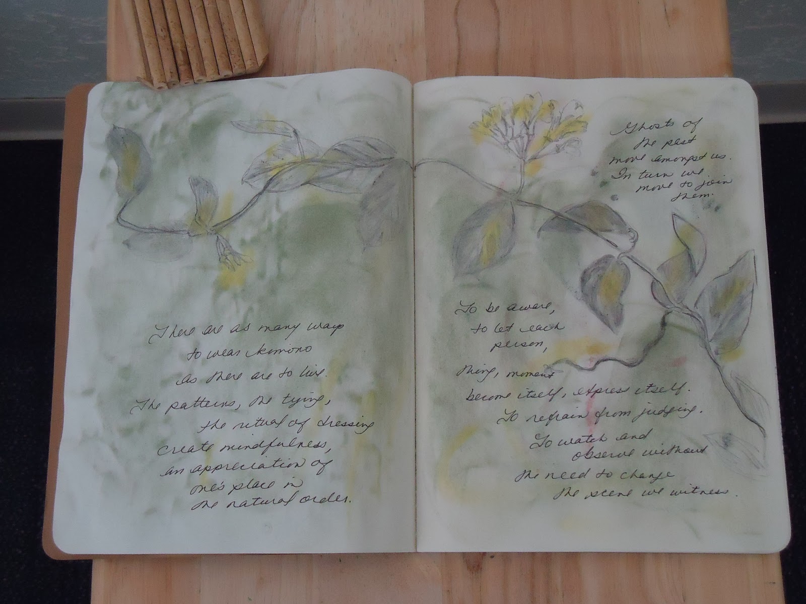
April is National Poetry Month, and this year I'm celebrating the season with a small poetry/art journal project with a Japanese-inspired theme I'm calling "30 Days of Kimono." The idea came to me when I visited the Albuquerque Art and History Museum with my writer's group several weeks ago. The museum was hosting a special exhibition on Japanese Art Deco, and because I've always been a huge fan of Japanese style, culture, and literature, it seemed like a good time to do something with all that inspiration!Rather than restricting myself to just poetry, I'm using a variety of methods, mediums, and digital sites, including Polyvore, where I made the kimono pictured above, as well as a Pinterest board. To keep all my ideas in one place, I've chosen to use a Moleskine Cahier Kraft blank notebook, which means I can decorate the cover too (still a bit of a work-in-progress...):On the inside I'm writing down my poetry thoughts, found poetry snippets, and sketch ideas for larger paintings:I'm also pasting in drawings made on other types of paper. For instance, the sketch below is made on a Japanese paper I can't describe very well other than to say it's slick on one side, rough on the other (I don't know if it's rice paper--sorry!). I used a pen cut from a piece of bamboo, Black Magic ink, and a little watercolor, then cut it into a kimono-ish shape. The pattern was based on my recent visit to New York and Central Park.One of the most enjoyable parts of this project has been my research; any excuse to go to the library and immerse myself in good books is fine with me. Besides losing myself in several gardening books covering Zen gardens and tea houses, my favorite find was a classic, The Book of Kimono by Norio Yamanaka. Everything you'd ever want to know about the history, making, and wearing of kimono is in this comprehensive little book. And believe me, there is a lot to know about wearing a kimono--about 36 actions just to get into "the thing," (which is all the word "kimono" really means: "a thing to wear") and half of those include hand-sewing, my most detested task on earth. Then of course there's the good behavior required to not crush or ruin the kimono, including never letting your back touch the back of a chair or car seat. Reminds me of when my mother forced me to wear scratchy nylon dotted Swiss on Sundays--don't move! Don't eat! Don't breathe! Which was perfectly expressed in this bit of found poetry I took from various lines of my magazine cut-outs:
Starched linen,
quiet wealth.
Piety, memory, cleanliness,
beauty
and stories.
Tip of the Day: Whether it's National Poetry Month of National Novel Writing Month, why not choose a theme or subject you've always wanted to know more about but never really had the time to explore? Not only could it start an entire new direction for your creativity, but it could also help give you that special edge to stand out from the crowd.
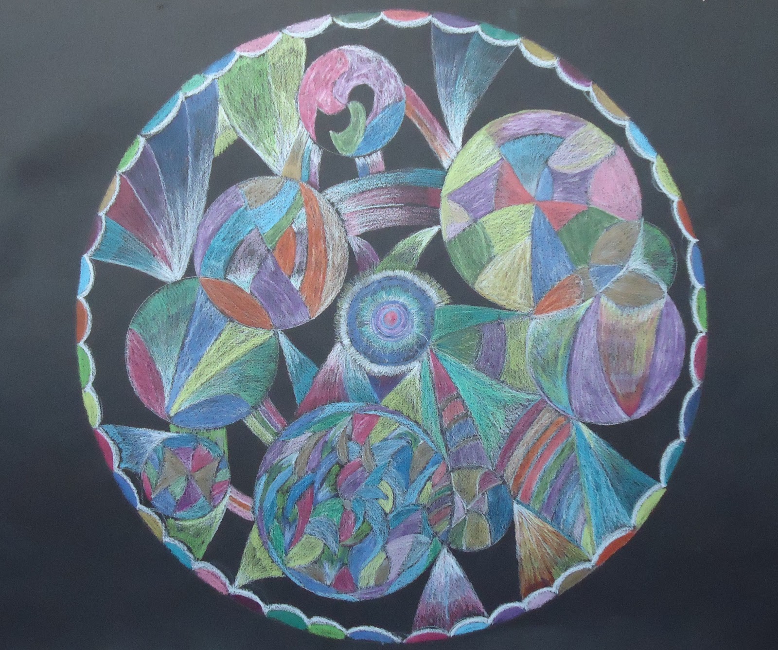
Today's art journal theme continues my series of posts based on Art Journal Class, My Favorite Tips, and today we have Mandalas. The word "mandala" is from the Sanskrit for "circle." Think of it as a labyrinth on paper, a vehicle for meditation and discovery, and an entrance into a world beyond the ordinary and mundane. In other words, it's the perfect tool for enhancing and getting the most out of your art journal.Although mandalas originated in Eastern religion and culture and have been used for thousands of years, it was Carl Jung who introduced them to the West. For me, creating a mandala in my art journal is about taking a break from a hectic day, calming down, becoming centered, and making some beautiful art that provides me with meaning and authenticity.To learn more about the history and use of mandalas, there are many good books, far too many to list here, but there is one in particular that I feel fits in well with the concept of art journaling: The Zen of Creative Painting by Jeanne Carbonetti. One of my favorite quotes from the book is: "In the creative realm, mandalas present images of wholeness, for they bring forth our other side, the side usually hidden from view."In the same way love makes the world go round, working within the circular boundaries of a mandala seems to make us feel more open and contained at the same time; it's a safe place to be. But don't let that stop you from exploring other shapes: square, triangular, or totally unique images from your heart are as valid as any other mandala form.As for "what to draw with," if I had to choose a single medium for mandala-making it would be colored pencil (the Tibetans use colored sand, but I'm sure that takes centuries of practice). A simple Prismacolor set of 12 or 24 pencils works beautifully and won't break the bank. My reason for recommending pencil is I once tried watercolor and it was so difficult it seemed to defeat the entire purpose behind the mandala. Instead of inner peace and relaxation, I quickly fell into stress, confusion, and disappointment. On the other hand--perhaps this was a good lesson in letting go and I should use watercolor more often--or at least watercolor pencil!Another concern you might have is your paper, especially if you want to work with a dark or black background. Don't worry if your journal pages are white because you can always a) paint them with black gesso and/or color before you begin, or b) tape or paste various colors and textures of paper onto the pages, either before or after you've written or drawn on them. (Note: the mandala I've shared at the top of this post is HUGE. I used a full sheet of Canson Mi Tientes black paper, but thanks to the computer, I've been able to shrink it down to art journal size. So don't feel restricted by having to always work directly into your journal.)Some other helpful tips include:- Before you start working, slow down for a few minutes. You might like to try a meditation practice, offer a prayer, or just concentrate on slowing your breathing.
- Listen to music, both before you begin drawing, and while you're creating your mandala.
- Experiment with using just one or two colors in all their various hues and shades. Are you in a blue, purple, or terracotta mood?
- Collage elements can be added to your mandala, or used exclusively as a creative approach.
- Mandalas don't always have to be abstract or ethereal. You might want to express an important event you witnessed during your day, or put a particular feeling or emotion into a series of concrete objects and symbols.
- If you find you really love making mandalas, you might want to devote an entire journal to them, perhaps by choosing a theme such as "nature" or "favorite music."
- Old photographs can sometimes be a way to start working with a mandala theme. Either place the picture in the center and work your way outwards, or use nothing but photos to assemble the entire mandala.
- You can do the same with individual words or phrases that are meaningful to you.
- Drawing the realistic outline of a particular flower can be a good starting point too: roses, daisies, sunflowers, anything that appeals to you.
- Don't forget your fruits and veggies! The cross section of an apple or an orange can create a beautiful pattern.
- As can jewelry and pendants . . .
- Or plates and pottery . . . In fact, why not make a mandala out of clay? It may not fit into your journal, but you can always take a photo. (Now I totally want to do this.)
Tip of the Day: Please take a few minutes to watch this video--a picture is definitely worth a thousand words in this lovely instance.
For today's post I'd like to explore the second suggestion from Art Journal Class, My Favorite Tips: Write about a cherished object.The first time I tried this prompt, I ended up writing about a seashell that belonged to my grandmother. She told me it was from the Gulf of Mexico--a place as foreign as Mars to me--and I used to spend hours holding it to my ear to "hear the ocean." Although I have no idea what happened to the original shell, I do have one very much like it: dark brown, gray, and cream stripes on a swirly, spiral sort of mini-conch (I don't know how else to describe it, apologies to the marine biologists out there!). Regardless of my inability to scientifically categorize the shell, writing about it, and then drawing an accompanying picture into my journal released a flood of memories that in their turn became further journal entries. It also reconnected me to a time that was very special in my life and one that I'm sure contributed to me being the writer I am today.It doesn't really matter how you approach this exercise. You might want to choose an object first and then write about it, followed with a drawing or a collage of the object; or you could choose to first write about a specific memory that brings to mind an object you want to illustrate. Have fun with your choice of mediums: colored pencil, watercolor paints, crayons, or even a photograph you then photocopy and alter in some way with pencils or paint--it all works. Don't forget to add playful embellishments to your page(s): fabric swatches, scraps of lace or trim, glitter glue, feathers, buttons, pressed flowers or leaves--use whatever appeals to you and helps re-live the memory. There's no such thing as a right way to do this!Some ideas for objects to spark written and illustrated memories can include:- A favorite item of clothing: dress, shirt, shoes, hat, etc.
- Your first car.
- First pet (not exactly an object, but you know what I mean).
- A favorite book, especially one from childhood
- A treasured piece of jewelry--the one you love regardless of monetary value.
- A vacation souvenir.
- A photograph.
- A tree or plant in your garden.
- Childhood toy.
- A family heirloom.
- An item from childhood that you could only play with or hold on special occasions.
- Holiday decorations.
- A religious or sacred item.
- A random item quickly selected from your shelf. It reminds you of -- ?
An interesting switch to this exercise is to write about an object you dislike or that bothers you on some level. For instance:- A detested item of clothing you were forced to wear, e.g., a school uniform or an unflattering bridesmaid dress.
- A gift you didn't want. But had to accept.
- A piece of clutter you want to get rid of, but can't.
- A broken appliance still hanging around.
- Housework tools: mops, brooms, sponges, buckets, ugh.
- Most disliked food.
- Something owned by a person who gets on your nerves.
- An item owned by that same person that you wish was yours (especially when you think they don't deserve it, LOL! Getting deep here....)
- Weeds or dead plants in your garden.
- Your worst photo--ever.
Working through negative emotions can often turn into your best and most enlightening journaling sessions. And who knows, it may also bring you to an entirely new perspective on both the object and the memories surrounding it.I find that aiming for at least 500-1000 words is a good goal for this exercise; it's enough to really sink into the subject. However, once you've written your piece, you might not want to keep absolutely all of it. You may want to grab your scissors and cut (or tear) out your best or most important lines, and then paste them into your drawing to create a collage. Another technique is to take those lines and turn them into a found poem--rearranging your thoughts and adding more lines as they occur to you. And if you'd prefer total privacy along with some instant artwork, stacked journaling is always an exciting approach to fully express yourself.Tip of the Day: Wherever you are right now, pick up the object nearest to you. How does it make you feel? Why is it in your life? Where's it from? What does it remind you of? It doesn't matter how small or insignificant the item is--just explore and write down your feelings. Use this as a practice session, although it could very well turn into just the right piece to add to your art journal.
I don't know what motivated me to do this?? I have had the idea rolling around in my head/notebook for a long time. It's just something fun I did!
I did this using scraps of paper from my huge pile and a little bit of dye ink. If you interested in a print I will have it available in my Etsy shop soon.

By:
Bronson Hill Arts,
on 9/7/2012
Blog:
Monday Artday
(
Login to Add to MyJacketFlap)
JacketFlap tags:
pencil,
graphite,
Monday Art Day,
watercolors,
man in the moon,
Apollo 11,
Neil Armstrong,
Bronson Hill Arts,
moonlanding,
Add a tag
 |
Man In the Moon
5x7 Graphite & Watercolor
©2012 BEDeuel/Bronson Hill Arts |
The Man in the Moon. Neil Armstrong. July, 1969. Still an incredible moment. Always an incredible moment.
I've never been a technology geek so my emotional attachment to this historical event is purely one of awe, of the impossible come true. Something, I think, that we all have to believe can be achieved.
A reluctant hero, but a hero all the same. Thank you, Mr. Armstrong. You're my Man in the Moon.
More musings on the subject at Bronson Hill Arts.
I'm not sure who is the most focused child or dog, they are both waiting with baited breath for words of wisdom! More on my
blog
Buzz buzz buzz, watercolor
Mr Bears very green form of transportation.
A bit of a stretch for the theme but other than a little hot air a pretty green form of travel. Will he recycle the balloon?
“She walks in beauty, like the night
Of cloudless climes and starry skies;
And all that’s best of dark and bright
Meet in her aspect and her eyes…”
~Lord Byron
Thanks! :-) ~Anne Kelley
When it comes to digital art, there is a school of thought that feels that the more digital artwork mimics traditional mediums the better. Unfortunately, anyone who has tried to replicate watercolors knows that a computer tends to fall short when it comes to copying those "happy accidents" that are inherent in watercolor painting. So I say, why try? Instead of slavishly trying to replicate watercolors, this technique takes inspiration from a loose airy style of watercolor painting and incorporates it into something new and a little different.

This illustration started off by scanning in a finished pencil drawing. I sometimes do my final line work in Photoshop using various grainy brushes, but sometimes it just feels good to pick up a pencil and paper.
After I scanned in the drawing, I selected Image/Adjustments/Desaturate to convert the image to black and white. The paper I was using had a slight yellow cast to it and I didn't want that showing up in the final art. Next, I selected Image/Adjustments/Levels. I clicked on the white eyedropper and then clicked on the white of the paper to make paper really white. Next I selected the middle slider under the Input Levels graph and slid it slightly to the right to darken the pencil lines just a bit.
Once the pencil drawing was adjusted and looking right, I moved it to a layer above the background layer. The way I do that is to open the Layers windows and click and drag the background layer down to the "new layer" icon at the bottom of the layer window, it's the icon next to the trash can. This creates a duplicate of the background. Name this new layer, "outlines." Set the blend mode of this new "outlines" Layer to "Multiply" Next I select the background layer and click Select/All and fill the whole background with white. So now my image looks like this...

And my Layers window looks something like this...

Next I create a new layer between the background layer and the outlines layer and name this new layer "colors".
On the new "colors" layer I select the paintbrush tool and using a hard round brush and 100% opacity I start coloring in the picture. I purposely leave gaps here and there to leave bits of white showing between the colors just as if I was painting wet watercolors next to each other. If you aren't seeing the colors, make sure you have the outlines layer blend mode set to "multiply."
So now the image looks like this...
0 Comments on Photoshop Tutorial - Watercolors (sort of) as of 1/1/1900
Zoe's Hats!
...Zoe's hat is silly and bright!
Author/Illustrator-Sharon Lane Holm
Zoe's Hats has been included in "2011 Best Books to enhance Curriculum", Pre K-2
ABC-CLIO Books Dept.
It's a large investment.
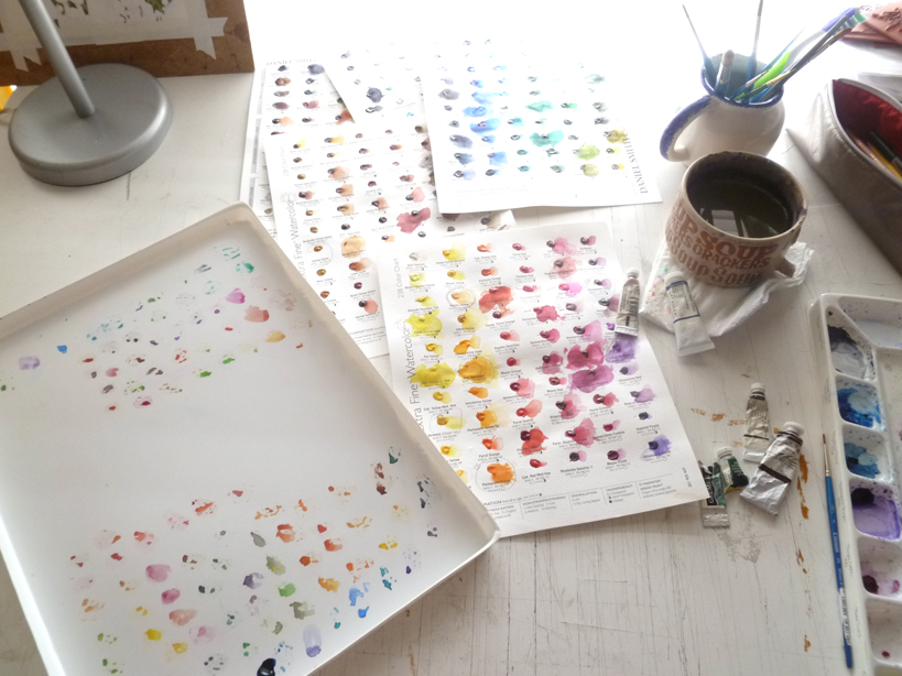
I just spent $80 on 9 tubes of watercolor paint. Nine. Seems like a small number for that price, but I believe it's worth the investment.
I have been using student grade Winsor & Newton watercolors for years, and have a few professional/artist grade tubes. The idea of spending $10 on one 5ml tube of paint just didn't compute. Until I got the
Daniel Smith Try It Dot pages. These are
AWESOME!Over 200 colors, all there to try out and use. The real deal in trial size. Genius. It is because of these sheets did I finally come to realize, as a professional, how much I needed professional grade watercolors.
They're smooth like silk, mix without a hitch, and the colors are so gorgeous! I then decided to purchase. But the price tag was still making my stomach turn. So expensive!
This led me to an entire week of studying and figuring out which colors to purchase. The DS dot sheets were key to this. They're the only professional grade paints I have right now. To help I found a great website that makes watercolor paints into science called
HandPrint.
I don't understand much in science, but he had a large section on palette color choices. All of the research was done for me, and they listed which colors were the best to have in every palette....colors that make all of the "convenience" colors (sap green, turquoise, violets, etc.).
 That's what I needed, the foundation colors.
 From there I could at least start, then purchase as needed the extra colors.
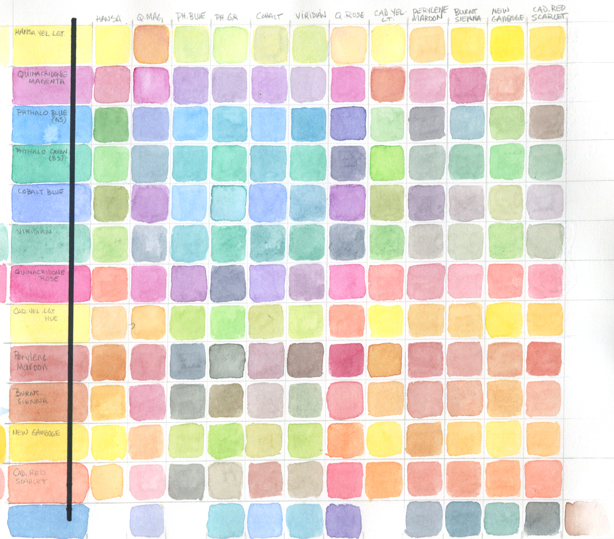
I also came upon an exercise to help decide which colors to have in your palette. A color chart. As one of my students yesterday best said "A multiplication chart but with color." Exactly!
Here's the blog link:
Ask Susie -
http://ask-susie.blogspot.com/2009/01/make-your-own-color-chart-for.htmlTho the woman who suggested the chart used only 7 colors, I ended up having 13. I wanted to see and be exactly sure what I was going to spend my money on.
This was grueling but totally surprising and fun seeing what two colors made what. I was pretty amazed at the little knowledge I had about color mixing.
Here are the colors I ended up purchasing:Phthalo Blue GS - DS
Phthalo Green BS - WN
Cobalt Blue - WN
Quinacridone Rose - DS
Perylene Maroon - DS
Burnt Sienna - WN
Cadmium Scarlet - WN
Yellow Ochre - WN
Benzimida Yellow (Winsor Yellow) - WN
* DS = Daniel Smith; WN = Winsor & Newton


.jpg?picon=1679)


This is beautiful. Thank you for the great advice and instruction. I feel peace expectantly waiting for me to bring out my supplies. I use oil pencils, allows creative blending.I wonder if I paint on a square of fabric...? Okay, guess I meed to go get busy! Thank you for sharing!
Valerie,
I just love your introduction to the mandala! You give some great encouragement for anyone who wants to create one and the list of tips you include make it so fresh and custom to what works for you. I also appreciate the video you include that shows the making of one. It really looks simple, fun and focused.
That's what makes art journaling/journaling such a fab practice; you can do it any way you want to and benefit from its meditative qualities.
I have chosen your post, Art Journal Tip: Meditate with a Mandala, for the #JournalChat Pick of the Day on 3/5/13 for all things journaling on Twitter; a link will be posted on the social networks, on my blog and website Refresh with Dawn Herring, and in my weekly Refresh Journal: http://tinyurl.com/abael32.
#JournalChat Live is every Thursday, 5 EST/2 PST, for all things journaling on Twitter; our topic this week is Your Journaling: Changing Perceptions.
Thanks again for sharing the mandala and how we can benefit from making our own.
Be refreshed,
Dawn Herring
Your Refreshment Specialist
Host of #JournalChat Live and Links Edition on Twitter
Author of The Birthday Wall: Create a Collage to Celebrate Your Child
What a great idea! I love it. Simple and lovely article.