What is JacketFlap

  • JacketFlap connects you to the work of more than 200,000 authors, illustrators, publishers and other creators of books for Children and Young Adults. The site is updated daily with information about every book, author, illustrator, and publisher in the children's / young adult book industry. Members include published authors and illustrators, librarians, agents, editors, publicists, booksellers, publishers and fans.
    Join now (it's free).

Sort Blog Posts

Sort Posts by:

  • in
    from   

Suggest a Blog

Enter a Blog's Feed URL below and click Submit:

Most Commented Posts

In the past 7 days

Recent Comments

Recently Viewed

JacketFlap Sponsors

Spread the word about books.
Put this Widget on your blog!
  • Powered by JacketFlap.com

Are you a book Publisher?
Learn about Widgets now!

Advertise on JacketFlap

MyJacketFlap Blogs

  • Login or Register for free to create your own customized page of blog posts from your favorite blogs. You can also add blogs by clicking the "Add to MyJacketFlap" links next to the blog name in each post.

Blog Posts by Tag

In the past 7 days

Blog Posts by Date

Click days in this calendar to see posts by day or month
new posts in all blogs
Viewing: Blog Posts Tagged with: Adobe Photoshop, Most Recent at Top [Help]
Results 1 - 25 of 36
1. Cardinal #6 with Video


I felt like I had to do at least one more cardinal.  And since yesterday's cardinal was biking, I thought we should go old-school and have a cardinal flying today. I think this guy is enjoying the last of the warm weather before the snow moved in tomorrow. :(


0 Comments on Cardinal #6 with Video as of 4/15/2014 11:23:00 AM
Add a Comment
2. Cardinal #5

What better warm up for a Monday morning than drawing a bird on a bicycle?

0 Comments on Cardinal #5 as of 4/14/2014 11:57:00 AM
Add a Comment
3. Drawing Video - Cardinal


I love watching other people draw.  So this morning I've been playing around with the camera and trying to video tape myself drawing.  Here's a little bird that I did just for the fun on it.  (I also need to consciously start doing a warmup drawing every morning to get myself going.)


I scanned in the drawing and colored it in Photoshop which I wanted to include in the video but, alas, the video capture software I was using refused to cooperate. Grrr!

There are definitely some things I'll do differently next time.  For one things, I'll use a darker pencil. And I'll make sure to clean the camera lens!  But I hope you find it interesting.


0 Comments on Drawing Video - Cardinal as of 1/1/1900
Add a Comment
4. Digital Art: Marigolds from the Garden

Marigolds digital floating lemons


Snapped photos of some marigolds from the garden, erased the background on Photoshop and then popped them into Corel Painter and used oil brushes to repaint them. Back into Photoshop for a cleanup, and here they are.

Then played around a bit with filters to see if enhancing them further would give me extra-ordinary results. Came up with the result below and I do like it, though I think I prefer the colours and contrasts of the original above. Still, there's something slightly crazy about the version below that appeals to the 'need-to-experiment-more' side of my nature that's demanding my attention at present.


Marigolds digital 2 floating lemons


Wishing you a bright, extraordinary day. Cheers.


Add a Comment
5. John Knoll Named Chief Creative Officer of ILM

Veteran visual effects supervisor John Knoll has been promoted to the position of chief creative officer at Disney-owned Industrial Light & Magic, reports Variety.

Working directly with ILM president Lynwen Brennan, Knoll will ensure creative consistency throughout the planning and production stages of ILM projects. The move is similar to John Lasseter becoming chief creative officer at Pixar following Disney’s purchase of the company.

Knoll is held in high regard throughout the visual effects industry. He was a visual effects supervisor on the Star Wars prequels as well as the first three Pirates of the Carribean films. He has worked on countless other major projects at ILM stretching back to Willow and The Abyss, and including films in the Star Trek and Mission: Impossible franchises. Knoll is also known as the creator of the software package Adobe Photoshop, which he developed with his brother Thomas in the late-1980s.

Besides serving as a creative voice in the production process, Knoll told Variety that he will leverage the company’s talent pool by encouraging interaction between crews working on different projects. He also said that he will remain hands-off in many instances:

“We have well-established supervisors here that certainly don’t need me to interfere with their project. Michael Bay comes because he wants to work with Scott Farrar. J.J. [Abrams] comes to ILM because he has a great relationship with Roger Guyett. These things are already working and I don’t need to interfere. [My role] is just to help from a facilities standpoint to make sure they get the resources they need, and to troubleshoot problems.”

Add a Comment
6. Artist of the Day: Alex Grigg

Alex Grigg

Alex Grigg is an Australian artist working in London. He posts work on his portfolio and blog.

Alex Grigg

Alex creates 2D and 3D animation commercially and for personal projects. He has refined a workable method of animating in Photoshop that allows him access to the varied brushes and mark-making tools in the program. This is a video guide on his methods.

These are his “Idiots” loops for the monthly LoopdeLoop animation challenge:

Alex Grigg

And this is an animated GIF from the project Alex and Jason Pamment are working on for the Late Night Work Club:

Alex Grigg

Add a Comment
7. Doodle Day: Quirky Cupcakes

Now that I've started on a cupcakes theme, I'm going all the way with it this week! So I doodled some quirky cupcakes ... they're a bit odd, whimsical, playful and lots of fun to draw. I doodled flower cupcakes, a sailboat cupcake, coffee cupcakes, a heart cupcake, a colourful iced cupcake, one with a cherry on the top, and even a landscape cupcake with mountains and a stream ... Here are the doodles:


Doodle-quirky-cupcakes-1

Doodle-quirky-cupcakes-2


I then scanned them in and started working on them individually. Don't like the bottom left and bottom right ones too much so those will be scrapped, but I think the rest might make for a cute pattern and as individual images to place on cards and gifts. So I made sure I scanned in a relatively high resolution and went to work on the rest. Here are what I've done so far with the first two ...


Doodle-quirky-cupcakes-3


A pretty pink Daisy cupcake, and ...


Doodle-quirky-cupcakes-4


... an orange Rose cupcake. What do you think? I digitally 'painted' them and cleaned up edges and finally applied a photoshop filter. I normally repaint them using Corel Painter 12 but since my last Mac OS update that no longer works, which is truly disappointing. I'm hoping that they catch up on the updates soon as I do miss it, but meanwhile, photoshop handled these cupcakes pretty well.

I'm still working on the rest of them. I may post those once I'm done. Cheers.


Add a Comment
8. Love Birds Tutorial

I haven't done a tutorial in a long time so I thought I'd share some of the newer Photoshop tricks and techniques that I've learned lately.  Here's a piece that I did for the Illustration for Kids February promotional mailer. 


For this image, I knew I wanted to make two love birds so I downloaded a bunch of reference photos of love birds and created a rough pencil drawing.


It was pretty messy, so I redrew it on tracing paper.


I scanned the pencil drawing of the birds into Photoshop and cut and pasted it into a new photoshop document, making sure this new file was the size of the final artwork and in RGB color mode.  I made sure I included all the necessary bleeds, so there weren't any surprises later.


Then I created the heart shape in Adobe Illustrator and cut and pasted (paste as pixels) into the Photoshop file. Then I erased the parts of the heart that should be hidden by the birds. I also sketched in the rest of the leaves on the end of the branch.


For this illustration, I wanted everything in the image outlined in a grainy pencil line.  To do that I could have created a new layer in Photoshop and traced the image using the brush tool, but I haven't found a pencil brush in Photoshop that I'm completely happy with. So I decided to print the image out on drawing paper and trace it with a soft graphite pencil.  But before I did that, I made some modifications to the image.

I selected the layer with the birds and clicked on Image->Adjustment->Levels.  I then adjusted the level sliders in order to make the whites whiter and the pencil lines darker.


Next, I wanted to make the whole image a pale blue color, sort of like a non-photo blue pencil.  To do this I made sure I was on the topmost layer of the file and I created a new "Hue/Saturation" adjustment layer.  In the Adjustments window I checked the "Colorize" check box and moved the hue slider to a cyan blue color and increased the Saturation and Lightness until I was happy with the results.


Next I stuck a sheet of Strathmore drawing paper in my inkjet printer and printed the image.  I then traced over it with at 4B pencil.


Then I scanned it back into Photoshop, adjusting the Levels as needed to make the whites white and the darks dark.  It wasn't bad, but I had a few places where I didn't follow the lines exactly so I had some light blue lines showing through.  


In order to get rid of these blue lines I went the the "Channels" window.  By default Photoshop makes all three color channels visible (red, green and blue)  By clicking on the little eyeballs next to each channel I could turn each one on and off.  I could see that the blue lines show up much more on the red channel but not so much on the green and blue channels.  I took advantage of that to get rid of those pesky blue lines.


To do so, I clicked on the blue channel while holding down the CTRL key.  This selected everything in the blue channel, actually this selected all the white areas in the blue channel. By clicking on Select->Inverse I was able to select all the dark parts.  Then I created a new layer in my file, made sure my foreground color was black and press ALT-Backspace to fill the selection. Tada! now I have a new layer that is just my pencils lines an nothing else.  

Phew! I think this is a good place to stop for now. Next time I'll go over how I colored the artwork.


0 Comments on Love Birds Tutorial as of 1/29/2013 8:44:00 PM
Add a Comment
9. Doodle Day: Branches

I usually doodle into a small moleskine journal that sits beside me and gets picked up whenever I have to wait for something to happen, such as when I'm uploading large images to one of my stores. I've been flipping through its pages recently, and found this tree silhouette, so of course decided to see if I could take it a bit beyond its scribbly confines to and use it on cards or gifts somewhere somehow ... Here's the original sketch, warts and all:


18-tree-silhouette


And here are some of the steps I worked on. First I 're-painted' the background digitally so it wouldn't look so marker-pen-ish:

18-tree-silhouette-2


I then had the brilliant (debatable I know) idea of working on the tree itself:

18-tree-silhouette-3


And finally, as I have Valentine's Day ideas in mind, I carved a heart on the trunk ...

18-tree-silhouette-4

All of the above was done in Corel Painter 12 (I love it!) and Adobe Photoshop. I'm a mere beginner at both but I couldn't live without them now.

I'm still undecided as to which one to use or whether to use it at all, though I guess I could put up some cards with the carved heart on it and see if anyone would like that for Valentine's Day. Would you send it to someone you loved? Cheers.


Add a Comment
10. Same Tree Different Finish


Maybe it's just me but I feel like the pencil phase and the final art phase are two completely different things. This is the same pencil drawing that I started with for the other tree, but finished in a different way. Also done in Adobe Photoshop.

2 Comments on Same Tree Different Finish, last added: 10/19/2011
Display Comments Add a Comment
11. Happy Fall!


I've been flipping through my new Peter de Sève book today and puttering with Photoshop. This is the result. This is a pencil drawing colored in Photoshop.

1 Comments on Happy Fall!, last added: 10/19/2011
Display Comments Add a Comment
12. Space Rocket

24-Rocket-red-yellow-round

Rocket red yellow


A few months ago my sister asked me to design a space rocket for the birthday party of a young wannabe-astronaut, an event she was helping out with. So I drew her the above image and apparently it was very well-received by the little spaceboy.

I took another look at it recently and decided to work on it a bit more, so I redid the rocket in 5 different colour combinations before uploading the lot onto just about all the available products at Zazzle. Here they are:

24-Rocket-blue-green-round        24-Rocket-blue-pink-round

Rocket blue green                                  Rocket blue pink

24-Rocket-pink-green-round        

Add a Comment
13. Photoshop - Using Photos to Create Texture Brushes

I like creating my own texture brushes from all sorts of things. This tutorial will show you how to create texture brushes from your own photos.

Texture hunting makes for a fun afternoon. If you have little kids, it can be a fun family project. With digital camera in hand, and start looking for interesting patterns and textures. Rocks, trees, carpets, clouds are just a few things that can make neat texture brushes.

Once you have a some photos,upload them and open in Photoshop. This is a photo I took on vacation of a rock outcropping in Central Park...


This photo was already fairly monochromatic but that's not always the case, so the first thing I like to do is desaturate the image (Images->Adjustments->Desaturate). Then I create a levels adjustment layer. I want to boost the contrast in my image to make the texture more noticeable in the final brush.

Altering the levels isn't mandatory, you can leave more gray tones in your image, it will just mean that the textures will be more subtle. Experiment and see what works for you.

Next I use the round marquee tool to select a circle out of the middle of my photo. I then click Select->Modify->Feather and feather the edges of my selection about 10 or 15 pixels.

I then copy and paste my selection to a new file. So I have something like this...


Now I can create a new brush by clicking Edit->Define Brush Preset. This is what it looks like when I try and paint with it.


It's okay but I think modifying the brushes characteristics will make it a lot better. So I open the Brushes Palette and make a few modifications. First I increase the spacing. Right now some of the texture is getting lost in the overlay of the individual brush strokes. By increasing the spacing a little the texture will show through better.
0 Comments on Photoshop - Using Photos to Create Texture Brushes as of 1/1/1900

Add a Comment
14. Why DID the chicken cross the road?


Sorry, I don't know.

But Henrietta here is going to help me with the talk I'm giving on Photoshop painting technqiues at the New England SCBWI conference on May 15th. I'm going to be deconstructing this image and talking about the Photoshop brushes I used and how I created them. I'm giving the talk Sunday morning with Carlyn Beccia. We'll be covering various painting techniques using Photoshop and Corel Painter. Carlyn is very talented and knows a lot about Painter, so I'm hoping to learn a few things myself.

3 Comments on Why DID the chicken cross the road?, last added: 5/5/2011
Display Comments Add a Comment
15. Photoshop Brushes - Flow Vs Opacity

I'm giving a presentation next month with my friend Carlyn Beccia at the New England SCBWI conference. I get to speak about Photoshop painting techniques. And I thought this would be a perfect time for me to really look at some of the features of the Photoshop brush tool.

When you click on the brush tool you have an option to set the flow and opacity of your brush. This is one of those things that I found very confusing in Photoshop. What the heck is the difference between Flow and Opacity? They both have to do with the transparency of the brush strokes, but depending on the brush you are using they can seem to do pretty much the same thing. But there are some difference between the two.

According to the Photoshop help file, flow sets the rate at which color is applied as you move the pointer over an area, where as opacity sets the transparency of color you apply. Umm, I don't know about you, but that really didn't help me a whole lot.

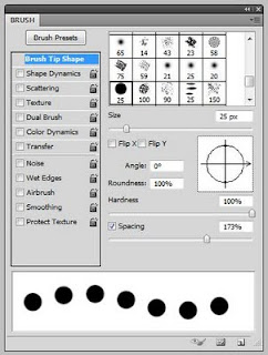
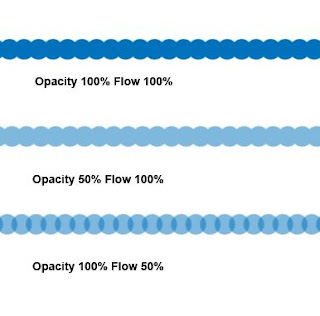
So let's take a closer look at each options. Let's select the hard round default brush. If we draw with this brush it looks like a think solid line but when we open the brush palette and increase the spacing we notice that this brush is lots of circles being laid down really close to one another, if you lay them down close enough together they look like one continuous line.


So for now let's leave the spacing kind of wide so the individual circles are touching slightly, somewhere around 70%. Now if I set the opacity to 100% and the flow to 100% and draw a line with this brush I get a sort of rippled solid blue line. No surprise there. If I leave the flow at 100% but reduce the opacity to 50%, I get the exact same ripply line only 50% lighter. But if I reverse it and leave the opacity at 100% and reduce the flow to 50% I get something a little different. Now, each little dab of the brush is reduced to 50% but where those little dabs overlap the paint coverage is actually darker than 50%.


Okay so that's not too confusing. Now what happens if I start reducing both the opacity AND the flow? This is where is can start hurting your head.

I like to think of opacity as being the main transparency governor. If I set the opacity to 75% then no part of my stroke will ever be stronger than 75% transparency. Within that 75% range I can decide how transparent each dab of the brush will be from 1 to 100%. So let's say my opacity is set at 75%, even if I set my flow to 100% my stroke will still only be 75% of the original color.

Right now you might be saying, well, that's great, but how is that going to help me with my painting? Look at these four samples. In each one, I scribbled around and around in circle until I could go no darker. As you can see the center of each dot is the same color (75% opacity) but you can see when I used a lower flow rate, I needed more little dabs of paint to get to that color. At 5% flow I was scribbling quite a lot longer than I was at 100% flow. So flow gives you a way to gradu

0 Comments on Photoshop Brushes - Flow Vs Opacity as of 1/1/1900
Add a Comment
16. Photoshop Tutorial - Watercolors (sort of)

When it comes to digital art, there is a school of thought that feels that the more digital artwork mimics traditional mediums the better. Unfortunately, anyone who has tried to replicate watercolors knows that a computer tends to fall short when it comes to copying those "happy accidents" that are inherent in watercolor painting. So I say, why try? Instead of slavishly trying to replicate watercolors, this technique takes inspiration from a loose airy style of watercolor painting and incorporates it into something new and a little different.


This illustration started off by scanning in a finished pencil drawing. I sometimes do my final line work in Photoshop using various grainy brushes, but sometimes it just feels good to pick up a pencil and paper.

After I scanned in the drawing, I selected Image/Adjustments/Desaturate to convert the image to black and white. The paper I was using had a slight yellow cast to it and I didn't want that showing up in the final art. Next, I selected Image/Adjustments/Levels. I clicked on the white eyedropper and then clicked on the white of the paper to make paper really white. Next I selected the middle slider under the Input Levels graph and slid it slightly to the right to darken the pencil lines just a bit.

Once the pencil drawing was adjusted and looking right, I moved it to a layer above the background layer. The way I do that is to open the Layers windows and click and drag the background layer down to the "new layer" icon at the bottom of the layer window, it's the icon next to the trash can. This creates a duplicate of the background. Name this new layer, "outlines." Set the blend mode of this new "outlines" Layer to "Multiply" Next I select the background layer and click Select/All and fill the whole background with white. So now my image looks like this...


And my Layers window looks something like this...


Next I create a new layer between the background layer and the outlines layer and name this new layer "colors".

On the new "colors" layer I select the paintbrush tool and using a hard round brush and 100% opacity I start coloring in the picture. I purposely leave gaps here and there to leave bits of white showing between the colors just as if I was painting wet watercolors next to each other. If you aren't seeing the colors, make sure you have the outlines layer blend mode set to "multiply."

So now the image looks like this...

0 Comments on Photoshop Tutorial - Watercolors (sort of) as of 1/1/1900

Add a Comment
17. Coloring Pencil Drawings - Arthur Rackham Style


I thought it was time for another Photoshop tutorial. This tutorial will show how to color a drawing to give it an Arthur Rackham type feel. Now, before you say it, I know, I'm no Arthur Rackham. I just want to show how to give a drawing that aged sepia tone sort of look that he was known for.

The technique I'm going to use is very similar to the one I showed a while ago with Coloring Line Drawings in Photoshop, but with a few extra steps. So you might want to go back and take at look at that tutorial first if you are a Photoshop newbie.

This image started out as as a pencil drawing that I scanned into Photoshop. You could also start with a pen and ink drawing, charcoal, whatever you want. Below is exactly how it was scanned in, and I don't know if you can see it, but the whole image has a pinkish cast and lots of pencils smudges.


The smudges I'm going to leave, I think they will add to the feeling that I'm going for. But I want to get rid of that pinkish tint to the paper. So I click Image->Adjustments->Desaturate (or SHIFT-CTRL-U) That converts the image to greyscale.


For this technique you need to have the line drawing on a layer above the background layer. The way I do that is to create a copy of the background layer. You can either right click on the background layer and select "duplicate layer..." or you can drag the layer down to the little "new layer" icon right next to the trash bin. Rename this new layer, "Line Drawing". Now, go back to the Background level and select all (CTRL-A) and fill with a solid tan color. Your image won't look any different yet, but your layers window will look like this...


Click again on the "Line Drawing" layer and create a new adjustment layer (the little icon at the bottom of the layer window that looks like a black and white cookie.) We're going to create a "gradient map." Experiment a little with the gradients, you'll find that you can tinker with it in all sorts of ways to get lots of neat effects. You can see that I chose a gradient that goes from dark brown to

1 Comments on Coloring Pencil Drawings - Arthur Rackham Style, last added: 2/9/2011
Display Comments Add a Comment
18. Photoshop and Wacom Tablets


When I first started using the computer to create illustrations I primarily used Adobe Illustrator. This paper plate design was the first image in which I used Photoshop. I also used a mouse to create all my work (yep, I did that jungle plate with a mouse.) Wacom tablets were/are expensive, and I thought $400 was a ridiculous amount to pay for one. Oh, did I mention that I'm a cheap skate?

But then a friend of the family, who happened to be a graphic designer came to the house and saw my workspace. And she said, "you idiot, go buy a pen tablet!" I'm sure she said it much more diplomatically than that, but that was the gist. And she was right. If you want to use Photoshop for painting, a mouse will only take you so far. You really need to invest in a tablet. The good news is they have come down considerably in price.

The really difficult part of using a tablet is that you draw in your lap but your brush strokes show up on the monitor. That incongruity takes some getting used to. And honestly, I never found it as natural as drawing with paper and pencil, although I know some artists that don't have a problem. But a couple of years ago I upgraded to a Cintiq. The Cintiq is basically the Cadillac of the Wacom line. It's a monitor with a Wacom tablet built into it, so instead of drawing on a separate tablet you draw directly on the monitor. Sound cool? It is wicked cool, and much more natural feeling to me. I can't tell you how much I love my Cintiq. One of the function buttons was sticking the other day on my precious baby and I was fretting as if one my real children had come down with the flu. What would I do if my poor Cintiq became ill?! Luckily it recovered on it's own. Phew!

Programming the Wacom Function Keys

When I first started using a Wacom tablet I didn't make good use of the available funtion keys. I still had one hand on the keyboard to do things like hit "b" (the hotkey for the brush tool) and "e" for the eraser tool and my all-time favorite "CTRL-ALT-Z" for undo. But I have since started programming my Wacom for the way I work and it has definitely streamlined up my work flow.

Think about the tools that you use most in Photohsop and try bringing that functionality down to the tablet. I spend most of my time switching between the brush tool and the eraser tool. So in the Wacom preference utility, I set the left function keys to "b", "e" and "CTRL-ALT-z". The preference utility can be accessed in Windows by going to "Programs -> Wacom Tablet -> Wacom Tablet Properties" Notice how I can specify that the keys only have this behavior within Photoshop. You can set up different behavior for use in other applications (Illustrator for example)


The other thing that I have found very useful is to reprogram the buttons on the actual Wacom pen. I have set the top one to the left bracket and the bottom one to a right bracket. "[" and "]" are hot keys that are used in conjunction with brush tools. The they will resize the paint

2 Comments on Photoshop and Wacom Tablets, last added: 5/27/2010
Display Comments Add a Comment
19. Quickly Creating Patterns in Photoshop

As I was unpacking my materials from the NESCBWI conference this week I realized that I completely forgot to cover one of my presentation topics. I'm so annoyed with myself, because I thought it was one of the neater things that I was going to cover. I can't believe I forgot it. Oh well, at least I'll post it here on my blog. Better late than never, right?

I discussed this technique a while ago in the context of creating polka dot patterns but I think it's worth repeating. Many folks like to create collage images but are concerned about the copyright implications of using other people's fabric or paper designs in their work. This is a quick way to create all sorts of repeating pattern of your own in Photoshop.

First create a new document in Photoshop. It doesn't matter what size you make it as long as the height and width are an even number of pixels. I'm going to make mine 200px wide and 200px tall. Make note of the size, you will need it later.

Next draw something. The only rule is that you can not touch the document boundaries with your drawing. You can change the background to different solid color if you want, but make sure your drawing does not touch the edges of your image.

You can add textures, shadows, what ever, get as fancy with this as you want. Here I set the background to a light blue and drew a flower.


Now I could stop right here. If I click "Select -> All" and "Edit -> Define Pattern" I will get a pattern that will look something like this...


It's not bad but I want something less grid-like. So I'm going to modify it. First if you used more than one layer to create your image (which I did) you will need to flatten it into one layer. Next, select "Filter -> Other -> Offset" You will need to set the horizontal offset to one half of the total width of your image. In my case that would be 100 pixels. You will also set the vertical offset to half of the total height, again, in my case, that will be 100 pixels. Lastly, you will check "Wrap Around" for the undefined areas. If you click on the other options you will quickly see the difference. Once I run the offset filter I have something like this...


Now I can again draw something in the middle. But again don't touch the edges of the document. I can even draw over my original drawing and modify it just as long as I stay away from the document bounds. I drew another flower and one of the green curly cues overlap my original flower.

2 Comments on Quickly Creating Patterns in Photoshop, last added: 5/21/2010

Display Comments Add a Comment
20. Creating a Texture Brush in Photoshop


I'm working on a Photoshop techniques presentation for the New England SCBWI conference this weekend and I thought I'd share with you one of the techniques I'll be discussing on Sunday. The following tutorial will show you how to create the texture brush I used to create the image above.

This is a fun technique for creating custom brushes that will add texture and interest to your images. By the way, I'm using Photoshop version CS3 in this demonstration.

First get some white paper and some black paint (yep, I said paper and paint) I used some copy paper and cheap black acrylic craft paint. Then I used sponges, Saran wrap, leaves and anything else I could find to make irregular shaped blobs on the paper. You can even get your kids to help with this part.

Once it all dried, I scanned in some of my blobs. Here's one that I created with a wadded up piece of Saran wrap dipped in paint.


I selected the blob using the marquee tool and then clicked Edit -> Define Brush Preset and hit OK.

If I then use the brush tool using my newly created brush, I get something like this...


It's interesting, but too mechanical and repetitive for what I want to do. So I'm going to open the brush palette (Window -> Brushes) and make some changes.

I clicked on the Shape Dynamics on the left-hand side of the dialog to open the shape dynamic options. The first thing I change is the size jitter, I set the Control to pen pressure. But I don't my brush size to vary too much in size, so I set the minimum diameter to 70%.

Next I set the Angle jitter to 100% and also check Flip X jitter and Flip Y jitter. This will give it a more random look, like I was dipping a sponge in paint over and over again twisting the sponge as I went.


As you can see from the preview window in the bottom of the brush dialog this is looking a lot more random now. Of course I encourage you to play around with all the brush settings and see what sorts of effects you can come up with.

It's very important to remember that once you change the brush set

2 Comments on Creating a Texture Brush in Photoshop, last added: 5/11/2010
Display Comments Add a Comment
21. Ask the "experts"? Don't bother. Ask the artists.

Anyone considering singing up for Adobe help should save their money. Better to buy a six pack, go online, read how other digital artists have fixed the problems, and do it yourself.

After paying the nearly $40 and several hours of "tech support"(most of the time on hold) I was basically told to continue tinkering with a fix to "see what works" and rebuild all of the work I did to customize the program to meet my workflow.

1 Comments on Ask the "experts"? Don't bother. Ask the artists., last added: 2/23/2010
Display Comments Add a Comment
22. NESCBWI Conference May 14-16, 2010


It's hard to think about a spring but registration opened last week for the New England SCBWI conference in Fitchburg, MA. The New England regional conference is always a really wonderful event. If you are in the area and are interested in writing or illustrating for children I highly recommend attending this conference.

This year author Cynthia Leitich Smith, illustrator Marla Frazee, and editor Allyn Johnston will be giving the key note addresses. Plus there are lots of other great speakers including Matt Phelan, Dani Jones, and Frank Dormer just to name a few. And yours truly will be running a Photoshop workshop for illustrators on Sunday. Hope to see you there!

1 Comments on NESCBWI Conference May 14-16, 2010, last added: 2/17/2010
Display Comments Add a Comment
23. Illustration Friday - Germ


Just to show that you can use all sorts of things to make interesting Photoshop brushes. The brush I used for the background of this image was created by manipulating a photo of the H1N1 virus.

5 Comments on Illustration Friday - Germ, last added: 10/4/2009
Display Comments Add a Comment
24. Alley Cats


I'm currently working on a book that has lots of different animals in it but one happens to be a cat. And for some reason, I find cats one of the more difficult animals to draw. So in an attempt to get some practice drawing cats plus test out some new painting techniques in Photoshop, I did this piece. I just finished and I'm not really sure what I think if it yet, but I thought I'd share it anyways.

0 Comments on Alley Cats as of 1/1/1900
Add a Comment
25. Happy Weekend Inspiration Card 16


Work like you don't need the money.
Dance like no one is watching.
And love like you've never been hurt.
~Mark Twain
One of my favorite quotes!

The illustration you see here is a glimpse of a design that I created for the German magazine DECO. Can you believe it, there's a gift service that sells Yodel lessons in the alps! That's what my illustration was for. I wonder if earplugs come with the package ;-)
Astrid

0 Comments on Happy Weekend Inspiration Card 16 as of 1/1/1900
Add a Comment

View Next 10 Posts