

Corel has added significant improvements to the 2017 edition of its digital paint software Painter.
The post Texture Painting, Glazing Brushes, Customizability Among New Features in Corel Painter 2017 appeared first on Cartoon Brew.
Add a Comment
 By: Jerry Beck,
on 8/9/2016
By: Jerry Beck,
on 8/9/2016
Corel has added significant improvements to the 2017 edition of its digital paint software Painter.
The post Texture Painting, Glazing Brushes, Customizability Among New Features in Corel Painter 2017 appeared first on Cartoon Brew.
Add a Comment
This image is part of a two page spread that illustrates the change in hibernation patterns of Spanish bears in the Cordilleran Mountains. They are waking up too early due to warmer winter temperatures and often no food is available for them to eat.

People have been asking, and I am pleased to announce that “Bunny Baron 2″ is on its way! The story is already written; I may need to do some editing, but I think it will have a great positive message. It is now time for me to do the illustrations. This is something that took me quite a long time to do in the first book because I drew everything by hand, from the sketching to the coloring. Coming into the second book, I wanted to make it bigger and better. I also wanted to streamline the process so I can deliver a great quality story faster than I was able to before.
I decided that I am going to draw my illustrations for “Bunny Baron 2″ digitally. I gathered up the tools I need with the guidance of a good friend.  I purchased a copy of Corel Painter X3 which will be my drawing platform. Obviously, there will be a learning curve, but I know I can do it! I also purchased a Wacom Intuos touch tablet.
  This will be my “pen and paper.” I am ready for the new “digital age,” and I am prepared to begin putting these new tools to use and create the Bunny Baron and all of his friends in a new digital perspective. I am so excited to begin this new digital experience. I will keep everyone posted on the progression of “Bunny Baron 2″ and hopefully in the not too distant future, it will be finished!
 By: Lynne Chapman,
on 2/26/2014
By: Lynne Chapman,
on 2/26/2014


Snapped photos of some marigolds from the garden, erased the background on Photoshop and then popped them into Corel Painter and used oil brushes to repaint them. Back into Photoshop for a cleanup, and here they are.
Then played around a bit with filters to see if enhancing them further would give me extra-ordinary results. Came up with the result below and I do like it, though I think I prefer the colours and contrasts of the original above. Still, there's something slightly crazy about the version below that appeals to the 'need-to-experiment-more' side of my nature that's demanding my attention at present.
Wishing you a bright, extraordinary day. Cheers.
By: Lynne Chapman,
on 4/17/2013


Getting a smile to look right is important. There is a fine line between friendly and psychotic.
Not sure if I achieved that here but these were ‘fun’ to do.
Not sure who the one on the left is but the one on the right is of actress Ziyi Zhang.

I’ve been working on a few projects recently including Alice in Wonderland. I like to explore lots of different options when I’m designing a character. This is just the initial amount of sketches with reference to the original illustrator Sir John Tenniel in the top right. I then chose the designs I like the most and develop them further with more variations in shapes.
I like to get the reference right first and this helps me learn more about the character, but I think having fun and trying crazy variations is also very important to the creative process.

I’ve also been doing some warm up exercises I learned from the Schoolism course I did last year (Character design with Stephen Silver). There are infinite variations you can create with the circle, square and triangle as a starting point but here are just 3. the top one is the closest to the original reference but obviously stylized somewhat.

Add a Comment
I’ve updated my mixed media brush library for Corel Painter 12.
I made some new ones and got rid of ones I didn’t like so much.
Enjoy!
Add a Comment
Here are some studies for today.


I did the lips yesterday and made a video of the painting progress on youtube.
I’m a bit of a mushroom fan, I’ve got about 6 books on the subject now. I just love the different shapes and colours.
Add a Comment
This is a study using the lovely actress Tilda Swinton as a starting reference.
I’m a bit obsessed with red hair I suppose- it’s not very easy to paint with so many shades going on so I like the challenge.
I also saw Pixar’s film “Brave” last night and it was brilliant- lots of red hair too.
 Add a Comment
So. I'm in the middle of updating one of my older drawings. Well, a set of drawings ... three white ducks drawn, ATC-sized (that's 2.5"x3.5" to those who have no idea of what Artist Trading Cards are) on coloured backgrounds, all in coloured pencil. The originals are at this post: Ducks ATCs.
I decided to play with them a bit in Corel Painter and now I'm not sure of which ones I should put up on my cards and gifts online - the original drawn in coloured pencil, or the new digitally re-painted ones!
I'd love some help deciding, so here is the original:
And here's the 'painted' version:
To tell the truth, this isn't the first time I find myself stuck at having to make a choice. Am not too great at decision-making anyway, and when it comes to my art I think I get far too emotionally close, so it's difficult to stand back and be objective. I can get stuck for hours just trying to pick two different shades of the same colour! It's so not amusing that it's funny.
I'm seriously considering starting up a regular "dilemma" section where I ask for help picking out colours or different versions of a piece of art or illustration ... we shall see ...
As far as my Ducks are concerned, I do think I know which one I'm leaning more towards, but am still unsure and haven't made up my mind, so I'd love and appreciate any comments and help. Which one do you prefer?
I am, very slowly, learning more about Surface Design. And discovering that I'm loving it. It's certainly not a simple process, but I do love puzzles and that probably helps, as putting the separate pieces together to make a cohesive (and aesthetically pleasing!) whole is definitely a large part of the overall process. I just hope that I'm getting it right.
Following on from my Daisy Joy, I've drawn 5 Poinsettia plants in the same style, and attempted once more to create a pattern from them. Here's one of the painted Poinsettias, and below that are the fabrics I've designed from them.
As the Poinsettia plant is so closely associated with Christmas, I've picked cheery seasonal colours for the backgrounds ...
Poinsettia Joy dots Fabric Collection
Poinsettia Joy red Fabric Collection
Add a Comment
I've been increasingly fascinated by surface design lately. I've always loved patterns but it never occurred to me that I might one day be able to create some of my own. Recently, being able to design on household products has driven me to study the formation of patterns, and I'm slowly learning, researching, and experimenting. Here are the results so far:
I started off by drawing some daisies, then scanning them and digitally painting them in Corel Painter 12 before I took them back into photoshop to apply a few effects. Then it was time to pick background colours, never an easy task for me and it usually takes me hours of nail-biting indecision but I finally came up with three ...
The above turquoise blue was my favourite, but it seemed to work just as well against the chantilly pink and gold yellow (see below). I was aiming for a cheerful, bright and joyful look. Hope I achieved it. The background seemed a little subdued for some products, so I applied stripes in a lighter colour, I then picked a few daisies to enlarge and highlight, and this is the end result:
Add a Comment
A digital painting from a photograph by the friend who made the cupcake ... Thank You Michelle! It looked too delicious to resist, and as I couldn't pop one into my mouth as I wished, I drew it instead.
Felt like playing with Corel Painter 12, so I used the oil paint brush and picked the colours from the actual photograph to do this piece. I'm wondering though if perhaps the icing could with a bit of extra whitening, what do you think?
I love anything with sugar icing, doesn't it look just too delicious? I've been promised some cupcakes when she visits this summer and can't wait. Perhaps I'll do more cupcake drawings then, in a variety of mediums. From photographs. Once I've gobbled them down. Cheers!
The Red Owl is in fact my Blue Owl from last year, transformed into a vibrant creature dressed in reds ... though still retaining that slightly bored, slightly grumpy expression I've become quite fond of.
I'd originally planned on just adjusting hues and saturations in Photoshop and leaving it at that, but of course I wasn't quite satisfied with the result, so I ended up dragging it into Corel Painter 12 and doing a huge repainting job with their oil brushes. Glad I did, as I quite like the end result. Took it back into photoshop to fiddle a bit more and add the drop shadow, and here you have it.
I then drew and added the graduation cap, as it just seemed right. The final result is a bright creature, extremely intellectual (as owls are), and slightly cynical (with dollops of humour). But happy. Honest.
If you'd like to peek at the original Blue Owl, it's over at: http://www.floatinglemons.com/2011/02/blue-owl-bee-happy-daisies.html. Cheers!
RED OWL cards and matching gifts are over at:
Red Owl at FLoating Lemons Illustration @ Zazzle, and
RED OWL GRAD graduation cards, invitations and matching goodies is up at:
Red Owl Grad at Floating Lemons Events @ Zazzle
A little image that came to me while I was watching TV a few evenings ago (I was watching a particularly gory episode of a forensic series, so have absolutely no idea of why cute owls came to mind). I grabbed my little wacom and laptop and scribbled it straight into Corel Painter 12 and had fun with it the rest of the evening.
Once I was done I googled 'owl love' just to make sure that the inspiration hadn't come straight from somebody else's illustration that had stuck in a corner of my visual brain. It's something that happens far too often, so I always have to ensure that I'm not inadvertently 'copying' some else's work that I previously admired. Particularly so in this instance as owls seem to be multiplying in flight on the virtual airwaves; apparently they are a huge trend at the moment.
Once I was as sure as one can be that I wasn't plagiarising, I cleaned it up and uploaded it to my stores. It's a quick little digital sketch, I know, but I'm now quite fond of it. Cuteness seems ingrained in some part of my psyche whether I wish it to be or not.
Cheers!
If you're interested in taking a peek, I'm uploading it at the moment to:
I've been doing a bit of doodling. Not quite sure where this came from, but I liked it enough to transfer it into Corel Painter and paint over the original colored pencil drawing. Still needs a bit of a clean-up but I'll do that once I'm done with the queue of Christmas and New Year designs I have to finish up or redo! Cheers.
A little doodle of a sweet pair of doves, one pale blue and the other light pink, cuddled in an embrace shaped like a heart. It started out as a pencil sketch in my moleskine that I scanned and then digitally painted in Corel Painter, then played around with in Photoshop to create a pair of separate blue and pink hearts as well:
I've used them to design cards and matching gifts for ...
Weddings: Two Doves One Heart Wedding at Floating Lemons Events;
Baby Showers for twins: Twin Doves Heart at Floating Lemons Events;
and Valentine's Day: (coming soon!)
Cheers!
By: Lynne Chapman,
on 5/25/2011


I've just discovered Corel Painter and am thoroughly enjoying everything it has to offer. This blue owl started off as a teeny marker pen doodle in my moleskine ideas book, and was scanned in and dropped into Painter where I had a sinful amount of fun painting him over, playing with their oil brushes and palette. Couldn't do it without my Wacom Bamboo pen and tablet -- I spent a whole day immersed in a non-messy oil painting experience. Can't wait to get my hands 'dirty' again. I have further plans for my Blue Owl, he will be 'graduating' soon and wearing the proper attire for it.
Here's an older drawing (Bee Happy Daisies) that I reworked in photoshop (pre-Painter discovery) and uploaded to Zazzle. I cut the bees and flowers out and played with the design in various configurations on the different products that they have to offer ... I love the customization option on Zazzle that allows for this. So it's slightly different depending on which product it's on up at the store, but this is the original illustration:
Cheers!
Blue Owl cards and matching gifts at Floating Lemons at Zazzle
Bee Happy Daisies cards and matching gifts at Floating Lemons at Zazzle
By: Lynne Chapman,
on 5/15/2010
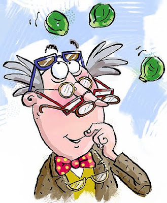 Disappointingly though, there were no brussel sprouts involved - this is a digital illustration (done in Corel Painter) from a Professor Brainstorm book from a few years back, and I can't for the life of me remember what the sprouts were about!
 The first pair turned out quite similar to my old ones I suppose, though more purple that pink.


great job :)
your work is just lovely...what an inspiration you are. Thanks for sharing x
Hello Lynne!
Wow! What a great talent you have! Your illustrations are absolutely amazing but I guess you already know that. You have also managed to make this blog a very good platform for your work - its a good read. Anyway, I think I could help to further increase your readership (yes, I do realise that you already have a pretty big following - and rightfully so).
I am looking for quality blogs to include into our community of bloggers - glipho.com
Please check us out and drop me a line at [email protected] for any questions.
Best!
Hubert
That is fascinating. So your old Corel continues to work on an updated computer?
So far. .. :-]
Nice explanation Lynne! I've had similar issues too in the past. I really don't like the way text tends to hover over artwork, so whenever possible I avoid using text within the artwork. Shop signs are an inevitable exception though. Well treated!
Looks amazing! Do we have a publishing date yet?
Remember I mentioned a while back about hoping to have my own picture book published soon? Well, that is about to come true in the next few months! A picture book I illustrated is to be published end of summer :)
Congratulations Louise! That's great news - well done. You are going to beat me to it big-style, as 'Swap!' is unfortunately not going to be around for some time yet. The new publication date is August 2014, simultaneously in the UK, US and Australia.