new posts in all blogs
Viewing: Blog Posts Tagged with: handbag friends, Most Recent at Top [Help]
Results 1 - 17 of 17
How to use this Page
You are viewing the most recent posts tagged with the words: handbag friends in the JacketFlap blog reader. What is a tag? Think of a tag as a keyword or category label. Tags can both help you find posts on JacketFlap.com as well as provide an easy way for you to "remember" and classify posts for later recall. Try adding a tag yourself by clicking "Add a tag" below a post's header. Scroll down through the list of Recent Posts in the left column and click on a post title that sounds interesting. You can view all posts from a specific blog by clicking the Blog name in the right column, or you can click a 'More Posts from this Blog' link in any individual post.


via
Francois Roberts' "Contents"--a collection of photographs documenting the contents of 120 people's backpacks, pants, pockets, purses, handbags...
Of course he forgot to ask
The Handbag Friends what
ought to be in a handbag... (clue it's not keys and lipstick) and I don't see Clasp anywhere. But now is as good a time as any to sing The Handbag Song--won't you join me? Sing along, ready, steady, ... sing!
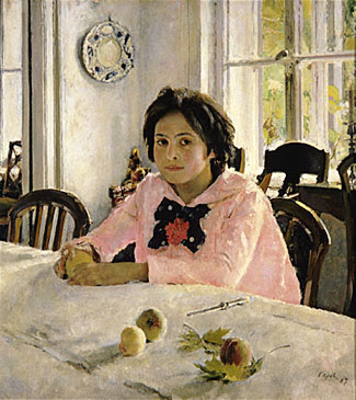
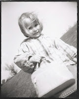 This is Olivia when she was about 3 with her pink handbag. (Oh she's my lovely niece, did I tell you?)
(Photo taken with my plastic toy Holga camera.)
My nephew, Harry (6), wanted to play machine guns in the trenches with his little sister; Olivia (3), just wanted to play princesses with Harry. It was a predicament.
It didn’t stop Olivia. She went fearlessly into battle but here’s the thing: in the middle of the machine gun fire—down there in the trenches with Harry—knee deep in all that mud—there she was, carrying her pink handbag.
Clearly—even in no-man’s land—Olivia would not be seen dead without her handbag.
But what to put in a handbag that goes with you into battle?
For that I approached the expert. "Olivia," I asked. "What do you keep your handbag?" She looked up at me as if I was the most foolish aunt any child could possibly have--and said, "My friends."
Of course. Do children have to explain EVERYTHING to grown ups? I think so. Probably. Sorry.
She then proceeded to pull out of her handbag: a plastic carrot, a furry bear, a tiny doll with one arm and bad hair, a strange knitted creature, a teapot and a purple troll.
But anyway, that's how Handbag Friends began. And it's for Oliva (and her pink handbag) that I wrote it.
Wait. Isn't it? shouldn't we? what about?
I think so.
Let's sing The Handbag Song! (You know you want to.)
 Last week, I had the privilege of visiting the children at Lincoln Hospital in the Bronx with Project Sunshine, a non-profit charity that sends volunteers to visit hospitalized children.
Needless to say, whatever I thought I was giving, I got back ten thousand fold. Thanks to my brilliant publisher (Random House) and editor (Anne Schwartz) and publicist (Noreen Marchisi) we were able to give away 70 books to these children. How cool is that?
They are a very brave group of children. What an honor. I got to chat with them in the wards and in the ICU and read to them and laugh with them. We read How To Be A Baby: By Me, The Big Sister and Handbag Friends and we sang The Handbag Song and watched the mini movie.
 For more information or to volunteer for this great organization, click here.
I'm part of the Book Club. Here's how they describe it:
"The Project Sunshine Book Club brings distinguished children’s book authors, illustrators and celebrities into pediatric medical facilities to provide special reading events. The Book Club enables children to meet authors and illustrators, to expand their interest in literacy, and to share in the joy of reading by learning how books are created."
You may recall the work of Atkinson Grimshaw, the Victorian moonlight specialist.
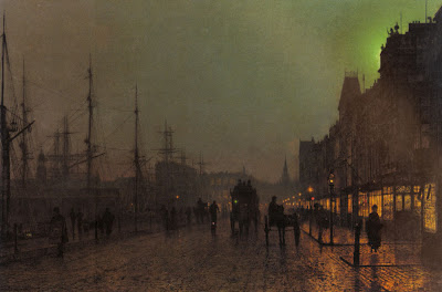 A typical finished Grimshaw dockside scene combines mysterious and atmospheric distances with the delicate tracery of rigging and other fine details.
What procedure did he follow to work out the perspective?
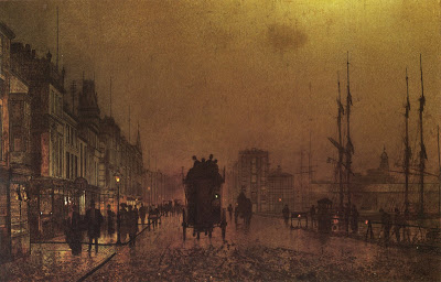
Fortunately there are a few unfinished Grimshaws which show his method. This one has a thin layer of brownish oil color scrubbed over the entire surface to establish the overall tonality and mood, but he has not yet moved on to the finished opaque rendering.
Here’s a detail of the same canvas. Grimshaw’s crisp preliminary line drawing shows right through the thin paint. I haven’t seen the original, but most likely the drawing was accomplished in India ink.
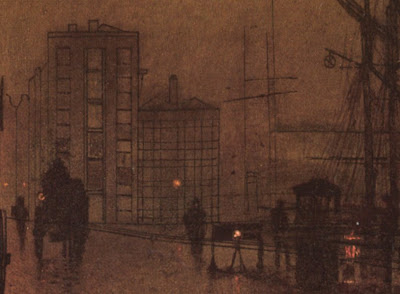
Grimshaw, like Bouguereau, Gerome, and many others in his day, preferred to have the foundational perspective work carefully completed in ink on the canvas before going on to the final painting. The drawing would eventually disappear under later opaque layers.
 Gerome also used a perspective ink drawing on the canvas before he dove into his renderings of complex tilework.
Other painters like Sorolla, Sargent, Duveneck, and Zorn (and, more recently, Richard Estes and Frank McCarthy) took a more improvisatory approach, and “found it in the paint,” drawing loosely at first with the brush. Both methods are completely valid.
More about Atkinson Grimshaw at ARC.org
Previous posts on the color of moonlight, Link; on perspective grids, Link; and on a Dinotopia preliminary line drawing, Link.
Tomorrow: Your Khalian Sketches (Deadline noon today)
Like a glissando in music, a color gradation moves smoothly from one note to another. Gradations can be very beautiful in purely abstract terms. They take you from one hue to another, or from a light color to a dark color, or from a dull color to a saturated one. Let’s have a look at some examples.
 This gradation goes from a dark desaturated blue to a pale desaturated yellow. So it shifts in hue and value, but not very much in saturation.

This one is fairly similar, but it moves from a neutral (or grayed down) dark to a warm light tone, passing through a slightly more saturated oranges in the middle of its range.

Here are three gradated strips of color. The top one changes primarily in hue as it goes quickly away from a dull red-orange and gradually arrives at a saturated blue, without changing very much in value. The middle one shifts darker in value, and the third one moves in and around related pinks and oranges before arriving at a paler pink.
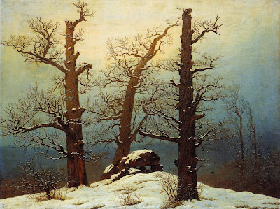
Now that you’ve seen some gradations out of context, let’s see where they came from. The first color strip comes from the right side of this painting by Caspar David Friedrich. Note that the brownish color of the trees also gradates as it moves away from the bright center of light. When two color sets move together, I call it a "parallel gradation."
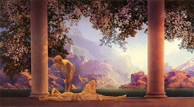
The second color gradation appears in the sky of this painting by Maxfield Parrish. The stone wall also gradates very slightly from warmer at the top to cooler at the base.
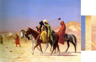
The group of three strips are all taken from a single Gerome painting of Arab horsemen. This painting is full of gradations, many more than I’ve shown. It owes much of its luminosity to the skillful use of changing color.
John Ruskin observed in Modern Painters (1843) that a gradated color has the same relationship to a flat color as a curved line has to a straight one. He noted that a painting of Turner—and that nature herself—contains movement or gradation of color both on the large and the small scale:
“I wish to insist…that nature will not have one line nor color, nor one portion nor atom of space without a change in it. There is not one of her shadows, tints, or lines that is not in a state of perpetual variation.”
Gradations don’t just happen. They take planning. In some future post we’ll explore some techniques for painting gradations and look at ways to use them in composition.
More from the Art Renewal Center database on Friedrich, Parrish, and Gerome.Tomorrow: Backs of Heads
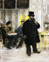
Juste milieu is a name given to both a philosophy of painting and a movement of painters in 19th century France.
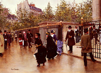
The juste milieu artists have been unjustly ignored in the oversimplified and polarizing narrative offered by most art history texts.
There aren't many books on them; they don't have a Wikipedia entry; they're not even mentioned in the index of many books about French painting—at least not in English. But if you read accounts from the period, they were talked about constantly. (Click on any image for enlargement, and to see the artist's name and the title of a work.)

"Juste milieu" translates as “the right mean,” or the “happy medium.” These artists aimed for a middle way between impressionist and academic camps.

Many of today’s new realist painters are trying for a similar kind of synthesis, introducing the best of both approaches into their work.

Starting in the Third Republic in the 1870s, independent painters were beginning to make inroads into the authority of the French Academy.

By the late 1880s, the juste milieu group separated from the Academy, forming under the name “Societe Nationale des Beaux-Arts.” Among these defectors were Carolus-Duran, Duez, Besnard, Raffaelli, Roll, and Braquemond.

They combined progressive ideas like a lighter palette and looser brushwork with high standards of draftsmanship—skills which were often lacking in the radical proponents of the new style.
Their work had a looser handling than would have been acceptable during the July Monarchy. They preferred to avoid the “licked” finish of Gerome, Cabanel, and Bouguereau.

At the same time, certain juste milieu artists like Dagnan-Bouveret (above) portrayed contemporary rural folk traditions with a dignity that Academic artists had previously given to classical subjects.

The juste milieu commitment to the middle way won them the admiration of many of the artists from around the globe who came to France for training and inspiration. Joaquin Sorolla journeyed to Paris not to see Monet, but to see Bastien-Lepage. (above).
Most of the worldwide impressionist movements, particularly in England, Australia, Russia, and America, were more influenced by the juste milieu artists than by the artists that we think of as impressionists, like Sisley, Pissarro, and Renoir.
 Degas, who felt the impact of this group of artists, said of Besnard, (ceiling decoration, above) “[He] has stolen our wings.”
Tomorrow: Frontal Lighting
If you paint in oil with big flat bristle brushes, it gives the painting a kind of “big pixel” look. Here’s a plein-air study I did of some rooftops.
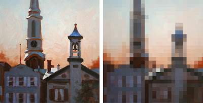 On the left is the actual painting, and on the right is a computer interpretation. The idea of the digitized version is to suggest the approximate module of the patches or brushstrokes. Each square is more or less equal to the width of the brush. So for a 16 x 12 inch painting, the brush was about a half inch wide.
I don’t think this painting was very successful. Part of the problem is that the units of detail are all about the same size throughout the picture. The effect is kind of clunky and simplistic, and there’s no center of interest. It’s like a whole symphony played at the same tempo and in the same key.
Let me propose this principle: a broad handling works better if there’s a center of interest in sharper focus.
You may have seen my painting of a McDonald’s sign before, but I want to make a different point with it. In the actual painting (oil, 10x8 inches), the word “McDonald’s” is painted as tightly and carefully as I could manage while standing outdoors in the parking lot.
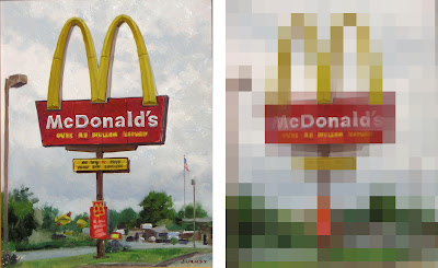
But the line of writing below “McDonalds” is almost not readable. And the type on the yellow and red signboards lower down are just suggested with blocky shapes. In the background, the scale of blockiness increases even more.
In the mosaic version of the painting at right, I’ve interpreted the image in two sizes of tiles, with smaller tiles near the center of interest to make the simple point about varying the module of brushstrokes.
This principle of the scaling of detail is one of the hallmarks of the late 19th century portrait painters, like Sargent, Zorn, Sorolla, or Valentin Serov. Serov isn’t well enough known in America. Here is his portrait of the composer Rimsky-Korsakov. Click on it; it's a big juicy file, thanks to Wikimedia Commons.
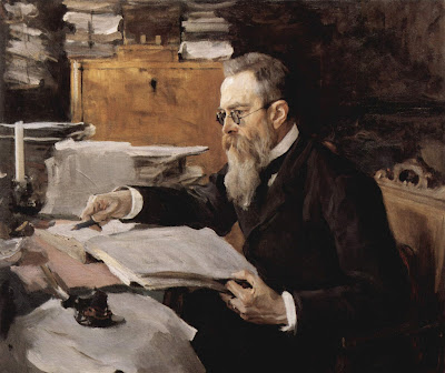
Serov painted the face in relatively tight focus, but he represented all other areas of the picture with rough strokes made with a bigger brush module.
I find this orchestration of detail deeply satisfying because it captures the way our eyes actually perceive the world. There’s a tight focus at the center of interest, and bigger shapes in the periphery. Serov gives us all the information we need to understand the character of the man, no less and no more.
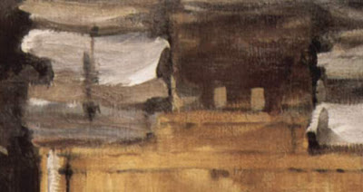 Look at this background detail from the Serov portrait. It has a wonderful “pixelly” abstract quality, like something caught at the edge of vision.
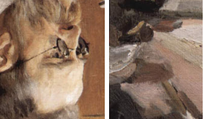
And here’s another detail, placed out of context next to the rendering of the face, and turned upside down to help us see them abstractly. Note that these two detail areas are shown at exactly the same relative scale of enlargement.
In context, the strokes effectively describe the clutter of papers on the desk. They don’t call attention to themselves as strokes or as paint. Instead they convey what they need to convey and then they keep encouraging the eye to return to the face and hands. If he had painted the outer areas with the same level of detail, the sense of immediacy would have been lost.
I call this scaling of brushstrokes the “stroke module.”
It’s a good general rule to strive for variety in the stroke module. Use a smaller stroke module (with smaller brushes or digital brush tools) for the center of interest, and then use bigger brushes and broader handling for the peripheral areas.
Tomorrow: Taboret
When a tree grows each year, it adds some twigs and branches, but it also increases the girth of its trunk.
As artists we grow the same way. Our outer growth includes the practical skills of the hand: things like smooth calligraphy, accurate drawing, efficient color mixing, or an intuitive digital interface. We develop these skills from daily practice.
Our inner growth as artists has more to do with what we’re doing when we’re not actually painting. It includes our art historical awareness, our scientific understanding, our observational sensitivity, and our aesthetic taste.
That inner growth—the trunk of the tree—takes a lifetime to develop. If our roots are drawing inspiration throughout our lives, we can add a growth ring to our inner artistic selves, even if we are not practicing art daily.
This is encouraging news for people who are out of the habit with daily skills. You can keep growing as an artist even if you’re a busy parent with your art supplies languishing in the closet or a college student wrapped up in other concerns for a few years. As long as we keep seeing and thinking as artists every day, the trunk of the tree keeps growing.
On May 28, 2007, The New Yorker published the following about playwright Tennessee Williams:
"When, in late 1948, his play 'Summer and Smoke' failed on Broadway, Williams’ confidence dipped still further; he felt, he said, like a 'discredited old conjurer.' To his champion Brook Atkinson, the drama critic of the Times, he wrote in June 1949:
'The trouble is that you can’t make any real philosophical progress in a couple of years. The scope of understanding enlarges quite slowly, if it enlarges at all, and the scope of interest seems to wait upon understanding. . . . All artists who work from the inside out have all the same problem: they cannot make sudden, arbitrary changes of matter and treatment until the inner man is ripe for it.'"
All of which leads to a philosophical question that I’d like to pose to those of you who are teachers or students of art: What can or should an art school nurture? The inner or outer artist? Is it possible for a school to nurture both?
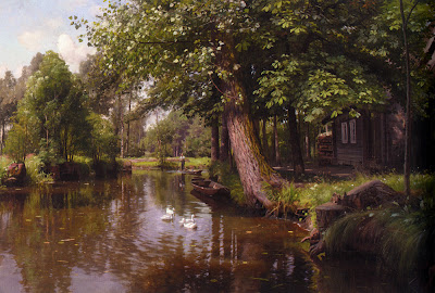
Painting above by Peder Mork Monsted (1859-1941), Link.
Thanks for the quote, Dave S.Tomorrow: Stroke Module
Moonlight is about 400,000 times weaker than direct sunlight. It’s so dim that the color receptors in our retinas, called the cones, can barely function.
In moonlight the other retinal cells called rods are doing most of the work. Rods detect relative lightness and darkness, but they are entirely color-blind.
Moonlight is simply the white light of the sun reflecting off the gray surface of the moon. There’s nothing in that interaction to give the light a bluish or greenish quality. In fact, scientific instruments have shown that the light from the moon is very slightly redder in color than direct sunlight.
These facts added together suggest a mystery at the heart of how we as artists choose to portray moonlight in paintings. If moonlight is just gray-colored light, and if it’s close to the minimal threshold of our color receptors anyway, then why do so many artists paint moonlight as bluish or greenish? Do we really see it that way? Is it some kind of illusion, or perhaps is it just an artistic convention?
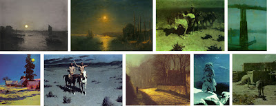
Let’s look at some paintings by master painters of moonlight. As you look at them, consider your own perception of the colors at night, and ask yourself which of the paintings best convey your own experience.
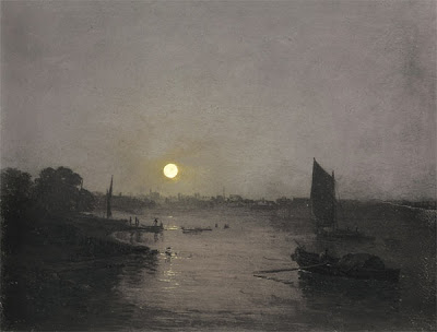 Here’s a painting by J.M.W. Turner. It’s fairly gray, with just a hint of warm color around the moon. Notice that there isn’t much detail in the shadow area. All you really see clearly are the silhouettes of the sail and the boat on the water.
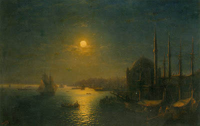
Russian seascape painter Aivazovsky painted this night scene lit by a golden moon. The sky, the water, and the shadows all sink into blue-green tones. He doesn’t show very much detail, and he stops well short of black in the shadows.
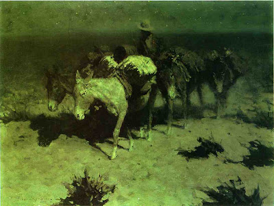
This lightening of darks was also a feature of Remington’s nocturnes. The cast shadow to the left of the pony’s nose is composed of dull umbers and greens. These luminous shadows lighten and liven the obscurity. Except for the light saddle cover, Remington has left most of the edges soft and undefined, especially on the donkey on the right.
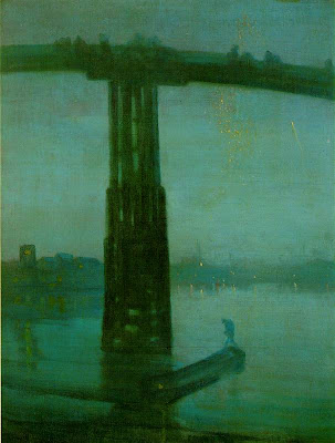
This famous nocturne by Whistler of the Battersea Bridge uses a fairly saturated blue-green color, especially in the water and in the silhouetted figure. The detail is blurred throughout, even in the areas where the bridge appears against the sky, setting up for the tiny sparkles of light in the distance.
One of the reasons for softening the edges is that we depend on the cones for fine discrimination of edges. Unfortunately the cones are located on the fovea, the centerpoint of vision, and with them off-line in the darkness, we just can’t sort out small details.
If you take a book or newspaper outdoors in moonlight, you can see that there is writing on the page, and you might be able to read headlines or other large type, especially when you glance around with your peripheral vision. But reading normal size text is almost impossible. When you look directly at the words, the blind spots get in the way.
I said earlier that our cones are barely functioning in moonlight. In fact, contrary to what some authorities have claimed, most people’s cones can make basic color judgments by the light of a full moon. But how much variation in color can we really see?
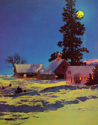
Maxfield Parrish rendered this moonlight scene with quite a bit of color saturation. He painted the yellow moonlight, the reddish cupula on the barn, the deep blue of the sky, and the orange color on the shadow side of the house. Did he really see such colors in moonlight, or did he invent them for pictorial effect? Too bad he’s not here to ask.
Direct plein-air painting is virtually impossible in moonlight. Every artist has to work from memory and imagination. We may try to convey our actual optical sensations, but we’re not scientists. Each of us is also trying to make a subjective aesthetic statement intended to evoke a particular mood or emotion. Any moonlight painting is an attempt to translate a “rod experience” into a “cone experience,” an image that will be seen in a brightly lit environment.
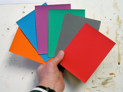 Here’s how you can test how your cones actually respond to color in moonlight. Paint a set of separate, matching, unmarked color swatches or find some construction paper at about the same value. Take them into full moonlight (this Tuesday) and let your eyes adjust (it takes about 30 minutes). Shuffle the cards, and while you’re still outdoors, mark on the back what colors you think they are.
 I have used Photoshop to manipulate a photo of the swatches (actually shot in daylight) to simulate how they appeared to me under the full moon: dulling, darkening, and blurring them. Both Jeanette and I could easily identify the basic hue family of each swatch. But beyond that basic classification, we weren’t sure, and the gray swatch confused us both.
When I looked at the same swatches in the much dimmer light of a half-moon, or in a moon shadow, I found my cones went sub-threshold and shut down completely, and the swatches became completely monochromatic.
Although the rods of the eye can’t actually see color, scientists have shown that they are most sensitive to greenish wavelengths of light. As a result blue-green hues appear lighter in tone in dim conditions. There’s a name for this: the Purkinje Shift. It’s a different phenomenon from, and often mistaken for, the perception of moonlight as blue.
You can demonstrate the Purkinje Shift by comparing a red and green swatch that start out indoors at the same value. If you take them outdoors in moonlight, the greenish one will seem much lighter in tone. Many observers have noticed that red roses look black in the moonlight.
If you scroll back up to my Photoshopped version of the moonlight color swatches, you can see I’ve adjusted the values to simulate the way the red and green looked to me as a result of the Purkinje Shift.
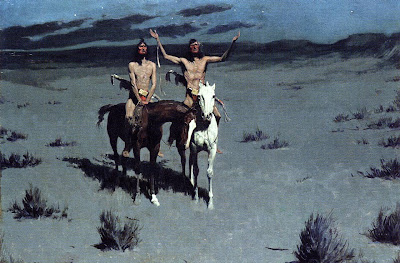
Here, Remington shows a scene with Indians in moonlight. We see their flesh tones and some clear red touches in their costumes. Throughout, the edges are much crisper than his other painting.
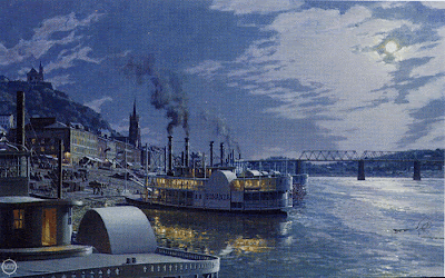 This nocturne of old Cincinatti by contemporary artist John Stobart has a distinctly bluish cast. He introduces much more detail than we’ve seen in the other examples, reminiscent of the “day-for-night” film shoots in old westerns. You can even read the name “Bonanza” on the shadow side of the ship.
In addition to the moonlight, there’s a secondary source of yellow-orange lamplight. In this case, one could argue that the blue cast to the picture may be a complementary color induced in opposition to the color of the lamplight.
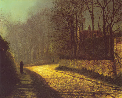 Atkinson Grimshaw was famous for his poetic moonlight studies. Here the shadow masses at the left are fairly soft and impenetrable, but the bricks and branches show up very clearly. The moonlight on the road is an intense yellow-orange, assuming this reproduction is accurate. The shape of the patch of light points to the lovers standing in silhouette at left.
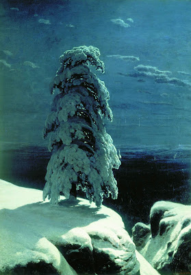
Russian landscape realist Ivan Shishkin, painted this haunting image of a winter night in the wild north. The snow in moonlight is relatively brilliant, with a soft halation along the edge at left, but it’s not yellowish. The cast shadow gradates in tone, getting lighter as it catches more sky fill and bounced light. There’s quite a bit of detail in the tree form, but he has kept the foreground and background description to a minimum.
So, to get back to the question posed earlier, why do we see moonlight as blue?
Saad M. Khan and Sumanta N. Pattanaik of University of Central Florida have proposed that the blue color is a perceptual illusion, caused by a spillover of neural activity from the rods to the adjacent cones.
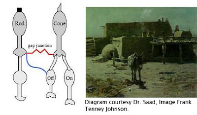 A small synaptic bridge between the active rods and the inactive cones touches off the blue receptors in the cones, kind of like an insomniac turning over in bed and rousing his sleeping spouse.
This influence of rod activity on the adjacent cones tricks the brain into thinking we’re seeing blue colored light, even though we’re really not.
As the authors put it: “We hypothesize that the rod cells predominantly synapse onto the S-cone (cone cells sensitive to bluish light) circuitry resulting in the visual cortex perceiving a tinge of blue.”
So moonlight isn’t blue; our eyes are just playing tricks on us.
Unfortunately, this tantalyzing hypothesis remains untested. I contacted Dr. Khan and he told me that because of other projects he hasn’t had time to prove the hypothesis in controlled conditions. I hope that he can shed more light—of whatever color—on this elusive topic.
Until then, moonlight remains a mystery at the meeting point of art and science.
Further reading:
- Khan and Pattanaik’s summary article in Journal of Vision, 2004. Link.
- Related discussion on the NASA web site. Link
- "The Eye and Night Vision," from American Optometric Association. Link.
- More on Remington’s nocturnes at David Apatoff's blog. Link
Tomorrow: Elegant Graphics
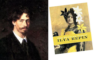
At age ten, Ilya Repin watched his cousin paint a watermelon. The budding artist regarded the process of creating an illusion out of raw pigments as utterly magical, and he “never lost fascination and wonderment for the process of painting, investing it with an autonomous, mystical, almost religious quality.”
This, according to David Jackson’s new biography of the 19th Century realist, entitled Ilya Repin: The Russian Vision.
Below: Repin's early work "Sadko in the Underwater Kingdom." (Click on it to enlarge.)

Tomorrow: Storage Tip for Watercolor Tubes
The French language, which has the richest vocabulary for art, has a wonderful word: “pompier.” Literally it means “fireman.” It is used as an affectionate put-down to describe a certain kind of painting.

I first ran across the term in the book Artistes Pompiers by James Harding (Rizzoli, 1979). Mr. Harding associates “pompier” with the excesses of academic painting.

Art that is “pompier” is like a noisy parade of firemen. It is brash, tacky, gaudy, extravagant, melodramatic, and overblown. Hey! That’s everything I love!

I asked Odile S. Chilton, Visiting Professor of French at Bard College, to explain the sources and connotations of the word further.
 She wrote:
“One possible origin of the expression might come from the poet T. de Banville as he described some of David's paintings depicting scenes from Antiquity (perhaps, the battle of Thermopilae). Those scenes were full of characters wearing shiny helmets, hence the (unkind) reference to firemen: "Look they are naked! No, actually they are taking their helmets off, perhaps they are firemen going to bed..." Another origin might also be linguistic, ie a pun on the words: pompe, pompeux = pomposity, pompous.

"It is interesting to me since when I show biblical art to children, they invariably prefer that type of painting to others. For example “The Finding of Moses” by Sir Lawrence Alma-Tadema was a huge hit!"
Thank you,
Dr. Chilton. Artists, in order of appearance:
Makart,
Cabanel,
Solomon,
David,
Alma-Tadema. Professor Chilton’s references come from
Le Trésor de la langue française informatisé, an online version of the French equivalent of the OED.
Tomorrow: Painting as Magic
When a thin veil of clouds covers the sky, sunlight is diffused and indirect.

The sky appears light grey or white. It gives a soft overall illumination that lightens all the upward-facing planes. As planes face progressively downward, they get darker. But there’s no sharp demarcation between light and shadow, and there aren’t any definite cast shadows.

Overcast light is ideal for complicated outdoor scenes. It was a favorite with the French academic painters, like Edouard Detaille (1847-1912), above. One of its virtues is that it allows you to paint forms in their true local color with a minimum of modeling (description of form using light and dark values).

Ernest Meissonier (1815-1891) was a leading academic painter who frequently made use of this kind of light. With overcast light his picture is simpler than it would have been with direct sunlight.

For example, here’s a painting by Meissonier in the full sunlight. You can see how the shapes of the cast shadows become new elements that he has to manage in the composition.

Technically speaking, this painting by Meissonier is set in open shade—note the sunny window on the other side of the house—but it’s the same basic effect as overcast light.

I believe Meissonier was a huge inspiration for Howard Pyle (above). Meissonier was the artist that every history painter was talking about during Pyle’s formative years, but he’s still in eclipse among most American art historians, unfortunately.

Pascal-Adolphe-Jean Dagnan-Bouveret (1852-1929) used overcast light to beautiful effect in this painting of Breton women. The light allowed him to reduce modeling. The white headdresses appear as simple silhouettes first.

Dagnan-Bouveret used shape welding in both the light and dark areas to unify the tonal masses even further. Painting a scene with nine major figures and still keeping it simple is very, very difficult to do.
You can survey more work by these artists, some in very large files, at the website artrenewal.org. Links to: Detaille, Meissonier, Pyle, Dagnan-Bouveret.
Tomorrow: Overcast light in plein-air and fantasy.
Many people say they love a vigorous and direct brushwork that shows the touch of the hand. We all take pleasure in dazzling technique. But there’s a risk in making the brushstrokes the main subject of painting.
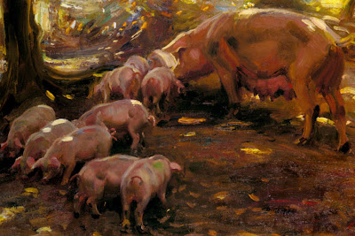
Above is a detail from “Pigs in a Wood, Cornwall” by Sir Alfred J. Munnings. Evidently he painted this from life with the pigs moving around in front of him in the dappled light of a forest. The technique is impressive, because every brushstroke describes form, movement, light, and local color.
Good technique like this happens when you try to convey the most complete illusion in the least time with the simplest means. The goal should be to make an accurate statement in the time allotted, not to dash off some eye-catching brushstrokes.
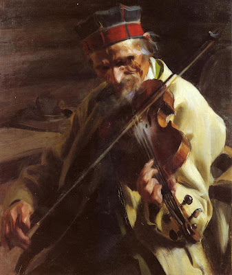 Above is another example of fine paint handling, this time by Anders Zorn. It’s painted with urgency and directness. He worked from life in a limited amount of time, probably an hour or two. We see beyond the paint surface to the musician’s chiseled face, the rosin from his bow, the cool light from the window.
 Here’s a small detail from a magazine illustration in gouache by Harry Anderson from the 1950s, showing a group of sisters conferring about their grieving mother. It’s another example of a functional bravura that stops short of being self-indulgent. There’s no wasted effort. Most of the passages are kept wet together, softening the modeling and immersing most of the strokes.
All of these are quick paintings, all virtuoso efforts. Great paint technique can also be manifest in a carefully crafted month-long effort. In this case, the brushwork can still be economical, but it’s evident on a smaller scale of reference.
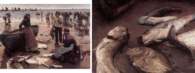 For example, here’s a painting from 1885 called “Fish Sale on a Cornish Beach” by Stanhope Forbes, along with a detail of the fish. Click to enlarge.
The painting took Forbes weeks to complete. He worked entirely outdoors from life. When you look at the painting, you see more than just the paint. You practically smell the fish.
Good technique always draws attention beyond the surface of the painting and toward something else, something intangible, something invisible—light, atmosphere, character, or story.
OK, so if these are examples of true virtuosity, where is the pitfall?
Unfortunately, by the end of the 19th Century, many artists became concerned primarily with the paint surface as an end in itself.

Here’s a detail of a painting by Frederick Frieseke from 1913. The paint strokes have taken on a life of their own. It’s a bit hard to tell what the strokes are trying to represent. They’re painted in a completely different style from the woman’s knees.
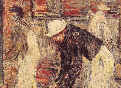
This detail is from a painting by Childe Hassam called “The Bricklayers.” Hassam seems to be stuck on the surface, too, as if he was just frosting a cake. What has he told us about these bricklayers, or about the environment they’re in, or about the light shining on them? Not much, because the paint gets in the way. It's not a problem with a lack of drawing ability. Both of these guys could draw well if they wanted to. The problem is with the thought process.
It’s easy to make a painting look like paint. But it’s a lifelong challenge to use paint to evoke the chill of autumn or the smell of a rose.
A century and a half ago, Asher B. Durand wrote that when execution “becomes conspicuous as a principal feature of the picture, it is presumptive evidence, at least, of a deficiency in some higher qualities.”
Enduring masterpieces have two qualities. They INVITE and they DELIGHT.
INVITE
A picture invites us by presenting a clear effect at a glance. It grabs us from across a room. The composition makes a definite statement. The lighting conveys an unmistakable mood.
The basic idea or situation of the picture must be evident right away. It must be understandable without too much explanation. Avoid concepts that are too intellectual. Avoid illustrations that depend entirely on an extrinsic narrative, unless it is universally recognized. People are easily embarrassed if they cannot begin to respond to a picture right away.
At the same time most masterpieces raise a question, suggest a mystery, leave a doubt, or present an unresolved conflict.
 DELIGHT
While a strong singular impact invites us into a picture, what really captivates us are the delights that we discover after the first impression.
“Delight” doesn’t mean the picture is necessarily cheery and optimistic; even if the story is horrifying or foreboding, we find a strange pleasure in exploring the sources and consequences of the tragedy. For this reason, we're usually more interested in the moment just before or just after the peak of the action.
We like pictures that let us discover things on our own. We connect with a picture when we find subtle, hidden elements.
We want to study a picture to become familiar with the supporting characters or details. We want to discover hints of a story beyond the obvious. If this is done well, we will say, “I see something new every time I look at that picture.”
When a picture contains human figures, we automatically identify with them. The human factor helps us live inside the scene. We respond to real people in real situations. Poses must be based on life, even if they are idealized.
Emotions, such as humor or pathos, must be sincerely felt by the artist, and transmitted by every pictorial means possible.
In landscape, the human factor can be the mere suggestion of a human presence, such as a road or a tree stump.
 Next time you’re planning a picture, let those words dance in your head: “invite, delight.”
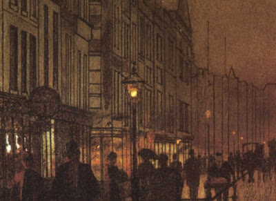
Contre-jour lighting is a type of backlighting where you place the subject right in front of a bright, sunny sky. In French the phrase literally means “against the day,” a poetic way to express this mysterious and powerful effect.
The term is still in common use among photographers. But cameras can’t deliver this effect as powerfully as painters can, because cameras are unable to respond to a wide enough range of intensities, and the silhouettes tend to go to black.
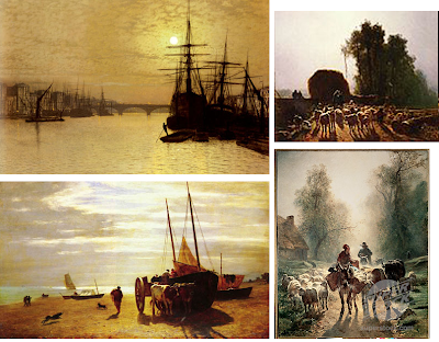 Artists of the 19th Century did wonders with contre jour. You’ll find it with Royal Academicians like Atkinson Grimshaw (upper left), Barbizon painters like Constant Troyon (the other images here), and American landscapists like Frederick Church.
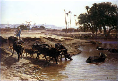
Troyon’s student Leon Belly used this effect to capture a feeling of dazzling, intoxicating illumination in several of his Orientalist paintings, like this one of water buffalo in a desert oasis. I learned about contre-jour lighting from art historian Kristian Davies, who discusses it in his brilliant book The Orientalists (Laynfaroh, 2005).

When a form is placed contre-jour, it goes into silhouette. The colors weaken. Shadows stretch forward. Details disappear as the glare of the light spills over the edges of the form. The sun itself often shines from inside the frame of the picture, making the viewer’s eyes squint involuntarily.

I’ve been fascinated by the idea of contre-jour since starting work on Dinotopia: Journey to Chandara, and it crops up in quite a few of the paintings in the new book, like the one above, where Arthur and Bix are approaching the Imperial Palace.
Today I visit Rhode Island School of Design. Stay tuned in a couple of days for the report.
We had the day off in Baltimore yesterday, so we spent most of the day in the Walters Art Museum. This is a must-see collection if you like 19th Century academic painting, and they also have a vast collection of Asian, Egyptian, and Roman stuff on display. And it’s free! Check out this gem “Figaro’s Shop” by the Spanish genre painter Jose Aranda 1837-1903.
 I also inaugurated a new Moleskine mini watercolor sketchbook. The view is of Vernon Square Park from the steps of the Peabody Conservatory.

As usual, I picked a motif that was way too complex, so I was boggling my brain trying to sort it all out. I took a couple of shots in progress:
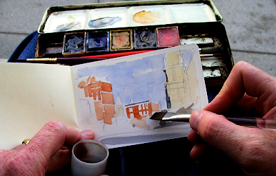 I tried to simplify things by using a limited palette: lampblack, ultramarine blue, yellow ochre, vermillion, and sepia. After a quick pencil drawing, the first step was to block in the main shapes with a ½ inch Winsor & Newton series 995 flat.
 After this rough block-in I like to add the finicky details with a brown fountain pen. But I left it in the hotel room, so I used an Escoda 1212 Kolinksy round #4 instead. The water supply is from a clear 35mm film can. Remember film cans?
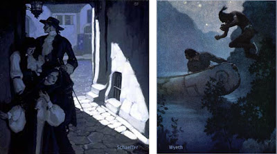
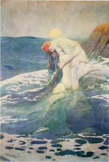
The best pictorial compositions are simple. Simple shapes are easy to recognize and remember. Busy pictures with lots of little separate shapes have less impact. My own work stands improvement in this area, so I’ve been trying to figure out how the masters did it. Below: Mermaid, by Howard Pyle.
Achieving simplicity doesn’t always mean restricting yourself to just a few minimal forms, like one apple against a blank background. You can have plenty of elements or figures and still have an uncluttered picture. The trick is to cleverly arrange the elements so that adjacent tonal shapes fuse together into larger abstract patterns.
According to Charles DeFeo, Howard Pyle used to say, “Put your white against white, middle tones (groups) against grays, black against black, then black and white where you want your center of interest. This sounds simple, but is difficult to do.” The picture above is by Mead Schaeffer, a grand-student of Pyle through Harvey Dunn.
You can unify shapes by losing them in an enveloping cloud of shadow, and the light areas can spill over into each other. The Lincoln picture below is by Pyle.
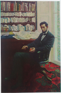
This automatically sets up unexpected larger shapes with great abstract beauty and expressive power.
To my knowledge there’s no word in art theory for this idea, so I would like to suggest the term “shape welding.”
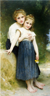
Shape welding shows up not only with Howard Pyle and the Brandywine School, but also with academic painters like Bouguereau (above). All these artists were clearly thinking about shape welding, but I don't know what they called it. The only word I’ve run across to name it is the French word “effet,” which in the academies meant the large overall pattern of light and dark.
Maybe someone reading this blog will know other terms that have been used by artists to describe this principle.


.jpg?picon=1009)


SUCH a treat starting off the day with the handbag song- thank you!