By: HipWriterMama,
on 3/10/2008
Blog:
HipWriterMama
(
Login to Add to MyJacketFlap)
JacketFlap tags:
Deer Tick,
Add a tag
Remember last year, when a pesky deer tick embedded itself in my little one's crook of her arm? Yesterday morning, I found a tick embedded in my knee. I freaked out and my husband, pulled the darn thing out. Later on in the afternoon, I felt something crawl on the back of my neck. When I reached to grab it, I became a little concerned. It was a wandering tick. I thought deer ticks didn't
If you paint in oil with big flat bristle brushes, it gives the painting a kind of “big pixel” look. Here’s a plein-air study I did of some rooftops.
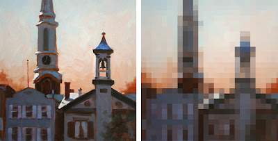 On the left is the actual painting, and on the right is a computer interpretation. The idea of the digitized version is to suggest the approximate module of the patches or brushstrokes. Each square is more or less equal to the width of the brush. So for a 16 x 12 inch painting, the brush was about a half inch wide.
I don’t think this painting was very successful. Part of the problem is that the units of detail are all about the same size throughout the picture. The effect is kind of clunky and simplistic, and there’s no center of interest. It’s like a whole symphony played at the same tempo and in the same key.
Let me propose this principle: a broad handling works better if there’s a center of interest in sharper focus.
You may have seen my painting of a McDonald’s sign before, but I want to make a different point with it. In the actual painting (oil, 10x8 inches), the word “McDonald’s” is painted as tightly and carefully as I could manage while standing outdoors in the parking lot.
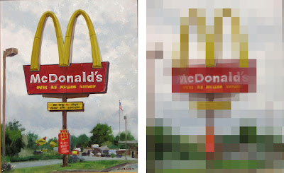
But the line of writing below “McDonalds” is almost not readable. And the type on the yellow and red signboards lower down are just suggested with blocky shapes. In the background, the scale of blockiness increases even more.
In the mosaic version of the painting at right, I’ve interpreted the image in two sizes of tiles, with smaller tiles near the center of interest to make the simple point about varying the module of brushstrokes.
This principle of the scaling of detail is one of the hallmarks of the late 19th century portrait painters, like Sargent, Zorn, Sorolla, or Valentin Serov. Serov isn’t well enough known in America. Here is his portrait of the composer Rimsky-Korsakov. Click on it; it's a big juicy file, thanks to Wikimedia Commons.
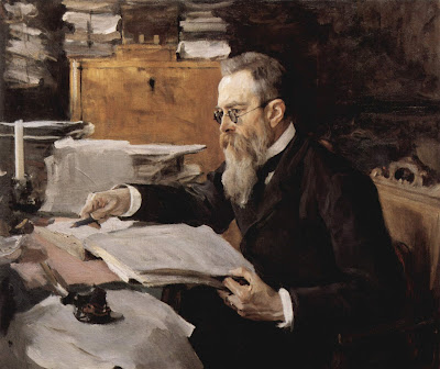
Serov painted the face in relatively tight focus, but he represented all other areas of the picture with rough strokes made with a bigger brush module.
I find this orchestration of detail deeply satisfying because it captures the way our eyes actually perceive the world. There’s a tight focus at the center of interest, and bigger shapes in the periphery. Serov gives us all the information we need to understand the character of the man, no less and no more.
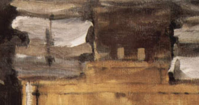 Look at this background detail from the Serov portrait. It has a wonderful “pixelly” abstract quality, like something caught at the edge of vision.
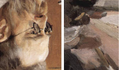
And here’s another detail, placed out of context next to the rendering of the face, and turned upside down to help us see them abstractly. Note that these two detail areas are shown at exactly the same relative scale of enlargement.
In context, the strokes effectively describe the clutter of papers on the desk. They don’t call attention to themselves as strokes or as paint. Instead they convey what they need to convey and then they keep encouraging the eye to return to the face and hands. If he had painted the outer areas with the same level of detail, the sense of immediacy would have been lost.
I call this scaling of brushstrokes the “stroke module.”
It’s a good general rule to strive for variety in the stroke module. Use a smaller stroke module (with smaller brushes or digital brush tools) for the center of interest, and then use bigger brushes and broader handling for the peripheral areas.
Tomorrow: Taboret
 Have a look at this painting of bears in a forest by Ivan Shishkin. As you look at the composition, take note of where your eyes travel.
 Do the same thing with this one by Thomas Moran. What did you notice first? What parts of the picture did you just you glance at, and where do your eyes linger the longest?
 Here’s another Turner. There are a lot of things to look at here. Allow your eyes to peruse it casually, but try to be aware of what they just glance at and where they spend the most time.
 Here’s one by David Roberts. Where do you look first? How do your eyes explore the scene?
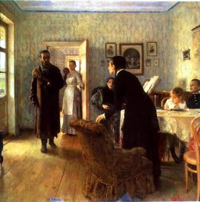 OK, one last picture. You saw this on an earlier post. Look at it again, and try to be aware of how your eyes track around the picture.
I asked you to play this game in order to pose a couple of fundamental questions: Does everyone look at pictures in the same way? And do we really understand how pictorial design influences the movements of our eyes?
Scientists have designed experiments to explore these questions. In 1967, Russian psychologist Alfred Yarbus developed sensitive instruments to track the involuntary jumping movement of the eyes, called “saccades.”
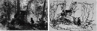
Here’s a map, or “scanpath,” of the movement of one person’s center of vision, or fovea, as it scans the bears in the forest. The eyes clearly fixate on the bears, but they also circulate generally around the perimeter of the picture.
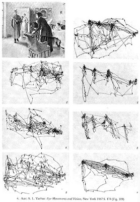
Yarbus showed his subjects the Repin painting “They Did Not Expect Him.” The scene shows a prisoner returning to his family after a long exile. Yarbus asked his subjects a series of different leading questions, like how old the people were, or how rich they were, or how long the man was away. He found the chart of eye movements differed wildly each time. And the scanpaths varied from person to person.
These scanpath studies lead to a number of conclusions—and questions—for us as artists:
1. Different people don’t look at the same picture in the same way. And a single person will look at a given picture differently depending on what questions they bring to the image. This has profound implications to curators writing museum tags and comic artists writing word balloons.
2. Pictures do not “control” the eye. The viewer’s thought process plays a huge role in how their eyes travel through a composition.
3. Standard compositional theory assumes that our eyes follow contours. That doesn’t seem to happen at all. They never follow along the curve of the woman’s back, for example, they just jump from face to face. Of course we do perceive lines of action and flowing contours, but our eyes don’t actually follow along them.
I also wondered if there is any basis to the assumption in standard compositional theory that the eye is attracted to areas of strongest contrast. That’s why I showed you the Turner and the Roberts and the Moran. I noticed when I looked at those pictures that my attention was sometimes attracted to the edges with the least contrast.

In the Turner, for example, I found myself looking at the light-colored tower (1) more than the black gondola (2), which had much more contrast. Was that true for you, too?
My hunch is that the areas of strong contrast are somehow felt or registered by the peripheral vision, but that the eye’s center of vision quickly moves to other tasks, in this case to sorting out close contrasts.
To my knowledge, there hasn't been much scientific study at all on the subject of what's going on in our peripheral vision when we're decoding an image.
In any case, when it comes to how we look at pictures, there is more than just abstract design theory going on. Regardless of how the picture is designed in abstract terms, we seem to be involuntarily attracted to sorting out the human stories.
I hope you’ll share your own experience of looking at these pictures in the comment section. For more information on the science of eye tracking, check out this link:
Tomorrow: Stretching a Face
Philip Straub discusses an issue I struggle with daily: Composition. This tutorial is for concept art, but the principals are universal. (link)


.jpg?picon=1009)


You're making me thankful for our 15 inches of snow...and nervous that it doesn't mean diddley when it comes to ticks!
EEEEWwwwwww
Yeah, they're freaky. And for hours afterward, you "feel" them crawling all over. Ick.
Guh-ross. But good idea linking to the page on how to avoid and remove them!
When I was 9 and at a weekend Guide camp I got one of those in my armpit. My older sister rushed me off to the leaders for advice. Everyone still smoked in those days, and to this second I still remember Aunt Lil (the leader) sticking the end of her cigarette on the end of the tick's bum to encourage him to come out. He did, too, but it took me ages to recover from having a lit cigarette stuck in
Do you know that if I EVER find a tick on me, I will pass. the. freak. out? I'm so serious. They terrify me. I'm a big wuss around most bugs (roaches make me hyperventilate -- I think I might have a real phobia), but finding a tick on me? You will be able to hear me scream from Tennessee. Or if I find one on my kids. So sorry. I hope you don't get any more. Durn.
Oh, boy, now I am going to worry...living in the same town!Watch out for those red rings--sign of Lyme's...
these are disgusting Viv...luckily they look in tact!
I'm not usually squeamish about bugs, but the very notion of a tick makes me break out in a cold sweat. I've never seen one IRL, but if I did, I think you'd hear me screaming, too. Just the idea of something that wants to EMBED ITSELF IN MY SKIN. Ew, ew, ew. They make horror movies about that kind of thing.