new posts in all blogs
Viewing: Blog Posts Tagged with: Journey to Chandara, Most Recent at Top [Help]
Results 1 - 25 of 32
How to use this Page
You are viewing the most recent posts tagged with the words: Journey to Chandara in the JacketFlap blog reader. What is a tag? Think of a tag as a keyword or category label. Tags can both help you find posts on JacketFlap.com as well as provide an easy way for you to "remember" and classify posts for later recall. Try adding a tag yourself by clicking "Add a tag" below a post's header. Scroll down through the list of Recent Posts in the left column and click on a post title that sounds interesting. You can view all posts from a specific blog by clicking the Blog name in the right column, or you can click a 'More Posts from this Blog' link in any individual post.
 Because an incoming snowstorm is expected to dump over a foot of snow between here and Massachusetts tonight and tomorrow, the March 1 Dinotopia booksigning event at the Odyssey Bookshop in South Hadley, MA has been cancelled and now rescheduled for Saturday, April 26 at 11:00 a.m.
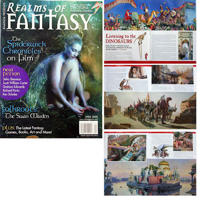 Realms of Fantasy magazine will have a six-page gallery feature on Dinotopia: Journey to Chandara, with an article by Karen Haber coming up in its April 2008 issue. It should hit the newsstands in a couple of weeks.
The issue also has an interview with Holly Black of Spiderwick, and fiction by Delia Sherman, Ken Scholes, Richard Parks, Graham Edwards, and Scott William Carter.
How do you get exactly the colors you want in a picture….and no others?
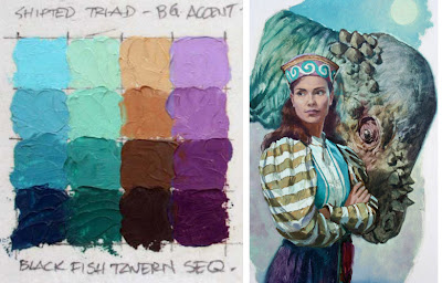
This is the third post in a Sunday series about a method called color wheel masking. The first post showed how color masks can help to analyze color schemes, and the second post explored different shapes of masks.
In this post I’ll demonstrate how to actually mix the colors you have chosen for a given painting.
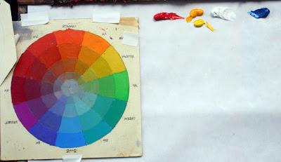 To start with, here’s the color wheel on the left. To the right above the palette paper are some primary colors of oil paint. You can use as many tube colors as you want at this stage. I just have little demo dabs of Winsor Red, Cadmium Yellow, Titanium White, and Ultramarine Blue.
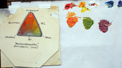
Let’s say you want a monochromatic atmospheric triad with the dominant (and the most saturated) color in the red-orange range. Using your palette knife, mix a batch of each of the three colors that you see in the corners of the triangular gamut.
I've placed a little white box over those colors in this photo. In this case, it’s a saturated red-orange, a desaturated red-violet, and a desaturated yellow-green.
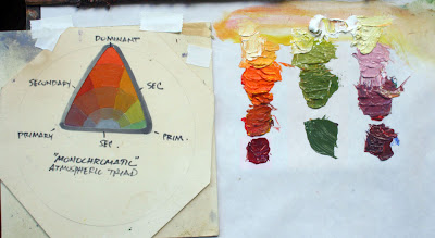
Now you’ve created the “heads of the families” or subjective primaries. Next, extend those colors into four different values or tones. Try to keep the hue and the saturation constant as you do so.
Look again at the color wheel mask. Halfway along the edge of the triangle are little marks indicating your secondaries. These are your in-between colors, which you may want to mix as well. You may end up mixing and working with anywhere from three to six strings of colors.
Before you start painting, remove from the palette all the tube colors that you squeezed out, except for white. This is important, because these colors are outside your gamut. You don’t want to have access to those anymore during the painting process.
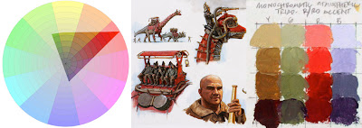
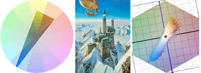
At left is a color wheel with a monochromatic atmospheric triad emphasizing red. This time it’s laid out on Tobey Sanford’s digital color wheel (link to download). On the far right are the color ranges I mixed. In the middle is the resulting painting from Dinotopia: Journey to Chandara.
 This group portrait takes place in Dinotopia’s phosphorescent caverns in the book The World Beneath (1995). I wanted the colors to suggest a cool, magical ambiance. With the colors in this gamut, it’s impossible to mix any intense warms, even if you wanted to. But as your eyes adjust to the color mood, it feels complete. The relative warm colors appear enough warm in the context of the picture.
I have noticed that when I use the color wheel masking system I am more careful to keep my brushes clean and to push against the outside of my range. Harmony and unity are a given, so the effort goes into reaching for accents. It's the opposite of the color-mixing mindset when I'm mixing color from a full palette of tube colors, where I'm always neutralizing mixtures.
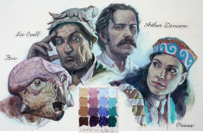
To conclude, here’s a painting from Dinotopia: A Land Apart from Time (1992), about the time when I first developed this method. I have digitally reconstructed the gamut I used for the narrow complementary color scheme.
Blog reader Briggsy provided the diagram on the right. He processed the image through a filter available for Windows users at couleur.org. What you’re looking at to the right of the painting above is an objective computer visualization of the actual color scheme.
As you can see, it corresponds pretty closely to the generating mask, proof that the system is giving us exactly the intended color scheme. The blue colors are very intense, almost touching the edge of the wheel. The rest of the colors are in a narrow swath running across the grey center to the weaker complements.
I look forward to hearing how this method works for you, either with traditional or digital techniques.
Tomorrow: Pinkwater Portrayed
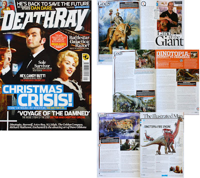 Readers of Dinotopia: Journey to Chandara will want to check out the six page feature in the new issue of DeathRay magazine, now on newsstands in the U.S.A and the UK. There’s also an interview with Spiderwick creator and artist Tony DiTerlizzi.
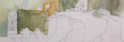
Here’s a tip that really helps when you’re painting a scene with fairly complex perspective.
The image below is a photo of my pencil drawing on illustration board for “Scholar’s Stairway,” page 138 of Dinotopia: Journey to Chandara. Over that I have superimposed a slice of the final painting in oil, so you can see how the picture ended up.
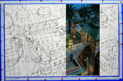
The perspective is fairly complicated, with three vanishing points, each one a few meters away from the edge of the painting. Rather than worrying about those remote VPs, I established a series of graduating slopes for each VP by means of a set of evenly spaced guide marks alongside the margins of the picture. They’re marked off on a piece of white tape superimposed over the low-tack blue tape at the edge of the painting.
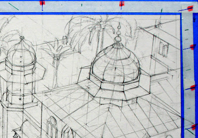
Any intermediate slope for any of the three vanishing points can easily be determined by lining up the mahl stick with the guide marks along the edge. Since the painting is not tied in space to the VPs, it can be moved around or turned upside down while you're working.
Having these guides was important in a painting like this, where the line drawing itself (including the center lines for the domes) was eventually covered up by the opaque paint. When the painting was finished, I stripped off all the tape, leaving a clean white edge around the image. Thanks to Ted Youngkin and Jack Wemp for teaching me this.
Tomorrow: Eye Magnets.
Todd N. of Ontario, Canada emailed me yesterday asking about the paints, supports, mediums, and drying times for the Dinotopia artwork.
I admit that I haven't really explained my oil technique yet. I've been meaning to get to it, but since you asked, here it is.
 All of the paintings in the Dinotopia books are done with traditional oil paints. I use Gamsol turpentine to thin the paints. To extend the flow of the paint, I sometimes add a little Liquin painting medium. This alkyd medium accelerates drying time, but it dries to a matte surface, which needs varnishing at the end. I use Kamar spray varnish for the final varnish after the painting has completely dried.
 The mixing surface is a roll of white polyethylene-coated freezer paper, set up in a sloping palette arrangement. I use kerosene in a peanut butter jar for cleaning the brushes.
For some of the larger paintings I work on an acrylic-primed cotton canvas glued to ¼ inch birch plywood, but most of the paintings are worked out on heavyweight 100% rag illustration board. I use three different textures: smooth, medium, and rough surface. The brand I use, “Columbia 1776,” is, to my knowledge, no longer being manufactured, but there are equivalents out there. Below: canvas primed with a tint of light red gesso, with the sealed pencil drawing and partial oil block-in. Note pre-texturing in lower left.
 I don’t use tracings, light tables, or projected photos. Rarely, on large paintings on canvas, I’ll use an Artograph projector to blow up a compositional line drawing that I’ve worked out at a smaller scale. The drawing above was projected from a sketch.
Nine times out of ten, I’ll do the drawing in pencil directly on the illustration board. As I work out the drawing, I erase it often with a kneaded eraser until I'm satisfied with the linework and I’m ready to paint.
I then seal the drawing, first with Krylon workable fixative and then with Liquitex acrylic matte medium. The latter can be applied fairly thinly with a brush and then squeegeed off with a piece of mat board. That thin layer of acrylic medium will keep the oil paint from soaking into the board or disturbing the drawing. It’s at this point that I may pretexture the surface with acrylic modeling paste. You can see the texture above next to the orange figure.
Over that sealed pencil drawing I sometimes block in with acrylic in the first layer to save time. I then begin with thin washes of oil. I often cover the surface with a complete tone (or "imprimatura") to get rid of the white and to set the basic color mood of the scene. Sometimes I'll block in with a complementary color, especially under a painting with a green tonality. Then I proceed with a quick overall block-in and a final rendering, usually working area-by-area, starting with the center of interest.
The nice thing about this way of working in oil is that you can lay down the paint opaquely, transparently, or a combination of opaque and transparent. While the paint is wet you can scratch through with the brush handle to get light accents.
 I don’t usually use accelerators or fast-drying mediums, except for the Liquin itself. Rarely, if I’m building up a light impasto with thick paint that has to dry by the next day, I’ll add a drop of cobalt drier to the supply of white paint. Since white paint insinuates itself into all the opaque mixtures, the drying agent does its work, and the whole painting is dry to the touch within 24 hours.
By the way, if you like this nuts-and-bolts stuff, check out Jeffrey Freedner's helpful comment about the palettes of the old masters at the end of yesterday's post on color. Thanks, Painterdog.
Todd, I hope that answers your question!
Tomorrow: A handy tip for perspective.
 Happy New Year, everyone! And for those of you in Southern California, don't forget that the Dinotopia exhibition at the Los Angeles Public Library will be up only through this Sunday. For more info, check the LAPL or Dinotopia sites.
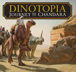
Dinotopia: Journey to Chandara contains a total of about 150 paintings and drawings. Out of that number, about 144 are newly created for the book. But half a dozen or so are images that pre-existed the story, and were originally created for an entirely different purpose.
One example is the painting of the flying galleon. The image illustrates the vision of Captain Goldsworthy Marlinspike, who presides over Bilgewater, a village made up of sailing ships turned up on end.
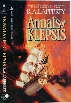 I did this painting twenty-five years ago for the cover of a science fiction paperback book called Annals of Klepsis by R.A. Lafferty about some space pirates.
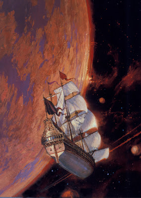 The painting was already sold to a collector, so retouching it was out of the question. But I had to get rid of the pirate motif on the flag and the plume of smoke (which didn’t make sense in space anyway--but then neither does the wind or gravity on the flag and sails, come to think of it).
So I did some Photoshop retouching work (the only use of Photoshop in the entire book) to make the necessary changes and to flop the image.
Speaking of recycling, thank you Dr. Fabre for the post about Dinotopian retro-tech on your fun blog Voyages of a Steampunk Physician.
Mike Fredericks, editor of the magazine Prehistoric Times announced yesterday that his readers voted Dinotopia: Journey to Chandara and Dinosaurs by Dr. Thomas Holtz and Luis Rey as their favorite prehistoric animal books of 2007. Mr. Fredericks received an equal number of votes for both books.

Congratulations to my friends Tom Holtz and Luis Rey, and thanks to the readers of PT. If you're interested in dinosaurs and ice age mammals, I recommend subscribing to Prehistoric Times. It’s the best overview out there for both the science and the popular culture of prehistoric life.
If you look at almost any portrait or wildlife photograph, you’ll notice that the background is out of focus. The same is true of sports or action photos.
 This shallow-focus quality, known to photographers as “depth of field” is a powerful way to control the viewer’s attention. For painters, controlling focal depth adds tremendous realism to close-ups, but surprisingly few artists use it.
 This may be because our eyes naturally shift focus from near to far when we look at the real world. As a result, our minds construct the misleading impression that everything around us is in equally sharp focus.

The reason cameras produce a shallow depth of field is that when you photograph a subject with a telephoto lens or with the aperture wide open, the camera can only focus on one plane of distance at a time. Everything else is blurry, and the blur increases as objects get farther from the plane of focus. Very bright highlights burn out the film or digital sensors, and may appear as sharp-focused circles of various size.
 These details are taken from oil paintings for Dinotopia: Journey to Chandara to show how I used this photographic effect for fantasy paintings. If you’re painting in oil, you can use larger brushes and a wet-into-wet handling to achieve this impression.
But don’t overdo it. Effects like this are like a spice or a perfume, better if they are sensed unconsciously by the viewer, rather than jumping out as an obvious trick.
This is the last of a three-part series on paint texture.
Rembrandt was a master at using impasto texture in the light areas of the picture, such as a necklace, a nose, or a collar. He used two devices to accentuate an area of impasto: “glazing in the pits” and “top-dragging.”
 Glazing in the pits means dropping pigment into the hollows, nooks, and crannies of your impastos. You can see it here in the foreground of the painting “Market Square.” To do this, build up your impastos either with acrylic modeling paste (always before using the oil at all--never use acrylic over oil) or with oil paint mixed with a little cobalt drier to help it set up.
When it is completely dry, you can quickly glaze a thin layer of raw or burnt umber thinned down with turpentine. Most of it will sink naturally into the pits.
When that layer is dry, you can lift off the hint of the umber layer from the tops by using a smooth cotton rag with just a hint of turpentine. This will take away the glaze from the tops but leave it in the pits. But don’t try either of those last steps unless the surface is bone dry.
 Glazing in the pits helped accentuate the texture on the rock on the right, above, a detail of "Desert Crossing" from Dinotopia: Journey to Chandara. These impastos were pretextured with modeling paste, and photographed a special way to bring out the 3-D quality.
The rock on the left is an example of top-dragging. To do this, I first painted the stone a bit lower in value over a pretextured base. When that was dry, I loaded a bristle brush with thick, light paint and dragged it over the base, allowing the the paint to come off on the top of the little mountains of impastos. In a couple of quick strokes, you can achieve a random quality of rock texture without a lot of fussy rendering.
My brother Dan, aka "Mr. Kindergarten," has tested out the Dinotopian game "Tuggle" with interesting results. Check out his new blog, which offers tips, techniques, and reflections from his 40 years of experience in the classroom. I'll be visiting him in Sebastopol tomorrow.
I’ve been blogging mostly about the artwork in my Dinotopia books, but the writing is just as important to me and deserves a little explanation.
 Each picture, as they say, is worth a thousand words. The pictures convey mood, atmosphere, a sense of place, and character. But the writing communicates everything else. Only the writing can deliver narrative sequence, continuity, backstory, dialog, interior thoughts, names, sounds, smells, and feelings. That’s a lot of work for a few words to do.
It’s a challenge to subordinate the written text to the pictures. It would be very tempting to give over more space to the writing, because writing is much faster to compose than artwork. A Dinotopia book could be finished up in half the time if the writing were allowed to take up the majority of the page space. But I think picture books work best when they sustain us primarily in a visual, dreamlike mode. Like graphic novels or movies, picture books suffer if they are too text-heavy. I end up writing about five times as much material as I have space for, and have to cut most of it out.
With words and pictures balanced in this way, there isn’t the novelist’s luxury to indulge in rich layers of motivation, backstory, and extended conversation. It’s a sacrifice I gladly make in exchange for the glories that only pictures can provide.
Although I have the plot worked out fairly carefully in the early storyboard and outline stages, there’s plenty of room for improvisation during the final art stage. The idea for the old musical conductor character named Cornelius Mazurka, for example, emerged while I was creating the paintings.
The running text comes last, so ideas that come up during the art stage can freely enter the story. I write the final text in the InDesign page layout program, with all the page elements in place. In this way I can be sure that the text comes to a full stop at the end of every layout. I want the reader to be able to pause and enjoy the artwork without being tripped up on the page turn. And I want the book to be as inviting to the casual browser as to the reader who takes the full train ride.
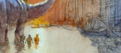
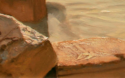
“You can’t cast a shadow over deep water,” says an old law of landscape painting. It’s usually true, but only when the water is clear. If the water is murky you can see cast shadows, but their edges are more diffuse than shadows cast over on land because the light transmits throughout the medium of the diffused particles.
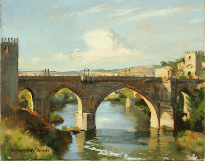 What happens when a cast shadow on water crosses a reflection? That’s what I was trying to capture in this 8x10 oil sketch, painted on location of the bridge leading into Toledo, Spain. It was a mind-bending challenge of color mixing.
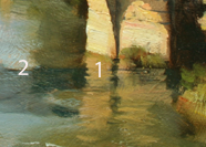 The simple answer is that the reflection “wins,” as you can see in the closeup. The light colors reflected from the stone piers (1) don’t get any darker where they cross into the shadow. But to the left, I observed the weaker reflections of the sky and the trees (2) became influenced by the deeper colors of the water in the cast shadow.
 I used the light, color, and basic composition of this plein-air study as my source for the painting “Ruined Bridge,” in Journey to Chandara. The main change was to add a half-collapsed tower covered with vines and a makeshift house.
--------
By the way, let me express my regards and thanks to all at Rhythm & Hues, Art Center, LA Public Library, DreamWorks, Imageworks, and Sony Pictures Animation. I'm very grateful for your welcome. Meeting all of you fellow artists—and seeing your incredible work has been so inspiring to me that I have been walking on air. And to my readers, please be patient for the blog posts about those visits, because with all the travel it may take quite a while to catch up.
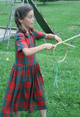
I was shooting photo reference for a series of games in Dinotopia: Journey to Chandara, and I had some young friends of mine posing for a game called “graces.” This was a popular game in early America. It involves launching a wooden hoop from two dowel rods.
 After I shot a bunch of photos of this hoop game, the girl told me she was pretty good at making faces. Yeah, sure, I thought. Every kid likes to make funny faces, but how many are truly gifted at “gurning?”
 Gurning, by the way, is the art of using your face to look completely ridiculous. I’m something of an expert on this. Being a Gurney I come from a family with genetic advantages for making silly faces (although I'm waiting to lose all my teeth to achieve the truly championship-level gurns).
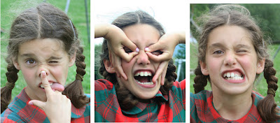 My young friend demonstrated a few of her best gurns, and I realized I was in the presence of a master.
 Then her brother, no slouch himself, launched into a few of his best gurns, including the famous “pig nose,” “mouth-stretch,” and “super-pucker.” These take more than just practice. They take instinct and artistry.
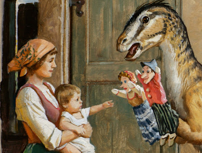
I had no choice but to change my idea for the picture. I discarded the idea of graces and went for a gurning contest instead. 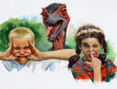 Since this was Dinotopia, there had to be a dinosaur gurning as well. I believe this is the first painting in history of a “Gurnasaurus.”
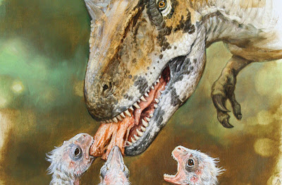
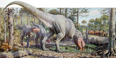 This painting appears in Dinotopia: Journey to Chandara, but it was originally created for Discover Magazine to accompany a story on the vulnerable side of the Tyrannosaurus.
We often see this animal as a ruthless and invincible predator, but in fact its numbers were already declining due to climate changes around 70 million BP, when this scene is set, five million years before the asteroid impact. I chose a moment when the T. rex is drinking water from a receding water hole. He is accompanied by two juveniles, a herd of Triceratops in the distance, a softshell turtle, and various other creatures that are found together with T.rex in the Hell Creek Formation in what is now Montana.
I drew inspiration for the cracking mud and dead trees from a pond in the forest behind my home. The palmetto and cypress came from location studies in Florida.
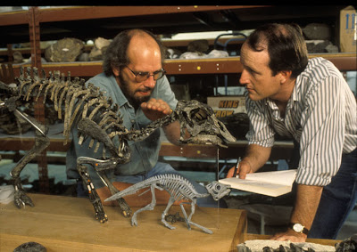 My consultant was Jack Horner of the Museum of the Rockies in Bozeman, Montana, here in his museum with skeletons of baby Maiasaura (photo by Tobey Sanford). Horner proposed the provocative idea that the T. rex may have been a scavenger as well as--or instead of--an active predator.
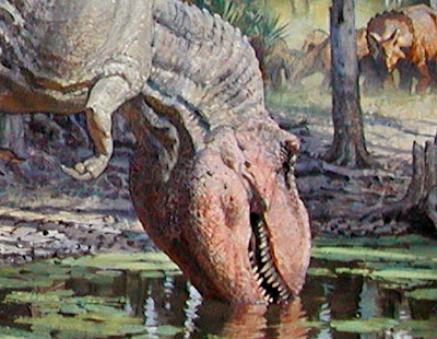 At his suggestion, I gave the creature a reddish face, similar to the faces of vultures and many other scavengers.
This painting was recently accepted into the Focus on Nature X exhibition of natural history artwork. It will appear at the New York State Museum in Spring of 2008.
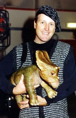
When you are drawing and painting main characters you need really detailed miniatures for reference. It’s worth putting a little extra time to sculpting these “hero maquettes” until they look just the way you want them.
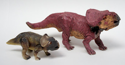
On Dinotopia: A Land Apart from Time, I used the little plastic model from Dino-Riders (left) as a reference model for the Protoceratops Bix. But it really wasn’t adequate for such an important character, and the art suffers as a result. So for Dinotopia: The World Beneath, I sculpted the larger maquette of Bix (above, right). I made this one out of Sculpey and painted it with acrylics. The head is a separate piece and attaches it with a swivel joint so that it can be set to any angle.
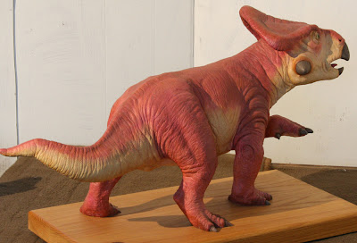 My favorite Bix maquette is this one (above), sculpted by Jim Henson’s Creature Shop. It’s about 36 inches long (about half the size of a real Protoceratops), cast in resin from a clay original.
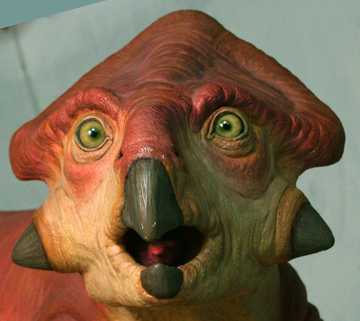 It has wonderfully expressive glass eyes. The Henson sculptors are masters at capturing a creature’s charm and personality.
 The Henson shop also created the hatchling character “26” for the Hallmark miniseries, which was done as a remotely controlled animatronic puppet. It weighed about as much as a watermelon. They handed it to me on the set at Pinewood Studios in London, and all at once it started wiggling its feet, blinking its eyes, and moving its jaws. I almost thought it was alive until I saw two or three guys in the shadows with radio control sets.
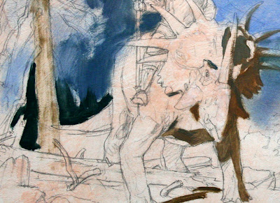
One of the most common mistakes in painting dinosaurs is to make the skin texture equally prominent throughout the form.
In digital work, the appearance of overall equal texture can happen when a bumpy 2-D pattern is mapped equally over a form. The texture appears in the shadow essentially the same as it does in the light, but in a reduced value or tone. Traditional painters are tempted to do the same. That way of doing texture doesn’t look real because it’s not how the eye sees it.
In fact, the textural relief is not equally apparent in the light and shadow. Texture is very difficult to see at all in the shadow region, and it’s only slightly more visible in the fully lit areas.
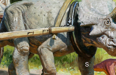 The place to see texture is in the halflight.
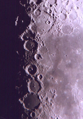 The halflight is sometimes called the halftone or demi-teinte. This is the area where the form transitions from light into shadow. Astronomers looking at photos of the moon call this region the terminator. It’s the area where the raking light brings out the detail of the craters.
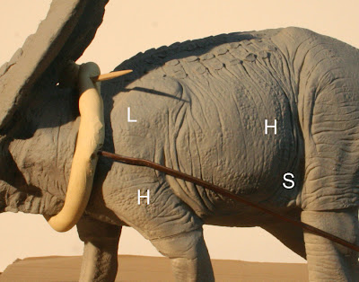 On this photo of a dinosaur model, I’ve marked the fully-lit areas with an L, the shadow with an S, and the halflight with an H.
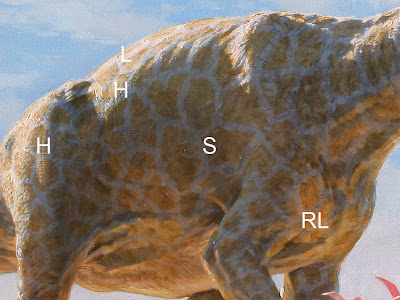 Here’s another detail of a painting from Journey to Chandara, showing the halflight in comparison to the light and shadow. Note that the texture in the reflected light (RL) should also be downplayed compared to the halflight. With traditional opaque painting media, you can suggest halflight texture by dragging pigments over bumpy impastos, or in this case, canvas texture.
 In more transparent media you can suggest halflight texture with a drybrush handling. This painting was also done in oil, but the paint is used more thinly.
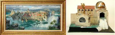
Maquettes can be made roughly and quickly, and still provide plenty of useful information.
Here’s an architectural maquette made of foam core board assembled with a glue gun. It only took about two hours to cut out and stick together. The whole thing is about six inches long, with toothpicks for the windmill spars. As a maquette, it's no beauty!
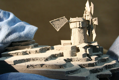 I spray-painted it gray to make it photograph better. White tends to bleach out in the photo. You can see how the bumpy texture of the paint and the ragged inner surface of the foam board really shows up in the “halflight,” or the area where the form is turning into shadow. The textural effect is strongest on the tail fin and on the side plane of the tower.
There’s also an interesting cast shadow to the right of the cluster of buildings, with cool upfacing planes, and little slivers of light on the edges of the buildings and the terraces.
 This is the kind of information I needed from the maquette as I developed the final painting, even though the form and design ended up quite different.
Please check back again tomorrow, and I'll explain more about texture in the halflight, because it's the key to painting dinosaurs convincingly in direct sunlight.
If you look closely at Arthur Denison’s map of Dinotopia in Journey to Chandara, you’ll notice a lot of place names that didn’t appear in previous editions. There are new towns with strange sounding names sprinkled across the island.
 Let me reveal one of my favorite sources for these names: Merriam-Webster's 365 New Words Page-a-Day Calendar.
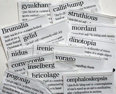 This curio cabinet of weird words is a daily delight in our household. When I find a word that I like, I tear it off and tuck it away in a file folder. Later I may use it to name a dinosaur, a character, a group, or a village. Here are a few of the words that I have collected and put to use in the new story.
Yesterday morning the rain kept pouring down as we endured the rush hour traffic into Albany, New York for an interview on public radio. We got to the station 45 minutes early, with plenty of nervous energy to burn off.
We parked Trusty Rusty in view of the WAMC headquarters and its performance hall, a retrofitted old bank building on Central Avenue. I started a watercolor sketch of the streetcorner, while Jeanette cast on another knitted sock onto her bamboo needles. I had to fire up the defroster and wipers every ten minutes or so to keep the windshield from fogging up.
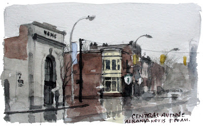 I take back what I said yesterday about watercolor being impossible on rainy days. The comforts of the car interior is better than getting a steady soaking outside. Here’s the sketch in my mini-Moleskine, using the Schmincke sepia, light red, ultramarine, and yellow ochre.
We suddenly remembered to tune the radio to WAMC. As I put on the last touches to the sketch, the hosts Joe Donahue and Julia Taylor introduced the segment: “Next we’re going to take a journey into a world of fantasy with artist and author James Gurney…” I rushed in to the studio with a cup of coffee and my sketchbook still in my hand.
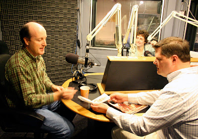 The on-air room was lined with foam waffles, and the microphones swung out from spidery arms. Even though the show is called “The Roundtable,” the table is actually elongated. The engineer behind the glass flashed a hand with five fingers—was that five seconds or five minutes? Joe and Julia were completely relaxed and friendly, but intensely focused, always in the moment. They write the intros, segues, and questions the day before, Joe told me. But they depart from the written script on a whim.
It’s the interviewer’s job to get the guest beyond his prepared answers, and the guest’s job to get the interviewer beyond his prepared questions. They were fun to talk to, and got me thinking about aspects of Dinotopia that I hadn't touched in an interview before.
Today I do two more interviews: an in-studio chat at WKZE and a phoner from LA to plug the Art Center gig.
Photos are a big help, but you can’t take them too literally.
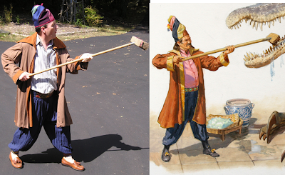 I wanted to paint a picture of an elegant gentleman scrubbing the teeth of a Baryonyx. But all I had available for a model was myself. So I grabbed some baggy pants and a long jacket and stood on the driveway with a push broom.
On its own, the photo is pretty lame. The shadows are too black. The legs appear too short. The coat hangs straight down in wrinkles that don’t describe any action. The pose needed a better sense of action and a clearer silhouette. Every photo is just a starting place, and the fun begins when you make departures from the facts they present.
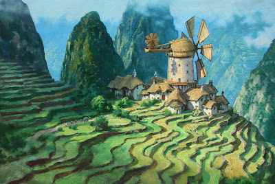
This painting from the Dinotopia: Journey to Chandara shows Will Denison flying through the mists of Waterfall City on his giant pterosaur Cirrus. I wanted to give the painting a feeling of lightness and airiness, so I stuck to pale tones in the distance, and a warm palette of color overall. It’s another example of the weird principle of reverse atmospheric perspective brought on by edge lighting in a moisture laden environment.
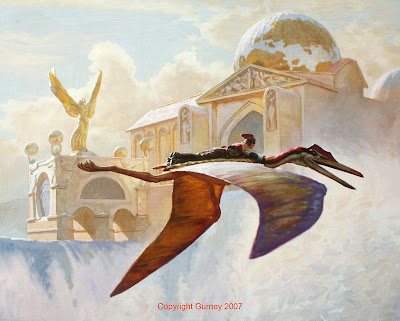
To figure out how the edge lighting would appear on the architecture and the flying figures, I put my maquettes to work in real sunlight. Here’s a little model of Will flying on Cirrus that I've used many times before. The pterosaur model is made from a variety of materials: Sculpey, wood, pipe cleaners, and cardboard. It has poseable wings, which are made from a pair of old stockings that have been painted with latex to give them a membranous surface.
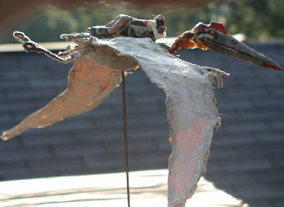
With the model set up in the real sunlight you can see clearly how the top side of the near wing picks up the cool of the sky, while the far wing is warm from the transmitted light shining through it.
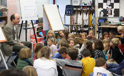
Elementary school teachers Teresa Moucha and Alice Toepel at the Carl Traeger Elementary School in Oshkosh, Wisconsin started planning their author visit almost six months ahead.
They wrote a grant proposal and a curriculum plan. The idea was to bring art and science together using the fantasy of Dinotopia. Mrs. Moucha and Mrs. Toepel, with the blessing of principal Janna Cochrane, below right, asked their fourth and fifth graders to create their own utopian worlds.
 The Oshkosh Public Museum’s assistant director Mike Breza, at the center of this picture with his daughters, coordinated the "Return to Dinotopia" museum exhibit in town and worked with the public library to develop a reading list. He received grant money to allow school kids free admission to the museum, which includes not only Dinotopia artwork, but costumes to try on and four full-size dinosaur skulls.
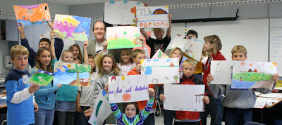
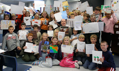
 The students at Traeger sketched actual plants and taxidermied animals. They invented an animal character that talks, a plot conflict, and a plausible fantasy setting. During the two and a half months counting down to my visit, they designed maps, landscapes and architecture and wrote stories about their imaginary worlds.
The results included “Dragontopia,” “Gerbiltopia,” “Fishtopia,” and “Dogtopia.”
 When I arrived on Friday, I gave a quick digital slide show about how I work, and then they performed the “Garden Chorale.” Then I visited four classes to talk in more detail with them about their projects and to share my Magic Marker presentation.
 The day after the school visit, Mrs. Moucha handed me a beautiful handmade book with thank-you notes tucked into secret compartments. One student named Kaitlyn wrote a note that brought me tears of joy: “Thank you for coming to our school. You really changed my thinking about art.”
Here's a link to a newspaper story from the Nov. 4 Oshkosh newspaper, and a report in the District Newsletter.
View Next 6 Posts


.jpg?picon=1009)
 Because an incoming snowstorm is expected to dump over a foot of snow between here and Massachusetts tonight and tomorrow, the March 1 Dinotopia booksigning event at the Odyssey Bookshop in South Hadley, MA has been cancelled and now rescheduled for Saturday, April 26 at 11:00 a.m.


sorry to hear that james,
you sure you cant burn through the snow with your lazer flame eyes from your tron goggles?
save us all SUPER-TRON-GOGGLE-MAN!
haha, but seriously, do you ever plan on coming back to D.C. and doing another show at the smithsonian natural history museam?
Hey, Gator,
Too bad the Tron goggles won't blast through the snowdrifts. But I will be in DC at Politics and Prose on March 11 at 10:30.
Ah, I got excited when I saw the word "Massachusetts!" But alas, there's a big difference (and a very long walk, if you're a car-less college student) from Boston to South Hadley!