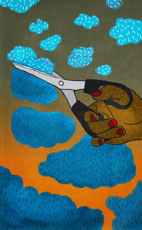
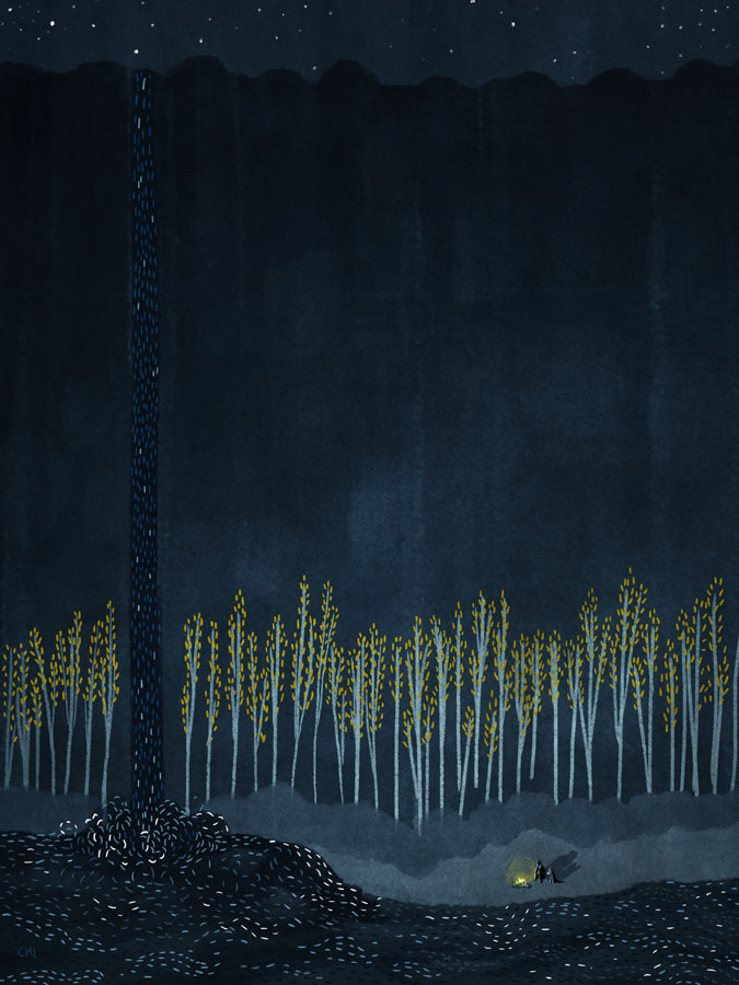
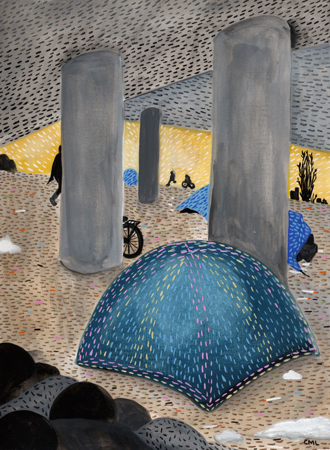
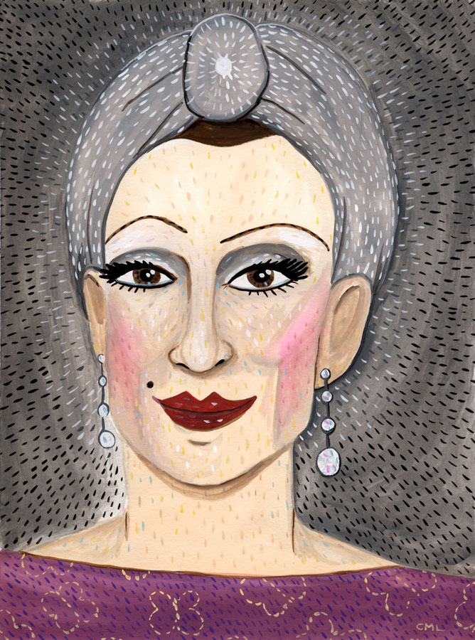
Come see this painting at the "Writers" show at Essentia in Belltown.
Opening Friday 6/10/16 6-9pm.
Join us for art, snacks, and readings by Sarah Galvin, Lesley Hazleton, and Maged Zaher
Push/Pull & Seattle Review of Books present
Writers:
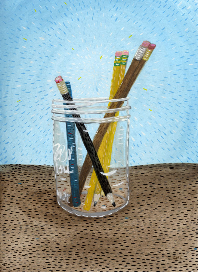
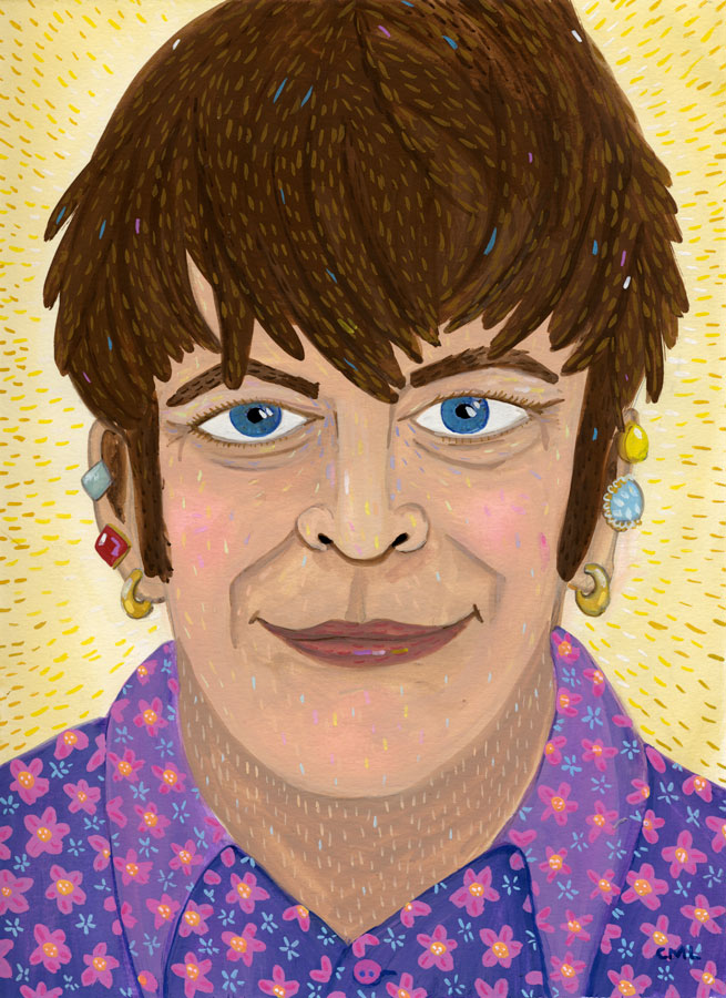
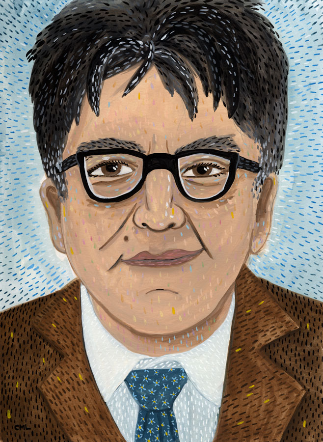
A selection of portraits painted for the Seattle Review of Books of local and national authors, plus paintings of the objects of a writer's life.
Christine Marie Larsen is a Seattle illustrator. Her work has appeared in The New York Times, Travel & Leisure, The Stranger, and more. Her illustrations explore the serious and sill aspects of this life on earth.
Artist Reception will include readings from Lesley Hazleton, Maged Zaher, and Sarah Galvin.
Come join us for an evening of local authors and art. We also have a Little Free Library to browse and borrow from. Refreshements will be provided.
This show is made possible through The Betterhood at Essentia World's Only Natural Memory Foam.
Essentia Mattress Store - Seattle
2008 1st Ave, Seattle, Washington 98121
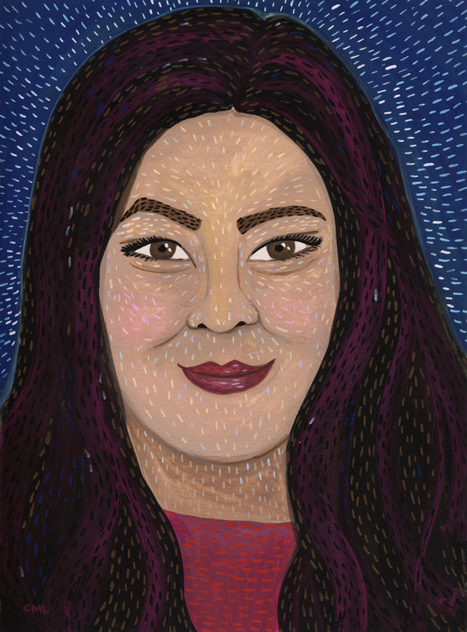
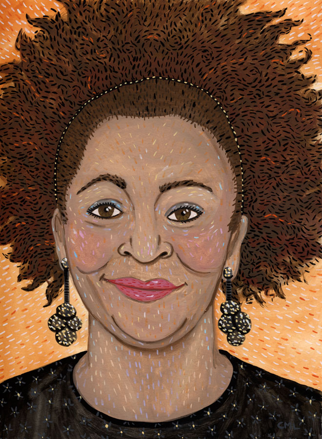
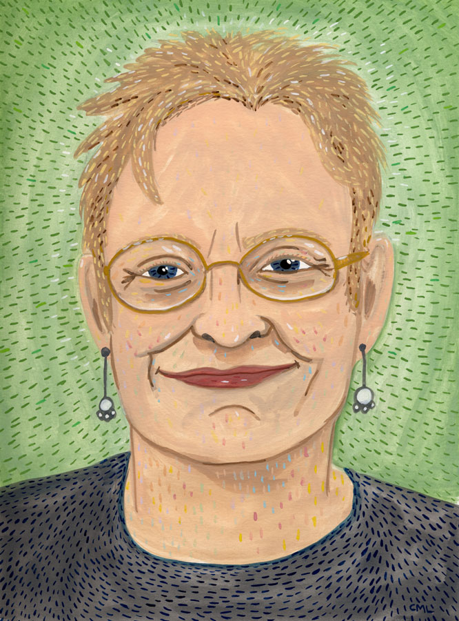
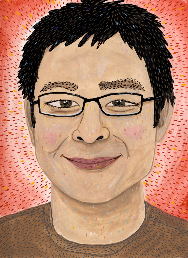
A SRoB portrait of TIME magazine correspondent Jay Newton-Small, author of Broad Influence: How Women Are Changing the Way America Works.
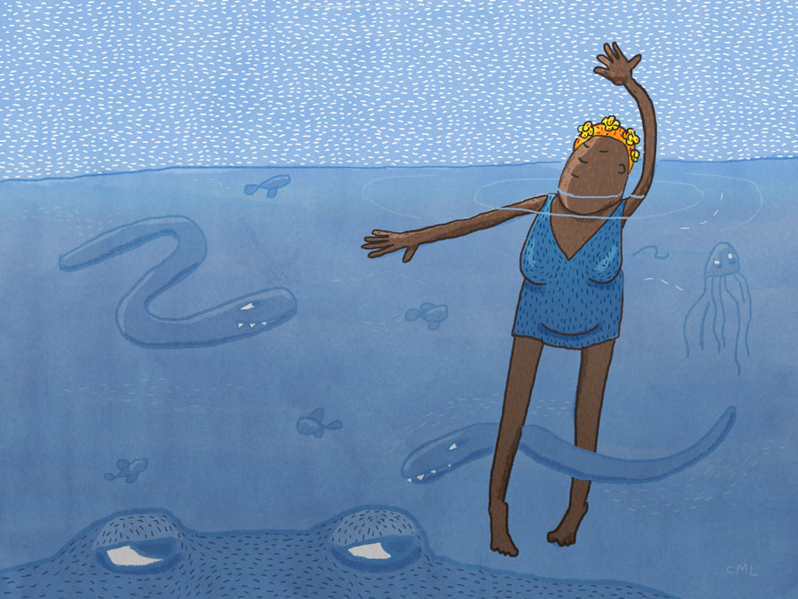
Over the last few months I have been listening to the unabridged Blackstone Audio of Moby Dick. Along the way the story has seeped into my thoughts and drawings. I present to you some work that I made along the way. As it turns out, I am a little obsessed with illustrating stories. Hmm, perhaps there a […]
via Studio Bowes Art Blog at http://ift.tt/1rLX8sv
 Welcome to the GJ Book Club. Today we'll cover pages 192-216 of the chapter on "Tone and Colour Design," from Harold Speed's 1924 art instruction book Oil Painting Techniques and Materials
 .
.
I'll present Speed's main points in boldface type either verbatim or paraphrased, followed by my comments. If you want to add a comment, please use the numbered points to refer to the relevant section of the chapter.
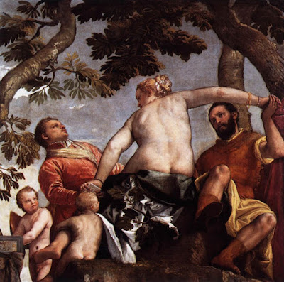 |
| Veronese—Allegory of Love: Infidelity |
1. Veronese analysisSpeed does a diagrammatic analysis of the painting, and notes the large arc formed by the woman's arms and shoulders.
2. Warm and Cool Color
Speed groups the following as cool colors: lemon yellow, green, greenish blue and full blue.
Warm colors include orange yellow, orange, orange red and full red. Purple is on the dividing line.
3. If the colors are very vivid and violent they will tend to make their complementary colors tell in the picture.
Harmony and contrast are not always in agreement. More of one quality makes for less of the other.
4. When the color introduced is of a quieter order, those similar to it in the other parts of the picture sing up in sympathy.
For example, a blue note will bring out all the cool colors.
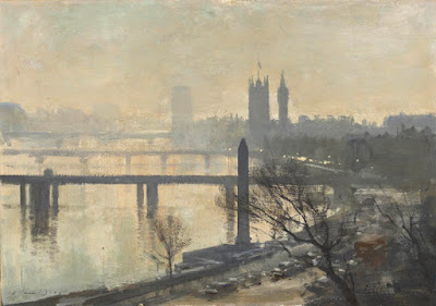 |
| Seago --Thames Embankment |
5. The picture that has a prevailing unity of hue, but is full of color varieties subtly introduced in the tones is one of the most beautiful of schemes.
With all the coal smoke in Speed's day, London subjects were often gray days, mostly monochromatic schemes with subtle color—He advises not to overdo it trying to make a pretty picture. Important to get the sober feeling. The prevailing hue must never be of a very pronounced color, but always in the more neutral range.
6. The selection of too many varieties of colour masses should be avoided....A lavish display is apt to be vulgar.
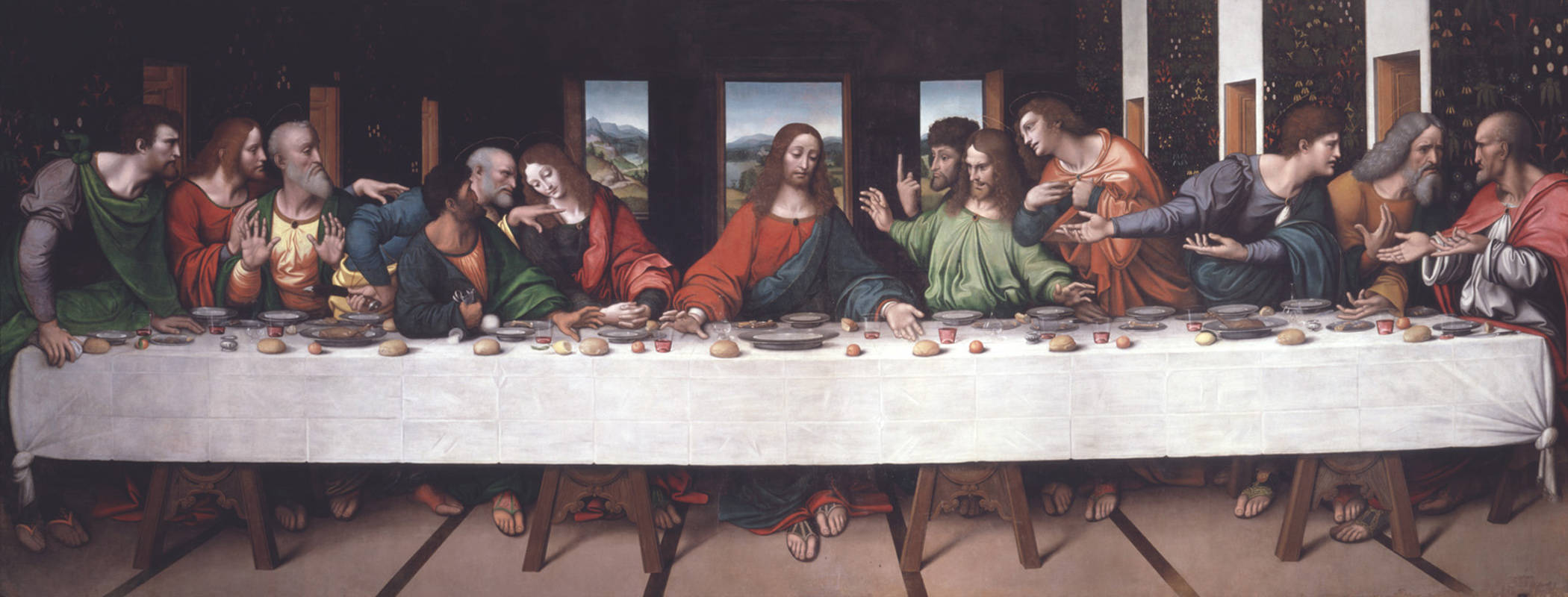 |
| Giampietrino Last Supper ca. 1520 after Leonardo |
7. Copy of Leonardo's Last Supper. Strong color notes of red and blue brought together in the figure of Christ.
8. Arrange masses of color so that warm colors are grouped together and cold colors together.
Kind of like shape welding using color temperature instead of value.
9. "Whenever any composition device becomes too obvious, one's sympathy is alienated."
Speed cautions against making the contrasts too violent, and leaves that for the poster designer.
10. Begin planning your color scheme with the broad idea and let the varieties be added to this large intention.
11. White masses always need very careful designing, as they catch the eye.
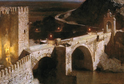 |
| Harold Speed -- The Alcantara, Toledo |
12. Toledo bridge. Painted in monochrome, allowed to dry, with color added later.
 |
| Sargent Wyndham sisters. |
13. Grouping multiple white masses into a larger mass.
White needs careful observing. Beware of harsh chalky whites.
14. When painting outdoors, it's easier to get the overall color impression, but when painting from imagination, it's harder to invent a convincing color statement.
Beware of using blue too much as a unifier.
15. Good exercise: Start with a black and white reproduction and invent various color schemes consistent with those tonal values.
16. Two sources of inspiration: the study of nature and the study of the best art of all times.
These are also the keys to freeing oneself from the fashion of the moment, says Speed.
17. Page 211. "What a better world we might have if real experts were allowed to control the formation of our habits, and were consulted by those in authority when anything demanding taste came up for discussion."
Speed goes on a rant here. He argues that ordinary people end up preferring art of lower standards merely from habit, because they're not exposed to finer things. His appeal for a cultural elite must have seemed like a reasonable bastion against the artistic excesses of his time, but I don't think such a top-down program would work in free countries, particularly given the penchant for artists to defy authority.
Today the aesthetic standards are largely defined by commerce. In the USA art lives or dies in the marketplace, with art that sells for higher prices or movies that make big box office results being justified on those terms.
However, the Internet has fostered the growth of a citizen band of book critics, movie commentators, and teachers of form and style. And the Internet has also introduced crowd-sourcing as a new model of funding and distribution. This crowd-sourced check-valve on the arts has changed how and why creators do what they do. I wonder what Speed would have thought of it.
18. Art takes patience to appreciate.
Speed says, "The mind only opens to the reception of ideas and experiences that are beyond one's present capacity." He says that art takes patience and reverence to really appreciate. He tells the story of the young museum-goer asking him to explain the merits of an old master to him. Speed advocates spending time with older painters and "getting past the brown varnish" to understand its retiring qualities.
19. Beware the "one better" type.

Whether you call it lens flare (what happens in a camera when you look at the sun) or color corona (a similar phenomenon that happens in your eye), it's a powerful effect that's popular in photography and video these days, but it's also something that has fascinated painters for a long time.
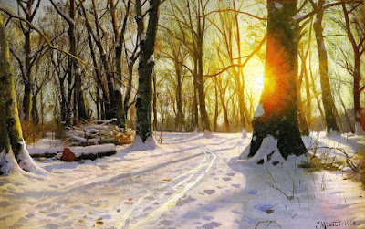 |
| Peder Mønsted, A Winter's Day |
The painting above was done in 1918, before color photography would have been in common use, so it's almost surely based on the effect that you can observe with your eyes. However, I don't recommend looking directly at the sun, which can damage your eyes.
The effect comes from light scattered by water vapor and dust in the air between you and the sun. The light is further scattered by your eyelashes when you squint, and then by the
aqueous humor and
vitreous fluid of the eye. The effect is best observed when you glimpse a setting sun through trees or when you see a streetlight at night.
Try squinting hard at a streetlight and tilting your head to see how the rays tilt with you. Also, try walking through the forest where the sun is mostly blocked by branches and glance up toward the sun as you walk to see how the corona comes and goes.
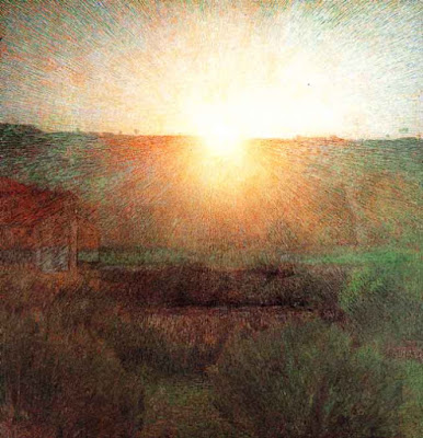 |
| Giuseppe Pellizza (Italian, 1868-1907) Volpedo, The Sun, 1904 |
Both Mønsted and Pellizza show the corona with lines radiating from the sun. They also observe a shift from yellow into red. Pellizza breaks the effect into particles of varied color. Note how simply and softly he paints the foreground areas.
Lens flare is
easy for digital artists to add, and a little harder for physical painters, depending on the technique. As a photographic effect, it has origins in camera optics. Its artistic use—and overuse—in film, television, and photography is well explained in this Vox video (
link to YouTube). Thanks,
Dan.
--------
Related GurneyJourney posts:
Color CoronaHow to Get a Feeling of Misty LightPractical LightsLight SpillMore of this kind of stuff in my book
Color and Light: A Guide for the Realist Painter

Post by Chloe


Lotta Nieminen’s illustrations are packed with detail, colour and narrative. The bold vector shapes combined with subtle texture and an atmospheric colour-scheme is what really brings this work to life. Lotta Nieminen’s talent doesn’t stop at illustration either. She is also a graphic designer and art director who runs her own studio based in New York.
If you would like to see more of Lotta Nieminen’s work please visit her portfolio.
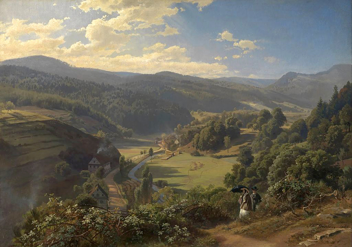
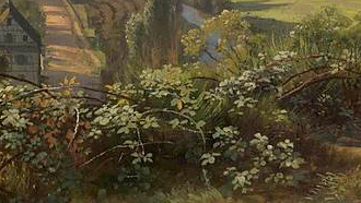
In the foreground there's a full range of values used to model the foliage. The leaves and branches are painted individually, with considerable variation of value.
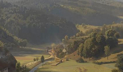
In the middle distance, all foliage is divided into masses of light and shadow, with the shadow rising to the mid-range. The warm greens in the light side are grayed down as the distance increases. Shadows get cooler as you go back, and detail in the shadow is greatly reduced.
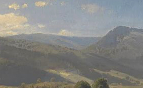
In the far distance the values step back even further. Light and dark values become very close. In the last range of hills, they merge into a single tone just a shade darker than the sky color.
When painting landscapes in oil, it helps to mix batches of each of these value steps on the palette and make sure they progress evenly.
-----
There's also a double gradation going on in the sky. More on
Sky Gradations on a previous GurneyJourney postand more of this kind of stuff in my book
Color and Light: A Guide for the Realist Painter

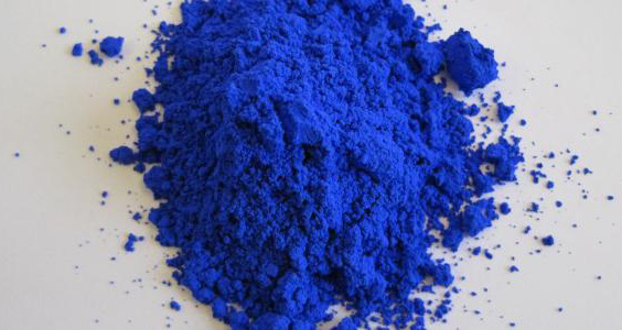
A new non-toxic, inorganic blue pigment has been discovered by accident by chemists in Oregon. They were experimenting with electronics materials that they mixed with manganese oxide and heated them to 2,000 degrees Fahrenheit, when a batch suddenly turned a brilliant blue.
"The new pigment is formed by a unique crystal structure that allows the manganese ions to absorb red and green wavelengths of light, while only reflecting blue. The vibrant blue is so durable, and its compounds are so stable – even in oil and water – that the color does not fade. These characteristics make the new pigment versatile for a variety of commercial products."
Read the rest
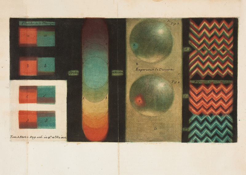
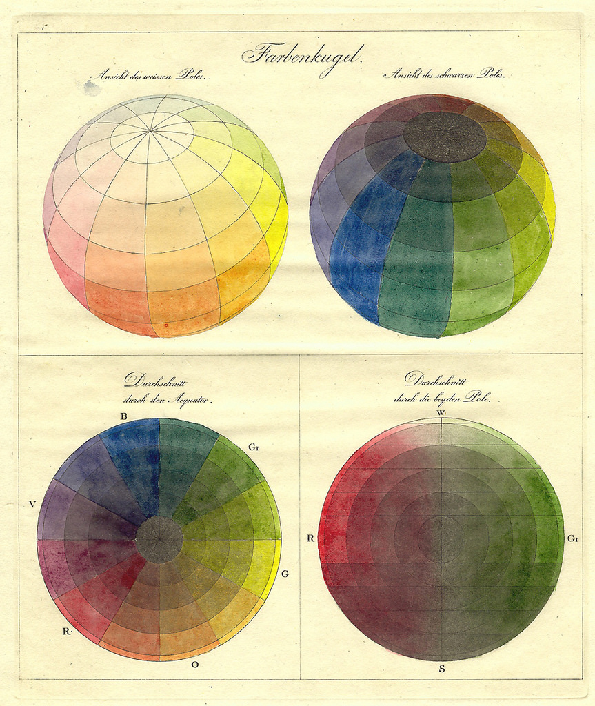
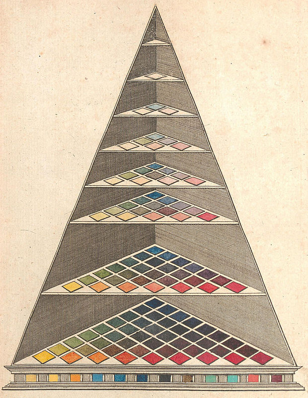
For centuries artists have explored ways to map the universe of color. Each kind of chart reflects a different conception of color. Here are a few examples, from a selection by The Public Domain Review
 |
"A chart from 1746 by Jacques-Fabien Gautier illustrating his theory that the primary colours
are black and white, with red, yellow, and blue being secondary. Colours were thought
to be drawn out of the shadows by the presence of light – Source." |
 |
"Philipp Otto Runge’s Farbenkugel (1810). The top two images show the surface
of the sphere, while the bottom two show horizontal and vertical cross sections –Source." |
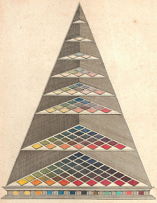 |
"Johann Heinrich Lambert’s three-dimensional adaptation of
Tobias Mayer’s triangle, featured in his Beschreibung einer mit
dem Calauschen Wachse ausgemalten Farbenpyramide (1772) – Source." |
 |
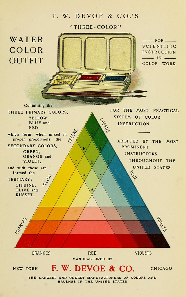
"Page from Priced catalogue of artists’ materials : supplies for
oil painting, water color painting, china painting … and
drawing materials for architects and engineers, manual
training schools and colleges (1914) – Source." |
Captions quoted from:
The Public Domain Review. See more at their post
Color Wheel Charts and Tables Through HistoryMore about color systems in my book:
Color and Light: A Guide for the Realist Painter


karolin schnoor is a German freelance Illustrator and designer, who uses screen printing as an integral part of her illustration practice. Inspired by a love of colour and pattern her illustrations can be found in magazines, stationary, calendars and mugs with a vast array of products to purchase in her Etsy shop. Some of her clients include; Harper Collins, Creative Review and The New York Times.
To see more from this artist visit her website.


.jpeg?picon=2456)


.jpg?picon=1009)


