

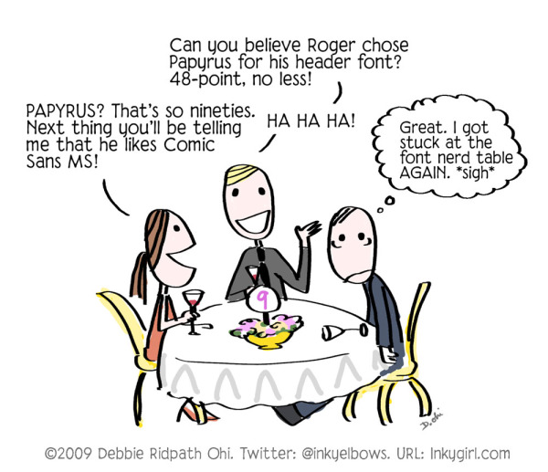
0 Comments on Comic: Font Nerds as of 3/2/2016 9:17:00 AM
Add a Comment

 By: Debbie Ridpath Ohi,
on 3/2/2016
By: Debbie Ridpath Ohi,
on 8/31/2015
By: Debbie Ridpath Ohi,
on 3/2/2016
By: Debbie Ridpath Ohi,
on 8/31/2015

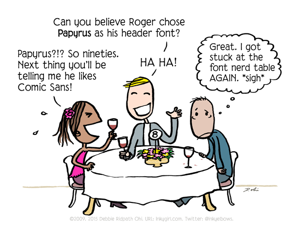
For those interested, the Font Nerd Table comic above is now available as a greeting card in my card shop.
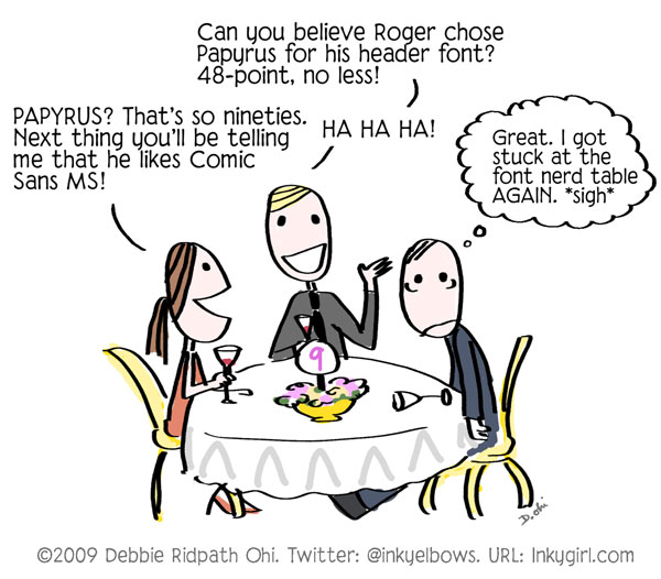
I do admit that I over-used Comic Sans and Papyrus when they first came out. Fontfaces are so much like fashion, aren't they? You have the basic fontfaces which never seem to go out of style, like Helvetica and Times Roman. But then there are the trendy fonts which are massively popular for a short period of time but then fall by the wayside.
Like Comic Sans. And speaking of Comic Sans, here's my favorite Comic Sans music video ever:
Insider kidlit trivia: Andrew Huang, who makes a guest appearance as a rapper in the video above, is also the voice in Greg Pincus's book trailer for The 14 Fibs Of Gregory K.
By: Debbie Ridpath Ohi,
on 1/22/2015
And yes, I'm a font nerd. And here's my favorite Comic Sans song ever:
By: Debbie Ridpath Ohi,
on 6/2/2014
 By: Julia Callaway,
on 4/29/2014
By: Julia Callaway,
on 4/29/2014
The illustration of a graphic history begins with the author’s script. There are two aspects to turning that script into artwork. It’s both a story, calling for decisions to be made about the best way to present the narrative visually, and a history, rooted in fact and raising questions about what the places and people (and their furniture and transportation and utensils) would actually have looked like.
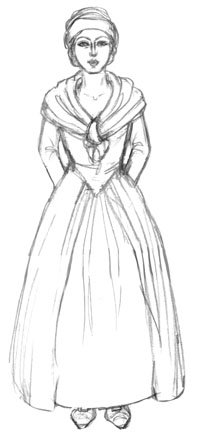
A sketch of Esther Mendoza, wife of Daniel Mendoza. Courtesy of Liz Clarke. Used with permission.
It’s unlikely that we’ll find perfect answers to all of these questions, particularly in a pre-photography age like the late 18th century, when Daniel Mendoza was at the height of his boxing career. Some subjects offer a wealth of images. Some, like a number of the places Mendoza frequented in London, still exist today. I was able to work from current photographs of locations including Mendoza’s house in Paradise Row, the cemetery where he is buried, and the exterior of the White Hart Inn. We had several images of Mendoza himself to refer to, thanks to his celebrity status. We knew what he looked like at different points in his life, how tall he was and how much he weighed. We knew about his fighting style from newspaper reports, artwork, and from his own instructional writing.
However, other subjects may not have been recorded in an image or even in a written description at the time. If records were made, they may not have survived. This means we have to cast the net wider. There are many sources of general information available that allow a lateral approach — records of people and places with shared characteristics, surviving artefacts and garments, artwork and documents from the time. There was nothing definite to work from in the case of Mendoza’s wife Esther, but we could ask what a woman like Mendoza’s wife would have looked like. How would a woman similar in age, class, and religion to Esther have dressed and worn her hair? We could then blend fact and imagination to arrive at a concept sketch of Esther, which allowed us to agree on how we would depict her.
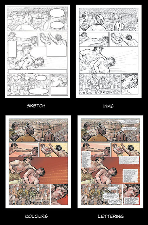
A page from Mendoza the Jew, showing the process from the sketch stage to the final piece. Courtesy of Liz Clarke. Used with permission.
Once we have enough information, each page is planned in detail. I’ll decide on the composition of the whole page, and of the contents of each panel on the page. There are choices to make about viewpoint (for example, if the scene is going to be presented from a low angle, looking up at it, or a high angle, looking down on it, which creates two very different effects), how to draw attention to the pivotal point in the scene, the characters’ body language and expressions, if they aren’t already defined by the script, and how to convey the themes of the book. This layout sketch is the most important stage in the illustration of a page.
Once the author has approved the sketch, I draw it in ink as line art and prepare this to be coloured digitally. Colour and the nature and direction of the light can also contribute to the storytelling. For example, the desaturated colours at the beginning of an exchange between Mendoza and Humphries, when Mendoza is not at his best, gradually become brighter and warmer by the end of the scene, as their verbal sparring restores Mendoza’s fighting spirit. The text comprising the narrative and dialogue is added to the art, and text boxes and speech bubbles are fitted to it. For Mendoza the Jew, we decided to use three different fonts. Two fonts with some resemblance to typefaces from the time period represented quotes from Mendoza’s autobiography and from a newspaper report of Mendoza’s match against Humphries in Doncaster, distinguishing the author’s words from Mendoza’s, and those of the reporter.
As an artist, illustrating a graphic history, as opposed to a work of fiction, has some unique rewards as well as challenges. There’s an awareness that these were real individuals and events, and it always feels like a privilege to be telling their stories.
Liz Clarke is an illustrator based in Cape Town, South Africa. Her artwork has appeared in magazines, games and books, including Abina and the Important Men: A Graphic History by Trevor R. Getz and Mendoza the Jew, Boxing, Manliness, and Nationalism: A Graphic History by Ronald Schechter.
Subscribe to the OUPblog via email or RSS.
Subscribe to only history articles on the OUPblog via email or RSS.
The post Illustrating a graphic history: Mendoza the Jew appeared first on OUPblog.

Featured FF Marselis by Jan Maack
We’ve seen a fair amount of typefaces pop up over the last couple of months, but here are few of our favorites.

FF Marselis by Jan Maack
FF Marselis crossbreeds geometric and humanistic forms, creating a freshly dynamic sans serif family. All of the counters in the typeface are open; this aids readers’ eyes quickly flow across lines of text, without experiencing hang-ups.
Available at FontShop and FontFont

Hipster Script Pro by Alejandro Paul/Sudtipos
Hipster Script received a Judge’s choice Certificate of Excellence at the Type Directors of New York and was selected to be part of the Bienal Tipos Latinos 2012.
Available at MyFonts, YWFT, Now 30% off till Oct 14, 2012

Aranjuez Pro by Alejandro Paul/Sudtipos
Aranjuez is the latest Koziupa and Paul adventure. This time, they max out on calligraphic art deco, then add a healthy dose of the thick-and-thin mantra that’s been so trendy for quite a few years now. The result is neo-psychedelia in an upright cross-breed of pseudo-wood deco and ornamental calligraphy, complete with alternates, swashes, endings, playful contrast treatments, and even background possibilities.
Available at FontShop, MyFonts, YWFT

Aquus by Phospho
Aquus is a contemporary all-caps display font that refines the elegance of a classic Didone with experimental interventions. Geometric elements and subtle details are found in its letters, many of which connect to ligatures.

Romeo by Latinotype
Romeo is a perfect couple of Julieta , they are a condensed, unicase family full of swashy love.

Mission Script by James T Edmondson
The first part in James’ Mission series of fonts.
Available at the awesome Lost Type Co-Op.

Idlewild by Hoefler & Frere-Jones
Available at H&FJ
—–
Also worth viewing:
YWFT Fonts
Fonts by Laura Meseguer
Travis Stearns’ Fonts
Not signed up for the Grain Edit RSS Feed yet? Give it a try. Its free and yummy.
A Huge thanks to Squarespace for sponsoring this week’s RSS Feed!©2012 Grain Edit - catch us on Pinterest , Facebook and twitter
Featured FF Marselis by Jan Maack
We’ve seen a fair amount of typefaces pop up over the last couple of months, but here are few of our favorites.
FF Marselis by Jan Maack
FF Marselis crossbreeds geometric and humanistic forms, creating a freshly dynamic sans serif family. All of the counters in the typeface are open; this aids readers’ eyes quickly flow across lines of text, without experiencing hang-ups.
Available at FontShop and FontFont
Hipster Script Pro by Alejandro Paul/Sudtipos
Hipster Script received a Judge’s choice Certificate of Excellence at the Type Directors of New York and was selected to be part of the Bienal Tipos Latinos 2012.
Available at MyFonts, YWFT, Now 30% off till Oct 14, 2012
Aranjuez Pro by Alejandro Paul/Sudtipos
Aranjuez is the latest Koziupa and Paul adventure. This time, they max out on calligraphic art deco, then add a healthy dose of the thick-and-thin mantra that’s been so trendy for quite a few years now. The result is neo-psychedelia in an upright cross-breed of pseudo-wood deco and ornamental calligraphy, complete with alternates, swashes, endings, playful contrast treatments, and even background possibilities.
Available at FontShop, MyFonts, YWFT
Aquus by Phospho
Aquus is a contemporary all-caps display font that refines the elegance of a classic Didone with experimental interventions. Geometric elements and subtle details are found in its letters, many of which connect to ligatures.
Romeo by Latinotype
Romeo is a perfect couple of Julieta , they are a condensed, unicase family full of swashy love.
Mission Script by James T Edmondson
The first part in James’ Mission series of fonts.
Available at the awesome Lost Type Co-Op.
Idlewild by Hoefler & Frere-Jones
Available at H&FJ
—–
Also worth viewing:
YWFT Fonts
Fonts by Laura Meseguer
Travis Stearns’ Fonts
Not signed up for the Grain Edit RSS Feed yet? Give it a try. Its free and yummy.
A Huge thanks to Depositphotos for sponsoring this week’s RSS Feed!©2012 Grain Edit - catch us on Pinterest , Facebook and twitter
 By: Chad W. Beckerman,
on 9/10/2012
By: Chad W. Beckerman,
on 9/10/2012


 By: John,
on 8/15/2012
By: John,
on 8/15/2012
A group of independent font designers have teamed up to create a service which will track the unauthorized use and distribution of font files online. They’re trying to raise $4,000 to make this happen:
TypeSnitch is a community-funded service that helps you keep tabs on where your font files are being publicly shared online. It will monitor popular sources and help you request file takedowns and other tedium related to inappropriate sharing of your files.

Allonghata by Christine Gertsch
Type and Media is an intensive one-year masters course in type design held at The Royal Academy of Art in Den Haag, The Netherlands. The course teaches a wide range of skills in the area of type design such as calligraphy, stone carving, non-latin scripts, typeface revivals, Python programming, modern font editing software as well as the creation of new letters. All of the final project typefaces created in the last four months of the 2011/2012 course are available to view here.

Pilot by Aleksandra Samulenkova

Leda by Aliz Borsa

Dato by Daniel Perraudin

Blanco by Dave Foster
——————–
Also worth viewing:
Travis Stearns
YWFT Fonts
Recent Fonts
Fancy Antique Display
Not signed up for the Grain Edit RSS Feed yet? Give it a try. Its free and yummy.
A Huge thanks to squarespace for sponsoring this week’s RSS Feed!©2012 Grain Edit - catch us on Facebook and twitter
By: John,
on 7/12/2012
Free FontShop Plugin for Photoshop & Illustrator:
Two handy font plugins in one week??! What are the odds!
The free FontShop Plugin lets you preview any of our 150,000 fonts, in the context of your own artwork in Adobe Photoshop or Adobe Illustrator (CS5, CS5.5 and CS6). This is a great new way to find the perfect typographic fit for your project.

Meet Herbie, the latest display font from Morten Iveland at the Infamous Foundry. As the name might indicate, Herbie is inspired by Herb Lubalin’s work and the decorative style and kerning of his era.


Download Herbie here.
——————–
Also worth viewing:
Fancy Antique Display
Bolda Display
New Fonts Available at YWFT Part 1
Not signed up for the Grain Edit RSS Feed yet? Give it a try. Its free and yummy.
©2012 Grain Edit - catch us on Facebook and twitter
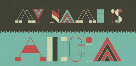
.jpg?picon=572) By: andrea joseph,
on 4/20/2012
By: andrea joseph,
on 4/20/2012

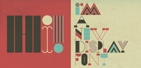
The Alicia font is a cool new experimental typeface by Alexander Wright. This face is a good example of taking the ideas and eccentricities of lettering and creating a functional product out of them. If you enjoy this font, HypeForType, the foundry behind the project, also has many other great lettering-inspired display faces to explore within their expanding database of typefaces.
Also worth viewing:
Travis Stearns
New Fonts Available at YouWorkForThem
Andrew Woodhead
Not signed up for the Grain Edit RSS Feed yet? Give it a try. Its free and yummy.
——————–
©2012 Grain Edit - catch us on Facebook and twitter
 By: Beth,
on 9/25/2011
By: Beth,
on 9/25/2011
If you’re like us at my library, you’re fairly limited in the software you’re allowed to use (ahem, Microsoft Office suite), and your in-house publicity is made with Publisher. If you’re in the habit of making signs or flyers for your programs, check to see if you’ve gotten into the clipart-gradient background-text rut. If this isn’t you, please please please help your fellow librarian who fits this description. If you’re thinking, But what’s wrong with my clipart?, I beg of you, please keep reading.
Backgrounds
Flyers and signs should be eye-catching, especially when you’re competing for the short attention span of teens, and it all starts with your background. It shouldn’t be just any color, or a color at all. The background you choose can determine what images you use, as well as the type and color of your font. If you choose a plain background, you’d better have an image that pops, and your font color should be a high contrast. On the other hand, if your background is an image, use other pictures or clipart sparingly (if at all), and consider a “washout” effect, essentially increasing the brightness and lowering the contrast. You want the text to be readable from a distance, and an image background can obscure readability.
Images
Think about cropping an image in a neat way to only use part of it. Instead of a floating ninja head, put that same head with the chin cropped off at the bottom of the flyer to make it look like it is looking over something. If you’re looking for something fresh, try searching through Google Images, Flickr, or other photo sites. Remember to keep copyright in mind, though, and look for images licensed through Creative Commons instead, which is often easier to use and understand.
Fonts
The last important element is the font. Even if your IT department protests every time you try to install something new, that doesn’t mean you can’t use special fonts. For a Halloween program, use a Friday the 13th-esque font or some other font that embodies your gruesome theme. Having a spa program for girls? Use a super girly font with a lot of flourishes. You can even try to match the font from a book cover (think Hunger Games). Here’s the trick: download the font, unzip it if required, and save the TrueType file to your desktop. Open the file, and like magic, the font becomes available when creating WordArt in Publisher. As long as the font file is open while your Publisher file is open, the font is available and will show up properly (Side note: even if you save the Publisher file, the font will revert back to a standard font if the downloaded font file is not open. To avoid this, save the file as a .jpg). Fonts can come from a number of sources, but my usual choice is dafont.com
The most important thing is don’t forget to have fun with this! What tricks have you learned along the way to keep your publicity from getting boring? Leave your answer in the comments.

By: Lauren,
on 5/13/2011
Tweet
This girl is reading the entire Patient Protection and Affordable Care Act out loud. [Act of Law]
Why no smoking signs actually ENCOURAGE smokers to light up [Daily Mail]
Think there’s no point in keeping print books around? I respectfully disagree. [Unshelved]
Here are some kitties crashing into each other. [YouTube]
100,000 staples arranged over 40 hours and other awesome staple art [NextWeb]
What does your literary tote bag say about you? [Vol1Brooklyn]
QUIZ: Can you tell Arial from Helvetica? [Ironicsans]
INFOGRAPHIC: The hardest languages to learn [Column Five]
This article on “Asian-American overachievers” is certainly creating a stir. [NYMag]
Incredible photos of the Great Flood of 1927 [Buzzfeed]
By: John,
on 3/21/2011
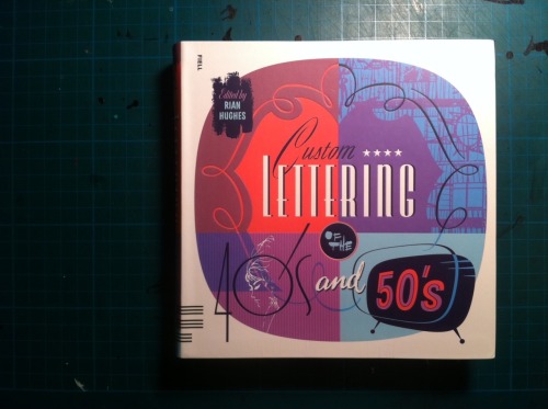
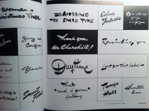

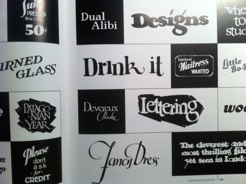
Custom Lettering of the ’40s and ’50s
Last year’s Custom Lettering of the ’60s and ’70s, Rian Hughes’s massive scrapbook of curated lettering samples culled from movie posters, ads, and other ephemera of the time, was one my favourite books of 2010. It quickly gained a permanent spot on the bookshelf closest to my drawing table, it’s such a great reference book.
Its new successor, Custom Lettering of the ’40s and ’50s now joins it on the shelf. Both books are nothing but pure typographic pornography, carefully sorted by style and tone.

YWFT Herzog / Designed by Travis Stearns
Our friends at YouWorkForThem have updated their shop with some tasty new fonts.
Originally drawn in 2008 by Travis Stearns of YouWorkForThem, we revisited the Herzog drawings in 2011 and developed them into a fully functional opentype font release. YWFT Herzog comes with two style options (regular and alternate), with each style containing opentype stylistic alternates for upper case and lower case characters.

Sevigne ST / Designed by Reserves
Sevigne ST is a highly refined, contemporary geometric sans, inspired by the ambience of high-end fashion and luxury. Subtle, considered details are found within individual letters, contrasted by the complex, intersecting forms that make up the various ligatures. With multiple stylistic sets added to the expanded ligatures, individual letters and ligature pairs can be carefully exchanged to fine-tune text settings for a unique custom type solution.

Tenshu / Designed by Radomir Savov Tinkov
Tenshu comes in OpenType format, and also covers Cyrillic language.

Thickset / Designed by Joshua Grzybowski
Designed as a display font, Thickset is a solid slab-serif with thin counters that makes it ideal for publications like fashion and editorial magazines. But don’t get me wrong, she’s more than willing to give anything a try. Just as long as you respect her in the morning. In addition to ligatures and fractions, Thickset’s other OpenType features include old style numbers and small caps.

 By: Betsy Bird,
on 1/25/2011
By: Betsy Bird,
on 1/25/2011
 New York, she is so snowy these days! I’ve lived in this pleasant burg roundabout six years, by my count, but this is the first winter where the weather decided to bring back memories of my Michiganian (Michigander? Michiganolian?) youth. Well, a good Fusenews is the perfect solution for any snowy day. On to the top stories!

GRIEFABET by Karen O. Johnson MEd.
“Griefabet” by noted American therapist/counsellor/presenter, Karen O. Johnson is unusual.
The book,of course, is primarily aimed at counseling and therapy settings and there is a workbook that can be purchased to accompany “Griefabet”. But this little book is a great deal more.
A book of warm, witty, affirmations for those who are coping with grief and loss, it has a few happily playful ‘venting’ exercises thrown in for good measure. It is also a free verse poem that celebrates life and the resilience of the human spirit. Finally, it is a work of art – illustrations use the letters of the alphabet in designs that mirror the verse of affirmation opposite. It is a design achievement!

GRIEFABET - peek inside
“GRIEFABET” by Karen O. Johnson, www.griefabet.com, ISBN 978-0-615-39746-7.
Karen O.Johnson-2010-09-21 AuthorTacklesGriefFromAtoZ


Once again, for your consideration we present the following covers with title fonts that stand out as particularly interesting, or that function extra well as part of the design.

 |
| The Firefly Letters by Margarita Engle (Holt, 2010) |
 |
| Frozen Secrets: Antarctica Revealed by Sally M. Walker (CarolRhoda, coming October, 2010) |
 |
| Lulu and the Brontosaurus by Judith Viorst, illustrated by Lane Smith (Atheneum, 2010) |
 |
| Wild Things by Clay Carmichael (Boyds Mills/Front Street, 2009) |

GHS / Designed by the House of Burvo
We’re big fans of YouWorkForThem and we’re excited to announce that they’ve recently added a slew of new fonts to their shop.

GHS / Designed by the House of Burvo
GHS is an exciting new typeface from HouseOfBurvo, it comes in 4 styles, each style is sold in 3-font sets containing a Key font, and two ‘Layer’ fonts separating the Hairline Strokes from the Stress parts. These layers can be combined to create endless variations.

Hernandez Bold / Designed by Sudtipos
Hernandez bold is a ’slab serif display’ font. It has a unique feature, it gives the possibility of composing words in different rhythms. It has a big number of alternates, which allows the user various combinations within a text.


Cumulus & Foam / Designed by Stefan Kjartansson
Like other unbeautiful creations, Cumulus is not an easy read. Its delicate origins (in Didot) are perceptible, but this familiarity is cloaked with malproportioned outgrowths and misfigured swellings. Not only have the characters all but eluded recognition, there is a sense that they haven’t ceased to form. As clouds transmogrify when borrowed for a dream, so does Cumulus bloom and thrust when committed to a baseline.

Inlove / Designed by Sudtipos Add a Comment
Ran across these covers recently and was taken with the title typeface choices:
Rosie and Skate by Beth Ann Bauman (Random House, 2009). A young adult novel about two sisters living on the Jersey shore during the off-season. So 1950s diner-ish. Love the whole cover, actually.
Layla, Queen of Hearts by Glenda Millard, illus. by Patrice Bowman (FSG, release date April, 2010). A middle-grade novel about a girl's friendship with a senior citizen. The red lettering is inviting (for girls, anyway) and the curly style promises a heartwarming story within.
Can an Old Dog Learn New Tricks? And Other Questions about Animals by Buffy Silverman, illus. by Colin W. Thompson (Lerner, 2010). A non-fiction book which examines common sayings about animals and whether they're really true or not. The typeface is energetic, like a comic book; it promises juicy good fun inside. I think boys would think it's rough and tough enough.
I wonder if there are other typefaces that could be sorted into "best for girl books" and "best for boy books" categories.
 For beginners, from a beginner, here are ten terms to know about book creation. (Would be most grateful if the better-informed will correct or clarify in the comments! --Carol)


 <
<
I ran across both of these new books online today and the contrast was outstanding enough to make me stop and think. Simplicity vs. intense busy-ness. Which works better?
Admittedly, my bias is the old cliche “less is more.” Sharon M. Draper’s book, Out of My Mind (Atheneum 2010) is a peaceful blue with a nice complementary orange for a focus point. The simple image says a lot, though. Fish out of water… breaking free of things that bind you, etc. It usually irritates me when the author’s name is bigger than the title – but it works here. Draper’s name is subtle enough as not to distract. The white title attracts the eye if only because it’s white against so much blue. I like how “a novel” delineates the goldfish’s path out of the bowl. The bubbles add visual interest.
A Small Free Kiss in the Dark by Glenda Millard (Holiday House April 2010, Allen & Unwin 2009) – I don’t know why the Yiddish exclamation “OY VEY!” comes to mind – but OMG! Too much, too much, too much. And if that’s not enough, the strange font, outlined in white and placed strangely in the layout, further complicates a cover that is already way to busy with text and mixed images. Maybe all this mishmash will draw kids? It’s only the plot summary here that might pull me in.


Out of My Mind: Considered by many to be mentally retarded, a brilliant, impatient fifth-grader with cerebral palsy discovers a technological device that will allow her to speak for the first time. Ages 10+. Reviews 1, 2, 3, 4, 5. Reading Group Guide.
Small Free Kiss in the Dark: Skip, an eleven-year-old runaway, becomes friends with Billy, a homeless man, and together they flee a war-torn Australian city with six-year-old Max and camp out at a seaside amusement park, where they are joined by Tia, a fifteen-year-old ballerina, and her baby. Ages 12+. Reviews 1, 2, 3, 4, 5.
4 Comments on Simplicity Rules!, last added: 3/11/2010
Display Comments
Add a Comment
this is absolutely FANTASTIC!
Ooh, very pretty :) I think you'd do a great job! (By the way, hello! I'm your latest follower ;D)
Hello, Zia!
Thank you both.
love this! and then you can start experimenting with ligatures!!
My favourite of all my favourites in that piece is the "Be" the fuzziness is so well done, I feel like I could reach out and rub it!
Fan from Canada
Beautiful work!
Ooh you should definitely try to design fonts! I always love your lettering. :)