

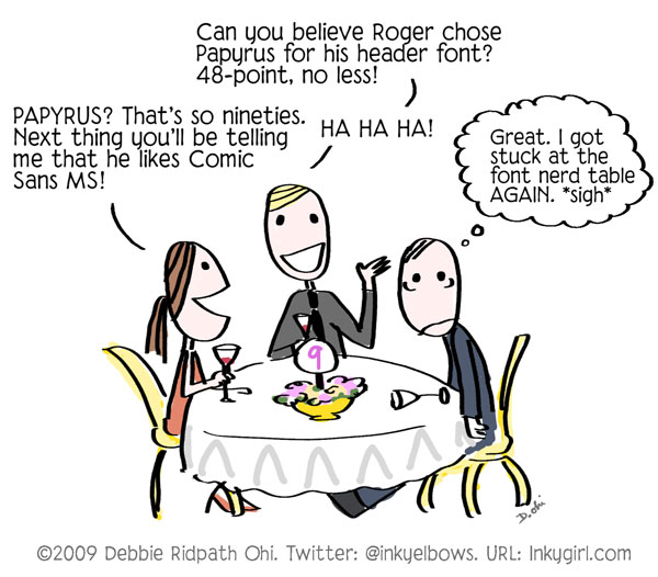
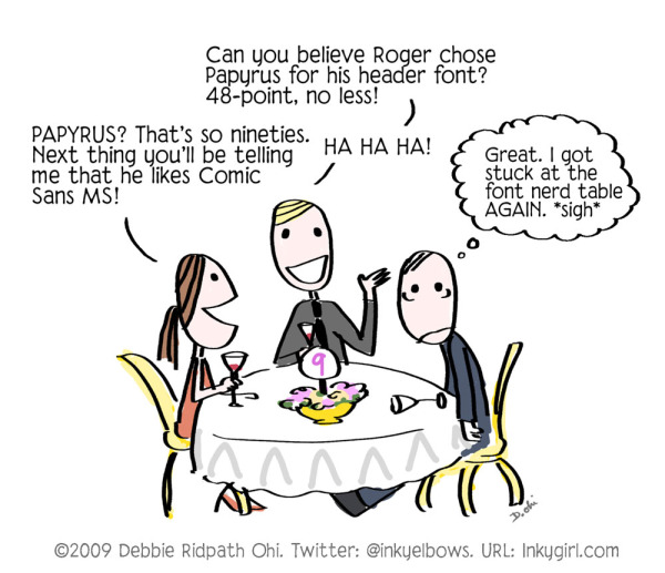
And yes, I'm a font nerd. And here's my favorite Comic Sans song ever:
0 Comments on Comic: Font Nerds as of 1/22/2015 11:05:00 AM
Add a Comment

 By: Debbie Ridpath Ohi,
on 1/22/2015
By: Debbie Ridpath Ohi,
on 1/22/2015
And yes, I'm a font nerd. And here's my favorite Comic Sans song ever:
 By: Rachel Frankel,
on 8/10/2014
By: Rachel Frankel,
on 8/10/2014

Ok, I’ll save you the spiel about how deeply I’ve fallen in love with typography and lettering, as that should be fairly obvious by now. Drew Melton‘s work essentially speaks for itself. His deeply expressive fonts and lettering demonstrate the importance of hand-drawing into the design process. Even in the sharpest, finalized versions of his work, you’ll a spontaneity that’s unmistakably fun and energetic.


Drew is an L.A.-based graphic designer and typographer who’s worked with clients like McCann, Nike, Saatchi & Saatchi, and Penguin Books. He’s had quite the interesting journey to success in the lettering realm, some of which is marked by serious self-reflection and the ability to remain humble.

One of the things that hurled him into the design spotlight was his Phraseology project, started with a few other designers and developers in 2011. Very similar to Erik Marinovich’sFriends of Type blog, Phraseology offers the public a chance to submit any word or phrase to be designed by members of the team. Soon enough, Drew was being commissioned for some big-time typography work by notable clients.


Unfortunately, with that exciting attention also came some consequences. As much as I admire Drew’s hand at lettering, I might be even more enamored with his grace and honesty about his past mistakes.
In January 2013, Drew bravely posted a public apology on his blog to several typographic designers, including Jessica Hische, Jon Contino, Dana Tanamachi, and Darren Booth, for drawing inspiration from their styles in ways that were not entirely “okay.” He spoke openly about his guilt and sadness at realizing that his creative process had been built too closely upon the examples of his heroes, and that his heroes were now upset with him.

The topic of creative originality is probably one of the most sensitive. It’s something that is constantly under debate and argued by strong opinions. I’m a strong believer that nothing is purely unique, especially in this day and age. It’s the nature of craft and evolution to build upon an existing idea. But in an age when visual information is so widely accessible, when an illustrator or designer can essentially educate themselves by opening their web browser–it’s up to the creative to draw the line between inspiration and imitation.
It’s a testament to Drew’s work ethic and passion for the art of typography that he was still able to gain success after this admission. Even while he struggled to define his style in the beginnings of his career, it’s clear that he’s succeeded.


Drew is now focusing on font development in addition to personal design and typography. Some of my favorite fonts of his are Lastra, Handsome, and Magnifique.
I highly recommend Drew’s interview with the Australian Graphic Supply Company (a previous Art Crush feature), as well as his feature (along with this wife, stylist and co-creative Kelsey Zahn) on Rverie. Follow along with Drew here:
By: Debbie Ridpath Ohi,
on 6/2/2014
By: Debbie Ridpath Ohi,
on 5/30/2014
 By: Julie Fortenberry,
on 10/1/2012
By: Julie Fortenberry,
on 10/1/2012
Typetalk from Milly Freeman on Vimeo.
 By: John,
on 11/5/2011
By: John,
on 11/5/2011
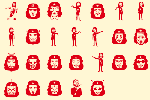
As I’ll be visiting Buenos Aires later this winter, I’ve been reading up on all things Argentinian (including re-watching The Motorcycle Diaries), so I was tickled when I stumbled upon this icon set of the iconic Che Guevara, designed by Jorge Alderete for an Argentinian type foundry named Sudtipos (who also created a lovely Calgary-inspired font named Calgary Script!).
(via SL Che - MyFonts)
By: Julie Fortenberry,
on 3/10/2010
.jpeg?picon=893) By: Annie,
on 11/19/2009
By: Annie,
on 11/19/2009
by LuAnn Schindler
When you're composing on your computer, do you tend to select one font more than another? Sure, Times New Roman is common in the publishing world, but do you long to use other fonts that express your personality?
At times, I do. And some times, I compose in those fonts because it makes sense in my mind. It adds an edge to my writing, especially when writing fiction. It's a visual cue that allows me to see how a character sounds. It's a personality trait that formulates a picture and maps the story arc.
Does a certain font describe your personality? I took a ten-question quiz on the Independent Lens webpage that discusses the history of print.
According to the quiz, I'm Edwardian Script. I believe that's fairly accurate: I'm a true romantic at heart; nothing gets my juices flowing more than flowery, flutterly love.
What font are you? Does it describe your personality?
Follow LuAnn on Twitter @luannschindler .
 By: Kevin Levell,
on 6/30/2009
By: Kevin Levell,
on 6/30/2009
Earlier in the year, I blogged about a free service that turned your handwriting into a workable truetype font... The service provided by yourfonts is no longer free, but I didn't think the font I had was good enough to use for my comic art... There are some fantastic free fonts available on Blambot for using on comic strips - a link I got from the most excellent gentlemen at FutureQuake Press - but somehow, using someone else's (comic) font doesn't feel like I'm lettering myself... kind of like borrowing the hands of another letterer - albeit digitally.
I spent some time in illustrator pushing nodes around the natural letter-forms I had produced in my last attempt. Once I had a font I felt might work and that still had some relationship to my block capitals, I went ahead and paid just under £8 for the automated service. I'm very happy with how the font works, I think it looks pretty good too... an example of it in action can be seen in my previous posting.
By: John,
on 4/25/2009

Created by Vancouver designers Sue Lepard and Matt Heximer to celebrate Canada Day, Adanac is “an iconic font representing aspects of Canadian culture and history.” And bless their souls, you can download it for free! Here’s a few more gems:


By: Kevin Levell,
on 2/5/2009
I found this great free online font generation service via Mark Cardwell's Bad Librarianship blog. I'd been thinking I'd like to have a go at getting my own block capitals done as a font... Well I think there's a lot more potential than simply that with this fab online service.
I got this workable truetype font as an almost instantaneous result of uploading a template page and pressing a button. I know there are some problems with a bit of the kerning, but with a bit of fiddling, I think you could get a great font as a result.
I don't normally big-up things like this, but this one was relevent and useful to me.
Life is also very insistent when it needs attending to and easily distracts one from creative pursuits no matter how much one procrastinates ... :) I've had so much to attend to lately that I find myself slightly (or hugely depending on how I want to view it) blocked where art is concerned at the moment. So I've been fiddling around more with typography lately and this is one of the results.
I hand-draw into my sketchbook first now, as my tablet PC seems to have given up on me, and then scan the drawing in and polish it up in photoshop. After which I transfer it into Illustrator to fine tune the lines as it's the smoothest way of changing the colours on the letters if I wish to do so.
I'm considering opening up a new store on zazzle devoted entirely to my play with fonts and type design, as they seem to be getting increasingly popular. It's also fun and almost as therapeutic as drawing, so I won't be giving up on it anytime soon. Cheers!


Money well spent to feel like it's all your own work. Very satisfying. A nicely constructed font. I see the blog has undergone some spring cleaning as well... I must admit I'll miss the old banner as I feel it was more intriguing and distinctive than the confrontational (though excellently executed) Dredd. Perhaps the banner art could update from time to time...? I'm a fine one to talk though, my banner has been like that for ages now!
i meant to get my own done ages ago and now look. oh well, your font does look great though and how much better to have a personalised version. see you soon, x