new posts in all blogs
Viewing: Blog Posts Tagged with: lettering, Most Recent at Top [Help]
Results 1 - 25 of 107
How to use this Page
You are viewing the most recent posts tagged with the words: lettering in the JacketFlap blog reader. What is a tag? Think of a tag as a keyword or category label. Tags can both help you find posts on JacketFlap.com as well as provide an easy way for you to "remember" and classify posts for later recall. Try adding a tag yourself by clicking "Add a tag" below a post's header. Scroll down through the list of Recent Posts in the left column and click on a post title that sounds interesting. You can view all posts from a specific blog by clicking the Blog name in the right column, or you can click a 'More Posts from this Blog' link in any individual post.
.jpg?picon=572)
By:
andrea joseph,
on 8/5/2016
Blog:
andrea joseph's sketchblog
(
Login to Add to MyJacketFlap)
JacketFlap tags:
AJ,
andrea joseph,
online course,
handwritten,
Andrea Joseph fonts,
Sketchbook Skool,
creative lettering,
lettering,
course,
hand lettering,
Add a tag
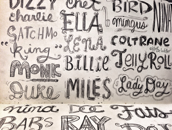
You know every now and then I catch up with the world. Or the rest of the world catches up with me. It's all about how you look at it, I suppose. Well, there seems to be a real thirst for creative lettering out there, and if you're feeling thirsty I have the answer for you. I have a brand new lettering course starting at
Sketchbook Skool right NOW!!
A whole month of daily exercises that'll improve your hand lettering. So, if you'd like to find out how to do this....
or this....
or this...
then head on over
HERE now. What are you waiting for?
Renaissance woman Alex De Campi is not only a writer and director…she also letters her own comics and now she’s shown you how you can too! I am one of those rare writers who letter their own comic books. It started off, as so many things do, because we couldn’t afford a decent letterer. Then […]
It’s widely acknowledged is that a great letterer is one that you don’t notice. Marshall Dillon is often an exception to that rule. He made a big splash with his work on Skullkickers, a series with explosive action and silly sound effects. Dillon has deepened his footprint in the comics industry on titles like Prince Valiant, the Thrilling Adventure Hour […]
Here's a video about master penman Jake Weidmann (link to video). I just wish the editing gave us a little more time to see his work.
The video begins: "My name is Seb Lester. I'm a designer and artist based in the U.K. The focus of all of my work is letterforms." (
Link to video)
Seb Lester's calligraphy is best known from a series of videos showing a wide range of calligraphy styles.
A freehand demo of some familiar corporate logos recently went viral.
(Link to Video) On his
Facebook page, Mr. Lester has generously shared a detailed description of his lettering tools:
"In terms of broad edge tools, necessary for Gothic and Italic styles of calligraphy,
Pilot Parallel Pens
are good tools for beginners. These are the pens I have been using for the clips that have recently gone viral on social media and websites like Design Taxi and Buzzfeed. ‘
Manuscript’ brand calligraphy fountain pens are widely available and practical beginners tools. As you advance you will probably want to start using traditional metal calligraphy nibs made by established manufacturers like
Brause
and
Mitchell
and also
Automatic
Pens. They can be a bit more difficult to handle but can help achieve finer, crisper results."
"For pointed pen calligraphy, characterised by graceful curves and strong contrasts in line width, I would recommend trying
Nikko G-Pen
nibs. You can use these in either a traditional or an oblique pen holder, it is a matter of personal preference. Iron Gall ink is best for this type of calligraphy. Walker’s Copperplate Ink and McCaffrey’s Ink get good results for me."
"Paper is always an important consideration. The paper I often use with Pilot Parallel Pens is
Daler Rowney Smooth Cartridge Paper
, but any smooth cartridge paper should be fine. When I’m working on roughs for any type of calligraphy I often use layout paper and marker pads. In terms of sketch pads a lot of calligraphers like the
Rhodia
and
Clairefontaine
brands as the paper doesn’t bleed very easily. As with everything the key is to experiment, paper with more texture can produce interesting results too."
"In terms of books for inspiration I can recommend ‘
Scribe: Artist of the Written Word’ by John Stevens, a true modern master. For instruction I would also suggest ‘
Foundations of Calligraphy
’ by the brilliant Sheila Waters. ‘
Calligraphy
’ by Gaye Godfrey-Nicholls was published last year, a good book for beginners. Any of ‘
Speedball Textbook
’ series are also inexpensive sources of instruction and inspiration."
"The key to producing beautiful calligraphy is perseverance. Progress comes through focused and sustained study and practice. You will only persevere if you enjoy what you’re doing. For this reason I’d personally suggest starting with a calligraphy style you particularly like the look of. When you have a reasonable grasp of that style you will notice many of the skills are transferable to other styles."
-----


By: Jeanine Henderson,
on 3/3/2015
Blog:
Illustration Friday Blog
(
Login to Add to MyJacketFlap)
JacketFlap tags:
cover,
graphic,
hand lettering,
Jeanine,
typographic illustration,
illustration,
typography,
packaging,
artists,
Lettering,
Add a tag
Post by Jeanine


I fell completely in love with the gorgeous work of illustrator and hand-lettering artist Kate Forrester as soon as I stumbled upon it. Her striking and versatile style has earned her an extensive list of international clients and diverse projects, including book jackets, packaging, greeting cards, advertisements, billboards, and much more. Kate combines dynamic hand-lettering with lovely illustrations to create flowing, organic images and often explores new & exciting mediums including wood, chocolates, tattoos, laser-cut paper illustrations—and even wedding cake!
Kate is based in the UK and her impressive list of clients includes Tiffany NYC, Victoria’s Secret, Random House, Penguin Books, Crate and Barrel, The Guardian, Little Brown, Walker Books, Moonstruck Chocolates and many more.
See more of Kate’s work here: Portfolio | Blog
By: Jeanine Henderson,
on 2/3/2015
Blog:
Illustration Friday Blog
(
Login to Add to MyJacketFlap)
JacketFlap tags:
children,
design,
books,
illustration,
childrens books,
typography,
artists,
Lettering,
book cover,
Jeanine,
Add a tag
Post by Jeanine


Beautiful drawings, stellar storytelling, and gorgeous typography are among the many skills and expertise of Italian illustrator, Iacopo Bruno. They are also the key components of truly successful book covers, so it’s no surprise that Iacopo’s portfolio is jam-packed with delightful covers and his client list inclusive of many major publishers.
His style varies just enough to adapt to an impressive range of audience and subject matter. Sometimes his covers feature delicate hand lettering, vivid silhouettes, lively characters, or a touch of vintage or steampunk details—and often a combination of these elements. But the end result is always an inviting cover, drawing any reader into the world that lies within.
Iacopo founded DOT, a graphic design studio based in Milan that specializes in editorial and book design, illustration, and typography for a range of client markets. He’s created over 300 book covers, always bringing enthusiasm to each new project.
More of his work can be seen here: studio site | cover blog |sketch blog
Posted by Jeanine


UK based artist Linzie Hunter’s typographic illustrations are so fun to look at! Her bright and playful work often has a vintage flair, and she mixes unique type styles with color and pattern to create whimsical pieces from often complicated, text-heavy content. Linzie’s started 2015 with a very cool personal project—she’s been accepting new years resolution submissions from folks around the internet and illustrating one per day throughout the month of January. The full series can bee seen on her website, Twitter, and Instagram.
Linzie’s work can be seen on book covers, magazines, and in ad campaigns, and clients include Time magazine, The Guardian, The Washington Post, The Wall Street Journal, Hallmark, Nike, VH1, Gillette, The BBC,Penguin Random House, and Chronicle Books. Her work has also been featured in Communication Arts, 3×3, and How magazine.

Todd Klein is the dean of comics lettering in the US, with more awards than he can carry, and a portfolio of logos and classic lettering that would be hard to touch. And he’s put it all together for a seven part series on the history of comics lettering:
Part One
Part Two
Part Three
Part Four
Part Five
Part Six
Part Seven
This is an amazingly concise and fact filled journey through the most overlooked aspect of comics creation. That contains not only examples of lettering through history but a ton of photos of the letterers themselves, few of whom I’d ever seen before. I’d love to read this in a little chapbook but I guess copyrights would prevent that. For instance, the above lettering from an early Wonder Woman looks like mechanical lettering but it’s actually from the dreaded Leroy lettering guide, which produced a more mechanical looking font.
In the final chapter, Klein looks at the actual rise of Digital lettering:
The 1990s were definitely a era of turmoil for letterers in comics. Once digital lettering became possible, it was just a matter of time before comics publishers adopted it. An all-digital workflow offered many advantages for them, saving time, expense and materials. It also offered flexibility for reprints in other languages they hadn’t had before. Artists and especially inkers generally hated it, as it meant they had more to draw or ink on the page, once the lettering wasn’t there. It also hurt sales of comics art to fans. Without the lettering, comics art is just pictures, the story is missing. Letterers (and colorists) faced the hardest challenges though, needing to buy expensive computers and software and learn new working methods if they wanted to stay in the market. Letterers also had to create their own fonts, a difficult task, or use commercial comic book fonts, thereby making the work they did less likely to stand out from the crowd. Many feared the changes, and much anger and hatred were directed at the pioneers in digital lettering. Alan Moore once said, “You can always recognize a pioneer — he’s the one lying face down in the dirt, pointing the way with arrows in his back,” It was true for comics lettering, and there are still hard feelings from the 90s, when some letterers unwilling to go digital, or behind the curve, were pushed out of the business. Others came around later and reluctantly, often at a cost to their ability to find work.
Despite this, we now seem to have a fairly wide field of lettering options, from hand designed fonts to the occasional mad(wo)man who still does it by hand. If you’ve ever wondered about comics lettering, get a hot drink, sit down and red this whole series.
PS: Klein reprints this chart made by Comicraft back in the day he made detailing the old way vs the new way. UPDATE: This is actually Todd’s work sorry for the misidentification!

By: Rachel Frankel,
on 11/16/2014
Blog:
Illustration Friday Blog
(
Login to Add to MyJacketFlap)
JacketFlap tags:
illustrator,
illustration,
new york,
typography,
lettering,
creative director,
design,
digital,
artists,
pen/brush and ink,
adc young guns,
industry maven,
jon contino,
Add a tag


I discovered Jon Contino by following the work of Jessica Hische and Drew Melton (the typography world is very small). The first two things that resonated with me was the fact that he, like me, didn’t go to art school, and that he also used his musicianship as a passageway to his passion for design. As much as I’ve grown to love digital illustration and type design, I’m always the most drawn to analog aesthetics–and Jon prioritizes them in his work.


Jon Contino is an award-winning designer, illustrator, art director and self-professed alphastructaesthetitologist. His style is strongly inspired by contemporary street art, his native stomping grounds of New York, and the grit of hand-drawn type. He’s worked with clients like Ogilvy, Nike, Whole Foods, McSweeney’s, Target and The New York Times. He’s also an ADC Young Gun 9 winner to boot, and happens to possess a heartwarming Long Island-born accent.


Jon cites his family as being vital in governing his design and illustration aesthetic. His mother and grandmother happened to be artists, both supporting and assisting in his pursuit of his craft by bringing home reams of butcher paper and instructional drawing books (more about this in the wonderful Shoptalk interview here). He discovered that the lettering he was seeing in movie posters and baseball adverts still counted as typography–even at a very early age. It took me much longer to figure out that illustration and beautifully drawn words weren’t just for books–the marks of our handiwork can truly be found anywhere, if you just slow down and take the time to look.
As a teenager, Jon got his freelancer chops very early on. As a designer geek and drummer in a hardcore band, he was constantly relied upon by his band (and friends’ bands) to supply flyer designs, gig posters and the like. Soon enough, he realized that he could actually “make money at this thing,” and he was preparing invoices and freelancing by the ripe old age of 15.


In 2006, after working for a few different companies and design houses, he opened his own creative studio and has been working for himself ever since. He’s constantly turning pet projects into mini-businesses–most recently, he started up Contino Brand. And even amidst his successes, he’s learned the art of saying no for the sake of self-preservation.
Jon has spoken about how his preference for modern minimalism and his hand-drawn gritty aesthetic meets with a clash. That clash has governed a unique vision that brings the best of clean design and true-to-form drawing together. I’m enthralled by this intersection, and so clearly see the passion and determination that stands solidly behind Jon’s work. His personal history only continues to illuminate it.
Website
Facebook
Blog
Twitter
I also highly recommend his interview with The Great Discontent and his podcast interview with Shoptalk.

By:
Paula Becker,
on 11/10/2014
Blog:
Whateverings
(
Login to Add to MyJacketFlap)
JacketFlap tags:
cartoon,
bible,
comic,
General Illustration,
Samples,
lettering,
paula j. becker,
paula becker,
Cartoons & Comics,
kids,
girl,
woman,
Add a tag
On (and off) the drawing board:

By: Rachel Frankel,
on 9/27/2014
Blog:
Illustration Friday Blog
(
Login to Add to MyJacketFlap)
JacketFlap tags:
freelance,
children's illustrators,
abstract,
hand lettering,
freelance illustrator,
abstract painting,
lisa congdon,
pen/brush and ink,
master of the month,
apparel / products,
art inc.,
design,
creativity,
mentor,
typography,
children's art,
digital,
artists,
editorial illustration,
Lettering,
pattern,
san francisco,
surface design,
Add a tag

This Art Crush entry has truly been a long time coming. I first came across Lisa Congdon by way of Meighan O’Toole’s former art blog and podcast, My Love For You (which is post-worthy in its own right–it was an enormous source of inspiration for me during my college years). While I definitely gravitated to Lisa’s work on a visual level, it was her personal story that drew me in. Freelance illustration had been her second career. She didn’t start painting or making art until she was 31, and here she was, participating in museum-level shows, working with clients like Chronicle Books, and just being a genuine, successful badass. Lisa is not only someone I look up to artistically–she’s also a prime example of a human being.
Lisa’s art career was secondary, after she accumulated over a decade of experience in the education and nonprofit industries. By pure chance, she stumbled into a painting class and began making art of all kinds from that day forward–fueled by pure joy instead of the desire to succeed quickly. Having always been an avid collector, her random ephemera would find their way into countless collages as well as a series of photos, drawings and paintings that would eventually make up her A Collection A Day project. As she continued to develop her craft and share it with the ever-expanding Internet, people began to catch on. Today, she is an accomplished and prolific working artist, blogger, illustrator, public speaker and writer. Some of her most notable clients to date include The Land of Nod, The Museum of Modern Art, Harper Collins, 826 Valencia and Martha Stewart Living Magazine.


Lisa unabashedly tackles the subjects she is most passionate about, and that fearlessness is expressed effortlessly in the execution of her work. She describes herself as a “visual junkie,” and is deeply inspired by patterns, travel, architecture and vintage packaging, just to name a few. A faithful blogger, Lisa writes about her own process in addition to other artists whom she admires, as well as her life “outside the studio,” which includes swimming, biking, sewing, and traveling. In other words, she’s just making all of us look bad! (I only kid.)


One of the reasons I relate to Lisa’s work is due to the versatility and ever-evolving nature of her aesthetic. Certain characteristics like neon hues and her penchant for all things Scandinavian are mainstays, but she continues to branch out and explore all kinds of mediums (block printing and calligraphy, to name a few). These explorations fuel her work and expand her direction, which is most recently geared towards abstract painting. She’s a wonderful example of why you don’t need to narrow yourself down to one specific style (something I often grapple with).


Lisa is quite a unique artist in that she is not only a creator, but a mentor as well. Breaking into freelance illustration can be a challenging and solitary undertaking, and she continues to give her generous time to those who wish to pursue and learn more about the field through classes, speaking engagements and conferences around the country. I first met Lisa at her first Freelance Illustration class at Makeshift Society back in December 2012, and it was one of my most pivotal learning experiences to date.

Lisa recently released her new book, “Art, Inc.: The Essential Guide for Building Your Career as an Artist,” which is a revolutionary and timely answer to the starving artist stereotype. It covers all areas of the freelance artist’s domain, such as photographing fine art, finding printing services, copyright, and diversifying income. It sits on the shelf above my working desk (I like to call it my “VIP” shelf) as I reference it constantly.
On that same note, I’m very excited to be taking Lisa’s “Become A Working Artist” class through CreativeLive next week! You can follow along with the class virtually by RSVPing here.

To listen to Meighan’s podcast with Lisa, click here. I also highly recommend her feature in The Great Discontent.
Follow along with Lisa below:
Website
Twitter
Blog
Instagram
Purchase Lisa’s books below:
Art, Inc.
Whatever You Are, Be A Good One
A Collection A Day
There are a lot of talked about aspects when it comes to manga, but out of all of them, manga lettering is generally the one aspect that’s not talked about much. That’s mostly because the only time you would ever notice a letterer is if the manga they actually worked on has mistakes with the ... Read more
By: Rachel Frankel,
on 8/10/2014
Blog:
Illustration Friday Blog
(
Login to Add to MyJacketFlap)
JacketFlap tags:
design,
illustration,
creativity,
typography,
graphic design,
Lettering,
originality,
font,
type,
drew melton,
font designer,
phraseology,
Add a tag

Ok, I’ll save you the spiel about how deeply I’ve fallen in love with typography and lettering, as that should be fairly obvious by now. Drew Melton‘s work essentially speaks for itself. His deeply expressive fonts and lettering demonstrate the importance of hand-drawing into the design process. Even in the sharpest, finalized versions of his work, you’ll a spontaneity that’s unmistakably fun and energetic.


Drew is an L.A.-based graphic designer and typographer who’s worked with clients like McCann, Nike, Saatchi & Saatchi, and Penguin Books. He’s had quite the interesting journey to success in the lettering realm, some of which is marked by serious self-reflection and the ability to remain humble.

One of the things that hurled him into the design spotlight was his Phraseology project, started with a few other designers and developers in 2011. Very similar to Erik Marinovich’sFriends of Type blog, Phraseology offers the public a chance to submit any word or phrase to be designed by members of the team. Soon enough, Drew was being commissioned for some big-time typography work by notable clients.


Unfortunately, with that exciting attention also came some consequences. As much as I admire Drew’s hand at lettering, I might be even more enamored with his grace and honesty about his past mistakes.
In January 2013, Drew bravely posted a public apology on his blog to several typographic designers, including Jessica Hische, Jon Contino, Dana Tanamachi, and Darren Booth, for drawing inspiration from their styles in ways that were not entirely “okay.” He spoke openly about his guilt and sadness at realizing that his creative process had been built too closely upon the examples of his heroes, and that his heroes were now upset with him.

The topic of creative originality is probably one of the most sensitive. It’s something that is constantly under debate and argued by strong opinions. I’m a strong believer that nothing is purely unique, especially in this day and age. It’s the nature of craft and evolution to build upon an existing idea. But in an age when visual information is so widely accessible, when an illustrator or designer can essentially educate themselves by opening their web browser–it’s up to the creative to draw the line between inspiration and imitation.
It’s a testament to Drew’s work ethic and passion for the art of typography that he was still able to gain success after this admission. Even while he struggled to define his style in the beginnings of his career, it’s clear that he’s succeeded.


Drew is now focusing on font development in addition to personal design and typography. Some of my favorite fonts of his are Lastra, Handsome, and Magnifique.
I highly recommend Drew’s interview with the Australian Graphic Supply Company (a previous Art Crush feature), as well as his feature (along with this wife, stylist and co-creative Kelsey Zahn) on Rverie. Follow along with Drew here:
Website Blog Twitter Dribbble
By: Rachel Frankel,
on 7/5/2014
Blog:
Illustration Friday Blog
(
Login to Add to MyJacketFlap)
JacketFlap tags:
design,
illustration,
artists,
Lettering,
vintage,
nostalgia,
stationery,
painterly,
rifle paper co.,
pen/brush and ink,
anna bond,
woman-owned companies,
Add a tag

In the midst of a world grounded in digital technology, sometimes we need a reminder that good things can still be grounded in reality. This is why we still go visit galleries and museums to see artwork in person (a habit I’m still trying to get better at). This is why we still give each other greeting cards, or why our desks seem to collect countless post-its over time. It can be as simple as opening a letter or unwrapping a present–interacting with real material still matters.
On that note, I’d like to introduce you to Anna Bond, owner and creative director of Rifle Paper Co.–an inimitable force in the stationery field and beyond.

While Anna now lives and works in Winter Park, Florida, she has roots in New Jersey and received a degree in graphic design in Virginia. After working as an art director and freelance illustrator for a couple years, she discovered (or rekindled, rather) her love for stationery design while illustrating some wedding invitations. As mentioned in her feature on The Every Girl, stationery was the optimal combination of graphic design and illustration that she had been searching for, and so she pushed onwards.
While there’s something to be said for art directing at 21, I admire Anna’s honest and expressive way of dealing with her expectations, realities, and how to improve upon them. She’s spoken before about the first launch of Rifle Paper Co.’s website, detailing product disasters, website crashes, international shipping issues, and taking turns panicking with her husband. Without sounding cruel or spiteful, it’s incredibly comforting to know that someone as ambitious and driven as Anna has screwed up before. And to me, there’s no better way to recover than by succeeding.
Nearly all Rifle Paper Co. products feature Anna’s hand-painted illustrations, which are often nostalgic in style with a pastel palette.


Some of Rifle Paper Co.’s selected clients and collaborative partners: Anthropologie (their very first!), Kate Spade New York, Hygge & West, Chronicle Books, AMC Mad Men, and Penguin Books. I think it’s important to note that the variety of clients reflects Anna’s ability to design for both traditional and modern brands, which can be difficult depending on one’s personal style.


Follow along with Anna and her husband Nathan’s exciting ventures at Rifle Paper Co.’s website, and take a peek at Anna’s portfolio here. You can also find her on Twitter. I particularly enjoyed her Day in the Life feature on Design*Sponge as well.
By: Rachel Frankel,
on 6/20/2014
Blog:
Illustration Friday Blog
(
Login to Add to MyJacketFlap)
JacketFlap tags:
design,
typography,
artists,
technique,
graphic design,
Lettering,
illustrationfriday,
hand lettering,
painterly,
mary kate mcdevitt,
pen/brush and ink,
Add a tag


Mary Kate McDevitt is one of the most successful hand-letterers and illustrators working today. A graduate of Tyler School of Art, Mary went on to work at a design studio in Lancaster, Pennsylvania. After 2 years, she moved out west to pursue a freelance illustration and design career in Portland, Oregon before ultimately settling in Brooklyn, New York, which is where she presently resides. While she previously imagined that she would work as an illustrator, dabbling in some lettering on the side–but it turned out to be quite the opposite. Her ever-growing client list includes Chronicle Books, CMYK Magazine, Fast Company, and the United States Postal Service.


She is specifically inspired by vintage type and techniques, including the ones of her own family. As a teenager, she discovered a plethora of handwritten letters that her mother and aunt wrote to her grandmother during college. She used this inspiration for her Your Handwritten Letters project, a daily hand-lettering exercise. Mary would hand-draw a letter of the alphabet and mail the original to a unique participant each day.

You can follow along with Mary Kate McDevitt on her website, blog, Instagram, Dribbble, and can also purchase prints through her Etsy shop. She also has two online classes on Skillshare that can be found here and here.
My daughter has been looking forward to this day for a long time. Although I do believe it has more to do with her appreciation of pie than her love for math; her teacher promised to bake a pie for the student who memorizes the highest number of digits in PI. (more than 90 at last count!)
So here is my contribution:
I've been meaning to practice my hand lettering skills...
.jpg?picon=1009)
By: James Gurney,
on 3/10/2013
Blog:
Gurney Journey
(
Login to Add to MyJacketFlap)
JacketFlap tags:
Lettering,
Add a tag
SIGN PAINTERS (OFFICIAL TRAILER) from samuel j macon on Vimeo.
(Direct link to video) Directors Faythe Levine and Sam Macon documented the stories of more than two dozen sign painters who still follow the traditional methods of lettering by hand. Here's the trailer for their documentary "Sign Painters," the first anecdotal history of the craft, featuring the stories of more than two dozen sign painters working throughout the United States.
"There was a time, as recently as the 1980s, when storefronts, murals, banners, barn signs, billboards, and even street signs were all hand-lettered with brush and paint. But, like many skilled trades, the sign industry has been overrun by the techno-fueled promise of quicker and cheaper. The resulting proliferation of computer-designed, die-cut vinyl lettering and inkjet printers has ushered a creeping sameness into our landscape. Fortunately, there is a growing trend to seek out traditional sign painters and a renaissance in the trade."
Book related to the project:
Sign Painters
by Faythe Levine
Documentary website:
signpaintermovie.comPreviously on GurneyJourney:
"Hand Painted Signs"There are several Flickr groups devoted to this subject:
“Hand-Painted Signs of the World.”“Folk Typography”“Signpaintr,” dedicated to the lost art of hand-lettering
“Hand-Painted Signs of Cambodia.”
...unless you're just, totally... just, DONE.
(But there is NO WAY that you're totally done!!)
The Making of John Mayer's 'Born & Raised' Artwork from Danny Cooke on Vimeo.
(Link to video on Vimeo)
David A. Smith is an artist from England renowned for his traditional hand-crafted signs, which are etched and gilded on the reverse side of glass.

David recently produced a cover for American singer/songwriter John Mayer's album "Born and Raised" by matching the style of turn-of-the-century trade cards and letterheads.
This behind-the-scenes video captures the many stages of the process. The video is by Danny Cooke, shot on a Canon 7D.
-----
Previously on GJ: The style of lettering known as engrossing.
Thanks, Dick Hill
Ohmigosh... am I starting to sound didactic with all these "don't"s? Hope not.
Eek, I had such fun with this one... just thinking about holding on to whatever it is that makes you GO in life, when you're being pulled in all different directions like Silly Putty. It's not always smooth sailing but the most important thing is honesty, integrity, truth—inward and outward! :D Hey, my journey will never end as long as I'm here, but in my time I have definitely learned a thing or two about being a happy person... inwardly and outwardly! :D
Have a great day!
Here's one that's very fitting for me right now. Is it fitting for you, too?
I actually LOVE my sleep—I feel like I can never get enough of it, sometimes... But alas, too busy right now to be too lazy about it. I get what I need and then it's off to the races. Another one of my favorite quotes sums it up: I can sleep when I'm dead.
Maybe I'll do that one next.
What can you accomplish in one hour, in the middle of the work day? I can think of lots of things.
Jazzy, baby! Happy Wednesday.
Remember when everyone was saying "Really? REALLY?" all the time?

Yep, me too.
View Next 25 Posts


Very nice interview. Thanks.
not sure what’s going on with my icon there though…