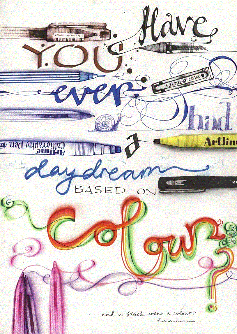
So, where has all that time gone, huh? The last time I posted anything here my lettering course, over at
Sketchbook Skool, was just about to start. Now, over a thousand students and nearly month of daily classes later, we're coming up to our final week. I hope all of those of you who signed up have learned lots and keep on playing with lettering. I know I'll keep pushing and pulling and squashing and stretching my lettering because there's just so many places to take it. Interesting in expanding your lettering? You can learn how to do this kind of stuff. Or interested in pushing your drawing for that matter, there are loads of brilliant courses at
Sketchbook Skool. Right, I have a few more tricks up my sleeve for the final week...
You know every now and then I catch up with the world. Or the rest of the world catches up with me. It's all about how you look at it, I suppose. Well, there seems to be a real thirst for creative lettering out there, and if you're feeling thirsty I have the answer for you. I have a brand new lettering course starting at
Sketchbook Skool right NOW!!
A whole month of daily exercises that'll improve your hand lettering. So, if you'd like to find out how to do this....
or this....
or this...
then head on over
HERE now. What are you waiting for?
Amongst all the other illustration work I do, I also co-run
Dr Sketchy Sheffield and, so, being the sketching half of the team (
my co-running partner is from the performance arts), I create the poster artwork. It's one of my favourite things to illustrate. Because it makes me feel closer to the poster artists, from days gone by, who's work I adore. I wish there were more call for poster artists. These days it's all done digitally so I like to buck that trend with purely illustrated posters (and I wouldn't have a clue how to do it digitally).
Now once we've set our theme for our Dr Sketchy event the idea for the poster image pretty much comes to me straight away. Sometimes without even having to think about it. Really, it's just there. I see it - the whole poster - fully formed. I then just need to put it onto paper.
Our next event (
next Saturday, at the Greystones, Sheffield!) will be a celebration of dance. We have performers from different genres of dance modelling and, erm, dancing for us. We have a belly dancer, a breakdancer, a bhangra dancer amongst others. So, already I knew I had to get that info into the drawing. The first and original thought was of the kind of drawing in the image above. I think it's important to go with that initial idea if it has presented itself to you. I love those 'consequences' drawings. I've heard them called other things and somebody once told me that they were known as 'exquisite cadaver' drawings. I think that's such a great name, which conjures up all sorts of weird and wonderful images, so I'll be sticking with that.
I made a few exquisite cadaver sketches, like the one above, to try it out. To see if it worked. I'll be honest with you, I think the trial run above is still my favourite. I guess that's because it was the most spontaneous. Then when I'd got one that I felt would work as a poster image I sketched it out onto a 'proper' bit of paper. I always add the image first, leaving room for the text. Sometimes I will play around with where I want to place the image. I did with this one - I tried her on both sides of the page and central before settling on this composition.
For the text I always quickly research (Google) posters or fonts until I find something that fits. For example, I'll Google
'Bollywood poster fonts' or some such thing. This one was a combination of various fonts because of the variety of dance genres. When I find a font I like I loosely copy it. I don't measure out the letters, nothing technical happens, I just copy it by eye (is that even a saying? It looks odd now it's typed out). I don't want it to look exactly like the fonts I find. I want it to be my own version of them.
Anyway, that's a little (ish) explanation of how I create my posters. Now anyone want a poster illustration? I'm for hire. I'm always for hire.
Hi folks, I have a small, limited edition, set of these bag and badge ('button' in the US?) sets for sale.
The tote bags feature my illustration of
Nora Hildebrandt, the original tattooed lady, on the front and back.
The badges feature a couple of examples of my drawings and a couple of examples of my lettering work.
You can get your paws on them
HERE. Merci!
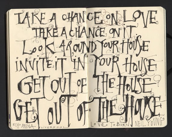
Okay, so these may not be the greatest sketchbook pages. They're not going to set the world alight, but, I just needed to shout about the fact that I went to see Neil Young on Sunday!!! Damn, I love that man. He's the most inspirational artist to me. So, we may work in very different fields but how he continues moving on and changing creatively is so very inspiring. I wish I were that brave.
Above is the inner cover of the little Moleskine sketchbook that I took with me. I drew it as the arena was filling up. And, I drew it over the page where I created
THIS VIDEO (the one that shows you how to write your name!). I cannot leave a blank space alone. I just can't stop fiddling.
I'm often asked about what I do if a page in a sketchbook 'goes wrong'. My answer is usually 'collage', but it's also where a good quote or lyric comes in handy. The page above didn't so much 'go wrong' but the girl I was drawing moved away, just as I got my pens going, so I was left with just a few squiggles. You can see them behind these Neil Young lyrics; behind the top two lines on the right hand page.
Anyway, you know what? Not every sketchbook page should set the world alight or be all singing and dancing. In my opinion. To me the unremarkable, quiet little pages act as a comma or a pause in a book. Some time for a brief reflection. A page to get your breathe back before you dive back in.
And, the lyrics and quotes; a great place to practice your handwriting. Or better still, make up a whole new kinda handwriting.
Lots of people tell me that when they buy a new sketchbook (especially something like a Moleskine) they get new sketchbook nerves; the fear of the blank sketchbook. I'm quite the opposite. I can hardly wait to get it home before unwrapping it and laying my pen on the paper - that is why I have a hundred unfinished sketchbooks, though.
So, with those of you in mind, and for all of you guys who are starting the new semester of
Sketchbook Skool and getting your school bags ready, here's a little video that'll take away the fear. See starting your sketchbook as an exercise too. Hope this helps!
A couple more of my posters for our Dr Sketchy Sheffield events. I just love doing this poster artwork. I've been wondering why I enjoy it so much. It's obvious really, that mix of illustration and text really floats my boat. Maybe I should hire myself out as a poster artist. Have an event that you need a poster for? I'm your lady.
You can read a post about one of my poster artist heroes, the legendary Toulouse Lautrec, and see more of my own creations
HERE.
I'm playing catch up at the moment. Not on the drawing front (I have NOT stopped drawing recently) but on all the other things that go along with that. Like blogging. These are a couple more drawings from last weekends sketch crawl in Buxton. And very shortly I'll post the drawings from this weekends sketch crawl in Chesterfield. Our group seems to have a very busy schedule because there's more planned for next weekend. Phew. Exhausting, but great too.
I did this little one in the Buxton Museum and Art Gallery where I held my exhibition last year. This is of the mantelpiece in the Victorian room. At least I think it's the Victorian room. But don't listen to me I seem to think everything old is Victorian. I have no idea why.
Here's another little spread from last Sunday's sketchcrawl in Sheffield. The weather was a bit on the wild side so we ended up drawing in a couple of pubs. A perfect way to spend a wet and windy Sunday afternoon.
I can't quite decide whether to add some colour to this. The
Delerium Tremens sign was purple with a pink elephant which could work. But you never know.
This drawing was made in the little mini Moleskine sketchbook. This book had sat unused, on my shelves, for at least a couple of years. I never thought I'd like using it. I thought it was too small. But it's really grown on me. And whilst I always take the larger sketchbook with me, on my travels, I love having the option of this little one too. It's just really cute.
If you are interested you can take a peak at the drawings I've made in this book so far
HERE.
Why do I find a broken bench so moving? Yes, because I'm a bit odd. And, yes, I'm a hyper-sensitive fool. But, apart from that, why is it so moving?
And, one more thing; whatever happened to Gomez? They were amazing.
Previously I mentioned that I thought that end-paper artist would be one of the most the perfect jobs for me. Here's another; font designer. I couldn't be happier than when I am playing around with words and letters.
One of the reasons it's taken me so long to post this drawing is that, as some of you may know, Blogger have been making changes. And, apparently it's now much easier to make posts. Apparently so.


.jpg?picon=572)


Hah! I am so far behind with everything I shall meet myself coming back!
But I wanted to let you know Bristol has crown chimney pots, too! Still have not seen any in London...
Hi Di, a pity you didn't come up last weekend the weather was gorgeous. Or next weekend you could have helped with the exhibition!!