

Here's a fascinating look behind the scenes at how a book is printed and bound.
http://picturebookbuilders.com/2015/06/to-the-printer-we-go/
0 Comments on Book Printing as of 7/26/2015 6:24:00 PM
Add a Comment

.jpeg?picon=2691) By: LAURIE WALLMARK,
on 7/26/2015
By: LAURIE WALLMARK,
on 7/26/2015
Here's a fascinating look behind the scenes at how a book is printed and bound.
http://picturebookbuilders.com/2015/06/to-the-printer-we-go/
 By: Hannah Charters,
on 11/27/2014
By: Hannah Charters,
on 11/27/2014
On 28th November 1814 The Times in London was printed by automatic, steam powered presses for the first time. These presses, built by the German inventors Friedrich Koenig and Andreas Friedrich Bauer, meant that newspapers were now available to a new mass audience, and by 1815 The Times had a circulation of approximately 5,000 people. Now, 200 years later, newspapers around the globe inform millions of people about hundreds of topics, from current events and local news, to sports results, opinion pieces, and comic strips. The Times, along with many other newspapers, is now available online, on desktops, mobile phones, and tablets, with a circulation of over 390,000 people. Newspapers themselves date back further than November 1814, to the early 17th century when printed periodicals started replacing hand-written newssheets and the term ‘newspaper’ began to make its way into common vernacular. These first newspapers are defined as such because they were printed and dated, had regular publication intervals, and contained many different types of news. As the technology of printing improved, the spread of newspapers to more and more people grew – it may be said that as the physical printing press was invented, ‘the press’ as an entity came into being.
To celebrate this milestone in newspapers and printing we’ve brought together a reading list of free content across our online resources. Below you can discover more about the history of printing, its influence on society, how computers are used in the newspaper industry today, and much more:
‘What News?’ in The Invention of the Newspaper: English Newsbooks 1641-1649 by Joad Raymond
How did we find out about news before the newspaper? Before the publication of the newsbooks, the inhabitants of early-modern Britain had to rely on gossip, hearsay, occasional printed pamphlets and word-of-mouth to get to grips with what was going on outside of their communities. When newsbooks, the precursors to the modern-day newspaper, began to be printed in Britain in the 1640s, this, however, began to change. This chapter examines not just the literary and historical merit of these publications, but also analyses what they reveal about a burgeoning, British print culture.

‘Printing and Printedness’ in The Oxford Handbook of Early Modern European History, Volume 1 (Forthcoming) by James Raven
From Gutenberg’s printed bibles in 1438 to the advent of newspaper printing in the 17th century, the social, economic, and political implications of newspaper production and circulation transformed early modern Europe into a more socially aware society. The introduction of new typographical styles allowed for a more accessible and inclusive written history, contributing to a rise in European literacy no longer restricted to the upper classes. Raven tracks the impact of this evolving “print culture” on job creation and industrialization, demographic variation and new literary forms, and geographical innovations resulting from periodical dissemination.
‘Uses of Computing in Print Media Industries: Book Publishing, Newspapers, Magazines’ in The Digital Hand: Volume II: How Computers Changed the Work of American Financial, Telecommunications, Media, and Entertainment Industries by James W. Cortada
The rise of the computer has been a relatively sudden and recent one, and yet has changed almost every facet of our daily lives – from how we entertain ourselves, to how we communicate with each other, and much more. One field in which computers have come to reign supreme is the workplace, and this chapter examines the huge impact they have had on the world of print media industries, including book, newspaper, and magazine publishing.
‘Gossip and Scandal: Scrutinizing Public Figures’ in Family Newspapers?: Sex, Private Life, and the British Popular Press 1918-1978 by Adrian Bingham
Our attitudes towards celebrities, and how they are reported in the news media, have changed drastically throughout the last century. During the time of Edward VIII’s affair with American socialite Wallis Simpson in the 1930s, the press – in marked contrast to how they would have reacted today – remained silent. Things began to change in the 1950s, however, as a market developed in Britain for sensational and scandalous stories featuring the celebrities of the era. This chapter then analyses the relevance of the Profumo Affair which broke in 1963, as an example of the increasing invasive investigations undertaken by the industry.
‘Murder is my meat: the ethics of journalism’ in Journalism: A Very Short Introduction by Ian Hargreaves
Journalism in all forms, including newspapers, must intrinsically be truthful and accurate. Without either of these the trust of the journalist or newspaper is undermined, so codes, laws, and standards have been put in place in order to eliminate serious misconduct. This chapter reflects on the UK phone-hacking scandal and considers the ethical issues that surround journalism today.
‘Clicking on What’s Interesting, Emailing What’s Bizarre or Useful, and Commenting on What’s Controversial’ in The News Gap: When the Information Preferences of the Media and the Public Diverge edited by Pablo J. Boczkowski and Eugenia Mitchelstein
With the advent of the internet and mobile devices, how does society now read newspapers? With the increasing digitisation of news content, we are starting to consume and interact with news stories in different, complex ways. Taking a closer look at the data behind our interaction with online news content, this chapter analyses what might make us click on an article, and why we might comment on one, whilst emailing another to friends or family.
Headline image credit: Newspaper stack. Image by Ivy Dawned. CC-BY-SA 4.0 via Flickr.
The post The history of the newspaper appeared first on OUPblog.
 By: Tatjana Mai-Wyss,
on 10/2/2014
By: Tatjana Mai-Wyss,
on 10/2/2014

 By: Carter Higgins,
on 8/18/2014
By: Carter Higgins,
on 8/18/2014
 (image here.)
by Dahlov Ipcar (Flying Eye Books, 2014; originally published 1958.)
The great folks at Flying Eye sent me this book a while back, and I’ve been staring at it for weeks. Months. It’s enchanting. And simple. And complex. And a huge restoration effort, which was a bit mind-blowing to understand. That’s why I consulted the experts.
But if you don’t know Dahlov Ipcar and her bright body of work, check this out first:
![]()
Because her original plates were lost long ago, Flying Eye figured out a way to bring this story to many new readers. It’s remarkable. Here’s my conversation with Sam Arthur, Flying Eye’s Managing Director. And of course, some really beautiful art. (Click any of the images to enlarge.)

Can you describe the original way the art was created? I understand it to be color separated plates, but is that the best way to describe it? Sort of like a silkscreen process?
The original separations would have been created on drafting film or trace paper. In this way the process is very similar to preparing artwork for a silkscreen process. The main difference being that offset lithography allows for subtler more detailed textures than most screen printing processes as the ‘screen’ (meaning dots that make up the image – also known as half tone) is made up with smaller dots. I think Dahlov made her original artwork using mixed media, collage, pastel brush and wash.
So the original art was unavailable, I assume? Can you describe the steps in the process to remaster the work?
The original artwork had been lost over the years, so our challenge was to recreate the new book using artwork from finished books that were from the original print runs (printed in the early 60s). All of the information we required was in these books. Most publishers would have simply scanned the images and printed them using standard CMYK reproduction (a composite image made up of dots using cyan, magenta, yellow and black). Our intentions were different, we wanted to produce the book in the same way as the original, which used 4 different special spot colours (or Pantone colours as they are now called).
In order to reproduce the book using the original printing technique, we had to recreate the original separations from the flattened, printed artwork. That was the tricky bit, we had to scan the artwork at very high resolution and then using photoshop un-pick the colours and put them into separate layers. The difficult thing is where the colours overlap each other, sometimes it’s difficult to see and it helps to have the original book to hand. So in the end the process uses photoshop selection tools, but also hand retouching. It’s a skilled job. 

How many people worked on this? How long did it take and how long was it in the works?
The first book we did was The Wonderful Egg and it took 5 weeks to complete all of the images. There were two of us working on it, but we had a tight schedule and when it came to working on I Like Animals we had to call on three others to help us meet our deadline.
Was the way color was printed in the 1950s and 1960s drastically different from today? How?
In the 50s and 60s most of children’s books that were illustrated were printed using separations created by the illustrator. As time went on and technology improved illustrator’s artwork would be photographed and translated into CMYK separations using a photographic process. In the early days presumably this process was more expensive than simply asking illustrators to provide their own separations. Many children’s books also had a 4/2 colour scheme – meaning half of the book would include 4 colour images and the other half would have 2 colour images. This would save money in the printing process and also give the illustrator slightly less work to do on the 2 colour images. It does give these books a nice rhythm as you turn the pages. It was a practical consideration that has fed into the aesthetic, that’s quite interesting in itself.
(image here.)
I’m curious if you got any backlash for republishing something with incorrect factual information? As a reader (and a librarian!) I love the choice, and see such value in preserving a particularly lovely era in picture books, but I wonder if you received any negative feedback. (Hope not.)
We have had a few comments, not really negative ones, more observations of the change in thought on the origin of dinosaurs etc. I think most people realise quickly that it’s an old title, so there is different kind of appeal when reading it. Also as I stated above the key story behind the egg, is still relevant in today’s thinking.

Why did you all decide to remaster this book, and are there plans for others as well? (We are thankful and we are hopeful, too!)
We decided to remaster this book as it felt quite contemporary in it’s treatment of the subject matter even though knowledge of the subject has changed, but the key message is still widely accepted in palaeontology. The illustrations are beautiful and we wanted to Dahlov’s this work to a new generation. This year we also released her book I Like Animals, next year we will be re-publishing Black & White and Wild & Tame Animals also by Dahlov Ipcar.
![]()
Cool, right? What a legacy! Big thanks to Flying Eye for gathering us all around the campfire in celebration of great stories.
And speaking of color separations, check out this post at Seven Impossible Things for a look at how Jonathan Bean is doing the same thing in a contemporary picture book. Unreal. But very real, which is the great news.

Thanks to the folks at Flying Eye (Tucker, Sam, and Emily!) for the images in this post. I received a copy of The Wonderful Egg, but all thoughts are my own.
By: Tatjana Mai-Wyss,
on 3/7/2013

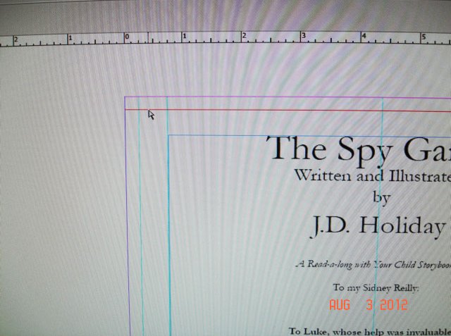
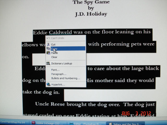
 By: JD Holiday,
on 2/7/2013
By: JD Holiday,
on 2/7/2013
 |
| Here, I'm using EFFECTS, then choosing EDGE EFFECTS for this image. |
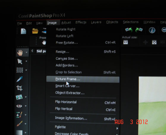 |
| 1. Here, I'm using IMAGE> PICTURE FRAME. |
 |
2. Here you see there are a number of choices. For printing books your printer will need the resolution or DPI /Dots Per Inch to be 300 DPI or 600 DPI. I always scan in my images at 300 DPI. A higher DPI means a higher quality print, image or screen resolution. (NOTE: Also know, that the larger the images the more space each image will need on your computer for storaging them. This is important to know because the more high resolution images on you drive can stop some programs from running due to limiting usable space on the hard drive.)  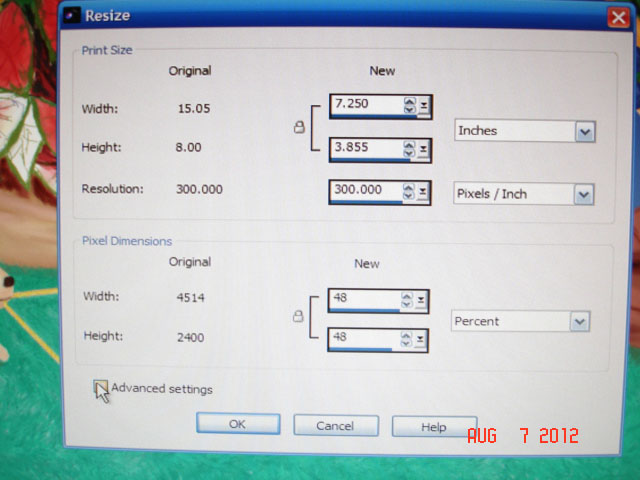 I pick the size of each image due to the size page that it will fit on in my book. |
 |
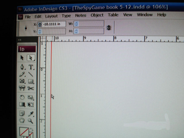
| Making sure the images are at least 300 dpi or higher. NEXT: Moving To My Book program: Indesign CS 3 How I Make My Picture Books: Part II |
By: JD Holiday,
on 2/7/2013

 |
| Here I am opening the document. FILE: NEW: DOCUMENT |
 |
| The file opens and this is what it looks like. |
 |
| Here you see that I have a PRESET for chapter books. |

 |
| A |
 | ||||
| B In both pictures here, A and B, you can see the Arrows pointing to the top and side GUIDES. The Guides turn from read to blue when placed. You GRAB the Guides by going to the ruler, (top and left side rulers,) with your Mice and drag it to your margin, gutter and bleed areas. THAT EASY!~ ~  To add an image or graphic (in TIFF Format) to a page, you use the Selection Tool and go to FILE> PLACE. Your computer opens and you find the image you are looking for and click OPEN. Then move the Selection Tool to the place you want it on the page and click the spot. 
|
 By: JD Holiday,
on 2/4/2013
By: JD Holiday,
on 2/4/2013
|
| Here, I'm using EFFECTS, then choosing EDGE EFFECTS for this image. |
|
| 1. Here, I'm using IMAGE> PICTURE FRAME. |
|
2. Here you see there are a number of choices. For printing books your printer will need the resolution or DPI /Dots Per Inch to be 300 DPI or 600 DPI. I always scan in my images at 300 DPI. A higher DPI means a higher quality print, image or screen resolution. (NOTE: Also know, that the larger the images the more space each image will need on your computer for storaging them. This is important to know because the more high resolution images on you drive can stop some programs from running due to limiting usable space on the hard drive.) I pick the size of each image due to the size page that it will fit on in my book. |
|
| Making sure the images are at least 300 dpi or higher. NEXT: Moving To My Book program: Indesign CS 3 How I Make My Picture Books: Part II |
 By: John,
on 9/10/2012
By: John,
on 9/10/2012
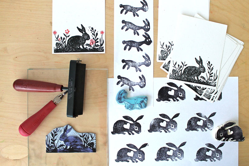
Watch illustrator Michael Wertz explain the process with which he created his hand-printed board book Dog Dreams.
 By: martín (dibujandoarte),
on 7/24/2012
By: martín (dibujandoarte),
on 7/24/2012
 By: John,
on 2/23/2012
By: John,
on 2/23/2012
![]()
![]()
The nice folks at Moo hooked me up with a set of their new Luxe Business Cards, and they arrived today in a nice fancy box. I got to design my cards myself using Moo’s easy-to-use tools, just like with all their offerings. I could have easily ordered a different image on each card, but chose to just go with the one.
Their Luxe cards are what the name implies - deluxe versions of their already popular print-on-demand business cards. The paper is nice and textured, three times as thick as a regular business card, and with an optional coloured paper sandwiched in between the two outer layers.
They feel great, and they’re almost too nice to give away. I’ll be saving mine to use as promo items, as they are more like mini art prints than regular disposable business cards.
By: Kirsty,
on 12/19/2011
 “Marley was dead, to begin with. There is no doubt whatever about that. The register of his burial was signed by the clergyman, the clerk, the undertaker, and the chief mourner. Scrooge signed it.” So begins a staple of Christmas celebrations, Charles Dickens’s novella A Christmas Carol.
Dickens’s book, of course, relates the conversion of the crabbed miser Ebenezer Scrooge to a warm-hearted man who embraces Christmas after a night of visits from the ghost of his old partner, Jacob Marley, and three time-traveling spirits, those of Christmas Past, Christmas Present, and Christmas Yet to Come. Dickens’s work became an instant classic. All 6,000 copies of the first printing were sold by Christmas, and the 2,000 copy second printing that quickly followed was also quickly sold out. Its lasting charm is evidenced by countless plays, radio dramatizations, television specials, and movie adaptations that have followed, a new one, seemingly, each generation.
While A Christmas Carol is probably Dickens’s most beloved work, it did little to alleviate the financial trouble in which he labored in 1843. At the time, Martin Chuzzlewhit was being serialized, but sales were slow. With his wife expecting the couple’s fifth child, Dickens penned the Christmas story in the hopes of a financial boost. Despite the brisk sales, his income did not rise as desired. The cost of producing the book—all resulting from Dickens’s own decisions, as he supervised the printing and hired the illustrator—was so high that the author saw few profits. Dickens lamented that “I shall be ruined past all mortal hope of redemption”—ironic, given that A Christmas Carol demonstrates that redemption has nothing to do with one’s financial condition.
“This Day in World History” is brought to you by USA Higher Education.
You can subscribe to these posts via RSS or receive them by email.

 By: Valerie Walsh,
on 9/7/2011
By: Valerie Walsh,
on 9/7/2011
 I am hosting a giveaway here! Uprinting is one of the most versatile online Printing Companies and one of their products are stickers. They can also customize them according to your needs and offer Custom Stickers. They will look great with your art, logo or photo. Please leave a comment on my blog and you have entered to win:
.png.jpg?picon=3640) By: Sara Burrier,
on 4/8/2011
By: Sara Burrier,
on 4/8/2011
After Struggling with D.I.Y. postcards, they came to the rescue
Who sells the best paper for D.I.Y. postcards? I have gone through many different papers, spending lots of money, and now have stacks that I probably will never use, just to find what's right for postcards.
I've been determined to save by making my own, but to purchase cardstock strong enough just isn't possible without spending loads of money.
I gave in and just started to make them with the best quality matte paper I could find. Unfortunately customers found this paper still too flimsy. So I moved on to the idea of having them professionally made.
Who can provide the best price for the best product?
I went to overnightprints.com, zazzle.com, vistaprint.com, and yet I couldn't find a deal that allowed me to continue charging the price I had in my shop. When I broke down the numbers, it was still too expensive...and I wasn't going to charge $7 for one postcard. You crazy?!
I almost came to just settle with the fact I would have to undercharge and pay extra to offer postcards.
Who came to my rescue?
Bindery 1. Enough said. They're a local printer here in Des Moines, ran by the lovely Renatta and her family. Name sound familiar? She also runs Lotus Moments Event Center where I just recently had my Artist Reception.
Most large binderies and printing companies probably wouldn't bother with a small business artist who needs a handful of postcards. What a waste of time and money! They're accustomed to thousands to be printed off for one client.
Bindery 1's passion to serve everyone, large and small, makes them unique. I had a couple hundred postcards printed for the artist reception and was impressed with the price AND the quality! Not to mention the turnaround time.
After many questions and her patience, I plunged and ordered 500 postcards. HUGE order......for little 'ol me.
I can now offer professional grade, strong, vivid, and affordable postcards to my customers while staying local! Who knew a business would be so willing? The new postcards will be offered soon. :)
The Bottom Line:
Don't be afraid to approach your local binderies and printers and get a quote from them. There might be someone out there who is willing to do the small run to support you, and in turn it will support them! And if you can't find anyone, contact Renatta at Bindery 1!
 By: Kathy Weller,
on 1/23/2011
By: Kathy Weller,
on 1/23/2011

 By: John,
on 11/2/2010
By: John,
on 11/2/2010
Pure printing porn. I am excited to see this documentary about the stalwart typesetting machine.
 By: Emily Smith Pearce,
on 9/20/2010
By: Emily Smith Pearce,
on 9/20/2010
The pink started here:
My dear husband, for reasons yet unknown, picked out these shades for the lights in our apartment living room. In most apartments here, the lighting fixtures are not included, and since we’re here for a limited time, we didn’t want to spend a lot on them. We have no pink in our house otherwise, so I can only guess he was asking for a dose of color in our lovely but very white white white apartment. Reactions from guests have ranged from: “Fresh! Modern! I love them!” to “Hmmmph. Why? Why?”
I felt the need to echo the pink somewhere else, so recovering our pillows was my first thought. Finding fabrics here has been tough, so I hit up the thrift store, bought old white cotton tablecloths and turned them into something that works.
First I doused the tablecloths in a good strong brew of coffee (no, I did not use the good stuff, honey). Then I broke out a favorite childhood toy.


I love these stamps. I used Deka fabric ink that I found at the local art store. I’ve used Deka ink before, a long time ago, which was more like a gouache consistency. This was different, more gel-like.
You may recognize this shape from another project using dishwasher gel.

Now the pink feels at home.


For more information about printing on fabrics and other surfaces, check out Lena Corwin’s excellent book: Printing by Hand.

 By: dibujandoarte,
on 7/13/2010
By: dibujandoarte,
on 7/13/2010
 For beginners, from a beginner, here are ten terms to know about book creation. (Would be most grateful if the better-informed will correct or clarify in the comments! --Carol)


 <
By: John,
on 12/2/2009
<
By: John,
on 12/2/2009

Radiolab is my favourite thing on the airwaves. Or podwaves, or whatever you want to call them. And now the science and philosophy podcast for the layman has been treated to a tribute by some of my favourite designers and illustrators. In Radiolab We Trust is a set of affordable Gocco screenprints being sold to benefit Radiolab and its parent station, WNYC New York Public Radio.
The prints are the work of Jez Burrows, Frank Chimero, Nicholas Felton, Meg Hunt, and Impactist. And dig that perfect logo.
Here’s Frank Chimero’s print, taken from Jez Burrows’s Flickr set of the prints:

Posted by John Martz on Drawn! The Illustration and Cartooning Blog |
Permalink |
No comments
Tags: Frank Chimero, Impactist, Jez Burrows, meg hunt, Nicholas Felton, Printing, radio, science
By: John,
on 11/26/2009


Nobrow is fast becoming my favourite small press outfit. They keep putting out fantastic small runs of illustrated books and comics, all of them beautifully printed.
The latest is an English translation of French comicker Blexbolex’s graphic novella Abecederia. The book is a horrific scifi thriller masked as an alphabet book; each page features an illustration based on the shapes of the letters of the alphabet, all printed in a minimal 3 colours, and the combinations they make. Visit Nobrow to order the book.
Posted by John Martz on Drawn! The Illustration and Cartooning Blog |
Permalink |
No comments
Tags: ABC, Blexbolex, Books, Comics, Nobrow, Printing, Typography
By: John,
on 10/22/2009


Fans and students of engraving, traditional printing processes, art history, and 19th-century ephemera alike should, like I did, fall instantly in love with Pictorial Webster’s: A Visual Dictionary of Curiosities.
Bookmaker John M. Carrera meticulously restored thousands of engravings from the pages of 19th-century Webster’s dictionaries, and has compiled an extraordinary visual account of Victorian history.
In his introduction to the book, Carrrera suggests that the very juxtapositions of the illustrations tell a story:
The conceptual underpinning is that this book can act as a springboard for individual creativity. It was printed with a belief that the human compulsion to find meaning would lead readers to create stories that explain whole pages and perhaps even inspire some to derive unifying threads that might, in a Joycean fashion, enable a narration of the entire book.
It is a creative and romantic way to look at what amounts to a collection of images very purposefully arranged in alphabetical order, but he continues to admit the book is invaluable even just as pure reference:
The surface function of the book as a visual reference needs little explanation. The book contains many great examples of how to solve problems of illustration. … By virtue of the magnitude of engravings, their varying density and size, the book also becomes a study in design.
In this video I found on Vimeo, John Carrera gives us a detailed tour of the process, tools, and machinery used to print and bind the hand-made jaw-dropping deluxe edition of the book. It is nothing short of book-making porn:
The pricetag of this lovingly crafted tome? $4600.00.
But not to worry. The trade edition of Pictorial Webster’s is an affordable $35.
Posted by John Martz on Drawn! The Illustration and Cartooning Blog |
Permalink |
One comment
Tags: Art History, Books, engravings, Illustration, John Carrera, Printing
 By: Darcy Pattison,
on 7/27/2009
By: Darcy Pattison,
on 7/27/2009
No, there are no 33-page picture books. Not yet.
At a recent conference, though, I had a discussion about why picture books are usually 32 pages. One person suggested that some famous picture book author should come out with a 33-page picture book, and then the industry would print it.

Uh, no. It really does have to do with the way paper folds and how much can be printed on existing printing presses.
So, the response was that when picture books go digital it won’t matter. That’s right: online, page counts can be anything you want.
But I argued that the 32-page picture book has developed into a certain literary form, much like the 14 line sonnet form for poetry. Yes, of course, writers of digital picture books can choose to write free verse; but they may also choose to write in the 32-page format.
We don’t know if or when the majority of picture books will change to digital versions. But it’s still worth studying and mastering the 32-page format because it will teach a lot about selecting events and details for a picture book, about language that works in a picture book, about planning for kids to chime in, about making it read-aloud friendly, and much more. The 32-page format won’t be completely abandoned even when (or if) digital picture books become the norm.

Related posts:
By: John,
on 7/22/2009


I recently received a copy of Nobrow Magazine, a new periodical created as a platform for artists and illustrators. Limited to 3000 numbered copies, the magazine is gorgeously printed in just two spot colours, and features the work of folks like Jordan Crane, Mcbess, Stuart Kolakovic, Paul Blow, Toby Leigh, Sam Arthur, and others. It’s a decently sized book at about 9.5″ x 13.5″, and the work looks great shown at such nice big size. Can’t wait for issue 2.
By: John,
on 7/22/2009

Here’s an idea I love:
The International Cartoonist Conspiracy, Big Time Attic, and Altered Esthetics gallery are collaborating to produce an oversized newspaper comics section like they would do it today if they still did it like they did it in the old days.
I have a copy of the old timey newspaper in question, and not only is it enormous, it’s gorgeous. Dozens of artists have put their heart and soul into doing it the old fashioned way, and the results are impressive.
The stand out is Jesse Gillespie’s Little Emo in Slumberland. I won’t post a paltry jpeg here, though, because a) you have to spread it out on the living room floor in front of you to truly enjoy it, and b) I can’t seem to find Jesse’s work online.
Read more about the project and buy a copy here. There’s an accompanying gallery show next month, which you can learn more about here.

 5 Comments on Product review: Stickermule, last added: 1/27/2011
ohh, so sweet (and yet not too sweet, if you know what I mean).