new posts in all blogs
Viewing: Blog Posts Tagged with: Photoshop, Most Recent at Top [Help]
Results 1 - 25 of 349
How to use this Page
You are viewing the most recent posts tagged with the words: Photoshop in the JacketFlap blog reader. What is a tag? Think of a tag as a keyword or category label. Tags can both help you find posts on JacketFlap.com as well as provide an easy way for you to "remember" and classify posts for later recall. Try adding a tag yourself by clicking "Add a tag" below a post's header. Scroll down through the list of Recent Posts in the left column and click on a post title that sounds interesting. You can view all posts from a specific blog by clicking the Blog name in the right column, or you can click a 'More Posts from this Blog' link in any individual post.
Watch the powerful debut film of animator Robert Valley.
The post Watch Rob Valley’s ‘Pear Cider and Cigarettes’: 50% Off Promo Code Inside appeared first on Cartoon Brew.
As you can see, I work quite quickly. Any given piece usually takes about 30 seconds. From "Lucy's Lovey" by Betsey Devany. From Henry Holt this September.
Best known for his work on projects like "Gorillaz" and "Tron: Uprising," Robert Valley is making a statement of his own with an electrifying new project.
The post Rob Valley Talks About His Epic New Film ‘Pear Cider and Cigarettes’ (Exclusive Trailer Premiere) appeared first on Cartoon Brew.
Do you ever find yourself struggling to remove the white paper-textured background from around your images? I used to, until I learned this incredibly simple method using the “Channels” function in Photoshop. Here’s what you need to do, step by step.
1. Open up your image in Photoshop. Today I’ll be using this bicyclist illustration. Click the “Channels” icon (circled in red below.) You should see four rows: RGB, red, green, and blue. (Unless your image is CMYK, in which case you’ll have a channel for cyan, magenta, yellow and black instead.)

2. Depending on the dominant colors in your image, one channel will likely be darker than the others. I like to start with that one, but really any of them would probably work. In my case, the darkest channel is the the “Blue” channel. When I click on it, I see a grayscale version of my image. I’m going to copy this channel by dragging it down to the “copy” icon in the channels box. (See red arrow.)

3. Now there should be a fifth row in the channels box called “Blue copy.” You can re-name it if you like. While this channel is active, go to Image -> Adjustments -> Levels. Use the sliders to adjust the levels so that everything you want to be deleted (the background) is white, and the image is black. Anything that appears gray will be semi-transparent.

4. Once you’ve adjusted the levels on your channel, use the brush tool to clean it up, making sure the interior of the image is completely black if you don’t want the background showing through. (I didn’t want my cyclist’s mustache to be transparent!) When you’re done, click on the “RGB” composite channel so that your image appears as normal.

5. Exit the “Channels” view by clicking back on the “Layers” icon. Now it’s time to make the mask. To do this, go to Select ->Load Selection.
6. You will see a pop-up box something like this. Choose your “Blue Copy” channel, and click the checkbox for “invert.” (If you forget to do this, you can always just go to “Select -> Inverse”)

7. Now your background should be selected. To make it transparent, make a mask by clicking on the “Add a Mask” icon in your Layers box.

8. That’s all there is to it! It’s super easy. From here you can add any background you want, or just leave it transparent. Here I’ve added a blue background so that you can see how my mask turned out:


By: Jerry Beck,
on 8/25/2015
Blog:
Cartoon Brew
(
Login to Add to MyJacketFlap)
JacketFlap tags:
Interviews,
Photoshop,
Titles,
Gary Leib,
Alex Grigg,
Plastic Animation Paper,
American Ultra,
Anthony Bregman,
Bill Pankow,
John Martel,
Nima Nourizadeh,
Randall Balsmeyer,
Add a tag
How an indie animator in New York City added a unique animated touch to a major Hollywood film.
This is part two of a short series of posts about the development of my most recent book, Firefly Hollow written by Alison McGhee. See my post from June 26th to read part one.
Putting a story together, or rather discovering one and unearthing it, is tricky business. Steven King describes it this way:
“Stories are relics, part of an undiscovered pre-existing world. The writer’s job is to use the tools in his or her toolbox to get as much of each one out of the ground intact as possible. Sometimes the fossil you uncover is small; a seashell. Sometimes it’s enormous, a Tyrannosaurus Rex with all those gigantic ribs and grinning teeth.”
What parts of my story did I have? Not much. I had a few sketches that were resonating and some notes about the characters, but still no real sense of the story yet.
I tried asking myself questions about the characters: Who is this vole? Where does he live? I caught a few glimmers of things but any sort of narrative remained elusive.
So, I did what many illustrators do when they are stuck: Research.
I started collecting images of voles, crickets and paintings of water that I really loved. I looked up rafts and boats, grabbing anything that caught my eye. Some of the images I already had in a folder that is constantly updated called "curiosities". In his book on creativity "Catching the Big Fish", David Lynch calls these collections "firewood". I love the term, and it is perfect the way he describes it, but I shied away from naming my folder likewise. I didn't want to burn through my material too quickly! I started putting things up and soon I had a wall of the shed covered in images.

Writing is hard work, I happen to think that it is MUCH harder than illustrating though many of my writer friends disagree with me. Writing good picture books is particularly difficult, you will know this if you have ever tried. Trying, as I was, to write something like the final manuscript of Firefly Hollow Firefly...was....lets just say that it is like showing at Wimbledon and trying to compete because you beat everyone in your family at badminton. Nevertheless, I tried to write the picture book version of my story-numerous times. They were terrible; really, really bad.
As an illustrator, I respond to a text and then begin to add my own voice. Ultimately, I try to create a corresponding visual narrative that enhances and supports the written word-basically creating a parallel emotional narrative. That is a summarization, and I don't think about it that way when I am working, but its the closest I can come to describing the process. I had nothing to respond to so I continued on with what I felt right...the pictures. I sketched little visual "notes" about things that I thought would be fun to paint.
I was still on hold for the project in my desk so I scanned a few of the sketches and painted them up in Photoshop (just for the fun of it) as a color studies.


By: Michelina Ouellette,
on 7/4/2015
Blog:
Michelle Can Draw
(
Login to Add to MyJacketFlap)
JacketFlap tags:
artist,
illustrator,
illustration,
cute,
dog,
photoshop,
painting,
pugs,
digital,
pug,
dogs of tumblr,
Add a tag

This is Florence- a commission I did for a lovely couple. Yay for pugs!

Henri!, Character design concept.
"Happy" comes in many flavors.
There is the "reading a letter and seeing photos of loved ones" happy.
I'm doing a major edit on this illustration (which I showed you in the last post). I've added Mr. Mouse's wife, and embellished the 'story' quite a bit. He is still reading a letter, but now there are photos included. Mrs. Mouse is looking at one (no doubt of a Mouse grandchild or other special near-and-dear, and has her hand on her chest in that "My! how he's grown!" or "Look how beautiful she is!" or gesture.
There is also some stamp collector busy-ness going on there. You can see how I work here - layers of tissue, taped one on top of the other, with edits done, and re-done, and re-done, until its right. Lots of fiddling with the exact placement of things, overlaps, angles, etc., all to make it interesting and a good design. Its getting there, and hopefully I'll have finished art to show next time.
Then there's "YAY! Gay Marriage is finally legal all across the Land!" happy.
I did some creative editing on my striped candy colored pencil drawing to make it into a whole rainbow, in honor of the Gay Pride rainbow theme.
Below is the original drawing. I used Photoshop to duplicate a piece of it, then did a lot of flopping and reversing and erasing and fiddling to get it to look like two more candies balancing on top. Then I used the "replace color" thing in the Adjustments menu to make them blue and purple. I'm pretty happy with how it turned out. It's still all my drawing, just with some changes made.
I've made prints available in my
etsy shop, in a whole bunch of sizes.
These are some of my print layouts, all ready to go. I do layouts of the art in different sizes, all on 8.5" x 11" paper, with trim marks. Here you see the ACEO, 5" x 7", and 4" x 6" sizes all ready to print out.
And last but not least, there's the "My art won an award!!" happy.
An Award of Excellence!! I'm so proud of my little Berry Tart.

This drawing almost didn't get finished. I did this last Summer, and wanted to enter it in the
UArt Open Exhibit. The deadline was approaching, but I came down with the weirdest mystery illness that involved a lot of vertigo (where the level in your head goes wonky and you feel like you're going to tip over). I had that on and off for weeks. I'd work on this, then have a spell and have to go lie down. I finally finished the day before the deadline to submit art to the show - but because it was so close, I couldn't mail in the entry, and instead had to drive it over to the UArt store downtown and deliver it in person. I opted to drive the slower city streets route rather than the freeway, just in case. I made it there OK, and thankfully found parking right in front. There was a bit of a queue though at the counter, and while I waited my turn I felt myself start to go . . . I had a mild panic, thinking I'd topple over, but just in time it was my turn, and I handed over my entry packet to a nice man who wished me a hearty "Good luck!". And I was out the door and into the car, where I was OK again, since I was sitting. And I made it home again, slowly.
So long story short, the art did get accepted into that show (along with my Molasses Cookie, which won an award!), then came home again, where its been sitting in a closet all nice and safe until I decided to enter it in this State Fair show. There are some other really stunning entries in the colored pencil division of the show, so I was surprised and extra happy to find out mine had won a special award.
Here is the complete list of show winners, if your'e interested.
So that's about it for me, here. Happy Summer!
And it's time for Mr. Bear to finally say 'Bear is finished!'
I like these step by step progressions so if you scroll through the arrows on the images you can see how each image changes.
And of course with photoshop there are many, many changes to be accomplished.
Designers using Creative Cloud now have easy access to CG characters and animation tools.
I have now officially finished the text of the new book. Hurrah!
Judging on the response to what I have been submitting over the last 6 months, we probably won't be changing the text that much - more tweaks that re-writes I should think - but that doesn't mean I'm done. There will still be a little jiggery-pokery with my image choices, once the layouts have all been designed, and there's also some new artwork to create specifically for the book (like the 'colour before line' step-by-step I did for the original presentation for the US co-edition).

The other big job that's left to do is the scanning. So far, we have been working with low-res images: either the photos I took of my tagged sketchbooks, or low-res scans lifted from the website. All those images now have to be located in the original sketchbooks and scanned at 300ppi, ready for print. John is helping with that, but I still have to go through all the scans individually, tweaking things, as my scanner picks up a lot of 'background noise' like paper texture and sketches coming through from the other side, much worse than you see with the eye.
Unfortunately there's another issue too. In 2010 I was rather into digitally tinting my pencil sketches, like this one of my new shoes (a reward after the first op I had on my poor feet). This means that there is another job for some of the scans from that period: because I was only playing, not consciously creating 'artwork', I only tinted the low-res scans I'd made for my website. Now that I want to feature some of those images in the book, I am having to create the coloured versions all over again.
This image is going into the 'drawing feet' section, because of the way the shoes are sculpted through shadow and highlights. Above is the new high-res scan of the original sketch, with a not very white background.
Once I had played with it in 'Levels' in Photoshop, it looked better. I moved the date across to the right a bit while I was at it, so it would better balance against the text (even though I suspect that the publisher will crop the text off this one):
Better. But the line-work in the old, tinted version was beefed up a bit and given a slightly blue tint, to help it to hold its own better against the colour, so I altered my new scan the same way (Photoshop is wonderful - how on earth would we have done something like that before?):
Then I painted the colours on a layer beneath the line work. The result was the sketch at the top. It was quite therapeutic actually - a nice bit of colouring in, with guaranteed success, so no brain power needed.
Sadly, those lovely red shoes have now bitten the dust. I did very recently buy myself another pair of bright red shoes though, so all is well.
Here's a collection of some spiffy new art I've painted up recently.
Two new Upstairs Tabbies this week!
Sir Archibald Catley, and Reginald Sweet.

Sir Archibald Catley
"Archie" is the younger brother of Sir Cedric Catley, Earl of Mewton. He loves cricket, but mostly because of the sweaters. He has one for every day of the week. He also loves butterflies, and anchovy pudding.
Reginald Sweet
"Reg" is the brother of Lady Clara Catley (the former Miss Clara Sweet and wife of Sir Cedric Catley). He served in The Great War, and came home with a nasty scar for a souvenir. He did some paw-to-paw combat with a Russian Blue, which resulted in a bad scratch that never healed quite right. He's a little self conscious about it, and doesn't like to sit for pictures. He's not all seriousness though - he enjoys a lively game of cards with his mates, and loves to chase grouse and peafowl on the grounds of his sister's estate, where he lives.
I'm also playing with some new shapes for the Downstairs Tabbies, which, when I get the kinks worked out, I'll do for the Upstairs bunch too. I think some little cards would be fun with this round format, and some other things.
I'm having a lot of fun creating these characters, and learning their stories. I'm also having fun doing the colored pencil + photoshop colored pencil brush technique (I do the first part of the drawing with colored pencils, then scan, and finish it up with photoshop, darkening or doing whatever was too hard or labor intensive to do with the actual pencils). I like that it this let's me keep the 'hand drawn' look and feel, but with a little help where needed.
I'll be doing the Catley children next I think. :~)
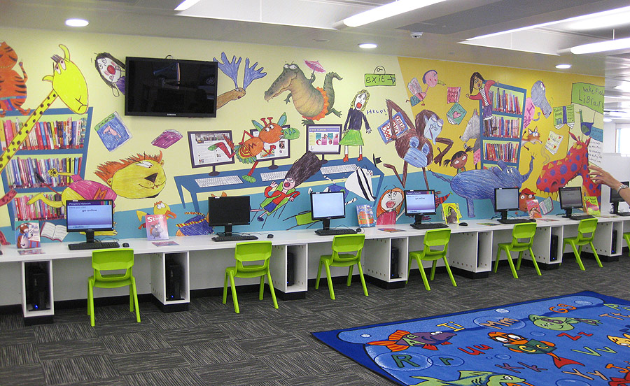
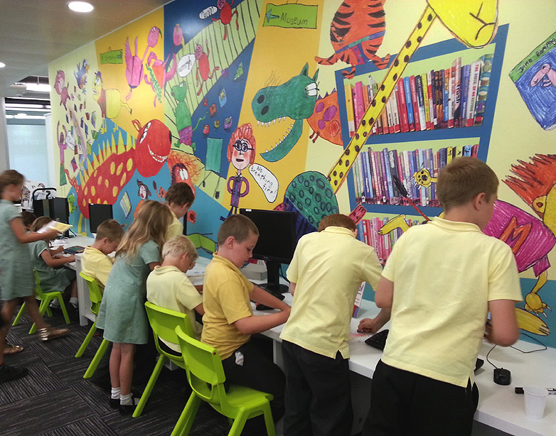
Because of World Book Day, I'm out visiting schools all this week (all over the place as usual) but, luckily, I just managed to get my mural artwork finished first. It was a skin-of-the-teeth thing - I didn't sign it off until 7pm last Friday night.
I'm enjoying being out and about again, as I have been locked at my computer for ages. The artwork stage has taken 3 weeks, working really long days mostly, but it is finally done. Hurrah! Below are the various sections, travelling around the walls anti-clockwise (ie from right to left), viewing what will be floor-to-ceiling once it's installed (though the emptier sections will be obscured by furniture):
There were so many different jobs to do and of course much of it took longer than expected - I think it's because I underestimated just how many individual characters and little objects I could cram into the huge space. Luckily, Wakefield Libraries have been absolutely LOVELY and said they will pay me for the time I've actually spent on it, rather than what I originally quoted them.
Every one of the new, high-res scans that John did of the various animals, books, trees etc had to be individually matched to their position on the low-res template I created earlier, re-sized to fit and then laboriously cut off the children's white, background paper in Photoshop.
Each component also had to have it's 'levels' balanced, to match the weight of the rest of the design, and then have extra colour added, so it was punchy enough. I even had to subtly go over some of the children's pencil outlines in Photoshop, thickening them up where they were too spindly.
And that's without all the graphic elements I had to draw for the background, like the distant forest and the various kinds of grasses and bushes.
Because I had to create the artwork in 6 sections (to keep the file sizes from blowing the brain of my computer), I also had the job of making sure the different sections joined accurately. That was a bit of a nightmare to be honest, as one millimetre's inaccuracy at each joint would obviously add up, and then the error would also be multiplied by 4, because of the artwork being 25% of the actual size. Yikes.
I was very good at remembering to 'save' all the time, not just to the computer, but also to an external hard drive, just in case any of the files decided to corrupt along the way. I got away without 'losing' anything, which is a great relief.
Then, just when I thought it was all finished, I realised I had forgotten the area of 'bleed' beneath the library's computer table! I had remembered to continue the design behind the bookshelves, so I don't know why I forgot the table. Tired I guess.
The colour boosting was the last job. I wanted to keep the mark-making from the children's colouring, so I made my final artwork translucent, then created a layer beneath the design, where I 'scribbled' half-opacity colour, so the effect was subtle and blended seamless with the children's coloured pencils. It was time consuming, but was worth it, as the boost made a huge difference. Look at the difference between the section above and part of the same section, before the extra colour:

Notice too, in some places I had to do extra tricksy things with the colour in Photoshop: look at the original colour of the desk, immediately above, then the colour it ended up.
Did you notice by the way, in the 2nd section from the beginning, I left my 'signature' on the computer screen? Sneaky huh? Actually, I suspect that most of this area will be obscured by book-bags, but I only really put it in as an after-thought.
The next stage is a final chat to the printer who will be transferring my design to wallpaper, ready to paste onto the walls. I'm a little concerned about how on earth we will manage to get things to line up where they are supposed to, what with crooked walls and wonky ceilings. For instance, all the creatures' feet, which need to be on the level with the tops of the bookshelves.
I am crossing fingers it all works out okay, as there isn't much I can do about that side of things.
Back on November on November 18th, I posted a sketch from the work on my desk that day. I just remembered that I planned to share a glimpse of the same part of the finished piece. Both are details of a larger painting from my forthcoming book Firefly Hollow written by Alison McGhee. Cheers.Chris
Great news - Wakefield Library Service love the mural design, so it's full steam ahead.
While I was away during the first half of this week, working with under-graduates at Bishop's Grosseteste Uni in Lincoln, John was helping out back home, scanning all the children's work again, this time at high res. It is extremely boring to have to scan everything twice, but I didn't know until now which images were going to be used and at what size; the original drawings have been re-sized a lot, to make them fit together within the design.

I also decided to try and fit a Henry Moore sculpture into the design, because of his Castleford history. It makes for a good discussion point for school groups coming into the library. As I mentioned previously, using someone else's photo would raise copyright issues. I have various sketches of Moore's sculptures, but the one above, from a visit to the Yorkshire Sculpture Park is the only one in full colour. We still had to run it by the Henry Moore Foundation though, to get their blessing. Luckily, they love it and so have now been added to the invite list for the Grand Opening.
It was no mean feat trying to find a spot for Henry, but in the end I moved a bush-baby out of one of the trees (above), to create a space on a column between two bookshelves. I also popped a tiny owl (I think that's what it is) on top, which really helped to make the sculpture 'belong':
It's a bit surreal, but well, it's not as if the rest isn't! I did like the bush-baby though, so I rejigged things in another section, to make room for him in a new location. It's a nightmare though, because each thing you move has a knock-on effect. Spot the differences:
My next job is trying to find a way to work with the high res scans in Photoshop. I am working at 25% of the real size and divided the design into 6 sections, but the base layer of each section was still coming up at 470MB - still too big to be practical. So I am also having to work on just the upper part first, adding the below-bookshelf-height elements at the end.
It's still going to be a bit of an ordeal for the computer and I will have to 'flatten' the artwork as I introduce each new element, as floating layers make a file enormous and my poor computer is likely to throw in the towel if I am not extremely careful. 'Saving' really often seems like I good idea!
And finally it's time for our happy little line to get dressed. What? Dressing the line? How can that be - is it undressed? Heavens!
Yes, the raw line right out of the scanner is woefully under-dressed. It's just a plain Jane... it needs that little extra bit of pizzaz. So once again, it's Mr. Potatoshop to the rescue.
With a few artful clicks of the keyboard the line is enhanced first of all with brightness - contrast. There, it's looking a better already. Next we do a little quick touchup on the actual lines themselves - with a matching textured photoshop black pencil. Finally, our line is ready to go out and meet it's book page!
But first, let's add a touch of color - a little blush! And then, naturally once it's all dressed up we add the color and texture and all the other nice things to make it a real finished line, and proudly part of the artful page.
If you scroll through the images you can see all these steps in like magic.
Regular readers will remember the excitement of the 13m long mural I created for the shiny, new Wakefield Library, working with local school kids. To be completely honest, I was really apprehensive about taking on the project, as I had never done anything at all like it before, but the results far exceeded my expectations, so I'm really glad now that I took the plunge.
Wakefield have had such amazing feedback (hurrah!) that they want me to do another mural, this time in Castleford Library, which is having a refurb. Again, I am a little nervous. This time it is even more complicated, as it is a whole room. Also, instead of a simple (albeit BIG) panel, I have to work on the whole space, designing around bookshelves and windows etc.
How to begin?!
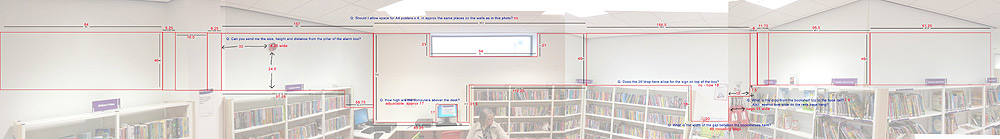
Well, I started by taking photos of the various walls in the space then, with a bit of jiggery-pokery in Photoshop, montaged them together to create a single flattened-out view:
So far so good.
I then asked the caretaker at the library to take his tape measure and note down every dimension. This was more complex than you might think, as I needed to know the exact size of obvious things like windows and bookshelves, but also the exact positions of objects like the alarm on the wall, the depth and width of the wall pillars, the height of the book-bag rail, the desk...
To organise that information into something that made sense, and thereby minimise the number of mistakes I was likely to make, I plotted all this information on top of the photo in Photoshop:
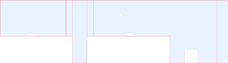
Then the even more fun job: I had to create a scale drawing of the space to act as a template: the shape to design the illustration into.
This is where it gets complicated, because the space is obviously VERY big. Eventually, I will create the high-res, digital artwork at 25%, but that's still going to mean working with massive files and, to stop the computer taking it's ball home, I will chop it up into 6 sections. Designing something in 6 bits is near impossible, so I am doing the designing at 10th size, so I only have to work in 3 sections.
This is what the template for section 1 looks like (the left third). You can see the pillar between the first 2 bookcases, the alarm and the first computer desk:
The next step is a bit more fun - a couple of illustration workshops with Y4 classes from local schools, to generate the children's drawings which I am going to build the design around. The workshops are tomorrow and the theme is: tigers loose in the library!
Be sure to visit my facebook fan page, Christopher Denise Illustrator:
A sneak peak of the current project! See my post from December 2nd to see a screen shot of this piece in an earlier stage. Blogger still seems to be automatically auto correcting the color. If you are interested, the color looks more accurate on my professional Facebook page-Christopher Denise Illustrator.
Different approach with this book. Working up the drawings in charcoal (digital) and layering in color. The designer and I were looking for a jewel tone range of soft colors. Takes a fair amount of restraint not to just rush in and try to paint over things but seems to be working!
I have been updating my professional facebook page, Christopher Denise Illustrator, but keep putting off updating my blog so I may try a new approach.
I had been posting some sketches and there seems to be some interest in process. I had been thinking about a longer post on the delights of drawing in my digital charcoal space but it may be some time before I get around to it. I think Ill just let out little bits here and there and go back later (summer 2015 probably) and sum up some thoughts.
In any event, I have found myself drawn back into a world of miniatures. It takes a certain mindset to stay in the right place and I have been helped along by the music of Jonsi and Alex-specifically Riceboy Sleeps. The duo are best known for their amazing work as Sigor Ros.
So today I put on the headphones again and begin working up this aerial nighttime drawing. It be painted up in the next day or two. Here is a little detail. I can't share full pieces just yet. If you guys like it...maybe I can try to check in once a week and show little glimpses and let you know what I am listening to.

View Next 25 Posts


 By: Christopher Denise,
on 4/24/2016
By: Christopher Denise,
on 4/24/2016
 By: Jessica Lanan,
on 12/17/2015
By: Jessica Lanan,
on 12/17/2015


 By: Paula Pertile,
on 6/27/2015
By: Paula Pertile,
on 6/27/2015


 By: John Nez,
on 6/24/2015
By: John Nez,
on 6/24/2015


 By: Lynne Chapman,
on 5/17/2015
By: Lynne Chapman,
on 5/17/2015


 By: Anthony VanArsdale,
on 4/21/2015
By: Anthony VanArsdale,
on 4/21/2015