Welcome to part four of my series on the making of The Story I’ll Tell. (Read down to the end of the post for the first print giveaway!) And now: color.
The Story I’ll Tell weaves a lyrical tapestry of fantasy and reality, and I wanted the palette of the illustrations to match the lush, dreamlike quality of the manuscript. I noticed early on that the story alternated between daytime and nighttime scenes, and I knew this would become an important element in the illustrations.
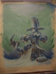
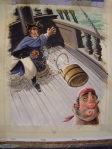
Reference images were the starting point. These Ukiyo-e prints were the inspiration for the blue nighttime pages. Matching the color was not a priority so much as capturing the mood of the image. I tied to imagine how it might feel, physically and emotionally, to step into these peaceful nighttime scenes.

Left: "Moonlight, Soochow," Elizabeth Keith, 1924. Right: "Moon at Arakawa River," Hasui Kawase, 1929.
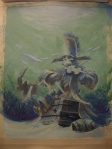
Once I knew what I was going for, I made a detailed color study for each image Photoshop. I find this useful for getting the value range correct. (For those not familiar with art terminology, value is the measure of how light or dark something is. Not to be confused with saturation, which is a measure of how vivid the color’s hue is.) Ideally I want the illustrations to read just as clearly in black and white as they do in color, and good value organization is essential. Coloring an image in Photoshop is such a mindless activity that I listened to quite a few audiobooks during this phase. Then I made a full-color, printed dummy.

I ended up lightening the value of the background for the final art in order to make the figures more visible.
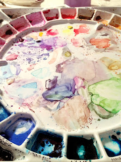
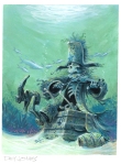
Finally, I painted color studies and chose an overall palette for the book. I wanted to use similar pigments throughout the book, and I needed a blue that could work either with a warm (daytime) or cool (nighttime) color palette. I tried quite a few combinations before I settled on Holbein’s French Ultramarine, Cadmium Yellow light, and Winsor Red, with other colors as needed. I went through a tube and a half of blue.

Experimentation is key
Okay, you’ve been waiting for it: it’s giveaway time! Leave a comment for a chance to win a giclée print from the book. (It has to be a real comment. If it’s about Louis Vuitton handbags or search engine optimization, I’ll delete it.) Winner will be announced this Friday, October 23. And if you don’t win this time, you’ll have another chance next week with my final installment in the series.

Coming up next: Painting with Guts! The final art, and how to avoid being wimpy with watercolor.
Other posts in the series:
 |
| ©the enchanted easel 2014 |
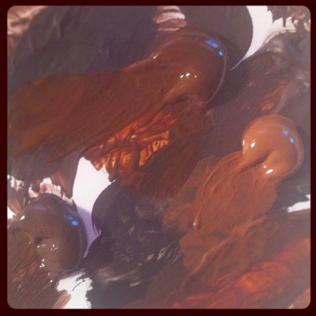
{because browns can be beautiful too}
good thing i don't like chocolate because after working with this palette of delectable browns...well let's just say i prefer my reeses pieces...and black licorice. ;)
I've tucked away the porcelain creamer, little orange flowers and cascading drapery, replacing the objects with photo references for a project I'm really excited about doing. The inspiration was a photograph of my oldest daughter taken about a year ago at El Capitan State Beach. However, I'm changing the location from a rocky beach to a rocky riverbed with some trees in the background.
I'm looking forward to playing with some colors that have not been on the palette for other projects - mainly Phthalo blue and green. I'm also excited about exploring colors and patterns of stones in water - I've always been drawn to that in nature. But, most of all, I'm delighted to be working with a specific concept - trying to capture the moment of quiet contemplation or listening in prayer.
I have flashes of what I think the end product might look like, but I've learned not to get hung up in those fleeting visions. They give me a direction, but the journey will likely take me down any number of possible paths. But, this is merely a study for the sake of exploration. Ultimately, I see this as a fairly large painting - large for my space, anyway, requiring more than a little tabletop. By the time I'm ready to move on to canvas, the weather should be comfortable enough to work in the garage again.
Ever wonder what I work with?
I am always curious to see other artists' studios, the tools they use, even down to how they brush the paint on. It fascinates me.
I'm working on a project right now that has forced me to look closer at what I work with and why I work with it.
You can find commentaries on blogs, forums, and Facebook about how one artist will voice their favorite pencil, while another artist in the same field will swear by another brand. Call it the sport of art if you like
(I'm sure there's an artist out there with a rabbit's foot).
Most of my tools have a story or memory attached to them. The oldest tool I've used every day in the studio is my
kneaded eraser.
My dad is an art teacher most of my life, so I grew up with this wonderful tool laying around his art studio coiled up or made into small pyramids. Something to do while thinking or working. I was introduced to it very young.
The next tool oldest to me is a retractable Tuff Stuff! The moment I discovered this eraser years ago I fell in love and haven't gone back. It gets into the little spots and is always a clean erase. I don't go anywhere without it!
 My pencils are newer to me.
 I have worked with mechanical pencils for at least 15 years now, but the one I used as a teenager...well....was great for a teenager.
Two years ago I did some research and tried
Pentel GraphGear 500 on a whim. Love them! Great body weight, good lead selection, amazingly priced! The green Pentel is their most standard.
Pentel P205...still a great drawing pencil!
Sketchbooks are personal, in every sense, like a diary. I have always favored the large
Strathmore or
Canson spiralbounds, 9x12 inch. I have several moleskines too that are smaller....and I adore them, but I like space for my hand when I draw, this allows it.
Color Theory wasn't around in the beginning for me, so I just picked colors that worked to my eye. This did not help in finding the best palette for me, or how to lay it out even.
All of my palettes up to several years ago were rectangle and felt rough to me. Nothing progressed fluidly for me, only manageable.
There was a teacher of watercolor where I work
(The Des Moines Art Center) who had a round palette out during one of her classes, and I was introduced to the
Stephen Quiller Palette.
A circle! Imagine color on a wheel!I took her class, several times, and have since learned how to better use my palette effectively.
The paints I use are a blend of
Daniel Smith and
Winsor Newton. I always have a messy palette, it's cleaned maybe once every two months. I also paint on primarily
Arches Hot Press and Cold Press 140lbs. It's a comfortable inbetween weight and their brand is one of the oldest. I'm open to other papers, but I'm a snob about Arches. The brushes?
Cotman series 666.If you know my work you'll notice my use of white. This started in the phase of trying to keep the white of the paper and failing. I taught myself watercolor, so I turned to problem-solving (an illustrator's best trait).
First it was
FW liquid acrylic. I would brush it on, but it cakes easily. Nowadays I usually water it down.
The other partner in crime is the white gel pen. Discovered this while watching watercolor videos on YouTube. Genius! I don't think I use the best one, your basic
Gelly Roll, but will be ordering a
UniBall gel pen and I'm looking forward to seeing how it works!
Last but not least, the infamous indigo colored pencil. I started using this prominently last year while working on
Tangerine. I was first introduced to
Verithin Colored Pencils by Prismacolor a couple of years back. They're fantastic because of the harder lead with less wax. Because I'm not a colored pencil artist, this worked great for sketching!
The indigo was an accident. I was sketching with it, and as I added color (without thinking of the muddiness it could create) I noticed how it's more dulled tone worked. After
Tangerine I continued to sketch with it. The hue is attractive to me, mixed with graphite or color. It helps to provide me my shadows.
Although indigo can create mud very quickly (it's not for the inexperienced), it does create a more earthy visual of color hues in the painting. I trust it so much I paint with indigo as well.
I try to sharpen always with a blade so that I don't go through the pencil as fast (taught by my dad), and the electric eraser was a gift to me. Never knew I would have a need of it until I discovered it erases the indigo colored pencil wonderfully!
Do you have a favorite pen or material that you use a bit religiously?
I was going to finish cleaning my kitchen floor… but then I thought, why not add a blog update? ha!
Today I went for a walk. There is nothing like walking in leaves! I love fall mornings.
As usual, even on my walks I am working. All I could see were color palettes! I picked up leaf after leaf to add to my fall collection.

Filed under:
Exercise,
Just for fun,
Kicking Around Thoughts,
Work is Play....? 


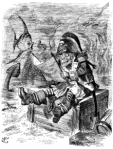
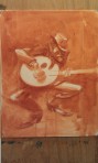
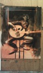
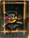
Richard Thompson (for my money, one of the best in the biz*) gives us a peek under the hood with a run-down of his watercolor palette and working method, here.
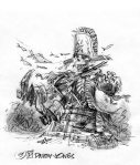
*Would you like to know when I fell in love with Thompson’s work? 20 or so years ago, when I first saw this masterpiece.
Posted by Adam Koford on Drawn! The Illustration and Cartooning Blog |
Permalink |
No comments
Tags: palette, Richard Thompson, watercolor, working method


.jpg?picon=1621)

.png.jpg?picon=3640)


.jpeg?picon=3304)


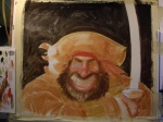
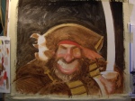
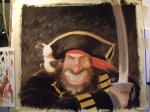
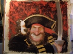
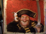
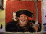
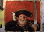
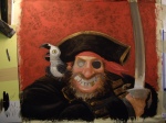
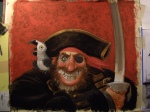
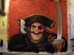
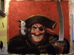
So much fun! Love the details, and especially the colors! Feel like I’m on the beach in the Caribbean! Still get mixed up with the pronunciation of that. Thought I had it all straight and then the “Pirates” movie trilogy came out and now I’m all confused!