By
Elisabeth Nortonfor
SCBWI Bologna 2016and
Cynthia Leitich Smith's
CynsationsLaurent Linn, art director for Simon & Schuster Books for Young Readers, began his career as a puppet designer/builder in Jim Henson's Muppet Workshop, creating characters for various productions, including the "Muppet Christmas Carol" and "Muppet Treasure Island" films. With Henson for over a decade, he worked primarily on Sesame Street, becoming the creative director for the Sesame Street Muppets, winning an Emmy Award. Currently, at Simon & Schuster, Laurent art directs picture books, middle-grade, and teen novels, working with illustrators and authors such as Tomie dePaola, Patricia Polacco, Bryan Collier, E. B. Lewis, Raúl Colón, Debbie Ohi, and Taeeun Yoo. Laurent is on the board of the Society of Children's Book Writers and Illustrators, and is the artistic advisor for the annual original art exhibit at the Society of Illustrators in New York. He is also an author: His debut illustrated teen novel, Draw the Line (Simon & Schuster), comes out in May. You can follow him on Twitter, Instagram, and facebook.Laurent, thank you so much for taking the time to answer a few questions about the world of illustration in children's publishing, and about the SCBWI Bologna Illustration Gallery (BIG). As art director at Simon & Schuster Books for Young Readers, what is the importance of the Bologna Children's Book Fair to you and other publishing professionals?The Bologna Fair has so much to offer everyone, and for a publisher like us, it serves more than one role. It’s a fantastic event to see what books are being published in other countries that we may want to acquire rights for to publish here in the U.S.
Also, we share certain books that we are publishing in the hopes international publishers will want to acquire, too.
In addition, we’re always on the look-out to discover illustrators from other countries that we’re not yet aware of — there is so much talent on display there!
What makes an Illustration Gallery such as the BIG at the SCBWI booth in Bologna interesting to publishing professionals? In the U.S. and around the world, children’s book publishers know that SCBWI members are serious about their careers. So it’s understood that the illustrators on display at the SCBWI booth are both knowledgeable and professional — something very important to us when we consider hiring an illustrator who is new to us.
When an art director or publisher views an illustration showcase such SCBWI's BIG, is s/he looking primarily for illustrators for picture books, or are they also scouting talent for other illustration opportunities within the industry?Speaking for myself, I always consider the strengths of each illustrator individually based on their work. For example, when I see someone whose strength is art that would be best suited for picture books, I may potentially keep them in mind for a future picture book. The same would be true of someone whose style is best for middle grade, etc.
Of course, many illustrators have different styles, which may be right for all types and genres of books, and I’d think about that as well.
Overall, I imagine that each art director and editor look for what he or she is publishing. Having said this, I do think the majority of art directors and editors at Bologna are looking at picture book illustration.
What makes an illustration stand out to you when you are serving as a judge for a showcase like BIG?A few factors. Talent and skill as an artist is extremely important, of course. But I’m also looking for strong visual storytelling — children’s book illustration is all about a narrative. If a piece is more of a portrait or composed scene lacking story, that doesn’t show how an illustrator could visualize a key moment of a narrative.
Also, I’m always looking to see if an illustration has an emotional connection — readers need to be emotionally invested in a book’s characters.
I think many illustrators, when thinking of a career in children's publishing, think primarily of illustrating picture books. Yet there seem to be more and more illustrated middle grade series, graphic novels are very popular, and your own illustrated young adult novel, Draw the Line, is scheduled for release in the summer of 2016. Do you see a trend in the industry towards more illustration in books for older readers?It’s such an exciting time for illustration in children’s literature! Picture books are being published with art using all kinds of media and in varied styles. More and more middle grade uses interior black-and-white illustrations within the pages, for all ages from young to pre-teen. And more and more art is even being used YA (young adult) fiction.
As you mention, my own debut YA novel, Draw the Line, has illustrations — 90 pages of art, in fact! It’s not a graphic novel at all, but is a traditional text novel that also has illustrations in it.
In my book’s case, the art is “drawn by” the main character, Adrian, but is of course really drawn by me. It’s a way to tell the story on a visual level to enhance the storytelling in the text. My YA is unusual in the amount of art in it, but we’re seeing more boundaries being broken down.
We have talented author
-illustrators like
Brian Selznick to thank in many ways. His illustrated novel
The Invention of Hugo Cabret (Scholastic, 2007) really broke ground.
And then, of course, there are true graphic novels for all ages. A graphic novel differs from an illustrated YA or middle grade in that the format is like a comic book: The entire story is told through art panels with speech balloons and narrative text boxes.
However, now we’re seeing hybrid books that are mixing up all preconceptions, so who knows what comes next?
I love the idea of the illustrations in Draw the Line being “drawn by” the character! I look forward to seeing it when it releases. How important do you think it is for an illustrator to be an author as well? Every creative person is unique — many illustrators have no interest in writing or are not good writers, and many are extremely talented writers with a passion for it.
If you look at the most successful top illustrators in children’s literature, you’ll find those that also write their books as well as those who only illustrate books written by others.
For me and my colleagues, whether an artist is also a writer or not has no bearing on if we will work with them or not.
What qualities do you think are important for an artist to have in order to be successful as an illustrator in the children's publishing industry? Certainly those creative elements I mention above: alent, a unique style and vision, good visual storytelling skills, and ability to bring an emotional connection to the art. But you must also be professional — children’s literature is a collaborative process.
In addition to being realistic and professional about deadlines, you have to keep in mind that art direction and editing are not personal judgments, but useful and necessary ways of communication.
Everyone in the process has her or his expertise, and we all want your book to be the best book possible. It’s a balance of creating a work of art yet being sure it sells and gets into the hands of readers who want and need it.
Another part of being a professional is making connections, getting your work out into the world to be seen, and being engaged in the children’s book world. For example, showing your art in the SCBWI Bologna Illustration Gallery!
Is there something that you think every illustrator should know, that I haven't asked?This may seem obvious, but it can be easy to lose sight of: always be yourself! Don’t imitate others or create art that you may think art directors “want to see.” There certainly are artistic rules to follow, but within those parameters, find your own vision and dazzle us with it. Yes, use influences and inspirations in your work, but only as tools to enhance your singular style and vision.
Cynsational NotesElisabeth Norton grew up in Alaska, lived for many years and Texas, and after a brief sojourn in England, now lives with her family between the Alps and the Jura in Switzerland.
She writes for middle grade readers and serves as the regional advisor for the
Swiss chapter of the Society of Children’s Book Writers and Illustrators.
When not writing, she can be found walking the dogs, playing board games, and spending time with family and friends. Find her on Twitter
@fictionforge.
The Bologna 2016 Interview series is coordinated by
Angela Cerrito, SCBWI’s Assistant International Advisor and a
Cynsational Reporter in Europe and beyond.
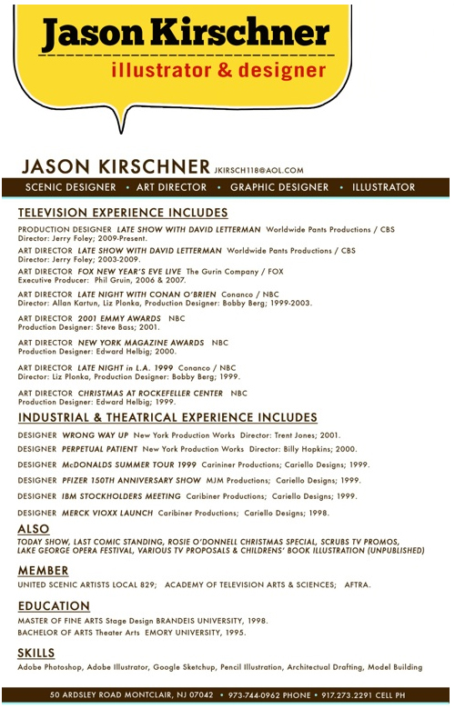
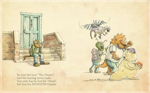
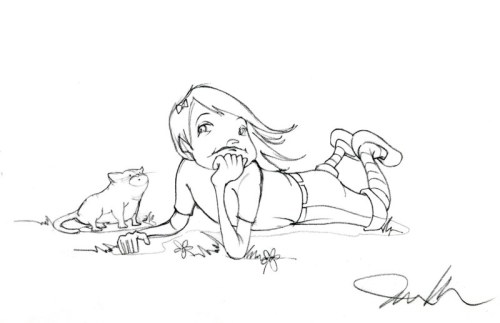
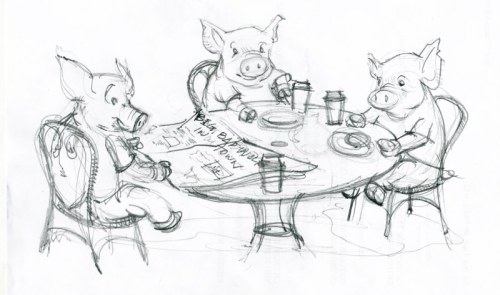
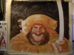
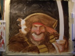
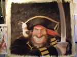
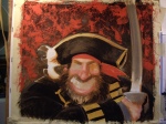
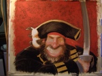
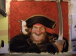
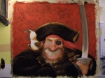
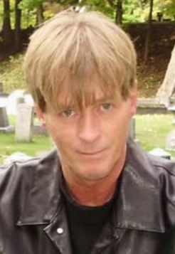
 Jason’s name might sound familiar, since I showed off his winning illustration from the NJSCBWI June Conference the other week. If you read Jason resume above, you will see how successful he has been in his career already. I am sure it is exciting to work around other creative people like he does on the David Letterman Show, but Jason is expanding into the children’s book market and I am sure he will be just as successful with that endeavor. Below you will see Jason’s process, but we start with his answers to my question about how he paints and what materials he uses. Here’s Jason:
I color everything digitally now and have done so for about a year and a half. I used to use watercolors, colored pencil and prismacolor markers but I’ve eliminated all of that. Digital is quicker and soooooo much easier to revise. You never have to wait for the paint to dry and its all free (after you’ve finished paying for Photoshop, of course).
As for Pencils… Right now I’m in love with Prismacolors. They’re nice and dark when you want a strong line. I also like the fact the line has a little bit of breakup in it. As stupid as it sounds–It keeps my drawing looking hand drawn. Beyond that, I’m also really happy with a nice #2 pencil.
As for paper I will really use anything. I probably should be more particular. I do like Strathmore or Canson sketch or watercolor paper. Honestly though 95% of the time I end up using cheap photocopy paper– 11″x 17″ if its around. The lack of texture is an advantage when I’m using the Photoshop magic wand to isolate different elements drawn on the paper. Truthfully I add whatever textures I want later in the process anyway.
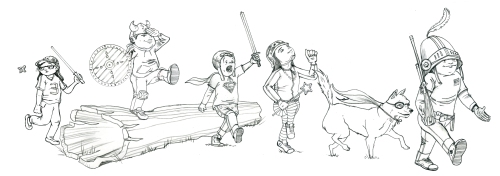
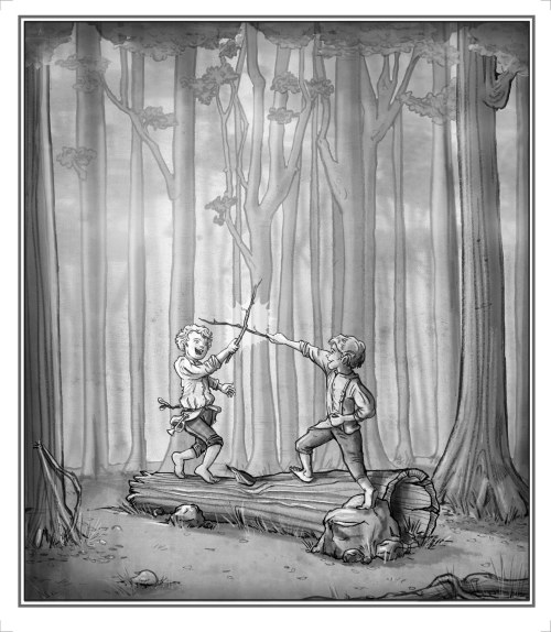
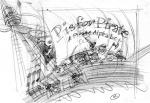
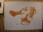
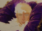
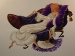
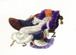
Step 1: After I figured out my idea and did a few rough sketches, I drew finished versions of each character with pencil and scanned each in separately. With each character on a separate layer I played around until I got a composition I liked.
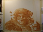
Step 2: If I’m going to use a texture or paper I lay it in right at the beginning. That way I can choose colors accordingly. Here I was going for a classic sort of feeling so I chose an old paper from my texture library and placed it on its own multiply layer above all the pencil sketches.
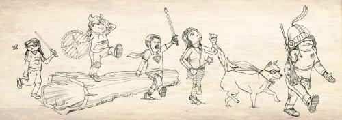
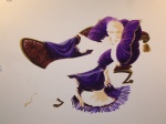
Step 3: Next I lay in the color, also on a multiply layer. For the most part I use solid blocks of color. In some places I start to indicate highlight and shadow but I do most of that in the next step.
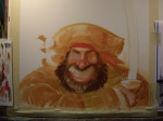
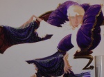
Step 4: Finally, I add a layer for shade and shadows , and one for highlights. This is also the time I’d use any sort of photoshop filters but I mostly avoid them.
What made you decide to go to Emory University to get a BA in Theatre Arts?
One day someone from the Theater Dept. came in to my high school art class and asked if anyone could paint a giant sunset for South Pacific. I raised my hand and was drafted into service. I loved working on sets in High School.
At Emory I designed and directed theater on the side. I was actually a math/computer science major for most of my time there. I used to go the the computer lab after rehearsals and work until late in the night. One night I was in the computer lab at 3:30am looking for a missing semicolon in 4000 lines of code while sitting between two guys arguing over which Star Trek captain was better – Kirk or Picard. I quit the next morning and declared a theater major.
Tell us about how you decided to go for you Master’s in Stage Design at Brandeis University?
I had been designing sets for a few years and I really enjoyed it. It seemed to be a career where I can draw for a living but not be a starving artist. I really liked the program at Brandeis (which is now sadly defunct) and after four years in Atlanta, I missed winters. It was great to have three years to really concentrate on nothing but Theater and sketching and painting.
Were you working in the theatre business while getting your master’s?
I did take a few outside design jobs but mostly I designed shows for Brandeis.
Did any of the contacts you made in college help you get you work?
My grad school contacts not only got me work — they got me my career. A Brandeis alum was working at the Late Show at the time and through him I started a brief internship there while they were designing a new set. That experience was invaluable to me. That credit on my resume helped me get an interview at Late Night with Conan O’Brien right out of grad school. When there was an opening a year later they offered me the job. I really loved my four years there.
Did that lead to working with the David Letterman Show?
While I was working at Late Night, I would occasionally fill in over at the Late Show. When a position opened up I interviewed and got the job.
Did you ever take any illustration class?
I’ve honestly never taken an illustration class. I did take figure drawing once in grad school. I’ve always loved drawing but I’m mostly self taught. I’ve got sketchbooks from when I was three or four years old. I started copying Sunday comics and comic books as a little kid and I’ve never stopped. I try to draw every day.
When did you decide that you wanted to try your hand with children’s books?
It’s always something I wanted to try. When my wife and I had our twins and started reading picture books I really wanted to make my own. I started putting together an illustration portfolio which is decidedly different from a scenic design portfolio. I’ve been at if for three years now and I feel I’m growing as an illustrator every day.
Do you think working in stage and theatre has influenced your children’s style?
The skits we do at the Late Show are usually very short so you only get a few seconds of screen time to set the scene. You have to pick your details wisely to convey setting. I think its a useful skill I draw upon when illustrating. Just like in TV or movies I try to start with a wide establishing shot to set the scene before I go in for close-ups. Lastly, set sketches are always very conscious of the lighting and mood of the scene. I try to bring that into my illustrations as well.
Do you think your style has changed since when you first started?
Definitely. I am always trying to evolve my style while trying to keep my illustrations looking like they’re mine. I find when I stray too far, people say the work doesn’t look like my own. I also really love line work so I am always trying new ways to keep things looking hand drawn.
What is your favorite medium to use?
Pencils. Prismacolor Pencils and Photoshop seem to be my preferred method these days. One day I’d love to get back to more conventional mediums like watercolors or colored pencils. Time becomes a huge factor and digital is just quicker. You can revise indefinitely without starting over. Any medium I can walk away from for a while and pick back up whenever is best for me lately.
The way I work now is to hand draw everything –pencil on paper. I try to draw all the elements separately. I scan them in and compose and edit in Photoshop. Then I color it all digitally.
What was the first piece of art that you sold?
I’ve never actually sold anything. Anyone want to buy something?
Have you made a picture book dummy to show art directors and editors?
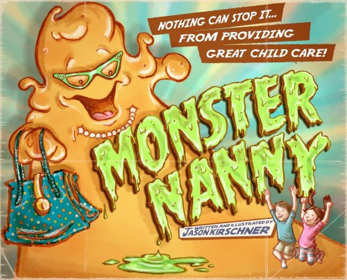
I have! I’ve spent the last ten or eleven months working on a picture book I wrote and illustrated called Monster Nanny. I’m constantly revising and rewriting and redrawing. I actually brought it to the NJ SCBWI conference earlier this month. I got lots of great feedback.
Are you represented by an artist rep.? If so, who? If not, would you like to find one?
No. Not yet. I would love to find some representation. I love the drawing and the writing but I’m new to the business end of it all.
Do you think you will ever write and illustrate your own book?
I really hope so.
Have you thought of submitting your illustrations to children’s magazines to help get you noticed?
I honestly haven’t but I’m open to any venue that will help me get my work out there.
Do you use Photoshop with your illustrations?
YES. All the time. I’ve been using Photoshop for years at my day job and I am constantly finding new ways to speed my process up by using Photoshop. I’ve also started coloring all my illustrations in Photoshop. I’ve also started using 3D modeling programs like Sketchup in the early stages of a drawing to help me figure out composition and perspective. I am also trying to make Corel Painter a part of my process but I’m not there yet.
Do you own a graphic tablet?
Yes. Love them. At home I use an Wacom Intuos tablet. At work I recently got a Cintiq which is so cool. In the few months I’ve had it I’ve already starting skipping some of the pencil drawing and doing it directly in Photoshop. Using different virtual brushes, I’m getting better at imitating a pencil line digitally. I can see doing more and more of that in the future.

Do you have a studio in your at home?
I do. It’s a recent addition for me and it makes me so happy. I go up there most nights after dinner and draw. I’ve got a drafting table and a computer station. The only problem is that the office is across the hall from my kids’ bedrooms so no TV or music without earphones.
When do you find time to work on the children’s illustration when you are doing The Late Show With David Letterman?
Nights and weekends. I’m always a little sleepy.
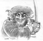
Other than the award you just won at the NJSCBWI Conference for the above illustration, has your artwork won any awards?
Sadly, no.
What types of things are you doing to get your work in front of publishers?
Not enough. I’m admittedly not good at selling myself. I’ve sent out a few postcards here and there. I’m working on a new illustration for a bigger postcard mailing in the next few weeks.
What are your career goals?
I’m pretty happy being the Production Designer for the Late Show.
I love working on the picture books as well. I’d ideally like to write and illustrate my own stuff but I’d be happy drawing someone else’s manuscript too. Maybe I could one day down the road transition to being a full time illustrator. Who knows?
Are there any painting tips (materials,paper, etc.) you can share that work well for you? Technique tips?
I am always reading blogs for these answers! I’m so terrible at knowing what to use. Once in a while I get up the energy to try a different kid of paper or marker or pencil but honesty I’ll draw on anything. More often that not, I draw with prismacolor pencils on cheap photocopy paper. Mostly because I’m lazy. I’m experimenting with drawing in browns and purples instead of black. Its a softer line but it isn’t appropriate for every illustration.
On the digital side, I keep trying to develop techniques that don’t look digital. I’ve been collecting a folder full of older papers and textures that I layer into my illustrations to give them a classic feel. I try to use layers to my advantage. I leave things separated until the end so I can keep playing with composition. I also try to use old school techniques of shadow and highlight, also on separate layers.
Any words of wisdom you can share with the illustrators who are trying to develop their career?
At this point in my illustration career, I am probably someone who should be taking career wisdom rather than doling it out.
Here’s what I can offer: First — draw every day. I do. I think it takes a while to get into “the zone” where you feel your drawings are worth keeping.
Secondly – I am not a spiritual person at all but I do believe that opportunities find you. You have to do the work and put yourself out there. Opportunity might open a door for you but you do need courage to jump on those opportunities and the skill to back it up.
Thank you Jason letting us get to know you and sharing your process. Make sure you keep us updated on all your future successes. If you would like to visit Jason, here is the link to his website: www.jasonkirschner.com
Please take a minute to leave Jason some encouraging comments – Thanks!
Talk tomorrow,
Kathy
Filed under:
authors and illustrators,
How to,
illustrating,
Illustrator's Saturday,
Process,
Tips Tagged:
Art Director,
Conan O'Brien,
David Letterman,
Jason Kirschner 

 The New York Metro SCBWI meets once a month on Tuesday evenings from September to June for their Professional Series.
It is a really good deal. You get to meet important people in the publishing industry and it only costs $15 if you are a member.
On March 13th, you can meet Laurent Linn, Art Director at Simon & Schuster Books for Young Readers along with Scott M. Fischer, Illustrator of Jump! and Lottie Paris Lives Here and hear them talk about how they worked together on the book.
 If you are in the city, don’t miss this oportunity. You can never go wrong when Laurent is involved in something. Besides adding to your industry knowledge, remember that going to these things helps fill your goal of maintaining a good mix of learning and networking.
SUBJECT: It Takes Two To Tango: How Art Directors and Illustrators Really Work Together
Location: The Anthroposophical Society, New York Branch, 138 West 15th Street (between 6th Avenue & 7th Avenue).
Time: 7:30pm-9:30pm. Doors open at 7:15pm.
Cost: $15 for SCBWI members, $20 for nonmembers Seating is limited to the first 80 people.
To purchase tickets, go to http://metro.nyscbwi.org/
Talk tomorrow,
Kathy
Filed under:
authors and illustrators,
Events,
networking,
opportunity,
Process Tagged:
Art Director,
Laurent Linn,
New York City Metro SCBWI,
Professional Series 


 2 Comments on Metro SCBWI NYC Professional Series, last added: 3/4/2012


 Soon the spring ’11 artwork will start pouring in to be digitalized, printed, and bound. Before our art director Nick becomes buried in a mountain of watercolor paintings I thought I would sit down and ask him about the art of, well, art.


Qapla’!
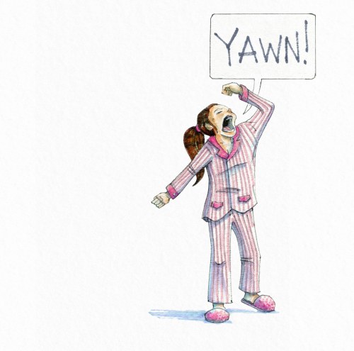
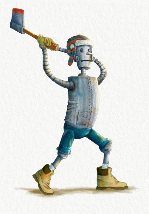
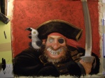
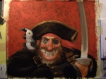
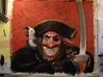
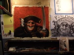
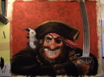
Fantastic. Love the palette, the crazed look in the eye is perfect, and that gold tooth! Beautiful.
Thanks, Mr Kiser!