JacketFlap connects you to the work of more than 200,000 authors, illustrators, publishers and other creators of books for Children and Young Adults. The site is updated daily with information about every book, author, illustrator, and publisher in the children's / young adult book industry. Members include published authors and illustrators, librarians, agents, editors, publicists, booksellers, publishers and fans. Join now (it's free).
Login or Register for free to create your own customized page of blog posts from your favorite blogs. You can also add blogs by clicking the "Add to MyJacketFlap" links next to the blog name in each post.
Blog Posts by Tag
In the past 7 days
Blog Posts by Date
Click days in this calendar to see posts by day or month
Viewing: Blog Posts Tagged with: materials, Most Recent at Top [Help]
Results 1 - 25 of 56
How to use this Page
You are viewing the most recent posts tagged with the words: materials in the JacketFlap blog reader. What is a tag? Think of a tag as a keyword or category label. Tags can both help you find posts on JacketFlap.com as well as provide an easy way for you to "remember" and classify posts for later recall. Try adding a tag yourself by clicking "Add a tag" below a post's header. Scroll down through the list of Recent Posts in the left column and click on a post title that sounds interesting. You can view all posts from a specific blog by clicking the Blog name in the right column, or you can click a 'More Posts from this Blog' link in any individual post.
Have you ever visited a colleague’s classroom or watched a video of a lesson and wondered, “How are those kids so perfect? How do they seem to know exactly what to do, the… Continue reading →
Are you feeling inundated with paper in your writing workshop? Here are some quick tips to help you help your students organize their writing so that their desks and writing folders are less cluttered.
Kids do need room to grow. Not only do they outgrow clothes in the blink of an eye, they also grow as readers and writers. This is why we need classroom libraries stocked with a wide range of levels, and it's why we need writing centers stocked with paper choices.
The summer is the perfect time to start stocking up on the things you really need. Whether you are hoping to get materials donated, or you teach in a community where families can provide a few things for your students, or you are planning to do some good old fashioned scrounging, this list can help you strategize a plan for materials.
It’s easy to presume that your doodles, illustrations, paintings and creative thoughts should make their way straight to paper or canvas although just for a minute why not think outside the box. Break the rules and do something creatively different that sets your doodles apart , not to abandon your sketchbook for to long but challenge yourself to something different. To help get you started heres just a few creative ways you can do that and truly think outside the box to show others just how creative you can be.
Remember that rather dull phone or tablet case you bought thats lacking a certain creative omph, well grab yourself some paint or a paint based marker and create your own custom case design. Add your own style and choose your own theme to make a stylish creative case you’d want to show off and not hide.
Mugs are great because they often get filled with heart warming teas or beverages although a plain little old mug is some what sad and gloomy. However with some ceramic paint or markers you could give it an unique handdrawn design of its own that is sure to make your tea breaks even better.
For fellow lovers of fabric the dream is no doubt to create your own and you can even without a huge fabric printer. With some acrylic paints and fabric medium you can paint your own designs onto calico, making reams of your own one of a kind design to embellish any type of project from home furnishings to wallart and more.
That little pair of converse you happen to have sitting in the hallway could use a splash of ink wouldn’t you say? Grab yourself some pens and markers ( ones that work well on canvas fabric and will not run) and create yourself a fashion piece that will set you apart from everyone else.
Image by artist Jaco Haasbroek you can find out more about their work here.
0 Comments on Creative ways to think outside the box as of 11/23/2014 4:48:00 PM
When I wrote Materials: A Very Short Introduction (published later this month) I made a list of all the Nobel Prizes that had been awarded for work on materials. There are lots. The first was the 1905 Chemistry prize to Alfred von Baeyer for dyestuffs (think indigo and denim). Now we can add another, as the 2014 Physics prize has been awarded to the three Japanese scientists who discovered how to make blue light-emitting diodes. Blue LEDs are important because they make possible white LEDs. This is the big winner. White LED lighting is sweeping the world, and that’s something whose value we can all easily understand. (Well done to the Nobel Foundation, by the way: this year the Physics and Medicine prizes are both about things we can all get the hang of.)
Red and green LEDs have been around for a long time, but making a blue one was a nightmare, or at least a very long journey. It was the sustained target of industrial and academic research for more than twenty years. (Baeyer’s indigo by the way was a similar case. In the late nineteenth century, making an industrial indigo dye was everyone’s top priority, but the synthesis proved elusive.) What Akasaki, Amano, and Nakamura did was to work with a new semiconductor material, gallium nitride GaN, and find ways to build it into a tiny club sandwich. Layered heterostructures like this are at the heart of many semiconductor devices — there was a Nobel Prize for them in 2000. So it is not so much the concept of the blue LED that the new Nobel Prize recognizes as inventing methods to make efficient, reliable devices from GaN materials. In this Akasaki, Amano, and Nakamura succeeded where many others had failed.
The commercial blue LED is formed by two crystalline layers of GaN between which is sandwiched a layer of GaN mixed with closely related semiconductor indium nitride InN. The InGaN layer is only a few atoms thick: in the business it is called a quantum well. Finding how to grow these exquisitely precise layers (generally depositing atoms from a vapor on a smooth sapphire surface) took many years.
The quantum well is where the action occurs. When a current flows through the device, negative electrons and positive holes are briefly trapped in the quantum well. When they combine, there is a little pop of energy, which appears as a photon of blue light. The efficiency of the device depends on getting as many of the electron-hole pairs as possible to produce photons, and to prevent the electrical energy from leaking off into other processes and ending up as heat. The blue LED achieves conversion efficiencies of more than 50%, an extraordinary improvement on traditional lighting technology.
An LED Solar Lamp, Rizal Park, Philippines “Solar Lamp Luneta” by SeamanWell. CC-BY-SA-3.0 via Wikimedia Commons.
How does this help us to get white light? Well, one route is to combine the light from blue, red, and green LEDs, and with a nod to Isaac Newton the result is white light. But most commercial white LEDs don’t work that way. They contain only a blue LED, and are constructed so that the blue light shines through a thin coating of a material called a phosphor. The phosphor (commonly a yttrium garnet doped with cerium) converts some of the blue light to longer wavelength yellow light. The combination of yellow and blue light appears white.
Perhaps we should pay more attention to how amazing little devices such as these are made. And how they are packaged, and sold for next to nothing as components for everyday consumer products. Low cost and availability are important. It is easy to see that making a white-light LED which can produce say 200 lumens of light for every watt of electrical energy it uses is a big step in reducing energy consumption in lighting homes, offices, industries, in street lighting, in vehicles, and so on. They replace the old incandescent lamp which produced perhaps 15 lumens per watt. Since 20% of our electricity is used for lighting, a practical white LED lamp is transformative.
But the white LED has another benefit, in bringing useful light to communities all over the world that do not have a public electricity supply. One day, I took to pieces a little solar lamp, which sells for a few dollars. I wanted to see exactly what was in it, and in particular how many chemical elements I could find. When I totted them up I had found more than twenty, about a quarter of all the elements in the Periodic Table. This little lamp has a small solar panel, a lithium battery and at its heart a white LED. It brings white light to people who previously had only dangerous kerosene lamps, or perhaps nothing at all. And it provides a solar-powered charger for a phone too. Four of the more exotic elements in this lamp are in the LED light, indium and gallium in the LED heterostructure, and yttrium and cerium in the phosphor. Is this solar lamp really the simple product that it seems? Or is it, like thousands of other everyday articles, a miracle of material ingenuity?
Featured image: Blue light emitting diodes over a proto-board by Gussisaurio. CC-BY-SA-3.0 via Wikimedia Commons.
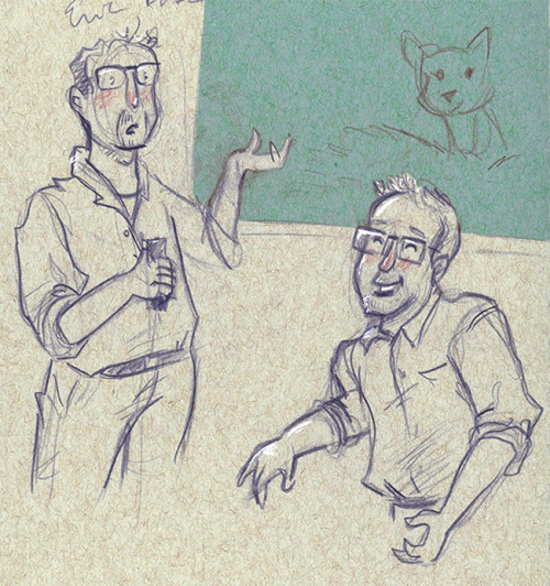
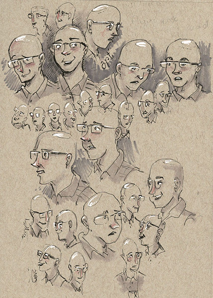
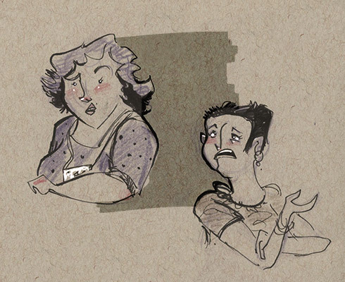
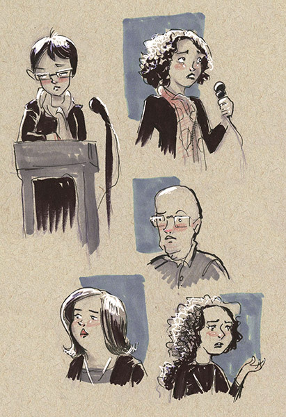
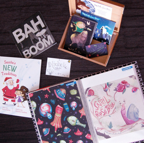
I visited a children’s book conference in the North of Michigan this past weekend and spent most of it sketching and listening. I’m not going to review the conference, but I’ve posted a few of the sketches I did (mostly of speakers but some audience members). You can also see the layout of my portfolio things which were on display during the weekend.
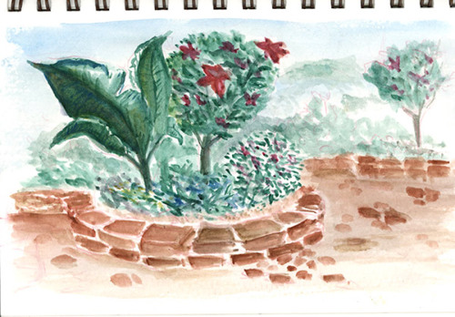
I really should mention though, that I did really enjoy painting in a butterfly garden (the watercolour & ink above) and getting to know a few really awesome people.
In my line of work as a staff developer, I often get the question, “Which do you think is better? Pens or pencils?” I have to start by saying that I don’t think… Read More →
Ever wonder what I work with? I am always curious to see other artists' studios, the tools they use, even down to how they brush the paint on. It fascinates me.
I'm working on a project right now that has forced me to look closer at what I work with and why I work with it.
You can find commentaries on blogs, forums, and Facebook about how one artist will voice their favorite pencil, while another artist in the same field will swear by another brand. Call it the sport of art if you like (I'm sure there's an artist out there with a rabbit's foot).
Most of my tools have a story or memory attached to them.
The oldest tool I've used every day in the studio is my kneaded eraser.
My dad is an art teacher most of my life, so I grew up with this wonderful tool laying around his art studio coiled up or made into small pyramids. Something to do while thinking or working. I was introduced to it very young.
The next tool oldest to me is a retractable Tuff Stuff! The moment I discovered this eraser years ago I fell in love and haven't gone back. It gets into the little spots and is always a clean erase. I don't go anywhere without it!
My pencils are newer to me. I have worked with mechanical pencils for at least 15 years now, but the one I used as a teenager...well....was great for a teenager.
Two years ago I did some research and tried Pentel GraphGear 500 on a whim. Love them! Great body weight, good lead selection, amazingly priced! The green Pentel is their most standard. Pentel P205...still a great drawing pencil!
Sketchbooks are personal, in every sense, like a diary. I have always favored the large Strathmore or Canson spiralbounds, 9x12 inch. I have several moleskines too that are smaller....and I adore them, but I like space for my hand when I draw, this allows it.
Color Theory wasn't around in the beginning for me, so I just picked colors that worked to my eye. This did not help in finding the best palette for me, or how to lay it out even.
All of my palettes up to several years ago were rectangle and felt rough to me. Nothing progressed fluidly for me, only manageable.
There was a teacher of watercolor where I work (The Des Moines Art Center) who had a round palette out during one of her classes, and I was introduced to the Stephen Quiller Palette. A circle! Imagine color on a wheel!
I took her class, several times, and have since learned how to better use my palette effectively.
The paints I use are a blend of Daniel Smith and Winsor Newton. I always have a messy palette, it's cleaned maybe once every two months. I also paint on primarily Arches Hot Press and Cold Press 140lbs. It's a comfortable inbetween weight and their brand is one of the oldest. I'm open to other papers, but I'm a snob about Arches. The brushes? Cotman series 666.
If you know my work you'll notice my use of white. This started in the phase of trying to keep the white of the paper and failing. I taught myself watercolor, so I turned to problem-solving (an illustrator's best trait).
First it was FW liquid acrylic. I would brush it on, but it cakes easily. Nowadays I usually water it down.
The other partner in crime is the white gel pen. Discovered this while watching watercolor videos on YouTube. Genius! I don't think I use the best one, your basic Gelly Roll, but will be ordering a UniBall gel pen and I'm looking forward to seeing how it works!
Last but not least, the infamous indigo colored pencil.
I started using this prominently last year while working on Tangerine. I was first introduced to Verithin Colored Pencils by Prismacolor a couple of years back. They're fantastic because of the harder lead with less wax. Because I'm not a colored pencil artist, this worked great for sketching!
The indigo was an accident. I was sketching with it, and as I added color (without thinking of the muddiness it could create) I noticed how it's more dulled tone worked. After Tangerine I continued to sketch with it. The hue is attractive to me, mixed with graphite or color. It helps to provide me my shadows.
Although indigo can create mud very quickly (it's not for the inexperienced), it does create a more earthy visual of color hues in the painting. I trust it so much I paint with indigo as well.
I try to sharpen always with a blade so that I don't go through the pencil as fast (taught by my dad), and the electric eraser was a gift to me. Never knew I would have a need of it until I discovered it erases the indigo colored pencil wonderfully!
Do you have a favorite pen or material that you use a bit religiously?
6 Comments on Tools of the Trade, last added: 2/14/2013
These tools are very useful to understand the pattern of trading very easily. Some of these tools are really very efficient & even i was not aware from them. Good Stuff !
you've listed so many great tools though I don't know most of them. for me, I like mechanical pencils, water soluble colored pencils and my laptop. but I think the best tool is really yourself and your hands.
you are so right, i love seeing and hearing about what artists like to use. I loved reading your post.
i enjoy most the things you have mentioned. Go through spurts with different materials. For a long time it was Derwent Inktense pencils or prismacolor pencils. Now i am learning a bit about watercolors.
Thank you for being so candid about what you use. I often look at art work and wonder what they have used to create it. Sometimes I can guess. Sometimes I am clueless! I love your work and your sense of color. I know I want my art work (which is mostly colored pencil) to be more vibrant and your post has really convinced me that I need a color theory class and a watercolor class would be nice.
Thank you everyone for such wonderful comments. I am beaming with joy knowing that I shared something new and something helpful!
Lissa, I couldn't agree more, that you yourself is the best tool. Thank you for sharing that, because I teach it so often in my classrooms.
Tammie Lee, I think exploring or switching out your mediums from time to time is such a healthy thing! I got so wrapped up in being a watercolor purest I forgot that I was an illustrator! And in essence almost lost what kind of artist I am internally. I have some Derwent watercolor pencils that I haven't really dived into. Waiting for that special day when I'm up for that challenge!! ;) Watercolors are fun if you keep them fun, hope you enjoy all that you learn!
Laura, thank you for your comment about being candid. We're told so often in business to be professional in how we speak, I'm the opposite. How I talk here is how I teach and talk with my clients. I really hope you do take some color theory and watercolor classes! Dig around and find some, or ask community schools if they know of any private tutors. Totally worth a few workshops!
Sara, Thanks for the great tips. What fun! I feel like I've taken a tour inside your studio. I love rapidographs, for softer looks and colors I use a soft brown ink and for the softest looks, I use a number 2 pencil. (funny, isn't it- it is so simple) I love watercolor paper with a cotton feel and slight texture. Sometimes it looks dirty when reproduced. I try to compensate for that in photoshop when it is scanned. My dad was a watercolor artist and used to rip the paper to add clear clean white sparkles. Thanks for sharing, you have amazing talent. bk
There are 2 things I need from a paper I'm doing pen and ink drawings on : it needs to be smooth and at least 2 ply. And I really like cheap.
If it's not smooth the sharp pen tips will catch and skip across the paper. I've used rougher papers for pen by drawing gently and slowly and I've managed just fine. However I don't want to do a whole book that way. I think it's best to use the material most well suited to a given project within your budget. The Situation, unlike Maddy Kettle, was drawn on higher quality watercolour paper. I did this for a few reasons. The big one is I just wasn't sure what materials were best yet and second, I had made the decision to hand colour The Situation so it needed to be a paper that could handle ink as well as watercolour and gouache without warping and going all pulpy.
And the paper should be 2 ply or greater because I'm really rough on my paper. I apply layers and layers of black and white ink (and often other materials) and sometimes need to scratch the paper with an exacto knife to get the right effect. A single ply paper will tear quickly under this punishment. So for me the quality of a paper is indicated by it's surface and thickness.
I tend to use a bristol paper or something similar. There are a number of brands like this. Strathmore is the most famous and it is also very reliable. This is what I'm using for Maddy Kettle. I'll switch if I can get the same quality for less money.
There are papers that might actually be better suited to this kind if pen and ink work such as Arches or Fabriano hot pressed watercolor papers. However, these papers are high quality papers made from cotton rag rather than wood pulp and are much costlier.
So, the truth is, the paper just needs to be OK and fairly cheap.
0 Comments on Comic Book Tools And Materials Part Two: The Disappointing Truth About Paper as of 1/1/1900
Till Lassmann (who drew the cute Chalkies we linked to in the summer) has posted a creative set on Flickr of random tape drawings. Till randomly stuck pieces of masking tape onto his paper, and then added linework to complete the drawing. Great idea!
It’s a month long appreciation of the art of drawing in ink and the practitioners that embrace that art. To celebrate I’m posting one ink drawing a day for the entire month. No pencils, no water colors, no photoshop, just the unadulterated black and white beauty of thick black ink on crisp white paper. Drawing with ink means commitment. There’s no hemming and hawing as to which pencil line you’re going to use, no sitting on the fence of values, no pussy footing with color. When you make your mark you better mean it. It’s black and white. True or false. On or off. And that’s what Inktober is all about.
Drawger has set up the Museum of Forgotten Art Supplies where “tools of the trade that have died or have just about died a slow slow death are cheerfully exhibited.”
I still have plenty of these kicking around from my school days — rubber cement pick-up, proportion wheel, dry cleaning pad, t-squares, triangles. I even use some of them still, despite having a heavily digital workflow. Heck, I’ve even used a plastic circle template on my Cintiq itself.
But please don’t make me set type by hand ever again.
I have a whole mess of zipatone sheets and stick on letters floating around somewhere. Once regular tools, now reserved for something really special since there’s no way to really replace them.
I still prefer good old hand crafted cutting and pasting. I use collage as my medium of choice. I find it really satisfying to take sheets of colored paper and magazines and to physically cut them up and glue them back together as something new. I also like hearing people’s disbelief when they realize what they are looking at is a collage and not a photograph or painting.
Sure, I could learn to do the same thing digitally, and I’m sure it would be faster, but it wouldn’t elicit the same reaction, nor would it have the same tactile satisfaction for me. So, I guess what I’m saying is that I mourn the passing of these seemingly obsolete tools not out of nostalgia, or because I’m an old dog unwilling to learn new tricks, but because I still find creating artwork physically with scissors and glue to be more satisfying.
SamD said, on 7/4/2009 12:04:00 PM
Heck, I’d love to -find- some of this stuff.
kenmeyerjr said, on 7/4/2009 9:19:00 PM
God…I think I have used at least 60% of all that stuff in the past. Still have (and use) some of it. I will echo John’s comments…though the pages have turned brown, I still love the old comics I created back in the 80’s using ink, zipatone, transfer letters, graphic white and crappy old rapidographs…god how I hated those pens! When I show the comic pages I did using duoshade paper to my fellow (much younger) students, they all want to go out and git sum!
hkrall said, on 7/16/2009 11:32:00 AM
In the past? I use a lot of this stuff every day. I would kill for a Lucigraph machine, they are amazing.
One of my local art supply stores just discontinued holbien gouache… That scares me.
I do plenty of coloring / touch ups on the computer, and honestly half the time it takes me just as long as doing it by hand.
I feel a bit foolish, I saw paste ups of these all over Melbourne and I photographed a bunch thinking they were really unique street art. Now it turns out it was viral marketing for a beer? dissapointed! (still a great design though)
Melanie Bilenker creates jewellery featuring drawings made with human hair.
From her artist’s statement:
The Victorians kept lockets of hair and miniature portraits painted with ground hair and pigment to secure the memory of a lost love. In much the same way, I secure my memories through photographic images rendered in lines of my own hair, the physical remnants. I do not reproduce events, but quiet minutes, the mundane, the domestic, the ordinary moments.
0 Comments on Jewellery drawn with hair as of 1/7/2009 8:13:00 PM
Ponoko is a very cool service from New Zealand that takes your designs and laser cuts them on demand into a variety of materials like acrylic, felt, wood, and cardboard. I decided to try out the service with some images from public domain books available on the web to make a variety of acrylic jewelry, keychains, and hair sticks (hey, hair sticks are infinitely useful. You can poke people with them in addition to keeping your hair tied back).
I downloaded their templates for Inkscape, a free vector graphics program that creates .svg files. Then I found a public domain book called Rambles of an Archaeologist Among Old Books and in Old Places by Frederick William Fairholt that had beautiful engravings of old jewelry designs, including a fascinating little Memento Mori ring that I thought would do quite nicely for Halloween.
I figured since I was paying for a full sheet of acrylic, I should probably cram it full of stuff. Plus, it gave me a chance to test the different engraving thicknesses as well as the exactness of sizing - ring sizes are precise to the millimeter, so I created three versions of the Memento Mori ring in ladies’ size 4, 5 and 6 to test. Then I added some images from L. Frank Baum’s Wizard of Oz series because I thought it would be super cool to have an Oz ornament hanging from our Christmas tree this year.
I uploaded my designs to my Ponoko account, then chose my materials - in this case, white frosted acrylic. The interface of the Ponoko site just makes this process that much more fun. I finalized my order, then sat back to wait for the results.
I certainly wasn’t disappointed! The package showed up five days after my order was completed, and I was very very happy with what arrived - everything was exactly as I’d specified, even the mistake I made on the Oz ornament was fully intact. I quickly tried on the rings, then checked them against a sizing chart, and they were perfect. The engravings are a bit difficult to see on the material I chose, but I brushed India ink over one of the rings to “antique” it and it looks awesome.
Now my head is full of ideas for truly 3D creations, like picture frames and puzzles and lampshades. They’ve added a variety of new materials in the last week, like bamboo, and they have a GREAT blog with links to designers experimenting with laser cutters and custom manufactory.
Since I used public domain images for my designs, I made the .svg files I created available under the same (non) license, so you can download them for free at Ponoko and do whatever you like with them. If you make something with Ponoko, let me know, I’d love to see your work!
How cool are these insect sculptures from artist Chris Goodwin? They are made with found objects and zero adhesives. Check out this step by step demonstration of one of his pieces being assembled.
0 Comments on Bug sculptures made from found objects as of 8/6/2008 12:33:00 AM
Kevin Cornell has begun to post an in-depth, multi-part examination of his drawing tools. The first part looks at pencils and erasers, and the second part covers pens and ink. The as-yet unposted third part of the series will take a look at painting tools.
Photographer Stuart Nafey and artist Lori Stotko create Light Doodles with custom-made LED pens. In addition to their website, they have work on Flickr, and what’s really cool — they’ve uploaded a step-by-step tutorial to Instructables on how to make your own LED pens.
0 Comments on Doodling with LED light-drawing pens as of 2/6/2008 7:37:00 PM
How gorgeous are these elegant wooden toys from Japanese toymaker Takeji Nakagawa, aka Take-G? The level of craftsmanship and design blow me away. There’s a awkwardly-translated interview with Nakagawa at Hitspaper that’s worth visiting if only for the high-res images of his work.


 By: Elizabeth Moore,
on 8/25/2016
By: Elizabeth Moore,
on 8/25/2016
 By: Kate Leonard,
on 11/23/2014
By: Kate Leonard,
on 11/23/2014
 By: Julia Callaway,
on 10/8/2014
By: Julia Callaway,
on 10/8/2014


 By: Michelina Ouellette,
on 9/23/2014
By: Michelina Ouellette,
on 9/23/2014
.png.jpg?picon=3640) By: Sara Burrier,
on 2/1/2013
By: Sara Burrier,
on 2/1/2013

 Most of my tools have a story or memory attached to them.
  My pencils are newer to me. I have worked with mechanical pencils for at least 15 years now, but the one I used as a teenager...well....was great for a teenager.
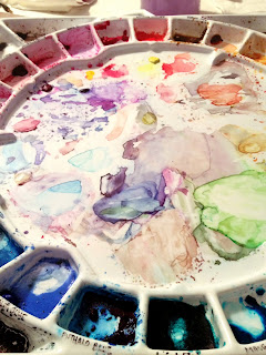 Color Theory wasn't around in the beginning for me, so I just picked colors that worked to my eye. This did not help in finding the best palette for me, or how to lay it out even.
 If you know my work you'll notice my use of white. This started in the phase of trying to keep the white of the paper and failing. I taught myself watercolor, so I turned to problem-solving (an illustrator's best trait).
 I started using this prominently last year while working on Tangerine. I was first introduced to Verithin Colored Pencils by Prismacolor a couple of years back. They're fantastic because of the harder lead with less wax. Because I'm not a colored pencil artist, this worked great for sketching!
 By: Eric Orchard,
on 5/26/2011
By: Eric Orchard,
on 5/26/2011
 There are 2 things I need from a paper I'm doing pen and ink drawings on : it needs to be smooth and at least 2 ply. And I really like cheap.
 By: John,
on 1/21/2010
By: John,
on 1/21/2010


 My pencils are newer to me. I have worked with mechanical pencils for at least 15 years now, but the one I used as a teenager...well....was great for a teenager.
 Color Theory wasn't around in the beginning for me, so I just picked colors that worked to my eye. This did not help in finding the best palette for me, or how to lay it out even.


These tools are very useful to understand the pattern of trading very easily. Some of these tools are really very efficient & even i was not aware from them. Good Stuff !
Thanks
Commodity Trading Tips
you've listed so many great tools though I don't know most of them. for me, I like mechanical pencils, water soluble colored pencils and my laptop. but I think the best tool is really yourself and your hands.
thanks for sharing this, have a great day.
you are so right, i love seeing and hearing about what artists like to use. I loved reading your post.
i enjoy most the things you have mentioned. Go through spurts with different materials. For a long time it was Derwent Inktense pencils or prismacolor pencils. Now i am learning a bit about watercolors.
Thank you for being so candid about what you use. I often look at art work and wonder what they have used to create it. Sometimes I can guess. Sometimes I am clueless! I love your work and your sense of color. I know I want my art work (which is mostly colored pencil) to be more vibrant and your post has really convinced me that I need a color theory class and a watercolor class would be nice.
Thank you everyone for such wonderful comments. I am beaming with joy knowing that I shared something new and something helpful!
Lissa, I couldn't agree more, that you yourself is the best tool. Thank you for sharing that, because I teach it so often in my classrooms.
Tammie Lee, I think exploring or switching out your mediums from time to time is such a healthy thing! I got so wrapped up in being a watercolor purest I forgot that I was an illustrator! And in essence almost lost what kind of artist I am internally. I have some Derwent watercolor pencils that I haven't really dived into. Waiting for that special day when I'm up for that challenge!! ;) Watercolors are fun if you keep them fun, hope you enjoy all that you learn!
Laura, thank you for your comment about being candid. We're told so often in business to be professional in how we speak, I'm the opposite. How I talk here is how I teach and talk with my clients. I really hope you do take some color theory and watercolor classes! Dig around and find some, or ask community schools if they know of any private tutors. Totally worth a few workshops!
Sara, Thanks for the great tips. What fun! I feel like I've taken a tour inside your studio. I love rapidographs, for softer looks and colors I use a soft brown ink and for the softest looks, I use a number 2 pencil. (funny, isn't it- it is so simple) I love watercolor paper with a cotton feel and slight texture. Sometimes it looks dirty when reproduced. I try to compensate for that in photoshop when it is scanned. My dad was a watercolor artist and used to rip the paper to add clear clean white sparkles. Thanks for sharing, you have amazing talent. bk