 Today I’ve my last review for this month as part of Gathering Books’ Award Winning Book Challenge, and again it’s a picture book which has won the Deutscher Jugendliteraturpreis (German Youth literature prize).
One, Two, Three, Me by Nadia Budde is a board book for the pre-school / nursery crowd. It is a quirky take on the “learn about the world around you” type of book with an exploration of colours, shapes, weather, locations, clothes, sizes and emotions/characteristics. Told in rhyme with naive, childlike drawings that reminded me a little both of Finnish illustrator Hannamari Ruohonen and Dutch illustrator Babette Harms, this is not your average toddler learning book, and is so much more fun for all that.
 The choice of vocabulary is interesting (eg “gigantic, average, wee” when talking about size, or “spotted, plaid, pale” when talking about colours and patterns), and the animals modelling the cloths / locations / emotions etc are unusual: you’ll meet boars, cockroaches, rats, moose and a gnu!

The unusual lexical and illustrative choices made by Nadia Budde ensured that was this book inherently more interesting to read than many of its ilk. Whilst I wouldn’t be surprised if some parents felt happier with a more conventional approach, for example Kali Stileman’s Big Book of My World (which I reviewed here), the slightly anarchic slant taken by this book meant I loved reading it aloud, my enjoyment came across to J, and she too discovered a new book to love.
So now for a slightly geeky diversion, if you’re interested in translation. As a rhyming book, and a book where there is a close connection between the text and the images I was curious to find out how it had been translated.
Nadia Budde’s book is called Eins Zwei Drei Tier (One Two Three Animal) in the original German. A little rooting around has shown that not only has the translation been creative, Nadia Budde also must have redrawn some of the images for the English language version. Here are some images from the original book side by side with the corresponding images from the translated version.

German and English frontcovers. Note the different animal a
Blog: Playing by the book (Login to Add to MyJacketFlap)
JacketFlap tags: Books in translation, Finland, Add a tag
 Today’s post is about signposting you to more children’s books either by Finnish authors / illustrators or with Finnish themes. Perhaps you’re simply curious about children’s literature from another part of the world. Or maybe at some point this year Finland will be in the headlines (for example because the Finnish city of Turku is joint European City of Culture in 2011) and you’ll want to find some books to read with your kids to complement learning about Finland. Either way, this post will provide you with some starting points, and hopefully whet your appetite for Finnish children’s literature.
I haven’t read all the books mentioned in today’s post (although in researching this post I’ve added lots of books to my wishlist!), and the list is certainly not exhaustive – rather I’ve tried to highlight some of the best Finnish books out there, using various reference works and recommendations to guide me in my selection.
 A to Zoo: Subject Access to Children’s Picture Books lists The Princess Mouse by Aaron Shepard, illustrated by Leonid Gore (and no other books) under the heading for Finland.
Based on the Finnish folktale The Forest Bride, the full (but unillustrated) text is available on Aaron Shepard’s website. Booklist says “Shepard’s charmingly droll version of a Finnish folktale combines classic elements with unexpected, witty details–among them, an outspoken mouse who sings a little song in the story (lyrics and melody appended). The jewel-toned art has beautiful luminescence; the elongated, somewhat blocky look of the characters reinforces the fantasy; and the mice are downright irresistible.”
Outside In, a UK based organisation dedicated to promoting and exploring world literature and children’s books in translation is a great place to visit to find information on children’s books in English, originally written in other languages. It’s possible to search by age and country of origin and is a wonderful resource!

 The two picture books (for slightly older children) listed in
3 Comments on More Finnish children’s books, last added: 1/13/2011
The two picture books (for slightly older children) listed in
3 Comments on More Finnish children’s books, last added: 1/13/2011Blog: Playing by the book (Login to Add to MyJacketFlap)
JacketFlap tags: Books in translation, Book tourism, French authors and illustrators, Add a tag
From 17 to 20 November, the Institut français in London will be celebrating magic of children’s books, illustration and films through an inspirational series of events at their Youth Festival. Children aged 3 to 15 will have the opportunity to hear and meet French and British authors and illustrators, have their books signed and take part in story-telling, workshops and talks!
Guests include Quentin Blake, Michael Rosen, François Place, Stéphanie Blake, Carl Norac, Isabelle Chatellard, Ed Vere, Véronique Joffre,Gaëtan Dorémus, Jean-François Martin, Alexis Deacon, Kit Wright, and Bruce Ingman.
Quentin Blake, a longterm patron of the festival and François Place, one of France’s leading artists and respected fiction writer, will be on stage to kick off the launch event. Quentin Blake is an English cartoonist, illustrator and children’s author, well known for his work with the writer Roald Dahl and famous for his humour. François Place is best known for his works The Last Giants, The Old Man Crazy About Drawing and The Atlas of the Geographers of Orbae, which has been celebrated as a masterpiece of children’s literature. These two artists will animate a drawing duel (Wed 17 Nov, 6.30pm), which will provide an engaging exchange of ideas for all to watch!
Storytelling events are programmed for all ages. The younger kids will be dazzled by the cine-nursery rhymes on the theme of ‘Monsters, fairies and other strange creatures’, through sound and image, organised by Michèle Baczynsky (Sat 20 Nov, 10am). Offering a mesmerising spectacle of word, songs and cinematic surprises this event will provide an unforgettable treat. The older ones are invited to travel with Mohamed Baouzzi, who is a well-known and loved French story-teller born in Marrakech (Sat 20 Nov, 11am). Children can listen to him tell tales from around the world whilst camels graze around camp fires on the slopes of the Atlas Mountains.
On Saturday 20 November Ciné lumière will screen a UK premiere of Eleanor’s Secret, an animation by Dominique Monféry, which tells the captivating story of a little boy called Natanaël and his brave journey to save a band of story-book characters in danger of disappearing.
Père Castor, the lovable creation of Paul Faucher, is celebrated through a comprehensive exhibition, covering the history of the collection from the very first publication in 1936 to it’s most recent successes (18 Nov – 17 Dec) and talk (18 Nov, 7.30pm). Michael Rosen, one of Père Castor’s biggest fans, along with Michel Defourney, will share their love and knowledge of this legendary collection. Michael Rosen, leading poet and children’s book author, has written numerous illustrated books. Michel Defourny is Professor of
Blog: Playing by the book (Login to Add to MyJacketFlap)
JacketFlap tags: Travel, Houses, Hats, Jutta Bauer, Books in translation, Moving House, Dens, Dollshouses, Peter Stamm, Add a tag
Earlier this month Jutta Bauer received the Hans Christian Andersen Illustrator Award at the at the international IBBY (International Board on Books for Young People) congress in Santiago de Compostela, Spain. Interested to find out more about this German illustrator I tracked down one of the books she has illustrated – When We Lived in Uncle’s Hat By Peter Stamm.
Just as the book arrived I found out that Tutti Frutti Productions, a UK theatre company whose work is aimed specifically at family audiences was about to start touring with a stage version of When We Lived in Uncle’s Hat. Such a lovely coincidence ensured we read the book straight away, and were then quick to buy tickets for the production which is touring to a theatre local to us in a few weeks’ time.
The auspicious signs didn’t end there – upon reading the book for the first time with M and J I experienced a rather strange sense of deja-vu – as if the book had been written for me, right here, right now.
When We Lived in Uncle’s Hat is a series of cameo descriptions of different homes a family has lived in, in their search for the right place for them, the home that would suit them all. They try living in the forest, on the church roof, in a hotel and even on the moon, amongst many other places, before finally ending up in a house that makes the perfect home for them. The book closes with the lines:
Now our house has four corners.
And our year has four seasons.
We moved here four years ago…
So … this is where we’ll live for a very, very long time.
This book spoke to me as I too have moved very many times in my life – on average staying in any one place for only three years. But it just so happens that this month we’ve been in this home, where we are now, for four years. A funny case of life mirroring art, but one which further endeared me to this book.
The structure of the book opens up lots of opportunity for flights of imagination and connective moments of empathy. What different places could you live in? What would it be like to live in given circumstances? For example, at one point the family find themselves living under a bridge, where “it smelt strange and the names of people we didn’t know were written on the pillars.”

The simple illustrations using a lot of coloured pencil (in addition to watercolour and collage) didn’t immediately grab me. Perhaps my expectations were too high given her recent accolade? They did, however, intrigue me. I imagine there were some interesting editorial discussions as a result of the content: several illustrations include German words, and these have been left in German in the English language translation, and there is also a (very small) drawing of a naked woman sunbathing – not something I imagine would be welcomed with open arms by most English publishers of picture b
Blog: Playing by the book (Login to Add to MyJacketFlap)
JacketFlap tags: Books in translation, Book Blogger Appreciation Week, Blogging about books, Add a tag
 Today, as part of Book Blogger Appreciation Week, writers across the blogosphere are highlighting “a book we wish would get more attention by book bloggers, whether it’s a forgotten classic or under marketed contemporary fiction. This is your chance to tell the community why they should consider reading this book!”
I’m interpreting this slightly more broadly – what I wish to highlight are children’s books, especially picture books, originally published in a language other than English.
Can you imagine a childhood of reading without Pippi Longstocking, The Moomin Family or Tintin, to say nothing of the fairy tales of Hans Christian Andersen, the delights of Miffy or the wonders of Barbapapa? Wouldn’t our adventures borne of reading be immensely impoverished had these books, all translated from languages other than English, not been published for an English reading audience?

Despite this, the number of children’s books, especially picture books, which are translated into English is shockingly small. Whether in the US or UK, it seems that only about 2-3% of all published books are translated from other languages (this figure is more like 1% if we restrict ourselves to fiction rather than including translations of non-fiction and techincial work!). This despite the fact that 90-95% of the world’s population speak a language other than English as their first language.
You might wish to argue that the US and UK have a particularly flourishing, high quality children’s literature industry that doesn’t need further input. But, given the figures how can it be that we are not missing out on riches from other languages and cultures if we continue to under-represent authors and illustrators whose first language is not English?
What worlds ripe for exploration are we and our children missing out on because more the the best German, Spanish or Japanese books are only rarely translated? Philip Pullman has the following to say about the dearth of translated children’s literature: ‘You never know what will set a child’s imagination on fire…but if we DON’T offer children the experience of literature from other languages, we’re starving them. It’s as simple as that.‘ (Source: foreword to Outside In, Children’s books in translation edited by Deborah Hallford and Edgardo Zaghini, also available online here.)
Why are so few children’s books translated? Arguments I’ve seen put forward include the expense of commissioning a translation, the claim that “what delights the young readers of one nation may have no appeal at all to those of another” and the apparent “instinctive suspicion” English readers have of translations (Source: Children’s Literature in Translation by Anthony Gardner, available online here).
 3 Comments on Book Blogger Appreciation Week – Forgotten Treasure, last added: 9/15/2010
Blog: The YA YA YAs (Login to Add to MyJacketFlap)
JacketFlap tags: Reading Resolutions, books in translation, cathy hirano, moribito, nahoko uehashi, Reviews, Fiction, fantasy, Add a tag
 Things you should know about Moribito: Guardian of the Spirit:
-
It’s purty. Seriously, the internet does not do the cover justice. In person, the cover is vibrant and gorgeous and actually depicts something that happens in the book. And the interior! Before I even sat down to read the book, I kept on oohing over how awesome the design was. Phil Falco, you rock!
-
The writing more than lives up to the expectations the cover and design create.
-
Or should I say the translation? Because if not for the fact that I think the central fantasy element is entirely non-Western, you would not know that this book has been translated from Japanese. Forget every stereotype of stilted or clunky translations that you may have, because Cathy Hirano’s translation is fantastic. It’s smooth, engaging, unpretentious, and very easy to read.
As a royal procession crosses a bridge, the Second Prince of New Yogo is thrown from his ox-drawn carriage into the raging river below. Balsa watches these events unfold, then jumps into the river to save the life of the Prince. She does this with no expectation of rewards. She’s a bodyguard; saving lives is what she does.
But the Second Queen, the mother of Chagum, the Second Prince, rewards Balsa, then begs her to take the Prince from Ninomiya Palace. The Mikado, the Second Queen fears, is trying to kill Chagum, and Balsa is the only person the Second Queen can turn to to protect him.
What makes Moribito: Guardian of the Spirit interesting (besides the fantastical elements described in the next paragraph) is that I would argue the main character is Balsa, a thirty-year-old woman. Among the major characters, Chagum, who is twelve, is the only young person. Yet the book is still suitable for and will appeal to tweens and teens. The action starts right away and rarely lets up, and the List of Characters and List of Places and Terms at the start of the book are useful references, especially once the central plot takes off.
Chagum was somehow chosen to deliver the egg of the Water Spirit, Nyunga Ro Im. The Mikado and his Star Readers, believing the Yogoese account of the creation of New Yogo, think Chagum is a threat to the country. Now Balsa must save Chagum, the egg-carrier and therefore a Guardian of the Spirit, from the Mikado and the deadly Hunters who do his bidding. And the more Balsa and her allies learn about Nyunga Ro Im, the more they realize the enormity of Balsa’s task. Because there is something else after the Guardian of the Spirit, something even more dangerous than the Hunters, and the knowledge of how to save the Guardian of the Spirit may have been lost forever.
If you are looking for an exciting fantasy, something different from the other fantasies currently being published, I highly recommend Moribito: Guardian of the Spirit. Besides the plentiful action, it also had a depth I was not expecting, touching on some philosophical, and occasionally rather academic, themes (somehow I was not surprised to read that the author is a cultural anthropologist), but which always felt natural and organic to the story. In her author’s note, Nahoko Uehashi mentions that this is the first book in the Moribito series. I hope we’ll be seeing the other books in English soon.

Blog: Gurney Journey (Login to Add to MyJacketFlap)
JacketFlap tags: Paint Technique, Paint Technique, Add a tag
Howard Pyle once said that painting a nude model is like painting a plucked bird.
As illustrators, comic artists, and animators, we’re most often called upon to portray the clothed figure. Why then don’t we spend more time in the studio drawing the figure fully feathered?
Below is a very hasty 20-minute oil sketch. It’s nothing to crow about, but I relished the chance to try something different.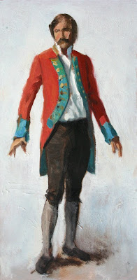
Granted, there are plenty of good reasons to study the nude figure. It’s a good way to learn principles of light and shade on form. It’s essential to understand the structure of the human figure beneath the garment. And the nude is the Everest for artists, given its expressive potential and interpretive subtlety.
But there’s an anatomy of costume, too. Fabric follows different principles from bone and skin. How many art schools or ateliers teach about velvet vs. satin, halflock vs. spiral folds, and dolman vs. set-in sleeves?
Blog: Gurney Journey (Login to Add to MyJacketFlap)
JacketFlap tags: Academic Painters, Paint Technique, Paint Technique, Academic Painters, Add a tag
You may recall the work of Atkinson Grimshaw, the Victorian moonlight specialist.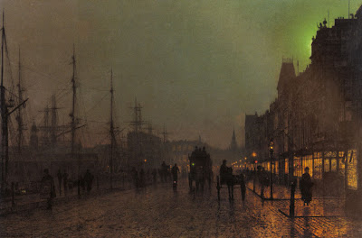 A typical finished Grimshaw dockside scene combines mysterious and atmospheric distances with the delicate tracery of rigging and other fine details.
What procedure did he follow to work out the perspective?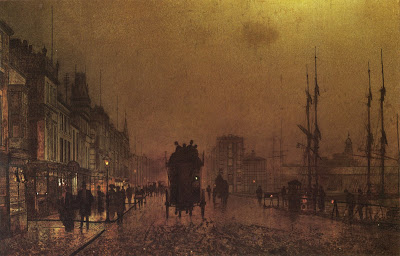
Fortunately there are a few unfinished Grimshaws which show his method. This one has a thin layer of brownish oil color scrubbed over the entire surface to establish the overall tonality and mood, but he has not yet moved on to the finished opaque rendering.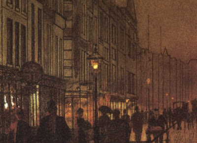
Here’s a detail of the same canvas. Grimshaw’s crisp preliminary line drawing shows right through the thin paint. I haven’t seen the original, but most likely the drawing was accomplished in India ink.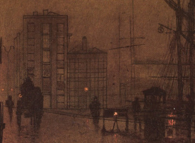
Grimshaw, like Bouguereau, Gerome, and many others in his day, preferred to have the foundational perspective work carefully completed in ink on the canvas before going on to the final painting. The drawing would eventually disappear under later opaque layers.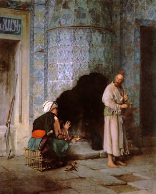 Gerome also used a perspective ink drawing on the canvas before he dove into his renderings of complex tilework.
Other painters like Sorolla, Sargent, Duveneck, and Zorn (and, more recently, Richard Estes and Frank McCarthy) took a more improvisatory approach, and “found it in the paint,” drawing loosely at first with the brush. Both methods are completely valid.
More about Atkinson Grimshaw at ARC.org
Previous posts on the color of moonlight, Link; on perspective grids, Link; and on a Dinotopia preliminary line drawing, Link.
Tomorrow: Your Khalian Sketches (Deadline noon today)
Blog: Gurney Journey (Login to Add to MyJacketFlap)
JacketFlap tags: Color, Journey to Chandara, Paint Technique, Add a tag
How do you get exactly the colors you want in a picture….and no others?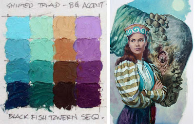
This is the third post in a Sunday series about a method called color wheel masking. The first post showed how color masks can help to analyze color schemes, and the second post explored different shapes of masks.
In this post I’ll demonstrate how to actually mix the colors you have chosen for a given painting.To start with, here’s the color wheel on the left. To the right above the palette paper are some primary colors of oil paint. You can use as many tube colors as you want at this stage. I just have little demo dabs of Winsor Red, Cadmium Yellow, Titanium White, and Ultramarine Blue.
Let’s say you want a monochromatic atmospheric triad with the dominant (and the most saturated) color in the red-orange range. Using your palette knife, mix a batch of each of the three colors that you see in the corners of the triangular gamut.
I've placed a little white box over those colors in this photo. In this case, it’s a saturated red-orange, a desaturated red-violet, and a desaturated yellow-green.
Now you’ve created the “heads of the families” or subjective primaries. Next, extend those colors into four different values or tones. Try to keep the hue and the saturation constant as you do so.
Look again at the color wheel mask. Halfway along the edge of the triangle are little marks indicating your secondaries. These are your in-between colors, which you may want to mix as well. You may end up mixing and working with anywhere from three to six strings of colors.
Before you start painting, remove from the palette all the tube colors that you squeezed out, except for white. This is important, because these colors are outside your gamut. You don’t want to have access to those anymore during the painting process.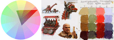
At left is a color wheel with a monochromatic atmospheric triad emphasizing red. This time it’s laid out on Tobey Sanford’s digital color wheel (link to download). On the far right are the color ranges I mixed. In the middle is the resulting painting from Dinotopia: Journey to Chandara.
This group portrait takes place in Dinotopia’s phosphorescent caverns in the book The World Beneath (1995). I wanted the colors to suggest a cool, magical ambiance. With the colors in this gamut, it’s impossible to mix any intense warms, even if you wanted to. But as your eyes adjust to the color mood, it feels complete. The relative warm colors appear enough warm in the context of the picture.
I have noticed that when I use the color wheel masking system I am more careful to keep my brushes clean and to push against the outside of my range. Harmony and unity are a given, so the effort goes into reaching for accents. It's the opposite of the color-mixing mindset when I'm mixing color from a full palette of tube colors, where I'm always neutralizing mixtures.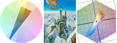
To conclude, here’s a painting from Dinotopia: A Land Apart from Time (1992), about the time when I first developed this method. I have digitally reconstructed the gamut I used for the narrow complementary color scheme.
Blog reader Briggsy provided the diagram on the right. He processed the image through a filter available for Windows users at couleur.org. What you’re looking at to the right of the painting above is an objective computer visualization of the actual color scheme.
As you can see, it corresponds pretty closely to the generating mask, proof that the system is giving us exactly the intended color scheme. The blue colors are very intense, almost touching the edge of the wheel. The rest of the colors are in a narrow swath running across the grey center to the weaker complements.
I look forward to hearing how this method works for you, either with traditional or digital techniques.
Blog: Gurney Journey (Login to Add to MyJacketFlap)
JacketFlap tags: Composition, Academic Painters, Paint Technique, Add a tag
If you paint in oil with big flat bristle brushes, it gives the painting a kind of “big pixel” look. Here’s a plein-air study I did of some rooftops.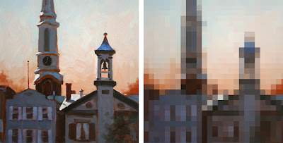 On the left is the actual painting, and on the right is a computer interpretation. The idea of the digitized version is to suggest the approximate module of the patches or brushstrokes. Each square is more or less equal to the width of the brush. So for a 16 x 12 inch painting, the brush was about a half inch wide.
I don’t think this painting was very successful. Part of the problem is that the units of detail are all about the same size throughout the picture. The effect is kind of clunky and simplistic, and there’s no center of interest. It’s like a whole symphony played at the same tempo and in the same key.
Let me propose this principle: a broad handling works better if there’s a center of interest in sharper focus.
You may have seen my painting of a McDonald’s sign before, but I want to make a different point with it. In the actual painting (oil, 10x8 inches), the word “McDonald’s” is painted as tightly and carefully as I could manage while standing outdoors in the parking lot.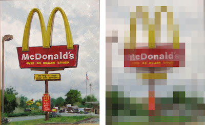
But the line of writing below “McDonalds” is almost not readable. And the type on the yellow and red signboards lower down are just suggested with blocky shapes. In the background, the scale of blockiness increases even more.
In the mosaic version of the painting at right, I’ve interpreted the image in two sizes of tiles, with smaller tiles near the center of interest to make the simple point about varying the module of brushstrokes.
This principle of the scaling of detail is one of the hallmarks of the late 19th century portrait painters, like Sargent, Zorn, Sorolla, or Valentin Serov. Serov isn’t well enough known in America. Here is his portrait of the composer Rimsky-Korsakov. Click on it; it's a big juicy file, thanks to Wikimedia Commons.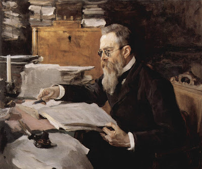
Serov painted the face in relatively tight focus, but he represented all other areas of the picture with rough strokes made with a bigger brush module.
I find this orchestration of detail deeply satisfying because it captures the way our eyes actually perceive the world. There’s a tight focus at the center of interest, and bigger shapes in the periphery. Serov gives us all the information we need to understand the character of the man, no less and no more.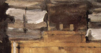 Look at this background detail from the Serov portrait. It has a wonderful “pixelly” abstract quality, like something caught at the edge of vision.
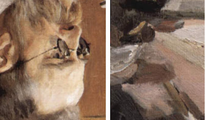
And here’s another detail, placed out of context next to the rendering of the face, and turned upside down to help us see them abstractly. Note that these two detail areas are shown at exactly the same relative scale of enlargement.
In context, the strokes effectively describe the clutter of papers on the desk. They don’t call attention to themselves as strokes or as paint. Instead they convey what they need to convey and then they keep encouraging the eye to return to the face and hands. If he had painted the outer areas with the same level of detail, the sense of immediacy would have been lost.
I call this scaling of brushstrokes the “stroke module.”
It’s a good general rule to strive for variety in the stroke module. Use a smaller stroke module (with smaller brushes or digital brush tools) for the center of interest, and then use bigger brushes and broader handling for the peripheral areas.
Blog: Gurney Journey (Login to Add to MyJacketFlap)
JacketFlap tags: Paint Technique, Add a tag
We took a look at speed blur on a previous post. Speed blur is what happens when a camera tracks along with a fast moving object, blurring the entire background along the line of action.
Motion blur is a little different. It’s what happens when a form moves rapidly in front of a stationary “camera.”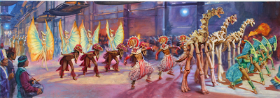
All live action film stills of rapidly moving objects have motion blur. The ability to simulate motion blur in CG animation was the revolutionary breakthrough that made the embryonic Pixar company take off in its first successful films. Very primitive CG animation, like traditional stop motion animation, left hard edges on moving objects, which gave a jittery rather than a fluid feeling to the motion.
As painters of still images—digital or traditional— we can take a lesson from these animation pioneers.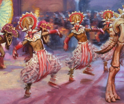
This oil painting from Dinotopia: First Flight (1999) shows dancers dressed up as dinosaurs parading at night through a city. They’re caught mid-stride in a wild dance. Their left feet are swinging forward, and their arms are flapping upward.
The faster the form is moving, the more it is blurred.
I painted in the figures and the background all wet together, and then softened all the edges in the direction of the line of action. For this kind of soft passagework, a slower drying medium helps.
To suggest that the “camera” was tracking along with the dancers, and to give a sense of shallow focus, I also blurred the details of the crowd across the street. If I had painted all these elements with crisp edges, they would have lost the feeling of depth and motion.
For more examples of motion blur in painting, have a look at the wildlife art of Manfred Schatz. Link.
Tomorrow: Giganotosaurus in Allentown
Blog: Gurney Journey (Login to Add to MyJacketFlap)
JacketFlap tags: Journey to Chandara, Paint Technique, Add a tag
Here’s a tip that really helps when you’re painting a scene with fairly complex perspective.
The image below is a photo of my pencil drawing on illustration board for “Scholar’s Stairway,” page 138 of Dinotopia: Journey to Chandara. Over that I have superimposed a slice of the final painting in oil, so you can see how the picture ended up.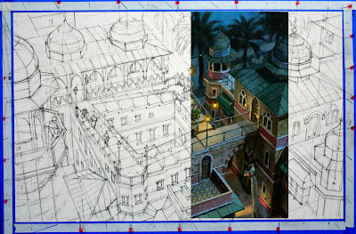
The perspective is fairly complicated, with three vanishing points, each one a few meters away from the edge of the painting. Rather than worrying about those remote VPs, I established a series of graduating slopes for each VP by means of a set of evenly spaced guide marks alongside the margins of the picture. They’re marked off on a piece of white tape superimposed over the low-tack blue tape at the edge of the painting.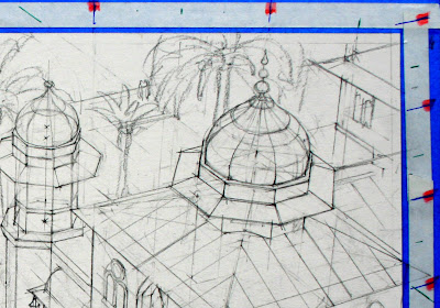
Any intermediate slope for any of the three vanishing points can easily be determined by lining up the mahl stick with the guide marks along the edge. Since the painting is not tied in space to the VPs, it can be moved around or turned upside down while you're working.
Having these guides was important in a painting like this, where the line drawing itself (including the center lines for the domes) was eventually covered up by the opaque paint. When the painting was finished, I stripped off all the tape, leaving a clean white edge around the image. Thanks to Ted Youngkin and Jack Wemp for teaching me this.
Blog: Gurney Journey (Login to Add to MyJacketFlap)
JacketFlap tags: Journey to Chandara, Paint Technique, Add a tag
Todd N. of Ontario, Canada emailed me yesterday asking about the paints, supports, mediums, and drying times for the Dinotopia artwork.
I admit that I haven't really explained my oil technique yet. I've been meaning to get to it, but since you asked, here it is.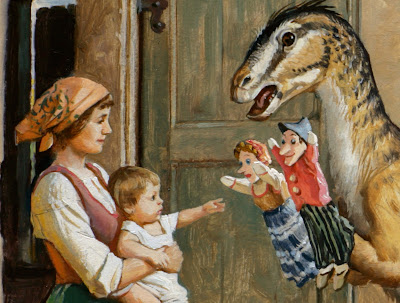 All of the paintings in the Dinotopia books are done with traditional oil paints. I use Gamsol turpentine to thin the paints. To extend the flow of the paint, I sometimes add a little Liquin painting medium. This alkyd medium accelerates drying time, but it dries to a matte surface, which needs varnishing at the end. I use Kamar spray varnish for the final varnish after the painting has completely dried.
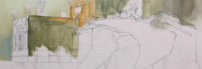 The mixing surface is a roll of white polyethylene-coated freezer paper, set up in a sloping palette arrangement. I use kerosene in a peanut butter jar for cleaning the brushes.
For some of the larger paintings I work on an acrylic-primed cotton canvas glued to ¼ inch birch plywood, but most of the paintings are worked out on heavyweight 100% rag illustration board. I use three different textures: smooth, medium, and rough surface. The brand I use, “Columbia 1776,” is, to my knowledge, no longer being manufactured, but there are equivalents out there. Below: canvas primed with a tint of light red gesso, with the sealed pencil drawing and partial oil block-in. Note pre-texturing in lower left.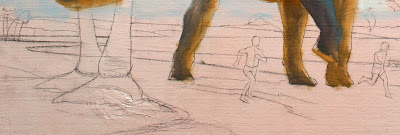 I don’t use tracings, light tables, or projected photos. Rarely, on large paintings on canvas, I’ll use an Artograph projector to blow up a compositional line drawing that I’ve worked out at a smaller scale. The drawing above was projected from a sketch.
Nine times out of ten, I’ll do the drawing in pencil directly on the illustration board. As I work out the drawing, I erase it often with a kneaded eraser until I'm satisfied with the linework and I’m ready to paint.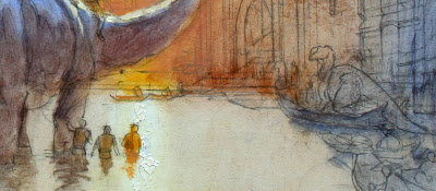
I then seal the drawing, first with Krylon workable fixative and then with Liquitex acrylic matte medium. The latter can be applied fairly thinly with a brush and then squeegeed off with a piece of mat board. That thin layer of acrylic medium will keep the oil paint from soaking into the board or disturbing the drawing. It’s at this point that I may pretexture the surface with acrylic modeling paste. You can see the texture above next to the orange figure.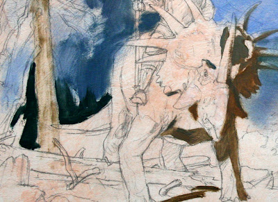
Over that sealed pencil drawing I sometimes block in with acrylic in the first layer to save time. I then begin with thin washes of oil. I often cover the surface with a complete tone (or "imprimatura") to get rid of the white and to set the basic color mood of the scene. Sometimes I'll block in with a complementary color, especially under a painting with a green tonality. Then I proceed with a quick overall block-in and a final rendering, usually working area-by-area, starting with the center of interest.
The nice thing about this way of working in oil is that you can lay down the paint opaquely, transparently, or a combination of opaque and transparent. While the paint is wet you can scratch through with the brush handle to get light accents. I don’t usually use accelerators or fast-drying mediums, except for the Liquin itself. Rarely, if I’m building up a light impasto with thick paint that has to dry by the next day, I’ll add a drop of cobalt drier to the supply of white paint. Since white paint insinuates itself into all the opaque mixtures, the drying agent does its work, and the whole painting is dry to the touch within 24 hours.
By the way, if you like this nuts-and-bolts stuff, check out Jeffrey Freedner's helpful comment about the palettes of the old masters at the end of yesterday's post on color. Thanks, Painterdog.
Todd, I hope that answers your question!
Blog: Gurney Journey (Login to Add to MyJacketFlap)
JacketFlap tags: Academic Painters, Paint Technique, Add a tag
Many people say they love a vigorous and direct brushwork that shows the touch of the hand. We all take pleasure in dazzling technique. But there’s a risk in making the brushstrokes the main subject of painting.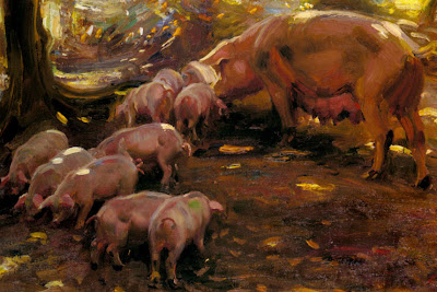
Above is a detail from “Pigs in a Wood, Cornwall” by Sir Alfred J. Munnings. Evidently he painted this from life with the pigs moving around in front of him in the dappled light of a forest. The technique is impressive, because every brushstroke describes form, movement, light, and local color.
Good technique like this happens when you try to convey the most complete illusion in the least time with the simplest means. The goal should be to make an accurate statement in the time allotted, not to dash off some eye-catching brushstrokes.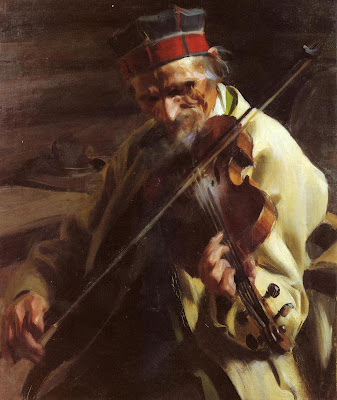 Above is another example of fine paint handling, this time by Anders Zorn. It’s painted with urgency and directness. He worked from life in a limited amount of time, probably an hour or two. We see beyond the paint surface to the musician’s chiseled face, the rosin from his bow, the cool light from the window.
Here’s a small detail from a magazine illustration in gouache by Harry Anderson from the 1950s, showing a group of sisters conferring about their grieving mother. It’s another example of a functional bravura that stops short of being self-indulgent. There’s no wasted effort. Most of the passages are kept wet together, softening the modeling and immersing most of the strokes.
All of these are quick paintings, all virtuoso efforts. Great paint technique can also be manifest in a carefully crafted month-long effort. In this case, the brushwork can still be economical, but it’s evident on a smaller scale of reference.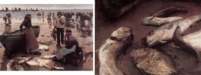 For example, here’s a painting from 1885 called “Fish Sale on a Cornish Beach” by Stanhope Forbes, along with a detail of the fish. Click to enlarge.
The painting took Forbes weeks to complete. He worked entirely outdoors from life. When you look at the painting, you see more than just the paint. You practically smell the fish.
Good technique always draws attention beyond the surface of the painting and toward something else, something intangible, something invisible—light, atmosphere, character, or story.
OK, so if these are examples of true virtuosity, where is the pitfall?
Unfortunately, by the end of the 19th Century, many artists became concerned primarily with the paint surface as an end in itself.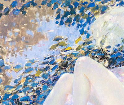
Here’s a detail of a painting by Frederick Frieseke from 1913. The paint strokes have taken on a life of their own. It’s a bit hard to tell what the strokes are trying to represent. They’re painted in a completely different style from the woman’s knees.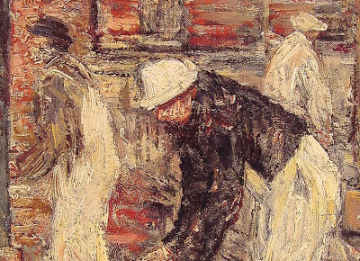
This detail is from a painting by Childe Hassam called “The Bricklayers.” Hassam seems to be stuck on the surface, too, as if he was just frosting a cake. What has he told us about these bricklayers, or about the environment they’re in, or about the light shining on them? Not much, because the paint gets in the way. It's not a problem with a lack of drawing ability. Both of these guys could draw well if they wanted to. The problem is with the thought process.
It’s easy to make a painting look like paint. But it’s a lifelong challenge to use paint to evoke the chill of autumn or the smell of a rose.
A century and a half ago, Asher B. Durand wrote that when execution “becomes conspicuous as a principal feature of the picture, it is presumptive evidence, at least, of a deficiency in some higher qualities.”
Blog: Gurney Journey (Login to Add to MyJacketFlap)
JacketFlap tags: Portraits, Journey to Chandara, Paint Technique, Add a tag
If you look at almost any portrait or wildlife photograph, you’ll notice that the background is out of focus. The same is true of sports or action photos.This shallow-focus quality, known to photographers as “depth of field” is a powerful way to control the viewer’s attention. For painters, controlling focal depth adds tremendous realism to close-ups, but surprisingly few artists use it.
This may be because our eyes naturally shift focus from near to far when we look at the real world. As a result, our minds construct the misleading impression that everything around us is in equally sharp focus.

The reason cameras produce a shallow depth of field is that when you photograph a subject with a telephoto lens or with the aperture wide open, the camera can only focus on one plane of distance at a time. Everything else is blurry, and the blur increases as objects get farther from the plane of focus. Very bright highlights burn out the film or digital sensors, and may appear as sharp-focused circles of various size.These details are taken from oil paintings for Dinotopia: Journey to Chandara to show how I used this photographic effect for fantasy paintings. If you’re painting in oil, you can use larger brushes and a wet-into-wet handling to achieve this impression.
But don’t overdo it. Effects like this are like a spice or a perfume, better if they are sensed unconsciously by the viewer, rather than jumping out as an obvious trick.
Blog: Gurney Journey (Login to Add to MyJacketFlap)
JacketFlap tags: Journey to Chandara, Paint Technique, Add a tag
This is the last of a three-part series on paint texture.
Rembrandt was a master at using impasto texture in the light areas of the picture, such as a necklace, a nose, or a collar. He used two devices to accentuate an area of impasto: “glazing in the pits” and “top-dragging.”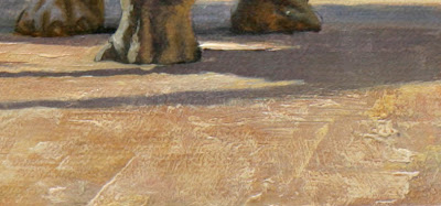 Glazing in the pits means dropping pigment into the hollows, nooks, and crannies of your impastos. You can see it here in the foreground of the painting “Market Square.” To do this, build up your impastos either with acrylic modeling paste (always before using the oil at all--never use acrylic over oil) or with oil paint mixed with a little cobalt drier to help it set up.
When it is completely dry, you can quickly glaze a thin layer of raw or burnt umber thinned down with turpentine. Most of it will sink naturally into the pits.
When that layer is dry, you can lift off the hint of the umber layer from the tops by using a smooth cotton rag with just a hint of turpentine. This will take away the glaze from the tops but leave it in the pits. But don’t try either of those last steps unless the surface is bone dry.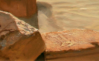 Glazing in the pits helped accentuate the texture on the rock on the right, above, a detail of "Desert Crossing" from Dinotopia: Journey to Chandara. These impastos were pretextured with modeling paste, and photographed a special way to bring out the 3-D quality.
The rock on the left is an example of top-dragging. To do this, I first painted the stone a bit lower in value over a pretextured base. When that was dry, I loaded a bristle brush with thick, light paint and dragged it over the base, allowing the the paint to come off on the top of the little mountains of impastos. In a couple of quick strokes, you can achieve a random quality of rock texture without a lot of fussy rendering.
Blog: Gurney Journey (Login to Add to MyJacketFlap)
JacketFlap tags: Paint Technique, Add a tag
Recently we looked at how directional lighting can bring out the tactile quality of canvas or rough surfaced illustration board. But machine-made background textures can get a bit monotonous on their own. You can customize the surface by “pretexturing” before going into the final painting. Even if you work fairly thinly in oil in the final stages, it will appear to have lots of “impasto,” or rough painterly surface.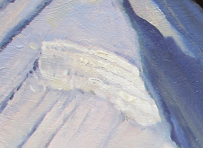 In the case of this image “Thermala: Alpine Hideaway” (page 76), I pretextured the entire board after the finished drawing was sealed with workable fixative and matte acrylic medium. To do this, you can use a mixture of modeling paste and matte medium (both acrylic based, and both fairly transparent). Brush this over the entire surface. The texture doesn't have to follow the details of the drawing very closely.
A good general rule is to build more impasto texture in the foreground areas and the light areas. Shadows and faraway misty regions tend to look better with a smoother surface.
Coming soon: The Rembrandt Effect.
Blog: Gurney Journey (Login to Add to MyJacketFlap)
JacketFlap tags: Paint Technique, Add a tag
The artwork for Dinotopia: Journey to Chandara was shot in a special way to bring out the three-dimensional texture of the oil paintings.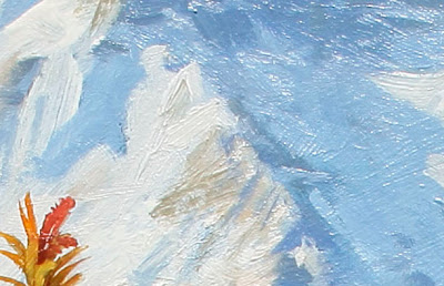
The standard way to light artwork for photography is to set up two lights directly across from each other. This arrangement tends to flatten out the ridges and bumps in the paint surface. Photographer Arthur Evans placed the lights more directionally.
His approach more effectively simulates the way the art would look if it were displayed on a wall beneath a skylight. Above is a detail of the painting “Chasing Shadows,” showing a background texture of stretched linen canvas.
“Most people think of paintings as two-dimensional,” Mr. Evans told me, “but I like to see them as three dimensional.”
Coming Soon: Part 2: Pretexturing Impastos


Hmm…I’d love to know why these changes were made too! Seems unnecessary, although both versions are very charming. Reminds me of the Swedish picture book Else-Marie and the Seven Little Daddies (reviewed in 32 Pages)-and the removal of the communal bathing scene for the North American version. Of course, with ‘One, Two, Three, Me’, it was an aesthetic decision rather than censorship, but you gotta wonder why the jackal was switched out for the giraffe in the English version! Must have been an interesting editorial meeting. I hope the illustrator got paid twice. Sadly, I don’t pay much attention to board books since I left the bookstore, but I certainly remember some very lovely titles. Your review made me very wistful. I’ll have to dive back in.
Donna McKinnon recently posted..Pigs On Ice
I want to know why they were changed too! I wonder if it’s just one of those things where someone has more time to think about something and then changes it. I do that all the time with writing!
Love your filling in the blanks activity, hope you don’t mind if I steal it!
Jen recently posted..Sora and the Cloud
Sorry Elli, I absolutely should have done, although it is not clear who the translator was. On the front cover of the English language version there is a second name – Jeremy Fitzkee – but I can’t be sure what role he played in the book.
Oooh thank you for this review! I am particularly interested in the original, as my children are growing up bilingually. Maybe the unusual choice of words is really good for us to help build vocabulary in the weaker language (German). And as the text is so simple it will give us plenty of time to discuss any unknown words. It is going on my wish list!
Maggy
maggy,red ted art recently posted..How to… Make Jar Terrarium
Hi Zoe! That’s an interesting question that you posed – I’m part of the organizing committee of the Asian Festival of Children’s Content this 2012 here in Singapore and we are planning on having a panel on translation – books that have been translated, the challenges faced by translators, the whole shebang. I am not sure whether we’re still pushing through with that panel, but you’ve raised great questions here that I’d be sure to ask if I’d have a chance to sit in that session. Great books, by the way! And yes, my library list is growing longer by the mile.
Myra from GatheringBooks recently posted..AWB 2012 Database