


new posts in all blogs
 By: Michelina Ouellette,
on 10/21/2016
By: Michelina Ouellette,
on 10/21/2016
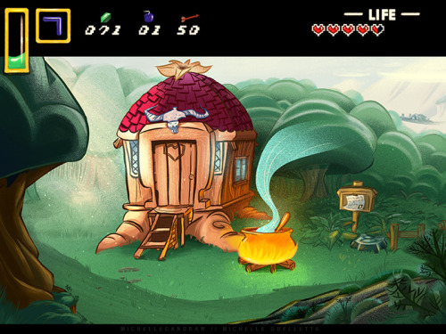
Blog: Michelle Can Draw (Login to Add to MyJacketFlap)
JacketFlap tags: illustration, background, zelda, layout, legend of zelda, a link to the past, background art, layout design, Add a tag
 By: Carter Higgins,
on 6/23/2015
By: Carter Higgins,
on 6/23/2015
Blog: Design of the Picture Book (Login to Add to MyJacketFlap)
JacketFlap tags: peter newell, concept, movement, line, layout, shape, rhomboid, the abcs of it, the slant book, Add a tag
 Add a Comment
By: Carter Higgins,
on 5/26/2015
Add a Comment
By: Carter Higgins,
on 5/26/2015
Blog: Design of the Picture Book (Login to Add to MyJacketFlap)
JacketFlap tags: scale, composition, movement, perspective, layout, Phaidon, size, Uncategorized, point of view, voice, Add a tag
By: Carter Higgins,
on 11/11/2014
Blog: Design of the Picture Book (Login to Add to MyJacketFlap)
JacketFlap tags: design, concept, scale, texture, composition, layout, Add a tag
By: Carter Higgins,
on 9/30/2014
Blog: Design of the Picture Book (Login to Add to MyJacketFlap)
JacketFlap tags: candlewick press, balance, pacing, negative space, perspective, line, layout, jon klassen, mac barnett, sam and dave dig a hole, design, Add a tag
 By: Joy Chu,
on 7/27/2014
By: Joy Chu,
on 7/27/2014
Blog: got story countdown (Login to Add to MyJacketFlap)
JacketFlap tags: American Sign Language, Joy Chu, Real life stories about illustrators, teaching children's book illustration, UCSD Illustrating Children's Books Workshop with Joy Chu, Gallaudet University Press, Debbie Tilley, ASL Dictionary for children, ASL for hearing and deaf children, lenticular, lenticular book cover, letterspelling, Peggy Lott, teaching American Sign Language, design, ABC, Richard Salzman, layout, ASL, Add a tag


 By: Carter Higgins,
on 4/30/2014
By: Carter Higgins,
on 4/30/2014
Blog: Design of the Picture Book (Login to Add to MyJacketFlap)
JacketFlap tags: color, space, balance, light, negative space, composition, color palette, abrams, layout, nikki mcclure, white space, paper cut, contrast, collect raindrops, design, Add a tag
By: Carter Higgins,
on 3/10/2014
Blog: Design of the Picture Book (Login to Add to MyJacketFlap)
JacketFlap tags: concept, rhythm, trailers, groundwood books, movement, line, layout, shape, cybele young, line direction, design, board book, balance, Add a tag
Tagged: board book, cybele young, groundwood books Add a Comment
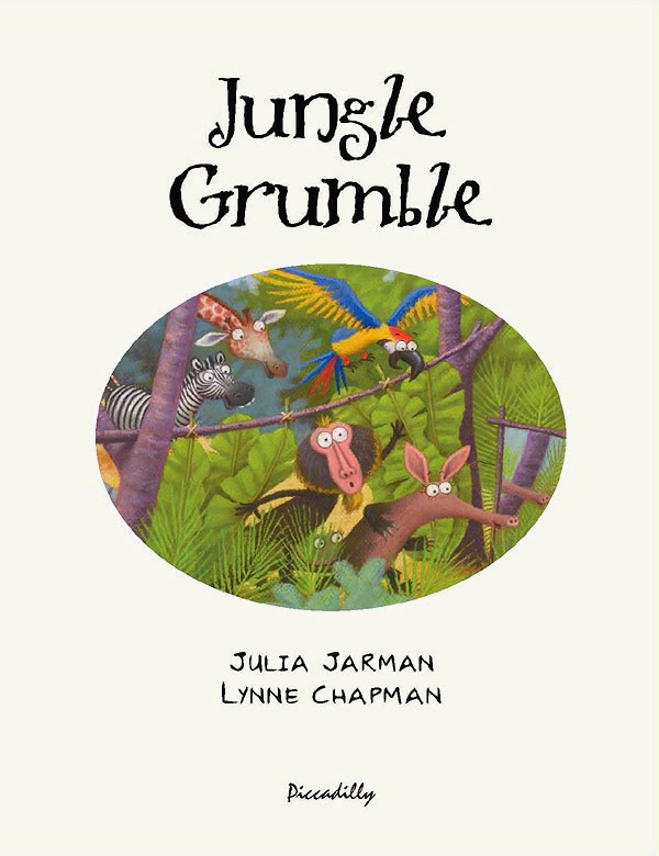
 By: Lynne Chapman,
on 3/7/2014
By: Lynne Chapman,
on 3/7/2014
Blog: An Illustrator's Life For Me! (Login to Add to MyJacketFlap)
JacketFlap tags: publisher, illustration, publishing, layout, Designer, hot tips, Jungle Grumble, Add a tag

By: Carter Higgins,
on 10/22/2013
Blog: Design of the Picture Book (Login to Add to MyJacketFlap)
JacketFlap tags: design, color, balance, pattern, texture, composition, layout, paul thurlby, unity, Add a tag
Tagged: color, paul thurlby, texture Add a Comment
By: Carter Higgins,
on 10/1/2013
Add a Comment
By: Carter Higgins,
on 10/1/2013
Blog: Design of the Picture Book (Login to Add to MyJacketFlap)
JacketFlap tags: design, harmony, wordplay, color, balance, pattern, rhythm, chronicle, composition, layout, shape, unity, paul rand, ann rand, sparkle and spin, Add a tag
By: Lynne Chapman,
on 9/5/2013
Blog: An Illustrator's Life For Me! (Login to Add to MyJacketFlap)
JacketFlap tags: planning, roughs, layout, hot tips, text overlays, illustration, Jungle Grumble, Add a tag

Before I put pencil to paper, I always ask my publishers to set the book's text in the chosen font, at actual size, so I know exactly how much space is needed. I then create blank templates for each spread in Photoshop (as above, with the gutter clearly marked), into which I place the text.
Obviously, until I have drawn the illustrations, nobody knows where the text needs to be positioned, so I am okay to move it around, as long as I follow basic design rules (like keeping an appropriate distance from the top / edges / gutter).
Mostly I keep the specified text on the particular spreads suggested by the publisher although, with Jungle Grumble, I did make a couple of changes. For instance, in my brief, this text at the very beginning of the story was split across 2 spreads:

Which seemed an unnecessarily slow start and, by combining both sets of text into one illustration, I freed up an extra spread for later in the book, which was very handy when we were in the thick of the action.
While doing the first thumbnails, I estimated the text area needed:

I then enlarged all the thumbnails and popped each into one of my Photoshop spread-templates. Dragging the bits of text into the positions my illustration idea demanded, I was able to see where more space was needed and rearrange the compositional elements accordingly.
Below is the spread that fits the template at the top of this post. You can see how I have divided the block of text into 3 sections, to make it more palatable to the reader and also easier to draw around. I have then placed the proper text in position on the enlarged thumbnail, replacing my estimated, hand-drawn text. This one fitted the actual text really well:

Using layout paper over the thumbnail print-out (which is translucent, allowing me to see enough of the thumbnail to guide me, but not too much, so no visual distraction as I redraw), I reworked the illustration, making sure I didn't get too close to the text.
My new drawing was re-united with the text when it was scanned and placed back into the Photoshop template, in place of the thumbnail:

Of course, the designer will now rework the text layout - mine is just a suggestion for how I think it best fits my illustrations. Sometimes it stays as is, other times they have ideas to make it funkier.
 By: Jerry Beck,
on 7/29/2013
By: Jerry Beck,
on 7/29/2013
Blog: Cartoon Brew (Login to Add to MyJacketFlap)
JacketFlap tags: Animators, Layout, Cartoon Modern, Chuck Jones, Maurice Noble, Add a tag
By: Carter Higgins,
on 5/6/2013
Blog: Design of the Picture Book (Login to Add to MyJacketFlap)
JacketFlap tags: design, Bengali Patua, joydeb chitrakar, scroll painting, the enduring ark, color, concept, composition, gita wolf, accordion, layout, tara books, Add a tag
Tagged: accordion, Bengali Patua, gita wolf, joydeb chitrakar, scroll painting, tara books, the enduring ark Add a Comment
By: Lynne Chapman,
on 4/25/2013
Add a Comment
By: Lynne Chapman,
on 4/25/2013
Blog: An Illustrator's Life For Me! (Login to Add to MyJacketFlap)
JacketFlap tags: libraries, illustration, Photoshop, workshop, digital, layout, characterisation, Add a tag

I am currently spending my time on Photoshop, trying to work out how to lay things out. It's so massive, and such a weird shape, I'm working on a one-tenth, low res mock-up, into which I have placed scans of all the animals, so I can move things around and re-size them, until it looks OK. Then I'll re-scan everything at the right size, as the final artwork will be created digitally (in sections and at one quarter size, so my computer doesn't blow its brain).
Although my initial chase idea sounded simple, I soon discovered that, if I don't want to end up with just a 'procession' of animals, in a long, uninteresting line, I will need to draw in incidental props, like bookshelves for animals to climb onto, or chairs for them to jump over. I might need to do some graphic things will colour in the background too (like I did with the cover of Swap!), to divide up the space. Not sure yet.
.jpg?picon=696) By: Alicia Padrón,
on 1/16/2013
By: Alicia Padrón,
on 1/16/2013
Blog: Picture Book Junkies (Login to Add to MyJacketFlap)
JacketFlap tags: alicia padron, layout, tara lazar, book construction, picture books, Add a tag

Here is a very useful post by the wonderful Tara Lazar that explains all the possible layouts on a typical 32 pg Picture Book.
Really worth checking it out! :o)
By: Lynne Chapman,
on 10/1/2012
Blog: An Illustrator's Life For Me! (Login to Add to MyJacketFlap)
JacketFlap tags: illustration, Swap, cover, planning, roughs, layout, characterisation, hot tips, Add a tag


Both my Art Director and Editor loved it - hurrah!
The patchwork letters were another brain-wave of John's by the way, the idea being that they are another DIY activity, like the home-made nose. I think they make it really funky: well done John x
By: Lynne Chapman,
on 8/8/2012
Blog: An Illustrator's Life For Me! (Login to Add to MyJacketFlap)
JacketFlap tags: drawing, planning, roughs, layout, Dogswap, Add a tag
By: Lynne Chapman,
on 7/17/2012
Blog: An Illustrator's Life For Me! (Login to Add to MyJacketFlap)
JacketFlap tags: publisher, illustration, publishing, drawing, planning, roughs, layout, characterisation, hot tips, Dogswap, Add a tag

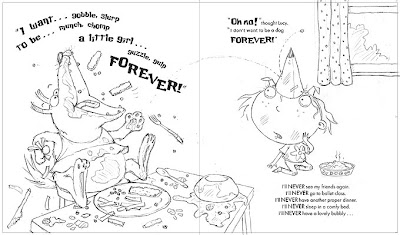
At the end of the story, Sparky finds out that little girls have baths every night. At last he wants to swap back.
Originally I had Lucy enjoying the bubble bath Sparky didn't want to have, with him sitting on the loo beside her, reading 'Ballet for Dogs'. But the text has changed slightly since then. Now the same conversation flows across both pages, so it makes no sense for them to be in a different part of the house.
So in an earlier drawing, I introduced a window...

By: Lynne Chapman,
on 5/23/2012
Blog: An Illustrator's Life For Me! (Login to Add to MyJacketFlap)
JacketFlap tags: drawing, process, planning, roughs, layout, hot tips, Dogswap, illustration, Add a tag

By: Lynne Chapman,
on 5/1/2012
Blog: An Illustrator's Life For Me! (Login to Add to MyJacketFlap)
JacketFlap tags: planning, roughs, layout, characterisation, Dogswap, illustration, Add a tag


By: Lynne Chapman,
on 9/28/2011
Blog: An Illustrator's Life For Me! (Login to Add to MyJacketFlap)
JacketFlap tags: publisher, illustration, cover, roughs, layout, Designer, characterisation, Baby Can..., Add a tag
On Friday, I finally got the go-ahead for the cover for Baby Can Bounce.

When I was deciding on the title, I could have chosen any of the featured actions, but I wanted to keep the alliteration that I established with Baby Goes Baaaaa!, which narrowed it down. Ultimately, Baby Can Bounce! is catchy, plus it's a fun, slightly silly action for a cover.
Inside the actual book, the 'Baby can bounce' page features the slug and snake:

Though the idea of a slug on a cover makes me laugh, slug and snake are not desperately cute and might put some people off (especially those with slug or snake phobias!), but one of my fave characters is the baby croc from Baby can dig:

What seems like months ago, Sarah, my designer at Egmont, sent me a basic cover layout, just to get the ball rolling and give me something to design around. That's really handy, as it gives me some idea how much space the title etc is going to need:
Display Comments Add a Comment
By: Lynne Chapman,
on 8/2/2011
Blog: An Illustrator's Life For Me! (Login to Add to MyJacketFlap)
JacketFlap tags: Editor, publisher, roughs, layout, Designer, Baby Goes Baaaa, Baby Can..., Add a tag

By: Lynne Chapman,
on 5/16/2011
Blog: An Illustrator's Life For Me! (Login to Add to MyJacketFlap)
JacketFlap tags: scans, Baby Goes Baaaa, publisher, illustration, Photoshop, digital, layout, Designer, Add a tag
While my trusty new side-kick gets my admin up to date, I am still working away at the computer, cutting out the illustrations for my new book Baby Goes Baaaaa!, lifting the pastel drawings from the digital scans, ready for the coloured backgrounds to be dropped behind.
But I quickly realised that making final decisions on the exact colours of the backgrounds needed to take priority, as changing them later would mean revisiting the cutouts.

 I substituted the brighter blue above for the more lilac-blue Sarah originally suggested, and I wasn't keen on the peachy yellow below.
By: Lynne Chapman,
on 2/7/2011
Blog: An Illustrator's Life For Me! (Login to Add to MyJacketFlap)
JacketFlap tags: drawing, cover, roughs, layout, characterisation, Baby Goes Baaaa, Add a tag
I'm due to get my feedback on the roughs for Baby Goes Baaaa! some time today. While I've been waiting for the final go-ahead, I've been taking another look at the cover design I began thinking about last week.
Sarah sent me some title text we could possible use, to help me get a feel for what space I had to play with, and I worked up the little sketch I showed you last time into this:
 I then had a play around with some other thoughts, incorporating different characters from inside the book. My editor said he was very keen on the bears, and so I woke up the sleepy, baby polar bear I showed you before, and gave him a go:

View Next 25 Posts
Viewing: Blog Posts Tagged with: Layout, Most Recent at Top [Help]
Results 1 - 25 of 62
Blog: Michelle Can Draw (Login to Add to MyJacketFlap)
JacketFlap tags: illustration, background, zelda, layout, legend of zelda, a link to the past, background art, layout design, Add a tag
By: Carter Higgins,
on 6/23/2015
Blog: Design of the Picture Book (Login to Add to MyJacketFlap)
JacketFlap tags: peter newell, concept, movement, line, layout, shape, rhomboid, the abcs of it, the slant book, Add a tag

by Peter Newell (Tuttle Publishing, 2001; originally published in 1910)
This book hopped back on my radar during my 2014 visit to the NYPL’s exhibit, The ABCs of it: Why Children’s Books Matter. (Check out the second to last picture in that post for cold, hard proof.)
It’s strange and silly and a playful use of the book’s form. Perfect, then, for a picture book.
It takes the shape of a rhomboid–not a rectangle, not a square. Because of that forty-five degree angle, the book itself drives the story.


Where Bobby lives, there is a hill–
A hill so steep and high,
‘Twould fit the bill for Jack and Jill
Their famous act to try
Thanks to that almost-literal twist, Bobby flies away from his poor, unsuspecting Nurse, and their nice walk through the neighborhood turns disastrous in a flash.


Page by page, to spot-on verse, Bobby leaves mayhem in his downhill wake. (And, of course, the story ends before his Nurse has to push him back uphill.)
Clever, unconventional, and a bit bizarre.
For form-lovers and geometry teachers and rhymers. For anyone who adores little weird picture books.


Want to see it in action? The Slant Book is in the public domain, so you can hear it here and see it here.
And in case you are looking for other beautiful rhomboids, these are pretty special. Artist and blogger Joanne Mattera curated the best of the shape for a lovely post.
A few favorites from Joanne’s collection:

Gudrun Mertes Frady
Cool Blue, 2009, oil and metallic pigments on wood, 18 x 18 inches

Doug Holst
Untitled, 2009, acrylic on wood, 12 x 12 inches

Altoon Sultan
#13, 2011, hand-dyed wool and egg tempera on linen, 11.75 x 13.5 inches
 By: Carter Higgins,
on 5/26/2015
By: Carter Higgins,
on 5/26/2015
Blog: Design of the Picture Book (Login to Add to MyJacketFlap)
JacketFlap tags: scale, composition, movement, perspective, layout, Phaidon, size, Uncategorized, point of view, voice, Add a tag

by Stella Gurney and Natsko Seki (Phaidon, 2013)
Do kids’ books have room for one more smart pigeon? You’ll be glad you let this one in, because Speck Lee Tailfeather is another flier with a healthy confidence and a chatty nature.


Speck’s mission is world travel, focusing on buildings from a bird’s point of view. He sees things differently.
His words are a travel journal of sorts to his pigeon friends. To his love, Elsie. And to us.


There’s a lot to look at, from speech bubbles to side bars to fascinating tidbits. The layout and voice are both unusual in the very best way. And if you just shake off what you expect from picture books and settle in, your flight from city to sky and back will be worth it.
Your tour guide, after all, is an expert in the unusual.


This one is for treasure hunters, trivia fanatics, architecture buffs, or anyone hungry for some off-the-wall-pigeon-fare. You never know.
Pair it with A Lion in Paris. Speck travels farther than France, but matching up the Parisian buildings (not to mention the books’ head-to-head size battle and their animal points of view) would be a fun thing for storytime.
By: Carter Higgins,
on 11/11/2014
Blog: Design of the Picture Book (Login to Add to MyJacketFlap)
JacketFlap tags: design, concept, scale, texture, composition, layout, Add a tag
 by Karina Schaapman (Dial, 2014; originally published in the Netherlands in 2011.)
This book.
This book is massive and mini all at once.
Its press release calls it Beatrix Potter meets I Spy. A fitting description, that one, but I might call it George and Martha meets The Ultimate Alphabet meets a craftier Cardboard Challenge.
This is the Mouse Mansion. Karina Schaapman spent years creating this architectural wonder, dreaming up more than 100 rooms and passageways and outdoor spots to explore.
She also dreamed up Sam and Julia, the teensy mice who live in its walls. Here they are. (Click to enlarge.) The Mouse Mansion is oversized and so is its book. It holds the best of treasures to look at and imagine. Sam and Julia have seventeen chapters of adventures together. They are small stories with big trouble, small creatures with big heart.
Sam and Julia don’t have enough pennies for the white chocolate with rice bubbles, so they buy broken cookies.
They smile about it.
Sam plays the violin and gives Julia the shivers.
But she’d never tell him how terrible he is.
They burn pancakes and make powdered sugared messes, but agree that pancake day is the very best day. That’s what best friends do.
My favorite of all of their escapades is their interaction with Sam’s grandpa, down at the fish market. Julia is shocked to see the pictures of an anchor on his arm and a pirate on his tummy.
Julia is very curious. “Why do you have all those drawings?” she asks. “What are they?”
Grandpa smiles. “They are not drawings,” he says. “They’re tattoos. And each one tells a story.”
Yes, you do. You need this treasure chest of a picture book. You need to see these two critters overload the washing machine and hoist barrels of lemonade up to the loft.
Just try not to squeal too loudly. The triplets are sleeping.
For more pictures of the Mouse Mansion’s bitty charm, check out this post by Julie Danielson at the smorgasbord that is Seven Imp.
Thanks to Amanda and Caitlin at Penguin for the images and a review copy of the book. Thoughts my own.
Add a Comment
By: Carter Higgins,
on 9/30/2014
Blog: Design of the Picture Book (Login to Add to MyJacketFlap)
JacketFlap tags: candlewick press, balance, pacing, negative space, perspective, line, layout, jon klassen, mac barnett, sam and dave dig a hole, design, Add a tag

by Mac Barnett and Jon Klassen (Candlewick Press, 2014)
You know Mac and Jon. You love Mac and Jon. Now meet Sam and Dave. You’ll love Sam and Dave.
Don’t rush into the pages just yet. This is one of the best covers I’ve seen in a long while. If we weren’t so aware that Jon Klassen (that insta-recognizable style!) is a contemporary illustrator, I would wholeheartedly presume that it was some vintage thing in a used bookstore. A find to gloat about, a find that makes you wonder just how you got so lucky.
The hole. The space left over. The words, stacked deeper and deeper. The apple tree whose tippy top is hidden. Two chaps, two caps, two shovels. One understanding dog.
Speaking of two chaps, two caps, and two shovels, check out the trailer.
(I’ll wait if you need to watch that about five more times.)
The start of their hole is shallow, and they are proud. But they have only just started. Sam asks Dave when they should stop, and this is Dave’s reply:
“We won’t stop digging until we find something spectacular.”
Dave’s voice of reason is so comforting to any young adventurer. It’s validating that your goal is something spectacular. (Do we forget this as grownups? To search for somthing spectacular? I think we do.)
Perhaps the pooch is the true voice of reason here, though he doesn’t ever let out a bark or a grumble. Those eyes, the scent, the hunt. He knows.

(click to enlarge)
And this is where Sam and Dave Dig a Hole treads the waters of picture book perfection. The treasure, this spectacular something, is just beyond the Sam and Dave’s reality. The reader gets the treat where Sam and Dave are stumped. Do you want to sit back and sigh about their unfortunate luck? Do you want to holler at them to just go this way or that way or pay attention to your brilliant dog? Do you root for them? Do you keep your secret?
The text placement on each page is sublime. If Sam and Dave plant themselves at the bottom of the page, so does the text. If the hole is deep and skinny, the text block mirrors its length. This design choice is a spectacular something. It’s subtle. It’s meaningful. It’s thoughtful and inevitable all at once.

(click to enlarge)
And then – then! Something spectacular. The text switches sides. The boys fall down. Through? Into? Under? Did the boys reach the other side? Are they where they started? Is this real life? Their homecoming is the same, but different. Where there was a this, now there is a that. Where there was a hmm, now there is an ahhh.
Spectacular indeed.
I like to think that the impossible journey here is a nod to Ruth Krauss and Maurice Sendak’s collaboration, A Hole is to Dig. That’s what holes are for. That’s what the dirt asks of you. It’s not something you do alone or without a plan or without hope. Sam and Dave operate in this truth. They need to dig. There’s not another choice.

(image here // a first edition, first printing!)
Sidenote: I’m pretty thrilled that these scribbles live in my ARC.

Look for this one on October 14th.
SAM AND DAVE DIG A HOLE. Text copyright © 2014 by Mac Barnett. Illustrations copyright © 2014 by Jon Klassen.Reproduced by permission of the publisher, Candlewick Press, Somerville, MA.
By: Joy Chu,
on 7/27/2014
Blog: got story countdown (Login to Add to MyJacketFlap)
JacketFlap tags: American Sign Language, Joy Chu, Real life stories about illustrators, teaching children's book illustration, UCSD Illustrating Children's Books Workshop with Joy Chu, Gallaudet University Press, Debbie Tilley, ASL Dictionary for children, ASL for hearing and deaf children, lenticular, lenticular book cover, letterspelling, Peggy Lott, teaching American Sign Language, design, ABC, Richard Salzman, layout, ASL, Add a tag

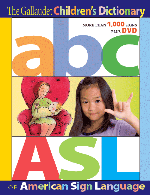
This may be the first book cover that actually teaches how to letterspell “A B C” in American Sign Language! (click to enlarge)
Let’s start with unveiling the cover itself. It features a lenticular!
And it’s going on press this month! I’m so excited!
Why? Because it all began as a list of words on a spread sheet almost five years ago. Gallaudet University Press lined up a team of illustrators for their upcoming definitive American Sign Language reference (think Merriam-Webster, but for signing), aimed at the pre-school through grade 3 level. It had to be usable for hearing families as well as the deaf and hearing-impaired.

Page 1 from the Dictionary
One of the illustrators already on board was Debbie Tilley. When agent Richard Salzman discovered it was (a) Gallaudet first foray into children’s books and general trade; and (b) they expected Debbie to produce the layouts too, he recommended they contact me to pull it all together for them. It was a dream project for all of us!


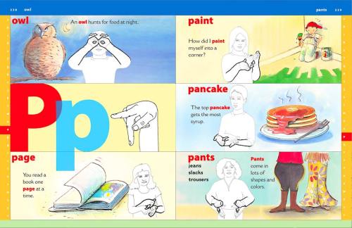
392 pages of full color! It looks like a graphic comic, with over 1,000 word entries, fully illustrated. Plus it includes a DVD featuring a rainbow of children signing. There’s also a special feature on forming sentences.
Over the next few weeks, I’ll guide you on the process. It will be like a diary on the making of a children’s reference classic. . .

Spread from pages 238-239 (click to enlarge)
You will witness exclusive behind-the-scenes book making. Stay tuned. That’s why I’ve been away for so long. Been dictionary-ing…
0 Comments on Stop the Presses…and START HERE! as of 1/1/1900
Add a Comment
By: Carter Higgins,
on 4/30/2014
Blog: Design of the Picture Book (Login to Add to MyJacketFlap)
JacketFlap tags: color, space, balance, light, negative space, composition, color palette, abrams, layout, nikki mcclure, white space, paper cut, contrast, collect raindrops, design, Add a tag

published 2014 by Abrams Books (reissue)
Every soul who has seen Nikki McClure’s art has loved it. I’m sure there are studies and statistics on that, trust me. It looks as elegant on an iPhone case as it does on a gift tag or greeting card.
But then there are books, and thank goodness she makes them. This edition of Collect Raindrops has been reissued in an expanded form and a new format. It’s based on her ongoing calendar series, and begs to take up permanent residence on your coffee or bedside table. Don’t just stick it on the shelf. You’ll want this one at easy reach. It’s gorgeous to touch, to see, and to behold.

 Here, her pictures are gathered by their season, each introduced with love letters to their very time and place.
“Some people just need help to see the obvious. And that’s what artists are for.”
That sentiment comes from this short film that demystifies her process but reveals a lot of magic. She calls it corny, but I call it lovely:
![]() She says her paper cuts are like lace, and everything is connected. Before it’s in a book, can’t you picture what that art looks like held up against a light? Physically, the paper that remains envelops the paper that is gone. Like knots, or filaments, or branches. How beautiful then, that her subject is often community. Shared memories and experiences.
She says her paper cuts are like lace, and everything is connected. Before it’s in a book, can’t you picture what that art looks like held up against a light? Physically, the paper that remains envelops the paper that is gone. Like knots, or filaments, or branches. How beautiful then, that her subject is often community. Shared memories and experiences.

 The contrast is what connects us. As much story lives in what’s been carved away as what sticks behind. But by simple definition, contrast means difference, and in design, your brain is searching for dominant elements. This art contrasts light and dark, filled and white space, and in those separations paints a portrait of community.

 And then there’s the case cover itself. A web, a symbol itself of creativity and connection, binds the pages together.
 Isn’t that remarkable?
- Check out Brain Pickings recent feature of Collect Raindrops here.
- Here’s a look at the previous edition’s cover.

Tagged: abrams, collect raindrops, contrast, light, negative space, nikki mcclure, paper cut ![]()
By: Carter Higgins,
on 3/10/2014
Blog: Design of the Picture Book (Login to Add to MyJacketFlap)
JacketFlap tags: concept, rhythm, trailers, groundwood books, movement, line, layout, shape, cybele young, line direction, design, board book, balance, Add a tag

 by Cybèle Young
published 2014 by Groundwood Books Don’t you hate throwing your ball out the window and being too short to see where it bounces? The worst.
 But the worst gets better, because in its place a spectacular parade clash-crashes by. Except when you’re a frantic, too-short creature, it’s really hard to see over the windowsill. Good thing you’re a clever whippersnapper, and push that chair up to take a peek.

 And just when you can finally see outside, the book tells you to turn around.
You’ll stumble smack dab into the spectacle.
Juggling shrimp on a unicycle! A bat on a hanging, clangy contraption! Pink swans pulling a turtle on a wagon!

 Thanks to this parade, you might just get your ball back. It’s one fantastic game of catch.
And check out this trailer to see the book in its glorious action. Mesmerizing.
P.S. – Remember the Twitter chat with Groundwood Books and Cybèle Young? The transcript is here, if you want to add to your art-to-study and books-to-love pile. It was such fun!
Tagged: board book, cybele young, groundwood books
By: Lynne Chapman,
on 3/7/2014
Blog: An Illustrator's Life For Me! (Login to Add to MyJacketFlap)
JacketFlap tags: publisher, illustration, publishing, layout, Designer, hot tips, Jungle Grumble, Add a tag
I managed to get all my Jungle Grumble finishing work done in time, so that's me finished until proofs come back from the printer.
The publisher is now setting up the final designs. My designer at Piccadilly sent me low-res versions of how the spreads will look with text. Now she has my finished digital illustrations, she will be fine-tuning the designs and placing all the text into position, ready for proofing. This is how the first spread is going to look:
They have also created designs for the 'extras', like the back cover and the title page, using sections from the existing illustrations. This is the title page design:
It's all perfect timing, because of course I am out of the studio most days at the moment, visiting schools. Today I am actually in a school in Sheffield, so nice and close for a change, but sadly no chance for train sketching.
0 Comments on Jungle Grumble: How it's Going to Look as of 3/7/2014 4:34:00 AM
Add a Comment
By: Carter Higgins,
on 10/22/2013
Blog: Design of the Picture Book (Login to Add to MyJacketFlap)
JacketFlap tags: design, color, balance, pattern, texture, composition, layout, paul thurlby, unity, Add a tag
 by Paul Thurlby
{published 2013, by Templar}
You know you have a book problem when you forget what lives in your piles. I bought this book when it pubbed back in March, and that tiger’s binocular’d glare stared me down the other day. I snatched it from the pile with the furious preying eyes of the creatures bound in this book.
(Dramatic? Sorry. You must not have heard Carmina Burana playing in the background of my opening monologue. Do you hear it now?!) In the early days of this blog (almost two years ago!), I wrote about Paul Thurlby’s Alphabet. I made lame jokes about Thanksgiving (‘if you’re stuffed, feast your eyes on this!’), so as you can see my wit and humor hasn’t improved much since.
Good thing Paul Thurlby has.  And that statement is a stretch as commentary on his genius, but I do think I might like this one even more than his last. This is a mashup of pictures and words in the most clever of ways.
 Each page shows us an animal bursting with personality. Look at that rat! (Reminds me of these rodents a little bit!) And each is captioned with a quirky fact which explains just what the heck is happening in the illustration. Here, it’s:
Keeping their skin moist by showering is important for elephants’ health.
and
Rats spend a third of their lives washing themselves.
Dolphins sleep with one eye open, while resting one half of their brain at a time.
Lions hunt at night, thanks to their ability to see well in the dark.
 Because the factoids lean toward kooky, the pictures’ silliness both shine and remain surprising.
 When I talked about Paul Thurlby before, I mentioned unity. Still holds. Still a package wrapped up in perfect pictures and words. But what I am most drawn to in his work are his textures.
  The grid, the distressed edges, the scratches, tape, and imperfections – all of those design decisions add a layer of warmth and grit to a bunch of terrifying but desperately adorable creatures.
Watch out for giraffes if you’re on stilts and run across them in the wild. They have 21-inch tongues!
Tagged: color, paul thurlby, texture
By: Carter Higgins,
on 10/1/2013
Blog: Design of the Picture Book (Login to Add to MyJacketFlap)
JacketFlap tags: design, harmony, wordplay, color, balance, pattern, rhythm, chronicle, composition, layout, shape, unity, paul rand, ann rand, sparkle and spin, Add a tag

By Ann and Paul Rand
{originally published 1957 by Harcourt, Brace, and World. Reprinted 2006 by Chronicle Books.}
 Sometimes pictures are just that: eye-catching and whimsical, without being packed with meaning or message. That spirit dances across the page in Sparkle and Spin, written by Ann Rand and illustrated by her husband Paul.
Paul Rand is an iconic American graphic designer. A problem solver. A storyteller. A communicator.
He said this about design:
“Good design adds value of some kind, gives meaning, and, not incidentally, can be sheer pleasure to behold.”![]()

 His biographer, Steven Heller, said this:
“Paul Rand did not set out to create classic children’s books, he simply wanted to make pictures that were playful. Like the alchemist of old, he transformed unlikely abstract forms into icons that inspired children and adults and laid the foundation for two books that have indeed become children’s classics.”
Maybe he didn’t intend to be a creator of legendary books for kids, but his love for beautiful work shines in this one. That’s the magic of Sparkle and Spin: harmony, wit, and playfulness.

 And Ann’s words are a delightful match to Paul’s pictures. There’s a rhythm, song, and honor to these words that represent the joy of learning. Harmony, captured perfectly.
In graphic design, harmony is the magic that happens when all of the individual elements complement one another. It’s when small parts of pretty make up a more lovely whole.![]()
 Here’s a detail I really love. This bold, graphic ice cream cone comes at the beginning, and with the inscription: To all children who like ice cream. And at The End, that scoop’s been slurped, chomped, and devoured. That’s what the experience of this book is. Tasty.
The book sparkles and spins. You’ll see what I mean.
Tagged: ann rand, chronicle, color, harmony, pattern, paul rand, shape, sparkle and spin, wordplay ![]()
By: Lynne Chapman,
on 9/5/2013
Blog: An Illustrator's Life For Me! (Login to Add to MyJacketFlap)
JacketFlap tags: planning, roughs, layout, hot tips, text overlays, illustration, Jungle Grumble, Add a tag
I thought it might be interesting to use my work on Jungle Grumble to talk about how I design around text. One common error made by would-be children's book illustrators, is forgetting that quite a lot of space needs to be created in your illustration for the words.
This can be a challenge if the illustrations need to be busy. Though ideally the text is evenly spread through the book, this is not always possible, depending on the action. Some spreads can end up very 'text-heavy'. Others have lots of dialogue and all those new lines make the text expand down the page:

Before I put pencil to paper, I always ask my publishers to set the book's text in the chosen font, at actual size, so I know exactly how much space is needed. I then create blank templates for each spread in Photoshop (as above, with the gutter clearly marked), into which I place the text.
Obviously, until I have drawn the illustrations, nobody knows where the text needs to be positioned, so I am okay to move it around, as long as I follow basic design rules (like keeping an appropriate distance from the top / edges / gutter).
Mostly I keep the specified text on the particular spreads suggested by the publisher although, with Jungle Grumble, I did make a couple of changes. For instance, in my brief, this text at the very beginning of the story was split across 2 spreads:

Which seemed an unnecessarily slow start and, by combining both sets of text into one illustration, I freed up an extra spread for later in the book, which was very handy when we were in the thick of the action.
While doing the first thumbnails, I estimated the text area needed:

I then enlarged all the thumbnails and popped each into one of my Photoshop spread-templates. Dragging the bits of text into the positions my illustration idea demanded, I was able to see where more space was needed and rearrange the compositional elements accordingly.
Below is the spread that fits the template at the top of this post. You can see how I have divided the block of text into 3 sections, to make it more palatable to the reader and also easier to draw around. I have then placed the proper text in position on the enlarged thumbnail, replacing my estimated, hand-drawn text. This one fitted the actual text really well:

Using layout paper over the thumbnail print-out (which is translucent, allowing me to see enough of the thumbnail to guide me, but not too much, so no visual distraction as I redraw), I reworked the illustration, making sure I didn't get too close to the text.
My new drawing was re-united with the text when it was scanned and placed back into the Photoshop template, in place of the thumbnail:

Of course, the designer will now rework the text layout - mine is just a suggestion for how I think it best fits my illustrations. Sometimes it stays as is, other times they have ideas to make it funkier.
4 Comments on Designing a Picture Book Spread: Placing Text, last added: 9/7/2013
Display Comments
Add a Comment
By: Jerry Beck,
on 7/29/2013
Blog: Cartoon Brew (Login to Add to MyJacketFlap)
JacketFlap tags: Animators, Layout, Cartoon Modern, Chuck Jones, Maurice Noble, Add a tag

In their new episode, the podcast 99% Invisible profiles legendary layout artist Maurice Noble. Noble made significant contributions to Disney films like Dumbo and Bambi, but he is better known for his layout and design work with Chuck Jones on memorable Warner Bros. shorts like Duck Amuck, Duck Dodgers in the 24½th Century, Ali Baba Bunny, What’s Opera, Doc?, and the Road Runner/Wile E. Coyote series.
That’s why it may be surprising for many readers to learn in this podcast about the personality battles between Noble and Jones, and how the two men weren’t particularly fond of one another despite their frequent collaborations. The subjects who were interviewed for the podcast are reliable authorities on Noble: his biographer Bob McKinnon; Tod Polson whose upcoming book about Noble’s techniques will be a must-own; and Pixar artist Scott Morse, who worked with Noble early in his career.
(Thanks, Bob Flynn)
Add a Comment
By: Carter Higgins,
on 5/6/2013
Blog: Design of the Picture Book (Login to Add to MyJacketFlap)
JacketFlap tags: design, Bengali Patua, joydeb chitrakar, scroll painting, the enduring ark, color, concept, composition, gita wolf, accordion, layout, tara books, Add a tag

by Joydeb Chitakrar and Gita Wolf
{published 2013, by Tara Books}
Get ready. You may never have seen anything like this before. Have you ever read something that you feel like should be in a museum and not in your hands? And then you realize that’s the whole point of the perfection and portability of picture books, but still your mouth hangs open in awe?

This is one of those books.
The Enduring Ark is a retelling of the flood story from Genesis, and this line from the first page enveloped me in its storytelling.
You may have heard this story before, but great tales deserve to be repeated – and so let me tell it here again, in my way.

And so it goes, this age old story with a breath of new words. Spare text, stunning imagery. The strong lines hold bold saturated color. And I’m dearly smitten with the two crabs!
They found all forms of creatures: large and small, fierce and tame, with feet, and fins, wearing fur, scales and feathers.

The book itself can be read page by page, left to right, as you are quite familiar with. But it also extends out like an accordion, the story literally unfolding before you.


Tara Books, of Chennai, South India, calls themselves a ‘collective of dedicated writers, designers and artists who strive for a union of fine form with rich content.’ This accordion-style scroll painting is the Bengali Patua style, which historically has been used to visualize mythological stories and aid the narration of a storyteller. What a sublime medium for their mission to unite fine form with rich content, right?

Also interesting? On the cover, the artist is named before the writer. Perhaps it’s because the words are a retelling? Or because the design of the book is what makes it extra special? I’m not sure, but I found that really lovely.
The Enduring Ark releases on May 14, 2013. If you are a fan of book design, fantastic story, and clever engineering, don’t miss this innovative book!
Big thank to the publisher, Tara Books, for providing a copy of this book for review. Why not connect with them on Twitter or Facebook if you think their work is magical, too?!
Tagged: accordion, Bengali Patua, gita wolf, joydeb chitrakar, scroll painting, tara books, the enduring ark
By: Lynne Chapman,
on 4/25/2013
Blog: An Illustrator's Life For Me! (Login to Add to MyJacketFlap)
JacketFlap tags: libraries, illustration, Photoshop, workshop, digital, layout, characterisation, Add a tag
A while ago I mentioned a mural project that I am doing, based on children's drawings created during an illustration workshop, focussing on characterisation and movement. The wall I have to cover, at Wakefield Library, is over 13 metres long, but only 2 metres high - very long and thin - so the idea is to create a chase scene along it, as if the children's animals are running through the library.
I let the teachers take the drawings back to school with them, for the kids to finish off. Unfortunately, instead of posting them a couple of days later, as promised, it took them 6 weeks and repeated hassling, so I am only now getting down to it.

I am currently spending my time on Photoshop, trying to work out how to lay things out. It's so massive, and such a weird shape, I'm working on a one-tenth, low res mock-up, into which I have placed scans of all the animals, so I can move things around and re-size them, until it looks OK. Then I'll re-scan everything at the right size, as the final artwork will be created digitally (in sections and at one quarter size, so my computer doesn't blow its brain).
Although my initial chase idea sounded simple, I soon discovered that, if I don't want to end up with just a 'procession' of animals, in a long, uninteresting line, I will need to draw in incidental props, like bookshelves for animals to climb onto, or chairs for them to jump over. I might need to do some graphic things will colour in the background too (like I did with the cover of Swap!), to divide up the space. Not sure yet.
Right: back to it...
6 Comments on Library Mural: Designing the Layout, last added: 4/26/2013
Display Comments
Add a Comment
By: Alicia Padrón,
on 1/16/2013
Blog: Picture Book Junkies (Login to Add to MyJacketFlap)
JacketFlap tags: alicia padron, layout, tara lazar, book construction, picture books, Add a tag

Graphic by Tara Lazar
Really worth checking it out! :o)
2 Comments on Great Links- Picture Book Construction, last added: 1/17/2013
Display Comments
Add a Comment
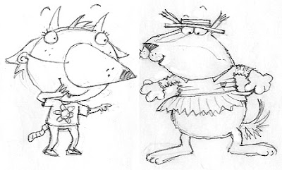
By: Lynne Chapman,
on 10/1/2012
Blog: An Illustrator's Life For Me! (Login to Add to MyJacketFlap)
JacketFlap tags: illustration, Swap, cover, planning, roughs, layout, characterisation, hot tips, Add a tag
I managed to get all my 'cut-outs' done in time (phew) and the book's mock-up will be in production at Gullane as we speak, ready for presentation at the Frankfurt Book Fair, to try and hook interest for as many co-editions as possible.
But I had yet another cause to put my pastel artwork on hold: a cover design was needed too. We often leave the cover design to the end - I am more familiar with the characters by then and it's easier to get a feel for what would work, once you can see the rest of the artwork.

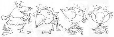
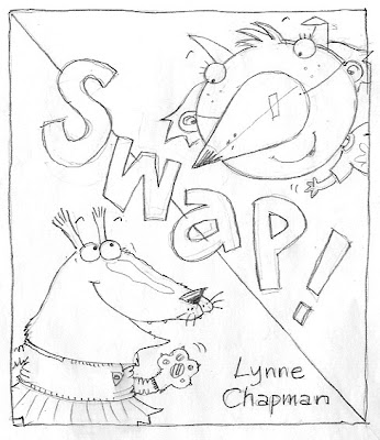
Anyway, I needed to come up with something in a hurry. I felt both characters needed to be on the front, but nothing much else (apart from the title etc, obviously), to keep it punchy. I did the sketch above as a starting point, but felt it needed more humour, so thought I could use the dog food problem to make things more funny. The ice-cream seemed to work well for Sparky and I tried out 3 alternative versions of Lucy:

One fundamental problem though, is that two characters side by side create a very landscape-format illustration, for what is a portrait-format cover. That means they would ultimately be quite small in the space.
My Art Director suggested I move them closer together, having them hugging, which would help the format and also make it a warmer relationship.

Trouble is, Lucy has a very wide head, so she can't easily get close without eclipsing Sparky, and his long nose has to face away from her, or they'd collide. Plus, his school uniform begins to disappear behind her and it all gets a bit visually confusing.
'We need a more graphic approach,' said my Art Director. So I played with having the characters poking in top and bottom, using blocks of colour to hold them in place and break up the space. John suggested the curly shape below and the idea that the title letters could swap colours with the background shapes, to echo the theme.
'We need a more graphic approach,' said my Art Director. So I played with having the characters poking in top and bottom, using blocks of colour to hold them in place and break up the space. John suggested the curly shape below and the idea that the title letters could swap colours with the background shapes, to echo the theme.

Then I had another go at bringing the two characters together, keeping the colour-swapping idea, but using hand-holding instead of hugging. I also tried a slightly simpler version of John's idea then sent these three designs back to the Art Director.

She liked the third, simpler one best, but said it needed more humour, rightly pointing out that, unless you've read the story, Sparky could be just another animal wearing clothes, as they so often do in picture books: people might not get the 'swapping' idea and so Lucy's nose would just be confusing. She also preferred Sparky's ballet outfit to the school uniform.
I had deliberately shied away from using the ballet costume on the cover, since I discovered Dogs Don't Do Ballet: Sara Ogilvie unfortunately uses a very similar outfit. But the ballet costume did offer more scope for extra humour. I managed to squeeze Sparky's foot, with Lucy's tiny shoe, into the picture then looked on Google for other children's ballet accessories and found the tiara. Just to be on the safe side, I gave Lucy a bone, to underpin the idea that she is supposed to be in a dog disguise:
I had deliberately shied away from using the ballet costume on the cover, since I discovered Dogs Don't Do Ballet: Sara Ogilvie unfortunately uses a very similar outfit. But the ballet costume did offer more scope for extra humour. I managed to squeeze Sparky's foot, with Lucy's tiny shoe, into the picture then looked on Google for other children's ballet accessories and found the tiara. Just to be on the safe side, I gave Lucy a bone, to underpin the idea that she is supposed to be in a dog disguise:

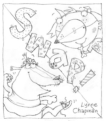
Both my Art Director and Editor loved it - hurrah!
The patchwork letters were another brain-wave of John's by the way, the idea being that they are another DIY activity, like the home-made nose. I think they make it really funky: well done John x
see more of my work at www.lynnechapman.co.uk
9 Comments on Evolution of an Idea: Creating a Cover Illustration, last added: 10/10/2012
Display Comments
Add a Comment
By: Lynne Chapman,
on 8/8/2012
Blog: An Illustrator's Life For Me! (Login to Add to MyJacketFlap)
JacketFlap tags: drawing, planning, roughs, layout, Dogswap, Add a tag
This week I am working on Swap! again.
I sent the last of the re-draws off to the publisher a few weeks ago. Normally they turn them round really quickly, but it's holiday time of course. Actually, I didn't mind the delay: it did me a favour and gave me time to fit in all those library workshops.

We are so nearly there now: just one spread that needs a 2nd redraw and some extra work, creating a different set of endpapers for the front.
The redraw is the illustration of the ballet class above. It's the part of the story when Lucy discovers she can't swap back to being a little girl again. My art director felt their dialogue needed to be closer to them, as this is a crucial turning point in their relationship. But Mum is in the way, so she suggested I incorporate more parents and sit Mum with them at the back, creating a new space for text in the middle:

I got a bit blind to it in the end, so John came to help and provide a fresh pair of eyes. He suggested I go back to the original and work harder at moving Mum out of the way.

He also suggested trying Lucy much larger, which does indeed make for a more dramatic composition. It means she's not quite as close up to Sparky for their disagreement, but the overall effect is less fussy. I have sent both versions to my publisher. I never normally recommend providing alternatives; my experience has always been that, if you offer 2 choices, the client always like a little of one and a little of the other, so you end up having to do a 3rd version! Let's see...

It's not awful, but I'm worried things are too busy and slightly 'bitty' now, with so many characters. I spent ages yesterday afternoon, moving the various elements around in Photoshop. It would be compositionally better if the parents were smaller, to provide visual contrast, but then they would look too far away, turning the space into a massive hall.
I got a bit blind to it in the end, so John came to help and provide a fresh pair of eyes. He suggested I go back to the original and work harder at moving Mum out of the way.

He also suggested trying Lucy much larger, which does indeed make for a more dramatic composition. It means she's not quite as close up to Sparky for their disagreement, but the overall effect is less fussy. I have sent both versions to my publisher. I never normally recommend providing alternatives; my experience has always been that, if you offer 2 choices, the client always like a little of one and a little of the other, so you end up having to do a 3rd version! Let's see...
see more of my work at www.lynnechapman.co.uk
0 Comments on Illustrating a Picture Book: a 2nd Round of Re-draws as of 1/1/1900
Add a Comment
By: Lynne Chapman,
on 7/17/2012
Blog: An Illustrator's Life For Me! (Login to Add to MyJacketFlap)
JacketFlap tags: publisher, illustration, publishing, drawing, planning, roughs, layout, characterisation, hot tips, Dogswap, Add a tag
I abandoned John again last Tuesday. As we speak, I am in Santo Domingo, sketching my hand off at the Urban Sketchers symposium. In the meantime, I thought I'd leave you with this 2nd post about the changes I've been making to my roughs for SWAP?!?
You remember there were 2 major redraws needed, as a result of feedback from the publisher: Lucy and Sparky leaving ballet class, which we looked at recently, and the final spread.

At the end of the story, Sparky finds out that little girls have baths every night. At last he wants to swap back.
Originally I had Lucy enjoying the bubble bath Sparky didn't want to have, with him sitting on the loo beside her, reading 'Ballet for Dogs'. But the text has changed slightly since then. Now the same conversation flows across both pages, so it makes no sense for them to be in a different part of the house.
So in an earlier drawing, I introduced a window...

...through which Sparky could escape the bath, ending up in the back garden. I thought that would be quite funny:

6 Comments on Illustrating a Picture Book: Getting the End Right, last added: 7/20/2012
Display Comments
Add a Comment
By: Lynne Chapman,
on 5/23/2012
Blog: An Illustrator's Life For Me! (Login to Add to MyJacketFlap)
JacketFlap tags: drawing, process, planning, roughs, layout, hot tips, Dogswap, illustration, Add a tag
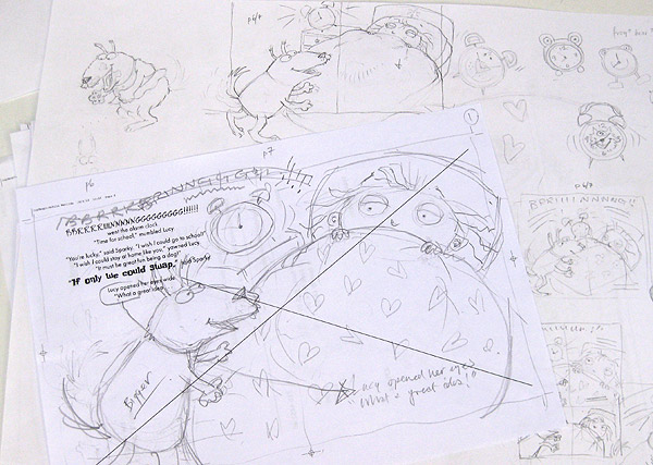
I've been working backwards in the story this week. As I discussed previously, I don't work through the roughs chronologically, but take them in the order in which they most interest me, so I 'get into' the book as quickly as possible.
Now I am concentrating more on how the whole 'swapping places' idea is set up. Above is the first spread, where the idea is hatched. I'm really pleased with this one but, though it looks simple, it didn't come together quickly. I had trouble keeping both characters large but also out of the gutter, whilst keeping them close so their relationship was intimate enough. Below you can see all my tiny variations on the composition:

As you can see, I also tried out lots of alarm clock designs too: hard to make it fun without getting fussy. I love the big, curved BBBRRRRIIIIINNNNNNGGGGGGG!!! of the alarm that pulls the whole image together - I do hope Gullane let me keep it that way.

Above is the next spread: where Lucy and Sparky actually swap, and Mum and Dad are fooled. The two little drawings came toge
4 Comments on Designing the spreads: Composition is Key, last added: 5/25/2012
Display Comments
Add a Comment
By: Lynne Chapman,
on 5/1/2012
Blog: An Illustrator's Life For Me! (Login to Add to MyJacketFlap)
JacketFlap tags: planning, roughs, layout, characterisation, Dogswap, illustration, Add a tag
This week I've started to look at the new book roughs. I'm still doing fairly rough sketches so far, trying to get a feel for how images might work in their allotted spaces. It takes a while to get your brain (and your drawing hand) back into gear, but by the end of the week I should be really up to speed.
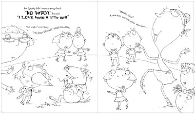
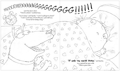
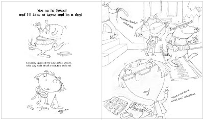
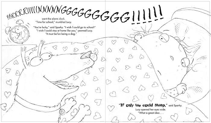
My story is about a little girl, Lucy, and her dog, Sparky. When her alarm goes off, Lucy thinks it's not fair that she has to get up and go to school, while Sparky stays home. Sparky would much rather go to school, as he thinks staying in is boring, so they take the only reasonable course of action...

...they swap places for the day! Sparky (who I decided should be a slightly fat, mongrel with an over-eager attitude to life), squeezes into Lucy's uniform, while she makes herself a doggy disguise. I had so much fun illustrating Sparky in Lucy's uniform.

2 Comments on 'Dogswap': Starting on the Roughs, last added: 5/4/2012
Display Comments
Add a Comment
By: Lynne Chapman,
on 9/28/2011
Blog: An Illustrator's Life For Me! (Login to Add to MyJacketFlap)
JacketFlap tags: publisher, illustration, cover, roughs, layout, Designer, characterisation, Baby Can..., Add a tag
On Friday, I finally got the go-ahead for the cover for Baby Can Bounce.

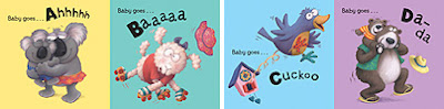
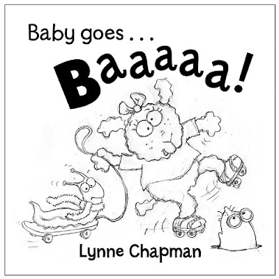
When I was deciding on the title, I could have chosen any of the featured actions, but I wanted to keep the alliteration that I established with Baby Goes Baaaaa!, which narrowed it down. Ultimately, Baby Can Bounce! is catchy, plus it's a fun, slightly silly action for a cover.
Inside the actual book, the 'Baby can bounce' page features the slug and snake:

Though the idea of a slug on a cover makes me laugh, slug and snake are not desperately cute and might put some people off (especially those with slug or snake phobias!), but one of my fave characters is the baby croc from Baby can dig:

What seems like months ago, Sarah, my designer at Egmont, sent me a basic cover layout, just to get the ball rolling and give me something to design around. That's really handy, as it gives me some idea how much space the title etc is going to need:
Display Comments Add a Comment
 5 Comments on Crocodile on a Trampoline!, last added: 9/28/2011
By: Lynne Chapman,
on 8/2/2011
5 Comments on Crocodile on a Trampoline!, last added: 9/28/2011
By: Lynne Chapman,
on 8/2/2011
Blog: An Illustrator's Life For Me! (Login to Add to MyJacketFlap)
JacketFlap tags: Editor, publisher, roughs, layout, Designer, Baby Goes Baaaa, Baby Can..., Add a tag
There's been so much going on throughout July that I'd almost forgotten I am in the middle of a couple of books! This week though we start a new month and I am back to real work with a vengeance.
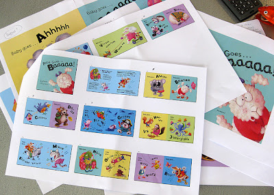
On Monday morning, my friendly postman delivered a package - jiffy bags always mean something interesting... This one was no disappointment, as it contained the coloured layouts for Baby Goes Baaaaa!.

They are not the actual proofs, just print-outs, but the colours look pretty good. This is the first time I have seen how it all looks together, and not just as files on the computer.
It seems ages since I finished working on the scans. Things have been going on in the background though - it has already been shown to oversees publishers and to Waterstones for feedback.

I'm really pleased with how vibrant and fun they are looking. I also love what Peter and Sarah (my editor and designer at Egmont) have done with the 'extra spread' below:

I can't remember if I told you, but I did a fair bit of educational research into p
3 Comments on The Layouts are Here!, last added: 8/5/2011
Display Comments
Add a Comment
By: Lynne Chapman,
on 5/16/2011
Blog: An Illustrator's Life For Me! (Login to Add to MyJacketFlap)
JacketFlap tags: scans, Baby Goes Baaaa, publisher, illustration, Photoshop, digital, layout, Designer, Add a tag
While my trusty new side-kick gets my admin up to date, I am still working away at the computer, cutting out the illustrations for my new book Baby Goes Baaaaa!, lifting the pastel drawings from the digital scans, ready for the coloured backgrounds to be dropped behind.
But I quickly realised that making final decisions on the exact colours of the backgrounds needed to take priority, as changing them later would mean revisiting the cutouts.

Sarah at Egmont suggested a colour scheme of around 7 colours, repeated throughout, to hold things together - a good idea. I tweaked her colour suggestions a bit and then narrowed them down to 6 I felt worked well across all the images.

Above are the 1st 4 spreads of the book, with all 6 colours in play.
 I substituted the brighter blue above for the more lilac-blue Sarah originally suggested, and I wasn't keen on the peachy yellow below.
Sarah had kicked things off by created a low-res, digital mock-up of the whole book, a tri
4 Comments on Choosing the Background Colours, last added: 5/17/2011
Display Comments
Add a Comment
By: Lynne Chapman,
on 2/7/2011
Blog: An Illustrator's Life For Me! (Login to Add to MyJacketFlap)
JacketFlap tags: drawing, cover, roughs, layout, characterisation, Baby Goes Baaaa, Add a tag
I'm due to get my feedback on the roughs for Baby Goes Baaaa! some time today. While I've been waiting for the final go-ahead, I've been taking another look at the cover design I began thinking about last week.
Sarah sent me some title text we could possible use, to help me get a feel for what space I had to play with, and I worked up the little sketch I showed you last time into this:
I then had a play around with some other thoughts, incorporating different characters from inside the book. My editor said he was very keen on the bears, and so I woke up the sleepy, baby polar bear I showed you before, and gave him a go: Another fave of my editor, is a little mole I've drawn for one of the spreads (P is for Pee-Bo!). I'm also quite keen on the silliness of the slug on the skateboard (who you might remember, was originally a dog, and then a hedgehog...), so I tried them in a third idea:
Not sure which I like best, so I'll see what the guys at Egmont say. Any thoughts?
I usually have a policy of never presenting more than one alternative rough. This dates back to my days in editorial illustration, when I discovered that, if ever I presented two alternatives, the art director would say something like, "Mmm, I like this from this one, but that from the other... Could we please combine them?" And I would end up having to draw a third.
I'll let you know if it happens again!
see more of my work at www.lynnechapman.co.uk
8 Comments on Cover Rough for 'Baby Goes Baaa!', last added: 2/8/2011
Display Comments
Add a Comment
View Next 25 Posts
That's really interesting to see from a writer's point of view! Thank you, Lynne.
I've also been editing picture books recently, and it's surprising how some authors don't seem to think about how much space their text might take up on the page and how that might squeeze the pictures. I cut wherever I can. Cut, cut, cut. The fewer word the better!
Thanks for posting:)Very usefull:)There is always something to learn here:)
very nice blog. Thank you for sharing your fantastic art
-Kat-
Great information!!! I was surprised to learn the publishers allow you to manipulate the text as much as they do. It makes sense, though. How else could one create final illustrations without the text layout? Thanks for such valuable information! Love your blog!