
by Ann and Paul Rand (Chronicle Books, 2009; originially published in 1956.)


You might remember how much I love this pair’s Sparkle and Spin, and this one is just as playful and just as true. That case cover surprise is an a delight, and complementary-colored endpapers start this book with a bang.


Paul Rand’s graphic genius is so well-matched by the simple and spare words of his wife, Ann. The text and the pictures both glide through that magical reality of childhood. Things that might seem daunting to someone bested by time are small and accessible. Things that may seem obvious or forgettable are ripe for play and adventure.


It’s a reminder to slow down, listen, and watch. The world is built of wonderful things. The big picture is as beautiful as the details.

Here, the sentiment is the whole of this person. I’m not sure there’s an ending more perfect, not for kids or their grownups. There’s so much more to know, but what you carry with you can stay.

Bob Shea has written and illustrated over a dozen picture books including the popular Dinosaur vs. Bedtime and the cult favorite Big Plans illustrated by Lane Smith.

By Ann and Paul Rand
{originally published 1957 by Harcourt, Brace, and World. Reprinted 2006 by Chronicle Books.}
 Sometimes pictures are just that: eye-catching and whimsical, without being packed with meaning or message. That spirit dances across the page in Sparkle and Spin, written by Ann Rand and illustrated by her husband Paul.
Paul Rand is an iconic American graphic designer. A problem solver. A storyteller. A communicator.
He said this about design:
“Good design adds value of some kind, gives meaning, and, not incidentally, can be sheer pleasure to behold.”

 His biographer, Steven Heller, said this:
“Paul Rand did not set out to create classic children’s books, he simply wanted to make pictures that were playful. Like the alchemist of old, he transformed unlikely abstract forms into icons that inspired children and adults and laid the foundation for two books that have indeed become children’s classics.”
Maybe he didn’t intend to be a creator of legendary books for kids, but his love for beautiful work shines in this one. That’s the magic of Sparkle and Spin: harmony, wit, and playfulness.

 And Ann’s words are a delightful match to Paul’s pictures. There’s a rhythm, song, and honor to these words that represent the joy of learning. Harmony, captured perfectly.
In graphic design, harmony is the magic that happens when all of the individual elements complement one another. It’s when small parts of pretty make up a more lovely whole. Here’s a detail I really love. This bold, graphic ice cream cone comes at the beginning, and with the inscription: To all children who like ice cream. And at The End, that scoop’s been slurped, chomped, and devoured. That’s what the experience of this book is. Tasty.
The book sparkles and spins. You’ll see what I mean.

Tagged: ann rand, chronicle, color, harmony, pattern, paul rand, shape, sparkle and spin, wordplay 
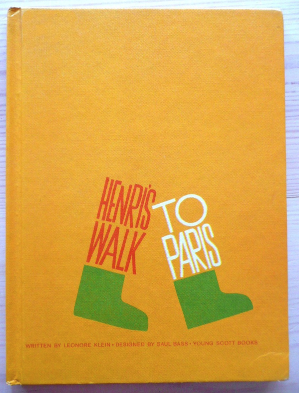
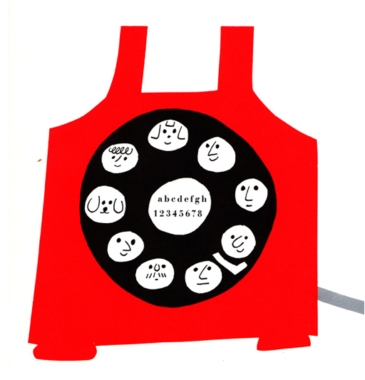
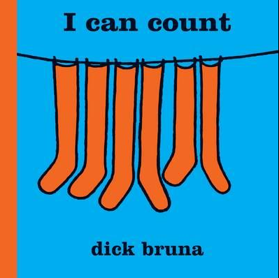
Sometimes simple things are the best. Like scrambled eggs and butter toast,
a tomato sandwich or a cup of soup, simply designed illustrations can be just what is needed. But simple is a misnomer here. While the illustrations below may look simple, a lot of time, planning and expertise went into the final product.
Henri's Walk to Paris by Saul Bass
From Sparkle And Spin by Paul Rand
I Can Count by Dick Bruna
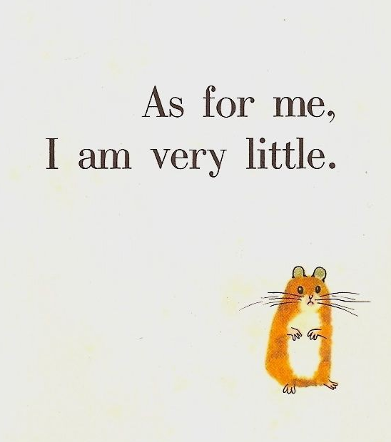
From Monsieur Bussy, The Celebrated Hamster,
Illustrated by Annick Delhumeau
From I Want to Be a Coal Miner
Little Oleg by Margaret and John Court
A Cat Can't Count by Blossom Budney, illustrated by William Wondriska
space alphabet by Irene Zacks, pictures by Peter P. Plasencia
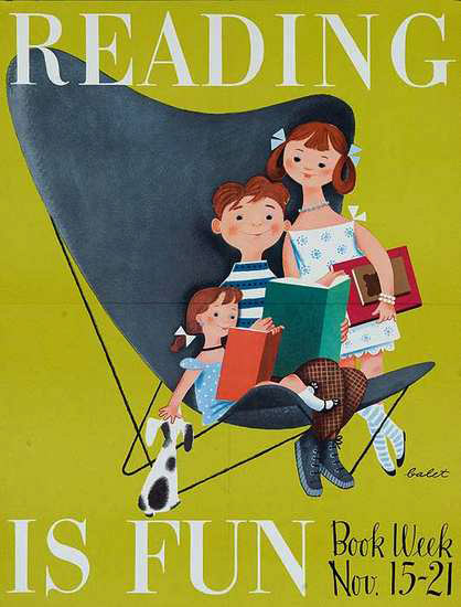
In honor of Children's Book Week, here are some vintage posters for you to peruse. Enjoy!
Helen Sewell, Illustrator, 1941
Elizabeth Orton Jones, Illustrator
1953 Poster
Garth Williams, Illustrator, 1955
Roger Duvoisin, Illustrator, 1952
3 Comments on Vintage Children's Book Week Posters, last added: 11/19/2011


So true Jil, simple is sometimes the best option. Making something look simple is often the difficult part. Love the blog.
Thanks Craig, I always appreciate your comments.
I agree with you! A cover illustration must be...incisive! I love these vintage covers!