


For the first time in the 39-year-history of the Ottawa International Animation Festival, a student film received the festival's top honor.
Add a Comment
new posts in all blogs
 By: Jerry Beck,
on 9/19/2015
By: Jerry Beck,
on 9/19/2015
Blog: Cartoon Brew (Login to Add to MyJacketFlap)
JacketFlap tags: Matthew Rankin, Priit Tender, Nata Metlukh, Riho Unt, Alex Boya, Dan and Jason, Frits Standaert, Irina Rubina, Jaime Giraldo, Paul Bush, Ryan Ines, The Magic Mountain, Awards, Color theory, Ottawa International Animation Festival, Don Hertzfeldt, Patrick McHale, Nicolas Ménard, Over the Garden Wall, Sarina Nihei, Add a tag
 By: Carter Higgins,
on 4/28/2015
By: Carter Higgins,
on 4/28/2015
Blog: Design of the Picture Book (Login to Add to MyJacketFlap)
JacketFlap tags: joohee yoon, paper weight, spot colors, color, printmaking, paper, composition, color theory, color palette, shape, binding, enchanted lion, pantone, Add a tag
By: Carter Higgins,
on 12/16/2014
Blog: Design of the Picture Book (Login to Add to MyJacketFlap)
JacketFlap tags: shape, white space, paul rand, ann rand, case cover, design, harmony, color, space, balance, concept, composition, endpapers, color theory, modernism, Add a tag
By: Carter Higgins,
on 12/1/2014
Blog: Design of the Picture Book (Login to Add to MyJacketFlap)
JacketFlap tags: harmony, color, balance, candlewick, endpapers, color theory, nicola davies, the promise, contrast, laura carlin, Add a tag
By: Carter Higgins,
on 9/22/2014
Blog: Design of the Picture Book (Login to Add to MyJacketFlap)
JacketFlap tags: color mixing, herve tullet, color, chronicle books, concept, color theory, Add a tag
By: Carter Higgins,
on 9/2/2014
Blog: Design of the Picture Book (Login to Add to MyJacketFlap)
JacketFlap tags: design, color, balance, cut paper, color theory, color palette, contrast, enchanted lion books, complementary colors, princesse camcam, Add a tag
Tagged: color theory, complementary colors, cut paper, enchanted lion books, princesse camcam Add a Comment
By: Carter Higgins,
on 8/5/2014
Add a Comment
By: Carter Higgins,
on 8/5/2014
Blog: Design of the Picture Book (Login to Add to MyJacketFlap)
JacketFlap tags: color, space, composition, color theory, color palette, shape, size, helen stephens, complementary colors, how to hide a lion, Add a tag
Tagged: color, color theory, complementary colors, helen stephens, how to hide a lion, shape, size Add a Comment
By: Carter Higgins,
on 7/29/2014
Add a Comment
By: Carter Higgins,
on 7/29/2014
Blog: Design of the Picture Book (Login to Add to MyJacketFlap)
JacketFlap tags: color, candlewick, texture, composition, color theory, timothy basil ering, Add a tag
Tagged: candlewick, color, texture, timothy basil ering Add a Comment
By: Carter Higgins,
on 7/10/2014
Add a Comment
By: Carter Higgins,
on 7/10/2014
Blog: Design of the Picture Book (Login to Add to MyJacketFlap)
JacketFlap tags: color, concept, rhythm, jutta bauer, color theory, color palette, line, size, north south, Add a tag
Tagged: color, color theory, jutta bauer, north south Add a Comment
By: Carter Higgins,
on 7/1/2014
Add a Comment
By: Carter Higgins,
on 7/1/2014
Blog: Design of the Picture Book (Login to Add to MyJacketFlap)
JacketFlap tags: color, space, balance, color theory, color palette, line, Phaidon, shape, white space, Jean-Jacques Sempé, size, contrast, Martin Pebble, Add a tag
Tagged: color, contrast, Jean-Jacques Sempé, line, Martin Pebble, Phaidon, shape, size Add a Comment
 By: Heidi MacDonald,
on 6/30/2014
By: Heidi MacDonald,
on 6/30/2014
Blog: PW -The Beat (Login to Add to MyJacketFlap)
JacketFlap tags: color theory, Top News, melanie gillman, Process, Add a tag
By: Carter Higgins,
on 5/13/2014
Blog: Design of the Picture Book (Login to Add to MyJacketFlap)
JacketFlap tags: design, illustration, typography, book trailers, color, balance, trailers, composition, movement, color theory, color palette, CMYK, shape, greg pizzoli, disney-hyperion, spot color, Add a tag
Tagged: book trailers, CMYK, disney-hyperion, greg pizzoli, illustration, spot color Add a Comment
By: Carter Higgins,
on 5/5/2014
Add a Comment
By: Carter Higgins,
on 5/5/2014
Blog: Design of the Picture Book (Login to Add to MyJacketFlap)
JacketFlap tags: color, space, pattern, color theory, size, flying eye books, design, complementary color scheme, spot color, Add a tag
Tagged: color theory, complementary color scheme, flying eye books, spot color Add a Comment
 By: Christopher Denise,
on 3/24/2014
By: Christopher Denise,
on 3/24/2014
Blog: Christopher Denise (Login to Add to MyJacketFlap)
JacketFlap tags: Film, Color Theory, Wes Anderson, Add a tag

By: Carter Higgins,
on 9/17/2013
Blog: Design of the Picture Book (Login to Add to MyJacketFlap)
JacketFlap tags: die cut, complementary colors, orange and blue, waterloo and trafalgar, design, color, movie posters, balance, trailers, negative space, composition, color theory, color palette, olivier tallec, Add a tag
Tagged: balance, color palette, color theory, complementary colors, movie posters, olivier tallec, orange and blue, trailers, waterloo and trafalgar Add a Comment
By: Jerry Beck,
on 6/20/2013
Add a Comment
By: Jerry Beck,
on 6/20/2013
Blog: Cartoon Brew (Login to Add to MyJacketFlap)
JacketFlap tags: Ideas/Commentary, Color theory, Color script, Add a tag
By: Christopher Denise,
on 11/30/2012
Blog: Christopher Denise (Login to Add to MyJacketFlap)
JacketFlap tags: James Gurney, Color Theory, Landscape painting, Color Script, Color Keys, Add a tag

.jpg?picon=1621) By: DIANE SMITH,
on 6/20/2008
By: DIANE SMITH,
on 6/20/2008
Blog: DIANE SMITH: Illo Talk (Login to Add to MyJacketFlap)
JacketFlap tags: painting, ink, watercolor, bird, worm, color theory, Add a tag
 By: Rebecca,
on 10/22/2007
By: Rebecca,
on 10/22/2007
Blog: OUPblog (Login to Add to MyJacketFlap)
JacketFlap tags: Health, research, A-Featured, Medical Mondays, Psychology, patient, klitzman, physicians, medline, prognoses, technology, oxford, sick, house, illness, america, medicine, oupblog, columbia, healthcare, Add a tag


Viewing: Blog Posts Tagged with: color theory, Most Recent at Top [Help]
Results 1 - 19 of 19
By: Jerry Beck,
on 9/19/2015
Blog: Cartoon Brew (Login to Add to MyJacketFlap)
JacketFlap tags: Matthew Rankin, Priit Tender, Nata Metlukh, Riho Unt, Alex Boya, Dan and Jason, Frits Standaert, Irina Rubina, Jaime Giraldo, Paul Bush, Ryan Ines, The Magic Mountain, Awards, Color theory, Ottawa International Animation Festival, Don Hertzfeldt, Patrick McHale, Nicolas Ménard, Over the Garden Wall, Sarina Nihei, Add a tag
By: Carter Higgins,
on 4/28/2015
Blog: Design of the Picture Book (Login to Add to MyJacketFlap)
JacketFlap tags: joohee yoon, paper weight, spot colors, color, printmaking, paper, composition, color theory, color palette, shape, binding, enchanted lion, pantone, Add a tag

by JooHee Yoon (Enchanted Lion, 2015)


(click to enlarge)
This book is something. A mashup of poetry and pictures, washes of color and words.


(click to enlarge; this is an example of a spread that folds out to reveal an entirely new and more expansive illustration.)
Some thoughts from JooHee on the art and creation of Beastly Verse:
I wanted to create a book that not only tells wonderful stories, but one that is beautiful to behold. For me, the design of the book is just as important as its content; they are inseparably linked. I believe all elements of a book–its paper, binding, size and weight–create an atmosphere that plays an important role in the experience of reading.
The printing process fascinates me. Not only traditional printmaking, but also industrial processes as well, since these are just a further development of the old printmaking techniques. I have always been drawn to printmaking, and rather than mixing colors on a palette and putting them on paper, I enjoy working with flat color layers overlapping one another to create the secondary colors. My experience with printmaking informs almost all of my artwork today. I wanted to take advantage of the industrial printing process so the printer is not just reproducing the image I make, but in a sense creating the image itself.


This book has been printed using just three colors. The areas where the main colors overlap create secondary colors, resulting in a book that seems very colorful even though only a limited palette was used. Seen alone, each layer is a meaningless collection of shapes, but when overlapped, these sets of shapes are magically transformed into the intended image. To me the process of creating these images is like doing a puzzle, figuring out what color goes where to make a readable image.
I am very inspired by books from the early 1900s – 1950, when artists were forced to work with spot colors since reproduction methods weren’t as developed as they are today. It is amazing what some artists could do with just two or three colors, and this is exactly the same process I am using, but one from choice rather than necessity. There is a luminous brilliant quality to the colors when images are reproduced this way that I love.


(click to enlarge; this is an example of a spread that folds out to reveal an entirely new and more expansive illustration.)
It’s fascinating to pull the curtains back on an illustrator’s process, and I’m thankful to JooHee for her words here. Her explanation of something so simple, so exquisite, and so complex is as brilliant as those colors she creates.
And the book itself is definitely a work of art. Uncoated, thick pages. Slightly oversized. There’s a non-uniform feeling to the ends that isn’t quite a deckled edge, but a bit more raw and tactile. Hand-crafted almost.

(click to enlarge)
Beastly Verse’s dedication reads simply, For the Reader.
Here, the reader is also the design enthusiast, the art collector, and the wordsmith. A book for book lovers.

Huge thanks to Claudia Bedrick at Enchanted Lion for the images in this post.
Add a Comment
By: Carter Higgins,
on 12/16/2014
Blog: Design of the Picture Book (Login to Add to MyJacketFlap)
JacketFlap tags: shape, white space, paul rand, ann rand, case cover, design, harmony, color, space, balance, concept, composition, endpapers, color theory, modernism, Add a tag

by Ann and Paul Rand (Chronicle Books, 2009; originially published in 1956.)


You might remember how much I love this pair’s Sparkle and Spin, and this one is just as playful and just as true. That case cover surprise is an a delight, and complementary-colored endpapers start this book with a bang.


Paul Rand’s graphic genius is so well-matched by the simple and spare words of his wife, Ann. The text and the pictures both glide through that magical reality of childhood. Things that might seem daunting to someone bested by time are small and accessible. Things that may seem obvious or forgettable are ripe for play and adventure.


It’s a reminder to slow down, listen, and watch. The world is built of wonderful things. The big picture is as beautiful as the details.

Here, the sentiment is the whole of this person. I’m not sure there’s an ending more perfect, not for kids or their grownups. There’s so much more to know, but what you carry with you can stay.
By: Carter Higgins,
on 12/1/2014
Blog: Design of the Picture Book (Login to Add to MyJacketFlap)
JacketFlap tags: harmony, color, balance, candlewick, endpapers, color theory, nicola davies, the promise, contrast, laura carlin, Add a tag

by Nicola Davies and Laura Carlin (Candlewick, 2014)
The Promise is on this year’s New York Times Best Illustrated Books list and I’m so glad it captured a spot. I imagine weeping and gnashing of teeth to pare down a year into a handful of notables, but they got this one so right.


Here you have bleakness. Bare and raw. And a girl who doesn’t have much but the desolate things. The words themselves pierce the brightness.

The people, too, dry and dusty.
And then.
Some seeds and a promise and a reluctant okay.
I pushed aside the mean and hard and ugly, and I planted, planted, planted.


Everything works in this book. The text is exquisite. The pictures haunting and heartbreaking and hopeful. The paper is luxurious. The case cover differs from the jacket itself. Dig in. Look around. Don’t miss the endpapers that start as stone and end as spring.
There’s a little Frog Belly Rat Bone here, in this fragile world in need of color and life.
(Also, there’s a lot of great stuff about this beautiful book here, and this post is so, so lovely as well.)
And PS! Add a comment by Wednesday, December 3rd to this post for a chance at winning all ten of those books from Chronicle. Don’t forget your pledge to #GiveBooks this year!
Add a Comment
By: Carter Higgins,
on 9/22/2014
Blog: Design of the Picture Book (Login to Add to MyJacketFlap)
JacketFlap tags: color mixing, herve tullet, color, chronicle books, concept, color theory, Add a tag

by Hervé Tullet (Chronicle Books, 2014)
First of all. Welcome to the new Design of the Picture Book! I’m super excited to feature this particular book as the first spot in my face-lifted blog–its heart and soul of art and play is exactly what I think these new digs represent.
Do you see? The logo! The colors! The Book Party? THE BOOK PARTY?!! (If you are in a reader, click over and see all the goodies. And for the love, please join the Book Party. I mean really.)
Super huge thanks to Sara Jensen for, well, everything. (#taken)

It’s here. This highly anticipated follow up to the smash hit Press Here is muddled-up fun and completely magical.
Remember those rolls of endless butcher paper and squishing your fingers into as many paint puddles as possible? That’s what this book is. It’s a lesson in color mixing wrapped up in a hefty dose of play.


Slam the book together so the yellow and blue make green. Shake it on its side and watch purple drips racing off the page. What happens when you add some white? Or black? Or stick your hand right in the middle of the mess?


It’s a color theory primer and an invitation to get dirty. And isn’t that the best kind of creating?

I’m a grownup. I get the gig here. And still I looked at my palm when I flipped the last page of this book, sure it would be dripping with paint.
Welcome back to childhood. It’s good here.
Want to win a children’s painting studio worth $500? Check out the details here, and tweet away using #MixItUpBook!
P.S – If you need more Hervé Tullet (and the answer is probably yes, yes you do) check out this other experiential art book for tiny, creative minds.
I received this book from the publisher (right back atcha, #chroniclecrush!), but opinions are all mine.
Add a Comment
By: Carter Higgins,
on 9/2/2014
Blog: Design of the Picture Book (Login to Add to MyJacketFlap)
JacketFlap tags: design, color, balance, cut paper, color theory, color palette, contrast, enchanted lion books, complementary colors, princesse camcam, Add a tag

by Princesse Camcam (Enchanted Lion, 2014)
It’s hot in Los Angeles. Like, super really really hot. That’s why this book is an especially welcome reprieve. A book with snow in it? Please. A book with cool blues and winter scenes? Yes.
This is Fox’s Garden.
It’s a lovely little book.
A lone fox, stark red against the white forest. A house in the distance, swirling with the colors of home and twilight. Frightened grownups chase him away. A boy cloaked in red, watching and waiting and caring. 

This boy loves animals. They are in sketches, framed on his wall. They are in mobiles and stuffed friends, in bookshelves and toy chests. 
This fox, followed by her brood, leaves blossoms of kindness right back for the boy. It’s a tale of sharing and growth and unlikely accomplices. No words, all heart.
And the pictures. My French is un peu rusty, but according to Princesse Camcam’s blog, these have got to be cut paper illustrations, lit and photographed. They are intricate and textured, perfect layers for this story of a fox and his friend.
Remember when we talked about complementary colors setting the tone and mood? The rich red of the fox is set apart so dramatically from the snowy scene and the stark greenhouse. It’s a mood, and it’s a strong one. It’s so pretty, too.
Keep an eye on Enchanted Lion, folks. They are in the business of making beautiful books.
Be kind to a chased-away stranger today.

Review copy provided by the publisher.
Tagged: color theory, complementary colors, cut paper, enchanted lion books, princesse camcam
By: Carter Higgins,
on 8/5/2014
Blog: Design of the Picture Book (Login to Add to MyJacketFlap)
JacketFlap tags: color, space, composition, color theory, color palette, shape, size, helen stephens, complementary colors, how to hide a lion, Add a tag

How to Hide a Lion (Henry Holt, 2013. Originally published 2012 in the UK.)

One hot day, a lion strolled into town to buy a hat.
Of course he did. That frilly blue thing in the window is pretty fancy after all. This beast only has eyes for that bonnet, and bypassed the bakery without even a side eye. But while the beast has eyes for the bonnet, the townspeople have eyes for safety and decorum. They chase him out.
And like any smart wild animal, he finds refuge in a kid. A kid who was not scared of him in the least. A kid who saw a problem that needed solving. A kid who saw her world differently. She knows he needs hiding, and I think that’s such a beautiful example of what it must be like to be a kid. You have this vague awareness of things that are problems for grownups, and yet you attack them as if those grownups are absurd.
That’s kid truth. That’s a great thing for this lion.
There’s smushing behind the shower curtain, there’s lounging on the limb of a tree, and there’s plenty of bed-jumping. And still, when he overhears Iris’s parents saying there’s no such thing as a kind lion, there’s sadness.
But.

The way Helen Stephens is using color in this book is both sweet and striking to me. This lion, large and yellow, takes up a lot of space on pages of close ups. And his girl, Iris, matches him a bit with her yellow arms and brown mane. That’s sweet. That’s friends who can see themselves in each other.
But the blues. Loose complements to the wild yellow of the beast, the wild brown of Iris’s hair. Ever notice when a book is cracked open, the edges of the cover frame it a bit? This one is blue, a lovely turquoise. The endpapers are a shade of sky and a deep navy. Those pages and that cover peek around the story itself.
A little touch of blue, giving this lion a hug.
Just like Iris. 

These vignettes! The gag is a an unhide-able lion, right? It’s an impossibility that’s highlighted with the use of these orange-yellows and blues.
After the lion escapes his Iris-refuge, he blends in to his surroundings. A camouflaged cat, if you will. He holds his breath between two marble-sculpted friends. I don’t want to show you the spread, cause Big Things Happen, but take a look at the colors of that page. His hiding is a success. No need for blues to offset his presence.
Also, I love how this book is pretty big. That’s obviously not a very technical or artistic term to to reference trim size, but it’s true. A lion is tricky to hide, and the physical space this book takes up is the gentlest nod to the absurdity of that task. Besides, a lion wouldn’t fit in a smaller book, right?
He’d be much harder to hide that way.

PS: Be sure to visit this post from Danielle at This Picture Book Life. There’s some secret-spoiler-y-easter-egg things on the pages of this book, and her post is the coolest.
Tagged: color, color theory, complementary colors, helen stephens, how to hide a lion, shape, size
By: Carter Higgins,
on 7/29/2014
Blog: Design of the Picture Book (Login to Add to MyJacketFlap)
JacketFlap tags: color, candlewick, texture, composition, color theory, timothy basil ering, Add a tag

The Story of Frog Belly Rat Bone (Candlewick, 2003)
I have a feeling this is one of those books that you either adore to hyperbolic proportions or is completely off your radar.
I’m in the hyperbolic proportions camp, but it’s still a book I forget about. And then when I remember, I wonder how I forgot?!
So this is an origin story, one that starts in Cementland and ends in gritty beauty.
The first spread is so perfect. A wide shot of Cementland, described as a dull, gray, endless place. A boy, arms open and striped in red, stands at your attention in the midst of all that gray. All of the lines and the stress and the mess lead you right to him.
This red-striped fellow believes treasure hides among the heaps of junk in Cementland, and in a triumphant moment finds a box bursting with color. Bright colored packages, but filled only with tiny gray specks. Hundreds of them. Not wondrous riches.
He plants anyway. And after two or three minutes, nothing happens.
While he’s gone, thieves root and loot the plot. So this boy–this treasure hunter, gathers smelly socks, scraggly wires, and of course, a crown, and dubs his creation Frog Belly Rat Bone, the monster who will protect the specks.
They are a duo with a mission and a patched together friendship that pays big rewards.
That’s why Timothy Basil Ering’s use of texture is the only possibility for this type of storytelling. The art is the story. It’s stitched up. It’s not slick. It’s piled up and layered and cobbled together just like Frog Belly Rat Bone himself. There’s warmth in the mess and intention in the scatter. It’s as beautiful as that treasure that the red-striped boy finds. And creates.
![]()
“…[W]hen I first made the dummy book for Frog Belly Rat Bone, naturally, I beat up some wood and sewed it all together. It gave it that nostalgic, cobbled-together look that’s just plain interesting to me. I wanted it to look like it was made the same way the little boy in the story makes Frog Belly, with just raw hand-stitching and splashes of paint.”
(That’s from here, which is a great read!)
It’s definitely one I want to share early in the year with our fourth graders who are the school’s expert gardeners. It would pair well with The Curious Garden (for obvious reasons) but also classic unlikely friendship stories. Isn’t a trash-made monster-thing with picky underwear a pretty unlikely friend? I’m thinking about Amos and Boris and Leonardo the Terrible Monster.
Giveaway Update: Thanks for playing! I’ve picked the winners, but I’m going to wait until my order comes in from the bookstore to share the spoils. We had to special order a few titles. Did you know your local indie will do that for you?! And then you get to go back. Stay tuned!
Tagged: candlewick, color, texture, timothy basil ering
By: Carter Higgins,
on 7/10/2014
Blog: Design of the Picture Book (Login to Add to MyJacketFlap)
JacketFlap tags: color, concept, rhythm, jutta bauer, color theory, color palette, line, size, north south, Add a tag
 by Jutta Bauer (NorthSouth, 2014; originally published in Germany, 1998, as Die Königen der Farben.)
I love the work NorthSouth is doing, and this book in particular has stuck with me for a while. So it’s a funny little book, but it’s also literally little, and there’s a lot of mayhem happening in such a small package. I think that’s smart.
 Color’s been on the brain a lot this week because I’m in the thick of teaching an Intro to Photoshop and Graphic Design class to kids. This has been a fun one to show them, because the colors in this book take on such a clear identity.
 Blue is soft and gentle. I love how the Queen is giving it a hug and kiss.

 Red barrels in and nearly knocks her over. It’s wild and dangerous.
 And then there’s Yellow. Warm and bright and sunshiny on her toes.
These colors have purpose, but when Matilda can’t control them, the whole mess turns Gray.
 It’s the same in art. Too many colors competing leaves you a whole lot of buzz and confusion. It doesn’t work.
 (image source.)
This Gray sticks around for a while. It doesn’t work. 
 But it does make the Queen of Colors sad. Not gentle, not wild, not warm. Not colorful.
So she cries. You’ll have to see for yourself what her tears do to the gray. Here’s a hint: it’s scribbles and stars and swirls. It’s a happy ending.
Color has a story, and it’s a story that matters.
P.S.—Does Queen Matilda remind you a little bit of Queen Ursula from the Little Mermaid? I think it’s part her bossiness, and part her curves. I’m awful at remembering lines from films, but this is one that has stayed with me a long, long time. I think it’s thanks to the bubbles that shimmy out of her hind parts!
![]()
Tagged: color, color theory, jutta bauer, north south
By: Carter Higgins,
on 7/1/2014
Blog: Design of the Picture Book (Login to Add to MyJacketFlap)
JacketFlap tags: color, space, balance, color theory, color palette, line, Phaidon, shape, white space, Jean-Jacques Sempé, size, contrast, Martin Pebble, Add a tag
 Martin Pebble (Phaidon, 2006; first published in French, 1969)
by Jean-Jacques Sempé
I love this book.
I love the type on the cover.
I love the yellow.
I love the shape and the size and the story.
I love Martin Pebble.
He’s loveable.
(I picked this up on a recent trip to Once Upon a Time in Montrose, CA, which is exactly why shopping in stores is the greatest thing. I had to touch this thing to believe it, and I might not have seen this thing if it weren’t for the bookseller. Bookstores are like story petting zoos and museums that don’t give you the stinkeye if you get too close to the art.)
(Something like that.)
But poor Martin Pebble.
Martin Pebble could have been a happy little boy, like many other children. But, sad to say . . . he had something that was rather unusual the matter with him:
he kept blushing.
 Martin Pebble blushes for all the usual reasons and for no reason at all. The brilliance of Sempé’s color here is hard to miss. Black and white line work contains the red of Martin’s face, and that red occasionally extends to the text as well.
Subtle. Striking. The contrast Sempé crafts between Martin’s red face and all that black and white makes that blushing even worse.
Martin is in a pickle. He’s tiny and nearly lost on the page save for his giveaway condition.
He dreamed of fitting in. But he always stood out.
 Then comes a series of sneezes, some very loud A T I S H O O s, and there he is.
Roddy Rackett, the new neighbor.
 When the story changes, and the hardships knock at the door, Sempé doesn’t just use the suspense of a page turn. He stops the story cold.
 Roddy Rackett’s family moves away.
When you are a boy, and when you are made normal in the quirks of another, you never really forget about it. You think about A T I S H O O s while you are doing grownup things like riding taxis and elevators.
 Sometimes things get back to normal.
 I won’t spoil past that pink-lettered page.
But I love it.
And!
Sempé himself sounds like a storybook character. He sold tooth powder door-to-door salesman! Delivered wine by bicycle! (More here.)
Click here for some of Sempé’s covers for The New Yorker. Lovely.
And this Pinterest board is a feast for the eyes, too. Enjoy!
Tagged: color, contrast, Jean-Jacques Sempé, line, Martin Pebble, Phaidon, shape, size
Blog: PW -The Beat (Login to Add to MyJacketFlap)
JacketFlap tags: color theory, Top News, melanie gillman, Process, Add a tag
Eisner-nomintaed As the Crow Flies cartoonist Melanie Gillman has a cute, simple intro to the basics of color theory, which will help you understand why movies are all orange and teal and European-style coloring look way more pleasing than rando pseudo CGI.
0 Comments on Go read: Color palette basics by Melanie Gillman as of 6/30/2014 11:29:00 AM
Add a Comment
By: Carter Higgins,
on 5/13/2014
Blog: Design of the Picture Book (Login to Add to MyJacketFlap)
JacketFlap tags: design, illustration, typography, book trailers, color, balance, trailers, composition, movement, color theory, color palette, CMYK, shape, greg pizzoli, disney-hyperion, spot color, Add a tag
 by Greg Pizzoli
published 2014 by Disney-Hyperion
I’m honored and thrilled to have Greg Pizzoli back to the blog this week. About a year ago we talked about Kroc and The Watermelon Seed, and in the many weeks since, that thing (and Greg!) won the Geisel Award! My kindergarteners call him ‘the BURRRRPPP man’ which I’m pretty sure is the highest praise any mere mortal can achieve.
But today! Today is the birthday of Greg’s latest and greatest, Number One Sam. This is my favorite tweet about it: (And side note, you should follow Matt Roeser at Candlewick cause he has impeccable taste and eyeballs.)
And this (!) is the trailer:
![]() Greg chatted with me about process and art and picture books, and I’ve read these answers about a billion times and am still learning. Enjoy!
Greg chatted with me about process and art and picture books, and I’ve read these answers about a billion times and am still learning. Enjoy!
Your spot color. Wow! Can you talk about why such a stripped-down design with a limited color palette is such a powerful visual device?
Great question!
To be honest, I’m not sure. But, I think it comes down
to working from an intention, and just having a plan, or restrictions
set in place from the beginning. You can’t just grab another color
from somewhere – when it comes time to make final art, we’ve done
rounds of pantone tests and paper tests, and the limitations and
possibilities are in place, so nothing is casual. Maybe it makes you
consider things in a way that is unique to working in that way?
I know for me, if I’m doing a book that is printed in a limited color
palette, it can feel restrictive in one sense, but there is a real
freedom within the limitations, if you know what I mean. There’s not
endless guessing the way there might be with a CMYK book. Obviously we
do lots of tests and make sure we get the base colors right for the
book, but once that is done, I can start carving out the drawings and
not worry too much about the colors, because we’ve done so much work
on the front end. It’s a challenge I enjoy.
Here’s a photo of a spot color test proof.
Why do you think your stories are best suited to the form of the picture
book. What can you do in this form that you might not be able to in another?
This is a tough one, Carter. Boy, I come to your blog looking to have
a good time, maybe show a video or something, and you slam me with
this “why picture books” stuff. Sheesh. “Gotcha blogging” right here.
But that’s fine, I’ll play along.
I’m kidding, of course. But, it is a tough one. I guess it’s not all
that complicated for me. I’ve always loved picture books and I think
it’s because there are so many possible ways to solve the problem of
telling a story with text and images. It’s a cliche I think, but you
really can do anything in a picture book. But here again, I like the
restrictions. As much as I might complain to my editor that I “just
need one more spread” to tell the story, it’s actually nice to have a
structure where you have to fit a complete world, with a character, a
problem, and (maybe?) a solution to that problem in only 40 (or so)
pages.
There’s something about how deliberate every decision has to be
that is super appealing to me. I’ve been working on writing a longer
thing recently, a series, and it’s not as though I’m not deliberate
when working on it, but I’ll admit that it feels as though not as much
is hinging on each line or picture in the same way. With picture
books, you don’t have room for anything to feel arbitrary. I like
that.
Also, I thought you might want to see these. Sam started out as a
print of a weird dog (top) and then I made a print of another
(cuter) dog, and he kept coming up in my sketchbooks until he became
Number One Sam (bottom).

What do you think are the most important considerations when creating a book trailer?
How do you think through compressing an already spare narrative into a short
animation? Are there aspects to animation you wish you had access to in
picture book art or vice versa? (I guess mostly I’m curious about how book
trailers share storytelling space with picture books and what they can do
differently. Does that make sense?!)
Ya know, it’s a complicated thing this book trailer business. I am
really happy with the two we’ve done so far, but I definitely can’t
take all the credit. Jimmy Simpson, directed and animated both the
trailer for The Watermelon Seed and for Number One Sam, and he is
pretty incredible to work with. Both times we started working, I had
already finished the book, and I had a very basic sense of what I
wanted the trailer to be, but he figures out all of the transitions
and added all of the touches that make them work as well as I think
they do. For example, the “wink” shot from the Number One Sam trailer –
that’s all Jimmy. And of course, he does all of the animation.
I draw the stuff, which is somewhat complicated because you have to
keep everything separated, meaning draw the arm on a different layer
from the body, and the hand on a different layer than the arm, and the
ear on it’s own layer, etc. Basically everything needs to move
independently of everything else, but my characters are pretty simple,
so it’s not too big a deal.
And the music is key. My buddy Christopher Sean Powell composed the
music special for both trailers. What a talent, right? He plays in the
band Man Man, and has his solo music project called Spaceship Aloha,
and was a part of a pretty seminal band from these parts called Need
New Body. I’m thrilled we get to work together on this stuff.
But, to your actual question, I see the trailer and the book as
completely separate things. They have their own pacing, and their own
objectives. With the book, you want everything to feel complete, and
have an emotional pay off of some kind. And you have the narrative arc
to keep things together. With the trailer, it’s more of a tease. You
don’t want to give it all away. And I guess our objective is to just
make them fun and unique.
Book trailers have become more popular, and there is a sort of
template for how they are done that we have tried to stay away from.
We just want them to feel different enough to maybe stand out. It’s a
super small community in some ways, and my book trailers certainly
aren’t racking up millions of views or anything, but we enjoy making
them for their own sake, partly I think because we all just like
working together. If other people dig them, and check out the book on
top of that, that’s icing.
What types of trophies do you have lining your shelves? What kind do you
wish you had? Side note: What would a book called Number One Greg be about?
Beyond my published books, which I kind of think of as trophies in a
way, there are a couple. Last year when I finished the art for Number
One Sam, my editor Rotem sent me a trophy that I keep on my bookcase.
And recently I was looking through some old family photos and found a
first place ribbon that I had won for a school wide art contest in
the 1st grade. My family moved around a ton when I was little, so the
actual winning piece was lost. I remember it though! It was a big
piece of yellow poster board with a marker drawing of outer space.
Maybe it’s time to do a space book?

![]() And now for some art from Number One Sam. Thank you, Greg! (Click to make any of them larger.)
And now for some art from Number One Sam. Thank you, Greg! (Click to make any of them larger.)


Tagged: book trailers, CMYK, disney-hyperion, greg pizzoli, illustration, spot color
By: Carter Higgins,
on 5/5/2014
Blog: Design of the Picture Book (Login to Add to MyJacketFlap)
JacketFlap tags: color, space, pattern, color theory, size, flying eye books, design, complementary color scheme, spot color, Add a tag

published 2014 by Flying Eye Books Let me introduce you to Flying Eye Books, if you aren’t already pals with them. Their books are fairly new to me, but are consistently striking and interesting and a different sort of fare than some more commercial offerings.
Case in point: this post by Danielle Davis over at This Picture Book Life (you know her, right? Her posts are a work of art and always a celebration of the picture book form. I’m lucky to know her in real life, not just on the internet.) and this look at their current season (and an interview!) by Travis Jonker.  100 Bears is a counting book with some actual narrative to it. The pace starts off sweetly but then 9 gunshots and an escape leads to a madhouse of 23 knocked over chairs and 37 or 38 bits of confetti. Such trouble a few bears can get into! Some teensy text flaws swim around in that lost-in-translation sea, but there is some real satisfaction in a circular counting story with 100 moving parts. The smile you’ll get from the first and last pages alone is one of the true joys of story.
 A design technique shown off so spectacularly here is spot color. That’s when a single color is printed at a time, and so the process gets layered (and tricky!) by rolling down the building blocks of a print on the same lithograph. You won’t see gradients or blended color, just blocks of hue. (Here’s a little more about the process, from author/illustrator Greg Pizzoli.)
And why does the cover catch your eye? It’s more than a circus style balancing act of big old bears and their blocky numbers. It’s that complementary color scheme. Blue and orange. With a splash of pink for some oh, yes.
And so what is this thing? I’m not too sure, and I don’t really care! It’s like a coffee table book for the sippy cup set. Enjoy it, for sure. P.S. – Crazy for spot color? Stay tuned and hear again from the master himself, Greg Pizzoli. Coming up soon on Design of the Picture Book!
Tagged: color theory, complementary color scheme, flying eye books, spot color
By: Christopher Denise,
on 3/24/2014
Blog: Christopher Denise (Login to Add to MyJacketFlap)
JacketFlap tags: Film, Color Theory, Wes Anderson, Add a tag
This post is so great-the palettes and screen shots are amazing.
Follow them here: https://www.tumblr.com/register/follow/wesandersonpalettes/2
0 Comments on This is so cool. I am a huge Wes Anderson fan. as of 3/24/2014 11:19:00 PM
Add a Comment
By: Carter Higgins,
on 9/17/2013
Blog: Design of the Picture Book (Login to Add to MyJacketFlap)
JacketFlap tags: die cut, complementary colors, orange and blue, waterloo and trafalgar, design, color, movie posters, balance, trailers, negative space, composition, color theory, color palette, olivier tallec, Add a tag
Tonight was for writing this post and watching some football and thinking about orange and blue. And then this commercial comes on TV. (Well, this one is a few years old. Same flavor, though.)
![]() Remember this. It means something in a bit. I promise I don’t care where you buy your life insurance.
Remember this. It means something in a bit. I promise I don’t care where you buy your life insurance.![]()

{published 2012, by Enchanted Lion Books}
Waterloo & Trafalgar is at once spare and very much not. It’s a book about unnecessary fighting and the two stubborn sides who forget why they are even at odds. They are suspicious, bored, but always staid. Until. A snail, a bird, a different perspective. Different looks a little bit the same after all. Tallec’s goofy little men end up as a charming shout for peace. They are absurd. They are us.
Waterloo. Blue. Trafalgar. Orange. Opposites. Enemies.
 There they are, as far from one another on the color wheel as possible. Direct opposites. Complementary colors.
Orange and blue are a combination of dominance, because each is competing for the attention of your eye. One cool, one warm, constant attention-grabbers. Because of their stark contrast, each truly shouts. That’s why it’s a duo you see in a lot of advertising for banks, credit cards, and other Important Things. Would that Northwestern Mutual commercial be as strong if it were in a different color palette? Probably not. They want to imply strength, power, and – well, life.
And, ahem. I’m a fan of these two colors. Note my blog header and the rest of this thing’s design. Those design decisions were intentional, and since you are reading this and hanging out here with me, it might just be working. Perfect choices for Waterloo and Trafalgar, right? It wouldn’t make sense for those two ridiculous little men to be represented by closer together hues. Their orange and blues are a tenuous balance.
Besides a color scheme that works, that sings, and that smacks you in the gut, this is just a darn beautiful book. The paper is thick and rich to the touch, and some split pages inside extend the stories and heighten the division at hand. I love the die cuts on the cover – those clever windows reveal these two nuts and their telescopes at the ready. And the endpapers’ narrative is subtle as it holds the story in place. The carved out holes close up by the end, and the stream of blue and orange smash right up against each other.
 Still different, still far apart on that wheel. Transformed into something lovely together.
![]()
Ok, ok. One more orange and blue moment I love is the opening title sequence to the James Bond flick, Quantum of Solace.
![]() (These titles are created by a studio whose motion design work is just spectacular, MK12. They are the creative minds behind the visuals in Stranger Than Fiction and the gorgeous end titles of The Kite Runner. By the way, notice the colors in the first minute of that one!)
(These titles are created by a studio whose motion design work is just spectacular, MK12. They are the creative minds behind the visuals in Stranger Than Fiction and the gorgeous end titles of The Kite Runner. By the way, notice the colors in the first minute of that one!)
![]() And! A whole slew of orange and blue on movie posters. You won’t un-see this color palette once you start noticing it. That’s a promise prefaced with a slight apology! Here’s just one:
And! A whole slew of orange and blue on movie posters. You won’t un-see this color palette once you start noticing it. That’s a promise prefaced with a slight apology! Here’s just one:
Tagged: balance, color palette, color theory, complementary colors, movie posters, olivier tallec, orange and blue, trailers, waterloo and trafalgar
By: Jerry Beck,
on 6/20/2013
Blog: Cartoon Brew (Login to Add to MyJacketFlap)
JacketFlap tags: Ideas/Commentary, Color theory, Color script, Add a tag
Just by looking at this “bar code”, can you tell what animated movie this is? Go on, take a guess:

Give up?
It’s Bambi.
For a few years now, MovieBarcode has been one of my regular stops on Tumblr. The moderator (who prefers to remain anonymous) takes every frame from a movie, skews it to be only a pixel wide and lines them up in a row, creating a barcode-like image of the entire film. While many live-action films don’t necessarily need color to help tell the story, the majority of animated productions go to great lengths to plan out a clear color script. In many ways, the color is as vital to a movie as the characters and story. Color can set the mood, intensify the drama or action, clarify with contrast, and even define a character. Just pick up any Pixar “Art of” book and you’ll see how much thought is put into the color and lighting of a movie, through the use of color scripts, color keys and color association.
Take a closer look at the Bambi barcode again. For those who are familiar with the movie, can you tell just by looking at the colors what sequences are taking place? The light blue for the ice skating sequence? Deep red for the forest fire? Desaturated grays and blues for the death of Bambi’s mother? And what about the color of the characters themselves? How well does the black and white skunk stand out when Bambi first meets him in the predominantly yellow flowerbed? Or Bambi’s bright orangey hue against the pale greens of the forest behind him? All these things are planned out to the most minute detail to make sure that the viewer can clearly see what is happening on screen.
Let’s make things fun by testing your animation knowledge. Here’s a few more animation barcodes, now try and guess what movies they are from. Some are pretty clear, and some might be a little tricky. For those that are stumped, click on the images to see which movie it is.


How’d you do?
Add a Comment
By: Christopher Denise,
on 11/30/2012
Blog: Christopher Denise (Login to Add to MyJacketFlap)
JacketFlap tags: James Gurney, Color Theory, Landscape painting, Color Script, Color Keys, Add a tag
Heads up to all the color key and color script artists out there. Saw this courtesy of a tweet by Tony DiTerlizzi.
After you watch visit the link below for more information on gamut masking from this incredible artist.
0 Comments on Wowza, James Gurney is brilliant. as of 11/30/2012 8:21:00 PM
Add a Comment
By: DIANE SMITH,
on 6/20/2008
Blog: DIANE SMITH: Illo Talk (Login to Add to MyJacketFlap)
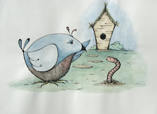
JacketFlap tags: painting, ink, watercolor, bird, worm, color theory, Add a tag
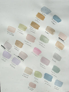
Added color to "A Dinner Invitation" using watercolor. Overall, I'm pretty happy with it.
Before I painted it, I played around with some color mixing using my (VERY limited) assortment of watercolors. If there was one thing I remember from my college art instruction, it was the emphasis on getting darks by mixing complementary colors and avoiding black. I never really paid much attention to the siennas and umbers at all (remember - I tended toward the vibrant expressionist color palette back then).
I did have one instructor that required paintings done each week with limited color palettes (as dictated by him). I think it was a great exercise, HOWEVER there just wasn't time enough for me to really get into it and learn from it. I just always felt more focused on getting it done and moving on to the next thing.
Anyway, I have found that I LOVE umber - my new color friend. I love the earthiness it brings to colors - darkens them but keeps them warm (where black darkens but cools). I used both light and dark umber A LOT in the chicken drawing with colored pencil, and I used dark umber in many of the colors in today's painting.
1 Comments on Umber is my friend..., last added: 7/10/2008
Display Comments
Add a Comment
By: Rebecca,
on 10/22/2007
Blog: OUPblog (Login to Add to MyJacketFlap)
JacketFlap tags: Health, research, A-Featured, Medical Mondays, Psychology, patient, klitzman, physicians, medline, prognoses, technology, oxford, sick, house, illness, america, medicine, oupblog, columbia, healthcare, Add a tag

It is not easy for anyone to become ill and be at the mercy of doctors, but what about doctors themselves? How do they react to being on the other side of stethoscope? In When Doctors Become Patients Robert Klitzman, Associate Professor of Clinical Psychiatry at Columbia University, looks at what the experience is like for doctors who become sick, and what it can teach us about our current health care system and more broadly, the experience of being ill. In the excerpt below Klitzman explores how doctors go about researching their own diseases and how this research seems more disheartening once they have become part of the statistics.
‘‘We know very little,’’ Roxanne, the gastroenterologist, said, referring to the medical literature on the causes of cancer. As suggested above, once ill, many of these physicians came to reassess the role of research in individual medical decisions, and became more critical in their evaluations of research as a whole. Roxanne, for example, became more sensitive to the elusiveness of ‘‘the truth,’’ no longer thinking there was just one answer. ‘‘People base things on the literature and on one paper that’s not been duplicated. I’m skeptical. There’s a lot of literature, but also fashions—things used in the past. Now we’re into other treatment approaches. We can’t cure anything.’’ Indeed, these ill physicians appeared previously to have paid little heed to the implications of this pattern. (more…)
0 Comments on When Doctors Become Patients: Researching One’s Own Disease as of 1/1/1990
Add a Comment
Hi Diane,
I love umber too!!
Thanks so much for your comment. Yes, be sure to check out Crooked Still, they have such an authentic yet fresh spin on old old ballads. Really upbeat and beautiful.
Take care!