new posts in all blogs
Viewing: Blog Posts Tagged with: Jungle Grumble, Most Recent at Top [Help]
Results 1 - 11 of 11
How to use this Page
You are viewing the most recent posts tagged with the words: Jungle Grumble in the JacketFlap blog reader. What is a tag? Think of a tag as a keyword or category label. Tags can both help you find posts on JacketFlap.com as well as provide an easy way for you to "remember" and classify posts for later recall. Try adding a tag yourself by clicking "Add a tag" below a post's header. Scroll down through the list of Recent Posts in the left column and click on a post title that sounds interesting. You can view all posts from a specific blog by clicking the Blog name in the right column, or you can click a 'More Posts from this Blog' link in any individual post.
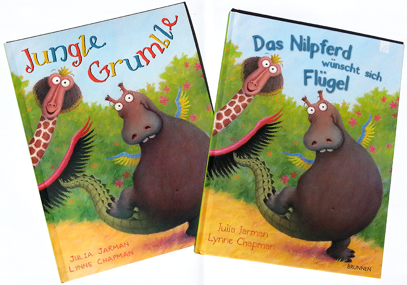
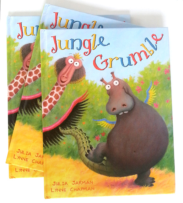
The postman delivered another parcel this week. It's the German co-edition of Jungle Grumble:
It's always fun to get copies of foreign co-editions of my picture books. I especially enjoy it when I get German ones, as I did German A level at school, many, many moons ago.
It got very rusty of course so, in the days when I used to torture myself at the gym, I used to work my way, painfully slowly, through German translations of trashy novels, while I was puffing away on the exercise bike - much easier vocabulary than more worthy literature. People used to laugh at me, because I had to hold the book in one hand and a pocket dictionary in the other!
After that, I decided to re-do a German GCSE, just for fun, as an evening class, because I was OK reading off the page, but absolutely rubbish at any kind of conversation - which is after all, the point of a language. I really enjoyed myself and was a real swot. A little group of us used to get together in-between classes and test each other. I got an A* and was very pleased with myself.
Anyway, enough of this rambling and back to Jungle Grumble. The fact that I can read the text (more or less) is interesting, because things are not always direct translations. The title for instance is no longer Jungle Grumble but 'The Hippo Wishes He was a Bird'.
It's great news that the 2014 German edition of 5000 copies has already sold out: the copy my publisher has just sent me is from a 2015 reprint - they have done another 4000. Hurrah!
 I also just found out that Jungle Grumble has now got a Chinese co-edition. I had Chinese editions of Stinky! and Lark in the Ark too. I love the ones with different alphabetic styles. I've had lots of Korean ones and Big Bad Wolf is Good was published in Arabic, which is great for taking into schools, because it runs in the opposite direction to a UK book, something I didn't know until I got my copy.
Actually, its publication date came while I was still in Barcelona but, as you can imagine, I had a few other things going on at that point, so have only just found time to tell you the good news.
Jungle Grumble is really funny and very unusual, so please do all rush out and buy it, right away! The paperback is £6.99. If anyone would like a signed copy with a little drawing and a dedication inside, just drop me an email and we'll sort it out on PayPal, then I'll pop one off to you. Perfect Christmas presents to put away perhaps?
Thank you as well to all the team at Piccadilly Press who have worked with Julia and I on the book. People outside the business don't always realise what a team job picture books are and how important people like the editor, art director and designer are, not to mention all the folks we rarely get to meet, from sales and publicity etc.
If you would like to follow the process of how I created the illustrations, use this blog's Jungle Grumble label and scroll back to the beginning, for my very first sketched thoughts. There are also several short films on my YouTube channel, explaining how I created the animal characters in Jungle Grumble:
...and how I designed the book's roughs (it takes about a month to work out all the drawings and layouts in pencil, before any colouring can begin):
There is also another film on the way, talking you through the creation of a piece of pastel artwork - the cover of Jungle Grumble - just like the film I did when I was illustrating Swap!:
The footage for new film is all shot, but it always takes quite a time to edit the films and this is the most complicated one we have attempted. It got put on the back-burner while other things have been happening, but now the book is available, it's definitely time to get it out and get it sorted, so watch this space!
The day before I left for Brazil, the postman bought me another of those fun packages. I have already had an advance copy of my next book Jungle Grumble, so I have seen it, but this new copy is the paperback.
It's due out in October, although I am not sure which end. Not long though now!
Sorry I've been off-air for a while. I am so busy trying to get my sketching book ready for presentation at the Frankfurt Book Fair, that I have not been able to stop and chat. But I had to tell you about what arrived in the post today...
My advance copies of Jungle Grumble! It was a total surprise, as I wasn't particularly expecting them yet, since publication isn't until October. It's looking great. It's got a silk-finish cover, rather than full gloss, which I rather like.
I'll let you know when it's actually available to buy. Not long now! Right, back to work...
I just went to my YouTube channel to reply to a lovely comment about one of my films and discovered that the filmed demo I did of me drawing a piece of artwork from Swap! has recently gone over 20,000 views. How exciting is that?! It's kind of weird too, to think that 20,000 people, probably all over the world, have watched me drawing.
If you haven't seen the demo already, here it is again:
Do 'like' or 'share', if you find it interesting - every little helps in this business!
Since we did this film, John and I shot another demo film in the studio: this time it's me creating some artwork from Jungle Grumble. It's a larger illustration and so, when it's ready, it will be a longer film. We recorded pretty much the whole way through the illustration, from first marks to completion, which means lots of footage, so it needs quite a bit of time spending on editing, to get it down to a manageable length. That's a tricky business, as I am talking about process all the time, so we need to cut big sections, without losing too much that's interesting.
Trouble is, things have been so busy ever since we filmed it, there has not been time to finish the editing process yet. We are about a third of the way through, I reckon.
It's another thing on the 'to-do' list. Life is quieting down though, now we are out of the main school-visits season, so hopefully it won't be too long before I can share the new demo with you. In the meantime, here are a couple of films we made of me talking through how I drew the roughs for Jungle Grumble. If you haven't watched them already, you might find them interesting:
The publisher is now setting up the final designs. My designer at Piccadilly sent me low-res versions of how the spreads will look with text. Now she has my finished digital illustrations, she will be fine-tuning the designs and placing all the text into position, ready for proofing. This is how the first spread is going to look:
They have also created designs for the 'extras', like the back cover and the title page, using sections from the existing illustrations. This is the title page design:
It's all perfect timing, because of course I am out of the studio most days at the moment, visiting schools. Today I am actually in a school in Sheffield, so nice and close for a change, but sadly no chance for train sketching.
Last week, the scans of my Jungle Grumble illustrations came back from the repro-house. Things have been a bit fast and furious: I've had just a few days to get all the 'finishing work' done, then Dropbox the final digital artwork back to the publisher, ready for everything to be put together and sent off to the printer. Phew. There were three 'finishing' jobs for me to do in Photoshop / Painter:
1 - text overlays
Children's illustrators never draw text onto their actual artwork, because of translations. All text, even wording that is part of the actual picture, is added afterwards, digitally. Unfortunately, because of the pastel texture of my work, ordinary, typed text 'floats', so I make my own text overlays, using Painter, which look like they are drawn in black pastel. Luckily there wasn't much intrinsic text in Jungle Grumble, only one lion roar and the Swap Shop sign, though that does appear a few times:
2 - legibility issues
To keep things as clear as possible, it's easiest when a story's main text falls over areas of sky. That wasn't always possible in Jungle Grumble: in several places I had to use trees or bushes as backgrounds for text. But it was tricky to be sure precisely where specific lines of text would need to sit and, because of my style, it was hard not to include undergrowth textures which might be visually distracting behind the words. Once my designer got the scans, she was able to layer the two together so we could spot any places where things were slightly too busy or too dark to be sure of maximum visibility. I then used Photoshop to make subtle changes. Spot the differences to the bush bottom right:
3 - vignettes
Not all my illustrations are full spreads with illustrated backgrounds. Some pages feature smaller vignettes: characters against a plain background. My biggest digital job is cutting vignette characters off my pink paper. It takes ages because of the pastel edge, especially where the pastel colour is close to the pink of the paper, like Lion's roar:
He looks so much better on green, don't you think? For anyone who wants to know how I do the cutting out, here's a detailed 'masterclass' (though my version of Photoshop is old, so many things may be slightly different on up-to-date editions).
Most illustrators don't do this digital stuff themselves, but I prefer to, as the pastels make it quite a bit more tricky than usual. It's possible that I'm being a bit of a control freak, as usual, but after all that time spent getting the drawings done, I like to be sure that these final alterations are exactly right.
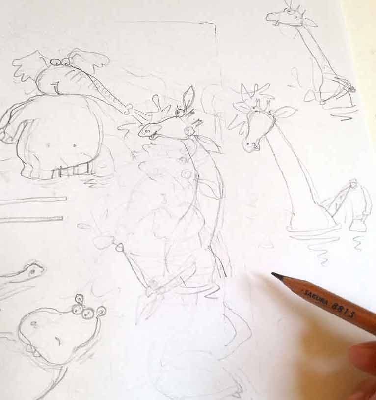
I have started my pastel artwork for The Jungle Grumble. I am only doing 2 pieces of artwork at this stage, to be taken to the Frankfurt Book Fair by my publisher. I have just enough time to get it done. Because things are tight, John has been helping me with jobs, like cutting my pastel paper to size:
I generally work larger than the actual size. On this book I am doing my drawings at 120%, although one of the 2 images the publisher has chosen for their Frankfurt presentation is the very complex 8th spread, so I'l be doing that at 140%, so I can manage the detail:
Another job is getting the prints-outs of the roughs ready for me to trace. We only have an A4 printer. By the time the line-work is enlarged to the scale I am going to work at, the image is pretty big, so we have to print it out in several bits and then stick them back together again. The image above was in 6 pieces! To get them to line up accurately, we use the light-box:
I then have the extremely tedious job of tracing the illustrations up onto my pastel paper, again on the lightbox. I have to turn out the lights and pull the blinds, to make it dark enough to see through the pink pastel paper, which is about as thick as watercolour paper. If you want to know why I use pink, read this post, from when I was at the same stage with Dragon's Dinner.
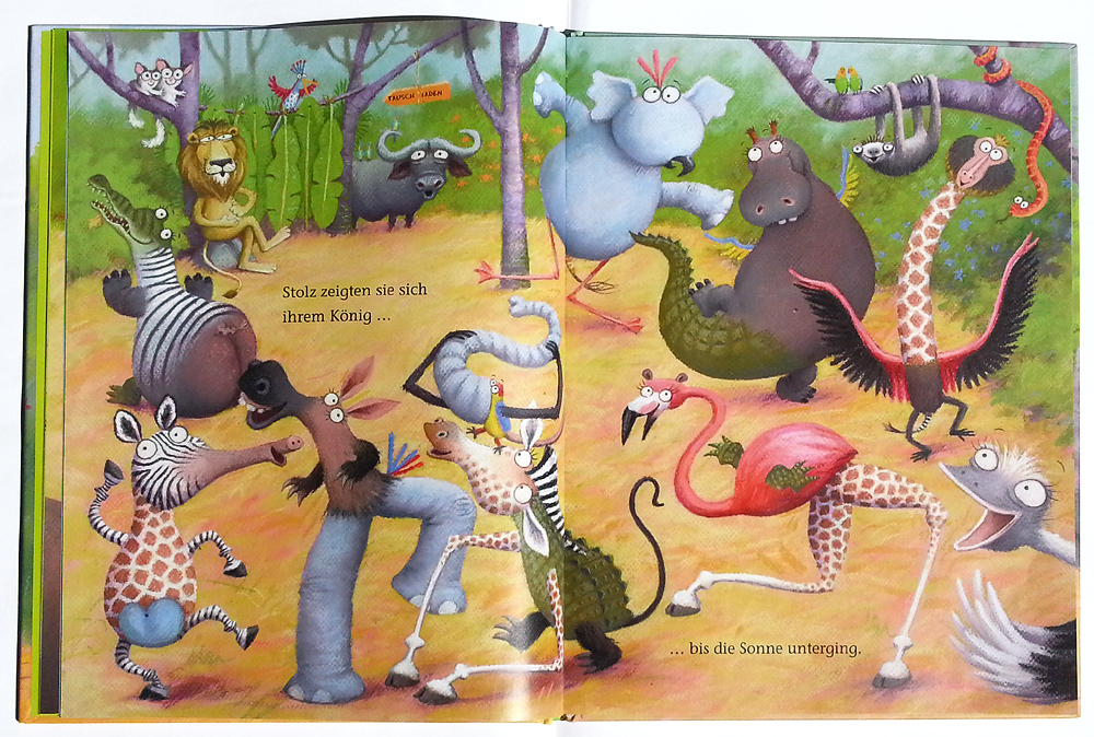
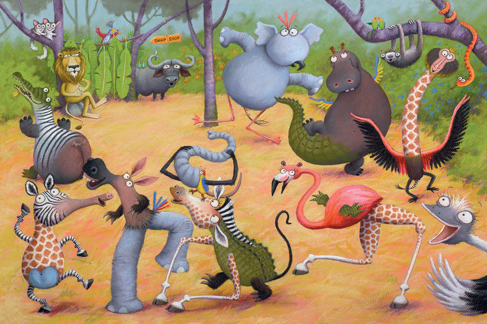
I had a bit more trouble with one of my Jungle Grumble spreads that the others and I thought it offered a good opportunity to talk about issues around composition.
It was the penultimate page: the animals have all swapped back and decided that they are much better off that way (of course). My original thumbnail looked like this:
But Julia Jarman's text begins, 'Later that night, Lion listened to the animals as they gathered at the waterhole.' then it follows on with their comments. I realised that Lion needed to be on the left. So I flipped it:
I wasn't happy though - giraffe didn't fit (she needs to be standing in the water to squeeze her legs in), Hippo was too close to the gutter but, if I moved her, it left poor Zebra out on a limb on his own.
So I shrunk Giraffe a bit and shuffled things around. I moved Parrot from Elephant's head to Croc's, for more humour, moved Monkey to Zebra's page, but it just didn't hang together and was all a bit dull:
There was also the issue of whether to draw naturalistic or non naturalistic poses, now the animals are all back to normal. As you can see, I tried mainly naturalistic, but it was proving hard to make that fun.
The biggest issue though, was the relative sizes of the animals. When you have a cast of very different characters, it's a logistical nightmare fitting them all in so the smallest aren't visually dominated by the largest. Which is why Giraffe and Elephant are at the back. But to make Giraffe fit, she was getting so small that she felt detached from the action. I thought about having her sitting on her bottom at the water's edge, but when I sketched it, it just looked weird - too unnaturalistic!
As I added the characterisation, things at least started to look a bit more happy:
I got the idea of putting Giraffe waist deep in the water, so I could bring her forward, but she needed to be doing something fun. I thought I could have her being spurted by Elephant and splashing him back, but this also proved tricky. Her arms were too long to look right splashing. I tried many times without real success:
Over lunch, I showed my problems to John. He didn't like the splashing sketches either, but suggested drawing Giraffe drinking, like they do, with their legs splayed. I'd used this pose earlier in the book, so had disregarded it as a possibility, but things were getting desperate: I tried it...
Hey presto! Thank goodness (and thanks John).
Not only did this fit her in, it also brought her head down to everyone else's level, so she's part of the fun. And the splayed front legs draw your eye in a circle around the ring of animals, joining together the disparate elements in the composition, which was otherwise in danger of looking 'bitty'.
Let's pray my publisher likes it and I don't have to start again!!
Hurrah - all done in time and emailed off to the publisher!
All those very tiny thumbnails I showed you earlier were scanned and enlarged in Photoshop to 75% of the actual book size:
I then used print-outs of these as a guide, to help me draw everything again, reworking the compositions and correcting mistakes where needed. You can just see the enlarged thumbnail showing through my layout paper:
It was also at this stage that I was adding the new characterisation to each animal, as I went along.
The finished pencil drawings were then re-scanned and enlarged to actual size, then taken back into Photoshop for last-minute tweaks and scale adjustments, as well as the fine-tuning of the text placement.
When I was doing the original thumbnails, this was the spread I was most nervous about. I left it to the very end, because there were so many animals to try and fit in it: not just the 10 featured ones, but sundry others to act as the audience:
I had to find a way, not just to squeeze everyone in, but also to show off their various 'swaps' in a way that let you see everything clearly, to avoid visual confusion (whilst still remembering not to put anyone's face anywhere near the page gutter). Nightmare! Only, actually, when it came to it, I managed okay. Maybe because I had warmed up on the rest of the book.
The one that was redrawn the most in the end, was this one, which at first glance looks the most straight-forward:
I'll tell you why next time - you'll just have to wait!
I thought it might be interesting to use my work on Jungle Grumble to talk about how I design around text. One common error made by would-be children's book illustrators, is forgetting that quite a lot of space needs to be created in your illustration for the words. This can be a challenge if the illustrations need to be busy. Though ideally the text is evenly spread through the book, this is not always possible, depending on the action. Some spreads can end up very 'text-heavy'. Others have lots of dialogue and all those new lines make the text expand down the page:
Before I put pencil to paper, I always ask my publishers to set the book's text in the chosen font, at actual size, so I know exactly how much space is needed. I then create blank templates for each spread in Photoshop (as above, with the gutter clearly marked), into which I place the text.
Obviously, until I have drawn the illustrations, nobody knows where the text needs to be positioned, so I am okay to move it around, as long as I follow basic design rules (like keeping an appropriate distance from the top / edges / gutter).
Mostly I keep the specified text on the particular spreads suggested by the publisher although, with Jungle Grumble, I did make a couple of changes. For instance, in my brief, this text at the very beginning of the story was split across 2 spreads:
Which seemed an unnecessarily slow start and, by combining both sets of text into one illustration, I freed up an extra spread for later in the book, which was very handy when we were in the thick of the action.
While doing the first thumbnails, I estimated the text area needed:
I then enlarged all the thumbnails and popped each into one of my Photoshop spread-templates. Dragging the bits of text into the positions my illustration idea demanded, I was able to see where more space was needed and rearrange the compositional elements accordingly.
Below is the spread that fits the template at the top of this post. You can see how I have divided the block of text into 3 sections, to make it more palatable to the reader and also easier to draw around. I have then placed the proper text in position on the enlarged thumbnail, replacing my estimated, hand-drawn text. This one fitted the actual text really well:
Using layout paper over the thumbnail print-out (which is translucent, allowing me to see enough of the thumbnail to guide me, but not too much, so no visual distraction as I redraw), I reworked the illustration, making sure I didn't get too close to the text.
My new drawing was re-united with the text when it was scanned and placed back into the Photoshop template, in place of the thumbnail:
Of course, the designer will now rework the text layout - mine is just a suggestion for how I think it best fits my illustrations. Sometimes it stays as is, other times they have ideas to make it funkier.


I'm encouraged to know that I'm not the only one combining sections of images manually and tracing the enlarged image on a lightbox. Thank you for sharing your process.
What a fascinating insight into the publishing process. I had no idea it was so fiddly and time consuming! I love your animal art it is so funny and cute.
Good to see your hard at work. I'm excited to see the end result. Stay active, best wishes,
Benjamin
It's great to see the publishing process:) What a great idea the pink paper,great post:)
Thank you. Glad to hear that the background information is still interesting.
:-)
That there's craft, that is!