By Jilly Traganou
After attending the “Because” event at the Wolff Olins office on July 4th, I was once again reminded of the big disconnect that lies between designers and their public. Wolff Olins is the firm that designed the London 2012 brand, a multifaceted design campaign that included much more than the London 2012 logo. Readers may remember the numerous complaints that the logo generated. As my research revealed, this was caused partly due to International Olympic Committee (IOC)’s restrictions and the corporate unwillingness to allow for the full application of what might be seen as a “no logo” campaign.
Wolff Olins proposed an open-source framework that would integrate the public by providing a design language that could be shaped into new forms and messages. The designers’ intention was to “hand over some tools that would allow people to make everything they wanted.” Design would be “off the podium, onto the streets.” But neither the public nor the broader designers’ community were ready to accept that the Wolff Olins team showed no compliance to the usual set of corporate instruction and that what they were trying to achieve lied beyond the creation of beautiful forms.

London 2012 event. Photo by Gary Etchell. Used with permission. All rights reserved. http://www.flickr.com/photos/gary8345/557769058/
The designers’ goal was to evoke an effect similar to that of the Mexico 1968 design: a visual language designed by Lance Wyman that was not only appropriated by the counter-Olympic movement, but also marked future visual languages developed by local designers in Mexico. In a way, Wolff Olins’ design succeeded in its adaptability, even though its multiple viral deconstructed versions that appeared on the streets and online were meant to primarily express conspiracy and protest, or even a disdain for the very visual language that the designers provided (and which these “dissidents” are now using).
But why would designers today strive for openness and participation? And why should IOC, London Organising Committee of the Olympic and Paralympic Games (LOCOG), or the general public be indifferent or even hostile to these intentions? After all, are there any designs that would meet the aspirations of all stakeholders: Olympic organizers, designers, and their multiple publics? The Olympics, as indeed most public events, are complex platforms that bring to the surface deep social conflicts and generate heated debates about the notion of public good. The new temporary or permanent configurations that are designed for the Olympics express these tensions and often become the targets of opposing voices.
Everyone today recognizes that the modern Olympics only partly concern sports. Few, though, are aware of the multiplicity of the design engagements that are mobilized for their realization. Being characterized as something between urban festivals and quasi-religious events, the Olympics have a strong ceremonial character that design generates. Hundreds of designers are mobilized to create a series of objects (logos, posters, uniforms, mascots, souvenirs) that are indispensable for the Olympic ensemble. This may seem to some a contemporary distortion to the original 19th century idea of the modern Olympics’ founder, Pierre De Coubertin, but Coubertin was keenly aware of the importance of design for the identity of the Games. He designed what has been credited as the most recognizable logo in the word, the Olympic rings, and spent considerable energy in prescribing the ceremonial characteristics of the event, with writings on subjects that ranged from attention to lighting and decoration, to specifications on the architecture of the venues.

Photograph in newspaper (unspecified) of Richard Beck working on the design for the Olympic poster. This proto-version differs from the final design, particularly in its typography. Collection: Powerhouse Museum, Sydney, 92/1256–1/4. Used with permission.
The design for the Olympics has been an overlooked subject in the fields of design history and Olympic studies alike. Olympic design’s role as an instrument of modernity becomes obvious, for instance, in the way
British athletes’ uniforms were designed for the early Opening Ceremonies, expressing but also helping to shape the identity of modern Britain. The Melbourne 1956 poster designer, Richard Beck,
abandoned the neoclassical body of the male athlete that characterized earlier Olympic posters for a non-figurative composition along the tenets of modern design.
As it has become only too obvious with the current case of London, in late modernity the Olympics are also an opportunity for new infrastructure projects and major real estate enterprise, which leave a debatable legacy to the host-city. Planners, architects, and urbanists play a major role in this process, as well as those who sponsor, lease, or invest in the projects in the longue durée of the post-Olympic era. The design for the Mexico 1968 Olympics had significant ideological implications for the social segregation that marked the future of Mexico City. The architecture of the Athens 2004 Olympics is emblematic of ‘instant monumentality’ and a lack of legacy planning that has characterized many modern Olympics.
At the same time, the high visibility, budget, and scale of the Olympics have provided designers with opportunities to realize ambitions that are not possible through ordinary projects, and to envision ideas that are often too advanced for their times. Katsumi Masaru for instance insisted in compiling a design manual for the Tokyo 1964 Olympic Games (a set of prescriptions that would secure the unified application of the graphics, and thus a cohesive Olympic image), even though he knew too well that it could hardly be applied in the Tokyo Olympics per se. Indeed it was completed just before the start of the Games leaving nevertheless an important legacy for all forthcoming Olympics for which a design manual became a staple. Should we similarly expect that the “no logo” idea of the London 2012, with its openness and lack of corporate compliance, is signaling a new paradigm shift?
Jilly Traganou is Associate Professor in Spatial Design Studies at the School of Art and Design History and Theory, at Parsons The New School for Design in New York. She has published widely in academic journals, has authored The Tokaido Road: Traveling and Representation in Edo and Meiji Japan (Routledge, 2003) and co-edited Travel, Space, Architecture (Ashgate, 2009). She is currently working on a new book Designing the Olympics: (post-) National Identity in the Age of Globalization. Traganou has recently edited a special issue titled “Design Histories of the Olympic Games” for the Journal of Design History, where she also serves as Reviews Editor.
The new issue of the Journal of Design History titled “Design Histories of the Olympic Games” introduces the Olympics as a multifaceted design operation that generates diverse, often conflicting, agendas. Who creates the rhetorical framework of the Olympics, and how is this expressed or reshaped by design? What kind of ambitions do designers realize through their engagement with the Olympics? What overall purposes do the Olympics and their designs serve? ‘The Design Histories of the Olympic Games’ brings together writings by a new generation of scholars that cross the boundaries between traditional disciplines and domains of knowledge. Some of the articles look at the role of Olympic design (fashion design and graphic design) in representing national identity. Other articles look at the interconnected area of architecture, urbanism and infrastructure and the permanent legacy that these leave to the host city. You can view more on the Journal of Design History’s Design Histories of the Olympic Games Pinterest board too.
Subscribe to the OUPblog via email or RSS.
Subscribe to only art and architecture articles on the OUPblog via email or RSS.
Read more blog posts about the London 2012 Summer Olympic Games.

 Fresh from winning a gold medal at London 2012, Olympian Alex Morgan has landed a 3-book deal with Simon & Schuster’s Books for Young Readers (SBYR). The American soccer star will be penning her debut middle-grade series, The Kicks.
The not-yet-titled first book will be released in Summer 2013. SBYR editor Kristin Ostby negotiated the deal with William Morris Endeavor Entertainment literary agent Eric Simonoff. Ostby, who will edit the manuscript, secured both world English and audio rights.
Morgan (pictured, via) had this statement in the release: “It seems like only yesterday, I was a kid myself, getting my first taste of the joys of teamwork, good sportsmanship, acceptance. Playing team sports is one of the best ways I can think of to develop strong values, good work ethics, and a health-focused lifestyle. This series will no doubt widen the appeal of soccer and bring an appreciation of the sport to readers who might not otherwise have that opportunity.”
New Career Opportunities Daily: The best jobs in media.


svff:
fuckyeahillustrativeart:
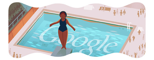
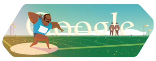
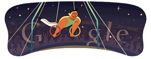
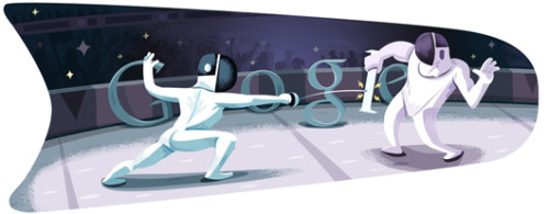
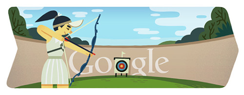
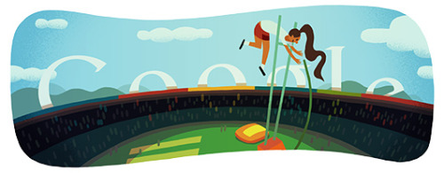
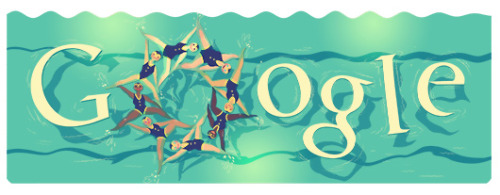
2012 Olympic Google logo illustrations by Sophie Diao
follow Sophie on tumblr!
Hi wow thanks for posting these! I’m so glad people like them! However, I only did the shotput and pingpong doodles - the rest were done by Ryan Germick (opening, fencing, field hockey) and Sophia Foster-Dimino (archery, diving, rings, pole vault) - please head over to their respective blogs and give them some love!
Also hello new followers :D Looking forward to getting to know you all!
Wondering who drew the Google Doodles appearing during the 2012 London Games? They were created by a trio of illustrators: Sophie Diao, Ryan Germick, and Sophia Foster-Dimino, as mentioned in this tweet by Sophia.
I’ll repeat what others have said too: “Hey Google, please credit your illustrators publicly. This isn’t hard to do; magazines, newspapers, and other websites do it all the time.”

So ... this is another castle post ... and a note about feet. The one thing they don't tell you in all the castle brochures is that you will be walking lots and lots. Now in the greater scheme of things walking is great but the muscles that we have used to climb those stairs, wow! I have found new muscles in the ankles, in the legs and the heel that I didn't know were there. They have really, really, really had an extreme workout through these castles. I was pondering too as I was climbing and descending the numerous steps - the castle residents must have regularly stumbled over the steps. In many places they were sooooo narrow that I walked with one foot pointed to the side and the other facing forward. I have also lost count of the number of times my forehead made contact with the archway or a lintel (usually carved from stone) above a door. (Bini had no trouble...short stature and little feet.)
Yesterday's castles were
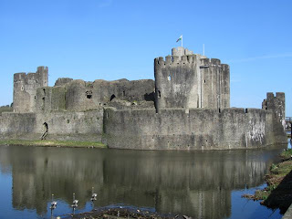
Caerphilly,
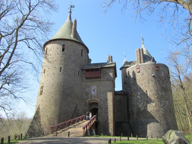
Castell Coch (a pseudo castle that really was very imaginative and a tad disneyish!) and we also had a peek at the
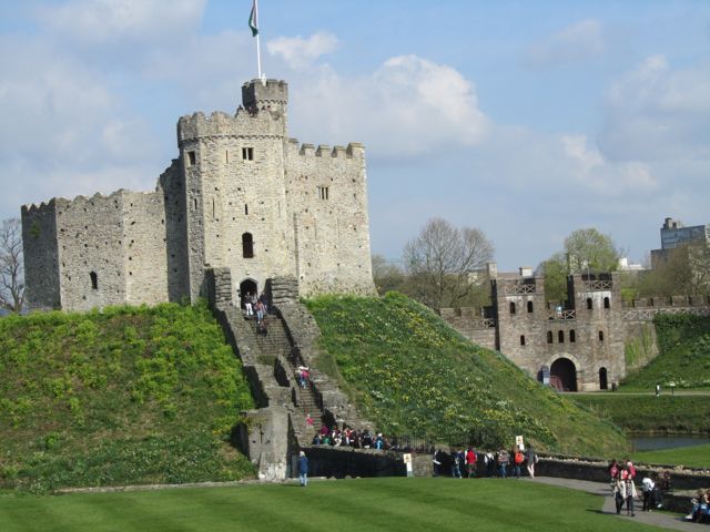
Roman Baths. This morning our final viewing was this -
Cardiff Castle. They said three hours for the walk around but we did it in under two and it really wasn't as grand as we expected.
 |
| Caerphilly |
 |
| Castell Coach |
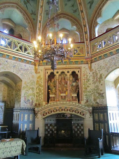 |
| a tad ornate room in Castell Coch |
Our last day in Wales also involved, after viewing Cardiff, a house call at WIndsor to see Liz. She was home (we knew because her flag was flying) but she wasn't taking visitors!
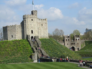 |
| Cardiff Keep |
0 Comments on MORE castles and a note on climbing steps as of 1/1/1900
Where have we been? ... Well, tripping up and down the Wye Valley in Wales of course.
I love the driving (especially in our very, very upgraded satellite-enabled mode of transport) that moves from easily marked motorways to thin and extremely narrow roads, bordered on each side by exquisitely manicured hedges that at times make it impossible to see oncoming traffic - even tall tractors! It really feels at times like I am driving through a maze.
Yesterday, which was Friday over here in Wales, we set off from Bath and drove a few miles and began our visit to the Welsh castles and ruins ... as many as we can. We have a three day Historic Castles and Attractions pass so we are going to use these as much as possible.
Chepstow Castle and
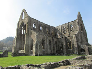
Tintern Abbey yesterday, and then today we hit three -
White Tower,
Tretower Castle and Court and finally
Raglan Castle ... and the one uniting feature besides the grandness of the walls was the very many steps we climbed. We have found some new muscles and a few aching knees! I spent ages just marvelling at these grand structures, with such thick walls, blocks of stone arches, the huge window spaces and the spacious halls, moats and dining rooms, and the many other rooms - some even have ensuites! Its amazing some of the stones that form these structures and the sweeping views from the top of the towers are stunning. HUGE fireplaces and kitchens were in some of these castles - they must have had raging parties within those walls.
 |
| Chepstow |
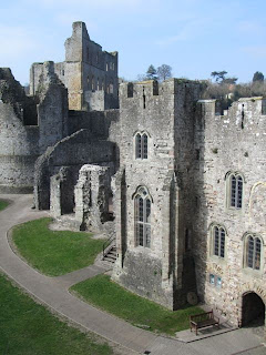 |
| Chepstow from high walls within |
 |
| Tintern Abbey |
 |
| Tintern Abbey |
Post Hong Kong and post Bologna, it is time now for us to enjoy a little downtime, first in London and then at various outposts in Wales. So here is a snapshot (with a few piccies) of our days so far ...
First off, London with our gorgeous friend Marcia. We dropped in to the V&A (Victoria and Albert Museum) for another visit and spied Marcia's wonderful Dickens book on display as part of the Dickens centenary celebrations ... and she didn't even know it was there.
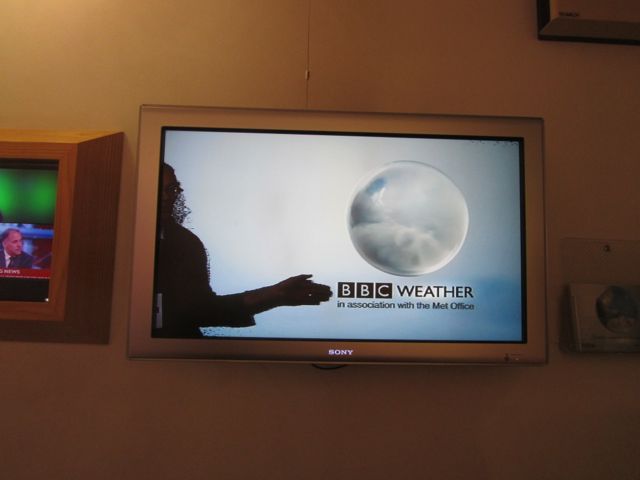
And a must see and do is a tour of the BBC television studios (before they close down). Bini and I got to present the news, I got to do a quick weather presentation, and wonder of wonders ... I stepped into the Tardis (that's another tick for the bucket list). Mind you, the BBC shop could take a lesson from our ABC shops and have a better collection of Dr Who bits and pieces. I will have to buy my mini Tardis back him in OZ but at least I can say that I have now stepped inside that police box - and it looks much bigger inside on television!
 |
| step inside |
 |
| that's me (Chris) pointing |
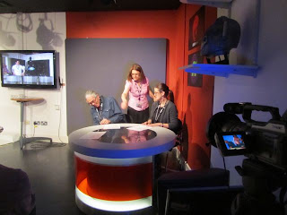 |
| wiring up |
 |
| not so big Dalek! |
A morning journey on London transport which was fast and rapid and uses an Oyster card (oh to such wonderful Australian ingenuity) t
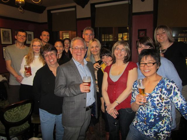
Our travels have taken us to London and after lots and lots of communication with Anita organising the British Isles showcase for Bologna I knew I would have to catch up with her on her own turf ... and see if she really did have a cockney accent.
It really was a thrill for me that she was able to arrange a social for the London members last Tuesday night and that we were able to drop in and chit chat to all the folks who gathered. What a lovely crew.
We also cheered Anita who organised a terrific showcase (complete with sweet treats) for the British Isles. I even had photos to show the members.
... and look who also turned up. Serena Geddes and Bruce Mutard (sorry Bruce ... i didn't get a snap of you for this) headed to London with us from Bologna.
... and folks who know me will tell you that this is a very very unusual photo - ME behind a bar!
... and what did we eat? A perfect English dinner ... PIE and CHIPS.
More about our London - Wales journey coming soon.


.jpeg?picon=3282)