When we think of Christmas cards, we usually picture images of holly, robins, angels and candles, or snow-covered cottages with sledging children, Nativity scenes with visiting Wise Men, or benevolent Santas with sacks full of presents. Very rarely, I imagine, do we picture a summer woodland scene features lounging female figures in classical dress and a lyre-playing cherub.
The post Aesthetics and the Victorian Christmas card appeared first on OUPblog.
By Jilly Traganou
After attending the “Because” event at the Wolff Olins office on July 4th, I was once again reminded of the big disconnect that lies between designers and their public. Wolff Olins is the firm that designed the London 2012 brand, a multifaceted design campaign that included much more than the London 2012 logo. Readers may remember the numerous complaints that the logo generated. As my research revealed, this was caused partly due to International Olympic Committee (IOC)’s restrictions and the corporate unwillingness to allow for the full application of what might be seen as a “no logo” campaign.
Wolff Olins proposed an open-source framework that would integrate the public by providing a design language that could be shaped into new forms and messages. The designers’ intention was to “hand over some tools that would allow people to make everything they wanted.” Design would be “off the podium, onto the streets.” But neither the public nor the broader designers’ community were ready to accept that the Wolff Olins team showed no compliance to the usual set of corporate instruction and that what they were trying to achieve lied beyond the creation of beautiful forms.

London 2012 event. Photo by Gary Etchell. Used with permission. All rights reserved. http://www.flickr.com/photos/gary8345/557769058/
The designers’ goal was to evoke an effect similar to that of the Mexico 1968 design: a visual language designed by Lance Wyman that was not only appropriated by the counter-Olympic movement, but also marked future visual languages developed by local designers in Mexico. In a way, Wolff Olins’ design succeeded in its adaptability, even though its multiple viral deconstructed versions that appeared on the streets and online were meant to primarily express conspiracy and protest, or even a disdain for the very visual language that the designers provided (and which these “dissidents” are now using).
But why would designers today strive for openness and participation? And why should IOC, London Organising Committee of the Olympic and Paralympic Games (LOCOG), or the general public be indifferent or even hostile to these intentions? After all, are there any designs that would meet the aspirations of all stakeholders: Olympic organizers, designers, and their multiple publics? The Olympics, as indeed most public events, are complex platforms that bring to the surface deep social conflicts and generate heated debates about the notion of public good. The new temporary or permanent configurations that are designed for the Olympics express these tensions and often become the targets of opposing voices.
Everyone today recognizes that the modern Olympics only partly concern sports. Few, though, are aware of the multiplicity of the design engagements that are mobilized for their realization. Being characterized as something between urban festivals and quasi-religious events, the Olympics have a strong ceremonial character that design generates. Hundreds of designers are mobilized to create a series of objects (logos, posters, uniforms, mascots, souvenirs) that are indispensable for the Olympic ensemble. This may seem to some a contemporary distortion to the original 19th century idea of the modern Olympics’ founder, Pierre De Coubertin, but Coubertin was keenly aware of the importance of design for the identity of the Games. He designed what has been credited as the most recognizable logo in the word, the Olympic rings, and spent considerable energy in prescribing the ceremonial characteristics of the event, with writings on subjects that ranged from attention to lighting and decoration, to specifications on the architecture of the venues.

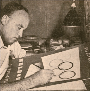
Photograph in newspaper (unspecified) of Richard Beck working on the design for the Olympic poster. This proto-version differs from the final design, particularly in its typography. Collection: Powerhouse Museum, Sydney, 92/1256–1/4. Used with permission.
The design for the Olympics has been an overlooked subject in the fields of design history and Olympic studies alike. Olympic design’s role as an instrument of modernity becomes obvious, for instance, in the way
British athletes’ uniforms were designed for the early Opening Ceremonies, expressing but also helping to shape the identity of modern Britain. The Melbourne 1956 poster designer, Richard Beck,
abandoned the neoclassical body of the male athlete that characterized earlier Olympic posters for a non-figurative composition along the tenets of modern design.
As it has become only too obvious with the current case of London, in late modernity the Olympics are also an opportunity for new infrastructure projects and major real estate enterprise, which leave a debatable legacy to the host-city. Planners, architects, and urbanists play a major role in this process, as well as those who sponsor, lease, or invest in the projects in the longue durée of the post-Olympic era. The design for the Mexico 1968 Olympics had significant ideological implications for the social segregation that marked the future of Mexico City. The architecture of the Athens 2004 Olympics is emblematic of ‘instant monumentality’ and a lack of legacy planning that has characterized many modern Olympics.
At the same time, the high visibility, budget, and scale of the Olympics have provided designers with opportunities to realize ambitions that are not possible through ordinary projects, and to envision ideas that are often too advanced for their times. Katsumi Masaru for instance insisted in compiling a design manual for the Tokyo 1964 Olympic Games (a set of prescriptions that would secure the unified application of the graphics, and thus a cohesive Olympic image), even though he knew too well that it could hardly be applied in the Tokyo Olympics per se. Indeed it was completed just before the start of the Games leaving nevertheless an important legacy for all forthcoming Olympics for which a design manual became a staple. Should we similarly expect that the “no logo” idea of the London 2012, with its openness and lack of corporate compliance, is signaling a new paradigm shift?
Jilly Traganou is Associate Professor in Spatial Design Studies at the School of Art and Design History and Theory, at Parsons The New School for Design in New York. She has published widely in academic journals, has authored The Tokaido Road: Traveling and Representation in Edo and Meiji Japan (Routledge, 2003) and co-edited Travel, Space, Architecture (Ashgate, 2009). She is currently working on a new book Designing the Olympics: (post-) National Identity in the Age of Globalization. Traganou has recently edited a special issue titled “Design Histories of the Olympic Games” for the Journal of Design History, where she also serves as Reviews Editor.
The new issue of the Journal of Design History titled “Design Histories of the Olympic Games” introduces the Olympics as a multifaceted design operation that generates diverse, often conflicting, agendas. Who creates the rhetorical framework of the Olympics, and how is this expressed or reshaped by design? What kind of ambitions do designers realize through their engagement with the Olympics? What overall purposes do the Olympics and their designs serve? ‘The Design Histories of the Olympic Games’ brings together writings by a new generation of scholars that cross the boundaries between traditional disciplines and domains of knowledge. Some of the articles look at the role of Olympic design (fashion design and graphic design) in representing national identity. Other articles look at the interconnected area of architecture, urbanism and infrastructure and the permanent legacy that these leave to the host city. You can view more on the Journal of Design History’s Design Histories of the Olympic Games Pinterest board too.
Subscribe to the OUPblog via email or RSS.
Subscribe to only art and architecture articles on the OUPblog via email or RSS.
Read more blog posts about the London 2012 Summer Olympic Games.


