new posts in all blogs
Viewing: Blog Posts Tagged with: Imagery, Most Recent at Top [Help]
Results 1 - 25 of 41
How to use this Page
You are viewing the most recent posts tagged with the words: Imagery in the JacketFlap blog reader. What is a tag? Think of a tag as a keyword or category label. Tags can both help you find posts on JacketFlap.com as well as provide an easy way for you to "remember" and classify posts for later recall. Try adding a tag yourself by clicking "Add a tag" below a post's header. Scroll down through the list of Recent Posts in the left column and click on a post title that sounds interesting. You can view all posts from a specific blog by clicking the Blog name in the right column, or you can click a 'More Posts from this Blog' link in any individual post.
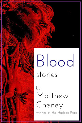
In the
Weird Fiction Review conversation I had with Eric Schaller, Eric asked me to talk a bit about designing the cover of
Blood: Stories, and in my recent
WROTE Podcast conversation, I mentioned an alternate version of the cover that starred Ronald Reagan (this was, in fact, the cover that my publisher originally thought we should use, until she couldn't get the image we ended up using out of her mind).
I thought it might be fun to share some of the mock-ups I did that we didn't use — the covers that might have been...
Front(click on images to see them larger)
 |
| 1a |
 |
| 1b |
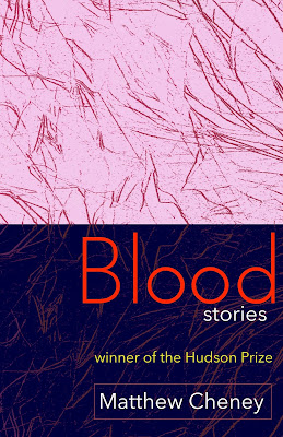
1a & 1b. These two are variations on an early design I did, the first one that seemed to work well, after numerous attempts which all turned out to be ghastly (in a bad way). 1b for a while was a top contender for the cover.
 |
| 2 |
2. I always liked the idea of this cover ... and always hated the actual look of it.
 |
| 3 |
3. I made this one fairly early in the process, using the
Robert Cornelius portrait that is supposedly the first photographic portrait of a person ever made. It ended up being my 3rd choice for the final cover. I love the colors and the eeriness of it.
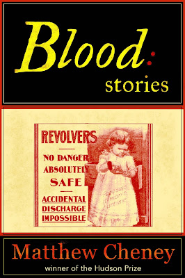 |
| 4 |
4. This never had a chance of being the actual cover, but I love it for the advertisement alone. As far as I can tell, that was a real ad for revolvers.
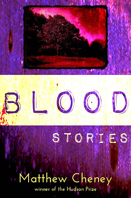 |
| 5 |
5. The inset picture is one I took in my own front yard. I like this cover quite a bit, but there's too much of a noir feel to it for the book, which isn't very noir.
 |
| 6 |
6. Here it is, the Cover That Almost Was. The image is a publicity photo from one of Ronald Reagan's movies.
 |
| 7a |
 |
| 7b |
 |
| 7c |
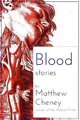
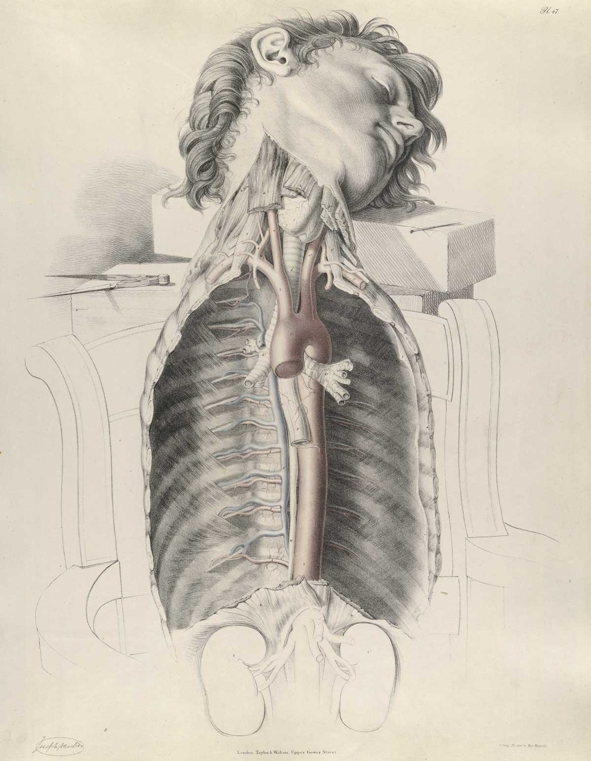
7a, 7b, 7c. Once I found
the Joseph Maclise image, I immediately thought I'd found the perfect illustration for the book. It took a long time and innumerable tries to figure out the final version, but it was worth the effort.
 |
| Actual cover |
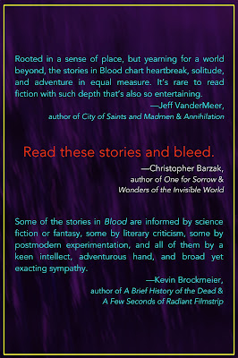
Back
Though the book designer Amy Freels ultimately did the back cover herself, I gave it a stab. As you'll see, we went back and forth on whether to use all of the blurbs or just Chris Barzak's and put the other blurbs on an inside page.
 |
| 1 |
 |
| 2 |
 |
| 3 |
 |
| 4 |
 |
| 5 |
 |
| 6 |
 |
| 7 |
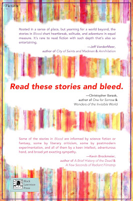
1-7. These are a bunch of early attempts. None quite works (some
really don't work), and they would have all felt sharply separate from the front cover. We had lots of conversations about #4, though, as the publisher was quite attracted to the simplicity and boldness of it for a while.
 |
| 8 |
 |
| 9 |
 |
| 10 |
 |
| 11 |
 |
| 12 |
 |
| 13 |
 |
| 14 |
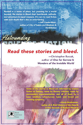
8-14. I love these, but they're all too complex for the back cover. As images, though, they still appeal to me deeply. I also like that they use
the Alejandro Canedo (or Cañedo) painting from Astounding (September 1947) that plays such an important role in the story "Where's the Rest of Me", though I also know we probably would have had to figure out how to get the rights to use it, and that could be a huge headache and a wild goose chase.
 |
| Full, final cover |
Try Book 1 for Free
There’s an apocryphal story about a writer who worked hard all day. In the morning, he inserted a semi-colon; in the afternoon, he removed a semi-colon.
This morning, I inserted a metaphor; this afternoon, I removed the metaphor.
Metaphors continue to be a thorn in my side. I appreciate when I’m reading a story or novel and there’s an apt metaphor. It adds to my enjoyment because it expands the story and creates new connections. Such glimpses into the thought process of another human are one of the joys of reading.
Yet, when I sit down to write, I’m practically metaphor free. Partly, it’s because I find it tedious to sit down and add metaphors just because someone says my prose would improve with the use of metaphors. But as I’ve thought about it more, I’ve decided my problem is the difference in dominant vs. scattered imagery.
Dominant vs. Scattered Imagery
In their work of genius, How Does a Poem Mean, Miller Williams and John Ciardi discuss “The Image and the Poem” in Chapter 6. I refer you to their book for a full discussion of imagery, metaphors, similes and so on. For my purpose, though, let me concentrate on the question of dominant and scattered imagery. Here’s what Williams and Ciardi say:
“When the images of a given poem, or of a given passage, are related by their denotations, that poem or that passage is said to be constructed on a dominant image. When the images are related by their connotations but range widely in their denotations, that poem or passage is said to make use of scattered imagery.” (p. 247)
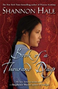 Here are some imagery (metaphor/similie) from Shannon Hale’s Book of a Thousand Days
- P. 1 I feel like a jewel in a treasure box. . .
- p. 2 Stay until your heart softens like long-boiled potatoes. . .
- p. 2 . . .skinny as a skinned hare.
- p. 8 It (the candle flame) tosses and bobs like a spring foal. . .
- p. 11 My heartache felt like a river, and I was sinking into it, carried away fast in its coldness.
- p. 12 . . if all they find is a delicate lady and her humble maid shriveled like ginger roots
- p. 13 I feel like a mucker from the ends of my hair to the mud of my bones.
- p. 13 It (lord’s house) was near as beautiful as a mountain in autumn. . .
- p 15 she sat on her bed, alone, straight as a tent pole
- p. 16. . . they resembled my own deel (clothing)as much as a worm resembles a snake.
- p. 18 . . . my lips thinner than the edge of a leaf.
- p. 18 He slapped his daughter’s face. . . like a snake striking.
- p. 20 She (Lady Saren) reminded me of a lamb just tumbled out, wet all over, unsure of her feet and suspicious of the sun.
Taken together, they don’t create a dominant image; Hale is using scattered imagery in a masterful way. Each image is directly related to the immediate situation. They don’t add up to a bigger image at the end—the collection of images don’t combine to create any symbolism.
Most of the time, when people mention the need for more metaphors in a piece, they mean this sort of scattered imagery.
However, when I write, I tend to write for a dominant image, using symbolism more than metaphors. The principle of selection of details for me is a wider scale. I’m looking for imagery that spreads across a whole chapter or even a whole novel.
Miller and Williams call this an overtone theme. (p. 110) They analyze the themes in a selection from John Milton’s Paradise Lost, concluding that Milton chose words and images based on two themes to describe the Biblical serpent who visited Eve: watery motion and regal splendor. A third category is when the two themes mesh.
Here’s a catalogue of the language:
- Watery Motion: indented wave, circular base, rising folds, fold upon fold, surging maze, floated redundant
- Regal splendor: carbuncled, burnished, gold, circling spires
- Combination of water and regal: towered, crested aloft
They say, “Whatever the value of such a tabulation, it cannot fail to make clear, first, that a unified principle of selection is at work in this diction, and second, that the words are being selected from inside their connotations and in answer to one another’s connotations, rather than from inside their denotation.”
Milton chose words/phrases because when they banged up against another word/phrase, they changed each other slightly. Circling spires weren’t just an architectural delight; instead, they hinted at regal splendor.
When I write, this is what I’m trying for: connotations speaking to connotations. I hope that I create a cumulative dominant image. I choose words based on certain themes and then work to make them collide.
Tips on Scattered Imagery
One reason I’m not fond of scattered imagery is that in the hands of a novice, it jerks me out of the current story. Here’s an example.
Setting: The principal tells you that you’ve won a scholarship, but to get it, you must accept an exchange student into your home for a year.
“. . . awesome news tossed into her lap like a grenade.”
Setting: A girl is thinking about a weird boy.
“ Thinking about him made her stomach hurt like she’d eaten a dozen McDonalds burgers at one sitting.”
These similes are easy to understand, contemporary, and not my favorite. In the first situation, a grenade carries the connotation of war, shock, and a shattered body. It’s too much for my taste because it pulls me out of a teen novel and instead, puts me in the Vietnam or Iraqi War.
In the second situation, I certainly understand that a dozen burgers (from anywhere) eaten in one sitting would give you a tummy ache. But how does this relate to the situation? It didn’t relate for me.
Hale sticks to imagery related to the immediate scene.
Setting: The princess and her maid are forced to become scullery maids in order to eat.
“Stay until your heart softens like long-boiled potatoes. . .”
In a kitchen setting, this makes sense. It also relates to the character who comes from the country and is familiar with the humble potato.
When you use scattered imagery, then, especially metaphors and similes, give them deep roots in the setting, not just a reference to a general cultural region.
And when you critique writing for others, remember the range of possibilities. Certainly, I always need to be challenged to use deeper imagery; but maybe, I don’t need to worry so much about just the one option for imagery called the metaphor.

I often tell writers that good writing is about the balance of action and information. I’m also always telling writers about mimetic writing. The other day, with an editorial client, I thought of a great image that helped them conceptualize these ideas in a way that made sense.
Let’s say that we have a getaway car. It’s assumed that it will be used in a chase sequence, which is primarily action. Per the idea of mimetic writing, the narrative style of this passage should be quick and to the point, since we’re dealing with a scene that’s meant to move quickly.
Now think about a camera taking a picture of the getaway car in order to convey what it looks like to the reader. This camera can take amazing high resolution images, or it can take grainy “potato quality” shots like you’d find coming from a middle-of-the-line cell phone. In this case, a many-megabyte high resolution picture of the getaway car might be beautiful, but if we try to work with that picture or send it to someone (the reader), it’s going to be a huge attachment, it’ll take time to upload, and it’ll clog up their email bandwidth. (Unless they have fiber, in which case this analogy is useless!)
For the chase sequence, then, we’d be fine with a quick, grainy snapshot of the getaway car so that we can get on with the action and not get bogged down with information. Here the balance swings to action rather than information. If we’re establishing a very important setting, then the beautiful high res image is very appropriate, and the balance swings to information. The reader wants to know the delicate details, and you can dwell on them more, taking your time.
I hope this short but effective reminder helps you craft tight and effective prose as you start a new year of writing!
I’ve been doing a lot of editing recently and have noticed a quirk that I’m totally guilty of. Instead of choosing one very strong image that says it all, writers don’t quite trust their readers to get it (a very common problem) and are dogpiling several related ideas into one sentence of description.
For example:
Looking at the buffet, she was so famished that she could swallow it all in one gulp, leaving nothing left, licking even the grease trap of the giant rotisserie oven clean.
Girl is hungry, we get it! (Side note: Don’t try and write examples on an empty stomach.) Here we have three images, one weak (leaving nothing left), one medium (swallow it all in one gulp) and one very strong and specific (the grease trap thing).
The reason I went a bit off the deep end with the final image is that it is unusual, descriptive, and teaches us a little bit about character while conveying the same information as the other two–not only is she hungry, but she’s a little grungy, and knows her way around a kitchen. There are people who just want the tenderloin steak, and then there are people who want the gristle and bones to gnaw clean. The strange way her mind goes to the drippy, fat-caked grease trap puts her firmly in the latter camp.
So pick one strong, specific image with potential emotional or characterizing undertones to it. Your aim isn’t to give a reader information as many times as possible, it’s to do it once, and ideally in a memorable way. Less is more. In fact, in writing, piling imagery onto one idea actually dilutes the effect instead of concentrating it.
By:
jrpoulter,
on 7/30/2012
Blog:
Jrpoulter's Weblog
(
Login to Add to MyJacketFlap)
JacketFlap tags:
Prue Mason,
launch,
SHeryl Gwyther,
Ipswich,
Ipswich Festival of CHildren's Literature,
Jenny Stubbs,
Lucia Masciullo,
Virginia Lowe,
Brisbane Square Library,
Journey of a Book,
Michelle Richards,
Blue Quoll,
Awards,
children,
children's books,
books,
illustration,
Literacy,
Fiction,
non fiction,
picture books,
inspiration,
Education,
drawing,
children's literature,
Teacher Resource,
children's stories,
Crichton Award,
imagery,
story books,
SCWBI,
Library resource,
Writing,
Australian Children's Book Awards,
Add a tag
The launch was wonderful, a chance to see everything in place, admire friends’ exhibits, show it all off to friends and family and network! Sheryl Gwyther, Prue Mason of SCBWI and Michelle Richards [our wonderful Exhibition coordinator from Brisbane Square Library] organised the launch event. Jenny Stubbs, Coordinator of one of Australia’s leading children’s book festivals, “Ipswich Festival of Children’s Literature”, came down from Ipswich to open the exhibition. Jenny gave a stirring and encouraging speech to gathered authors, illustrators and friends, despite protesting she didn’t fancy herself a speaker . 
Visitors included Dr. Virginia Lowe of “Create a Kid’s Book” fame and Lucia Masciullio of Blue Quoll Publishing, teachers and teacher librarians from Brisbane and Ipswich. Feedback has been excellent. It is vindicating, as an author or as an illustrator, to have people acknowledge the work that goes into a book’s creation and to have a new appreciation of the end result!
Read other reports of the Exhibition on Anil Tortop’s Blog and the SCBWI Facebook page. Better still, go along and have a squizz – Level 2, Brisbane Square Library, George Street Brisbane CBD, from 13th July to 31st August, 2012!
Click to view slideshow.


By:
jrpoulter,
on 7/25/2012
Blog:
Jrpoulter's Weblog
(
Login to Add to MyJacketFlap)
JacketFlap tags:
Poetry,
humour,
Literacy,
Fiction,
non fiction,
picture books,
birds,
Cats,
publishing,
young adult fiction,
teen fiction,
Writing,
inspiration,
Education,
e-books,
fantasy,
drawing,
children's literature,
Dogs,
mystery,
Animals,
Teacher Resource,
animation,
Tina Clark,
children's stories,
Digital publishing,
verse,
Prue Mason,
calligraphy,
imagery,
Sarah Davis,
story books,
SHeryl Gwyther,
humorous verse,
children's verse,
narrative verse,
humorous poetry,
iphone app,
Family pet,
Library resource,
Home schooling resource,
Katherine Battersby,
Australian Children's Book Awards,
J R Poulter,
Nette Hilton,
creative arts,
cross cultural exchange,
Jenny Stubbs,
Lynelle Westlake,
Peter Taylor,
ipad,
Angela Sunde,
Virginia Lowe,
David McRobbie,
craft work,
Peter Allert,
Brisbane Square Library,
Lynn Priestley,
book creation,
Journey of a Book,
Pam RUshby,
Michelle Tofts,
Ozan & Anil Tortop,
Awards,
YA,
children,
SCBWI,
children's books,
Design,
books,
illustration,
Reading,
Add a tag
Click to view slideshow.Books are created from the imagination and inspiration of authors and the insightful vision of illustrators. They are then crafted. The authorial crafting may be right brain with a touch of editing or slow and laborious left brain plotting. For an illustrator, it may be inspiration flowing like rivers from brush or stylus or it may be storybook or dummy creation then rethinks, scrap some ideas, adapt others. Eventually, a book emerges that is then ‘ready for submission’. These days, that may mean adding animation and audio to make the book a digital production for app developers like Utales or Flying Books, or for YA, formatting it for Kindle or Nook e-publishers. It may mean self publishing on Createspace or Lightningsource, Smashwords or Lulu. Or it will mean the long road via submission to traditional publishers.
If the latter is chosen, the publisher will often require more editing, changes and perhaps more changes. My own book, started under contract to one publisher, was already well underway with the inimitable Sarah Davis as illustrator. We were having a ball creating our book. Then our publisher was taken over and the new publisher wanted to institute changes. At first, the major change – ‘get rid of the dead bird’ – seemed straight forward. Then we realised the book needed the bird but, to keep it, we had to make some big adjustments. An injured bird can’t just disappear in a children’s book, it has to get better and be released, which, in our picture book, meant its story had to be woven into the fabric of the main story seamlessly. No problem, a few days and Sarah and I had nailed it! As book creators, you have to be flexible and, especially if going the traditional publisher route, you can’t be too precious about your creation.
SO! This exhibition is about the journey numbers of wonderful children’s and YA books took from creation to bookshelf! Each book has a different creation story to reveal - something the public doesn’t see, it’s behind the scenes. Now the reader can take a peek backstage, behind the scenes to how it all came together!
THE SET UP
Setting up was not straight forward. The spaces has to be utilised to best advantage and the items displayed needed to be seen from as many angles as possible given I had a two shelf rectangular glass case. I didn’t end up using everything I brought with me. It would have been too cluttered. Last minute inclusion, bulldog clips, proved life-savers! They held the photographic prints in place.
I had never ‘hung’ a painting before at an exhibition and that proved ‘interesting. Sarah Davis sent up her wonderful original painting via kindly courier, Peter Taylor, but it was unframed. I had no time to find a frame. Fortunately, I had one around the house that was a good match colour-wise though not quite the perfect size.
Given my exhibit was about my close collaboration with Sarah, the items displayed needed to reflect the two minds working together to make a new creative whole – our book! Sources of inspiration, stages in text change, changes in images, cover and trivia relating to the characters, objects and places in the book all combined to make a successful ( I hope you agree) exhibit!
Click to view slideshow.
THE LAUNCH


0 Comments on
Journey of a Book – children’s literature creation under the microscope as of 1/1/1900
Andrea has gotten it spectacularly right! The CEO of Tell Me a Story launched 10 new titles on 30th June, this year. I was privileged to be guest speaker at an event that had even seasoned politicians, Ian Rickuss, MP Lockyer, and Steve Jones, Mayor, Lockyer Valley Regional Council, commenting on attendance numbers!

Assembled authors, illustrators and guest panelists with Andrea Kwast

Muza Ulasowski [Panelist] and Guest Speaker, J.R.Poulter
The audience was rapt. I have seldom been at a publishing event where everyone’s eyes shone! Andrea has the devoted support of her very wide community of readers and growing. She also has the good fortune to have a very devoted group of assistants in administrator, Rel, and local photographer and budding author herself, Jenni Smith.
Research and innovation, preparedness to think out of the box, are hallmarks of Andrea and her team. She believes stories are lurking everywhere and it just takes the right determination, editing and dedication to bring them out. That she is succeeding over and above expetaction is more than demonstrated by the sellout and reprint, within the first few weeks since the launch, of no fewer than 3 titles!
Hearty Congratulations Andrea and Team and to all her authors – keep writing!
Click to view slideshow.


 0 Comments on Wow of a launch results in 3 titles in reprint already! as of 1/1/1900


.jpg?picon=160)


 6 Comments on Nicola’s Monsters! An interview with illustrator turned author, Nicola L. Robinson, last added: 5/30/2012


 0 Comments on How not to do a Book Launch?! as of 2/3/2012 4:20:00 AM
.jpeg?picon=893)


This was such an inspirational interview! I also loved (still love) Greek myths. Your illustrations are amazing! Very colorful and detailed work. I myself, after more than a decade of being an illustrator, started writing recently. What you shared with us today Nicola was very very interesting and helpful! Thanks! Thank you Jennifer!
Wonderful interview! I enjoyed reading about Nicola’s process. It’s so interesting seeing the rough sketches, and how they progress to such colorful, fun illustrations!
Great story!
My Pleasure Niki!
Thanks for stopping by and commenting, Julie!
Thanks Beth!:) I sent Bumbershoot to another publisher recently – am hoping for a thumbs up of course! Love your illustrations!