

I've been playing with panda bears again, this time on linocuts. Considering making some greeting cards out of these prints, what do you think? Here are a few more experiments: Playful Panda Prints.

I've been playing with panda bears again, this time on linocuts. Considering making some greeting cards out of these prints, what do you think? Here are a few more experiments: Playful Panda Prints.
 By: Jessica Holden,
on 2/15/2016
By: Jessica Holden,
on 2/15/2016


karolin schnoor is a German freelance Illustrator and designer, who uses screen printing as an integral part of her illustration practice. Inspired by a love of colour and pattern her illustrations can be found in magazines, stationary, calendars and mugs with a vast array of products to purchase in her Etsy shop. Some of her clients include; Harper Collins, Creative Review and The New York Times.
To see more from this artist visit her website.
By: Chloe Baldwin,
on 6/8/2015
By Chloe


Alice Pattullo is an illustrator based in East London. Her work is inspired by British folklore, traditions and superstition. This has created a distinctive vintage style within her work with a handmade quality. It is full of character and texture. Her work depicts a variety of subject matter from food to whimsical scenes of people and animals.
To view more of Pattullo’s charming illustrations, please visit her portfolio.
 By: Carter Higgins,
on 4/28/2015
By: Carter Higgins,
on 4/28/2015

by JooHee Yoon (Enchanted Lion, 2015)


(click to enlarge)
This book is something. A mashup of poetry and pictures, washes of color and words.


(click to enlarge; this is an example of a spread that folds out to reveal an entirely new and more expansive illustration.)
Some thoughts from JooHee on the art and creation of Beastly Verse:
I wanted to create a book that not only tells wonderful stories, but one that is beautiful to behold. For me, the design of the book is just as important as its content; they are inseparably linked. I believe all elements of a book–its paper, binding, size and weight–create an atmosphere that plays an important role in the experience of reading.
The printing process fascinates me. Not only traditional printmaking, but also industrial processes as well, since these are just a further development of the old printmaking techniques. I have always been drawn to printmaking, and rather than mixing colors on a palette and putting them on paper, I enjoy working with flat color layers overlapping one another to create the secondary colors. My experience with printmaking informs almost all of my artwork today. I wanted to take advantage of the industrial printing process so the printer is not just reproducing the image I make, but in a sense creating the image itself.


This book has been printed using just three colors. The areas where the main colors overlap create secondary colors, resulting in a book that seems very colorful even though only a limited palette was used. Seen alone, each layer is a meaningless collection of shapes, but when overlapped, these sets of shapes are magically transformed into the intended image. To me the process of creating these images is like doing a puzzle, figuring out what color goes where to make a readable image.
I am very inspired by books from the early 1900s – 1950, when artists were forced to work with spot colors since reproduction methods weren’t as developed as they are today. It is amazing what some artists could do with just two or three colors, and this is exactly the same process I am using, but one from choice rather than necessity. There is a luminous brilliant quality to the colors when images are reproduced this way that I love.


(click to enlarge; this is an example of a spread that folds out to reveal an entirely new and more expansive illustration.)
It’s fascinating to pull the curtains back on an illustrator’s process, and I’m thankful to JooHee for her words here. Her explanation of something so simple, so exquisite, and so complex is as brilliant as those colors she creates.
And the book itself is definitely a work of art. Uncoated, thick pages. Slightly oversized. There’s a non-uniform feeling to the ends that isn’t quite a deckled edge, but a bit more raw and tactile. Hand-crafted almost.

(click to enlarge)
Beastly Verse’s dedication reads simply, For the Reader.
Here, the reader is also the design enthusiast, the art collector, and the wordsmith. A book for book lovers.

Huge thanks to Claudia Bedrick at Enchanted Lion for the images in this post.
Add a Comment
By: Jeanine Henderson,
on 3/10/2015
Post by Jeanine


I’ve been a long time fan of the super talented design, illustration, and printmaking team known as Strawberry Luna. My art crush on this husband-wife studio might have a little to do with the fact that some of my favorite rock bands are among their impressive client list. And because they hand pull their beautiful silkscreens the super old-fashioned way. Or, because they hail from my hometown of Pittsburgh, PA. But, mostly I just am in love with their distinctive and smart graphic style! Best known for their silkscreen prints and posters, they also work on custom illustration and design projects including CD & vinyl packaging,web-ready icons, t-shirt designs, and logos & identity packages.
Their impressive client list includes Belle and Sebastion, Camera Obscura, Andrew Bird, Feist, Bright Eyes, Death Cab for Cutie and many, many more.
It was hard to choose just a few favorite pieces to share, so be sure to stop by their website and Etsy shop to see more!
 Illustrator & Gig Poster Designer Dan Stiles
 Mitch O’Connell Poster for Tura Satana Art Show
 Artist :: Andrew Holder
 Stunning book covers by artist Iacopo Bruno
 Artist:: Lucie Rice
 Studio Spotlight :: DKNG
 Artist :: Tatsuro Kiuchi
 Artist :: Tabitha Bianca Brown
 Sweet & Whimsical Work from Artist Jen Skelley
 By: Tatjana Mai-Wyss,
on 11/21/2014
By: Tatjana Mai-Wyss,
on 11/21/2014


 By: Jenny,
on 9/5/2014
By: Jenny,
on 9/5/2014
Janina Pechova will facilitate a two-day workshop. Venue: Johannesburg Date: 4-5 September 2014 Time: 10:00 - 15:00 Cost: R400 SCBWI members, R700 non-members RSVP: By 29 August to Jenny at [email protected] Booking is essential. Only a small number of participants can be accommodated. Participants will be doing monoprints and engravings (dry point etching) Monoprints are artworks
.jpeg?picon=1639) By: Shadra Strickland,
on 8/1/2014
By: Shadra Strickland,
on 8/1/2014
My summer vacation is coming to an end. For the past two weeks I have been visiting my dear friend Taeeun Yoo in Seoul, Korea. We spent our time drawing around Seoul, eating great food, working, and exercising together. It has been truly restorative. Today, my last day here, Taeeun conducted a printmaking workshop for me. I am most comfortable working in watercolor or pen, but am always eager to expand my artistic vocabulary.
First, I started with a drawing. Printmaking is wonderful because it forces you to think about shape and color first. Whereas, with other painting techniques, you are thinking about composition and line. My composition is based on my recent summer travels and a story idea I have been thinking about here in Seoul. I will share a few of the steps.

After transferring the drawing, I carved the white areas first. As in watercolor painting, I needed to build my print slowly from light to dark. The seagulls in this piece would remain white.

We mixed a greenish blue sky. This is the lightest color in the print.

Next, I carved away more of the block and printed the trees and ground a middle blue green.

After the sea printed, I added a darker blue green to the landscape and then printed the jacket and head of the boy last. After printing the jacket, we thought it needed to be warmed up a bit. We added a bit more yellow and then decided that we liked the original green.
 We printed an edition of three. You can see here that each print varies slightly. For instance, in the first print, we inked a clean, flat blue for the water. In the second print some of the texture of the plate was left behind, making marks that looked more like waves. I really liked that effect, and continued the water lines for the rest of the prints.
Lastly, once the ink dried, I add a few details with a brush.

Voila, my first linoleum block print. Many thanks to Taeeun Yoo for her friendship and instruction today.
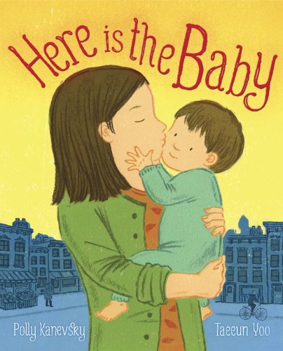
Check out her latest book, Here is the Baby, written by Polly Kanevsky, due out this September with Random House.
By: Tatjana Mai-Wyss,
on 9/5/2013
 |
| owl monoprint |
By: Tatjana Mai-Wyss,
on 12/17/2012
 By: Lynne Chapman,
on 8/13/2012
By: Lynne Chapman,
on 8/13/2012


 By: Shadra Strickland,
on 7/24/2012
By: Shadra Strickland,
on 7/24/2012
Kudos to two of my SU friends for this collaboration! Sara Gates, owner of Kingsland Printing in Brooklyn, NY, shares her work and love of the craft with film maker, Nadirah Iman. At Syracuse I knew Sara as a painter. We met in our foundation year and remained friends throughout. When I moved to NY in 2003, she and I reconnected and then later we found we lived in the same neighborhood in Greenpoint, Brooklyn, where her studio is located. Nadirah and I met through Sara and have been close friends ever since. Nadirah and I began as graphic designers at SU and from there she studied animation at SVA and then earned her M.F.A. in film making at SCAD. Nadirah is also the editor and producer of two of my book trailers, BIRD and OCCS.
Live the dream, ladies!
 By: John,
on 7/19/2012
By: John,
on 7/19/2012
Bill Fick is a personal favorite artist of mine, and a good guy and good friend to boot. Duke University’s Center for Documentary Studies sat down with him to talk about the monsters in his work. Bonus: watch Bill carve a big gooey linoleum-block head.
(via Controlling the Monster)
 By: Kathy Temean,
on 6/22/2012
By: Kathy Temean,
on 6/22/2012
 Anne Belov has been painting Fine Art for over 35 years, and doing printmaking for the last 17 years. She studied art at Philadelphia College of Art and later got her MFA in painting from the University of Washington in Seattle.
Over the years, she has realized nothing goes to waste. All her artistic endeavors have taught her that she can carry over things learned from one project to the next. From etching, she learned to love process, strengthen her value range and composition in my paintings, and enhance my ability to meet a deadline and now the impulses toward narrative in her paintings has fueled her desire to make visual stories for children.
Today she is venturing down the road of children’s books illustration and letting her life long passion for Panda Bears show up in her wordless picture book, Pandamorphosis.
She has been a pandamaniac since childhood. Four years ago, a chance encounter with an Atlantic Monthly story on pandas reignited her obsession. Since then, her online cartoon The Panda Chronicles has been gaining fans in leaps and bounds.
A serious painter, as well as a panda punster, Ms Belov resides in the Pacific Northwest where she presides over the Institute for Contemporary Panda Satire. Here is Anne showing and explaining her process:

This is actually 3 steps down the road to this new painting. I’ve done the drawing, under-painted a value study in egg tempera, and then glazed it with a mixture of a warm yellow-green and transparent yellow ochre, mixed with lots of neomeglip. As soon as I decide “I’m always doing it like such and such”, I start doing things differently. I’m working on a smooth clayboard, which is a commercially made product by Ampersand. Sometimes I like to use a very smooth surface, especially when I want to include lots of fussy and subtle detail.

This is halfway between stage 1 and 2, where I am reinforcing the value underpainting with a layer of mostly transparent purple underpainting. This will help reinforce the value structure, particularly in the darker passages. One of the big challenges is to keep the darks more transparent, which keeps them from going “dead”. Here is the full stage 2

Stage 3: OK now we’re on to adding color over most of the painting. OK well all of the painting. Still very rough at this point. I always want to keep edges soft until I’m at a more final stage in the painting. I’m working on the foreground first, as I want it to really pop out from the picture plane, so I want the background to work with the foreground, rather than vice versa. Capisce?

This is Stage 4

Stage 5: What happens here is that I try to experime
By: John,
on 2/3/2012
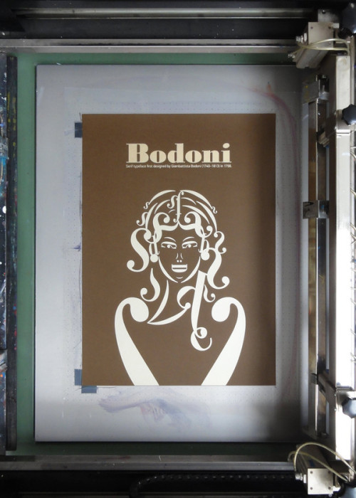
Clever silkscreen poster by Andreas Xenoulis, illustrated using characters from the Bodoni typeface. (Purchase here)
By: John,
on 7/22/2011
[Flash 10 is required to watch video.]
Drawn mega-pal Meg Hunt has posted a gorgeous short video of her solo show, Cosmic Forest, currently up at Portland’s Land Gallery. I had the great fortune of seeing the show in-person last weekend, and… well, it’s hard not to gush over a friend’s work anyway, but this show truly is superb. Meg’s linework and drybrush and colors (the colors!) and the tantalizing tease of a narrative that drifts across the collection of work is just awesome.
If you’re in Portland or nearby, make the trip before the show comes down! If you’re too far to see it with your eyeballs, don’t miss Meg’s Flickr set, linked below.
Okay! So it’s a lovely Friday in Portland and one week later, I have lots of documentation from Cosmic Forest, including the video above. Again, all this stuff was shot by my awesome intern, and it’s a lot of fun to see stuff in motion. If nothing else, it was a perfect summer show.
By: John,
on 2/7/2011
Here is a great video of the process of making a (really big) linoleum block print. The artist is my mentor and friend, Bill Fick, and this is one of his signature style prints. Gorgeous!
.jpg?picon=1621) By: DIANE SMITH,
on 11/18/2010
By: DIANE SMITH,
on 11/18/2010
My new round of art classes is underway - a Christmas Keepsakes class and a Intro to Linoleum Block Printing.
 |
| My sample print |
 |
| Guess you'll have to wait and see! |
 |
| What are we doing here? |
By: John,
on 11/8/2010
From Gutenberg to Photoshop: Little Buffalo Press :: Etsy Blog
More Vandercook analog printy goodness, this time from illustrator Don Kilpatrick III. (via)
By: Shadra Strickland,
on 3/10/2010
My etching class ended last night. I was able to pull one more print that I’m almost happy with, but will now be renting space at the Atlanta Printmaker’s Studio in order to study the craft and practice more. In the meantime, here is last night’s progress on the hummingbird piece. The drawing looks a little labored due to my having to redraw through the hard ground and having to reapply and redraw the soft ground details as well, and in this printing, I left a fair amount of ink on the plate for more plate tone….

My instructor, Kathy Garrou, brought in a book done completely in engraving! How crazy that? It’s a GORGEOUS book called TRICK OF THE TALE, written by John and Caitlin Matthews and illustrated by Tomislav Tomic. This book is published by Candlewick Press, who is ironically the publisher of my next book, WHITE WATER~ I can’t wait to add this book to my collection.

From the publisher: Enter (carefully) the world of the tricksters, those wily creatures who lie their way out of trouble, cheat when they get a chance, and devise elaborate tricks to get what they want — with delightfully unpredictable results. This truly diverse, elegantly illustrated collection follows such clever characters as Anansi, Coyote, Brer Rabbit, and others who play a role in a multicultural array of storytelling traditions, from African to Inuit to European, Tibetan to Native American to Japanese. Celebrate the slyest trickster tales from around the world in a lavish volume that gives a well-loved story tradition its rightful due.
Speaking of WHITE WATER…back to work~
By: John,
on 3/2/2009
Dehisce is a biology term describing the process of material being released upon the splitting open of an organ or tissue. Here animator Mark Andrew Webber explores this concept with a piece of animation created using nearly 300 printed hand-carved linocuts as his frames.
 By: Erik Brooks,
on 12/12/2007
By: Erik Brooks,
on 12/12/2007
 This a one of several possible images for my family's Christmas card this year. It also marks a return to printmaking -- which I really enjoy, and hope to do more of in 2008. Sleep tight!
.jpg?picon=380) By: Mark,
on 4/8/2007
By: Mark,
on 4/8/2007
Just One More Book! is a regular contributor to the online Childrens Literature Monthly Journal, The Edge of the Forest. This information-packed online resource includes book reviews, interviews, the latest news from the online childrens/YA literature community and much more. Our monthly audio segment is called Sounds from the Forest. This month’s segment includes an excerpt and some outtakes from our interview with Rachna Gilmore. Mark speaks with author Rachna Gilmore about her writing as neither work nor play, but “plark”, writing from the child inside and authenticity in characters. Books mentioned: Wild Rilla A Screaming Kind of Day The Gita series: Lights for Gita, Roses for Gita, A Gift for Gita Of Customs and Excise (adult fiction) Participate in the conversation by leaving a comment on this interview, or send an email to [email protected]. Photo: www.RachnaGilmore.ca Tags:A Gift for Gita, A Screaming Kind of Day, childrens books, Lights for Gita, Podcast, Rachna Gilmore, Roses for Gita, Wild RillaA Gift for Gita, A Screaming Kind of Day, childrens books, Lights for Gita, Podcast, Rachna Gilmore, Roses for Gita, Wild Rilla

I really loved this post. I'm sure all the 'hands-on' and experimentation made it very enjoyable. Like going back to art college :)
Yes, it was a bit. Good fun!
This looks fun Lynne,I will give it a go!Thanks for sharing!