JacketFlap connects you to the work of more than 200,000 authors, illustrators, publishers and other creators of books for Children and Young Adults. The site is updated daily with information about every book, author, illustrator, and publisher in the children's / young adult book industry. Members include published authors and illustrators, librarians, agents, editors, publicists, booksellers, publishers and fans. Join now (it's free).
Login or Register for free to create your own customized page of blog posts from your favorite blogs. You can also add blogs by clicking the "Add to MyJacketFlap" links next to the blog name in each post.
Blog Posts by Tag
In the past 7 days
Blog Posts by Date
Click days in this calendar to see posts by day or month
Viewing: Blog Posts Tagged with: Visual Perception, Most Recent at Top [Help]
Results 26 - 50 of 58
How to use this Page
You are viewing the most recent posts tagged with the words: Visual Perception in the JacketFlap blog reader. What is a tag? Think of a tag as a keyword or category label. Tags can both help you find posts on JacketFlap.com as well as provide an easy way for you to "remember" and classify posts for later recall. Try adding a tag yourself by clicking "Add a tag" below a post's header. Scroll down through the list of Recent Posts in the left column and click on a post title that sounds interesting. You can view all posts from a specific blog by clicking the Blog name in the right column, or you can click a 'More Posts from this Blog' link in any individual post.
What is the color of each words below? Say the name of each color aloud as you look at each word:
GreenRedBlue PurpleBluePurple
Now do the same thing for the words below. Don't read the words. Just say the name of the color of type used for each word.
BluePurpleRed GreenPurpleGreen
For most people, the second task is more difficult. It takes longer to name the colors when the word doesn't match the color, and mistakes happen more often.
This experiment was first conducted by John Ridley Stroop in 1935, and has been used to understand how different pathways of information can interfere with each other in the brain.
One explanation for why we have such a hard time sorting out the conflicting information is that it takes us longer to identify the color names than it does to read the words, so the brain has to go back and reconfigure each guess.
Totally off the subject -- I pulled up your son's "Hay Brigade" album of contemporary Irish music as I was painting today. Totally immersive; really tough to paint as I was bouncing to the tunes, humming along. Couldn't keep my brush straight. Good stuff.
Thanks, Lester. I miss having him playing in the studio as I paint. You've given me perfect chance to plug my son Dan Gurney, who is now living in New York, playing accordion (dangurney.net) and developing a concert streaming site (concertwindow.com).
Aha! I was wondering the relation. Accordion eh? That's something you don't see much anymore. Beautiful instrument though. I only know two people that play one. One of them is in her nineties.
Actually I didn't have much trouble with the second line and might have done it faster, but I might have cheated a little. I think I was using my peripheral vision to identify the colors before I focused on the letter patterns. Might be a little trick.
I tried doing it backwards and didn't do nearly as well.
Jim, I read somewhere that the effect was used at some point to detect spies.
For instance, suppose you had someone who you suspected to be russian but who claimed otherwise. Then you would run this test through him, with the words written in russian. If he was slower on the second sequence or made more mistakes then you'd have evidence that he understood written russian.
Jeffkunze: I also cheated, by unfocusing a bit and losing context (also, looking at the last letter of the word and the space after that). It works, though I think I was still a little bit slower on the second row. It makes me think that once the enemy spies hear of the test they can train to beat it :)
Wow. I've been paying more attention to my art in the past few years. The first time I ran into this test, I noticed how long it took to identify the colors in the second row and did make some mistakes.
This time was almost as fast with no mistakes. I think I've been staring at my palette for too long! Thanks for posting it, this sort of thing is fun!
I have a theory. For the first task, we just have to read off the written series of words, and that is something which we've had lots and lots of practice at. For the second task, we have to say the colors of a series of things, but that is something most of us have had little practice at. (You and other artists might be exceptions.)
Here is something similar. I once thought I might train myself to better recognize aromas, and I took a bunch of identically shaped spice bottles, closed my eyes, shuffled them, chose one at random, opened it and sniffed, then tried to say aloud the name of the spice. I found that I just couldn't do it. I would know the aroma perfectly well, but I couldn't say the name.
Maybe putting names, actual pronunciations, to things is something that requires task-specific practice.
If you glance around at this optical illusion by Akiyoshi Kitaoka, the snakelike coils around the outer edge will start to move.
But if you let your eyes come to a rest, the snakes come to a stop. Try looking toward one spot and 'spacing out.' Then start looking around again, and the snakes start moving.
Apparently, scientists have concluded, the illusion is somehow tied to eye movements.
Besides the "peripheral drift" I get a definite optical mixing effect. When I stare at the image defocused, the blue and yellow stripes combine to make a dull green.
This of course is what some of the impressionists and post-impressionists were after, notably Seurat with his pointillism. His colors are never mixed, just dots of pure pigment placed close enough to "mix" in the eye of the viewer.
Have a look at the photos below for five seconds or so. We'll come back to them later.
Scientists have used eyetracking technology to see where people look in a photo. One question they have asked is whether men and women look at other people in the same way.
In one experiment, groups of men and women were asked to look at the picture of baseball player George Brett and asked to think about his sport and position.
The eyetracking heatmap shows that both men and women spent time looking at the head, but men also looked at the crotch. This isn't necessarily a sign of sexual attraction. They could be sizing up the competition or identifying with him.
According to Nielsen and Coyne, men also tend to look more at private parts of animals when shown American Kennel Club photos.
Here are the results of thirty men and thirty women looking without prompting at that first pair of photos.
1. Men check out other men, especially their "assets." 2. Women checked out his wedding ring. 3. Guys don't seem to care about the woman's marital status, but looked at her face, breasts, and stomach. 4. If you ask people to self-report where they looked, they tend not to be very honest or they're just not consciously aware. ------------- Read more: Bathing Suit Photo Study (Think Eye Tracking) Online Journalism Review Studio Moh Related GurneyJourney posts Do Artists See Differently? Dog cam: Where do dogs and chimps look?
22 Comments on Men, Women, and Eyetracking, last added: 3/16/2012
I'm wondering how basic contrast/color also plays into it. IE., I looked at the shadow under the man's head first before anything else.
It's interesting to see what most men and women *don't* look at, especially on the women's side. Not even a blip down *there*! It sort of gives the message about how a lot of us guys place our egos into things that we think/hope others care about (well, both genders do that, really).
Interesting as always. I was wondering if you could say a few things about building up depth. Not so much in a city picture, but somewhere, where it is much more mixed up, like in a thick forest or somewhere wide open, like a desert dune.
.....No way I looked for his wedding ring. (Maybe in the study his jewelry was more apparent), but even then I'd look at this guy's admirable abs first and Heid Montag's pretty face (pre-surgeries) 2nd. Fascinating post!
The man appears to be wearing a pink panty and checking himself out. From the very start I feel like I am thrown off from my normal observation patterns by an uncomfortable feeling.
Not being a bisexual, I can't really claim total objectivity (I'm a straight female), but to me, there is not attractiveness-equivalency to the two people from the get-go. As etc-etc pointed out, the guy is checking himself out so 1) self-absorbed and 2) invisible face, which is the first thing *I* look at. Also, pink Speedo? Really? Who picked those pictures? LOL
I really question the scientific validity of their results. And how much they get out of the lab.
Terry, you raise some great points. The experimenters should have chosen a more neutral pose and swimsuit color for the guy.
One has to be really careful about inferring what people were thinking from the eyetracking data. Were they looking at the shape of the swimsuit, the color of the swimsuit, or the bulge under the swimsuit? It would take more lines of data (such as fMRI scans) to jump to such a conclusion.
One thing I found interesting was that no one (man or woman) looked at the guy's right hand. From a painter's point of view, I have to wonder: why bother rendering the hand with a lot of detail if no one looks at it?
@james: since the experimenters are based in the UK, one would suspect the photos are from that region. Not to defend this bloke's color choice, but I suspect that pink/fuchsia Speedos are more the norm on British or European beaches than in these parts - so, would he even get a second look over there? yes, over here, he'll be teased. is he really checking himself out? he's actually gazing at the beach, perhaps looking at the sand or seashells.
Anonymous said, on 3/15/2012 7:29:00 PM
I want to see them test more combinations of images before accepting any of their conclusions.
I'm a guy, so the first real conscious conclusion once I'd summarily processed the images is, beach-goers paired together, people in swimwear ah I see what they're trying to do, I see what they're trying to get me to prove.
Going back one more step, the second thing I saw a chick-in-a-bikini that looks like 99% of girls we're shown in a bikini, nothing interestingly new, and for me personally shameful to dwell upon her for what I've become accustomed to such images purpose which is to show off her beauty and sexuality (typically to sell something to me) at the cost of my desires for romantic partner (that's something that someone can latch onto but I won't be responding to such a debate on this thread). I'm just trying to show what kind of logic there is in the mere milliseconds of processing an image.
Whereas really what I saw first was the biggest block of solid high saturation colour, the guy's pants. Also drawn to it because it appears he's looking at them, so you're wondering what he's looking at? It has a far more interesting story to try to figure out and is an image I'd dwell on longer (seconds still) trying to understand that.
I think you're kind of right though James that there's not much point rendering great detail where people aren't going to look. We just need to know there's an hand there, as are any of it's details (which to me are visual messages) helping tell the story of the image better?
I think it's also what's the image used for. If it's selling me swimwear then who cares about those details whereas it does if it's hanging in a gallery or your Dinotopia books where as a child I looked at everything, fawning over pages for what felt like an age.
Anonymous said, on 3/15/2012 9:53:00 PM
It could be that no one looks at the guy's right hand because of the composition of the picture, or the presence of the shiny, sparkly watch. I wonder what the result might be if the mirror image of the picture is shown, with the watch photoshopped out.
raphael said, on 3/15/2012 11:38:00 PM
im always worried reading postulates like the bit about self-reporting being dishonest.
i am right with you there, james: what the study measured was the time and place the physical eyeball's lens was pointed at. seeing, though, is a question of consciousness, not of eyeball-pointing. we could, for example, have our eyeballs pointed at just the right spot in a piece of greenery all day, without seeing the camouflaged person standing in there. if we just "got it" after having our eyes pointed at that very spot for x minutes, we still wont have seen the person for all the minutes of eye focus rest, but just the last few seconds.
seeing is a question of the objects in the consciousness only. (therefore, knowledge influenced seeing: i see a damn annoying fly, the biologist sees a drosophila whateveris. we literally dont see the same thing. gladly, these things are usually easily manageable.)
to give the tracking the authority to say "haha, you dishonest fellow/lass! YOU say you didnt look at his crotch, but we KNOW you really did." is not only bad science, but also the stuff good headlines, and a degree in higher bullshit is made of.
unfortunately, fmri pictures wont bring much illumination to the matter either. same problem of misattributed authority.
those findings are always _useful_. but only that. they are no authority over reality, and cant be, for the very way their method that makes them so useful works. science theory 101, really.
(the best example for us painter dudes is color theories: no arguing that color theories based on newton are the ones we use to facilitate our paint mixing, because they provide us with a continually refinable framework for ordering the world. and we will gladly discard every old concept once a new, better-working one comes around.
to tell _what_color_is_, though, newton just falls flat on his face. no way around goethe and the theories he influenced, there. color happens in consciousness. nowhere else. thats darn useless for mixing paint, but thats what color is: a sensation. sensations of things are always consciousness of said thing.)
or, favorite husserl quote: theories have to conform to reality, not reality to theories.
"...I suspect that pink/fuchsia Speedos are more the norm on British or European beaches than in these parts..." They are not the norm in Europe. I agree with what Terry and various anonymous posters said.
My eye-tracking: Noticed some half-naked man wearing something pink. In horror, I immediately focused all attention on the safety and comfort of the woman's breasts. :P
My husband pointed out something I hadn't noticed: That the women checked out the areas of the woman where she had bones protruding. The hip bone, the ribs, etc. If men are sizing up the competition's crotch, then are women doing the same about a woman's perceived faults?
For our test, I looked at the man's chest and arms, then the boobs and tummy of the woman. He said he immediately looked at the man's crotch and woman's chest too. We match up pretty well in our "remembered" eye tracking. I didn't even think about looking at his crotch, even though it was pink and HE was looking at it!
Floaters are ghostly specks, dots, or lines that drift across your visual field. They’re most often visible in front of a smooth blue sky or a blank computer screen.
At left is a simulation from Wikipedia. You can’t look directly at floaters, because they exist at a fixed relationship to your direction of vision. As your eye moves to look at them, they dart away at the same speed.
Floaters are a normal experience for people with healthy eyes, but a lot of them can also be a sign of a retinal detachment or other medical problem. Normal floaters are caused by cell debris from the natural degeneration of the inside of the eye. Bits of protein material are suspended in the gel-like vitreous humour inside your eyeball and drift down like flakes in a snow globe.
10 fun facts about floaters:
There’s a different set of floaters for each eye, and you can see each separate set of floaters by covering one eye and then the other.
You get more floaters as you get older, but young people get them, too.
Young peoples’ floaters tend to look more like transparent worms, older folks' floaters tend to be more like dark specks.
Floaters eventually settle down to the bottom of the eyeball. During the day when you’re vertical, they settle at the bottom of the eyeball. During the night when you’re sleeping, they settle at the back.
If you tilt your head just right, you can sometimes get them to drift to the center of vision.
You don’t see the floaters, but rather the shadow they cast on your retina.
Floaters are not optical illusions, but are called entopic phenomena.
In bright light, when the pupil is contracted, the shadows cast by floaters are sharper, so they’re easier to see.
The gel-like vitreous humor gets more watery as you age.
In French they’re called “mouches volantes,” which means “flying flies.
They also appear during a vitreous detachment. It's something I've experienced, and the event itself is quite remarkable - colorful lights at the edge of vision. (Not to be confused with a painless optical migraine, which can offer a stunning lightshow not unlike the aurora borealis.)
In 3rd grade I pointed this phenomenon out to a fellow 3rd grader. We were sent inside from recess because we were standing in the outfield staring at these "worms" instead of playing kickball. :)
I have a few too many floaters which can be very annoying. I find myself going all shifty eyed sometimes when trying to get them to drift out of my field of vision. The worst is when I am reading. Feel luck if you just have a few.
Don't underestimate how bad floaters can be. After my vitreous detachment ( and retinal tear) I had such nasty big black floaters that I could see them with my eyes shut. They can block your vision. Fortunately they improved with time...
OMG! Thank you so much James! Since I was a child I always got mad seeing them, as I wasn't sure about what I was looking at, plus no one else seemed to see them... But now I know.
I brought this up once when talking to a friend of mine a while back. I wondered if others had noticed what I did...He said "Yeah, but I guess it's just something people don't talk about."
No one ever did so it's amusing that you are actually bloggin about this haha.
While you might not like to see these floaters, there is something you can choose to look at within your eyes and which is quite fascinating!
We are actually able to see the network of little veins we have in front of our retina.
To do so, look at a light colored wall through a little hole formed by your index finger you have bent. If you keep making little circular movements with your hand, you should see luminous dots appearing, gradually forming a network of tiny wires. These are your veins! An empty circle should remain in the middle, which if I remember well corresponds to your blind spot.
I keep telling people to try it and how amazing it is but for some reason they often want to try that in private...
Something that has happened to me a couple of times is what looks like a small lightning strike that gets bigger and peripheral vision is gone. I see the floaters every so often, too.
This eyetracking scanpath of a bust of Nefertiti by Alfred Yarbus 50 years ago shows how one person's gaze surveyed this face in profile.
It seems the ear is an important landmark, but the viewer didn't actually look at the cheek or chin very much. In an isolated object like this, it also appears that the eye is indeed following some contours, though in a jagged, jumpy sort of way. Source of image
7 Comments on Profile Scanpath, last added: 2/12/2012
It seems to me that people are really just attracted to the areas of detail. I would assume with a cityscape the eyes will linger in the area of the buildings that have the most detail and spend little time in the sky and clouds. To me I would think as a viewer you're trying to absorb all the information in a picture to understand it. I'm sure if the picture were abstract scribbles with more concentrated areas a person would spend time in the concentrated areas even if they don't depict a physical identifiable object. At least that is what I'm taking away from these experiments.
That's interesting - my own eyes were far more attracted to the planes of shadow on the cheek and neck, though the person observed here barely glanced at those areas.
Reminds me of a 2007 study comparing eye movements of laypersons and artists while looking at paintings. Non-artists tended to focus on areas of more detail (like people and faces), while artists were more likely to take in the entire picture, including negative space and the less-detailed areas.
I'd be interested to learn about the correlation between eye movement and the subjective apprehension of the gathered information too. I mean, these are the points the physical eye dwells on, the cognitive 'eye' may well take that data, process it and present it to the concious mind in a slightly different manner. Disparities between the two might contribute insights to our understanding of the whole process.
Runninghead, I think you've brought up a very important point, one that interests me, too. Put another way, these eye tracking experiments track foveal movement, but don't really measure how we perceive of larger shapes or contours through peripheral vision, or whether we're looking at the color or texture or thinking about something else entirely. I would suspect that one approach would be to correlate scanpath data with real-time brain scans. I've asked scientists in this arena how much we can deduce of cognitive experience from scanpath data, and they admit it's still somewhat limited.
Hear, hear to runninghead. One way that might help here is to let artists view the image. The different pathway suggest different apprehension and cognitive processing.
Other factor is not only how often we focus on a detail but also how long we stay on it, and how slow we move to a next part, as is illustrated in these more complex infographics. Staying longer on an item or moving slower to the next, might reveal more heavy cognitive processing.
In the rapidly developing field of artificial intelligence, the detection of edges is an important first step in analyzing and processing images. Edge detection is thought of as one of the primary steps in identifying and separating individual forms from each other and from the background.
Pioneers in this field face definite challenges: 1. Fragmentation, where the image processor can’t connect discontinuous segments of an edge. 2. False edges, where an edge is identified that doesn’t really belong. 3. Focal blur, where a sharp edge is not present because of optical blurring.
Using two cameras oriented stereoscopically helps by giving depth cues that would otherwise have to be inferred from a single image. Above is an artist’s rendering of a NASA Mars rover from Wikipedia Commons.
The prospect of machines that can see for themselves is still on the horizon. Right now, the applications include autonomous rovers and drones and industrial robots, but there are already early prototypes of machines that can assist the blind, drive cars, and take supersmart photos.. ---------- Wikipedia on Edge Detection Previously: Lines and the Brain
2 Comments on Computer vision, last added: 12/5/2011
This is pretty fascinating, but what will happen to our cabbies and truck drivers when robotic cars do their jobs for them? Those people need jobs just like any of us do. Artificially intelligent machines could put a lot of people out of work in many industries. It may be appropriate to remember a line from Jurassic Park at this time: "...scientists were so preoccupied with whether they could, that they didn't stop to think if they should."
Then people just have to find something else to do. ;) Perhaps people in general will have more spare time. It's not like there are loads of hunter/gatherers sitting around with nothing to do these days ever since farming was invented...
Neuroscientists at University of California at Berkeley have developed a technique for creating digital images that correspond with neural activity in the brain.
This represents one of the first steps toward a computer being able to tap directly into what our brain sees, imagines, and even dreams.
(Link to video) Every image that we see activates photoreceptors in the retina of the eye. The information is fed through the optic nerve to the back of the brain. There, the information is assembled and interpreted by increasingly higher-level processes of the brain.
In this experiment, subjects watched clips of movie trailers while an fMRI machine scanned their brains in real time. The computer mapped activity throughout millions of “voxels” (3D pixels).
The computer gradually learned to associate qualities of shape, edges, and motion occurring in the film with corresponding patterns of brain activity.
It then built “dictionaries” by matching video images with patterns of brain activity, and then predicting patterns that it guessed would be created by novel videos, using a palette of 18 million seconds of random clips taken from the internet. Over time, the computer could crunch all this data into a set of images that played out alongside the original video.
If I understand the process correctly, the images we’re seeing on the right side (“clips reconstructed from brain activity”) are actually running averages created by blending a hundred or so random YouTube clips that met the computer’s predictions of what images would match the patterns it was monitoring in the brain.
In other words, the right-hand image is generated from existing clips, not from scratch. In this video (link), you can see the novel video that's causing the brain activity in the upper left of the screen, and some of the samples (strung out in a line) that the computer is guessing must be causing that kind of brain activity.
That would explain the momentary ghostly word fragments that pop up in the images, as well as the strange color and shape-shifts from the original.
The result is a moving image that looks a bit like a blurry version of the original video, but one that has been a bit generalized based on the available palette of average images. Evidently, the perception of faces triggers the brain in very active ways, judging from the relative clarity of the computer’s generated images, compared to other kinds of images.
I wonder what would happen if you set this system up in a biofeedback loop, so that the brain activity and image generation could play off against each other? It might be like a computer-aided hallucination. Article on Gizmodo Thanks, Christian Schlierkamp
5 Comments on Constructing Images of Brain Activity, last added: 11/16/2011
Yeah this is a real interesting video. I saw it a few days ago, but in reading about the experiment I wondered if it wasn't slightly misleading.
The way I understood it, the subjects watched videos and the corresponding cerebral activity was matched up to that footage. Then when they were played completely new footage the brain activities were measured. The program then goes back to the images it previously associated most closely with that signature of brain activity and creates an average of them. So it is not in any way 'reconstructing' the image you are currently viewing as claimed by some of the headlines. It is simply recalling a past reference library of associations made when studying you and your stimulus.
The important difference being that it would not work without the specific calibration for each person to build a dictionary (as everyones brain works differently). If you extrapolate that it means it would be very hard for the program to reconstruct images from a blind person as claimed in the newscenter article. And it creates doubts in my mind about reconstructing dreams and imagination as that would require the assumption that these very different activities activate the brain in precisely the same way as seeing.
Still a cool video and cool area of study though, and the technology will improve. Just sensational reporting I'm sure.
Here is a Ted Talk from July 2010, that seems to me to be demonstrating the same principle. The ability to recognise individual thoughts by their measurable signature in the brain and build a library of them.
The guy in the wheelchair at the end really demonstrates the point. His action of "smile" causes the wheelchair to go straight. Amazing technology, but the actual meaning of the brain signature is irrelevant. "Smile" essentially has nothing to do with "wheelchair proceed directly forward". It is simply a brain signature that can be identified, and therefore tagged to something else.
Similarly in the "Constructing images of Brain Activity" experiment, it seems to me that they are building these associations beforehand. They are indexing brainwaves whose correlating stimulus they already know, not actually deciphering the brain signatures themselves.
That's an interesting system. It doesn't know exactly what the subject is seeing. It doesn't know what are the visual stimuli reaching the brain. What it does know is that some things trigger specific responses from the brain.
So, instead of trying to decipher what the person is actually seeing in visual terms, they guess it by comparing the reactions. It doesn't know whose face it is the subject is seeing, but it does know it is a face because that's the pattern that matches its database the best. Then it's just a matter of compositing the most relevant "hits", Google-style.
Maybe it could be useful for recovering at least some information from hazy memories? Probably not reliably, since memories at actually rather treacherous the longer they last. Well, at least it's yet another interesting scientific curio that could serve as a springboard for something more interesting in the future.
On page 156, I said that in the region surrounding the lips, “there are relatively more veins carrying blue deoxygenated blood,” It turns out to be a misconception that blood turns blue when it loses its oxygen contact.
Yet veins deep below the skin certainly do appear blue. Why, then has no one seen blue blood? I had always assumed the answer was that if when a vein is cut open, the blood immediately turns red on contact with air.
In fact, blood is always red (or at least a deep maroon color) when it is deoxygenated.
What’s going on here? The scientific answer involves a lot of factors, but according to Wikipedia, on light Caucasion skin at least, “veins appear blue because the subcutaneous fat absorbs low-frequency light, permitting only the highly energetic blue wavelengths to penetrate through to the dark vein and reflect off. A recent study found the color of blood vessels is determined by the following factors: the scattering and absorption characteristics of skin at different wavelengths, the oxygenation state of blood, which affects its absorption properties, the diameter and the depth of the vessels, and the visual perception process.”
Ive read that Bouguereau, painted veins with straight Viridian, and then scumbled translucent layers of the local skin tone over the Viridian to recreate the effect of blue veins. Ive tried it myself, and the effect is very believable. Ive tried other colors with bad results. The Viridian seems to work best.
This is funny to me. I've seen a lot of venous blood, and it's a dark, dull red immediately on leaving the body. Yet for some reason I still believed the deoxygenated blood thing. In fact, if I remember correctly, we were even told this in nursing school. So despite the clear evidence of my eyes, I believed what I had been taught. I find that so typical of so many things. It's easy to deceive ourselves, isn't it?
I suppose, relatively speaking, venous blood is "bluer" than arterial blood (which is astonishingly and sometimes alarmingly red -- alarming when you weren't expecting to see it!).
That said, even venous blood in a living person's veins contains a LOT of oxygen. I have noticed, though, that if the blood is from a corpse (on removing an IV, for example), it can be so dark as to appear almost (though not quite) blue.
Thanks, Cindy, We're benefiting from your experience with corpses, which is way beyond mine. And what you say is true. I remember when I was a kid someone told me that all clouds came from factory smokestacks, and it took me many years to say, "Hey, wait a minute!"
Liz, Bouguereau must have gotten the color right, at least for your veins.
Here's an impressive video version of the "checkerboard illusion." The lighting conditions in the room are set up to trick us into thinking the low light is the main light in the scene, but actually the top light facing down is dominant.
The giveaway is the lack of a cast shadow of the whole checkboard table onto the floor from the purported key light. They should have painted that, too.
Thanks, Jocque
0 Comments on Checkerboard Illusion Video as of 1/1/1900
Usually when you take a photograph, you have to select the focal distance and commit to it.
Either the foreground is in focus, or the background is sharp. When you click the shutter, you get one focal setting, and you can’t change it later.
A Silicon Valley start-up company called Lytro has developed a new technology called a “light field camera.” According to the company’s website, it has a completely different lens and capture system, allowing you to take a photograph of a scene and then fiddle with the focus afterward.
Try clicking on different parts of the image below and see the focus change.
Unlike a regular camera, which captures only the light quantities that intersect a single focal plane inside the camera, the light field camera captures the intensity, color, and vector direction of all the rays of light. It replaces many of the internal components of a traditional camera with special software.
If you combined these image interfaces in stereoscopic 3D with eyetracking technology to input the focus changes, I believe you'd get a very powerful 3D illusion.
Wow, this is pretty amazing. The rate at which all of these 3d-like technologies are advancing makes me think we will see the holodeck in our lifetime :)
All that technology and they couldn't get a decent tripod for the interview... :P No, but it really looks amazing. I think someone will think of more interesting applications than just refocusing a bad photo though.
In a recent study, Semir Zeki, Professor of Neuroaesthetics at the University College of London has shown that artwork stimulates the same centers of the brain that are active when we fall in love.
I love you. eye LUB U! i LOVE you man! Oh, wait, nooooo ... it's the art that I love.
Okay, you knew posting this that some smart alek would come up with the lame blog comment?! Right?! Yeah, you did.
So, as I'm the first to post a comment then the honour goes to me. (I added the 'u' to honor, to go along with that Brit accent from the footage ... raised in K.L., Malaysia at a Brit school ... so I can legitimately use it?!)
I love your blog, I love that you share so many ideas ... did you post about the Hudson River contest? If so, then you are responsible for getting me to get my man to enter said competition. Will he win? Hmmmmmm, undetermined as of yet.
I would love it if you would now be feeling the LOVE and rush to see what my art blog looks like because you have nothing better to do with your time than to humor me. Okay, I know that it's a pipe dream.
LOVE MEETS ITSELF AGAIN AND AGAIN AND AGAIN. ~gangaji, a really cool spiritual personage ...
Jan Olander www.ivegottadraw.blogspot.com www.playfulside.blogspot.com* www.shelflife.blogspot.com
*in hiatus, because my ego was suffering. true, sad, but true.
The beautiful is that which is desirable in itself. (Aristotle) __________________
« Aristotle famously rejected Plato’s theory of forms, which states that properties such as beauty are abstract universal entities that exist independent of the objects themselves. Instead, he argued that forms are intrinsic to the objects and cannot exist apart from them, and so must be studied in relation to them. However, in discussing art, Aristotle seems to reject this, and instead argues for idealized universal form which artists attempt to capture in their work. [...] Painting must not be studied merely to prevent people from being cheated in pictures, but to make them attend to physical beauty. »
I certainly agree with the video although not from a neurological point of view, I'm in no position to verify that. However, I find art the "happiest" activity - making art even more than looking at it. Not as if my stuff was that great but I think it comes with the added bonus of creating something, which always feels great. As for the National Art Pass, thanks for the reminder, I'll get one tomorrow: for £35 you get into some galleries that are otherwise paying (most of our museums are free anyway) but what's even better, you get to see special exhibitions in places such as Tate half price. Definitely worth it!
As I understand (Harvey) Dunn, it is necessary to have a feeling aside from just the drawing, the color, etc. In you picture. You might call it the picture’s life force. This Life Force does not have to be definitely of the character of the subject of the picture. In fact, the force has no definite character. Dunn has described this force of feeling toward your picture as love. If you have this feeling it surges through your brush on your canvas without effect on your part.
One of the reasons we like to look at paintings is that reality is filtered through someone's brain. Painters select the important elements out of the infinite detail that meets our eyes.
Here, Al Parker chooses to show us detail in the hands and face. He sinks everything else into a flat tone.
John Singer Sargent could have detailed every paving stone and roof tile in this Venice street scene. Instead he softened and simplified the background areas and put the focus on the faces.
This selectivity isn’t arbitrary. The detailed areas correspond with the parts of the picture that we want to look at anyway. As we’ve seen in previous posts, eye tracking studies have demonstrated the cognitive basis of selective attention. Viewers’ eyes consistently go to areas of a picture with the greatest psychological salience: things like faces, hands, and signs. We’re hard-wired for it.
What happens if you combine eye tracking data with computer graphics algorithms to automate the process of selective omission? Would the result look “expressive” or “artistic?”
(Click to enlarge) In his doctoral thesis for Rutgers University, Anthony Santella did just that. The photographs on the left include a set of overlapping circles showing where most people spent their time looking in each image. The larger the circle, the longer the concentration on those areas.
Santella combined that data with a rendering algorithm which simplified other areas of the image. In the top image, note the flattening of the far figures and the arches above them. In the bottom image of the woman, note how the wrinkles in the drapes and the textures in the sweater are rendered with flat tones. But her eyes, nose and mouth are still detailed.
The rendering algorithms can be designed to interpret the source photo in terms of line and color. Or the shapes can modulated in size according to the interest factor. Note how the outlying areas of each rendering is simplified.
Whichever rendering style one desires, the output image has a sense of psychological relevance, more so than rendering algorithms based merely on abstract principles such as edge detection. As a result these computer-modified photographs have a sense of something approaching true human artistry.
The results of this interaction between eye-tracking data and computer rendering algorithms suggests a heretical thought: What we think of as a rare gift of expressive artistic judgment is really something fairly simple and logical, something you can teach a machine to do.
"THE ART OF SEEING: VISUAL PERCEPTION IN DESIGN AND EVALUA
16 Comments on Automated Selectivity, last added: 5/27/2011
Totally fascinating! Thanks for posting. Hope soon common artist can use this to track our own wandering eyes to help us find a focalpoint/detail to paint?
This is an interesting post. This idea of focus verses unfocused areas is something I struggle with in my own work and I like how you presented it is a logical process. Like you say, if this selectivity can be "taught" to a machine it seems someone like me or anyone might be able to train himself to use this to create better paintings that have a more artistic look. Again your posts are so relevant and interesting and I thank you once again for your constant intellectual and artistic searches and explorations.
I never noticed before, but this post made me realize that I find most all of John Singer Sargent's compositions to be fairly humdrum and bland once you get beyond his otherwise masterful and expressive painting technique.
This is a subject I'm slowly coming to terms with in my work. I like to add detail to areas of my art that I end up just drowning in shadow or maybe digitally blurring out later on. If I had a better plan going in I could save myself some time.
I've also heard that term referred to as "Selective Realism".
Even in an image where there's a lot of stuff going on, it's important to concentrate on one or two focuses. As a comic artist, I know that. Humans are creature of order and we look for order in what we see. If we can't find order, then our brain will try to piece together a sense of order. Having pure chaos in an image can lose a reader or viewer - hence why it's necessary to focus on a particular element in an image.
What an interesting experiment. The selective focus seems to work best on the city landscape. Maybe that's because there is more depth in the photograph?
This would be awesome research for game developers to look at - what needs to be rendered and what resources can we cut back on? could create an interesting game experience..
Perhaps future cameras will have this device in them, judging what is relevant and what isn't. They already have face recognition and smile recognition.
Rachael, there's supposed to be a big book on Parker in the works. For now there's just an exhibition catalog from the Norman Rockwell Museum, which is slim but nice.
Chris, I like the city landscape treatment, too, because the editing is hardly noticable.
Olaf and Seren, yes, it would be fun to see this work for cameras, games, and CG animated films. Now, depth of field does a similar thing, but this edits an image with content factors rather than depth cues.
For me, the whole advantage of the photographic medium is its ability to capture "infinite detail". The trick in photography is to choose a subject, compose a subject, or arrange elements of a subject that stimulate the eye everywhere in the picture. This does not mean that every corner of the frame be of equal interest, just that the detail and texture play a role everywhere. To soften details in a photograph just lessons the power and potential of the medium, and when done badly, reduces it to a cheap imitation of painting. Selective focus in photography has its purposes, but the soft regions of a photograph will not hold the interest of the viewer in the same way that that the softened regions of Sargent's painting do. There is still delicious texture in those broad brush stokes, and we admire the economy in which Sargent achieves the effect, serving as a kind of sub-plot to the brilliance of his handling of the primary areas of interest. No such pleasures are found in the out of focus regions of a photograph. So why not play to photography's strengths rather than amplify its weakness?
Incidentally, I adore that painting. It's in the National Gallery in DC.
Walter, All good points. Your beautiful work with the "Can You See What I See" and "I Spy" books make the case just as eloquently. It's a joy to explore a richly detailed photographic universe. (And I love to paint such images.) And you're right that a Sargent is still textured even in his blurriness.
But I think there are and will be hybrid forms between photography and painting that will be very satisfying new art forms. And I think we've only scratched the surface of the potential to input eye-tracking and other visual perception data into semi-autonomous rendering algorithms, especially for interactive visual environments like video games or architect's renderings. Who knows where it will lead us?
The recent sophisticated "visualizer" programs for generating moving images to music would have blown the mind of Walt Disney.
I agree there will be exciting new hybrid forms of photography, digital art, and painting (I'm exploring that myself), but to scrub the micro details from photography really pushes it into the realm of graphic arts and illustration. When done successfully it will not be photography but photo-based work. It may not even matter what the origins are.
When photography tries to meet the goals of painting it often fails big time. Consider the comparison of the Vermeer's Girl with Pearl Earring with that of Scarlett Johansen in the same pose at the link below. You could pose it better, get a better expression, and scrub the photo till you get a better match, but it's a pointless exercise.
Now consider that terrific 1911 picture of the Emir you posted on your here earlier. It does needs no such corrections. It would be a crime to touch it. It's a perfect example of what photography does best. It needs no idealization. Every crack in the concrete contributes.
Walter, what a fabulous example and a great link. Food for thought!
It also brings to mind the efforts of the "Pageants of the Masters" in Laguna, where people form group tableaus to simulate paintings. I agree that whatever hybrid art forms emerge, they will do best in becoming more than curiosities by not trying to ape another art form.
Link for the Pageant: http://www.arizonafoothillsmagazine.com/valleygirlblog/travel/laguna-beachs-pageant-of-the-masters
Researchers at the Rensselaer Polytechnic Institute's Lighting Research Center (LRC) in Troy, New York are proving that exposure to blue light is tied to the day/night sleep cycles of our circadian rhythms.
Mariana Figueiro, PhD., who heads the LRC’s light and health program explains:
“Within the mechanism that affects the circadian system are two color opponent channels. One of those is the blue vs. yellow (BY) channel, which seems to participate in converting light into neural signals to the part of the brain that generates and regulates circadian rhythms.”
A person attuned to the changing colors of outdoor light will notice that just after the orange-colored sun sets, the world is bathed in blue light from the twilight sky. So perhaps it’s not surprising that our body rhythms are tuned by this color.
In one LRC study, patients with Alzheimer’s disease experienced more hours of sleep per night after being exposed to blue LED lights than they did after being exposed to red lights.
“Blue sky is ideal for stimulating the circadian system because it’s the right color and intensity, and it’s ‘on’ at the correct time for the right duration—the entire day,” said LRC director Mark Rea, Ph.D.,
semi off topic, but last night while walking around my condo complex i noticed the flickering lights in all the windows of people watching tv.
i never really noticed it before but 80 to 90 percent of the light was blue.
when i got home that night i tried to see if the majority of color coming on the tv screen was blue, it didnt appear to be but from what i viewed outside from all the window lights 80 to 90 percent of the color coming across a tv screen is blue? not sure what to make of this?
Which way are these eyes looking? Do they seem to be looking right at you, or off to the side?
Our perception of gaze direction is influenced by the position of the iris inside the visible surface of the sclera (the white of the eye), but that’s only part of the story.
In 1824 William Henry Wollaston made exact duplicates of an engraved plate of eyes and eyebrows. He then placed them in two different facial contexts. One face is turned one way, and the other points in the opposite direction.
Surprisingly the exact same set of eyes appears to be looking in different directions solely because of the surrounding facial cues.
Even if you take a matched pair of eyes and eyebrows and just shift the nose beneath them from one side to the other, you can shift the apparent direction of gaze.
Why this happens is still not completely understood. Ophthalmologists Michael F. Marmor and James G. Ravine, authors of the new book “The Artist’s Eyes: Vision and the History of Art,” suggest a psychological cause: “Our judgment of the direction of someone’s eyes is linked, in part, to the direction we believe that person to be looking.” ------ The Artist’s Eyes: Vision and the History of Art by Marmor and Ravine William Hyde Wollaston, Apparent Direction of Eyes in a Portrait ----- Don’t forget to vote in the video contest (scroll down to view the videos).
18 Comments on Gaze Direction, last added: 5/8/2011
In other words nothing what we see is really real. It's scary how much things become subjective, eyes are very complex mechanism indeed yet they still have a nonchalant way of cheating us.
Jake, I was just as surprised by this stuff. I learned about it from reading the book called "The Artist's Eyes," linked at the end of the post. I couldn't find much about it online.
Ivanka and Kev, yes, apparently there's a lot more subjectivity involved here that meets the eye.
I'm delurking after a couple months of reading your blog (and quite a few years of generally being a fan) just to say a big ol' thank you!
Today a patron came into the library where I work and asked for art books. She was going to teach herself to paint and wanted tips and inspiration - so after helping her choose a stack of books I showed her this blog, and she was thrilled! There's so much fascinating material here, and so much art stuff I probably wouldn't have had found otherwise.
James, I am completely agree with Flodo. Your blog keeps the highest level, informs, teachs, surprises, presents ideas. Amazing. Thank you so much! Eyes! How could guess??
Fascinating! Before I read your post, I was speculating that maybe each eye was pointing in a slightly different direction and that was why the overall direction felt ambiguous (like when you're talking to someone with a glass eye or who's blind in one eye).
This is an interesting entry. It's been really buggin me why quite a few drawings and paintings I see seem to have the eyes ever so slightly cross eyed but where if you do a double take they look fine. I've seen it in drawings and oil paintings. I thought that they may have just been mistakes made by the artist, but I see it every so often to think it really might have been done on purpose. One example is Vanderpoel's drawings. I couldn't find the actual drawing online so I scanned it in myself from my copy.
Thanks for the kind words everyone, and welcome. No such thing as a lurker here--It's totally fine to read without leaving comments.
Here's another weird thing about that second illustration. If you look at the two "faces" with the eyes appearing to look in different directions, and then cover up the bottom part of the face, the two sets of eyes keep on looking in different directions, every with those accessory clues removed. Very strange!
I think it has more to do with geometry than psychology. The surface of the eyeball is curved, not flat. The iris is also curved—but inward—which compounds the subtleties. A slight change in the angle between the viewer and the subject's eye will cause the relationship between pupil, iris, and sclera to change. Thus, we should be able to tell which way the eyes are pointed even without context.
For me, when I physically cover the features in the second illustration, I can only see the face as pointing left. I think this may be because of the shading beneath the eyebrows. But the context of the nose pointing the opposite direction must override the subtleties of the eyeball and brows.
This has an important implication for photoshop painting and, to some extend classic painting. In photoshop you can easily zoom in on the eyes to work on the details. However, for the direction of the eyes, you really need to zoom out again. As I said, this is probably also true for fairly large size portrait paintings. Often step back when working on the eyes!
Aha! There's another reason! For the first example, I noticed that there's something confusing with these eyes anyway. Regardless the face. Couldn't quite nail it down.
But I just played around a little in Photoshop with it and I discovered that the left eye looks to the right, while the right eye looks straight at you.
My guess is that the eye that is closest to you is the one that you use to determine direction of gaze.
So, in the left example, the eye closest to you is the left eye - which is looking to the right. In the right example the right eye is closest, and this one is looking straight at me.
Just checked: the same goes for the 2nd example, although not quite as strong. If you isolate the eyes, make sure to mask or erase the shadow of the nose as well, as it's already enough a hint to be able to guess the direction of the face.
I was just thinking about this recently about the cross-eyed thing in cartoons and why it works so well. I guess it's like the character is focusing on us as if we're close to them. Our eyes get crossed when we focus on things up close.
Even if you put out another book with the knowledge you so generously share with us I still find that a daily dose of James Gurney is just what the doctor ordered!
To artists, a line is a powerful geometric entity, whether it’s a straight or curved mark on a piece of paper. According to the author on neurobiology Carl Schoonover, the drawing by Picasso at left shows that we can distinguish shapes easily with a few lines, which he says “taps into our visual system's predilection for line.”
Yesterday I started to pose a few questions: Are lines merely abstract constructions—artificial conventions—that we have invented to represent nature? Do they have counterparts in the real world and in our minds? Do they reflect something basic going on in our brain when we look at the world?
These can be sensitive questions for artists who do most of their work in line. They are often made to feel that what they do is just a preliminary step, or that it isn’t as advanced as what a painter does. In fact, the management of line is one of the most sophisticated skills an artist can master, and it corresponds to some of the most basic and powerful experiences of visual perception.
We use lines to describe several things: 1. A boundary of a form (B, above). 2. An edge of a surface marking (A). 3. A plane change within a form (C). 4. Or an edge of a cast shadow (D). 5. Also, a line can describe a thin form, like a tree branch or a piece of spaghetti.
A shape boundary can be regarded as a type of line. Some images, like this poster by Maxfield Parrish, can be made up entirely of overlapping shapes.
At the initial level of visual processing, neuron groups in the visual cortex begin to process shape boundaries in a similar way that they process outlines drawn on white paper. But as we'll see in later posts, edge detection is just one preliminary step in object recognition. The brain constructs an understanding of shape and form and space by combining information from many different cues.
Our visual system has no trouble sorting out boundaries, surface marks, plane changes, and cast shadows (click to enlarge). But they are not trivial tasks when you’re trying to educate a computer, even a smart computer, to see. Edge detection and feature extraction are exciting frontiers for people at the intersection of computer science and visual perception. ---- That last photo is from Wikipedia on Edge Detection Colored cube is from GurneyJourney "Color Consta
12 Comments on Lines and the Brain, Part 2, last added: 5/1/2011
I don't know, I think I tend to see shapes/blocks of colour rather than lines. Though the GalaxyZoo.org project took advantage of the human ability to recognize stars versus other stellar objects and have processed an amazing amount of data in a fraction of the time it would have taken using traditional methods.
I have a question for you! I'm getting a tattoo of one of Tony DiTerlizzi's mermaids from the last book of Beyond the Spiderwick Chronicles and I want to use some of the creatures from The World Beneath. It's going to be a collage of sea creatures from a bunch of books I love. I wanted to make sure you were ok with it first! I will of course send you a picture of the finished piece. :)
Hey James this is totally unrelated to this post but I just need to say i just got my copy of Color and Light and it is one of the best books ever. Thank You!
I have really struggled with the difference between line and shape. Much more than one would think for a person who has painted and drawn for a lifetime. So the idea that the brain processes shapes and lines differently is very real to me. But the difference largely remains a mystery.
The 'lines do not exist in nature' statement may have use as a guide in art, but it implies a restrictive definition of the term 'line'. I see lines in nature all the time.
Reducing things to purely "line" is a much greater degree of abstraction than creating shapes as the painter usually does. In my mind, this makes a "line drawing" the most difficult artistic task to do well. While I can think of hundreds of great paintings, the number of great line drawings in art seems far less. Abstracting something to the minimal amount of information is a great skill!
Your final image of the girl and the computer generated line image perfectly illustrate how handling line is such a great skill. If you import the line image into photoshop and invert, you get a decent linear interpretation of the photograph. However it's rather confusing because no decisions have been regarding what to emphasise with the linework, what to leave out, or where the focus of our attention should be. Any artist even using a rapidiograph pen would have unwittingly made those decisions and created an image that projects some of their personality and style. Line seems to be a universally understood form of abstract art. It's been used since the earliest cave drawings and its use with flourish and skill still seem to be able to move something in us.
Your final image of the girl and the computer generated line image perfectly illustrate how handling line is such a great skill. If you import the line image into photoshop and invert, you get a decent linear interpretation of the photograph. However it's rather confusing because no decisions have been regarding what to emphasise with the linework, what to leave out, or where the focus of our attention should be. Any artist even using a rapidiograph pen would have unwittingly made those decisions and created an image that projects some of their personality and style. Line seems to be a universally understood form of abstract art. It's been used since the earliest cave drawings and its use with flourish and skill still seem to be able to move something in us.
Twilight Cat, A tattoo? Awesome, I'd be honored. Yes, please send a photo when you're done.
David, thanks for the kind words, and I'm glad you enjoy the book.
Etc, It probably is a rehash of stuff we've all thought about before, but that's what most of art learning is from my experience--just relearning the same principles.
Chris, I think the ultimate point of all this is that lines are very real to the brain, and that's what matters most when we do art.
Brad, I agree. By the way, Brad is a painter and comic artist who does a great blog (with lots of video) called "Thick Paint."
Don, I agree. Abstracting is both the simplest and the most difficult task.
Roger, I had the same reaction to that computer-generated line analysis. It couldn't see the forest for the trees. It will be interesting to see how this field of machine vision develops.
> the drawing by Picasso at left >shows that we can distinguish shapes >easily with a few lines, which he >says “taps into our visual system's >predilection for line.”
Jim, I think you meant to say that the Picasso drawing taps into our visual system's predilection for butts :)
Oh, that Pablo!!... Always trying to take credit and make trouble. The 'visual system for butts' has been well documented by anthropologists for years, its called the 'T & A' center (especially sensitive in teenagers and old-farts).-RQ
The question shouldn't be whether lines are real or not, but why students tend (no matter how much you push them in other directions) to use said lines to draw butts! :)
“There are no lines in nature, only areas of color, one against another” said Edouard Manet.
Perhaps not. But by the same logic there are no colors in nature, either.
Lines and colors are phenomena that manifest themselves in our our minds. At that level, lines are very real indeed. Perceiving boundaries is a fundamental aspect of our life as visual creatures. It is hard-wired into our perception.
According to neuroscientist neuroscience PhD candidate Carl Schoonover:
“Lines are the bread and butter of our visual experience. They define trees, horizons, the edges of things we don’t want to bump into. Our visual system is designed to rapidly extract this meaningful information in order to make sense of the world. Consequently, the area in the visual cortex that first processes information coming in from the eyes is configured in a manner that reflects this preference for lines.” --------- Quote from Carl Schoonover in “Portraits of the Mind,” (2010) Images from: Vanderpoel, The Human Figure, 1908 Norton, Freehand Perspective and Sketching
19 Comments on Lines and the Brain, Part 1, last added: 4/29/2011
Thank you for this edification – one of the lines drawn in art departments is from folks belittling others works by pointing out “yeah but lines don’t exist in nature.” Then I usually draw one, point to it and say “there’s one.”
Lines simply don't exist. I think they are a result of our inclination as humans to define objects as we know them as individual objects. Ask a kid to draw some grass and I guarantee you he will draw a few individual blades of it somewhere. I don't understand the statement about colour though? Objects are surely reflecting different wavelengths of light!?!
This is a wonderful explanation of the reason painters of realism have found it more compelling to mimic nature and exclude lines from their work as much as possible, since the act of extracting lines from visual information is so natural (and therefore satisfying) to the brain. Even brilliant line-work depends on weight and rhythm to signify form, involving the brain in supplying information vital to understanding. The involvement of the observer should never be taken for granted when it comes to valuing art.
You want us to argue the opposite, right? Lines are there, the problem is our sense of (acquired knowledge by) touch is stronger than our visual perception, and so we tend to overdo the lines...
One of my favorite teachers once challenged me to draw without using line. At first I thought it was some Yoda-ish trick, but then I realized he meant color and tone.
You can't draw without using line. A professor who tells you to do so is just playing mind games.
Drawing, in its simplest terms, is simply mark making. Even if you erase the lines or hide them with areas of contrasting tone, you always start with line. I think it is an astute observation that our minds are designed to delineate shapes and their boundaries in space. Why anyone would force you to work without line I can't imagine.
Whether or not lines really exist in nature is irrelevant. Lines DO exist in art because artists use them. I think the real problem begins when inexperienced artists OVER use them at the expense of other methods that might better describe the subject.I find this to be a significant problem with students as they do not fully understand things like value, contrast, edges and color. The fall back technique is line and therefore is what they use. Lines are merely one tool of expression and should be used judiciously if not sparingly in our effort to capture our subject matter.
I cant agree more with you Greg. I think there might be a general confusion between edges and lines. Edges are found at the limit of any physical object, where another object or element start to be visible. The line is a human invention to define boundaries/limits with happen to coincide with edges. I disagree with the color being a human invention. There is various wavelenght and we are sensitive to them. It's helping us defining more shapes and volumes... to more edges.
I have always felt that our brains learn to emphasize boundaries between objects as more important, as well as focusing more on areas of strong contrast. Lines seem to be a graphic representation of our sense of touch and act as a type of symbolic boundary/contrast/tactile sense.
Even "realism" is an illusion. As 2D artists, we are only creating representations of our perceptions that someone else's brain must then reinterpret to understand.
I remember my father-in-law visited a tribe of people who had little contact with the modern world. He handed a photograph of someone's face to one of the village elders and the man took it from him and continued to hold it upside-down as it had been handed to him and stared at it for a while uncomprehending. Through a translator he discovered that the elder just saw shapes, not a recognizable human face. I wonder if the ability to interpret 2D as 3D, forms in early childhood.
The perception of what is "realistic" may vary much more widely than we even know.
"Perhaps not. But by the same logic there are no colors in nature, either."
Love this remark! :)
Reminds me of your attempt to visualize the way a dino sees the world. Already in your first book you showed a keen interest in perception science.
To those who don't understand the statement that colours only exist in our heads: we don't see the full range of light wavelenghts that an object reflects. We don't see UV or infrared, nor do we see radiowaves or microwaves, which are all also a form of "light". Actually, to be more precise: light is just a very tiny subset of electromagnetic radiation. What we call "light" is thus nothing more than a small fraction of wavelenghts we can perceive. Thus "light" doesn't really exist in nature. Light is not what an object radiates. It's what are eyes are able to capture.
"Perceiving boundaries is a fundamental aspect of our life as visual creatures." It's exactly for this reason that line drawing is more interesting to me. "Value/tone drawing" is the way our retina (or a camera) works, while "line drawing" is closer to our brain and the way it works. Lines are a wonderful creation of our brain, and they more easily "interweave" with our thoughts/recollections/dreams. In a sense, we are more human (or at least "living beings"), less machine-like, when we draw with lines.
This may just reflect my own preference, of course...
drawing in line is what you see when you look at your drawing paper or when the image is transfered from obsrvation to making marks... its an unconscious event from the eye to the brain to to the tip of the pencil...fretting over lines existence or not is folly and apt to cause the eradication of ones confidence in the creative process .......
Audran and Michael, let me elaborate on what I meant by "color is a phenomenon that manifests itself in our minds."
You’re right, there’s plenty of light of various wavelengths bouncing around out there in the world around us, but color is not resident in objects; it’s a figment of our visual perception.
As Erik pointed out, some wavelengths we don’t see at all (such as infra red and ultra violet). How we perceive the others as specific colors depends on a lot mechanisms going on in our brains, such as simultaneous contrast, color constancy, successive contrast.
We are not objective photodetectors. For example, we can’t tell the difference between a pure yellow light and a mixture of red and a green light (which appears to us the same yellow).
This has always been interesting stuff to me. As teachers we often need to simplify. Although there are no colors in reality they are manifested in our brains by our particular way of seeing. So we perceive or "see" those colors. We do not, however, perceive edges in our minds as lines. Line is a graphic construct. So when your teacher says there are no lines in nature believe it, unless you want a whole lecture about light and perception and translation of waves in the brain.
I love line because it is a human construct and yet can have a personality and a beauty all its own.
Lines were the cornerstone of Jean Auguste Dominique Ingres' artwork - he believed line was very important.
Lines are a key part of learning to draw according to Dr. Betty Edwards and her book, Drawing on the Right Side of the Brain. She refers to lines though as "edges" and it's the first basic skill of drawing known as the perception of edges.
As luck would have it, there's a Howard Pyle anecdote on this topic, via illustrator Walter Jack Duncan (see "Speaking of Pen Drawing" in Scribner's Magazine, November 1920):
"I once had the honor of meeting Mr. Howard Pyle, the best of men and illustrators, at a time when he enjoyed, for a brief season, the directorship of the art department at McClure's. One day, when I went to see him with some pen drawings, he confided to me - with a kindness which I could not mistake - that there were no lines in nature, but only mass. Considering that Mr. Pyle's most distinguished work, perhaps, was executed in line, inevitably put me in mind of Elia's paradoxical cousin James who, often declaring there was no such faculty at all in man as reason, 'enforced his negation,' as Lamb says, ‘with all the might of reasoning he was master of.'"
>Objects are surely reflecting >different wavelengths of light!?!
They are indeed, but what you see is not the spectral decomposition (so much of this frequency, so much of that, all along the visual specttrum), but an arbitrary and human brain-specific interpretation of that spectral decomposition. Why is color 3-dimensional (whether you choose RGB, hue-sat-val, whatever?). It is not. It is just that our eyes and brain reduce the spectral curve (which is in good approximation a real-valued function over a line segment, hence a member of the infinite-dimensional space of all such functions) to a point in a mere 3-dimensional space.
Hence, if you are going to call that sensation (a complex construct of your brain from the spectral input that hits your eye) an objective thing, then a line is in the exact same way an objective thing.
You could argue it was different if a line was just a sophisticated arbitrary creation of the wider brain - of the imagination, so to speak - but research implies that it is not: lines are patterns automatically highlighted by your visual brain, in the same kind of automatic image tratement that allows you to see colours. In fact, the translation of colours that the brain performs seems to me much much more of a massaging of the raw input data than the highlighting of "lines".
Of course, that actual system of representing the "lines in your brain" by thin marks on paper *is* indeed a sophisticated construct of the wider brain, and a conventional device - but so is the process of translating the 3-d colour in your brain to a specific paint patch on your canvas (full of conventions and abstractions to allow for modifications of gamut, incident light effects, etc, etc)
Some people define “impressionism” as an approach to painting where the goal is to capture the first perception of a scene. The World Book Encyclopedia says that “impressionist painters try to show what the eye sees at a glance.”
The first-glance impact is usually represented by an image with simple masses of color, painted with big brushstrokes without much detail, often with soft edges between the masses, such as this haystack painting by Monet.
Typically, “impressionist” images have high-chroma dabs of color that resolve into a larger blurry image. Recognizable small details are conspicuously left out.
We’re told that this is how the eye perceives on the first glance. Let me see if I can simulate this idea using a photographic image. Here’s an unaltered photo of a street scene.
Here’s an “impressionist” take on the same scene (using the Photoshop filter “paint daubs” and a heightened color saturation).
I believe there are some assumptions here that need examining. Does our first impression really look like an impressionist painting?
If I’m really honest about my own experience of vision, my first-glance take on a scene is nothing at all like a Monet. What I see in the first two or three seconds are a few extremely detailed but disconnected areas of focus. Small individual elements, such as a sign, a face, or a doorknob, take on particular importance immediately, perhaps because the left-brain decoding process (seeing in symbols) is so heavily engaged in the first few seconds.
I’ve altered the photo to try to simulate this experience by sharpening and heightening these disconnected elements. What happens in the first few seconds for you? I don’t know how other people see, because I’m stuck inside my own head. Perhaps eye-tracking and fMRI studies can help us to better understand what really happens cognitively in the first few second of visual perception. Maybe it varies widely from person to person.
What I’m questioning is not the artistic tradition of impressionism, but rather our habits of thinking about it. The idea of trying to capture the broad, simple masses of a scene is a valid artistic enterprise. But even though I’m a plein air painter with impressionist leanings, I believe that kind of seeing emerges only after sustained, conscious effort and training, or not at all.
My eye is instantly drawn to the light colored stone (probably the result of some repair) in the wall and tower things and to the people walking around. I didn't even notice the signs until you pointed them out!
The devil's in the details. I'll leave it at that as a first impression. I was trained from the age of four/five to see edges and shapes that just happened to be characters. I recognize characters right side up, upside down, backwards and forwards and how they relate to the space around them, be it light or dark.
Perhaps the early training as a sign painter skewed my brain to the details and taught it to ignore the large masses of 'impression'. I don't 'like' Monet for that very reason.
To me impressionism was always about focusing the painting on capturing the light and color usually with little effort put into detail or a tight finish. While that usually ends up with distinct brush strokes and large value and color masses I always thought that part was carefully planned and learned. To average a scene that well never came across as an accident or natural way of seeing to me.
Excellent, really insightful post. It exposes a vague, non-descriptive cliché of general art history which was in my opinion brought to existence as a combination of afterthought and misunderstanding. Impressionism got its name from the eponymous Monet's painting, but I very much doubt that he used the word "impression" in that title in its most immediate, physical sense, as in "visual imprint". I suppose the word relates rather to the mood the scene evokes.
It is notable that some photographers are striving to capture the "first glance" quality, and the resulting aesthetic is strikingly different from an impressionist painting.
Some parts of art history/theory have become all too foggy and vague in the hands of some art historians who, not knowing much about actual painting, use a lot of terminology in a confusing or wrong way. I really appreciate articulate writings of real artists like Mr. Gurney on those subjects!
If you are 'honest' your first impression was that it was an outside daylight scene with buildings. After that, your eyes went to the details you described.
I doubt very much you looked at the stop sign then wondered if it was on a portrait or not.
Therefore the blurry picture without the details you show, would be more accurate to your FIRST impression.
I think I'm somewhat in between. I don't think I see something like the simulation of what you saw, at least not in this particular picture (I think it may be different when the composition has a more singular main point of focus), but rather something that's more like the impressionist take.
The ideal impressionistic painting, to me, would be a cross between the blurriness of the impressionist simulation, but with decreasing "impressionistic-ness" on those focal points. Perhaps not all of them, but something that would make more sense focus-wise.
I don't quite like impressionism, but I'm not happy with some paintings that seem to have crispy detail all around. Somehow, it makes it lose realism and look more like a technical, almost diagram-like illustration.
That applies both to paintings and some special effects, specially visible on CG dinosaurs, mostly post-JP1, but JP1 excluded I guess. They often have a finely detailed texture that does not lose focus as expected by a real object that would be there where it was inserted. For that reason I find even some old stop-motion dinosaur movies (like the ones on that movie/documentary hosted by Christopher Reeve) better than the CG stuff we see in new documentaries or even movies. I think that if they just had some CG technique just to make up for the "missing FPS", make the animation smoother, it would beat 99% of the pure CG stuff.
My 'impression' when first looking at an image is all about contrast. So in this example, it's all on the right side of the image, first the sharp edge of the reflection in the foreground car window; next the windows against the yellow wall in the background. Everything else is just a dark mass, until I look again into the details.
True,the understanding of the way we see things have changed dramatically - as I actually learned on this blog or your books.
But let's not forget that Monet had quite some problems with his vision. I believe that some scientist or doctors have actually evaluated Monet's work and other artists work from a pathological point of view. Put more simply: these doctors suspected abnormal vision with some artists, based on their work.
You are on the tip of an iceberg with this post. It's great that you're exploring the visual subjects and mentioning fMRI and eye-tracking at the same time. Neuroscience can help us improve many things including our system of government. Artist can be important message makers in conveying these extremely wide advancements in understanding. In order for people to accept and apply these advances they'll need us artists to give them something accessible, at-a-glance. Books like "How We Decide" by by Jonah Lehrer and "On Intelligence" by Jeff Hawkins have important concepts. To really stretch I would check out Chris Alexander's classic essay "A City is Not a Tree". I write a lot about the difference between information processing through a semi-lattice verses a hierarchy. I believe understanding how these two patterns interact will describe many things. Artists will likely do it best.
Very interesting thoughts! My eyes were attracted to the light bricks in the wall, then the signs and the green windows.
I only did pencil drawings for many years, so I learnt to squint my eyes to be able to see the light and shadows.
I think I read somewhere that the impressionists were influenced by oriental art. They had seen Sumi-e painting and that was how they started to paint with all the tiny strokes and dots.
Yes the influence of Japonism during that period is very important. I've always understood Impressionism to be about painting the light rather than the object. When Monet was working on one of his series paintings he would only work on a canvas until the light changed then he would switch to another canvas. It would take him multiple days of painting during a certain hour of the day to finish up a painting - and doing work back in the studio later was common as well. It was definitely not about a first glance.
Great comments, everyone. Thanks for the links and leads.
I suppose this post raises other philosophical issues, such as whether it can or should be the purpose of a painter to try to capture his or her subjective visual experience. In a way, every painting becomes its own reality by virtue of the way it shapes the perceptions of the viewer.
Monet's motives are impossible to fathom, especially since he in particular resisted analyzing his own thinking too much.
It seems to me that art/science/thinking is like anything else and is a product of it's time.
The notion of impressionism, that the eye records in the way the paintings (of Monet and others) show was probably, excuse my pun..., visionary at the time (and fashionable) and minus our modern technology as you mentioned with eye-tracking and fMRI studies. In fact maybe a better way of describing impressionism is it is a (another) way interpreting rather than the actual science of vision. Science affects art and our way of thinking, art MIGHT even affect science and our way of thinking (sorry scientists).
As for how exactly do our eyes see, perceive and record a scene it is probably true that we all bring 'to the table' our own experiences as MrCachet states. Witness' to the same crime scene all report different 'truths' as lawyers very well know.
The different ways of 'seeing' as art is concerned may better fall into the category of interpretation. I don't necessarily see one way better than another, just different.
I had a drawing class where the instructor taught us that the eye can only focus on one point at a time, the rest is peripheral vision, hence the constant movement of our eyes to take everything in.
So which is truer, look at a scene for only 3 seconds. First, focus on only one point for that 3 seconds, describe what you saw. Next, spend that 3 seconds scanning the entire scene, describe what you saw. You still only spent 3 seconds looking but probably have slightly different recollections.
So is a 'impressionistic', blurry image more accurate to our way of seeing or a highly detailed image more accurate to our way of seeing?
Maybe both and/or maybe neither. We'll see as science marches on.
Monet had serious eye problems, as did Manet, I've read. I think that also had a lot to do with the appearance of their work, especially their later work. I wonder how many other artists had eye issues that affected the way they painted.
New technology allows a camera to track an eye, a particular face, or any other specified object.
The inventor, Zdenek Kalal, takes it through its paces, showing how it can learn and adapt to a lot of tracking challenges.
The ominously named “Predator” has strong potential for autonomous driving systems, military targeting, consumer photography, wildlife filming, FX compositing, surveillance videography, image stabilization, industrial robots, and human/computer interface technology.
The field of machine vision is still in its infancy and largely limited so far to industrial applications. We’ve grown accustomed to surveillance cameras filming us. Next we’ll have to get used to seeing machines that recognize us and keep an eye on us. ------- Via Best of YouTube More at Wired.com's Gadget Lab
2 Comments on Smart Tracking Camera, last added: 4/8/2011
According to Variety magazine, the Disney company is working with a scientific laboratory known as the “Disney Media and Advertising Lab” or “Ad Lab” to analyze audience response to the ads appearing on its networks.
The lab building, which does not include the Disney logo, is located in Austin, Texas. Scientists dissect biometric data about eye tracking (left image above), heart rate, and galvanic skin response to better understand emotional reactions to ad content. According to Senior VP Artie Bulgrin, these data are far more accurate than the self-reporting of questionnaires.
Another technique called “facial coding” or “facial mapping” (right image, above) tracks tiny movements of individual facial muscles. For the future, the scientists at Ad Lab are considering including data from brain wave analysis to better understand how people respond to ads.
The lab’s primary mandate is to study advertising strategies on behalf of ESPN, ABC, and ABC Family, helping those multi-platform media networks to coordinate better with their advertising partners.
Ad lab studies classic metrics such as unaided recall to novel ad strategies like live ads, split screen ads, banners, and transparencies, where ads are superimposed over content.
No word yet on whether the mouse house is using ad lab to pre-test its motion pictures.
Maybe we could utilize the same methodology to gauge the viewer reaction to our art work. ;o) I've noticed especially with the type of ad art I'm incorporating into mine drew positive reactions to begin with, hence the success of the product in the marketplace, and the still-active response to the art.
The market is different than it was back then. If the packaging and ads didn't sell the product, the product didn't sell. Businesses hired good artists to produce good art to sell their products.
Disney needs to lay off with the world domination tactics. We are just lab rats to them, getting us to buy their 'Princess' stories, whitewashed versions of reality, and expensive logo-themed products.
I agree with Peggasus - I find this more than a bit creepy. Kind of makes you wonder what's next... mind control technology to make sure we are wistfully dreaming of their "branding" in our sleep?
With all the modern technology they have at their disposal, It seems the older Disney stuff was so much better. It's hard to quantify, the best I can say is that there was a certain "spark of life" that was present in, say "The Jungle Book" that you just don't find anymore.
buchwalderpenn - Just track down the old movie "Looker" (http://www.imdb.com/title/tt0082677/synopsis)
An undervalued work from Michael Crichton, which featured light-based hypnotism to control people using ads... And "digitized" characters scanned from live models to create footage purely in "the computer".
I'm sure other companies besides Disney would kill for something like that. It just took 30+ years for the first steps to become reality. :(
I think this just makes the marketing tactics in creative mediums more precise and may not leave much room for spontaneity or unique qualities... I read an article that stated most producers of movies have marketing degrees (not film degrees) and if they don't know how they can market something they are reluctant to make it... they are more interested in what can be easily explained and get a knee jerk reaction out of an audience.
There is still something fundamentally wrong here....there is a certain 'sort' of person who would volunteer for such shenanigans, just as a certain 'sort' would answer magazine questionaires or are happy to be interviewed by clip-board toters in the street. Most wouldn't, so the results of such surveys can only be out of balance. The thought of ads suddenly popping up as transparent overlays on movies and TV productions makes me feel queasy. I thought such things had been made illegal...J
@ Claire: Excellent point re. the "marketing" view of film making. Recently I saw an interview with an "old school" cinematographer who said exactly what you just said. That in the "old days" there were no formulas to follow, and the result was a creativity and willingness to try anything.
At the D23 Convention a year or so ago, they demonstrated this technology with an Audio-Animatronics figures that would be able to sense the emotions coming from the crowd. The character's speil would change to reflect those emotions.
The new International Artist magazine has a six page feature on the research on eyetracking and composition that I did with the help of Greg Edwards of Eyetools, Inc. The feature includes an extra painting that I didn't have room to analyze in Imaginatiive Realism.
It would be interesting to see these studies done on different cultural groups - Asian and Western, for example. There was a study that showed that those raised in Asian cultures spend considerably more time viewing background detail.
davidmaas, don't even think you'd have to go as far as the orient... what about, say hunters? http://isteve.blogspot.com/2009/10/situational-awareness.html Military researchers have found that two groups of personnel are particularly good at spotting anomalies: those with hunting backgrounds, who traipsed through the woods as youths looking to bag a deer or turkey; and those who grew up in tough urban neighborhoods, where it is often important to know what gang controls which block.
Thanks for that link MyPenName. Its amazing how much can learn from stepping down to another level of detail. For anyone interested, the study I mentioned was: "Culture and Diverging Views of Social Events" by Hannah Faye Chua, Janxin Leu & Richard E. Nisbett at the University of Michigan.
In the last two decades, new scanning technology has given us a better idea of what is happening in the brain as we process visual information. One of the discoveries that has come out of this new data is the realization that that visual processing divides into two streams, which take place in very different parts of the brain.
The two streams originate in the retina, which begins some low-level processing. The information pathways route back to the optical cortex at the back of the brain. Although there is some crossover and interaction, the two streams are largely kept separate from the level of the retina all the way to the higher-level vision centers of the brain.
The area of the brain that interprets tone is several inches away from the area that interprets color, making the experience of tone and color distinct physiological experiences, as distinct as sight and hearing.
The color stream (in blue), is also called the ventral stream or the “what” stream. It is more concerned with recognizing, identifying, and responding to objects. Color processing through the ventral stream is a capacity that is shared only by higher primates, not the bulk of other mammals.
I asked Dr. Livingstone if she would describe more differences between the "where" and "what" streams? In particular, is one stream more associated with emotional response or higher cognitive function?
“I don't know about emotions, she said, but the dorsal (what) stream is certainly more associated with higher, conscious functions and awareness.”
Well, speaking of blog readers sending you stuff - have you seen this? http://www.vischeck.com/examples/daltArt.php
It's a website that will show you what a picture (or another website) looks like to someone who is colorblind. It's fascinating to see just how much information gets lost. The link above will take you to the page where they "colorblind" and then "correct" several famous paintings - but if you go here: http://www.vischeck.com/vischeck/vischeckImage.php you can run their program on any image you like. I tried it on my website - some paintings changed completely, and others hardly at all.
Fascinating as usual... You demonstration image could actually show the difference more clearly, since the left side shows only luminance (tone), but the right side shows luminance + colour. A pure luminance vs colour representation looks like this:
This is closer to what the visual system actually processes, and demonstrates why colour alone is effectively useless for most scene recognition tasks. Luminance contrast is necessary for the recognition of objects, depth, and movement.
Nick (your admirer from Biomedical Communications at the University of Toronto)
I think you mistakenly called the dorsal stream the what pathway - it is the where pathway (a typo, I'm sure). The ventral stream is more associated with the temporal region that is responsible for language (defining objects), and the dorsal stream is more associated with the parietal region which is more associated with movement and spatial relationships.
I just took a sensation and perception class as part of my psychology requirements. I really think this class should be made available to all artists, and that all artists should take it. Knowing how the brain perceives the world we live in might change the way an artist represents them in his or her work!
For painting, It'd be handy if we could actually manually switch between the two streams -- first perceiving only values then looking at the color information.
But wait a minute, would that color information stream be devoid of any values? Like a gel or colored glass?
If so that means our perception functions analogously to the grisaille/ glazing method of painting.
Nick, your link is awesome - it actually helps explain a problem I've been having in my own paintings. I'm fine with tonal drawings, but when I work in color, I end up with something like the color representation. So I'm obviously having problems figuring out tone when using color.
Nick - Thanks for the link. That's what I was trying to say.
I think that is why, while I enjoy a lot of the pure impressionists work, I really prefer paintings that have decent color but also have a full value range -- Les valeurs as Carolus-Duran would say.
Thanks, Nick! I've switched the image for the one you sent.
Cheri, If you mean the dorsal/ventral confusion in Dr. Livingstone's quote, I think you're right. I feel fairly sure she misspoke, but I quoted her reply verbatim.
I should also mention that that the hypothesis as I've stated it is somewhat oversimplified and controversial. Not all agree that the streams are separated all the way along. But I believe the basic principle that there are many tasks of vision and they're managed by different areas of the brain is generally accepted.
Yet another reason to focus on value over color. Also,I suppose the far distance between the areas of the brain could be seen as beneficial. For example, if they were closer to one another, perhaps those that are colorblind would have problems discerning value as well?
This is fascinating. I took the liberty of combining the separate images in photoshop. I put the Luminosity image above the Value and set it to multiply. I think you'll find the results interesting.
Very interesting topic and some great contributions. I am amazed at the combined image, but I suppose I shouldn't be.
I have found that my best pieces have started with working in graphite to create an interesting design first and then working on the color component second. Perhaps it's because of the split in the brain or maybe it's just the extra planning.
This does not surprise me (but it is still really amazing) since the retina collects tonal and chromatic information separately (via rods and cones), and the retina is actually a little piece of brain tissue in the eye! What is really important about this is to realize that an image works on more than one level (at least two!) in our brains. Since the oldest (more primitive) part is the tonal information, it is vital that the tonal composition is coherent and as strong as possible: ie. interesting shapes (silhouettes and positive/negative relationships etc.) with balanced tonal relationships (shapewelding, rhythm, etc.). The chromatic information is (relatively) newer and conveys a more emotional and sensual (poetic? musical?) quality. I think it is important to realize that these two systems are not totally independent of each other: You can create ‘tonal’ relationships with pure color ( yellow is ‘lighter’ than purple, while green and red can both = gray); and the optical sensation of color can be generated by black and white (such as on a spinning disk). Great post Jimmy G. (and Fantastic interview on Sidebar, but they never even mentioned that upside-down-drawing-with-both-hands-thing that you do! Probably just an omission due to time restrictions and all.) Congratulations on the museum show too. You-the-Man, man! -RQ
I think that should be "three decades" rather than two, as the point is well explained in the 1985 film "Colourful Notions". I mentioned this film before when the topic of relative color came up.
The traditional method of painting (Rubens, Velasquez, Goya, etc etc) in which the forms are first modelled with white and sometimes a dark pigment (such as raw umber), and then coloured with glazes, does relate well to the way the brain works. However, in my experience students find it very hard to grasp: they are used to the idea that each patch of the image can be defined by picking a spot on the Photoshop colour editor, in one operation, or by mixing paint on a palette.
Also, they are used to starting with a white background and adding darkness.
You can simulate red-green blindness in Photoshop by viewing the "channels", and copying the red channel to replace the green (or vice versa), so that red and green are identical.
Or, you can mix them to simulate the more common partial color blindness.
Fascinating post. I have question about the topic, however.
You mentioned that a lot of classical artists plan their values and colors separately, but I've always tried to do them both at the same time, as value and color seem to be inseparable when it comes to the final piece. Also, I've noticed that a strong composition in terms of value isn't necessarily the strongest solution in terms of color. Could you elaborate on that statement, or show some examples of what you meant by the separate color/value studies?
if you invert the colored half of this image, then stare at the center for about half a minute (the telephone pole crossmember, say), and then look at the same point on the black and white side, your brain will conflate the two and you will see the image with both color and value. like magic!
until you move your eyes, that is. then it'll snap back to black and white.
the longer you stare at the color side, the more vibrant and long-lasting the effect will be. gotta invert it, though, for the retinal burn-in to work (otherwise the sky will be orange, the trees blue).
Frank, you raise a very important point. While it's usually true that any good composition should be legible in tone separately from color, there are times when you may want to play areas of equal value but differing hue or chroma against each other.
In fact, the subject of Margaret S. Livingston's study was a Monet sunset effect where the orange disk of the sun and the cool sky background was painted at equal luminance or value. The effect, she suggested, was to confuse the dorsal stream image processing, and only provide information to the ventral stream. It can be a very impressive effect if it's handled right, and a good argument for your way of doing color sketches.
The recent colored cube illusion showed us how our brain compensates for a color cast, making hues seem constant, even when they’re really not.
Our visual system does a similar thing with tones, discounting the effect of shadows and grouping tones into meaningful sets.
This checkerboard is an example. I painted it using the exact same gray mixture for the dark square in the light area (1) as I did for the light square in the shadow (2).
Don’t believe it? Here are the exact same squares with everything else made white.
Why do the tones seem so different? The light square is surrounded by darker squares. This makes our visual system automatically conclude that the actual tone is light in value, and we group it with the other light squares.
We interpret the diagonal bars of darker tone as shadows for the following reasons:
1. They have soft edges, and soft edges usually belong to shadows. 2. Those edges are parallel, and cast shadows from the sun on flat surface are parallel. 3. The tones of adjacent colored squares gradate to an equal degree, just the way shadows do.
Our visual system is designed to help us determine the actual color of objects in the world. The fact that it seems to deceive us is not a defect of our vision. It’s central to our survival.
But we have to know about this mechanism of visual perception if we want to paint tones accurately. ---------- A related illusion from Edward Adelson’s website.
17 Comments on Checkerboard Illusion, last added: 1/28/2010
I cut two small windows in a sheet of paper and held them up to the screen, playing off your Color Constancy post of a week ago. It was still startling to have the revealed squares suddenly appear as the same gray value.
Later, looking at Adelson's site, I saw him recommend the cut paper mask as a low tech way to check the values.
For me the queston becomes: How consciously would you keep this kind of information in mind as you paint? Or would it be enough to trust your visual apparatus and paint what "looks right," without analyzing it?
Steve, you raise a good point. No matter how visually experienced an artist might be, the shadow-eliminating mechanism still keeps on working away. No one can switch it off, really.
I guess it's a matter of just knowing and estimating how deep the shadow is, and making the necessary adjustments when you mix a color. And the other thing is using all the color-isolator tricks like you did to see a spot out of context.
It seems one main area where this knowledge might be particularly useful is anticipating the difference between a paint's appearance on the palette and how it will appear in the context of its neighboring elements in a painting.
Working in an opaque medium, you could adjust for "misjudgments" pretty readily. Working in watercolor, if I "go to the dark side" too soon, it's tough to reel it back.
I find this all the time when I put a stroke down on one area and it's too light, I move it slightly and suddenly it's shades darker! I know it's a trick of the eye, but it's still astonishing no matter how many times I see it.
What's interesting here is really that the more of the same grey you delute each respective shadow/light area with the starker the contrast between the same greys become. If you remove all other checkers with the grey: The difference almost seizes to exist. Why is this?
I'm trying to wrap my head around this phenomena (and tried for some time now).. To detect it in nature you really need to have an unbiased source (such as a pure white sheet of paper) you can compare values with. To use it in your painting you need to know that it's relative to the other same tones in your shaow / light.. It's not going to look as bright if you don't spread it throughout the neighbouring colors / values.. Excuse me, I'm thinking out loud.. :)
Also, I've seen an example with this using warm and cool colors. I could dig it up..
When we were doing cast studies and highly polished figure drawings in Atelier Stockholm, a classical atelier of the Florence school, we used pieces of paper with windows in them when we were keying our drawings. This worked great to show us that even though we thought we had gone dark enough, we could still go much darker. However, I can imagine that slavishly using a color isolator to find values and colours can be detrimental, both because it makes the process mechanical, and because we know we will never be able to match the darkest dark or lightest light of nature anyway.
The thing that seems to most interest me right now is painting images with full light and full shadow intersecting, and I'm encountering a lot of what you're talking about. "It's fascinating, Jim," as that pointy-eared guy would say--the one in the spaceship.....
It gets a little confusing. I thought the lightest dark in the shadow should never be as light as the darkest light in the light. (Disregarding reflected light) What you are also saying is if the white square (2) was in shadow and placed next to the black square (1) the edge between the two squares would disappear or be lost right? Which would destroy the checkerboard pattern.
This stuff is great! I love when we get back to fundamentals, something I think all of us need from time to time.
My first gut reaction was to squint while looking at it. This helped to a degree, but the distance between the two subject squares was too far apart with too much visual info in between to tell if they were the same tone.
A few questions: 1. If you paint all of the tones by isolating them, would you get the same painting you would if you painted the entire painting at once and adjusted each tone in relation to the other?
2. Would it be best to use the tone isolator only to establish the lightest light and the darkest dark, and then go from there working between those extremes?
3. By not using the isolator would the artist's "flawed" sense of tone translate to the viewer and look natural anyway since their sense of tone would be flawed as well?
Do we paint nature as we see it or paint it how it really?
I agree with all of you who say that tone isolator devices can be helpful tools, but their usefulness is limited by the lighting conditions in the scene. I believe you still have to rely on a combination of squinting, comparing.
Tom, about the lightest dark's relationship to the darkest light, it all depends on the relative strength of the secondary light sources. That's a good rule of thumb for a sunny day, but there are many factors: haze, the value of the ground surface, clouds, etc, all of which can raise the shadow value quite a bit.
Again, this demo painting was done out of my head, not from observation.
I’m not going back out on that limb this time! What I get out of this is not so much the need to become a slave to your handy-dandy value-isolator, because I think indulging one’s intuition and aesthetic sensibilities is vital to the creative process, but a great tool for establishing a common tonal value for an underpainting… similar to Genes coment: <2. Would it be best to use the tone isolator only to establish the lightest light and the darkest dark, and then go from there working between those extremes?>... since the common gray value for the light and dark relationships will harmonize and unite the painting; It’s also a great tool to help get you out of a color mixing jam. Great post Mr. G. -RQ
The painting below show the same colorful cube in red light and green light. The squares on the cube are cyan, magenta, ochre, blue, and white. Or so they seem. What colors are those squares really, objectively?
In fact, the cyan square in the bottom corner of the red-lit scene is exactly the same color mixture as the red square in the upper corner of the green-lit scene.
To test that claim, here’s the same image file with everything but those squares turned to gray tones. Nothing else has changed. The colors of those squares are made from the same paint, applied with the same brush. (The shaded surface side is a slightly redder gray in both cases.)
This phenomenon is called color constancy. We interpret local colors as stable and unchanging, regardless of the effects of colored illumination, the distractions of cast shadows, and the effects of form modeling.
Here’s another example. This powerful optical illusion, created digitally by R. Beau Lotto, is called the cross-piece illusion. Two bars made up of colored cylinders, meet in a junction piece. In one picture, the cross-piece looks blue-gray. In another it looks yellow. In fact it’s precisely the same color. At this link, you can view the illusion with a slider to isolate the actual color.
A fire truck looks red, regardless of whether we see it lit by the orange light of a fire, the blue light the twilight sky, or a blinking light of an ambulance. If the truck were parked halfway in shadow, we would still believe it to be a single, consistent color. If the fender were dented, the tones of red reaching our eyes would change, but we would still believe the red to remain the same.
Our visual systems make such inferences automatically. Color constancy processing happens unconsciously. It’s almost impossible for our conscious minds to override it. --------- More at R. Beau Lotto's site HueValueChroma R. Beau Lotto Wikipedia on Color Constancy
17 Comments on Color Constancy, last added: 1/18/2010
I'm going out on a limb here and say this is bogus! I think a special computer FX is at play here… No, No, wait a minute! A TED Lecture! Thanx Natalia!! (That LottoLab must be an amazing place). Once again Jimmy G., Way Kool Post -RQ
I am so confused. What can be concluded from this? If I look at Zorn pictures on the computer all day, then walk around will my eyes seek out objects that fit those color schemes or will my mind create those color schemes in objects that dont neccessarily fall into the Zorn mixes? Dare I say constructed inspiration.
Neato. That crossbar thing is so amazing I had to download the image and check the colors with the eyedropper tool of the gimp. Holy crap, not only are they the same, but they are *gray*.
I've run into this exact problem with multiple paintings and I was having so much trouble understanding why. I was attempting to paint a creature with a grey skin (In multiple different paintings) but the color kept coming out green, yellow, or blue. Now I realize it was due to my underpaintings. I wonder, then, how one would paint a grey-ish creature with some reds and/or greens in the underpaint to look more like skin, but still having it look grey overall. Would you just use a washed out complimentary color, or would you have to alter the colors of your underpainting altogether?
That's astonishing, I've seen many optical illusions, but these are by far the most impressive. I did exactly the same as stevec, I had to check. @K. W. Broad: for your object to look gray in a colored background, you have to use the same color, not the complementary (and vary a little around that color).
Edwin Land (the inventor of Polaroid) did a great lecture on this topic. It was broadcast by the BBC in 1985 as part of a film called "Colourful Notions". It doesn't seem to be on Youtube, but Googling "Colourful Notions" will lead you to some torrent sites that have a version of the film.
Without isolating the arrowed cubes in question, it's definitely impossible for my conscious brain to "see" that they are the same colours. Thanks for this mind-exploding post.
I think there can be a lesson here to take into your painting. I know that a lot of artists try to mix the colours on their palette into pretty much all the colour mixes that goes on that painting, to create harmony. If you could learn to control this colour constancy thing (which I guess you can to a certain extent when you develop a good artistic sense of colour), you could use it to further harmonize your paintings. Have the same colour in two places in your painting, but make them look different. (and I have to say that I could not believe any of the examples before i covered them with pieces of paper with holes in them... Amazing!)
also, I think the important thing to remember is that in all these examples, the ambiguous colours are grayish. I guess that is because near-gray colours can really go either way.
Really interesting illusion, I love the first example of the cubes, I wouldn't have thought those to be close let alone the same hue and val. The second one that is done digitally is wrong though. I know the principle is right, but the visual is wrong. If the colour of the cross piece under the blue filter were to appear as similar to the yellow rings on the bars, the visual of the same scene under the yellow filter on the left cannot be true. The light would have to affect the two pieces in the same way.
Josef Albers would have loved the comments that resulted from this post. The idea of color constancy (a phenomena not a fact..just like the moon illusion) is one of the most important of all lessons for painters because a painter has to see objectively, and witness how a red firetruck is in fact not constant. The red is different in daylight, streetlight, shadow,etc...This is the fundamental lesson of Albers' Interaction of Color, that although we may always recognize the "red" of the truck, it has in fact changed. Color constancy is a phenomena not a fact. If you take a swatch of red and place it on white, it is dark to some degree. On black, the same red will glow and appear to be a different color. If you mix a color on your palette and believe it is what you are after, you may be frustrated by how it appears different when placed in the context of your painting. So how does anyone working with color address this...There is very little fact when dealing with color and when you accept that, you will begin to see objectively and witness how the firetruck is in fact different in every situation. There is no "local" color for a firetruck, only a firetruck against white, a firetruck at night, a firetruck in yellow morning light, and a firetruck in pink dusk light. None are wrong and none are local. Thanks for your post. Mitchell www.mitchelljohnson.com
I wonder in what way this effect is related to 'photo-dependency' of images -- If one were to filter a photo to compensate for this effect -- substituting 'perceived' colors for actual colors, would it make an image look less photographic?
I wonder if artists would fare better in this experiment? After all, we are trained to see things other people don't. It would be interesting to find out!
I feel the experiment reveals a common feature of human awareness (unawareness); an unwillingness to truly look into the eyes and faces of strangers. To an extent, I also believe this is a phenomenon that is strengthened with increased population density and busy lives. The ever-increasing tendency to disengage from the present moment, marking time mentally by listening to our own thoughts about where we're headed, rather than being fully engaged with where we are, leads to the blindness demonstrated in the experiment. Unlike the process you and Jeanette went through, comparing the Soda Jerk painting to the published tearsheet, this experiment in noting changes was rooted in a human interaction. Most people have cultivated numerous defenses to avoid truly making contact with "strangers."
There's an excellent earlier version of this experiment as well: http://viscog.beckman.illinois.edu/flashmovie/15.php . The instructions to the experimental subjects were "When viewing the video, try to count the total number of times that the people wearing white pass the basketball. Do not count the passes made by the people wearing black." Most people don't notice anything unusual in the course of the counting...
Jim, I've seen another version of that experiment before, in a television program, and I had to actually rewind and watch it again to make sure they weren't fooling me.
Jim, I watched that basketball video knowing something weird would happen, and it seemed so obvious!
Steve, that's a really profound meditation about how we relate (or don't relate) to strangers. How often at a Target store does the whole transaction take place without any eye contact?
Pete, I don't know if artists would fare better. I'm often looking at the colors of shadows or something and missing something important in the scene.
I agree with Pete. Not only are artists trained to see more than the average person, but many of us (or at least myself and the artists around me) are constantly observing the world around us in scrutinizing detail. It's become habitual. Even if I'm just sitting in a chair daydreaming, my eyes are still soaking in my surroundings, paying attention to light and shadow, texture, color, and the layout of the world around me.
I also agree with Steve, but I think that also depends on the area you live. That was most certainly the case in California. No one looks each other in the eye. But after moving to Oregon, I've noticed people up here DO look strangers in the eye. Makes me wonder if the results of this experiment might change by region as well?
Interesting. I wonder if the results would be different if the experiment were conducted in a rural environment, as opposed to an urban environment. I'm also curious about the results when gender is factored in: women have better color memory than do men. As gathers, women had to remember the color of berries which were safe to eat. Men on the other hand are better at tracking moving objects: the hunters. This is also a reason why color blindness is prevalent in men.
i also wonder if it had to do with man and man intereaction and woman and man interaction. the females seemed to notice far more then the guys, the guys just almost seemed brain dead...but the girls definatly noticed it was a different guy, haha.
but i bet the same is true if you put a girl there the guys would notice a change, and the girls might fade off into brain dead land?
weird... 1st vid mentioned-do people really not notice it?! I mean they kinda get in the way of counting... 2nd vid mentioned- I kinda didn't notice anything till the second guy cause i was to busy tilting my head to see the painting. At the end I was laughing so hard I almost fell of my chair but that could be cause I'm sitting like L... Would the out come be different if it was a kid or teenager? and if they just let them leave i wonder how many would see the change later.....
also i thought of even more profound change blindness going on. i read alot of learning to lucid dream and realizing your in a dream just by questioning things around you during your awake time, simpily reminding yourself to check things around you each hour to see if anything is unusual, such as signs clocks. basically looking at a sign, then looking away, then looking back. if your dreaming the sign words might change.
but basically you do this all day, and eventually it becomes habit. and then you start doing it while your dreaming and if your looking at a sign in your dream or clock, look away and look back you can catch yourself dreaming and awaken in your dream.
so i would say that the mind is much much more "asleep" and "blind" then you may think. how can one catch a man who simply changes face, hair and shirt when most people cant even figure out on a nightly basis all the profound huge differences in the real world and the dreaming world.
i remember a dream where i was mowing the lawn and the mower was shooting out 20ft flames, and i just kept on going about my business mowing, if an average person, artist or not cant catch that then its easy to see why 75% of us wont ever catch a person popping up for a split second from behind a counter
I wonder how closely this is tied to familiarity? For example, when traveling in a foreign country, I am mentally exhausted by the end of the day: I have to think carefully about every sign, every spoken word, every landmark.
Perhaps our brains are in cruise control mode in a familiar environment.
Goo Goo, you're right, it seemed to be more often the women who noticed the change in this video and also in that Derren Brown video that James linked to (very clever setup). Don't know why that would be.
Also, that's an interesting link to lucid dreaming. Becoming aware that a dream is a dream (and not reality) means training yourself to look out for absurdities, which is probably a good survival mechanism in this crazy world of ours.
All right, okay -- I watched the video, and the video in Jim Ottaviani's comment. Marvelous! Brought much wondering laughter to my wife and son and I. My wife caught the unusual element in Jim's video -- my son and I did not. Amazing!
On a personal note, thank you for posting something that my son and I could share and laugh at. It helped get us through a particularly rough patch in our lives. Thank you both very much.
Very cool. I just tried to reproduce it in Photoshop and succeeded. It worked when the diamonds had a slight gradient on them, from darker at the top to lighter at the bottom. Very fun trick!
Like many of those optical illusions, they undeniably show that it's absolutely impossible to mix the exact color you need to paint a certain spot.
Typically with opaque paint, you'll bring the brush with your first mixture attempt to the painting and assess - even before applying the paint - that the mixture needs adjusting. After a couple of itterations you'll apply the paint.
There's a significant difference with painting in transparent layers. There you will assess what kind of wash a certain part of your painting needs: darker, redder,...But the mixture is not imporant - it's just a red wash.
The difference is fundamental in that with opaque paint, you constantly adjust your mixture but your endresult is fairly immediate, while with transparent paint you constantly adjust your endresult and it gradually grows. The diffence in technique implies a diffent frame of mind: the transparent approach seems more synthetical to me. ...Although I'm not sure about the latter.
This is cool. I do know that hard edges are not as hard as we think. There tends to a halo of similar tone that reaches beyond the border of any given shape and tone. What that means is scattered light reflecting off the toned diamonds or any object for that matter. This effect is somewhat subtle but it is additive. Since the diamonds have a gradient that is different from top to bottom, the effect multiplies enough to make the diamonds separate out from each other. Try holding your hand in some light and note the glow that is cast off the surface. This is subtle but is easier to see if you have a light toned hand against a dark background. An aura of light spills in all directions. But a hand is a 3 dimensional form, so the light is scattered in all kinds of directions. Since the diamonds are flat, they are generally scattering the light in one direction, but still spill enough tone to affect diamonds below and above.
Erik, I have come, more or less, to the same conclusion about opaque and trasparent painting (although the mixture is still important with trasparent colors - it's less critical). However, the opaque approach seems more synthetical to me (gouache), while transparent colors are cumulative. Anyway, it probably all depends on the painter's style and "brain", not only on the technique itself.
The diamond never made it to the bottom row, but I suppose it would have fit in there.
I'm looking at this and writing on Thanksgiving morning. Good time to thank you for all your efforts posting each day, James. It enriches so many lives. Thanks!
Hey Everyone! Let's pretend we're painting a still life with a print of this illusion lying on a table. How would you do it? Would you paint it with subtly gradated diamonds as it is, or would you paint each row of diamonds lighter and lighter as the mind perceives it?
how is that possible?! surely hen it was printed it would all come out as the same colour! im so confused! let me know if you find anything else like this, its really cool
I'm going out on a limb here and say this is bogus! (or prove me wrong!!) If the diamonds are all the same value, then you could take a sheet of gray paper and draw diamonds on it to create this effect (which you can't), or If the illusion was created by contrasting values you should be able to isolate the diamond from it's background and eliminate the illusion, (which it doesn't). I think a special computer FX is at play, or too much tryptophane. This is Thanxgiving day, not April Fools day. Thanx for the Turkey! -RQ
Debster and Roberto, I believe Lyon (second from top) has the secret: those diamonds are really gradated from dark at the top to light at the bottom. When they're arranged in an array they seem to be getting progressively lighter. It's helped by the row of white triangles at the top.
You are absolutely Right! I guess I’ll be eating crow instead of turkey sandwiches today! (I’ll blame it on the tryptophane.) It appears that the optics aren’t creating the illusion of shaded diamonds, but rather hiding/compensating it on the top row (with the light points appearing darker against the white background) and heightening the value shift in the lower rows (dark points surrounded by light points). The isolated cut out diamonds hides the value shading because the paper is slightly curled and catches the light unevenly. Way-Kool, Jimmy G! (one must be vvveerrryy vigilant on The Journey.) Thanx for the lesson.-RQ
Very cool. But, where's thy great yearning for Heaven in this Finite Existence, the Great Beyond in this lifelong demise that's over in an instant, girl? We cannot become sooo enraptured by the world we lose sight of our TRUE home. God bless you profusely.


.jpg?picon=1009)


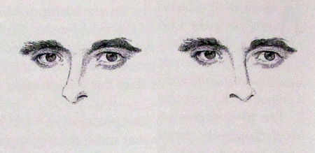


Great post, Jim. It definitely "got" me.
Totally off the subject -- I pulled up your son's "Hay Brigade" album of contemporary Irish music as I was painting today. Totally immersive; really tough to paint as I was bouncing to the tunes, humming along. Couldn't keep my brush straight. Good stuff.
Thanks, Lester. I miss having him playing in the studio as I paint. You've given me perfect chance to plug my son Dan Gurney, who is now living in New York, playing accordion (dangurney.net) and developing a concert streaming site (concertwindow.com).
Aha! I was wondering the relation. Accordion eh? That's something you don't see much anymore. Beautiful instrument though. I only know two people that play one. One of them is in her nineties.
Actually I didn't have much trouble with the second line and might have done it faster, but I might have cheated a little. I think I was using my peripheral vision to identify the colors before I focused on the letter patterns. Might be a little trick.
I tried doing it backwards and didn't do nearly as well.
Jim, I read somewhere that the effect was used at some point to detect spies.
For instance, suppose you had someone who you suspected to be russian but who claimed otherwise. Then you would run this test through him, with the words written in russian. If he was slower on the second sequence or made more mistakes then you'd have evidence that he understood written russian.
Jeffkunze: I also cheated, by unfocusing a bit and losing context (also, looking at the last letter of the word and the space after that). It works, though I think I was still a little bit slower on the second row. It makes me think that once the enemy spies hear of the test they can train to beat it :)
Wow. I've been paying more attention to my art in the past few years. The first time I ran into this test, I noticed how long it took to identify the colors in the second row and did make some mistakes.
This time was almost as fast with no mistakes. I think I've been staring at my palette for too long! Thanks for posting it, this sort of thing is fun!
I have a theory. For the first task, we just have to read off the written series of words, and that is something which we've had lots and lots of practice at. For the second task, we have to say the colors of a series of things, but that is something most of us have had little practice at. (You and other artists might be exceptions.)
Here is something similar. I once thought I might train myself to better recognize aromas, and I took a bunch of identically shaped spice bottles, closed my eyes, shuffled them, chose one at random, opened it and sniffed, then tried to say aloud the name of the spice. I found that I just couldn't do it. I would know the aroma perfectly well, but I couldn't say the name.
Maybe putting names, actual pronunciations, to things is something that requires task-specific practice.