During the recent series of posts on eye tracking, several of you wondered if artists look at the world differently from the general population.![]()
According to a study conducted by Stine Vogt and Svein Magnussen in Norway, the answer appears to be yes. ![]() Trained artists, compared to non-artists, spent less time looking at the focal points (here, a face or a figure) and more time scanning the overall image. In both pairings the artist's scanpath is on the right; that of the non-artist is on the left.
Trained artists, compared to non-artists, spent less time looking at the focal points (here, a face or a figure) and more time scanning the overall image. In both pairings the artist's scanpath is on the right; that of the non-artist is on the left. 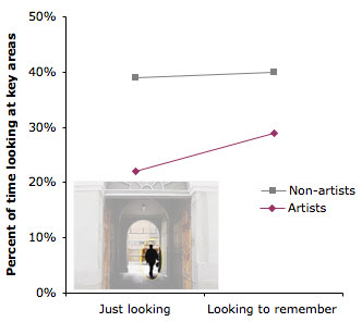 This was true whether they were looking at the pictures without any relevant guiding instructions, or whether they were directed to concentrate on the images in order to remember them.
--------
Thanks, David Palumbo.
Complete Story on Science Daily.
Previous post on eyetracking.
Viewing: Blog Posts Tagged with: Visual Perception, Most Recent at Top [Help]
Results 51 - 58 of 58
Blog: Gurney Journey (Login to Add to MyJacketFlap)
JacketFlap tags: Visual Perception, Add a tag
Blog: Gurney Journey (Login to Add to MyJacketFlap)
JacketFlap tags: Visual Perception, Add a tag
This small café at the bottom of St. Michael’s Hill in Bristol gave the name to an optical illusion caused by staggering the placement of white and black tiles. 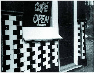 One row of tiles seems to converge to the right. The row just above or below it seems to converge to the left. The effect seems strongest away from the center of vision.
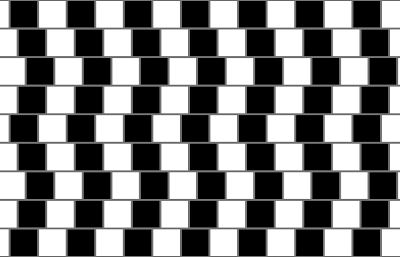 When the graphic is shown in its pure form, you can sense the lines separating or constricting in your peripheral vision as you scan each row from the right to the left.
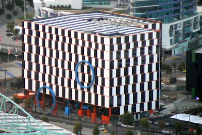 This building in the Melbourne docklands was designed to take advantage of the illusion. It takes force of thought to convince yourself that the floors are really level.
Here’s a technical explanation for the cause of the brain teaser, according to Michael Bach (link)
This illusion demonstrates the effect of some simple image processing occurring at the retina combined with some complex processing in the cortical cells of the striate cortex. The incoming image is first filtered by the centre-surround operator of the retina. The apparent tilt of the mortar lines is caused by orientation-sensitive simple cells in the striate cortex. The cells interact with one another to interpret the diagonal bands produced by the retina as a single continuous line, tilted in the direction of the diagonal bands.
Not sure I got that. But the café wall illusion should remind us as artists that we don’t see as a camera sees. Our brains actively construct reality, and that construction process is occasionally fallible.
Wikipedia on the café wall illusion: link.
Michael Bach’s explanation, with an animated figure.
Blog: Gurney Journey (Login to Add to MyJacketFlap)
JacketFlap tags: Journey to Chandara, Composition, Visual Perception, Imaginative Realism, Add a tag
(Note: This is the third and final part of a series of posts adapted from Imaginative Realism, Andrews McMeel, October, 2009). Please follow these links to the earlier posts, Part 1 and Part 2.)
By adding together the eye movement data from a group of test subjects, we can learn where most people look in a given picture.
To create the image below, the eye-tracking technology recorded the scanpath data of sixteen different subjects and compiled the information into composite images, called heatmaps. The red and orange colors show where 80-100% of the subjects halted their gaze. The bluer or darker areas show where hardly anyone looked.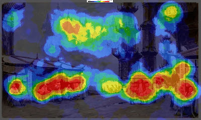 Here’s the heatmap for the painting Marketplace of Ideas, which we discussed in the last two posts.
It turns out that there was very little interest in either of the main vertical columns. Instead, the red splotches reveal a concentration of interest in the figures. There were secondary interest areas in the far buildings and the sign in the upper right.
The interest in people, especially faces, appears to reflect a hardwired instinct to understand our fellow humans.  In the heatmap for Chasing Shadows, which shows a group of children running along a beach with a Brachiosaurus, there’s a strong focal point around the dinosaur's front feet and the nearby running children.
There are secondary points of interest at the dinosaur’s head and the leading child. Note how the action of the walking pose was read without directly looking at the rear leg.
Other spots of interest congregate around the dinosaur’s tail, the base and the top of the tree, and the vanishing point along the beach.
Hardly anyone looked directly at the sky, the upper palm fronds, or the middle section of the palm trunk. But these areas were presumably perceived in the halo of peripheral vision around the center point of vision. Have a look at this painting, and be aware of where your eyes travel.
The heatmap for the painting Camouflage (click to enlarge) shows that everyone noticed the dinosaur’s face. They also spotted the hidden man and the small pink dinosaur.
According to statistical data connected to timing, these three faces drew almost everyone’s attention within the first five seconds. The dinosaur's face was statistically the first thing most people looked at, followed quickly by the hiding man. Below is one subject's scanpath, with the black numbers counting off seconds. I was surprised that the two patches of lichen on the tree above the man scored near 100% attention. Evidently viewers noticed these strange shapes in their peripheral vision and checked them to make sure they weren’t important, or somehow a threat to the man. From a narrative standpoint, I suppose they were a bit of a red herring, distracting with no payoff.
The sunken log and the detailed patch of leaves in the lower left drew 60% of the viewers, perhaps because those were likely places for other dangers to hide.
Just because an element has sharp detail or strong tonal contrasts, it doesn’t necessarily attract the eye. The dark branches behind the dinosaur’s head drew almost no attention because they fit into the natural schema of a forest scene. Apparently the viewers developed a search strategy based on the threatening situation of a hungry dinosaur looking for a bite to eat.
PRELIMINARY CONCLUSIONS
These experiments force us to question a few of our cherished notions about composition and picture-gazing.
1. The eye does not flow in smooth curves or circles, nor does it follow contours. It leaps from one point of interest to another. Curving lines or other devices may be "felt" in some way peripherally, but the eye doesn't move along them.
2. Placing an element on a golden section grid line doesn’t automatically attract attention. If an attention-getting element such as a face is placed in the scene, it will gather attention wherever you place it.
3. Two people don’t scan the same picture along the same route. But they do behave according to an overall strategy that alternates between establishing context and studying detail.
4. The viewer is not a passive player continuously controlled by a composition. Each person confronts an image actively, driven by a combination of conscious and unconscious impulses, which are influenced, but not determined, by the design of the picture.
5. The unconscious impulses seem to include the establishment of hierarchies of interest based on normal expectations or schema of a scene. For example, highly contrasting patterns of foliage or branches will not directly draw the gaze unless they are perceived as anomalous in the peripheral vision.
5. As pictorial designers we shouldn’t think in abstract terms alone. Abstract design elements do play a role in influencing where viewers look in a picture, but in pictures that include people or animals or a suggestion of a story, the human and narrative elements are what direct our exploration of a picture.
As Dr. Edwards succinctly puts it, “abstract design gets trumped by human stories.” The job of the artist, then, in composing pictures about people is to use abstract tools to reinforce the viewer’s natural desire to seek out a face and a story.
--------------
Related previous posts on GurneyJourney:
Introduction to eyetracking, link.
How perception of faces is coded differently, link.
All the paintings are from Dinotopia: Journey to Chandara.
Many thanks to the team at Eyetools, Inc. for their assistance.
Blog: Gurney Journey (Login to Add to MyJacketFlap)
JacketFlap tags: Visual Perception, Add a tag
Are you ready for a visual memory game? Please stop what you’re doing and grab a pencil and paper, and try not to scroll down to the pictures yet.
Without looking at a map or searching on the computer, draw from memory the shape of your state or province. People from Wyoming or Colorado can draw Texas.
When you’ve finished that, draw the outside shape of the continental United States—or of your country, wherever you live.
It doesn’t have to be too detailed, and don’t worry if you’re not sure, just give it a try.
On the left, below, is what Jeanette came up with for New York state. Mine is in the middle. I’m a little embarrassed of mine! I’ve driven all over the state, and I mistakenly thought the western end was squared off. But both of us got Long Island at least.On the right is my memory drawing of the continental US. It’s got quite a few mistakes, especially around the Great Lakes, but it’s not too bad. The only reason it’s OK is that I’ve played this game before.
Now the next step is to find a map and look at it as long as you want: two minutes, five minutes, or longer. But only look one time! When you’re done looking, go somewhere and draw the shape again.My second pass at New York State is better, but still has a lot of things wrong. I tried to conceptualize the shape as I observed it by thinking of two overlapping shapes, or of the metaphor of a hammer hitting a bent nail.
Here’s what I learned:
1. I tended to enlarge areas that I’m familiar with.
2. It helps to have a metaphorical symbol of something you need to remember.
3. When observing to remember, as Gannam said yesterday, the eye is much more searching, and takes a greater interest in the relationship of large and small shapes.
Thanks for all the great comments yesterday, everybody. Tomorrow's topic: Remembering a face
Blog: Gurney Journey (Login to Add to MyJacketFlap)
JacketFlap tags: Composition, Visual Perception, Add a tag
Here are two ink wash drawings of a picturesque street scene. They’re very similar. There’s an upper and a lower arch. The light is coming from the upper left in both scenes, and the figures are all in the same places. 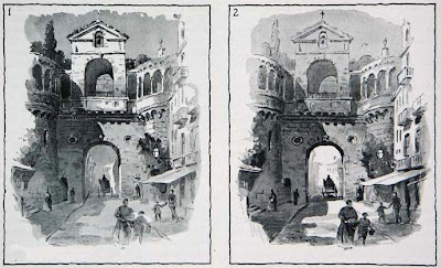 As you look at both pictures, do you find your attention is attracted to a different part of each picture? What is different about them?
Arthur Guptill, in his book Color in Sketching and Rendering, provides this example to show how tonal arrangement can help create a focal area.
His purpose with the picture at left is to draw the eye to the upper arch by means of strong lighting and punchy contrast. The second picture has the tonal focus on the lower arch.
I found that my eye moved the way he intended, but I may have been influenced by his discussion in the book. How did it work for you?
Blog: Gurney Journey (Login to Add to MyJacketFlap)
JacketFlap tags: Visual Perception, Add a tag
When you go out on a moonlit night, away from streetlights, can you see the cracks in the sidewalk? How about the blades of grass, the clapboards on a house or the small twigs and branches?
Unless you’re a cat or an owl, these smaller details melt into the larger shapes. Everything has blurry edges. The reason visual acuity drops off at night is because the central point of vision where we see small detail is filled with photoreceptors that only work best in bright light.James Perry Wilson, the artist famous for his diorama backdrops, conveyed this subjective experience in this architectural rendering. He softened the edges and suppressed the detail everywhere except in the brightly-lit windows where the light levels are higher.
Assuming that he wanted to simulate this perceived effect, this rendering by Edward McDonald is not quite as effective because he kept all of his edges too sharp.
If you use night photography as reference, remember that the camera doesn’t see as the eye does, and you have to make this adjustment if you want to suggest human vision.
---------
Related GJ posts:
James Perry Wilson, Part 1 and Part 2
Why moonlight is blue.
Day for night shooting.
Images from "Color in Sketching and Rendering" by Arthur Guptill. It's a book on watercolor rendering, mainly of architectural subjects, with lots of color plates, one of Guptill's best books.
Blog: Gurney Journey (Login to Add to MyJacketFlap)
JacketFlap tags: Rabbit Trails, Visual Perception, Add a tag
Whenever I walk through an airport far from home, I’m struck by all the strange faces. Endless new variations of features and head shapes present themselves. I know with certainty that I never have seen any of them before. Where does that certainty come from? How do I separate familiar faces from strange ones?
Like everyone else I probably have a few thousand faces filed away in my memory banks. There are the people I see regularly in my daily rounds. And then there are the famous people from the movies or in the magazines. I rarely see those famous people in real life, but I still recognize them at a glance from a blurry photo or from a caricature.
I can recognize all these thousands of faces at any angle, in any lighting, and with any facial expression. I unconsciously adjust my mental image of each face as each person grows older, grows a mustache, or gets a new haircut.
If I don’t see a teenager for a few years, I often don’t recognize them at all. They become, for a moment, strangers. That experience is jarring for me, and it must be a strange experience for the teenagers, too.
As we glance at the faces of people walking on a busy sidewalk in our hometown, we automatically check each face to see whether the person is an acquaintance or a stranger. Our behavior changes accordingly. We greet those we know and pass over the rest.
Aside from categorizing people according to gender, the division of people into the two sets of acquaintances and strangers must be one of the deepest unconscious tasks of visual perception.
Jules Breton once observed of his beloved Paris:
“It is a singular fact that when I am in Paris I fancy I recognize the faces of those I meet in the streets. I do not experience this feeling in any other city. This is because Paris reunites the various types one has seen elsewhere, and which strike one like old acquaintances, made one does not remember where.”
Image courtesy: link.
Blog: Gurney Journey (Login to Add to MyJacketFlap)
JacketFlap tags: Visual Perception, Color, Academic Painters, Lighting, Add a tag
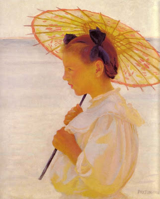 When sunlight is extremely bright, the eye is dazzled for a moment. It takes a few seconds for the pupils to constrict. The cones are overwhelmed. Color response drops off in the brightly lit areas, and the shadows appear higher in chroma. This is the reverse of the normal rule of “color obtains in the light.”
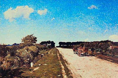 Before Impressionism there was a movement called “The Glare Aesthetic” where artists used this bleaching phenomenon to convey bright light.
----------
GJ post: "Color Obtains in the Light," link.
Top painting is by William Paxton (1869-1941) called the Chinese Parasol (1908), link.
Bottom painting by William Picknell (1853-1897), Road to Concarneau, link.
Chapter on the glare aesthetic in American Impressionism by William Gerdts, link.


I love optical illusions like this. I wonder if the Greeks had this particular understanding of the eye-brain conflict in mind when they designed and constructed the Parthenon.
I too love illusions like this. Here is the link to Michael Bach's site of 84 Optical Illusions & Visual Phenomena
http://www.michaelbach.de/ot/index.html
Enjoy! -RQ
Muchas gracias Roberto...that is a very fun site!