


Updated version of my modular wood-block-painting in the BYU-Idaho Faculty Art Show in the Spori Gallery.
0 Comments on Wood Block Painting as of 1/1/1900
Add a Comment

 By: Scott E Franson,
on 2/24/2015
By: Scott E Franson,
on 2/24/2015
Updated version of my modular wood-block-painting in the BYU-Idaho Faculty Art Show in the Spori Gallery.
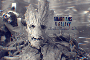
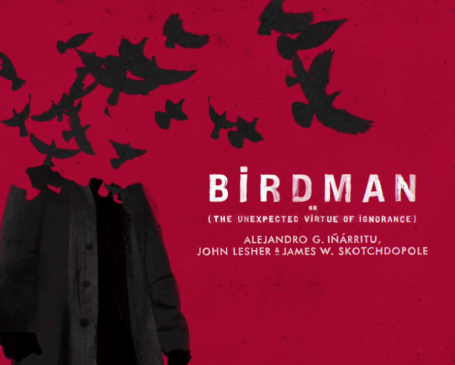
It’s not often you come away from an awards show thinking “Man those title cards were amazing!” but that’s exactly what I thought while watching the Oscars on Sunday. Everything about the graphics used to introduce the nominees was spot on — from the gorgeously curated objects used for the Production Design nominees to the lovely photos morphing into line drawings used for the in memoriam.
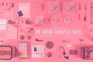
I wasn’t alone in my admiration. And Deadline has a profile of the man behind it: commercial director and Oscar design vet Henry Hobson who is about to make his feature film directing debut. Hobson worked with a variety of talented producers and production houses to introduce a bracingly modern and startlingly stylish look too something that people see for literally five seconds.
Those title cards showing the 3D elements of the visual effects category? The makeup swipes that transformed the actors to their characters? The Best Picture montage from Birdman‘s silhouette fluttering away to the voting ballot from Selma that turned from white to black? It was Hobson, visual producer Lee Lodge and design/production house Elastic who brought it all to life. (How lucky is Maggie‘s financier Lotus Entertainment and its distribs Lionsgate and Roadside Attractions to be able to tap Hobson’s talent for the film’s marketing materials?)
Hobson is quick to give credit all around. “The charge from (producers) Craig (Zadan) and Neil (Meron) was to make each category stand out and as much as possible and not to rely on clips because the audience gets turned off after awhile,” he said. “This year, I wanted to mix it up a bit, so I worked with Elastic for the first time. We had 23 out of 24 categories this year, and we wanted to showcase the uniqueness of each event.” He worked closely with Jennifer Sofio Hall, a producer at Elastic.
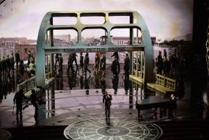
Hobson also worked with production designer Derek McLane with Hobson, Lodge and Elastic to recreate the Edmond Pettus bridge set where Common and John Legend sang “Glory,” which had almost everyone watching it in tears.
Here’s a video montage of Hobson’s designs for the title cards for the eight Best Picture nominees. Call it post Saul Bass/Milton Glaser.
Best Picture Oscar Nomination Title Sequence – 2015 from henry hobson directing & design on Vimeo.
Hobson has gotten a ton of attention for his work, including a fascintating interview on Slate where he reveals he such an Alan turing fan that he had reserved alanturing.com back in the 90s.
Sadly I can’t find any large images of his title cards, but you can get an idea of his fusion of classic and modern design sensibilities.
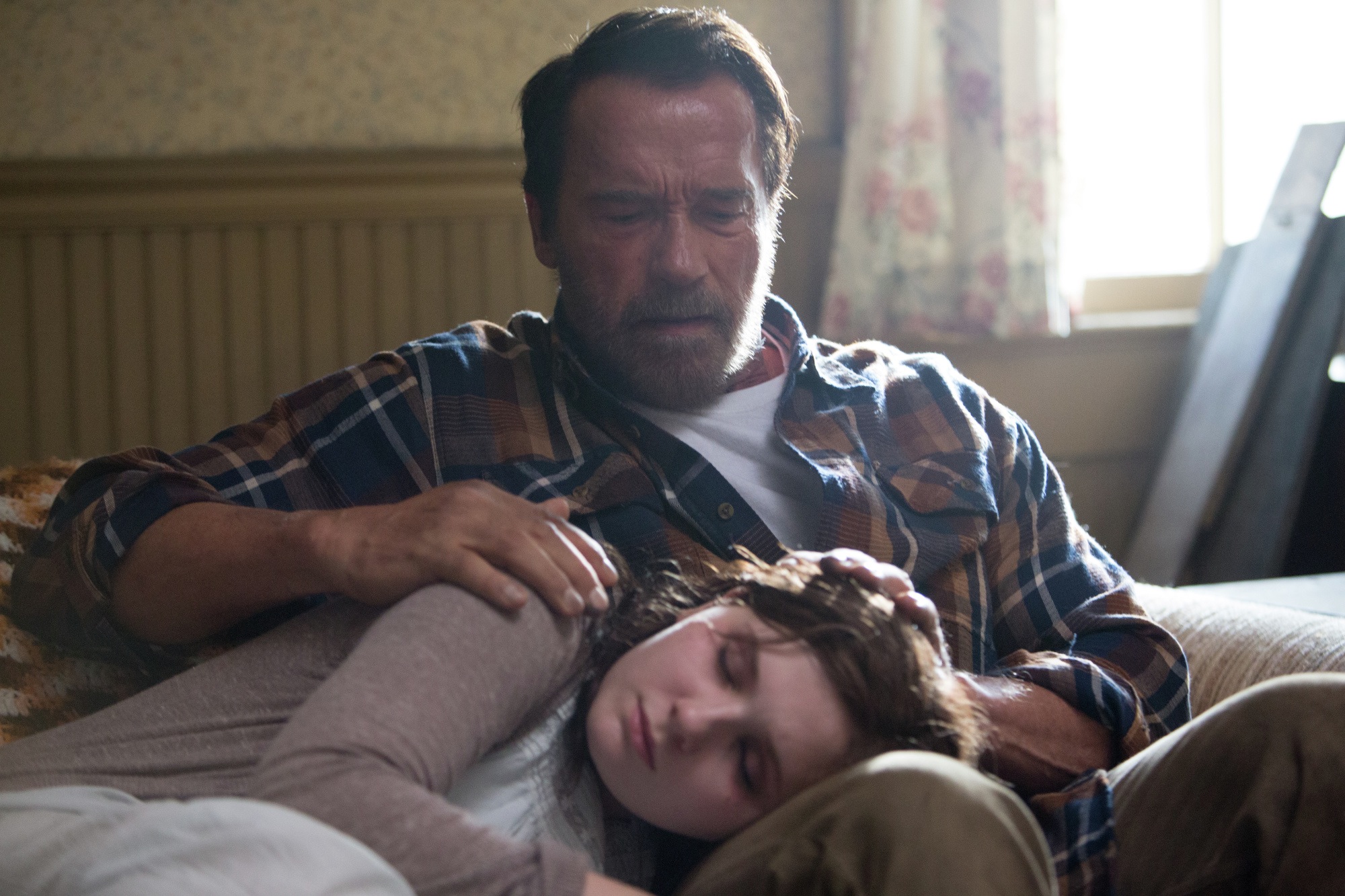
Hobson’s first film, Maggie, starring Arnold Schwarzenegger and Abigail Breslin, comes out in the Spring. While the casting may make you think it’s a “Professional” riff, t’s an offbeat zombie story about a father who stays by the side of a girl who’s been infected. Pretty sure it will look amazing.
.jpeg?picon=3080) By: Elizabeth Haidle,
on 2/11/2015
By: Elizabeth Haidle,
on 2/11/2015
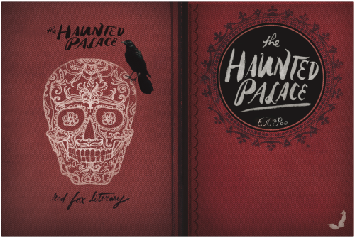
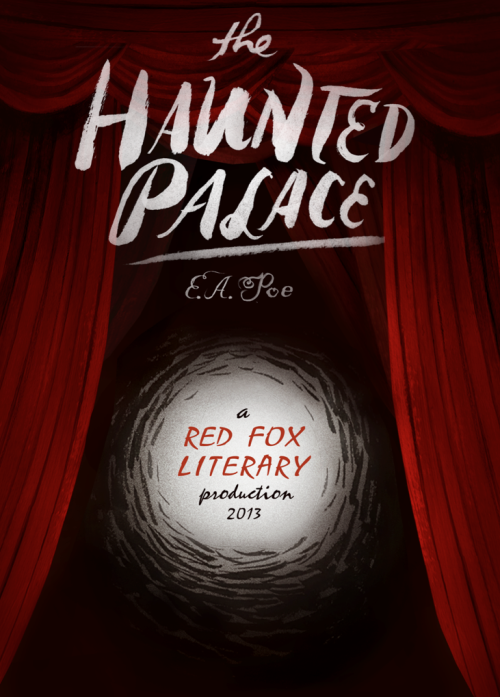
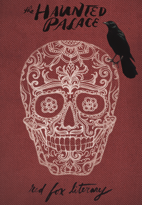
This is not recent, but I forgot to repost after website overhaul until now. Very Poe-inspired, of course.
Add a Comment By: Jeanine Henderson,
on 2/3/2015
By: Jeanine Henderson,
on 2/3/2015
Post by Jeanine


Beautiful drawings, stellar storytelling, and gorgeous typography are among the many skills and expertise of Italian illustrator, Iacopo Bruno. They are also the key components of truly successful book covers, so it’s no surprise that Iacopo’s portfolio is jam-packed with delightful covers and his client list inclusive of many major publishers.
His style varies just enough to adapt to an impressive range of audience and subject matter. Sometimes his covers feature delicate hand lettering, vivid silhouettes, lively characters, or a touch of vintage or steampunk details—and often a combination of these elements. But the end result is always an inviting cover, drawing any reader into the world that lies within.
Iacopo founded DOT, a graphic design studio based in Milan that specializes in editorial and book design, illustration, and typography for a range of client markets. He’s created over 300 book covers, always bringing enthusiasm to each new project.
More of his work can be seen here: studio site | cover blog |sketch blog
 Hand lettering Artist :: Linzie Hunter
 Illustrator :: Anna Walker
 Typographer & Font Designer Drew Melton
 Artist :: Julia Bereciartu
 Artist:: Lucie Rice
 Artist :: Leila Brient
 Illustrator: Isabelle Arsenault
 Dasha Tolstikova: fun, frenetic & just a little silly
 Jon Gray’s Typographical Book Covers
  Artist :: Steve Simpson
 Children’s Illustrator: Erin Bennett Banks
 Children’s Book Artist :: Lane Smith is Rather Cheeky
By: Elizabeth Haidle,
on 1/28/2015
Children’s Book Artist :: Lane Smith is Rather Cheeky
By: Elizabeth Haidle,
on 1/28/2015
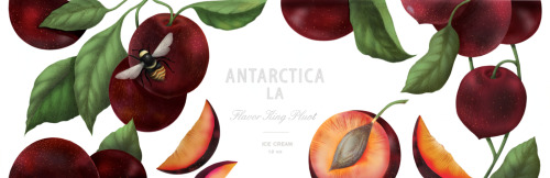

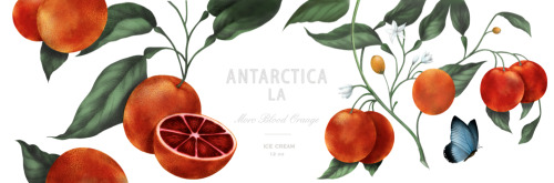


Package design/illustration for a new gourmet ice cream brand emerging in LA soon…better hope they can airlift their products, if you don’t live within driving distance.
Add a Comment
By: Elizabeth Haidle,
on 1/28/2015
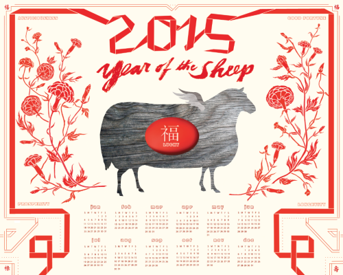
Year of the Sheep calendar….check! My all-time favorite holiday. Somehow end of February is a time when I’m actually able to process the previous year & to think about what themes reflect things that actually matter to me in the new year to come. (I think I’m selling them locally, but email me if you insist on having one & are far from Portland - I could stick ‘em on my webstore if there’s a screaming demand?)
Add a Comment
By: Alice Palace,
on 1/26/2015
Post by Alice Palace
Aless has just set up her own studio label called ‘This is gold’. Based in London, she is available for freelance surface pattern, illustration and childrenswear graphics. I love her characters…


See her New Website
 Illustrator & Writer Lisa Congdon
 Artist :: Lan Truong
 Artist :: Fuchsia MacAree
 To the creative overthinker …
  Kate Moross is THE coolest.
  Illustrator :: Lieke van der Vorst
 Tugboat Printshop
 Ashley Percival’s quirky imagination…
 Lisa Martin – All Things Bright and Quirky
 Artist Kevin Waldron
 Sweet & Whimsical Work from Artist Jen Skelley
 Artist :: Tabitha Bianca Brown
By: Andy Yates,
on 1/22/2015
Artist :: Tabitha Bianca Brown
By: Andy Yates,
on 1/22/2015


![]()


Francesco Francavilla is an Italian comic-book artist who’s fame has skyrocketed the last 5 years. He’d been working in the independent comics scene since the mid-2000’s on projects like The Black Coat, and Sorrow. Francavilla’s first high-profile project came in 2008 when he collaborated with Matt Wagner on a new Zorro series for Dynamite Entertainment. From there he got to infuse his classic pulp style art on Marvel’s Black Panther, and Scott Snyder’s first Batman story arc in Detective Comics.
In 2012 Francavilla introduced his own noir vigilante, The Black Beetle, to the world in the pages of Dark Horse Presents. Since then, 2 volumes of the critically acclaimed series have been published(No Way Out, 2013 & Necrologue, 2014).
Most of Francesco Francavilla’s recent work has been focused on the mega-hit Afterlife with Archie, which gives readers a more mature, horror take on those classic Riverdale characters. He also continues to work on various personal, and professional illustration projects, including some exclusive movie posters for Mondo.
Francavilla is frequently updating his blog with new art, so if you like what you see click here for more!
For more comics related art, you can follow me on my website comicstavern.com - Andy Yates
 Comics Illustrator of the Week :: Bill Sienkiewicz
 Comics Illustrator of the Week :: David Petersen
 Comics Illustrator of the Week :: Joshua Middleton
 Comics Illustrator of the Week :: Nathan Fox
 Comics Illustrator of the Week :: Jamie McKelvie
 Comics Illustrator of the Week :: Nimit Malavia
 Comics Illustrator of the Week :: John Totleben
 Comics Illustrator of the Week :: Cameron Stewart
 Comics Illustrator of the Week :: Noah Van Sciver
 Comics Illustrator of the Week :: Gabriele Dell’Otto
 Comics Illustrator of the Week :: Joshua W. Cotter
 Comics Illustrator of the Week :: Julia Gfrörer
[Editor’s note: The release this week of March Book Two by Rep. John Lewis, Andrew Aydin and Nate Powell has already made headlines with its story of the fight for civil rights in the 60s, and the covers to both volumes have become iconic in their own right. The message of the courage to fight for equality for all in the face of violent opposition is as relevant and needed today as it was 50 years ago. But powerful images to cover powerful times don’t always spring up fully formed. Here Powell and Top Shelf designer Chris Ross with an in-depth breakdown of how they created these covers and combined imagery to capture both history and ideals.]


NATE: March was originally a single, massive volume, so the initial front and back covers were intended to house the entire narrative: the front introduced the basic visual theme of opposition, with two elements facing off against each other, though a contingent of riot-ready white supremacist police were prominently featured across the bottom. After some discussion with Chris Ross, Andrew Aydin, and Congressman Lewis, we all agreed that we should shift some of that focus to the folks on the front lines, and away from Jim Crow police forces. Around that time, we decided to release the saga as a trilogy, so Chris and I jumped in to further develop the oppositional themes, but playing with different angles and approaches to the cover’s division.

NATE: The marching feet motif, like the book’s title, are rooted in one of Congressman Lewis’ favorite Martin Luther King quotes, “There is no sound more powerful than the marching feet of a determined people.” We experimented with a lot of other design elements, but in the end kept coming back to that unshakable image.
CHRIS: I think we also had to be very conscious of being white males metaphorically designing the “skin” of a graphic novel about the civil rights movement. For example, there’s a common trope in graphic design, especially featuring marginalized people, of representing characters as body parts, “cut off” by the edges and removed from any context. Women are reduced to legs, breasts, or butts. Black men are reduced to chests and backs. Lots of folks believe that that’s not coincidental, and doing that carries a unique meaning when we represent the race and the body. So in the context of marching feet, it’s important to add depth and see whole bodies in the background, while also showing faces where we can, conveying an accurate and diverse range of these folks’ unique experiences and emotional states. It gives context to the movement and The Movement.
 NATE: Once we settled on the lunch counter setting and I’d rendered it, a few more essential steps unfolded; importantly, there were a few re-draws of young John Lewis’ face to more perfectly capture his likeness, but several compositional changes occurred (eliminating the crowd of white heckers in the background, making the “Counter Closed” sign more legible, and adding condiment bottles to the counter, which really tied the whole room together, as The Dude might put it).
CHRIS: The type treatment began as Nate’s hand-rendered type, but the book “read” as a Nate Powell Book (alongside the fantastic Any Empire and Swallow Me Whole). This isn’t a problem because a Nate Powell Book is important and beautiful (as is Nate Powell), but March is in a different category and should have its own identity. So, we made a type treatment that was drawn from the interstate highway system, alongside some key fonts that I completely ripped off serve as homage to Eric Skillman [designer of Alec: The Years Have Pants and the Criterion Collection], whose spirit I tried to summon. Skillman is such a talented designer. So then I played with the type until it looked like the logotype March has always existed.
NATE: Chris had an incredible vision of the books as objects, as documents of that era whose contents had also survived the struggle. He brilliantly envisioned Book One as a second-hand textbook one might find in a segregated rural African-American school, like the one young John Lewis attended; the volume would bear the marks of excessive taping and binding, spine and corner wear… and the signed-and-numbered hardcover itself would include mid-century library card inserts and stamps.
CHRIS: Thanks Tualatin Elementary School librarians! But that is sort of an emerging trope—books as objects from other time periods and existing as living objects. I think it works when the designer and artist and author consider that the cover is not only going to communicate something to the reader, but that it will live a life exclusively with the reader. That’s a nice way of saying patina works in interesting ways and meanings on a cover, but it really does detract, in my opinion, when it’s an interior design choice. It makes me wonder how these books with interior patinas will affect readability in ten–twenty years. I’m guilty of thinking and designing like that myself. I think it seems like an easy tool in the toolchest, and I have to remember these books will last (and should be built to last) a long time. They live, as any teacher or librarian will tell you.
NATE: Likewise, Book Two’s cover is a survivor of that fateful bus burning along the Freedom Ride in Alabama, bearing the scorch marks and reconstructive tape necessary to keep it together as the Movement itself was threatened to be derailed.
CHRIS: The tape was originally the tape I was going to use on The Underwater Welder cover, but decided to go with a fabric texture with Welder and remembered the tape when we were noodling on March.
 NATE: We knew almost immediately what I wanted to be represented on the cover of Book Two, so it came together with very minimal sketching, but also opened up a series of conversations among the creative team. Congressman Lewis wanted to make sure that, even as a young man amidst the center of the Freedom Ride, he wasn’t exploiting the power of that burning bus’s image for the cover. Rep. Lewis had actually left the Freedom Ride for a couple of days to interview for activist work abroad, and as he was about to rejoin the Riders he discovered his bus had been attacked.
CHRIS: It’s such a dramatic rendering.
NATE: It was a powerful moment for reflection: that these experiences and their suffering were, part of a collective journey for liberation, but that can never undermine the fact that they were specific, real acts of terrorism inflicting deep trauma, injury, and death. To young John Lewis’ friends, neighbors, heroes, and to himself. It was a call to be mindful of ownership over these experiences. At the same time, he (and we) measured his own mandate to “tell the whole story,” to “make it plain.” At our consensus, I drew an alternate top for the Book Two cover depicting demonstrators at the March On Washington moving across the National Mall. After careful consideration, Congressman Lewis concluded that the original cover spoke more powerfully to the whole truth of the Movement and its struggle.
CHRIS: That alternative cover is really interesting, and it plays against the angles that we had set up, the angles of action. If we were going that way, we’d have to reconsider the dutch angle and the directions of movement above and below the title.
 NATE: Color and angles have played an important role in reflecting both the books’ individual contents and their placement in the narrative arc: Book One is largely the yellow of caution and instruction, urging slow, careful movements before the saga intensifies. Book Two is mostly the blue-and-grey of the previous century’s American Civil War, but carrying the gold/green/red palette of the first book forward as well. I will only briefly mention that the cover of Book Three may use the color scheme of the Alabama state flag, and the previously separated opposing elements have now been pushed into the same picture plane. The volumes begin with flat, ninety-degree compositions, but shift in design and camera placement as the Movement intensifies, echoing a literal escalation of angles across the covers.
CHRIS: I remember one of the color guides we were thinking about was really blue and yellow (the second from the left above), like Boy Scout blue and yellow, and it made the cover vibrate, but not really in a way that was communicating what we wanted to communicate. 
NATE: Just as we aimed for consistency and progression of theme on the front covers and total package, Chris Ross presented the idea of creating a triptych out of the saga’s back covers. One of us brought up the idea of Theodore Parker’s quote, adapted and immortalized by Dr. King, that the “arc of the moral universe is long, but it bends toward justice”, and we didn’t have to look long to find a perfect physical arc in the Edmund Pettus Bridge itself.
CHRIS: I wanted that as an art piece—a consistent narrative arc through time and this project. Standalone. Thematically linked through history that these conflicts get played out over longer time periods than humans live, and that through hard work and sacrifice, it gets incrementally better…we hope.
NATE: As I remember, I drew the Book One back cover waaaaay back in late 2011, when March was a single volume. I could see it very clearly in my mind’s eye, and just did one quick watercolor sketch before turning in the finished piece. Once we decided to make it a trilogy the next summer, we started looking ahead in content to pull out physical arcs and arches that might apply to our concept. I knew that Book Two would end with the bombing of 16th Street Baptist in Birmingham and wanted the blown-out window to be on the back cover as an eternal echo of the book itself, but it wasn’t until I started gathering more reference, much closer to the book’s end, that I realized the arch already continued in the blown-out window’s design.
 CHRIS: We also chose to crop the image on the back so that it displayed four missing panels—representing the four girls killed in the bombing. Then those missing panels become rays of sunshine.
 CHRIS: We find these coincidental things in our “discovery” of a cover, and it’s like they’re always already there. It’s also why I like designing covers FAR in advance of their release: not just for marketing reasons, but so that the creators can live with it for a long time, to become intimate with the cover, to feel like that cover has always existed. In fact, the book cover for March: Book Two was finished a few days after we finished the cover for Book One. Right now, we’re narrowing down the cover for Book Three.
NATE: On that note, I remembered the Birmingham window from my initial reading of Walking with the Wind, its Christ’s face blown out by the explosion—but I had to check in with Andrew and the Congressman halfway through drawing Book Two, in which the face of Christ is also blown out by a brick at First Baptist in Montgomery in 1961. It was eerie and disturbing to confirm both of these events, and from a writing perspective, the kind of thing you just can’t make up. So there it was. There they both were.
CHRIS: I didn’t know that—and that both these representations become something a bit more profound, a bit more representative of the movement. Kindness in the face (literally) of violent oppression.
NATE: We have elements in place to continue the overarching composition for Book Three—that’s being worked on right now (it’s sitting next to me at the desk!), but nothing to show yet. Back to the drawing table… gotta get these color sketches for the next cover done pronto!
CHRIS: That’s really the fun, terrifying, crazy, beautiful part: finding the engine of meaning and narrative in this story and doing some very Deep Thinking about what this engine looks like, how the elements that aesthetically speak to you play with Rep. Lewis’, Andrew’s, and Nate’s story. And represent them in meaningful ways. And hope that they always appear to have always existed.
March: Book One and March: Book Two are in stores now from Top Shelf Productions, an imprint of IDW Publishing.
By: Elizabeth Haidle,
on 1/15/2015


More for Seven Stones Roasters….labels for coffee collections….the site design is still running a final lap, but should surface this month.
Add a Comment
By: Elizabeth Haidle,
on 1/15/2015
.jpg?picon=1806) By: Eve Ainsworth,
on 1/9/2015
By: Eve Ainsworth,
on 1/9/2015


 By: Elizabeth Haidle,
on 1/3/2015
By: Elizabeth Haidle,
on 1/3/2015


….still in the works, stay tuned for more package design & story-telling imagery for Seven Stones coffee roasters…website should be up and rolling this month! (The names of the farms are still in flux…during the interim, I make up my own & use ‘em as filler)
Add a Comment By: Carter Higgins,
on 12/16/2014
By: Carter Higgins,
on 12/16/2014

by Ann and Paul Rand (Chronicle Books, 2009; originially published in 1956.)


You might remember how much I love this pair’s Sparkle and Spin, and this one is just as playful and just as true. That case cover surprise is an a delight, and complementary-colored endpapers start this book with a bang.


Paul Rand’s graphic genius is so well-matched by the simple and spare words of his wife, Ann. The text and the pictures both glide through that magical reality of childhood. Things that might seem daunting to someone bested by time are small and accessible. Things that may seem obvious or forgettable are ripe for play and adventure.


It’s a reminder to slow down, listen, and watch. The world is built of wonderful things. The big picture is as beautiful as the details.

Here, the sentiment is the whole of this person. I’m not sure there’s an ending more perfect, not for kids or their grownups. There’s so much more to know, but what you carry with you can stay.

 By: Metin Seven,
on 12/14/2014
By: Metin Seven,
on 12/14/2014
 By: Andy Yates,
on 12/11/2014
By: Andy Yates,
on 12/11/2014


If Paul Pope and Brendan McCarthy had a love child it would be Nathan Fox. Rarely have I seen an illustrator who produces work that is equally as impressive in ink/brush mode, as it is in full colored/painted mode; each being perfectly realized pieces of art. After a short stint of focusing his career on editorial illustration, Fox moved onto comics in the early 2000’s, and further expanded his skill-set at The School of Visual Arts(New York), in the Illustration As Visual Essay Graduate Program.
Nathan Fox’s career in comics has been an eclectic one, including work on mainstream books like Harley Quinn, The Haunt, and Batman: Gotham Knights, along with indy projects such as Pigeons from Hell, Blue Estate, and Dogs of War. Currently, Fox is providing cover art for the DC/Vertigo series Federal Bureau of Physics AKA FBP(which was recently optioned for a film), drew a story in Vertigo Quarterly: CMYK, and is part of an impressive collection of artists reviving Jack Kirby’s Captain Victory and the Galactic Rangers for Dynamite Entertainment.
Nathan Fox has also done illustration work for Wired Magazine, The New Yorker, Rolling Stone, Mad Magazine, and Entertainment Weekly, just to name a few. His work has been featured in art galleries across the U.S. and he teaches Visual Narrative at The School of Visual Arts in New York City.
You can get the latest news, and explore more of Nathan’s work at his website here.
For more comics related art, you can follow me on my website comicstavern.com - Andy Yates
By: Elizabeth Haidle,
on 12/10/2014

It’s that time of year again, FOR THE LOVE OF PIG IRON - ramping up for their post-New-Year Cabaret. Lucky me, I get to do the poster every year. Love these guys. They specialize in Hilarious Profundity, in the form of comedic physical theatre. More about them here
Add a Comment
By: Elizabeth Haidle,
on 12/8/2014


the Synchronized Saw Duo of Southeast Portland! I am one of the members. We now have a facebook page. Look for one of our costumed-busking moments on Peacock Lane this holiday season…
Add a Comment By: David Billings,
on 12/2/2014
By: David Billings,
on 12/2/2014

Same art box I’ve used since 1990.
If you’ve been hanging around here for a while, you probably know that I create a lot of digital art. You may not know that I didn’t start my art career as a digital artist. Nope. In fact, I am from that very long ago Once Upon a Time time where art schools did not even teach digital art. My school, the American Academy of Art only had one little Macintosh (what we called them back in prehistoric times), tucked away in a closet. Only advanced students were allowed to touch it [HAND SLAP]. Which was fine by me, because my computer knowledge at that time was limited to writing “go to” commands in BASIC. Adobe Illustrator (88) was still an infant.
So I did what I’ve always done, which is to create art using my hands, pencils, watercolors, ink, paper, glue and whatever I could find laying around. It was much later in my career that I started using a computer to create graphic design, and then animation for Nickelodeon. Which is amazing, because I feel that my experiences in crafting mixed media art from real world materials, sketching and painting helped me be more creative with my digital tools.
I still do a lot of digital work, but these days, more than ever, I like to get my hands messy by painting on wood.
Here’s a piece I’m just completing on a skateboard:

I like to use paint pens and Sharpies. This one in particular I did freehand, without an idea in my head of what it would be. Sometimes I just go with the flow to see what happens.
Other times, I’ll pick up a piece of wood and try to figure out what it wants to be before I start decorating. Like this chunk of 2′ x 4′ that I had laying around:

I’m trying to figure out what it wants to be. Which sounds like a lot of New Age bullshit, but really, it…
…nope. It does. It just sounds like New Age bullshit. Anyway, what I’m doing is scanning the wood and trying not to think about bills, pets, kids, my broken windshield wiper, bills, what’s for dinner, bills, or why my shoe keeps coming untied.
After I cleared my mind (more bullshit, that never happens), I flipped this puppy over and saw…

… a whale!
Here’s where I stop blogging about it and get to work. If you want to see the finished piece, follow Sparky Firepants on twitter or instagram. You can also see it in our Sparky Firepants Etsy shop, among our other specially special painted pieces.
Questions? Comments? Let ‘em rip!
By: Rachel Frankel,
on 11/30/2014


While my color mood project is officially over, I haven’t stopped keeping an eye for effective uses of color and geometry in illustration and design. Because I happen to be a musician, I’ve also started creating gig posters for my band’s shows. The gig poster is an interesting format–you have to draw attention quickly and effectively, which typically means that it needs a striking illustration or eye-catching typography.
Dan Stiles is a cornerstone of the gig poster world, and has continued to surpass its limits with his incredible command of color and use of interacting shapes. He’s a Portland-based designer and illustrator with an award-winning track record, and has worked with clients such as Death Cab For Cutie, Feist, Nike, Birch Fabrics, MTV, and Wired Magazine.


Dan, originally from Ann Arbor, Michigan, got his footing in Portland during his college years. He gravitated towards design by falling into the role of rock-poster-maker at the University of Oregon. Interestingly enough, he got his start as a pen-and-ink artist rather than a digital pixel-pusher (which he expounds on in his interview with WeMake). As a punk DIY-er, he originally was avoidant of graphic design. It’s a relief to know that there were others who resisted digital illustration at first aside from me!
From there, he fell in love with the design process as well as the silkscreen process, which is often a principal element in many gig posters. His minimalist aesthetic and focus on the integrity of shape only lends itself to his chosen medium. As a gig poster designer, he often has complete creative control over the concept and execution of his designs.


Since those early days, Dan has branched out to advertising, branding/identity, surface design, packaging, and even creates his own books and merchandise. He’s worked with Birch Fabrics on their Marine Too and Mod Squad lines (the former of which was borne out of his design for an A.C. Newman poster). Dan cites his success as being dependent on his abundance of completed work.
“I look at it like the sorcerer’s apprentice. I’m Mickey Mouse, and every project I complete is another broomstick out in the world doing work for me. The more quality work I release, the wider my reach.” -Dan, from his interview with Birch Fabrics.


Follow along with Dan here:
By: Elizabeth Haidle,
on 11/21/2014

I’d been meaning to get out my scissors & create shadow box type stuff, next chance I got. Turns, out, this was a great chance. ReNeux clothing boutique in Taos, always puts on a compelling holiday show each year, and so of course, needs a poster design to match!
Add a Comment By: Tatjana Mai-Wyss,
on 11/21/2014
By: Tatjana Mai-Wyss,
on 11/21/2014

 By: Elizabeth Haidle,
on 11/20/2014
By: Elizabeth Haidle,
on 11/20/2014
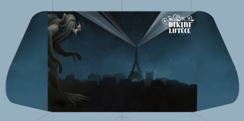
I just finished this wallet design…who doesn’t love Paris? And it’s a long story as to why H.P. Lovecraft’s Cthuhlu beast is sharing the landscape with the Eiffel, but ask me and I’ll tell you later.
Add a Comment By: Eric Orchard,
on 11/18/2014
By: Eric Orchard,
on 11/18/2014
 By: Eric Orchard,
on 11/17/2014
By: Eric Orchard,
on 11/17/2014


Yep, very cool stuff. It seems like the bar for design, of late, has really been raised high. I like to think it’s due to great communities like Behance that bring together the best minds in the world. Personally, I find viewing all the best in the world to be intimidating, but then again, it gives us all something to shoot for.