new posts in all blogs
Viewing: Blog Posts Tagged with: photoshop, Most Recent at Top [Help]
Results 26 - 50 of 349
How to use this Page
You are viewing the most recent posts tagged with the words: photoshop in the JacketFlap blog reader. What is a tag? Think of a tag as a keyword or category label. Tags can both help you find posts on JacketFlap.com as well as provide an easy way for you to "remember" and classify posts for later recall. Try adding a tag yourself by clicking "Add a tag" below a post's header. Scroll down through the list of Recent Posts in the left column and click on a post title that sounds interesting. You can view all posts from a specific blog by clicking the Blog name in the right column, or you can click a 'More Posts from this Blog' link in any individual post.
The once happy little red fox thinks she isn't good enough... but Grandfather fox knows better. I liked the folk tale nature that these characters allowed. And I like the mountain meadow setting.
In this Youtube Video, I share the technique I use to make my one layered sketch into a multi-layered illustration in Photoshop. Please "like" and share if this is helpful to you!

By: Carter Higgins,
on 7/21/2014
Blog:
Design of the Picture Book
(
Login to Add to MyJacketFlap)
JacketFlap tags:
photoshop,
graphic design,
giveaway,
chronicle,
jon klassen,
design mom,
everything you need for a treehouse,
brian won,
design,
Add a tag
 It’s been a busy few weeks around here. I’m still trying to figure out where the summer part of summer is!
But.
It’s all been fantastic things.
I taught a Photoshop and Graphic Design to kids in a Summer Session up at my school, and it was so much fun. Exhausting and crazy-making, but it was awesome to spend a couple weeks with kids who were creative, fearless, and super engaged.
That graphic at the top?
A fifth grader’s. She’d opened Photoshop for the first time in her life about twenty minutes earlier.  We studied Brian Won’s work (and his process post here!) for texture and shape, and I made them this guy as an example. He’s kinda cute, right?
 If you don’t know who these guys are, you’ve got to check out a student film (I think?) of Jon Klassen’s, An Eye for an Annai. The kid who made this said it if it had been a book it would be her very favorite of all time.
(My students dropping hyperbole on the glory of stories?! Are you shocked?!)
And for those story-crazed students and their story-crazed librarian, a huge expansion is in the works. I’ve always had the greatest job in the school, but now I’m going to have the most gorgeous spot in which to do it. Lucky. And ALA!
A few weeks ago, one of the highlights of my weekend was meeting my editor. Cause this book I wrote is happening, and I’m still pinching myself to make sure this is real life. Taylor is the most kismet-y match for this book, and I can’t wait to bring this thing into the world with her.  SUPER SQUEAL. I know.
And then somewhere along the way this blog picked up over 10,000 followers. Ten thousand! That’s a huge, humbling number, and I’m so so grateful for each of you.
So I looked up my top ten posts, and I’d like to give away these ten books. You made them popular, so perhaps you’d like one of your own?!
Pantone Colors
Bruno Munari’s ABC
I Want My Hat Back
Symphony City
Flora and the Flamingo
The Lion and the Mouse
The Man Who Walked Between the Towers
Iggy Peck, Architect
Ganesha’s Sweet Tooth
Hello, Mr. Hulot Also, I’m going to buy these books at Once Upon a Time in Montrose, CA. I love that bookstore anyway, but when they tweet you things like this:
 … I’d pretty much like to buy one of everything from them forever and ever.
All you have to do is leave a comment here by Monday, July 28th at midnight PST. And if you tweet this link so more people can play, I’ll give you an extra entry.
To books, to art, and to making lots more!
(Note: I can only open this giveaway to the US and Canada, so if you are farther flung than that, I send my love to you anyway! Thank you so much for spending time here with me.)

PS: If you’re commenting for the first time, I’ll manually approve it. Don’t panic if it doesn’t show up right away. Thank you!
Tagged:
brian won,
chronicle,
giveaway,
graphic design,
jon klassen,
photoshop 

By: Mike Cressy,
on 7/18/2014
Blog:
Sugar Frosted Goodness
(
Login to Add to MyJacketFlap)
JacketFlap tags:
illustration,
Monster,
comic book,
Photoshop,
art,
painting,
surreal,
creature,
Alien,
Jack Kirby,
pop,
MikeCressy,
Add a tag
This is for the Jack Kirby show that's coming up in August. I always loved the way he visually told stories made with crazy bold graphics. This one is taking an extra creature from an old comic book and painting it up in Photoshop while keeping the bold designs that Kirby created.
I wanted to do something more complicated but I've got many other projects that need my attention right now so this one will have to suffice.
I'm getting serious about improving, (ha, who are we kidding) getting some computer skills, these days. It's not that I'm going to completely change the way I work, I just want to stay on top of things, use my time wisely and make the most of my options, That said, it's a lot of fun!
As you can see I'm a total beginner, but I'm practicing with some images from my desktop, so kitty got to travel.
 |
| cat in the mountains (homage to Ferdinand Hodler) |
|
At this point I'm a bit of a
Skillshare addict. I had started a couple of classes before, and now that they've switched to a membership format, I get kind of dizzy with all the choices. I haven't actually completely finished and posted a project/assignment yet, but I've already learned a lot (I also learned the hard way to keep hitting "save" as you go along). If you're a newbie like me, you might be interested in this list of recommended free Photoshop
tutorials I encountered today. I have a collection of similar helpful links on a
Pinterest board.
Have a good weekend friends!

By: BobOstrom,
on 6/23/2014
Blog:
Bob Ostrom Studio
(
Login to Add to MyJacketFlap)
JacketFlap tags:
artist,
illustrator,
children's book illustration,
Illustration,
Childrens Books,
cartoons,
photoshop,
art,
cartooning,
Cartoon,
mouse,
crash,
adobe,
bicycle,
picnic,
Blue Sky,
Bob Ostrom,
For Kids,
Add a tag

The Blue Sky Folder
Deep in the archives of my computer there is a small beacon of light that shines brightly through the darkness. It’s called the Blue Sky Folder. Inside is a collection of sketches, experiments, new styles, new techniques, story concepts and a bunch of projects in various stages of completion. This folder is basically a resting place for all the ideas that rattle around inside my head long enough for me to get them down on paper or into various stages of digital completion. Like many other artists I’m always restless to try new things and this is my outlet.
This is a Blue Sky piece I began almost 3 years ago. I wasn’t quite sure where I was headed with it at the time so I put it in hold to work on other things. I had totally forgotten about it until I was leafing through the the folder recently and it caught my eye. One of the main reasons I had put this one on hold was that the techniques I’d used to create it were very time consuming and a bit unrefined. Looking at the piece again I realized that the solution was sitting right in front of me. I didn’t have my Cintiq tablet when I started so any digital freehand drawing was pretty much out of the question? As I popped the file up on my screen I realized that was no longer an obstacle. It only took me a few hours to finish the piece and I’m psyched because now I finally have a great way to save time and paint right on the computer.
The post The Blue Sky Folder appeared first on Illustration.
KIRKUS REVIEW
A rollicking, rhyming salute to the grandmother-grandchild bond.
Three independent, bundled-up young bears set off across the snow and past the pond for Grandma’s cottage, all smiles, as “It’s baking day at Grandma’s!” Everything at Grandma’s house—from the fire and old-fashioned stove and Victrola to her pink shawl and the woodsy cabin decor—points to coziness and love....
Read the rest here:
By: BobOstrom,
on 6/18/2014
Blog:
Bob Ostrom Studio
(
Login to Add to MyJacketFlap)
JacketFlap tags:
cartooning,
Cartoon,
cintiq,
johnny Appleseed,
For Kids,
illustrator,
children's book illustration,
Illustration,
Childrens Books,
cartoons,
photoshop,
Add a tag
 Johnny Appleseed Childrens Book Illustration.
This one was from a recent series of books I worked on last year. I’ve tried this look before once or twice using traditional art and a scanner but it was always a tedious process to get the lines bold enough. The Cintiq has helped make creating bold pencil lines very easy. My next goal is to start working on a more natural watercolor look.
The post Johnny Appleseed Childrens Book Illustration appeared first on Illustration.
This piece was inspired by Mary Blair. I find Mary Blair and photoshop are a match made in heaven.
Reading makes you smart! I'm quite sure of it.
This is a variation on the line and color of the previous blog illustration. I find it's fascinating how line quality can make such a difference.
I enjoyed painting in this cover. Cold - fog - and wintry blues. The client seemed well pleased too.
It was drawn in pencil on paper and the rest is photoshop color with scanned real textures. I think all art is mostly in the drawing.
By: Mike Cressy,
on 5/16/2014
Blog:
Sugar Frosted Goodness
(
Login to Add to MyJacketFlap)
JacketFlap tags:
MikeCressy,
dale arden,
flash gordone,
illustration,
story,
comic book,
Photoshop,
Space,
paint,
aliens,
Sci Fi,
ming the merciless,
pop,
planet,
Add a tag
These are from drawings I did a year ago. Ming the Merciless, Flash Gordon and Dale Arden.
Today's cardinal is taking advantage of his natural Mohawk. Sorry, I didn't have time to do a video today.
A new sketch of a girl and her pig.
And here she is in color. Pencil sketch colorized in Photoshop.

By: Christopher Denise,
on 3/17/2014
Blog:
Christopher Denise
(
Login to Add to MyJacketFlap)
JacketFlap tags:
Books,
photoshop,
Redwall,
Random House,
Technique,
Kindling Words,
Storyboards,
Anika Denise,
Baking Day At Grandma's,
Bookmap,
Edith Fine,
Sleepytime Me,
Add a tag
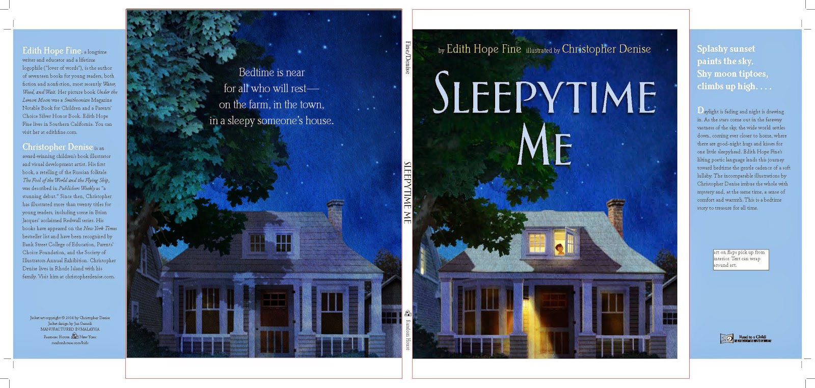
In January I gave a series of talk at Kindling Words east and can now share a bit of what I talked about during the breakout sessions with the illustrators. May 27th will mark the release date of
Sleepytime Me by Edith Fine, my next book with Random house so it best to focus on this title for this series of posts.
First I need to address the question of why I am using digital tools. Not for myself, but because I am asked...all the time. Technique and materials are really of little interest to me. Photoshop is a tool. Pastels and charcoal are tools. I am more interested in what you create with them. However, the question is always in the air so I will give you the cliff notes version of my thinking on the debate.
I started using photoshop when I began work as a visual development artist working on animated films and have found the program to be an invaluable tool in my book production work. First a quick note to all the skeptics who ask: "Don't you miss traditional materials?"Quick answer: No. While there is a learning curve, I have been able to customize my tools to create a process that not only replicates my traditional technique but removes many of the limitations of working in pastel and acrylic. Here are two examples of work. The one on the left is from my pastel work on the
Redwall picture books, the image on the right is a detail from my book due out at the end of August 2014,
Baking Day at Grandma's by Anika Denise. The image on the right was created using only digital tools.
I am impatient with my art. I work best when I can act and react. With digital tools changing the piece as it begins to emerge is far easier and I can get to the fun stuff faster. The goal is not necessarily to shorten the production time, though in this day of ever tightening deadlines and shrinking advances this is clearly a very good byproduct. The goal is to get as much of original inspiration down on the page as possible. With digital tools, I can cut right to the chase and then have the flexibility to edit, change, and repaint the piece to suit the needs of the entire book.
In the next post I will focus on the previously time consuming process of creating a bookmap with Photoshop.
By: Mike Cressy,
on 2/26/2014
Blog:
Sugar Frosted Goodness
(
Login to Add to MyJacketFlap)
JacketFlap tags:
illustration,
Photoshop,
digital painting,
stories,
forest,
monkey,
sword,
children's picture book,
pop,
flashlight,
MikeCressy,
alicia's adventure,
Add a tag
I'm hoping to work on the story for this soon,… after finishing the current picture book dummy.
Last week, the scans of my Jungle Grumble illustrations came back from the repro-house. Things have been a bit fast and furious: I've had just a few days to get all the 'finishing work' done, then Dropbox the final digital artwork back to the publisher, ready for everything to be put together and sent off to the printer. Phew. There were three 'finishing' jobs for me to do in Photoshop / Painter:
1 - text overlays
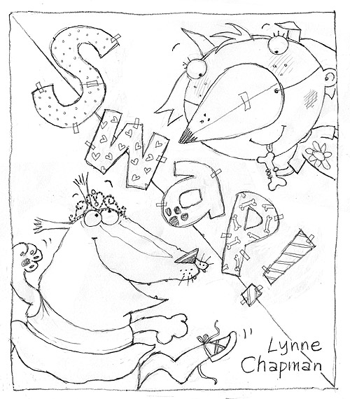
Children's illustrators never draw text onto their actual artwork, because of translations. All text, even wording that is part of the actual picture, is added afterwards, digitally. Unfortunately, because of the pastel texture of my work, ordinary, typed text 'floats', so I make my own text overlays, using Painter, which look like they are drawn in black pastel. Luckily there wasn't much intrinsic text in Jungle Grumble, only one lion roar and the Swap Shop sign, though that does appear a few times:
2 - legibility issues
To keep things as clear as possible, it's easiest when a story's main text falls over areas of sky. That wasn't always possible in Jungle Grumble: in several places I had to use trees or bushes as backgrounds for text. But it was tricky to be sure precisely where specific lines of text would need to sit and, because of my style, it was hard not to include undergrowth textures which might be visually distracting behind the words. Once my designer got the scans, she was able to layer the two together so we could spot any places where things were slightly too busy or too dark to be sure of maximum visibility. I then used Photoshop to make subtle changes. Spot the differences to the bush bottom right:
3 - vignettes
Not all my illustrations are full spreads with illustrated backgrounds. Some pages feature smaller vignettes: characters against a plain background. My biggest digital job is cutting vignette characters off my pink paper. It takes ages because of the pastel edge, especially where the pastel colour is close to the pink of the paper, like Lion's roar:
He looks so much better on green, don't you think? For anyone who wants to know how I do the cutting out, here's a detailed 'masterclass' (though my version of Photoshop is old, so many things may be slightly different on up-to-date editions).
Most illustrators don't do this digital stuff themselves, but I prefer to, as the pastels make it quite a bit more tricky than usual. It's possible that I'm being a bit of a control freak, as usual, but after all that time spent getting the drawings done, I like to be sure that these final alterations are exactly right.
Doing more digital stuff. These are kids on the playground, all in different stages of being fiddled with, re-drawn, edited, etc.
Having fun working out their outfits, and making them individual people - not just generic kids.
These will be in color, but I would like them to work as line art as well. So I will save one version as line art before I get into the coloring. I'm using Photoshop and my Wacom. I used to do this with ink and watercolor - I love being able to make changes with digital art! Not sure what "look" I'm going to do for the color - part of the fun of experimenting!
By: Carole Anne Carr,
on 5/11/2013
Blog:
(
Login to Add to MyJacketFlap)
JacketFlap tags:
charcoal,
sailing,
rivers,
mines,
Candle Dark,
River Dark,
Ironbridge Gorge,
Blists Hill,
Photoshop,
Add a tag
Plan A
Sophie Bignall drew three little characters for my next book cover and I then tried to use an eighteenth century painting of the famous Ironbridge as the background. But whatever I tried to do, and however much my Grandson, James Brinkler, manipulated the cover in Photoshop, the painting just would not sit happily with the charcoal drawing, (Sophie used charcoal so that this book cover
USC student Simón Wilches-Castro sent a message to let us know about his new short, Semáforo (Stoplight), inspired by the street performers of Colombia:
Due to the ongoing war in the Colombian jungles, many people are forced to flee their rural territories and find refugee in capital cities. Their only mean of acquiring money is to put on shows under the city stoplights. Some dress like clowns or do acrobatics, others spit fire or juggle; and some show the only thing they have left: deformities and amputations in exchange for some sympathy and change. This is the life of the people who live under a stoplight and the people who watch them.
Castro’s animation (made in Photoshop) is fun and creative, and he takes full advantage of the cinematic possibilities of the medium. The film will screen in competition at the Annecy festival next month.
A while ago I mentioned a mural project that I am doing, based on children's drawings created during an illustration workshop, focussing on characterisation and movement. The wall I have to cover, at Wakefield Library, is over 13 metres long, but only 2 metres high - very long and thin - so the idea is to create a chase scene along it, as if the children's animals are running through the library.
I let the teachers take the drawings back to school with them, for the kids to finish off. Unfortunately, instead of posting them a couple of days later, as promised, it took them 6 weeks and repeated hassling, so I am only now getting down to it.

I am currently spending my time on Photoshop, trying to work out how to lay things out. It's so massive, and such a weird shape, I'm working on a one-tenth, low res mock-up, into which I have placed scans of all the animals, so I can move things around and re-size them, until it looks OK. Then I'll re-scan everything at the right size, as the final artwork will be created digitally (in sections and at one quarter size, so my computer doesn't blow its brain).
Although my initial chase idea sounded simple, I soon discovered that, if I don't want to end up with just a 'procession' of animals, in a long, uninteresting line, I will need to draw in incidental props, like bookshelves for animals to climb onto, or chairs for them to jump over. I might need to do some graphic things will colour in the background too (like I did with the cover of Swap!), to divide up the space. Not sure yet.
Right: back to it...

By:
Lynne Chapman,
on 4/17/2013
Blog:
An Illustrator's Life For Me!
(
Login to Add to MyJacketFlap)
JacketFlap tags:
Photoshop,
digital,
Corel Painter,
Swap,
artwork,
scans,
text overlays,
hot tips,
illustration,
Add a tag
When it comes to the digital 'finishing' work on my books, it's the cutting out that's the real chore but, once that's done, I feel as though I have finished. Not so! There's the final, fussy job of doing the text overlays. Sigh...
All text has to be created separately from the main artwork, because of translations: you can't have English words embedded in the illustration and then hope to sell the book for foreign editions. This goes for all wording, but I am not talking about the regular text you can see above, but the little, incidental details: can you see the word 'DOG' on the bowl?
There are quite a few more on the spread below:
Most illustrators don't have to worry about the text overlays - the design team at the publishers sort out all that, when they place the other text. However, because I am daft enough to create my artwork in pastels, the bits of text which are intrinsic to the images don't work very well if they too are not in pastels: the wording sort of floats above the illustration.
It's not practical to do the text overlays in actual pastels, so I do it digitally, in 'pretend' pastels, using an old version on Corel Painter, which does a pretty good job of emulating the marks of my pastels, particularly after I have scanned in a sample of the actual paper I draw onto, so the texture matches. This is the text from the classroom door.
It's a boring and fiddly job, but looks much better. Of course, when it comes to the foreign translations, I have no control, so they just bung on ordinary text. Hey-ho - there are times when you just have to let go...
For the children's dance studio below, I've done the whole sign as an overlay, including the little drawings of the kids, because foreign translations can take up more space than English text. This way, it allows for the little figures to be removed if necessary, to fit in a more wordy name - clever eh?!
Anyway, I am now done, done, done (hurrah!) and a DVD of all the finished artwork has been sent back to my Art Director, who will be busy this week, dropping all the text into its final position and sorting out the final bits of design work (spine, title page, dedications, blurb, bar codes...).
The next stage should be the colour proof. That's the truly exciting bit, when it all looks real!
I finished off all the digital finishing-work, on the inside illustrations and on the cover for Swap! before the Easter holidays. It felt like I was nearly done. I thought I would be able to rattle off the endpapers and be ready to send it all off to the publisher pretty soon after getting back to work this week.
I don't know why I thought that: it was very silly.
 |
| front endpaper illustrations |
I wasn't really taking into account the fact that, not only are the illustrations different on the front and back endpapers, but there are six independent illustrations on each, every one of which is fiddly. Also every illustration features Lucy, whose head is a very similar pink to the pink of the paper I use, making it a bit of a technical nightmare to cut free.
 |
| back endpaper illustrations |
The illustrations will be put into a spot repeat pattern across the double spread of each endpaper:
I thought that, because the illustrations needed to be different - a sort of 'before and after' - I would use the same lilac coloured background for them both, to give some unity.
You can follow the progress of
Swap! (as well as
Baby Goes Baaaaa! and
Bears on the Stairs) from my first sketches and plotting sheets, through pitching the idea to publishers, creating artwork, as well as all the miriad issues that have arisen during the book's life so far, by clicking the
Swap! label, or other relevant label, on the right of the posts.
You can watch me create a piece of the original pastel artwork from
Swap! in a short film
here.
The diagonal line through the illustration is there because I wanted to use two different colours, partly to assist the design, but also to underline the idea of there being two sides, like the two sides in the story, which are going to swap over.
To help to make the cover as punchy as possible, I didn't want the two background colours to be drawn in pastels but to be
dropped in digitally. However, even at the point when I was
colouring the final pastel artwork, I didn't have much idea of which colour combination I wanted to use for the background.
But this week, once I had cut away the pastel paper in Photoshop, I suddenly had to decide. I wanted to stick to the colour palette from the inside illustrations, so I tried out some alternatives. My first thought was the pink and blue above. It's nice and rich, but felt a little heavy. The yellow and turquoise below seemed more lively and threw the characters and text forwards more:
I ran both alternatives by my Designer at the publisher. Luckily she agreed with me, so yellow and turquoise it is (
at least for now...).
Part of the Photoshop work I have been doing recently on Swap!, has involved designing the colours for the book. Some pages have fully illustrated backgrounds, but the ones that don't - the ones I have been cutting out - need my pastel paper replacing with a bold, flat colour.
To give the book an overall feeling of unity, the designer and I have to decide upon a colour palette: a limited range of colours to which I then restrict myself:
The trick is to distribute these colour backgrounds reasonably evenly throughout the book, whilst still making sure that each illustration has the best colour behind it, a colour that shows it off to best effect, but that also compliments any illustration on the opposite side of the page.
Quite often in this book, I have used two different colours to suggest a room, without actually illustrating one, as with this spread of the ballet class:
I like the contrast the technique creates between the textured pastel work of the characters and the smooth, bold colour behind.
View Next 25 Posts


I *TOTALLY* love these! Especially the cowboy boots!!