

Miró, Matisse, Picasso, and...Woody Woodpecker?
The post Must-See Los Angeles Art Show: ‘Woody Woodpecker & The Avant-Garde’ appeared first on Cartoon Brew.
Add a Comment
 By: Jerry Beck,
on 9/6/2016
By: Jerry Beck,
on 9/6/2016
Miró, Matisse, Picasso, and...Woody Woodpecker?
The post Must-See Los Angeles Art Show: ‘Woody Woodpecker & The Avant-Garde’ appeared first on Cartoon Brew.
Add a Comment

 By: Rachel Frankel,
on 12/11/2014
By: Rachel Frankel,
on 12/11/2014

Sometimes I feel like the wrong people are being boosted up and supported by their community. That may be a loaded thing to say–I simply mean that some of the art scene here in the Bay has become a bit homogenous and male-dominated. It’s no secret that the fine art world can often feel a closed door to many emerging artists as they continue to boost those who are already successful and well-known.

But obviously, there is room for everyone. My momentary pessimism was quelled when I stumbled across photos of LOSTBOY’s first solo show hosted at Betti Ono Gallery here in Oakland. To see an illustrator my age succeed in this way is incredibly motivating and empowering. Also, it doesn’t hurt that their work is wonderful to behold.


LOSTBOY is a first-generation Korean artist, illustrator, maker and a self-described “proud Aquarius.” They focus on visceral imagery and use the integrity of linework to draw attention to themes of identity, affirmation, consciousness and self-discovery. They are a graduate of the Portland Northwest College of Art’s Illustration program, and currently reside in Los Angeles, CA (yay hometown!).
After graduating from PNCA, LOSTBOY spent about 4 years in Oakland and recently moved back to their hometown to concentrate on preparing work for the aforementioned show, Core. LOSTBOY cites varied influences such as Yayoi Kusama, Yoko Ono, Ruth Asawa, and Antony and the Johnsons, in addition to fractals, oceanic imagery, and their own Asian-American heritage. In many ways, LOSTBOY’s work is about finding oneself and embracing one’s community, but it’s also about noticing and welcoming the unseen.


LOSTBOY’s solo show “Core” will be up at Betti Ono Gallery in Oakland until February 15, 2015. I can’t wait to see it myself and highly suggest you all check it out as well.
Follow along with LOSTBOY’s adventures:
By: Jerry Beck,
on 7/29/2014
A collection of rarely seen drawings by former Disney artist Jesse Marsh, who drew the "Tarzan" comic books for nearly twenty years.
Add a Comment
By: Jerry Beck,
on 7/2/2014
Young ladies, put down that issue of "Tiger Beat" because this is the only poster you'll ever need to hang above your bed.
Add a Comment
By: Jerry Beck,
on 6/26/2014
As one of the few animators to successfully cross over into the lucrative world of fine art, Takeshi Murata (b. 1974) has produced a wide range of video works that range from hand-drawn, computer-assisted animation to randomly distorted clips from films and TV shows a la glitch art, such as "Untitled (Pink Dot)" (2007), drawn from "Rambo," or "Timewarp Experiment" (2007) from "Three’s Company."
Add a Comment
By: Jerry Beck,
on 5/15/2014
Last night Jeff Koons sold a sculpture of Popeye for over $28 million. The sculpture may not have been designed by him though. In the comments of our previous post about the Popeye sculpture, Brew reader Alex Kirwan pointed out that Koons's sculpture bears a striking similarity to a Dark Horse-produced Popeye figurine released in 2002.
Add a Comment
By: Jerry Beck,
on 5/14/2014
Tonight in New York City, Sotheby's will auction a stainless steel, 2000-pound, six-and-a-half-foot-tall Popeye sculpture by Jeff Koons that is estimated to sell for between $25-35 million. Koons, who is already among the top three richest living American artists not to mention an avowed lover of "Croods," made three of these Popeye sculptures, which probably represents the number of people who he thinks are dumb enough to pay between $25-35 million for a Popeye sculpture.
Add a Comment
By: Jerry Beck,
on 4/29/2014
Joyce Pensato (b. 1941, Brooklyn NY) has been painting cartoon characters for years. She takes icons of cartoon art—Felix the Cat, Donald Duck, Batman—and renders them in smudgy charcoal and pastel or runny enamel paint. She works mostly in black and white, occasionally introducing silver and gold for contrast. Though her work seems grounded more in graffiti art, she actually draws from fine art history, from the likes of the Abstract Expressionists, and Philip Guston, who was also influenced by comics.
Add a Comment
By: Jerry Beck,
on 3/25/2014
The Whitney Biennial is one of the most anticipated events in the world of art museums. Begun as an annual survey of American art in 1932, it became a biennial in 1973. Its overall purpose is to show a snapshot of the contemporary art world, often focusing on very recent works. For the art intelligentsia, it is often an excuse to complain about a) the state of contemporary art, and b) the curatorial choices made, or both—with occasional exceptions, such as the 2012 Biennial, which was met with overwhelming praise.
Add a Comment
By: Jerry Beck,
on 3/20/2014
Patrick Oliphant (b. 1935) is one of the Old Masters of editorial cartooning. He began his career in his native Australia, then came to the US in 1964, and won the Pulitzer Prize for Editorial Cartooning in 1967, the first of many awards and accolades. The Gerald Peters Gallery in New York is presenting "Patrick Oliphant: A Survey," which includes 34 mostly new works ranging from charcoal and ink drawings, paintings in watercolor and oil, and bronze sculpture.
Add a Comment
By: Jerry Beck,
on 3/13/2014
Ad Reinhardt (1913-1967) was an artist’s artist, renowned among critics and curators, but hard for the general public to warm up to. His most famous fine art works are his Black Paintings, from the 1960s, which at first glance appear to be solid black, but on closer inspection turn out to be blocks of black and almost-black shades. Important, but challenging.
Add a Comment By: Kenneth Kit Lamug,
on 3/5/2014
By: Kenneth Kit Lamug,
on 3/5/2014
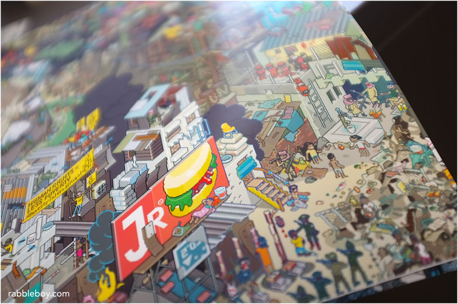
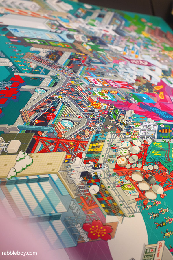
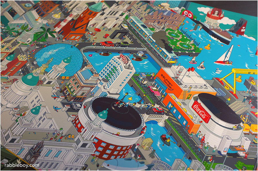
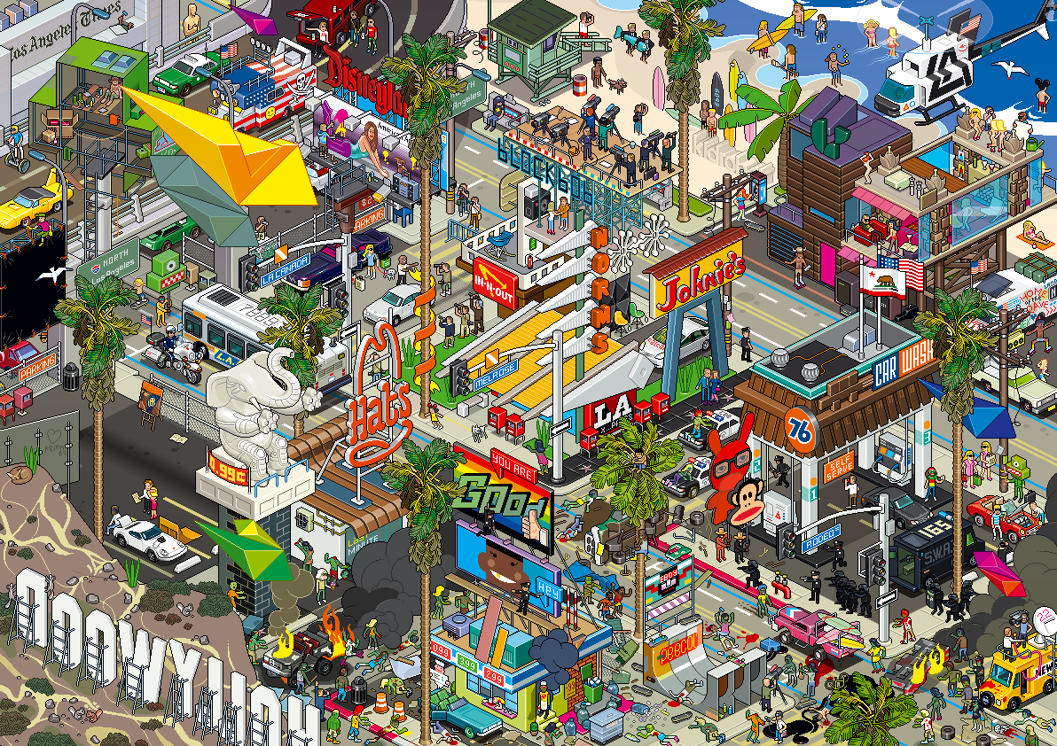
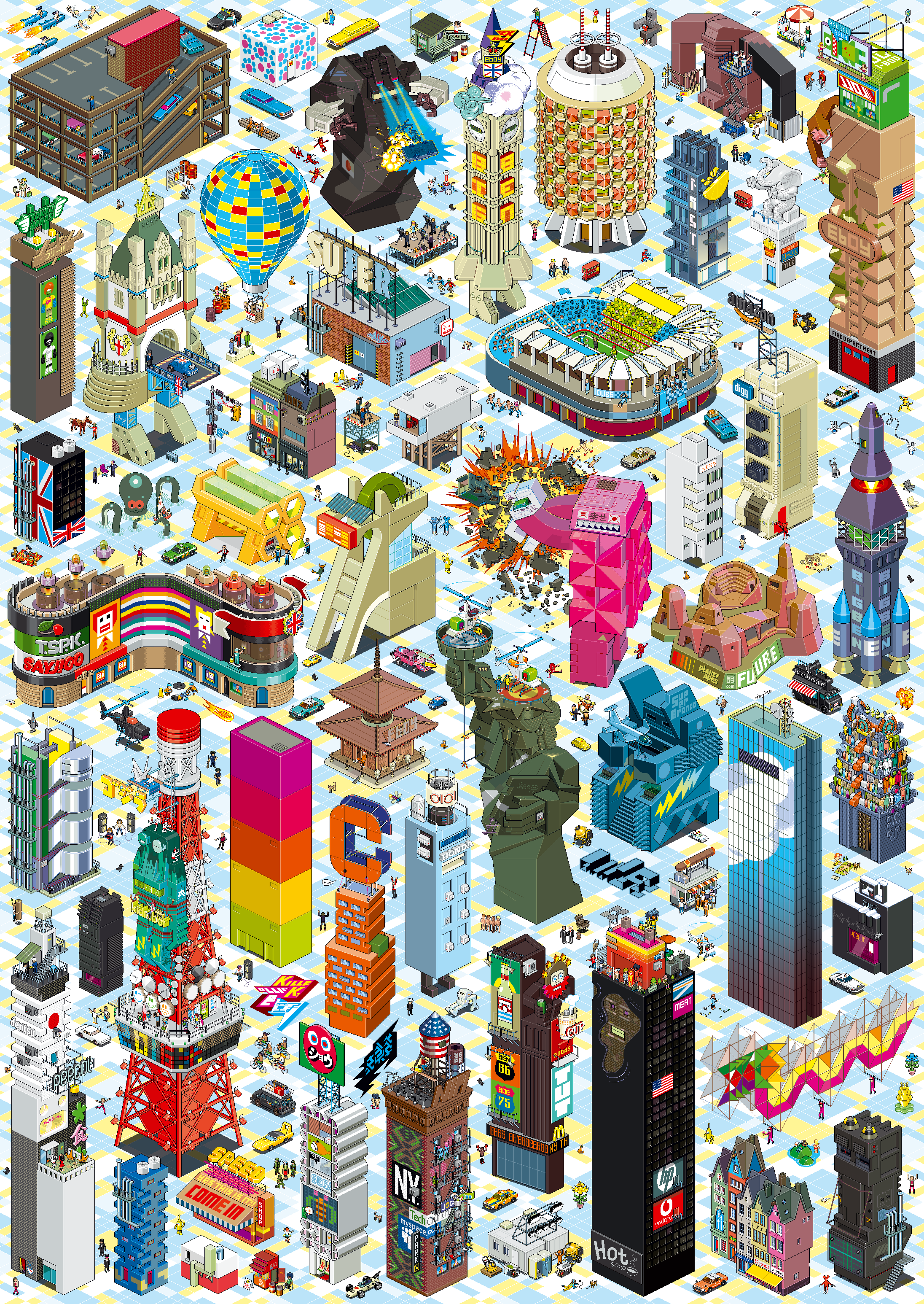
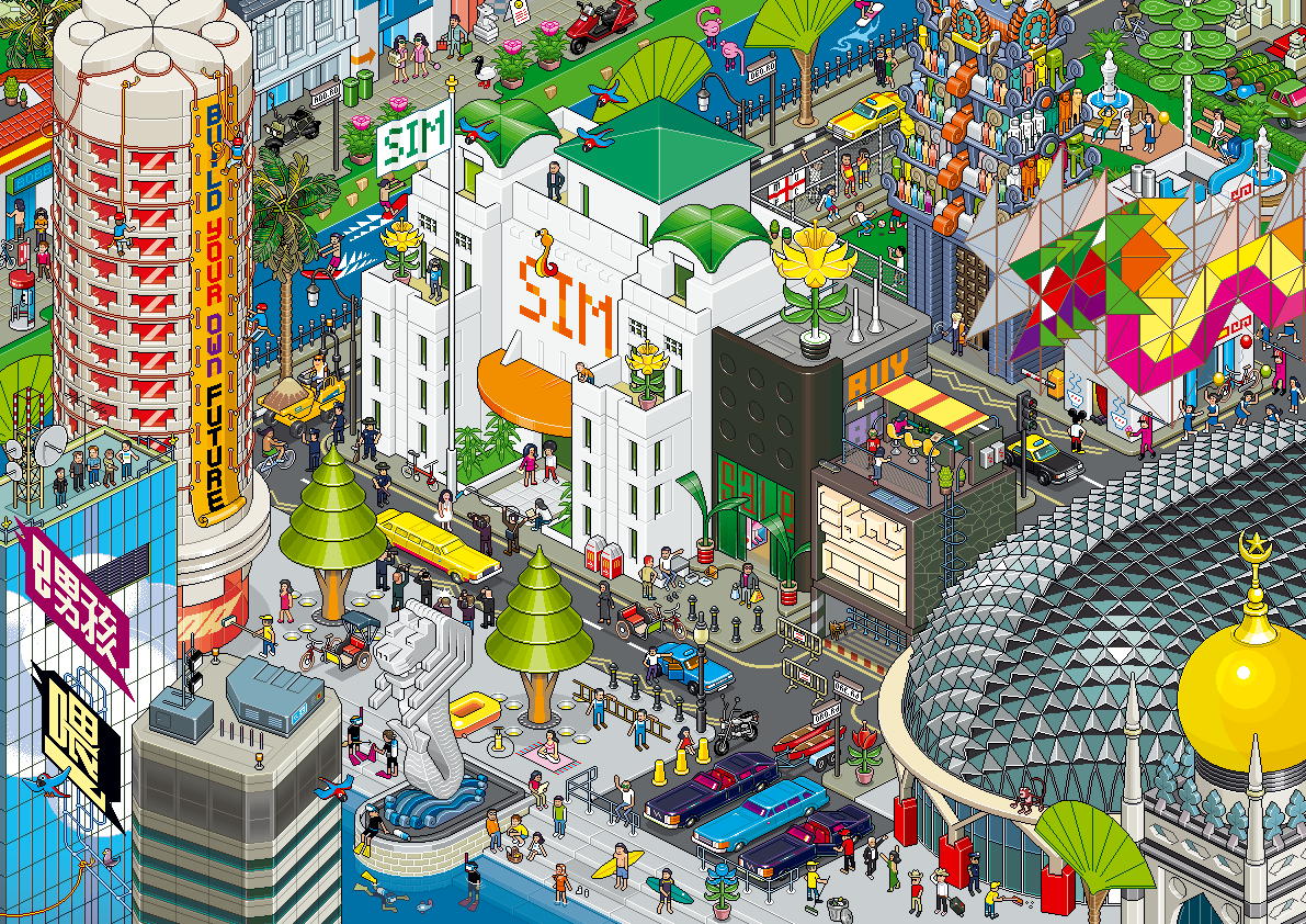
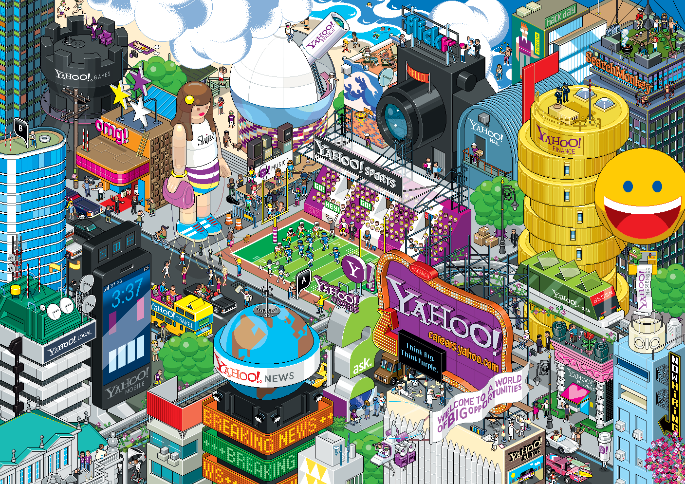
eBoy (“Godfathers of Pixel“) is a pixel art group founded in 1997 by Kai Vermehr, Steffen Sauerteig and Svend Smital.
Their complex illustrations have been made into posters, shirts, souvenirs, and displayed in gallery exhibitions.[1] They were founded on May 2, 1997. “We started working with pixels because we loved the idea of making pictures only for the screen. It’s the best way to get really sharp and clean looking results. Also, handling pixels is fun and you are forced to simplify and abstract things, which is a big advantage of this technique.” [1] eBoy is based in Berlin (Germany) and Vancouver (Canada).
Their influences come from: “Pop culture… shopping, supermarkets, TV, toy commercials, LEGO, computer games, the news, magazines…”[2] Kai grew up with Nintendo to inspire him, the rest of the eBoys lived in East Germany where video games did not exist.[3] Their work makes intense use of popular culture and commercial icons, and their style is presented in three-dimensional isometric illustrations filled with robots, cars, guns and girls. Now, most of their designs are printed and not used solely for computer screens, allowing images to get more complex with details.[1]“If we don’t work on other projects at the same time it takes about six to eight weeks to finish a very detailed cityscape, three eBoy’s working on it, nearly full time. But, if we have to do it in our spare time, which happens often, it could take years to finish a picture since we can’t spend so much time on it.”[1] Their style has gained them a cult following among graphic designers worldwide,[1] as well as a long list of commercial clients. Their latest project are plastic Peecol toys with Kidrobot, and a line of wooden toys are to be produced under their own label.
Source: Wikipedia
Check out Amazon for Eboy Posters


![]()
![]()


You’d be forgiven if you think of Matt Kindt as a breakaway success, since the “slow and steady” approach that’s defined his career so far looks like a sprint to the finish line with the explosive success of MIND MGMT from Dark Horse. Educator and author Travis Langley (Batman and Psychology) sat down with Kindt in a marathon 90 minute interview panel with the enigmatic creator on March 30th as part of the Comic Arts Conference at WonderCon. This “Focus” series event revealed just how long a road it has been for Kindt to reach his current level of exposure and fandom with MIND MGMT, a comic series about the dark legacy of a government spy agency staffed by agents with psychic abilities.
 Kindt, who says he’s probably been best know for his graphic novel SUPERSPY prior to MIND MGMT, had an unusual experience with comics at the age of 7 or 8 years old that left a big impression on him and still continues to influence his work. Reading Frank Miller’s DAREDEVIL, he ploughed through an entire issue where Daredevil visits Bullseye in the hospital, now paralyzed (following his murder of Elektra) and repeatedly pulls the trigger on his gun at the murderer. The issue itself consists of Daredevil speaking to the comatose Bullseye with almost no action at all, and as a kid Kindt thought “What kind of crazy superhero stuff is this?”. The heavy, odd dialogue and the “threat” of the unloaded gun, Kindt said, “made me love comics”. After a period in the 90’s when superhero books weren’t “capturing” Kindt’s attention anymore, he had another epiphany after discovering Daniel Clowes’ series EIGHTBALL at a con. He immediately felt, upon reading the issues, “This is the kind of comics I want to do” and an indie sensibility was born. Enter the years of hard work and learning just how to produce comics with his own particular voice.
 Kindt’s education in fine art and painting, still evident in his comics work, influenced him tremendously in making comics, he told Langley. To “know production” and “have control of every part of the process” of making comics now serves him well, but as an art student at Webster University, he “kept comic books a secret”, since they were not considered an “art form” by his instructors. The most rewarding skill he acquired, Kindt explained, turned out to be print-making. Even though it’s not a “discipline directly related”, its application to comics proved invaluable. “It helped me think about color and composition”, he said, and through print making he acquired one of his key concepts when it comes to making comics, “movement in production”, a phrase his print making instructor used that “still haunts” him. For Kindt, “movement in production” means not being “precious” about a particular stage of production and reminds him not to “hold onto things” but keep his comics output moving. It results in the fairly profound productivity readers see today from Kindt.
Another benefit of studying fine arts, Kindt said, was to “learn about everything” and learn to make art before learning to make comics. Learning to make comics from observing comics is fine, he assured the audience, but it is “limiting the scope of how you think about comics”. Kindt, who’s known for his use of watercolor and tirelessly inventive design of marginalia in his work, is a pretty good living example of his point. By bringing in tools and tricks learned in other art forms, he expands awareness for readers and creators about what the comics format can do.
 Kindt told Langley that he started off self-producing mini comics after attending ‘zine shows and first learned there about the common saying that a comics artist has to produce a thousand pages before they really produce one good one. The idea stayed with him as he watched his page count climb over the years. Inspired by autobio comics, he started producing them, meanwhile working his “boring day job”. “Every job was boring to me if I was not doing comics”, he confessed, and added that for him, “Everything has to have a dual purpose”. He worked in cinemas and bookstores to get discounts and continue to explore new artistic influences as part of his “dual purpose” of producing comics.
After graduating from college, Kindt worked at a “small design firm” and “hated it” despite the fact that it was art related. The “cubicle” environment depressed him and so he would speed through his required work and then “blatantly write comics after the work was done”. He rather ingeniously drafted and planned the comics while at work, so once home, “pages were ready to draw”. Kindt’s answers during this part of the interview were particularly funny as he broke into detailed narratives, but the most memorable vignette concerned using company color photocopiers to produce his comic covers after hours. “I don’t recommend this”, he warned regarding this strategy. Using special, thick paper for the covers, Kindt patiently kept copying despite the fact that the printer would jam every few copies. Finally, one cover “melted to the copier”, imprinting the drum of the copier with the cover image, including his name in clear script. After panicking, then realize there was simply nothing he could do about it, he knew he was “screwed” and left it. He returned to work without saying anything about it, watched the copier being repaired, and waited for the shoe to drop. It never did. His employers, for whatever reason, decided to turn a blind eye.
The job provided “motivation” for Kindt due to his profound desire to get away from an office job. He knew at the time, he said, “I’ll never be happy”. He was aware that he needed to “either fail or succeed at the thing I wanted to do most”. “Mocking” copies up at Kinkos at twenty dollars a piece, he printed 20 books and physically took the books to Dark Horse, Top Shelf, and Fantagraphics booths at a show in Chicago. By this time, Kindt had moved beyond autobio comics because he was getting a sense of “horrible feedback” from spending all day at a job he hated and then writing about it again in his comics. From making a list of things he wanted to draw, he concocted stories to allow him to do it. The list, he said (to laughter from the audience) included pirates, elements of old radio shows, and circus freaks. After handing over the hard-won comics to publishers, Kindt was more than amazed to receive a phone call at home. For Kindt, he still remembers the call as his “greatest moment”. Top Shelf wanted the book, “just as it is”. Ironically, the only change they wanted to make was to the melted cover.
 Kindt went on to learn a host of lessons in an uphill struggle to make a living in comics, from realizing that collaboration was just not his thing, to challenging himself (never again, he said) to create an entire graphic novel without a single narrative box, resulting in a 300 page tome, to the realization that with his book SUPERSPY, he had finally reached his 1000th page. Just on time, SUPERSPY took off in ways his previous critically acclaimed works had never managed to achieve.
Langley then led Kindt into the spy-obsessing portion of the interview, one which provoked a great deal of enthusiasm from the audience. Kindt, surprisingly, said that his espionage-based current work MIND MGMT, is not “really about spies”. He confessed that spy literature and film formed an early influence on his life from a family-bonding trip to a drive-in theatre to see MOONRAKER onward. The travel-writing aspect of spy novels were what Kindt found particularly appealing, churning through all the works of Ian Fleming as a teen. When he reads spy books or watches films now, however, he has a particular strategy in mind. He’s deciding what he’s “not going to put in books” since they’ve already been done by a process of “elimination”.
Kindt’s books now, and increasingly, show his obsession with “gadgetry” to the point that even close personal friends in comics (he mentioned Cullen Bunn and Jeff Lemire as examples) tease him about it, but it’s all part of the “physicality” and “interactive” aspects of printed comic books that appeals to Kindt. MIND MGMT is Kindt’s first fully serialized work where he is functioning as both writer and artist, and he’s taken advantage of that fact to emphasize the capabilities unique to print books, loading the inner covers of the comic, for instance, with extras for fans of spy lore. MIND MGMT contains features like a “field guide” format to its borders, Kindt explained, as if the comic is being presented within a field guide for secret government agents. Kindt also revealed that he’s particularly passionate about the role of covers in printed comics as the “very first page of the story” that has to function and work as simply a cover but also “work in a narrative way”.
 Though the question and answer period was generous and wide-ranging, covering his artistic processes, research for his books, and upcoming plans for MIND MGMT, Kindt’s passion for printed comics became a particularly hot topic. Working on a monthly book that is available in digital formats but contains incentives for print collection helps “get people back into shops every week”, Kindt explained, and may lead to readers discovering new books they like along the way rather than simply waiting for trades. He’s not averse to digital formats, he assured the audience, and reads many comics in digital format, but as a designer he’s concerned that “digital should be designed to be digital” and is not a fan of simple relocation of formats without attention to detail.
I asked Kindt, as the final question of the panel, what psychic powers he would like to have if he could somehow acquire them. His list was as down-to-earth as the hour and a half chat he shared with WonderCon goers: remember peoples’ names and be less oblivious. “I’d make the worst spy”, he confessed, “I can’t remember anything”. All a ploy to throw fans off the scent? Hearing a portion of the full story behind Kindt’s seemingly meteoric rise makes something clear once again about working in comics: it entails work, work, work, and more work, but it also demands commitment and passion. It’s not an easy combination to emulate, but for Kindt it’s been the only way to be truly happy.
Photo Credits: All photos in this article were taken by semi-professional photographer and pop culture scholar Michele Brittany. She’s an avid photographer of pop culture events. You can learn more about her photography and pop culture scholarship here.
Hannah Means-Shannon writes and blogs about comics for TRIP CITY and Sequart.org and is currently working on books about Neil Gaiman and Alan Moore for Sequart. She is @hannahmenzies on Twitter and hannahmenziesblog on WordPress.
.jpg?picon=1621) By: DIANE SMITH,
on 1/2/2013
By: DIANE SMITH,
on 1/2/2013
Time is ticking away - Christmas vacation is slipping away. But, I'm enjoying looking at the New Year, trying to plan how I can fit everything in that I want to do - especially art. As it stands, I will be the featured artist at the Town Center Gallery in October and I've got to get busy producing new work. Although it's a smaller-town member gallery, I'm excited about having a goal to work for. And, I'm really delighted to be taking steps back into the more "fine art" world - it can only enhance my illustration. I'm inspired by new ideas that I look forward to pursuing - I'll get more into that later.


.jpg?picon=696) By: Alicia Padrón,
on 8/15/2012
By: Alicia Padrón,
on 8/15/2012


.png.jpg?picon=3640) By: Sara Burrier,
on 3/15/2012
By: Sara Burrier,
on 3/15/2012
After much pushing and encouraging by my teacher and friend, I got through the brick wall. She is finally finished!
 |
| "The Red Ribbon" |
 |
| "The Peaceful Troll" - Sketch |
Okay for Now, by Gary D. Schmidt
In Schmidt’s latest novel for middle school readers, eighth-grader Doug Swieteck has many cards stacked against him. He’s got a mean older brother and a liability for a father. He’s just moved to a new school. He can’t read. He gets in fights. The principal is after him. The coach hates him. He doesn’t have a decent coat or a warm pair of shoes. His mother is sad and long-suffering.
Yet the satisfaction in this story comes not from the bad guys getting their due. Instead, the satisfaction is much deeper and broader—it comes from the reassurance that the inner self is always and truly free. In Doug’s story, this deliverance is aided by the kindness of strangers and by the gift of fine art. In author Gary Schmidt’s capable hands, its light shines right out of the pages of the book, making every day look like a fresh new spring day.
The fine art in this story is a book of John James Audubon’s Birds of America that Doug finds in the local library. Each chapter in Okay for Now is faced with a different plate from this book, and in each chapter, Doug uses that plate to further understand his world—this bird was falling and there wasn’t a single thing in the world that cared at all (the Arctic Tern) and that’s what the picture was about: meeting, even though you might be headed in different directions (The Forked-Tailed Petrel). A librarian—one of the kind strangers in this book—sees Doug’s interest in this book and encourages him to make his own drawings of the plates. The librarian’s critical analysis of these plates and the part they play in Doug’s story make a good reading experience into a sublime one.
I highly recommend this wonderful book for middle school kids of both genders and for adults who like a good story.
Gaby


 By: Paula Becker,
on 3/24/2011
By: Paula Becker,
on 3/24/2011

This week’s Illustration Friday prompt is the word “cultivate”. So…Clumsy the Bunny is trying to cultivate a taste in abstract art. However, it’s sometimes difficult to change how one sees things. Can’t say I blame him. It IS almost time for dinner!
By: DIANE SMITH,
on 8/29/2010
 |
| Studied this period in college - LOVED IT! |
 |
| "Twittering Machine" - Paul Klee |
 |
| Just Lovely |
 |
| Kandinsky |
 By: Lynne Chapman,
on 5/29/2010
By: Lynne Chapman,
on 5/29/2010
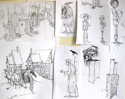
A title to keep you guessing, eh?


 By: Lynne Chapman,
on 5/7/2010
By: Lynne Chapman,
on 5/7/2010
OK, I know you're bored with me banging on about my holiday now, but there's a nice story I want to tell, before we move on.
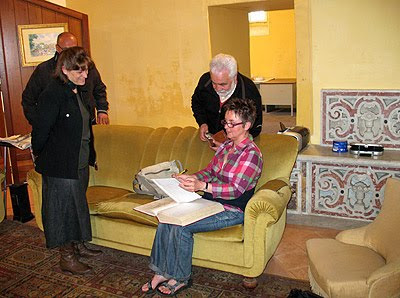

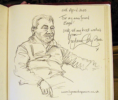
 I came away feeling wonderful. The exchange of work and ideas is such a lovely thing to share. Hello and thank you to Enzo and the artists of Procida if you are reading this!
  By: Mike,
on 4/4/2010
By: Mike,
on 4/4/2010


Happy Easter you guys! To celebrate spring I've created these two Abstract Variations. Sunshine and warmth are on the way people! Hal-ay-lu-ya!
By: Mike,
on 1/18/2010

I've finally started my winter painting for 2010! Off to a slow start because I'm busy with other deadlines but here it is. "Into the Atom Age"... which was from a sketch I had and was going to make a graphic novel about it but there was another idea that was way more pressing. I'm coming to the last stretch of doing the art for that and thinking about a few other stories I'm working on.
As always, this painting is available as a print on www.imagekind.com along with a bunch of other art that I do. Check it out!

Beautiful, I love the “BE YOU” illustrations.