new posts in all blogs
Viewing: Blog Posts Tagged with: cover art, Most Recent at Top [Help]
Results 1 - 25 of 92
How to use this Page
You are viewing the most recent posts tagged with the words: cover art in the JacketFlap blog reader. What is a tag? Think of a tag as a keyword or category label. Tags can both help you find posts on JacketFlap.com as well as provide an easy way for you to "remember" and classify posts for later recall. Try adding a tag yourself by clicking "Add a tag" below a post's header. Scroll down through the list of Recent Posts in the left column and click on a post title that sounds interesting. You can view all posts from a specific blog by clicking the Blog name in the right column, or you can click a 'More Posts from this Blog' link in any individual post.
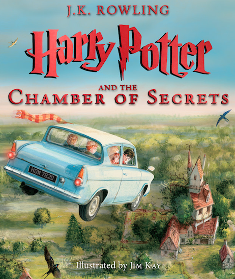
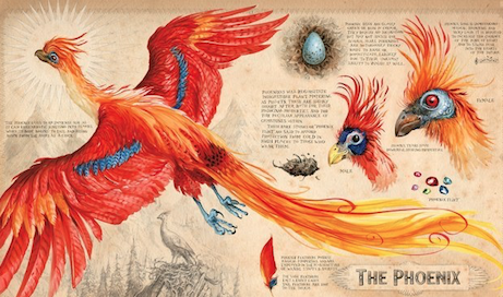
BuzzFeed exclusively revealed a first look at Jim Kay’s new work on the illustrated edition of Harry Potter and the Chamber of Secrets. The pop-culture news site revealed the cover art, as well as one beautiful diagrammed image of a Phoenix.
Please take a look at the new images below. Visit the original BuzzFeed article here.
By
Linda Covellafor
Cynthia Leitich Smith's
CynsationsThinking of going indie?
Self-publishing can be a fun, exciting, and rewarding endeavor. But get ready for an eclectic collection of hats, because you’ll be wearing many. It’s important to realize you’re selling a product that should be of the highest quality.
Here are some tips and resources to help you through the process.
EditingBy the time you’re ready to publish, you should have already gone through developmental editing of concept, character, and plot issues. Now, you need a proofreader/copy editor.
Don’t rely on a random friend or relative. Keep self-published books a strong and respected force in the market by having your manuscripts edited professionally or by a trusted, experienced critique partner. (Whenever you hire an outside service, be sure to have a contract.) See my
list of editors from author recommendations.
Tip: Other indie authors can be a great resource for any self-publishing questions.
Cover DesignYour cover should be unique while blending with other books in your genre (a fine line to walk).
There are three cover options:
DIY: Royalty-free images are available online, such as
this site, which you can use to design your cover.
Pre-made covers. Google
“pre-made book covers,” and you’ll find quite a few.
Custom cover design. I’ve compiled a
list of recommended cover designers.
Bibliocrunch and
Girl Friday Productions offer editing, cover design, and other help for indies on a budget.
ISBNDo you need an ISBN (International Standard Book Number)?
Not necessarily, but most retailers and publishers require one. (Amazon.com does not.)
With an ISBN, your book will be more discover-able by readers, bookstores, and libraries.
Currently the price for an ISBN (purchased through
Bowker) is $125—not cheap. And you need one for the ebook and paperback of each title. If you plan to publish several books, you can buy them in bulk at greatly reduced prices; they never expire. Some businesses buy ISBNs in large quantities so they can then sell them at reduced cost.
There’s some controversy about the validity of these or “free” ISBNs, so obtain one from a reputable source. See Joel Friedlander's
article on ISBNs and the
ISBN website.
Formatting and PublishingDepending on where you decide to publish your book, you may need help formatting your manuscript. It’s free and easy to publish ebooks through Amazon’s
Kindle Direct Publishing (KDP), and they accept Word docs. Amazon’s print service,
Createspace, is free and requires only a PDF. They also offer professional publishing services.
Smashwords is an ebook publisher, accepts Word docs, but has a style guide that must be followed.
Smashwords has distribution agreements with all major online retailers and with
Baker&Taylor, which libraries use to purchase books.
Draft2Digital publishes ebook and print books. They accept simple Word docs with no style guide to follow. They offer editing and cover design as well, and distribution agreements.
Smashwords or Draft2Digital? Here’s
one blogger’s analysis.
IngramSpark is a print and ebook publisher with distribution agreements. They have a style guide to follow, and you may need a professional formatter. See blogger Linda Austin on
IngramSpark vs. Createspace (
book doctor Stacey Aaronson says it’s beneficial to use both)!
PricingTo price your book, check other books in your genre. A common price for ebooks is $3.99.
The freebie can be a good marketing tool when you have a series: offer the first book for free in the hope that the reader will buy the other books in the series.
Experiment with pricing; see where that “sweet point” is. Just remember, you’ve worked hard and deserve to be paid a reasonable price.
Marketing and PromotionOnce you’ve published your book, the real work begins. As an indie book publisher, marketing and promoting is a never-ending job! Here are some tips and resources:
Local schools, libraries, and bookstores. Ask if libraries and bookstores will carry your book. Contact schools to do author visits.
Author Alexis O’Neill’s blog is a great resource on school visits.
Subscribe to newsletters for publishing news, tips, classes, freebies, and generally “knowing your industry.” Some good ones are:
Follow blogs, including those of your favorite YA authors. If you use Wordpress, you can follow tags in your reader to find others with similar interests. Good blogs for self-publishing include:
- Chris McMullen. Lots of info on Amazon, other self-publishing tips.
- Bookbaby (another ebook and print book publisher). They had a recent Twitter chat with YA author Lauren Lynne.
- IngramSpark has a blog on their website with self-publishing information.
- Of course, Cynthia’s blog, Cynsations!
Guest blog on YA authors’ blogs. Most bloggers love having guest posts. Come up with an interesting topic and ask!
Join
SCBWI (Society of Children’s Book Writers and Illustrators), check the website for resources, sign up for their newsletter, and get involved in your local chapter (you can join forces with other authors for book signings, etc.).
Use Social Media- Get your books noticed through accounts on Goodreads, Facebook, Twitter, Google+, Pinterest, Instagram, and other social media sites.
- Join some young adult author and reader groups on Facebook and Goodreads to meet and learn from other YA authors, and to expose your books to readers.
- Create a website. Pay someone or DIY with sites such as Wordpress.com and Wix. This article showcases some “stellar” author websites.
ReviewsIt’s tough for indie authors to get reviews. Ask for reviews on your website and social media. Put a request at the end of your books. Here’s one
list of bloggers who review books. Though the title says middle grade literature, most will also review YA books.
 |
| Ginger |
Do a blog tour (usually done when your book is newly published), and many of the bloggers will review your book. These businesses, among others, handle blog tours. Some specifically target YA audiences, but be sure to pick a blog tour company that lines your book up with YA bloggers.
Enter contests. Prizes can add credibility to and exposure for your books. There are many
free contests and others, such as
RONE,
Chanticleer, and
Literary Classics, have entrance fees. These three all have YA categories. And, of course, there are
the biggies from ALA. See which awards accept indie books.
Advertise. Occasionally having a sale on your book and advertising can help boost visibility. Advertising prices and results vary. Most, if not all, of
these promotional sites have YA categories. Missing from the list, but popular with authors, are
The Fussy Librarian and
Bookbub (expensive, but results can be worth it).
Self-publishing has lost its earlier stigma of “vanity publishing,” and readers are embracing indie authors and their books. Indies have discovered the advantages of self-publishing: control over content and cover design, higher royalties, and quicker time to market.
Do the research, put out a quality product, work on marketing, and you can find success and satisfaction as an indie author.
Cynsational NotesLinda Covella’s varied background and education (an AA degrees in art, an AS degree in mechanical drafting & design, and a BS degree in Manufacturing Management) have led her down many paths and enriched her life experiences. But one thing she never strayed from is her love of writing.
Her first official publication was a restaurant review column for a local newspaper. But when she published articles for various children’s magazines, she realized she’d found her niche: writing for children. She hopes to bring to kids and teens the feelings books gave her when she was a child: the worlds they opened, the things they taught, the feelings they expressed.
She is a member of the
Society for Children’s Book Writers and Illustrators (SCBWI). She lives in Santa Cruz with her husband, Charlie, and dog, Ginger.
No matter what new paths Linda may travel down, she sees her writing as a lifelong joy and commitment. Find Linda at
Facebook,
Twitter,
LinkedIn,
Goodreads,
Pinterest and
YouTube.
By
Cynthia Leitich Smithfor
CynsationsCheck out the cover for
The Alarming Career of Sir Richard Blackstone by
Lisa Doan (Sky Pony, 2017). From the promotional copy:
A funny middle grade mystery adventure complete with an unconventional knight, a science experiment gone awry, a giant spider, and a boy to save the day!
Twelve-year-old Henry Hewitt has been living by his wits on the streets of London, dodging his parents, who are determined to sell him as an apprentice. Searching for a way out of the city, Henry lands a position in Hampshire as an assistant to Sir Richard Blackstone, an aristocratic scientist who performs unorthodox experiments in his country manor. The manor house is comfortable, and the cook is delighted to feed Henry as much as he can eat. Sir Richard is also kind, and Henry knows he has finally found a place where he belongs.
But everything changes when one of Sir Richard’s experiments accidentally transforms a normal-sized tarantula into a colossal beast that escapes and roams the neighborhood. After a man goes missing and Sir Richard is accused of witchcraft, it is left to young Henry to find an antidote for the oversize arachnid. Things are not as they seem, and in saving Sir Richard from the gallows, Henry also unravels a mystery about his own identity.Congratulations on your upcoming release! What do you think of your new cover?I love it! Huge thanks to Sky Pony and my editor, Adrienne Szpyrka, for capturing the humor of the book while at the same time working in two prominent elements – the giant tarantula and a journal detailing a trip to South America.
The tarantula is Henry Hewitt’s problem and the journal is the key to figuring out what to do about it, which he must do to save his friend and protector, Sir Richard Blackstone.
More specifically, how does the art evoke the nuances of your book?We wanted the journal to feel Old World, hence the faded brown, as this story takes place in the late 1700’s English countryside.
Sky Pony’s designers had the genius idea of having the tarantula holding the journal to tie it all together. The red and yellow lettering really pop and signal the lighthearted tone.
I couldn’t be happier with how it turned out.
Isn’t it every middle-grade writer’s dream to have a cover with a tarantula on it?
I know it has always been one of mine!
Cynsational NotesLisa Doan has an
MFA in Writing for Children and Young Adults from Vermont College of Fine Arts and is the author of the award-winning series
The Berenson Schemes (Lerner).
Operating under the idea that life is short, her occupations have included: master scuba diving instructor; New York City headhunter; owner-chef of a restaurant in the Caribbean; television show set medic; and deputy
prothonotary of a county court. She currently works in social services and lives in West Chester, Pennsylvania.
By
Cynthia Leitich Smithfor
CynsationsCheck out the cover of
The Changelings by
Christina Soontornvat (Jabberwocky/Sourcebooks, 2016). From the promotional copy:
All Izzy wants is for something interesting to happen in her sleepy little town. But her wish becomes all too real when an enchanting song floats through the woods and lures her little sister Hen into the forest…where she vanishes. A frantic search leads to a strange hole in the ground that Izzy enters. But on the other side she discovers that the hole was not a hole, this place is not Earth, and Hen is not lost. She’s been stolen away to the land of Faerie, and it’s up to Izzy to bring her home.
But inside Faerie, trouble is brewing-and Izzy is in way over her head. A ragtag group of outlaw Changelings offers to help, and she must decide whether a boulder that comes to life, a girl that’s not quite solid, and a boy who is also a stag can help her save Hen before it’s too late. Tell us more about your cover. How did it feel to see it for the first time?It was a total thrill! When I opened the box of galleys that my publisher sent me, it seemed like the books were absolutely glowing. The cover art makes me want to dive in and see what is behind that door. I hope kids will feel the same way.
The girl on the cover is the main character, Izzy, who journeys into Faerie to find her little sister and bring her home. The three animals are the Changeling children who help her.
The Changelings are shape shifters who can make themselves look like almost anything for a short while. But they can only truly “Change” into a handful of forms – like the stoat, butterfly, and badger on the cover.
The little flying fairies are Pollenings. They play a very tiny, but important, part in the story. (And they make honey that goes great with pancakes!)
What was it like to see your characters depicted on the cover?I actually didn’t think the cover would feature the characters at all, so it was such a wonderful surprise to see them in the first draft! When I got my first look at Izzy, I thought the artist captured her perfectly. She looks curious and thoughtful, and is having a very human reaction to all the magic around her – a mix of awe and nervousness! I’m sure most of us would feel the same way if we stumbled into Faerie.
I think it was a very wise decision on Sourcebooks’ part to have Izzy be the only human face we see on the cover. The artist could have drawn all the Changelings in their child forms, but I think that would have taken some of the fun away from readers being able to imagine them for themselves.
Tell us more about the cover design process. Where you involved?The artwork and design were done completely without me – thank goodness! But my editor and art director did ask me for input on the characters, and we went back and forth several times to make sure the details were right and the cover was being true to them.
I am really lucky to have been involved as much as I was. I know that’s not always the case for authors!
I learned so much about covers during this process and the heavy lifting they have to do. The cover has to draw a reader in, give them a feeling for the writing and the story, but without giving too much away. Everything, from the font to the color palette, to the way the art wraps around to the back, contributes to that sense of wonder you want readers to have – before they even start reading.
The cover for The Changelings doesn’t depict an exact scene in the book, but I think it does everything you want a cover to do!
Oh, and there is a secret hidden in the cover as well. But you will have to read the book to figure it out!
Cynsational NotesChristina Soontornvat spent her childhood in small Texas towns, eagerly waiting for the fairies to come and kidnap her. They never came, but she still believes magic things can happen to ordinary people. When not writing, Christina hangs out in science museums and takes care of her own little goblins-ahem- children. She lives in Austin, Texas.
The Changelings is her first novel.
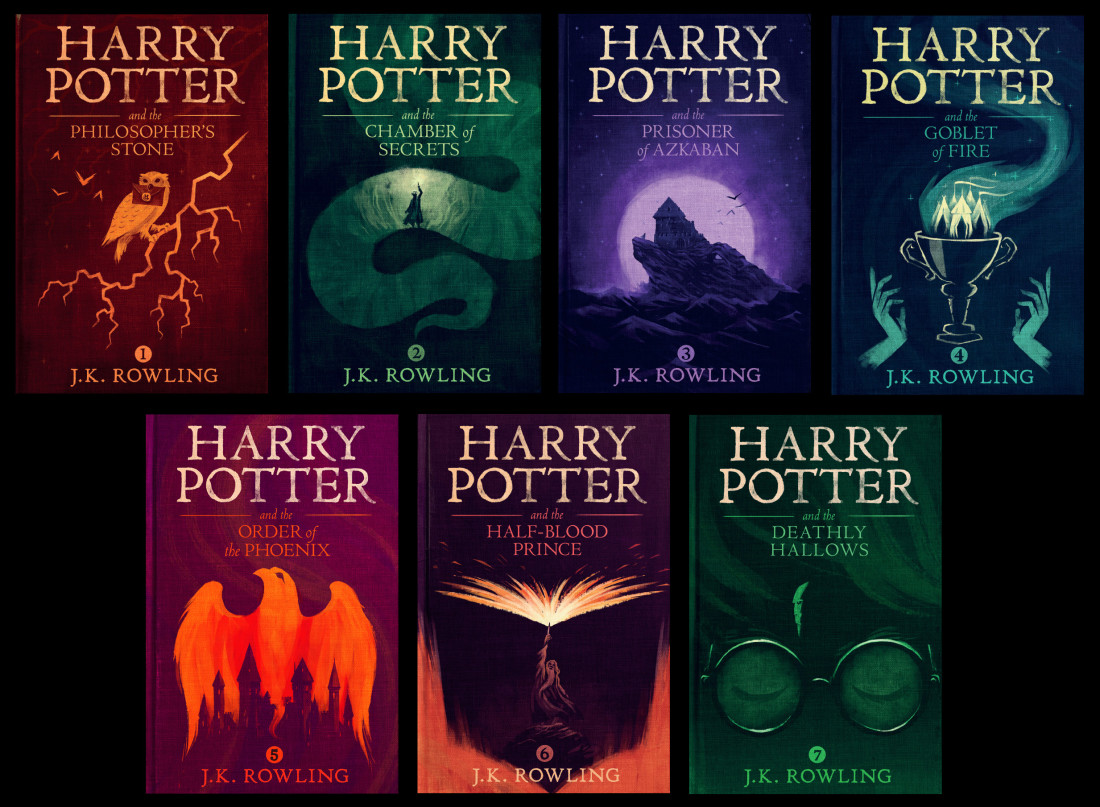
Today, Pottermore revealed the new graphic designs of the Harry Potter eBooks, created by Olly Moss. One of the PMCs had the opportunity to sit down with Moss, and discuss the covers and the designers love for Harry Potter.
Moss’s interpretations of the covers came from many sources of inspiration, but it was important for the designer to not give away spoilers on the covers for those who have not read the books before. In addition, the covers, though they look beautiful in their simplicity, also contain small details of the story within their imagery, which can be missed on first glance. (Click on photos to enlarge)
For example, can you find the subtle imagery in this Deathly Hallows cover?
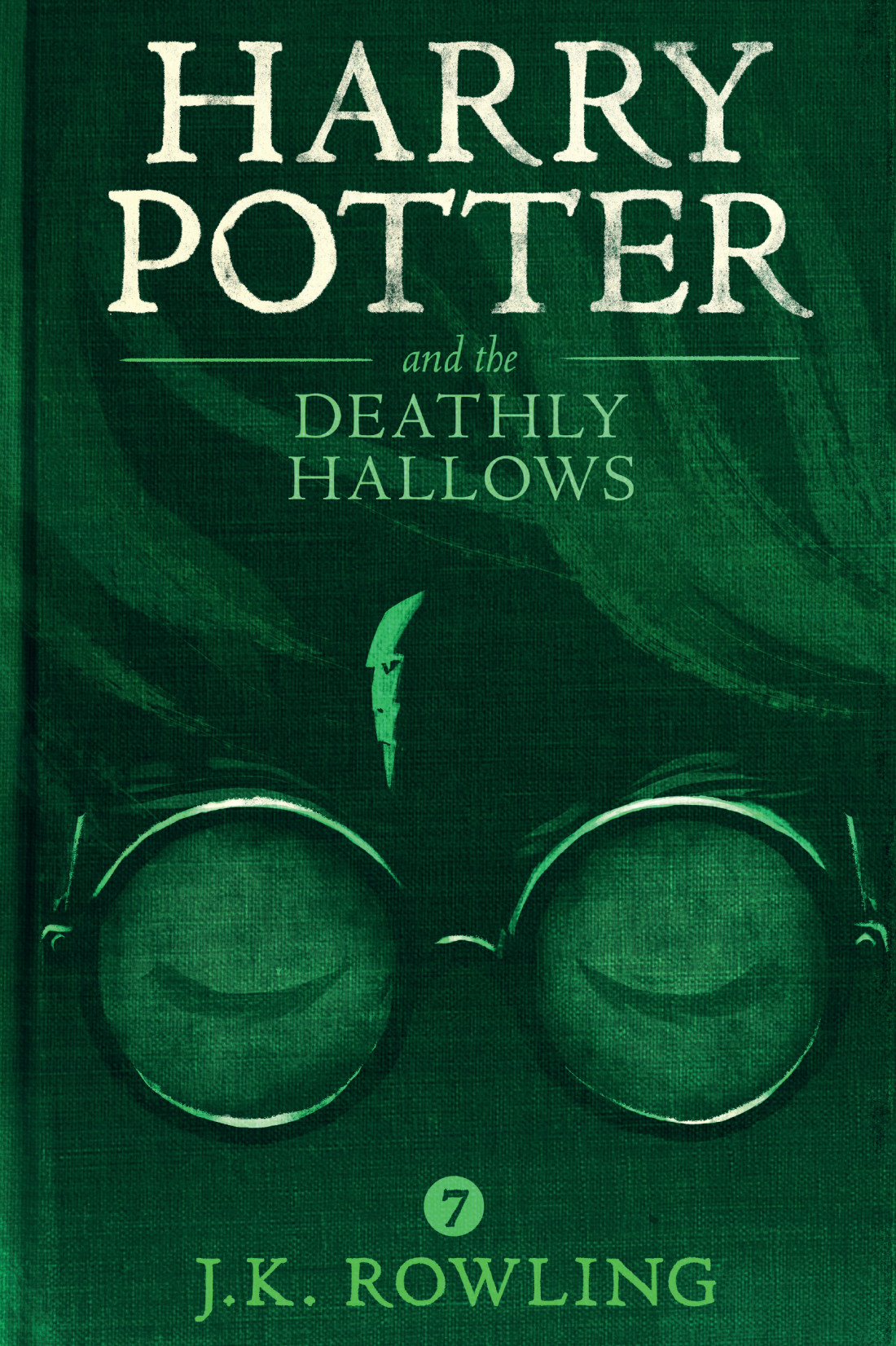
The PMC and Olly Moss discussed his interpretation of Deathly Hallows, favorite characters and more. Pottermore reports:
‘ Deathly Hallows is my favourite cover, because it’s the image that has summed up Harry Potter in my mind for such a long time. The scar – it feels like the culmination of the entire series and that’s the image that’s been stuck in my head.
‘This is a world where things often seem quite mundane on the surface and then have a secondary reveal. I love coming up with those images because it makes me feel that no one’s done this before – no one’s seen something in this specific way.’
The hugely talented graphic designer is a bit of a Potter fan, you see. So when Pottermore asked Olly to create new covers for the Harry Potter eBooks, he jumped at the chance.
‘Harry Potter has always been my favourite. I skipped [Philosopher’s Stone] because I was being a weird snob about it – I was ten. Then by the time Prisoner of Azkabanwas out, I remember my mum saying I should read them.
‘We were going on holiday and she bought [Azkaban] for me, but she got me the adult covers of the first two novels because I was still being a snob.’
Even then, covers mattered.
…
‘I wouldn’t work on something that I didn’t really love or wasn’t important to me, because I wouldn’t do a good job.’
The two go on to discuss Moss’s influences, sources of inspiration, his passion as a Harry Potter fan, how he got this ebook cover-design job, and J.K. Rowling! To read more of the PMC’s lengthy chat with graphic designer Olly Moss, please visit Pottermore’s site. The new eBooks will be available on the online Pottermore shop, and other eBook retailers around the world, in 2016.
We are thrilled to welcome editor and author Erin Rhew to the blog this month as our columnist for Ask a Pub Pro! Having worked with Erin, I'm amazed at how she tirelessly juggles so many hats. Not only is she an editor and the social media whirlwind for BookFish Books, but she's also the author of The Fulfillment Series, with the last book, The Fulfillment, releasing in just a few days!
Erin's here to answer your reader questions on how to brand yourself across genres, whether to send your own cover art in with submissions, and facing the fear of writing to a group younger than your age. Be sure to check out her newest release below!
If you have a question you'd like to have answered by an upcoming publishing professional, send it to AYAPLit AT gmail.com and put Ask a Pub Pro Question in the subject line.
Ask a Pub Pro with Erin Rhew
1) I've heard the advice that if you want to build a fan base, you need to brand yourself. But my ideas don't all lend themselves to one category or genre, though they all have some similar themes. I'm wondering if you can brand yourself writing across categories and genres but by always exploring a similar type of story question or theme. Or even a similar type of story?
That’s a great question! When branding yourself, it’s important to remember you’re branding YOU, not a specific book or genre. If you have a cause that’s important to you or a theme/message you’re trying to disseminate, you could certainly include information about that in your branding. For example, let’s say you want to bring attention to animal cruelty. As you blog, perhaps blog about that particular topic once a month or so. Highlight and promote charities you feel exemplify the work you’d like done for animals.
Read more »

By: Andy Yates,
on 9/10/2015
Blog:
Illustration Friday Blog
(
Login to Add to MyJacketFlap)
JacketFlap tags:
design,
illustration,
illustration friday,
comic,
cover art,
artists,
black and white,
prints,
Warren Ellis,
image comics,
weekly topics,
Tula Lotay,
comics illustrator of the week,
comics tavern,
comics tavern cover of the week,
Swords of Sorrow,
supreme blue rose,
thought bubble festival,
Add a tag


Since her beautifully delicate line-work graces the cover to the latest issue of Swords of Sorrow this week, we shine a light on the work of “renaissance woman” Tula Lotay! Working up her artwork in multiple layers of hand-drawn, hand-painted art, along with digital color/inks, Lotay spoils comics readers with an extraordinary amount of moody texture. She’s been contributing cover art and interiors to many books the past few years including Elephantmen, Zero, Rebels, American Vampire Anthology, The Wicked + The Divine, and Dynamite’s Swords of Sorrow.
Lotay is probably best known for her recent collaborations with writer Warren Ellis(Supreme Blue Rose, Blackcross; as cover artist, and their upcoming book Heartless), and her role as founder/organizer of the yearly Thought Bubble Festival in Leeds, West Yorkshire, England, which celebrates sequential art in all its forms.
If you like what you see, you should go follow Tula Lotay on her twitter page here!
For more comics related art, you can follow me on my website comicstavern.com – Andy Yates

The cover for This May Sound Crazy, a collection of nonfiction essays written by Oscar-nominated actress Abigail Breslin, has been unveiled. We’ve embedded the full image above—what do you think?
According to EpicReads.com, Breslin’s pieces touch “on the subjects nearest and dearest to our hearts: love, loss, and Tumblr.” HarperCollins will release the book on October 6th. (via Paste)

The cover for Untamed, a companion book for the Splintered series, has been unveiled on A.G. Howard’s blog. We’ve embedded the full image above—what do you think?
It contains three short stories: “Six Impossible Things,” “The Moth in the Mirror,” and “The Boy in the Web.” Amulet Books, an imprint at ABRAMS, has scheduled the publication date for December 2015.

The cover for Jonathan Franzen’s forthcoming novel, entitled Purity, has been unveiled on the Farrar, Straus & Giroux blog. We’ve embedded the full image above—what do you think?
This jacket was created by famed book designer Rodrigo Corral. FSG has scheduled the publication date for September 1st. (via BuzzFeed)
.jpeg?picon=2450)
By:
Sherrie Petersen,
on 3/30/2015
Blog:
Write About Now
(
Login to Add to MyJacketFlap)
JacketFlap tags:
YA author,
Los Angeles Times Festival of Books,
middle grade author,
Wish You Weren't,
book festival,
books,
writing,
celebrity authors,
cover art,
book signing,
book covers,
author appearances,
SCBWI-LA,
middle grade novel,
Add a tag
Last year when Wish You Weren’t came out, I was happy with the cover and hopeful that it represented the story well. I still love the cover, but I also started to realize that the static image implied a “quiet” type of story. If you’ve read Wish You Weren’t, you know that’s not the case. […]

By: Kim Sponaugle,
on 2/13/2015
Blog:
Illustrator Kim Sponaugle's Picture Kitchen Studio
(
Login to Add to MyJacketFlap)
JacketFlap tags:
cover art,
Kim Sponaugle,
cover design,
book cover,
Picture Kitchen Studio,
chapter book covers,
looking for a book cover artist,
need a great cover,
picture book covers,
tween book covers,
Add a tag
In need of a cover illustration or some design help with a picture book, early reader or tween chapter book? Picture Kitchen Studio can help!
…but is this cover

reminiscent of this cover?

In his March/April 2014 article “What Makes a Good Book Cover?” Thom Barthelmess praises the Grasshopper Jungle cover’s “iconic simplicity,” which “piques our curiosity” with its compelling minimalism. The same can certainly be said of Woman‘s cover art…but for a different reason!

The post Maybe it’s just me… appeared first on The Horn Book.
Hypable has posted pictures of the U.K.'s new adult covers for the Harry Potter novels. The most recently released cover is that of Harry Potter and the Deathly Hallows. Interestingly, Bloomsbury has chosen to feature Nagini for the visual representation of the final Harry Potter book. Also noted by Hypable, not one of the U.K.'s new adult covers features a human character. All new adult version of the Harry Potter novels will be available by September 26. Images of all of the covers can be seen here. The new Deathly Hallows cover may be viewed below.

Today I'm happy to participate in the cover reveal of Alyssa Rose Ivy's New Adult contemporary romance, The Hazards of Skinny Dipping! Hazards sounds like a fun, fresh read -- perfect for the beach, and it's hitting shelves in early summer 2013!
Without further ado...
ABOUT THE HAZARDS OF SKINNY DIPPING:This isn't a deep book about first loves or self-discovery. If you want a book like that, I'd be happy to recommend one, but I don't have that kind of story to tell. Instead my story is about rash decisions and finding out that your dream guy is bad in bed. It's the story of when I finally went skinny dipping, and how my life was never the same again. Oh, and it's also the story of my freshman year of college and realizing Mr. Right might have been there all along.
ABOUT ALYSSA ROSE IVY:Alyssa Rose Ivy is a New Adult and Young Adult author who loves to weave stories with romance and a southern setting. Although raised in the New York area, she fell in love with the South after moving to New Orleans for college. After years as a perpetual student, she turned back to her creative side and decided to write. She lives in North Carolina with her husband and two young children, and she can usually be found with a cup of coffee in her hand.
For more about this author please visit:
Thanks so much to Alyssa's publicist, Kelly, for inviting me to be part of this reveal!
So by now you've probably seen the
Jezebel post about hideous new covers for some classic books like
The Bell Jar by Sylvia Plath and
Anne of Green Gables by Lucy Maud Montgomery.
So. Faber & Faber (
The Bell Jar) I think is a Macmillan company in the US, and this is the UK cover. I actually kind of like the cover art, at second glance. It's not so much sexualizing the book as evoking the thought of a woman applying a mask, pretending to be happy, but the mask is slipping--and she's almost out of makeup. I don't like it as much as the US trade paperback cover (shown later in this post).
The
Breakfast at Tiffany's cover is from Viking which is a Penguin imprint. It's not so much pandering to a female buyer as it is, well, just not as classic as the first edition:
Gorgeous.
I feel you should only be allowed to tote that around in public if you look like this:
So that leaves Night & Day by Virginia Woolf, an Anne of Green Gables omnibus, and Charlotte Perkins Gilman's feminist Herland. Here comes the rant! News flash: these covers were selected by not-real publishers. These are self-published, Print-on-Demand (or POD) titles from Createspace.com and Readaclassic.com.
You know why there seem to be so many different copies of books like
The Three Musketeers by Alexandre Dumas, or
Moby Dick by Herman Melville? Once the copyright for a work has lapsed and no one holds license or title to it, anyone can go and reproduce it and resell it--this is called
Public Domain. So someone had the bright idea to take this farm girl photo and slap it on Anne of Green Gables, never mind that the model in the photo is blonde and kind of skanky looking, while Anne is supposed to be a sparky redhead. And while big publishers once in a while
mess up covers on a huge scale, I don't think any of them have quite let their standards fall this low.
So people, calm down.
When you go to the bookstore, this is probably the cover you will see on The Bell Jar:
And this is probably the most common cover art for Anne of Green Gables:
Or some variation of this.
Dover, who, yes, is a real publisher, and not some guy with a computer and Windows Paint, has these nice-looking thrift edition covers for Herland:
Kind of classic, really.
And Night & Day by Virginia Woolf might look like:
Oxford World's Classics (above), Penguin Classics (below)
Very serious, indeed.
My favorite cover is actually this one:
From Vintage books.
So relax, people. These self-pub shops don't have oversight, no one to go, "Wait--I think Anne's supposed to be a ginger..." Most of the time this lack of oversight is why I refuse to read books from Createspace/Smashwords or any self-pubbed outlet.
Also, while we're at it, stop complaining about
Twilight-ized classics. As a designer and someone who works with book publicity, I actually thought that was a kind of clever marketing decision, and I'd covet them if I didn't already have like, 6 copies of
Pride and Prejudice that have better binding than the cheap paperback one.
Ok, truth: I covet them anyway. They are so pretty! If only the binding were sturdier. (Yes, I think about these things a lot.)
</rant>
Do you have any covers you love, or ones you love to hate? Leave a comment below.
Good morning! Welcome to Uncovered, a feature that was started over on our adult book review site
Nite Lite. For me, a cover can often sway me to pick up a book or avoid it like the plague. I just love seeing new covers and it helps me get excited about a book. So Uncovered is just my way of sharing that cover love with the world. It won't be a regular feature over here, but I will be cross posting when I feature a cover on Nite Lite that falls into the YA/MG/children's category.
Today we are featuring the cover to
The Madman's Daughter by Megan Shepherd. This is a historical YA novel coming out in Jan 2013. Even though this one does feature a girl in a dress, it's not your typical YA cover. It definitely has a Gothic feel to it. The girl's dress looks fairly plain but broken up with the bright splash of color on her sash. The water looks still but it's dark and the clouds look ominous. I want to know what she's doing by the water. Is she going to jump in? Is something coming out? Plus, the title is great and makes me want to read it
right now.
Is anyone else as intrigued by this cover as I am? The Madman's Daughter will be released by Balzer + Bray on Jan 29, 2013.

By: Mark Miller,
on 10/1/2012
Blog:
From the land of Empyrean
(
Login to Add to MyJacketFlap)
JacketFlap tags:
YA,
artist,
adventure,
cover art,
race,
gambling,
ticking clock,
gangsters,
deceit,
treachery,
Elizabeth Eisen,
Kate Tenbeth,
wicked step-mother,
Add a tag
My friend, and author, Kate Tenbeth has an exciting new release! Here is the official story from her publisher:
Hello everyone! GMTA Publishing has a new YA novel set to come out on October 1st by Kate Tenbeth! Here's your first look at the amazing cover by UK artist Elizabeth Eisen!

About the book: There are always high stakes to play for in the world of gambling, but it’s a world 15 year-old Holly Maddon knows nothing about until her step-mother tries to kill her. The race is on as she tries to discover what her step-mother is up to and whether her father was murdered. She comes up against gangsters, multi-million pound land deals, treachery and deceit, she’s kidnapped, shot at and loses just about everything she loves – it’s a rollercoaster of a ride and Holly's intent on turning the tables.
About the author: I live in Essex with my son, who is studying at University, and my two cats, Puzzle and Bud. I’ve always loved writing and in January 2011 I got together with some friends and set up a writers’ group at our local library. One of our first guest speakers was a young lady called Penelope Fletcher who talked to us about self-publishing – I was so inspired I went back home, found some stories I’d written for my son when he was young and started the process of learning how to self-publish. I published 3 books in the
Burly & Grum series and then in July 2012 was lucky enough to be signed up by GMTA. I’ve enjoyed every single second of my journey so far, learnt an incredible amount and I’m looking forward to the future!
About the artist: Elizabeth Eisen is a 23 year old freelance illustrator from North London. She graduated from the University of Westminster with a BA Hons in Illustration in 2011 and has since worked on commissions ranging from album artwork to editorial. Further examples of her work can be found at
www.elizabetheisenillustration.co.uk Get Unlucky Dip by Kate Tenbeth today!
ONLY $3.99 on Amazon Kindle
(FREE to Prime users)
You may remember way back in January when I announced that I would have a short story appearing in the upcoming HarperTeen anthology DEFY THE DARK, that I said there'd be more exciting news about how YOU could be in the anthology too. Well, that day has finally arrived!
HarperTeen and Figment have opened up the DEFY THE DARK Short Story Contest.

This cover is NOT FINAL, but isn't it pretty?
The contest is open to any unpublished writer, or published writer who has earned less than $2000 from their writing. All you need to do is write a 2000-4000 word story of any genre that mostly takes place at night, or in the dark.
You can be creative with this. It doesn't have to be dark and scary. A girl sneaking out at night to meet her secret crush fits just as well as those creepy things that go bump in the night.
You have until September 1st to write an upload your story to Figment. The winner gets:
- The winner will get paid and have their story published in DEFY THE DARK!
- Two second place winners will also win cash prizes from HarperCollins and have their stories published on the Defy The Dark website.
So what are you waiting for? Get all the contest details at the Figment.com DEFY THE DARK contest page!
If you need a reminder:
 |
| A thing of beauty |
After many minutes of rabid refreshing, Simon and Schuster finally unveiled book 2, The Evolution of Mara Dyer (hitting shelves October 23 aka TOO FAR AWAY): First of all, YAY they kept the same theme and photographer! The underwater theme is dark and haunting, just like the first book. I also love how they seem to be images in a sequence. It has
evolved (cough) from them holding each other, to them being ripped apart but straining to hang on.
I also kind of love how you never get to see their faces. It keeps the air of mystery, and is also fitting since "Mara Dyer"is writing her story under a pseudonym (to protect the guilty?)
I also love the shift in color. Book one was green, and book two is blue... which seems darker and sadder to me.
Also, in case you missed it in all the cover excitement, there's a synopsis on Goodreads!
Two days after Mara walks into a police station in Miami at the close of The Unbecoming of Mara Dyer, she is committed for psychiatric treatment for what her parents believe is a mental breakdown. But what seems like a hallucination to everyone else is a chilling reality for Mara. Someone from her past has discovered her strange, disturbing secret and that someone wants her to pay. But she's about to discover that the price is more than she can bear.
Dark and thrilling, suspenseful and passionate, The Evolution of Mara Dyer will have readers breathlessly turning pages to find out what will become of Mara Dyer next.
Yes yes yes! Gimme gimme gimme!
The Unbecoming of Mara Dyer was my most anticipated read last year, and
The Evolution of Mara Dyer holds that title this year. This series is AH-MAZ-ING, and if you haven't read book one yet, what on earth are you waiting for?!
The Unbecoming of Mara Dyer is
on sale
8 Comments on
Cover Reveal: The Evolution of Mara Dyer (#2) by Michelle Hodkin, last added: 4/27/2012






I had on my outrage face when I first heard about blonde Anne a few weeks ago--what a relief to know it's POD and we won't be assaulted with that travesty whenever we're in bookstores.
Wendy @ The Midnight Garden
I had not seen this article. interesting. i didn't even know there were pay on demand books. I admit though that I don't really love the twilight copy new covers. it just makes them look really generic. bit that's just me. and who wants a cover for Anne of green gables with a blond on it? shudder.
Yep, print on demand is how a lot of indie authors used to produce their work before eBooks. That's a whole 'nother rant.
I have been known to buy books based on their covers. If it gets me to pick it up because it has a cover that catches my eye a little bit more, I'm all for it!
YEP! I wish more people realized that, though. It's driving me crazy having to explain what POD is.
I know but did you see the covers (on the Jezebel article)? The Anne one is just wrong... I kind of like the Faber cover for The Bell Jar, but that's all.