 |
A well-marked document design book
this writer loves. | Elizabeth King Humphrey |
I believe that my eyes are heavily involved in the tactileexperience of reading. Sure, I love to handle a new book or to upload a neweBook. There is that tactile. But my eyes want in on the game, too.
While the words definitely matters, keep in mind that the design of a book also matters.
As a graduate student in creative writing, I insisted onalso taking a document design class. It was clear to me that regardless ofwhere my books ended up, I wanted them to be aesthetically pleasing. I want mywriting to use beautiful fonts. I want my future books to look good. (Yes, I do believe that you can judge a book's design by its cover.)
And I want to be able to explain that to whoever is spendingthe time to layout my book.
A few months ago, I was hired to copyedit. But one of theelements of copyediting often overlooked is the job of ensuring the manuscript's overall consistency.
I spent hours ensuring that there were the correct number ofspaces between a chapter heading and the first paragraph. I looked at samplesof previous publications to provide the correct bold or italics placement. I eradicated two spaces after each period, if necessary.
When the design works, you don’t notice it. But when if fails, you probably notice it and itimpacts your enjoyment of the book. Your eyes catch the inconsistencies.
But design also helps by making books more inviting.
I checked a book out of the library recently. At home wealready owned two books dealing with the same subject. The library book wascolorful and the layout was accessible. The reason we hadn't consulted the other books was their layouts are flat. In the library book, the designer had festooned the pageswith illustrations that grounded me.
The book invited me into its pages. The words spoke to me. And my eyes were happy.
Look at your bookshelves, what books invite you into theirpages?
Elizabeth King Humphrey writes and edits in coastal NorthCarolina. Generally she loves reading books that are good AND have good design.

Wish you could tune out the world while reading your favorite book? The free “Go Away, I’m Reading” book covers will send a blunt message, customized for your book.
Erin Bowman, Sarah Enni and Traci Neithercott created the simple but inspiring dust jackets pictured above–what cover will you pick?
They have built “Climbing Mount Doom” for fans of J. R. R. Tolkien‘s Lord of the Rings trilogy, “In Narnia BRB” for readers of C. S. Lewis‘ The Chronicles of Narnia, “At Hogwarts” for aficionados of J.K. Rowling‘s Harry Potter series, “In Forks, Send Help” for fans of Stephenie Meyer‘s Twilight series and finally, “In the Arena, BRB” for readers of Suzanne Collins‘ Hunger Games series.
Here’s more about printing: “These covers will fit the traditionally-sized YA book. Take the PDFs to your local FedEx or Staples and get them printed on tabloid paper (11x17in). We suggest a matte cardstock (you could print on something glossy, but sometimes that causes light glares at certain angles and you want people to be able to read that Go Away message without incident). Choose a weight between 60-80lb for the paper. Anything lighter and the page will be too thin, anything heavier and folding it around your book will be difficult.”
continued…
New Career Opportunities Daily: The best jobs in media.

By:
Annie Beth Ericsson,
on 2/19/2012
Blog:
Walking In Public
(
Login to Add to MyJacketFlap)
JacketFlap tags:
blog,
picture books,
publishing,
book design,
blog updates,
my books,
children's book council,
freelance,
apps,
jan brett,
beauty and the beast,
blog update,
2011,
dave horowitz,
simms taback,
toddler apps,
game apps,
smart cookie studios,
early career committee,
little farmer,
maudie and bear,
young in publishing,
Add a tag

It’s finally time to resurrect my blog from its long hiatus! I’ve actually missed being on Walking In Public… digging up blog content has always kept me engaged with the publishing/art/design industries, and it motivates me to write and draw regularly. So, I’ll be back on the blog for a long while, with all-new features and updates on my journey to success in the children’s book world!
What have you missed while I’ve been away from the blog? Here are the best things that happened, circa 2011:
Annie’s Top 5 2011 Professional Developments

1. Illustrated and designed the Little Farmer app.
You may remember that I began a project working on a toddler game app, called Little Farmer, back in May. Well, after months of illustrating, designing and developing, we released it for sale in the iTunes store in October! It has been a really wonderful experience working with a talented developer, Anita Hirth, to create artwork that children can interact with, right there on any iPhone. There’s much more to say about the process of creating an app, and my future in the digital world… but those are subjects for bigger posts!
In the meantime, purchase the app here, or watch the video trailer, above!

2. Joined the Children’s Book Council’s Early Career Committee.
I’ve been attending events for young adults in the publishing industry for awhile, so it was exciting to be asked to represent Penguin Young Readers (and designers everywhere) on the Children’s Book Council’s Early Career Committee. This organization creates opportunities for those in the first 5 years of the children’s book industry to network, learn, and become more involved in their fields… so their mission is right up my alley! Since becoming a part of the team this summer, I’ve had a TON of fun making great friends with 20-somethings in different houses, through planning creative programming. I’m also having a blast designing fliers, making good use of my design time and talents.
If you haven’t already, make sure to catch up on the CBC and ECC’s fabulous social media enterprises – Facebook, Twitter, and Pinterest!

by Teri TerryIt has been a year with a lot to smile about: the last twelve months have seen an agent, and not just any agent but Caroline Sheldon; a publishing deal for Slated with Megan Larkin and Orchard Books; and finally: a long-awaited moment. An actual book cover!!Read on, and there just might be a chance to read Slated before the 3rd May publication date...One of the most exciting moments
 Think you have what it takes to be a book designer? Test your skills with the addictive Kern Type game.
The free game gives you a word, testing your ability to evenly space, or “kern” the letters, an old fashioned skill from the days of the printing press. Even though modern printers don’t physically lay out letters on a printing press, kerning is still very important for modern designers as they straighten letters in digital space.
Adobe’s glossary provides the simplest definition of kerning: “The adjustment of horizontal space between individual characters in a line of text. Adjustments in kerning are especially important in large display and headline text lines. Without kerning adjustments, many letter combinations can look awkward. The objective of kerning is to create visually equal spaces between all letters so that the eye can move smoothly along the text.” (Via Book Bench)
New Career Opportunities Daily: The best jobs in media.

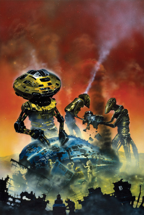
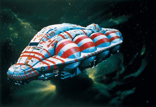
I just finished illustration a children’s book full of dozens of spaceships, and I wish I had this book to use as a resource when I was doing my initial concept work.
Hardware: The Definitive SF Works of Chris Foss collects the art that originally graced the covers of paperback scifi books from the 70s and 80s. Foss’s designs are both strangely organic and severely industrial.
The book features forewords from Moebius and Alejandro Jodorowsky whose collaboration on the comic book The Incal directly influenced the film The Fifth Element.
I’m keeping this on my reference shelf for the next time I need to draw dozens of spaceships.
Images © Chris Foss, courtesy ChrisFossArt.com

 According to the anonymous job site Glassdoor.com, the average salary for a book designer in the New York area is $58,924 a year.
The site also breaks out figures from specific companies. Below, we’ve made a list of what book designers at three book publishing companies make–all the figures drawn from anonymous users at Glassdoor.com.
Follow this link to find out how much book editors earn and this link to find out how much book publicists earn. For more details on book publicist salaries, keep reading…
continued…
New Career Opportunities Daily: The best jobs in media.
By:
Annie Beth Ericsson,
on 5/20/2011
Blog:
Walking In Public
(
Login to Add to MyJacketFlap)
JacketFlap tags:
pratt,
pratt show,
illustration,
happenings,
book design,
comic books,
cut paper,
students at pratt,
illustration sensations,
current students,
Add a tag
Mozart at the Beach from Christee Curran on Vimeo.
Oh, the Pratt Show . . . it’s hard to believe that it’s been a full year since all the momentous graduation-related events were happening to me! It was great to be on the other side of things last week… browsing new artists, sipping champagne and catching up with old classmates, without the stress of having my own work in the show.
This year’s class certainly didn’t disappoint in talent! I was so proud to see many familiar faces represented at the show, from Sarah Mimo‘s swoonworthy clocks, to new textile prints from Alexa MacFarlane and new comics from our former Putnam intern, Kris Mukai. I’m also jumping for joy to showcase Christee Curran‘s video storyboard project (above). How adorable is that kid at the beach?!
In addition to old friends, there were also a few new faces at the show. Here were my favorite kids’/book related discoveries:


1. Alexandria Marie Compo / I loved her quirky animal characters, and combination of digital and hand-crafted work. In fact, we were all so taken with her 3-D figures that they almost “walked” away with us! Very well suited for the pages of a trade hardcover picture book.


2. Michelle Lynch / Michelle’s range of work is crazy &nd
Greetings from Melbourne! Well, Geelong, to be exact. I've been here since Friday morning, and am slowly getting over jetlag. I'm staying with old friends who used to live in NY and am having a great time--getting a taste of what normal life is like, combined with a bit of sightseeing, too. Today I'm off to Melbourne to have lunch with author Karen Healey and her Australian editors at Allyn & Unwin.
 Before I left NYC, I arranged a Q&A with two of our fantastic Associate Art Directors at Little, Brown Books for Young Readers. Thank you so much to Tracy Shaw and Alison Impey for answering some questions! Note: they both answered these questions independently, but I loved arranging this so it seemed more like a conversation--I thought it especially telling that they answered question five in the exact same way.
1) Please list five books you've designed in the last two years.
Alison:
Tracy:
One of the fun things (for me) about e-publishing involves font selection.
Yes, you read that right: font selection. Crown me king of the geeks.
But think about it. Book covers are different in the digital era. They are an electronic "button" with which a reader might investigate or purchase your book. Fonts must be readable on small icons and draw in a reader's attention. They should convey a message about the book, too.
I could spend hours looking at fonts...
Unfortunately not much else would get done.
Some of my favorite haunts:
dafont.com
urbanfonts
1001 Free Fonts
Don't blame me if you accomplish nothing today.

On Monday, the Art Department took a field trip to see the AIGA’s 50 Books/50 Covers of 2009 exhibit. It was a worthwhile show to attend, but I had mixed feelings about it. For one, the non-traditional gallery presentation (above) brought both advantages and challenges. I loved the low bleacher set-up for books, because I could sit and relax while browsing heavier volumes. But the bleachers did the covers a huge disservice; not only did you have to bend down repeatedly to pick up each individual cover, you had to flip the card over to even see the image.
But the main reason that I left ambivalent over the 50/50 exhibit encompassed more of my greater feelings about design in general. Without a doubt, the books on display were creatively inspiring. I loved thumbing through the photos and art, the lavish paper stocks, and the 3-dimensionality of a beautifully-presented package. Books like these make me want to go home, stay up all night and make ART. It makes me feel a little inferior that I’m not doing that kind of work already.
At the same time, though, many of these books get right to the heart of one of my greatest pet peeves: design for design’s sake. Design should always serve a purpose, complement its material, and make content accessible to its consumer. I love design because it places equal importance on being functional AND visually pleasing. But many of the 50/50 books suggest the opposite. Type running into more type, or scattered across the page, or written in tiny Helvetica Bold . . . these things appeal to the hipster art-design community, but aren’t the best solution for the general reader. Go ahead and be as artsy as you want, but please, let it make sense.
That being said, I’ve composed some highlights of the exhibit to present my case. I’ll showcase my favorites, as well as some titles that really made my blood boil.
A perfect example to explain my point? Two books, no type on the cover:
Afrodesiac (AdHouse Books) – Perfectly captures the 1970s exploitation and comic book crazes. The interior contains pictures, not words. Generally all-around badass.
vs.
Manuale Zaphicum (Jerry Kelly LLC) – Yes, the letterpressed interior is absolutely gorgeous, but I found a blank cover for a book about a type designer to be annoying-ironic, not funny-ironic.
See what I mean? Okay, now on to some favorites:
 Pictorial Webster’s (Chronicle Books) – Gimme gimme gi
By:
Annie Beth Ericsson,
on 3/4/2011
Blog:
Walking In Public
(
Login to Add to MyJacketFlap)
JacketFlap tags:
classics,
fashion,
happenings,
book design,
reading is fundamental,
book covers,
ceramics,
jewelry,
maira kalman,
design finds,
good for you,
planned parenthood,
penguin classics,
penguin uk,
coralie bickford-smith,
david pearson,
Add a tag
Since the week has been so crazy for me preparing the Spring 2012 picture books at work, here are a few announcements/discoveries to keep y’all busy:

1. Seems that Coralie Bickford-Smith, senior cover designer over at the UK’s Penguin Books, has been on everyone’s brains lately . . . I received two links to her in the past few days! I have always been a huge fan of her Clothbound Classics series, but I hadn’t seen her full site.

And, my goodness, take a look at her newest work! I’m getting giddy looking at this Penguin Great Food series (link courtesy of Creative Review, via Ryan, extremely cool fellow designer/cubicle neighbor). Each plate is based on vintage ceramic patterns, and I seriously can’t get over how gorgeous they are.

2. Speaking of how the UK dominates beautiful patterned covers, let’s move along to White’s Books, a small London publisher directed by David Pearson (a former Penguin Books designer himself). In a different way, these patterns draw the reader into other imagery and bring visually potent symbolism to distinguished classics. Thanks to Kevin Stanton, amazing paper-cut illustrator from the Illustration Week extravaganza, for referring me to Jessica Vendsen’s blog!

3. On a local level, I have to give a shout-out to a new show opening up in town: Maira Kalman: Various Illuminations (of a Crazy World). I’ve mentioned before my infatuation with Maira’s work, and since she’s a Nancy Paulsen Books author/illustrator, I get to drool over her new children’s books on a regular basis. Can’t wait to check out this exhibit of many of her best-known works, as I know it’ll be as original and out-of-the-box as ever.

Maira Kalman: Various Illuminations (of a Crazy World) is on display at The Jewish Museum from

As I mentioned last Monday, last Wednesday was the photo shoot for the yet-to-be-named cover. On Monday, we reviewed the photos of our top choices from the model call. It was interesting to see that the one model I had thought was gorgeous did not photograph as such. One of the photographer's and designer's faves from the model call also did not photograph well. But our other top choice had absolutely lovely photos--she clearly knew how to model, and her poses were expressive and natural. There were a few other strong options as well. However, the problem was that we only had a "second hold" on our top choice, meaning that someone else had also really liked her and was considering her for a Wednesday job. We decided to challenge the first hold, and as of Tuesday morning, we thought we had her booked.
In the meantime, we were also searching for a male model. We had two top choices from Monday, but were told right away that one had been booked. We wanted to see more options, and so the model agencies told us they were sending two male models to the office.
Only one ended up showing up--it was a little surreal to have this tall, good-looking male model with us in a publishing company's conference room. When I saw him, I thought he looked a little familiar, and as I was flipping through his portfolio, I recognized a shot of his (that happened to be a shirtless photo--hee hee) from Friday.
"We've met you before, haven't we?" I asked him. He looked at me a little confused. "Were you at the model call on Friday?" He didn't remember. The models go to so many different calls that I guess I couldn't expect him to remember us.
At any rate, it was good thing we saw him again, because we realized that we liked his look over the other model we had chosen from Friday. We booked him.
It was all set. We were sent the schedule. And then, around 3:30 on Tuesday afternoon, the day before the shoot, we were told there had been a mix-up with the female model and that she had been booked elsewhere. After a flurry of phone calls, we decided to book our second choice, who luckily we still had a first hold on. Whew.
The day of the photo shoot was a busy one at work, and I knew I couldn't be there for the whole day. The designer, Alison, would be there the whole time to art direct, so I knew everything would go smoothly, but I did want to a least stop by to see how it all worked.
Bethany and I stopped by the studio at 10:30. The male model's call time was 9 am, so his make-up was done by the time we arrived. The female model's call time was 10 am, so she was in a robe about the sit down in the make-up artist's chair.
Alison and the stylist showed up the rack of clothing the stylist had picked out for the girl, ranging from leather jackets, to tank tops, textured dresses, slouchy sweaters, skinny jeans, leggings, etc. There was also a table of accessories. Awesome. "Everything's for sale, by the way," the stylist told us, "selling it would mean there's less for me to return later." Tempting, but I managed to resist.
The photographer started shooting the male model while the female model was getting her hair and makeup done. Different poses, different lighting, two different shirts, sitting standing, etc. Various assistants milled around helping with the lighting. Alison and the photographer discussed the different angles and what effect they wanted to achieve. It was fascinating. I love watching other creative professionals at work--it'
On occasion, publishers do photo shoots to get just the right shot for a cover image. Because photo shoots can be pricey, they're generally only done if the right stock photo can't be found.
I've never worked on a book where we've done a photo shoot for the cover...until now.
I won't mention which book it's for just yet, as I'd rather wait until the cover is final, but I was absolutely fascinated by the process, and thought I'd share.
This past Friday was the model call.
The designer takes care of setting everything up (in this case we used a coordinator who scheduled everything), so all I had to do was show up. Before the model call, model agencies send online portfolios of the models that meet the criteria that we've specified (age, height, hair and eye color, etc.). The designer and the photographer will both review the portfolios individually and pick which models they want to show up at the model call. As the editor, I was given the option of reviewing the portfolios as well, but I chose to just look at a sampling to make sure that the designer and I were on the same page. We were.
The model call was in a very simple, spare room. The designer and I (and my assistant for part of it) sat at a table near the entrance. The photographer set up his equipment. The coordinator of the shoot was out in the hallway with the models, taking their names, studio, and giving them numbers on stickers to wear so that we could keep track of who we liked. One by one, the models would come into the room, we would greet them, and look through their portfolios quickly. Most of them had tear sheets we could take and number to remember who we liked. Two had their portfolios on an iPad, which was a cool use of technology, I thought. Then the photographer would take some shots of them at different angles, highlighting the type of shots we would most likely be doing at the photoshoot, making sure to get the important angles. He spent more time with the models he liked.
It was fascinating! And really, really fun. Although it was exhausting, too. I felt like I was a judge on America's Next Top Model--the theme song "you wanna be on top?" kept running through my head. I found it interesting that neither the designer nor the photographer felt the need to take notes--they were both visual people, and remembered the models they liked and didn't like. I took notes, and felt really judgmental as I did: "Nose too big. Nice skin. Neck too short. Too awkward. Not pretty enough." etc. Although, of course, they were all beautiful in different ways. Some were just obviously not right for this project. Some had the right look, but didn't take direction well, didn't know how to pose.
"You must be the editor" the coordinator said to me at the end of the day. "Yes, how did you know?" "You're taking notes. You're into words." Ha.
For the most part, we were all on the same page, although there was one girl that I liked that the others didn't as much. I thought the model was gorgeous. The photographers thought others were better suited. "Her beauty feels a little too generic, a little cheap" the photographer said. "Not unique enough." I could see what he meant.
We chose five or so girls that we were most interested in based on what we saw during the call, although we won't choose officially until we review all the photos the photographer took. I plan on sending our top choices to the author to weigh in, too. The coordinator immediately emailed the agencies to put holds on the models we liked, and got a message back saying that one of them was alre
By:
Annie Beth Ericsson,
on 11/2/2010
Blog:
Walking In Public
(
Login to Add to MyJacketFlap)
JacketFlap tags:
book covers,
penguin,
aiga,
penguin classics,
panel discussion,
penguin75,
design,
publishing,
happenings,
grown-up books,
book design,
Add a tag

As I’ve mentioned before, this year is a great time to join the Penguin team – it’s the 75th anniversary of the classic paperback publisher. Since (of course!) I feel that Penguin’s greatest strength is its design and branding philosophy, I wasn’t going to miss the chance to hear about it from some of the best creative brains in the company at last Thursday’s AIGA panel.
First of all, can I just say that AIGA kicked off the event with some hilarious and heavily-accented (do those two things go together?) moderators! Board member Matteo Bologna, founder and president of Mucca Design Corporation, introduced Roberto de Vicq de Cumptich, an amazing book designer and creative director in his own right. You may know him as the creator of the children’s book Bembo’s Zoo (don’t miss the amazing online version!), which always reminds me of the best Type II project anyone could produce. I mean, it’s the same concept as your standard “play with letterforms” exercise, but blows every student out of the water.

Anyway, Bologna and de Cumptich got the crowd warmed up for what would continue to be a very witty discussion on the process of book cover design.
The featured guest of the evening was Paul Buckley, Executive VP and Creative Director of Penguin, not to mention editor of the featured Penguin 75 book. Aside from jokes about his former ’90s mullet and current “Penguin-esque” bald look, Buckley had some seriously enlightening things to say about the evolution of covers. Since Buckley was/is an illustrator as well (that’s his first love and original life plan), he’s passionate about integrating art and design, and pushing the limits of how the two can transform the surface of a book. Although he oversees hundreds of titles per year, you can still see his mark on the direction of new and old classics, such as the mind-blowingly AWESOME Penguin Ink series featuring tattoo artists.
 Bridget Jones’ Diary, illustrated by
0 Comments on Penguin 75: An AIGANY Panel as of 1/1/1900
Bridget Jones’ Diary, illustrated by
0 Comments on Penguin 75: An AIGANY Panel as of 1/1/1900

While going through the slush mail today, I came across a pair of standout illustrators in a pile of recent UArts grads. Jim Tierney and Sara Wood, a young Brooklyn couple, have a fantastic approach to book cover design. Their masterful combination of type, hand-lettering and drawing makes both of their portfolios equally impressive.
Check out Sara’s D. H. Lawrence book cover series, and Jim’s interactive Jules Verne thesis (there’s a
video too!).


I put the cards up on the “Wall Of Stuff I Like” in my cube, right next to our other favorite hand-drawn type designer,
Kristine Lombardi. Lombardi’s cards have been up on our wall for ages. While her cards have more of a feminine, fashion style (although I do like her
Kids page!), they are the first thing that designers walking by are ALWAYS drawn to. Check out a great interview (including the below image of her promo card)
here.

These designers got me to thinking: where’s the place for hand-lettered type in children’s books? Before the age of thousands of freebie fonts on the internet (hey, it wasn’t that long ago!), hand-lettered display type was commissioned for book covers all the time. I recently worked on the anniversary edition for Jacqueline Woodson’s
The Other Side, and I was so impressed to discover that the handsome title was calligraphed by the original in-house designer.

And while I’m sure it took a lot more effort than downloading a font, there’s something careful, purposeful and yet whimsical to hand-drawn type. So it’s no surprise that it is experiencing a rebirth of magnificently hip proportions. Now, type everywhere looks like this:

By:
Annie Beth Ericsson,
on 10/5/2010
Blog:
Walking In Public
(
Login to Add to MyJacketFlap)
JacketFlap tags:
book design,
pattern,
letterpress,
design sponge,
design finds,
geoff mcfetridge,
marian bantjes,
rebecca kutys,
design,
Add a tag
Today, I’m obsessing over…
 My first “find”, which I snagged from a take shelf (read: free books) on my way in to work, made up for everything that was hideous about the slush pile this morning. I have no idea why this profile on McFetridge (published as part of a series of designers by Gas As Interface) was in the office, but we are absolutely lovin’ it. While this L.A.-based designer with Champion Graphics creates everything from graphic posters to motion graphics/titles for films, I’m particularly loving his original wallpaper prints.
 McFetridge’s book might be a bit overboard on the Helvetica, but his projects were so intriguing that I had to find out more. Pick it up here!
 Ooooooh la la… if someone took every fancy trapping and visual treat and put it all in one book, it would be Bantjes’ I Wonder, which came out in gilded hardcover this month! The exquisite integration of text and art brings to mind that this is probably the single modern book that 15th-centrury monks would still be proud of. The price may be steep for a starving artist ($40), but all those elaborately designed pages look priceless.


Check out the rest of her projects as well… I can’t get enough of her seamless mix of materials and both old and new world design.
Thanks to Book By Its Cover for the link!

I’m not the kind of girl who has been planning her wedding since the age of 6. In fact,
Children’s book illustrator extraordinaire Dan Santat was inspired by old 1960’s Japanese monster movie posters and vintage sci-fi magazine covers when he created the cover for his soon-to-be-released book OH NO! (Or, How My Science Project Ruined the World). Dan talks about the cover (which turns into an actual movie poster if you take the jacket off and turn it over!) in depth on his blog. A very fascinating read for a very fascinating cover. Here’s a spread from the book. Looks great. Dan says:
The intent was to make the artwork resemble an old Japanese 1960’s science fiction movie so I added dust, and film scratches with an aged feel around the edges. I had originally proposed to have Japanese subtitles underneath the text but that was shot down.


Click image above to view larger.
I love how he drew himself and the writer, Mac Barnett as people in the crowd, running away. Dan, with the evil professor eye patch, of course.
Posted by Ward Jenkins on Drawn! The Illustration and Cartooning Blog |
Permalink |
3 comments
Tags: book design, children's books, Dan Santat


Will of A Journey Round My Skull shares with us twenty-five book covers and posters from the out-of-print bookBlickfang: Bucheinbände und Schutzumschläge Berliner Verlage 1919 – 1933.
The book features a thousand images, so these 25 are but a small taste. I’m dying to see what other treasures are in its out-of-print pages. Will also astutely points out that Blickfang is German for eye catcher.
Posted by John Martz on Drawn! The Illustration and Cartooning Blog |
Permalink |
No comments
Tags: book design, Books, Typography


In collaboration with the Folio Society and the estate of William Golding, Sam Weber recently illustrated a new edition of Golding’s novel The Lord of the Flies. You’ll need to join the Folio Society to get your hands on it, but as you’ll see, it’s a thing of beauty (like most of what comes from Sam’s paintbrush).
Posted by John Martz on Drawn! The Illustration and Cartooning Blog |
Permalink |
No comments
Tags: book design, Books, Illustration, Sam Weber


Michael Cho has posted a great description of his process in designing the cover for Don Delillo’s White Noise as part of Penguin Classics series of redesigns by prominent cartoonists and graphic novelists.

Visit Penguin art director Paul Buckley’s Flickr set to see the covers for every book in the series, including Dan Clowes’s Frankenstein and Chris Ware’s Candide.
Posted by John Martz on Drawn! The Illustration and Cartooning Blog |
Permalink |
No comments
Tags: book design, Books, Illustration, Michael Cho

View Next 20 Posts


.jpeg?picon=893)


 1 Comments on Q&A with Designers, last added: 5/9/2011
.jpeg?picon=3626)


Excellent post! I am currently a grad student in writing and have taken several courses that exemplify these concepts. The content is key, but the design features and readability can sink or swim your work. The content is the boat; the presentation is the water. Clear and concise writing as well as presentation also requires a consistency that meets the latest readability and comprehension research. This is true for EVERY professional communication, including blog posts, query letters, picture books and larger works.
Agree with you about design of a book being important. Hate to admit it, but when I get my daily email of free Kindle books, I select titles based on the cover design. And...I've read a lot of e-books that have poor inside design. Consistency is key!