new posts in all blogs
Viewing: Blog Posts Tagged with: Book Design, Most Recent at Top [Help]
Results 1 - 25 of 71
How to use this Page
You are viewing the most recent posts tagged with the words: Book Design in the JacketFlap blog reader. What is a tag? Think of a tag as a keyword or category label. Tags can both help you find posts on JacketFlap.com as well as provide an easy way for you to "remember" and classify posts for later recall. Try adding a tag yourself by clicking "Add a tag" below a post's header. Scroll down through the list of Recent Posts in the left column and click on a post title that sounds interesting. You can view all posts from a specific blog by clicking the Blog name in the right column, or you can click a 'More Posts from this Blog' link in any individual post.

By:
Cynthia Leitich Smith,
on 11/16/2016
Blog:
cynsations
(
Login to Add to MyJacketFlap)
JacketFlap tags:
David Jacobson,
Toshikado Hajiri,
picture book,
biography,
picture books,
publishing,
inspiration,
book design,
Misuzu Kaneko,
Add a tag
By
David Jacobsonfor
Cynthia Leitich Smith's
CynsationsFor the last eight years, I have worked for a small Seattle book publisher called
Chin Music Press.
I've done everything from fact checking and copy editing to developmental- and line-editing, from setting up book tours to reading through the slush pile (a task I actually enjoyed).
But during all that time, my name never appeared on the cover of a book.
That changed this September with the release of my first title,
Are You an Echo?: The Lost Poetry of Misuzu Kaneko. A picture book, it's both biography and anthology of a much-loved Japanese children's poet, whose work has yet to be introduced to English-language readers.
Becoming an author, I learned, is a humbling experience. I had to endure the red-penciling of my not-so-flawless prose (something I used to dish out myself), and the frustration of waiting for each cog in the publishing machine to take its spin—editing, illustrating, book designing, leveling, printing, marketing, reviewing, even mailing—as deadlines came and went.
The experience opened my eyes to the anxiety authors feel as they lose more and more control over their creation, something that had not really dawned on me despite my years working in publishing.
As a staff member at a publisher, I had dealt with authors who continued to rework small details of their text until the bitter end, who agonized over each cover illustration, or who fretted over how their book page appeared on Amazon. Indeed, the degree to which authors continued "meddling" in their books sometimes affected how well we worked with them.
But being on the author side of the equation taught me just how important it is to give up control, regardless of the anxiety it might cause. That was particularly true of my interactions with Are You an Echo? illustrator
Toshikado Hajiri.
 |
| David |
When it came time to decide which cover to use, I requested multiple cover sketches, asking for one thing after another to be changed. But I couldn't get satisfied.
Finally, since I was unsure of how to proceed, I asked our book designer Dan Shafer for advice. He recommended limiting how much I was trying to steer the illustrator. Illustrators, he said, do their best work when they have freedom to react to the text in their own way.
Ultimately, I left Toshi to his own devices and he ended up producing a glorious painting of Misuzu and her daughter at sunset.
We went with that.
During my time at Chin Music, there have been many occasions when interactions between writer and editor, or writer and designer have produced unexpected results.
Current author
A. V. Crofts tells of her own positive experience of letting go how she thought the cover of her book should look. In another of our titles,
Todd Shimoda's Oh! a Mystery of Mono no Aware, book designer Josh Powell brilliantly conceived of the idea of printing the entire book (both text and illustrations) in shades of black-and-white except for the very end.
 |
| Photo credit below. |
Though initially intended to reduce the cost of the book, his solution resulted in a final explosion of color that dramatically enhanced the conclusion.
Writing is often thought to be a solo activity where one can wield total control over ones craft.
Oddly enough, its twin, publishing—the business of connecting writers to readers—is more of a team sport, requiring the combined input of different players with different skills and sensibilities.
So, as an author, don't try to control everything in your book. Find really good people to join your team. Then let your editor, illustrator, designer, or translator bring something of him or herself to the process.
The result may surprise you.
 |
| interior illustration from the book |
Cynsational NotesPhoto of Misuzu, Courtesy of Preservation Association of Misuzu Kaneko's Work.
Review of the Day: Are You An Echo? by David Jacobson from
Elizabeth Bird at A Fuse #8 Production. Peek: "I hope that the fame that came to Kaneko after the 2011 tsunami will take place in America, without the aid of a national disaster. And I hope that every child that reads, or is read, one of her poems feels that little sense of empathy she conveyed so effortlessly in her life."

By: Heidi Mordhorst,
on 10/28/2016
Blog:
my juicy little universe
(
Login to Add to MyJacketFlap)
JacketFlap tags:
Poetry Friday,
book review,
book design,
anthologies,
mothers,
old-fashioned,
Kenn Nesbitt,
my own work,
One Minute till Bedtime,
Add a tag
This is the hour of
Kenn Nesbitt! Our former Children's Poet Laureate has worked for more than two years with over 130 poets to produce one of the loveliest anthologies of poetry I've ever held in my hands. (As a contributor, I have already had this pleasure though the book release is not until November 1.) I think one of the big appeals of
One Minute Till Bedtime is that it feels distinctly old-fashioned.
The heft of the book, the feel of the dust jacket and the paper inside (smooth but not slick) contribute to this initial sensation. The hand-chalked title and cover illustration glow forth from a deep purple background.
Christoph Niemann's robust drawings build the feeling--they appear simple and straightforward but they carry (like good
writing for children) layers of imagination and emotion. And the poems inside, not all of which are sleepy or soft by any means, are
cozy nonetheless--they speak to the experiences that children have at home, in their early close relationships with people, objects and the creatures of the natural world. There's no flash, no high-tech, no gloss--just outstanding design and sensitive curation.
In a time of--would you agree with me?--global unrest, when anyone who is paying attention to the Big Picture must carry a sense of unease, this book is somehow comforting and reassuring. It confirms that the fundamental, ritual experience of going to bed with a story, poem or song shared in the voice of a beloved caregiver is alive and well.
So it's fitting that when Kenn was invited to an
interview over at Michelle Heidenrich Barnes's blog, he offered this challenge:
Write a poem for your mother. Write it for your mother and give it to her. It can be any kind of poem you like, as long as it’s especially for her. In my opinion, a poem is the best gift you can ever give someone. It doesn’t cost you anything but a little thought and time, and yet it will be treasured forever.
And fittingly enough, I have just such a gift poem in my archives! I posted it to the Ditty of the Month Club Padlet and now I share it with you here--a poem about precisely that experience I described above, of being rhymed and rhythmed, thrilled and calmed each morning, noon and night by the voice of my mother, Lila (nee Zingerline) Mordhorst.
A History of Your Voice
Mothers’ Day 2011
this little piggy stayed home
for so long we were
together all the time
together all alone
together all among
open the doors and see all the people
four gray geese in a flock
for so long you listened to every word I
began to say
forgot to say
dared to say
wire briar limber lock
we parted disintegrated
re membered recombined
apple seed and apple thorn
for so long now we are
winding threads
dropping threads
picking up threads
sit and sing by a spring
there were two old Indians crossing the Mississippi
ripping a seam here and there
putting right sides together
stitching further rivers
would you like to hear the rest?
© Heidi Mordhorst
The round-up for this Poetry Friday is with Linda at
TeacherDance. May you hear today in your travels the voice of someone who spoke to you with love at bedtime--and may we seek that for every child.
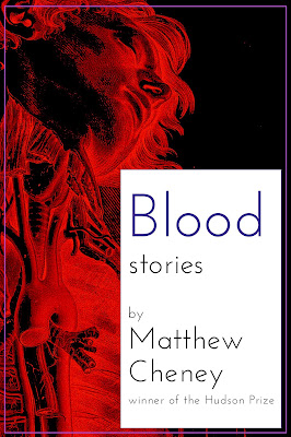
In the
Weird Fiction Review conversation I had with Eric Schaller, Eric asked me to talk a bit about designing the cover of
Blood: Stories, and in my recent
WROTE Podcast conversation, I mentioned an alternate version of the cover that starred Ronald Reagan (this was, in fact, the cover that my publisher originally thought we should use, until she couldn't get the image we ended up using out of her mind).
I thought it might be fun to share some of the mock-ups I did that we didn't use — the covers that might have been...
Front(click on images to see them larger)
 |
| 1a |
 |
| 1b |
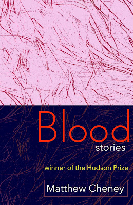
1a & 1b. These two are variations on an early design I did, the first one that seemed to work well, after numerous attempts which all turned out to be ghastly (in a bad way). 1b for a while was a top contender for the cover.
 |
| 2 |
2. I always liked the idea of this cover ... and always hated the actual look of it.
 |
| 3 |
3. I made this one fairly early in the process, using the
Robert Cornelius portrait that is supposedly the first photographic portrait of a person ever made. It ended up being my 3rd choice for the final cover. I love the colors and the eeriness of it.
 |
| 4 |
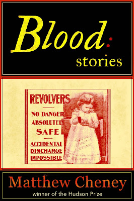
4. This never had a chance of being the actual cover, but I love it for the advertisement alone. As far as I can tell, that was a real ad for revolvers.
 |
| 5 |
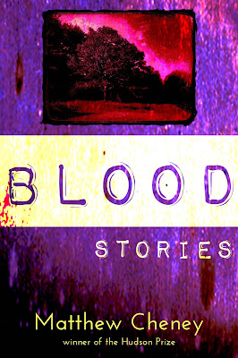
5. The inset picture is one I took in my own front yard. I like this cover quite a bit, but there's too much of a noir feel to it for the book, which isn't very noir.
 |
| 6 |
6. Here it is, the Cover That Almost Was. The image is a publicity photo from one of Ronald Reagan's movies.
 |
| 7a |
 |
| 7b |
 |
| 7c |
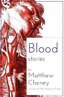
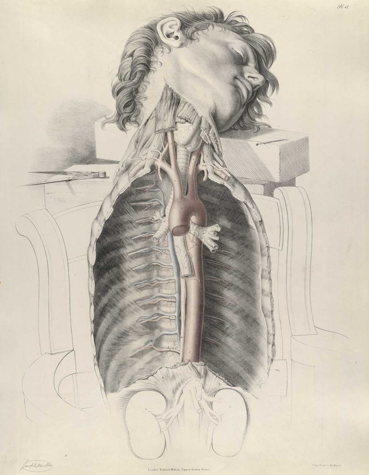
7a, 7b, 7c. Once I found
the Joseph Maclise image, I immediately thought I'd found the perfect illustration for the book. It took a long time and innumerable tries to figure out the final version, but it was worth the effort.
 |
| Actual cover |
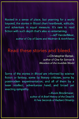
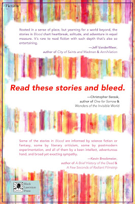
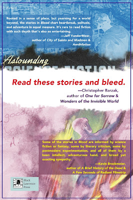
Back
Though the book designer Amy Freels ultimately did the back cover herself, I gave it a stab. As you'll see, we went back and forth on whether to use all of the blurbs or just Chris Barzak's and put the other blurbs on an inside page.
 |
| 1 |
 |
| 2 |
 |
| 3 |
 |
| 4 |
 |
| 5 |
 |
| 6 |
 |
| 7 |
1-7. These are a bunch of early attempts. None quite works (some
really don't work), and they would have all felt sharply separate from the front cover. We had lots of conversations about #4, though, as the publisher was quite attracted to the simplicity and boldness of it for a while.
 |
| 8 |
 |
| 9 |
 |
| 10 |
 |
| 11 |
 |
| 12 |
 |
| 13 |
 |
| 14 |
8-14. I love these, but they're all too complex for the back cover. As images, though, they still appeal to me deeply. I also like that they use
the Alejandro Canedo (or Cañedo) painting from Astounding (September 1947) that plays such an important role in the story "Where's the Rest of Me", though I also know we probably would have had to figure out how to get the rights to use it, and that could be a huge headache and a wild goose chase.
 |
| Full, final cover |
Hi. I want to ask you to please take a look at samples of my book design work--while you may not be in the market, at some time you may know someone who is, and it might be fun for you to see all the variety that's there.
You'll see designs for fiction, memoir, and non-fiction. Click on a cover to see the full front/spine/back cover in a larger size. I hope you'll drop in for a minute or two. A screen chapter of the samples page is below. To visit, go here or click the image below. Thanks for your time and consideration.
Ray

Ebooks have become ubiquitous to readers, and many of us utilize one or both of the dominant formats, .mobi (Kindle) and .epub (Nook, iBook, Kobo, etc.). As a part of my book design business, I create ebooks in both formats. To do so I happily stand on the shoulders of developers who designed abilities in the InDesign software I use to export those formats. Oh, there are things I need to do to the narrative to make it play nicely on ebook readers, but I think I’ve got that down.
But what, really, is an ebook? There are answers in What IS an ebook? David Kudler, an ebook designer who understands what’s under the hood. I thought it might be useful to you.
For what it's worth.
Ray
© 2015 Ray Rhamey
 What is the future for U.S. bookbinders in an era of digital books and overseas manufacturing?
The trade has not gone away, but it isn’t what it was when the Guild of Book Workers was first established in 1906. According to a story in The Los Angeles Times, bookbinders have had to be nimble to survive. Check it out:
“It will … never be as much as it used to be,” said Mariana Blau, who runs A-1 Bookbinding, which has been operating in downtown Los Angeles for 55 years. She employs two full-time workers, down from a peak of nine.
Blau’s company has kept going partly through high-end projects for Hollywood actors and directors who want to commemorate films they have been part of, as well as jobs for other specialty clients.
It’s no wonder the industry is not attracting much young talent. Nowadays the majority of professionals that bind books are 55 or older.
New Career Opportunities Daily: The best jobs in media.
 The New York Times has chosen their favorite book covers giving some much deserved praise to book designers.
Among the books that earned the honor are: Colorless Tsukuru Tazaki and his Years of Pilgrimage by Haruki Murakami, which was designed by Chip Kidd; A Girl is a Half-Formed Thing by Eimear McBride with a design by W. H. Chong; and Your Face in Mine by Jess Row with a design by Oliver Munday.
Here is more from The Times:
What is the value of a book cover if fewer and fewer people shop at bookstores? I used to browse St. Mark’s Bookshop looking for covers that caught my eye. It was an exciting way to discover new authors, and design played a huge role. Now, one increasingly encounters books through social media or online recommendations, and the role of the designer might, at first glance, seem diminished.
New Career Opportunities Daily: The best jobs in media.
 Simon & Schuster has revealed the cover image for Brian Grazer’s new book A Curious Mind: The Secret to a Bigger Life. Artist Jeff Koons created the design for the Academy Award–winning producer’s book.
“When we began discussing a design for the jacket of my book, Jeff Koons was the first person I thought of,” said Grazer in a statement. “His pieces have always spoken to me – they are suffused with positivity. My curiosity conversation with him was one of the earliest and most memorable I’ve had, and I remember being especially struck by how generous and genuinely interested he was, in everything. Curiosity is a very natural thing for him – it is the foundation of his work, and his energy as a human being.”
The book, which was written in collaboration with business journalist Charles Fishman, features Grazer’s weekly “curiosity conversations” which have inspired his filmmaking.
New Career Opportunities Daily: The best jobs in media.

Denis Johnson’s manuscript binder inspired the cover design
In the
Huffington Post series “Rejected Covers,”
Rodrigo Corral–the designer behind a slew of recognizable covers for books by Gary Shteyngart, Chuck Palahniuk and Junot Díaz—shares the creation process behind the cover for
Denis Johnson’s new book,
The Laughing Monsters.
Johnson, a National Book Award winner and Pulitzer Prize finalist, had created a manuscript cover that served as inspiration. Corral described it:
“His sketch is what I like to think of as three-quarters Basquiat, one-quarter ninth grade geometry class. I love the two joyful skulls–violent and rapturous somehow with their grins and sharpened teeth. Denis also suggested that we take a look at the paintings of Ronald Sloan, an outsider artist who creates macabre, almost Goya-esque paintings. These images were menacing in a lot of ways, but there was almost a childlike regard to that danger, a joy in the face of it.”
The designers experimented with Basquiat’s work and more traditional African imagery for contrast, in the end going with Johnson’s skulls because they captured the duality of humor tinged by death. Gold was used to reference the “get rich quick” aspects of the plot.
Corral told HuffPo, “The final cover is one that I hope conveys just how unsettling this book is and that nothing that transpires is ever black and white. Denis said it best to his editor here: ‘I’m not trying to be Graham Greene. I think I actually am Graham Greene.’”

The final cover design for “The Laughing Monsters”
New Career Opportunities Daily: The best jobs in media.
Researchers at the University of Colorado Boulder have designed a series of children’s books for the visually impaired.
U-Boulder’s Tactile Picture Books Project uses 3D printing technology to turn classic children’s books including Margaret Wise Brown’s Goodnight Moon and Harold and Crockett Johnson’s Harold and the Purple Crayon into books with three dimensional tactile experiences.
Colorado.edu has more: “The main idea is to represent 2D graphics in a 3D, tactile way on a scale appropriate for the cognitive abilities and interests of young children, said Yeh. The team combines this information with computational algorithms — essentially step-by-step instructions for mathematical calculations — providing an interface that allows parents, teachers and supporters to print their own customized picture books using 3D computers.” (Via Electric Literature).
New Career Opportunities Daily: The best jobs in media.
New York-based artist Brian Dettmer uses old books to create beautiful sculptures. Dettmer uses knives, tweezers and surgical tools to carve up the pages of a book. He does not add or move around content from the book, he only removes items to create new meanings with the page.
Here is more about the book from his artist’s statement: “The richness and depth of the book is universally respected yet often undiscovered as the monopoly of the form and relevance of the information fades over time. The book’s intended function has decreased and the form remains linear in a non-linear world. By altering physical forms of information and shifting preconceived functions, new and unexpected roles emerge.”
Dettmer is not alone is using books as a medium for art. Julia Strand and Mike Stillkey also work with old books in their creations.
New Career Opportunities Daily: The best jobs in media.

By: Kirsty,
on 8/10/2014
Blog:
OUPblog
(
Login to Add to MyJacketFlap)
JacketFlap tags:
design,
illustration,
Literature,
art,
book jackets,
book design,
OWC,
archery,
Oxford World's Classics,
daniel deronda,
Humanities,
george eliot,
*Featured,
Art & Architecture,
Arts & Leisure,
k m newton,
the fair toxophilites,
w. p. frith,
grandcourt,
gwendolen,
toxophilites,
deronda,
frith,
Add a tag

By K. M. Newton
The painting The Fair Toxophilites: English Archers by W. P. Frith, dating from 1872, is one of a series representing contemporary life in England. Frith wrote that his”
“desire to discover materials for my work in modern life never leaves me … and, though I have occasionally been betrayed by my love into themes somewhat trifling and commonplace, the conviction that possessed me that I was speaking – or rather painting – the truth, the whole truth, and nothing but the truth, rendered the production of real-life pictures an unmixed delight. In obedience to this impulse I began work on a small work suggested by some lady-archers, whose feats had amused me at the seaside … The subject was trifling, and totally devoid of character interest; but the girls are true to nature, and the dresses will be a record of the female habiliments of the time.”
After Gwendolen Harleth’s encounter with Daniel Deronda in Leubronn in Chapters 1 and 2, there’s a flashback to Gwendolen’s life in the year leading up to that meeting, with Chapters 9 to 11 focusing on the Archery Meeting, where she first meets Henleigh Grandcourt, and its consequences. In the England of the past archery was the basis of military and political power, most famously enabling the English to defeat the French at Agincourt. In the later nineteenth century it is now a leisure pursuit for upper-class women. This may be seen as symptomatic of the decline or even decadence of the upper class since it is now associated with an activity which Frith suggests is “trifling and commonplace.” A related symptom of that decline is the devotion of aristocratic and upper-class men, such as Grandcourt and Sir Hugo Mallinger, to a life centred on hunting and shooting.
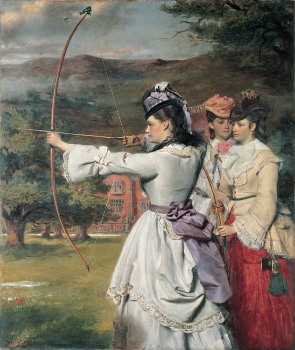
The Frith painting shows a young female archer wearing a fashionable and no doubt extremely expensive dress and matching hat. This fits well with the novel for Gwendolen takes great care in her choice of a dress that will enhance her striking figure and make her stand out at the Archery Meeting, since “every one present must gaze at her” (p. 89), especially Grandcourt. The reader may similarly be inclined to gaze at the figure in the painting. One might say that together with her bow and arrow Gwendolen dresses to kill, an appropriate expression for arrows can kill though in her case she wishes only to kill Grandcourt metaphorically: “My arrow will pierce him before he has time for thought” (p. 78). Readers of the novel will discover that light-hearted thoughts about killing Grandcourt will take a more serious turn later.
With the coming of Grandcourt into the Wancester neighbourhood through renting Diplow Hall, the thoughts of young women and especially their mothers turn to thoughts of marriage – there is obvious literary allusion to the plot of Pride and Prejudice in which Mr Bingley’s renting of Netherfield Park creates a similar effect. The Archery Meeting is the counterpart to the ball in Pride and Prejudice since it is an opportunity for women to display themselves to the male gaze in order to attract eligible husbands and no man is more eligible than Grandcourt. Whereas Mr Darcy eventually turns out to be the perfect gentleman, in Eliot’s darker vision Grandcourt has degenerated into a sadist, “a remnant of a human being” (p. 340), as Deronda calls him. Though Gwendolen is contemptuous of the Archery Meeting as marriage-market, she cannot help being drawn into it as she believes at this point that ultimately a woman of her class, background, and upbringing has no viable alternative to marriage.
While Grandcourt’s moving into Diplow Hall together with his likely attendance of the Archery Meeting become the central talking points of the neighbourhood among Gwendolen and her circle, the narrator casually mentions another matter that is being ignored – “the results of the American war” (p. 74). Victory for the North in the Civil War established the United States as a single nation, one which would ultimately become a great power. There is a similar passing reference later to the Prussian victory over the Austrians at “the world-changing battle of Sadowa” (p. 523), a major step towards the emergence of a unified German nation. While the English upper class are living trivial lives the world is changing around them and Britain’s time as the dominant world power may be ending.
Though the eponymous Deronda does not feature in this part of the novel, he is in implicit contrast to Gwendolen and the upper-class characters as he is preoccupied with these larger issues and uninvolved in trivial activities like archery or hunting and finally commits himself to the ideal of creating a political identity for the Jews. When he tells Gwendolen near the end of the novel of his plans, she is at first uncomprehending but is forced to confront the existence and significance of great events that she previously had ignored through being preoccupied with such “trifling” matters as making an impression at the Archery Meeting: “… she felt herself reduced to a mere speck. There comes a terrible moment to many souls when the great movements of the world, the larger destinies of mankind … enter like an earthquake into their own lives — when the slow urgency of growing generations turns into the tread of an invading army or the dire clash of civil war” (p. 677). She will no longer be oblivious of something like “the American war.” By the end of the novel the reader looking at the painting on the front cover may realize that though this woman who resembles Gwendolen remains trapped in triviality and superficiality, the character created in the mind of the reader by the words of the novel has moved on from that image and undergone a fundamental alteration in consciousness.
K. M. Newton is Professor Emeritus at the University of Dundee. He is the editor, with Graham Handley, of the new Oxford World’s Classics edition of Daniel Deronda by George Eliot.
For over 100 years Oxford World’s Classics has made available the broadest spectrum of literature from around the globe. Each affordable volume reflects Oxford’s commitment to scholarship, providing the most accurate text plus a wealth of other valuable features, including expert introductions by leading authorities, voluminous notes to clarify the text, up-to-date bibliographies for further study, and much more. You can follow Oxford World’s Classics on Twitter, Facebook, or here on the OUPblog. Subscribe to only Oxford World’s Classics articles on the OUPblog via email or RSS.
Subscribe to the OUPblog via email or RSS.
Subscribe to only literature articles on the OUPblog via email or RSS.
Image credit: The Fair Toxophilites by W. P. Frith. Public domain via Wikimedia Commons
The post The Fair Toxophilities and Daniel Deronda appeared first on OUPblog.

Penguin UK has redesigned the cover of Roald Dahl’s Charlie & the Chocolate Factory to celebrate the 50th anniversary of the book.
Here is more about the redesign from the publisher’s blog: “This new image for Charlie and the Chocolate Factory looks at the children at the centre of the story, and highlights the way Roald Dahl’s writing manages to embrace both the light and the dark aspects of life, ready for Charlie’s debut amongst the adult titles in the Penguin Modern Classics series.”
Some people responded negatively to the new cover on Twitter. (more…)
New Career Opportunities Daily: The best jobs in media.
By: Maggie Belnap,
on 6/22/2014
Blog:
OUPblog
(
Login to Add to MyJacketFlap)
JacketFlap tags:
Oxford University Press,
whistle,
*Featured,
mcnamara,
James Cook,
Life at Oxford,
Maggie Belnap,
Brady McNamara,
Coming Up Short,
Dog Whistle Politics,
Ian Haney Lopez,
jacket covers,
Jennifer Silva,
white—ears,
design,
Books,
Sociology,
Politics,
book design,
Add a tag
By Maggie Belnap
Despite the old saying, a book’s cover is perhaps the strongest factor in why we pick up a book off the shelf or pause during our online web shopping. Of course, we all like to think that we are above such a judgmental mentality, but the truth is that a cover design can make — or break — a book’s fortunes.
Brady McNamara, Senior Designer at Oxford University Press, admitted that designing book covers isn’t as easy as one might think.
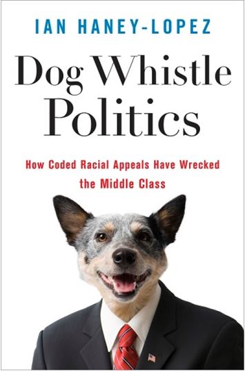
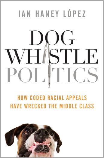
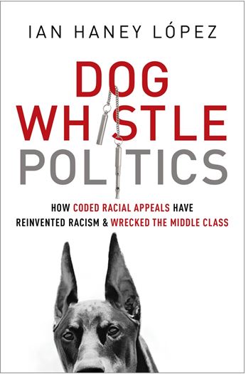
“To create a book jacket,” McNamara explained, “You have to first understand book’s concept. I have about 75 books at a time to design jackets for. That’s just too much. To help, I have about 10-12 really great freelance designers who really know what OUP is all about.” He continued, “I also always try one or two new freelancers each go around. Sometimes they work, and sometimes they don’t. That’s kind of what happened to Dog Whistle Politics.”
Ian Haney Lopez’s book, examining how politicians use veiled racial appeals to persuade white voters to support policies that favor the rich and threaten the middle class, is a difficult concept to capture. “It was a particularly tough cover to design: the subject just doesn’t lend itself to one concrete image,” McNamara agreed. He and his freelancer toiled over numerous cover drafts.
Dog Whistle Politics Design 1:
McNamara: “This is the initial sketches shown by our freelancer, I really liked [the] 1950’s clip art man. It had a kitchiness and style typical to ‘the conservative establishment.’ However, the cover review panel (editor and marketing manager) thought the starburst frame seemed out of place, like vintage advertising.”

Dog Whistle Politics Design 2:
McNamara: “In another sketch, the designer used a black background and surrounded our clip art guy with symbols of the economy and arrows illustrating its downfall. It was arbitrary and yet too obvious; just didn’t feel right.”

Dog Whistle Politics Design 3:
McNamara: “[The] editor suggested that an actual image of a dog could work. The sketch was submitted but not shown. I made a personal call that it was too gimmicky and distractingly odd. It was weird, and a not funny weird.”
Dog Whistle Politics Design 4:
“I finally took the design on myself,” says McNamara, laughing slightly as he remembers the process. “I had a pretty good idea of what we needed by now. It really wasn’t the freelancer’s fault, again, it’s just one of those books that is tough to design for. I tried an image of a bull dog and after the author mentioned a dog whistle, I incorporated that into the title. Nothing more literal I guess. The bulldog turned out to be too cute.”
Dog Whistle Politics Design 5:
McNamara: “I tried a more menacing Doberman in black and white—ears pricked up as if hearing the whistle. I also brought a serious tone back to the design by using just red, gray, and black type. This was finally approved. Not the most esoteric design, but it stands out on the shelf – if only for those pointy ears.”
While McNamara struggled with the concept for Dog Whistle Politics, design is a collaborative process.
James Cook, an Oxford University Press editor, discussed the pressing dilemmas of the design process: “I know the book best and worked with it the longest, so I understand the themes and perhaps have some ideas about how they can be illustrated.” He serves as a translator to the designer from the book itself and the author. “I talk with the author and try to relay his or her wishes to the designer, while also making sure the book and title are being represented. A cover needs to align, interpret, and reflect the books themes accurately, while also being attractive to a buyer.”
One of his titles, Coming Up Short, a book that sheds light on what it really means to be a working class young adult with all its economic insecurity and deepening inequality, also went through a number of cover jackets before finding the right fit.
Coming Up Short Design 1:
“One of the first designs was a girl in a skirt, sitting on a swing in the park,” remembers Cook. “It certainly portrayed what we wanted, but also had a sexual predator vibe as well.”
“I didn’t have a good feeling about the first cover I saw,” the author Jennifer Silva confessed. “I thought it had a kind of Lolita vibe when mixed with the title of the book. I expressed my concern, and it turned out that others at Oxford agreed.”
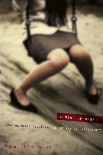
“Jen was great to work with,” Cook acknowledged. “Sometimes it becomes difficult going back and forth trying to satisfy everyone’s wishes while also finding a good portrayal of the book. Sometimes authors just don’t want certain colors or schemes in the cover, and it’s my job to make sure they are heard.”
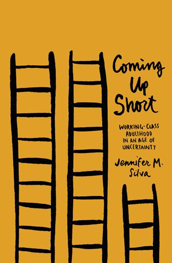
Coming Up Short Design 2:
After several other drafts, everyone agreed on a jacket: saturated yellow with multiple ladders.
“I love it,” raved Silva. “It feels young, modern, and hip. It’s not too literal, and also looks great on a bookshelf.” When asked about if the experience of jacket designing was frustrating or stressful, Jen waves the issue away saying, “No, it was fun to go back and forth!”
Not all books are as design-intensive as Dog Whistle Politics and Coming Up Short. Cook says, “Some academic books are easy because you can follow a certain style that is well known and easily recognized as being a textbook.”
However, there are always a few books along the way that keep designers and editors nimble.
Maggie Belnap is a Social Media Intern at Oxford University Press. She attends Amherst College.
Subscribe to the OUPblog via email or RSS.
The post Books by design appeared first on OUPblog.

Experts at Harvard have confirmed that Houghton Library’s copy of Arsène Houssaye’s Des destinées de lame is bound in human skin. They are 99 percent sure that their tests are correct.
Here is more about the tests from the Harvard blog: "Microscopic samples were taken from various locations on the binding, and were analyzed by peptide mass fingerprinting, which identifies proteins to create a “peptide mass fingerprint” (PMF) allowing analysts to identify the source."
The university also concluded that two other books which were suspected to be made of human skin were actually bound in sheepskin.
New Career Opportunities Daily: The best jobs in media.
Nonprofit Water is Life has a new book available that not only educates readers on safe water drinking tips, but also acts as a tool to purify water and kill deadly waterborne diseases.
"The Drinkable Book" is designed to educate people who are unaware of the risks of contaminated water and at the same time serve as a functional object that can help readers do something about it. The book uses technology invented by chemists at Carnegie Mellon University.
We've embedded a video with more details above.
New Career Opportunities Daily: The best jobs in media.
Whew, it’s good to be back on schedule after the days and days of being down while Typepad suffered a denial of service attack. Why are there such creeps on the Internet?
 We writers spend most of our time working with and on our words, but there comes a time when the work of an artist enters the picture. We Indie authors (the PC term for self-published) can’t usually afford to commission the work of a top artist—but that can’t stop us from appreciating amazing art.
To that end, take a moment to look at examples of Ian Miller's Awe-Inspiring Fantasy/Horror Book Art. I can’t begin to imagine the time and talent it takes to execute images such as these. Enjoy.
Ray
© 2014 Ray Rhamey

 Harvard University recently discovered three books in its collection that are bound in human hide.
The details make it sound more like the elements of a novel than of real life. One book was found in the Langdell Law Library, another in the Countway Library of Medicine, and yet another in the Houghton Collection. One book deals with medieval law, another Roman poetry and the other French philosophy. The book Practicarum quaestionum circa leges regias… doesn’t jump out as bound in human flesh, as The Harvard Crimson reports. Check it out:
The book’s 794th and final page includes an inscription in purple cursive: ‘the bynding of this booke is all that remains of my dear friende Jonas Wright, who was flayed alive by the Wavuma on the Fourth Day of August, 1632. King Mbesa did give me the book, it being one of poore Jonas chiefe possessions, together with ample of his skin to bynd it. Requiescat in pace.’
New Career Opportunities Daily: The best jobs in media.

By: Laura A. H. Elliott,
on 8/9/2013
Blog:
Laurasmagicday
(
Login to Add to MyJacketFlap)
JacketFlap tags:
cover reveal,
Quentin Tarantino,
Design,
Uncategorized,
Giveaways,
romance,
Book design,
goodreads,
cover design,
Book cover,
Add a tag
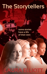
Synopsis:
Four storytellers
One ancient demon
No way out…
Four women who call themselves The Storytellers have gathered one hot August evening to tell tales, as they have for years. But on this night, they unknowingly evoke the powers of an ancient Mayan idol that breathes real life into their stories. The Mayan idol isn’t the only ancient being awakened. A power-hungry demon is determined to see the women fail and become enslaved to him forever.
Now the women’s lives depend on surviving each other’s stories, defeating the demon and solving a centuries-old mystery.
If they survive until The End untold wealth is theirs. But some stories have a life of their own…
ADD ON GOODREADS:
https://www.goodreads.com/book/show/18289410-the-storytellers
OMG! The road to this cover has been hilarious! There was the too-chicklity version the hands-down-the-pants version, the oh-kiss-her-already version and then…..the version that won….the Quentin Tarantino version! Cover design is an adventure for every writer. It’s near and dear to my heart because I loved working in graphics for decades and there’s lots to do here at what I lovingly call the fiction factory. I make the coffee and the popcorn, (you all know that  ) …I’m the janitor….tech support….I’m the buddy in the cubicle next to me who drives me nuts and chews my clock….AND…..I’m the book trailer gal, word maven, wine drinker, coach, and book designer. LOL! Next to writing, book cover design has got to be one of my favorite jobs as an indie––in a terrifying but fun sort of way. I love designing book trailers too but the covers are where I usually get to see my characters for the first time and that’s always magical. I hope you enjoy them. But enough about the book cover journey……
Click here for the giveaway!
Up for grabs? 5 e-arcs of THE STORYTELLERS
Get in on the special contest!
For every 100 adds Laura gets on goodreads for THE STORYTELLERS before the release (September 10th), she will reveal 5 pages of the book early!
If the book hits 600 adds before the release, Laura will release a bonus scene! She will also choose random people who use the tag #THESTORYTELLERS on twitter and facebook, or adds the book to their TBR list, to receive swag!
Goodreads link:
http://www.goodreads.com/book/show/18289410-the-storytellers


On Sunday, August 3, I'll be
 doing a workshop at the Willamette Writers Conference on Book Cover Design for Less than $50.
The workshop will cover these things:
- Tools: the free GIMP image manipulation program
- Resources: the best stock image resources and free typography resources
-
Considerations: the goals of your design, things to watch out for
-
Techniques: using single images, manipulating color and images for effect, combining multiple images, and more. I'll show the original art used, the type selected, and the process of putting them together for a number of books, including fiction, memoir, and non-fiction.
So I'm building a Powerpoint presentation on the above right now and I got to thinking--maybe people who visit FtQ would be interested in a book covering those topics.
The book would be an ebook, a PDF at the minimum, maybe a Kindle version. It would cover all the topics listed for the workshop, and be illustrated with many many color examples. I think a good price would be $2.99 or $3.99.
So please give me some insight with the poll below--you can enter multiple answers.
Many thanks, and I hope to see you at the workshop.
What's your interest in designing a book cover?
 In addition to editing and writing, I do book design, too, both covers and interiors. I've worked for a small publishing company for a couple of years, and the occasional independent author comes along. Here are the latest of the latter.
 Hookernomics is a title suggested by an FTQ reader (whose name I've lost) is non-fiction, ebook-only cover. It's about the business of sex, and I thought the art of a red light worked pretty well for catching attention and lending subtext.
 Collected Works is a private book, not available for sale, and at the far end of the spectrum from the first book. It is a book of poetry published in memory of my client's mother. I learned that she had, long ago, kept poems in what she called her "lavendar box," and that was the thought that led to this cover. It's a hard-cover book, and the cover is a "dust cover" with flaps on the inside.
 It was a very short book--there weren't a lot of poems--and many of the poems were about one page long. So the interior design for Collected Works uses spreads, graphics, and white space to display her art.
 Lastly, a lively, funny "food memoir" by a Jewish author. What else but Kosher Sutra would do? The art I found foreshadows the book nicely--lively, fun, and food (there are some delicious-sounding recipes in it).
Samples of other full cover designs are here.
For what it's worth,
Ray
© 2012 Ray Rhamey
 Self-published novelist R.L.
Mathewson initially published Playing for Keeps on Smashwords with a plain
blue and white cover, but saw a significant sales spike in the iBookstore once
she added a steamy Shutterstock photo to her cover
Self-published novelist R.L.
Mathewson initially published Playing for Keeps on Smashwords with a plain
blue and white cover, but saw a significant sales spike in the iBookstore once
she added a steamy Shutterstock photo to her cover

Smashwords founder Mark Coker had this to say:
“The new covers caught the readers eye and it helped clear
up any confusion they may have had about the books. The new cover along with
the price helped the books sell. I would say that you should avoid covers
that cause confusion, are horrible to look at, too plain, or too over the top.
You don’t need to spend a lot of money to get a good cover, but you do need
something that can help draw attention to your book and intrigue someone to
take a chance on your work.”
For what it's worth.
Ray

© 2013 Ray Rhamey

By: Kathy Temean,
on 5/12/2013
Blog:
Writing and Illustrating
(
Login to Add to MyJacketFlap)
JacketFlap tags:
book design,
opportunity,
Publishers and Agencies,
need to know,
BA Middlebury College in Literature,
dcdesign,
Dede Cummings,
Little Brown & Company,
Agent,
Add a tag

I personally do not know Dede Cummings, but I thought you would want to informed when a new agency opens. Here is a little bit about Dede, her background, and what she brings to the table.
Dede Cummings started her literary career as a book designer at Little Brown & Company. Prior to working at Little Brown, she worked at David R. Godine in Boston as a designer and production editor. Design is something she loves to do, and she still designs covers and interiors of books; most notably, she is a six-time winner of the New England Book Award for a number of authors’ works, including Slow Learner by Thomas Pynchon, Voices From The Moon by Andre Dubus, a reissue of Borstal Boy by Brendan Behan, four books of poetry by Mary Oliver, and others.
She is also a publicist and literary agent for emerging writers. She’s been coined as one of the most accessible and yet well-connected agents starting out in the business. Because she is an author herself, she understands both sides of the publishing process. Dede is a 2010 graduate of the Harvard Medical School’s Department of Continuing Education course “Publishing Books, Memoirs and Other Creative Non-Fiction,” under the direction of Julie Silver, M.D. Her first book, Living With Crohn’s & Colitis: A Comprehensive Naturopathic Guide for Complete Digestive Wellness, was published in 2010 by Hatherleigh Press and distributed by Random House. She has another cookbook (Cooking Well:IBS) under the same imprint, and her third book—Questions for the Dalai Lama—is due out in 2014.
Dede holds a BA from Middlebury College in Literature where she was also a poetry contributor at the Bread Loaf Writers Conference and was the recipient of the Mary Dunning Thwing Award. In 1991, she received an award to study with Hayden Carruth at the Bennington Writers’ Workshop. Dede has had her poetry published in Mademoiselle magazine and she was a Discovery/The Nation poetry semi-finalist, and she was most recently published by ConnotationPress for her poetry.
Dede has attended the National Publicity Summit in NYC where she made media contacts at this premier event. She is excited to work with writers — from Children’s picture books, YA fiction and non-fiction, to adult trade books, and she will help you think about all aspects of publishing from pitch to publicity, and even self-publishing. In its first year, the Dede Cummings Literary Agency has sold a number of books to the trade, most notably, “Wonder Woman Isn’t Bulletproof,” by Shannon Galpin, to Daniela Rapp at St. Martin’s Press.
Dede is interested in literary fiction, both adult and YA, Children’s illustrated books, self-help memoir, health and wellness. Submissions can be emailed to her at [email protected] and usually take 6-10 weeks for review. Self- or co-publishing writers may also contact Dede at this email.
Dede Cummings, literary agent, author, publishing + design
Filed under:
Agent,
need to know,
opportunity,
Publishers and Agencies Tagged:
BA Middlebury College in Literature,
book design,
dcdesign,
Dede Cummings,
Little Brown & Company 

")
Combining a matchbook and a classic novel, designer Elizabeth Perez created a thought-provoking edition of Ray Bradbury‘s Fahrenheit 451 for the Austin Creative Department.
Her design made the front page of Reddit, earning more than 400,000 views in a couple days. What do you think? Here’s more from the designer:
Fahrenheit 451 is a novel about a dystopian future where books are outlawed and firemen burn any house that contains them. The story is about supressing ideas, and about how television destroys interest in reading literature. I wanted to spread the book-burning message to the book itself. The book’s spine is screen-printed with a matchbook striking paper suface, so the book itself can be burned.
(Link via)
New Career Opportunities Daily: The best jobs in media.

Matthew Owen has won the Fahrenheit 451 cover design contest from Simon & Schuster and the American Library Association’s Office for Intellectual Freedom.
The winning cover (embedded above) was revealed at the ALA Midwinter Meeting.
Owen, who hails from Little Rock, AR, created a cover that beat out more than 360 submissions. Both the Simon & Schuster staff and the Bradbury estate participated in judging the entries.
continued…
New Career Opportunities Daily: The best jobs in media.
View Next 25 Posts


.jpg?picon=160)


Congrats!
Thanks! Very excited about my first adult title. Good luck in the giveaway
Oooooh a new book?!!!! Brilliant… can’t wait! I love that you call this cover the Tarantinto version… it SO is, Laura!! xx
xx
Thanks Suzy. Glad you like the cover