Sort Blog Posts

Sort Posts by:

  • in
    from   

Suggest a Blog

Enter a Blog's Feed URL below and click Submit:

Most Commented Posts

In the past 7 days

Recent Comments

Recently Viewed

JacketFlap Sponsors

Spread the word about books.
Put this Widget on your blog!
  • Powered by JacketFlap.com

Are you a book Publisher?
Learn about Widgets now!

Advertise on JacketFlap

MyJacketFlap Blogs

  • Login or Register for free to create your own customized page of blog posts from your favorite blogs. You can also add blogs by clicking the "Add to MyJacketFlap" links next to the blog name in each post.

Blog Posts by Tag

In the past 7 days

Blog Posts by Date

Click days in this calendar to see posts by day or month
new posts in all blogs
Viewing: Blog Posts Tagged with: Book Design, Most Recent at Top [Help]
Results 51 - 71 of 71
51. Help design the next Tezuka Black Jack book

Black Jack 7,8

I try to shy away from posting about contests, but this one is pretty fun, and requires minimal work. Knopf and Vertical Press book designer Peter Mendelsund (previously) wants some help choosing the colour scheme for the next volume of Osamu Tezuka’s Black Jack.

Visit Black Jacket Mechanical for the full details. Entries due September 9th, and the winner will get a full set of the Black Jack series.

0 Comments on Help design the next Tezuka Black Jack book as of 1/1/1900
Add a Comment
52. A new cover for LIAR!

Bloomsbury has just announced that they will be designing a new cover/jacket for Justine Larbalestier's LIAR, which I discussed last week. From Publisher's Weekly:

“In response to this concern, and in support of the author’s vision for the novel, Bloomsbury has decided to re-jacket the hardcover edition with a new look in time for its publication in October. It is our hope that the important discussions about race and its representation in teen literature continue. As the publisher of Liar, we also hope that nothing further distracts from the quality of the author’s nuanced and accomplished story, and that a new cover will allow this novel’s many advocates to celebrate its U.S. publication without reservation.”

I think this is the right decision, so good for them, and good for everyone pushing for them to do the right thing. I'll be so curious to see what the new cover looks like.

1 Comments on A new cover for LIAR!, last added: 8/6/2009
Display Comments Add a Comment
53. Beyond the Book: Fade to Blue by Sean Beaudoin

Cross-posted from the Blue Rose Girls.

Beyond the Book: Fade to Blue by Sean Beaudoin*

Looking back, I was disappointed to discover that I had never written a post dedicated to Sean Beaudoin's debut novel, Going Nowhere Faster, which came out in April 2007. Going Nowhere Faster was a novel about an unmotivated genius, Stan, who has just graduated from high school and is working a dead-end job at a video store. I called it Good Will Hunting meets Clerks. It was hilarious, with a sharp voice and memorable characters, and from the moment I read the proposal, I knew that Sean was a special writer, someone with a bright future.

His second book, Fade to Blue, does not disappoint. In fact, in my mind it changed Sean from "just" a contemporary, humorous, smart writer, to a writer where there are no limits. A writer who can do anything, a writer who will keep surprising.

Fade to Blue
is what I call Donnie Darko meets the Matrix. Or maybe it's Charlie Kaufman meets I Am the Cheese. Or perhaps it's Feed meets Be More Chill. However you describe it, this book is crazy. It's crazy good.

Speaking of crazy, the book starts out from the point of view of Sophie, a goth girl who thinks she just might be going crazy. Her father disappeared mysteriously almost a year earlier, on her 17th birthday. And now her 18th birthday is approaching, and she's having these crazy dreams. And did I mention that there's a weird Popsicle Truck stalking her?

Kenny Fade is the opposite of Sophie. He's the big man on campus, basketball star who has everything. But it's not all perfect with him, either, because, like Sophie, he thinks he may be going crazy.

The book alternates chapters between Sophie and Kenny, with some chapters from Sophie's brother O.S. and some other mysterious figures thrown in. It's a mind trip, and above all, it'll take you on a ride. It's innovative, funny, smart, and a little bit scary and sad, too. And it will make you think.

In terms of how this book came to be, this was not one of those books that came to me almost done. This one needed work. Because there were so many twists and turns, and because the mystery element was crucial to the overall success of this book, I needed help--I needed that invaluable "fresh read" several times throughout the revision process. In addition to my assistant, I had to recruit the help of three other editors along the way to give me that fresh read. This was truly a group effort, and a fun one at that. The revision process was as crazy a ride as the book is.

The book's title was also a challenge. The proposal came in called Sour White, which never felt right to me or the acquisitions committee. In the book, Sour White is the name of a soda that plays a key role in the plot. But most of the people we polled, and for some reason mostly women, had a negative reaction to the name. So, the author came up with a long list of other possibilities, including: Scatterblue, Standing Without Permission, Black Kite Blue, Splickity Lit, Sky Blue, Code Blue, Neon Blue Panic, and more. (BTW, Sophie's last name is "Blue")

What do you think? Do any of these appeal more than Fade to Blue? Maybe one will work as the title to a future book.

In terms of the design of this book, a lot came from the idea of having a comic book artist illustrate the cover, as a comic book plays an important part in the plot. But Sean took it a step further and asked if it would be possible to include an actual comic in the book. Now, when he asked this, I think my first thought was "Cool," and I think my second thought was, "How the heck do we do that?" Luckily, the amazing designer, Kirk Benshoff, who at the time had started to work mainly with our graphic novel imprint, Yen Press, was up for the task of figuring this out with me. We started by coming up with a list of possible artists. I believe it was Sean's agent who suggested Wilfred Santiago, who ended up being the artist we chose. And from there, it was working out the budget for the interior comic, having Sean write the text and description, and then Wilfred worked his magic.

Here are some shots of the 12-page interior comic. Does this mean that I can now say that I've edited a comic book?


And finally, check out this fantastic blogger review. Perhaps we'll put a blurb from it on the paperback edition: "This book is nine different level[s] of F*CKING AWESOME!"

I concur.

Sean is hard at work on his third YA novel, tentatively titled You Killed Wesley Payne which is due to pub next Fall. It's a slick, noir-ish mystery set in a high school where the cliques are battling for power. So: What do you think of that title?


*pronounced something like "bo-DWAH"

1 Comments on Beyond the Book: Fade to Blue by Sean Beaudoin, last added: 8/12/2009
Display Comments Add a Comment
54. Handmade Book Design class–Prescott Valley, AZ

accordianem1Handmade Book Design Class—Yavapai Community College, Prescott Valley, AZ campus

Tell your stories and let your self-expression find a new outlet in the form of making books! Students will be introduced to different types of easy book bindings and handmade book structures—including stab stitch, pamphlet 3-hole, instant and mutant books—in this fun, two credit class given Thursdays 6-8 pm by instructor & artist Ronni Hall. After making the books they will learn solid design principles for pleasing forms. Next they will learn how to fill them with their own story, art and finds along the way. The class will be designing to different theme challenges, exploring creating all kinds of books including publishing their own ‘zine, art journal and altered books.

Register online for Art 298 at http://www.yc.edu. Questions? Call the Prescott Valley office at 717-7911 or email the instructor at [email protected].

0 Comments on Handmade Book Design class–Prescott Valley, AZ as of 1/1/1900
Add a Comment
55. Beyond the Book: Fade to Blue by Sean Beaudoin

Beyond the Book: Fade to Blue by Sean Beaudoin*

Looking back, I was disappointed to discover that I had never written a post dedicated to Sean Beaudoin's debut novel, Going Nowhere Faster, which came out in April 2007. Going Nowhere Faster was a novel about an unmotivated genius, Stan, who has just graduated from high school and is working a dead-end job at a video store. I called it Good Will Hunting meets Clerks. It was hilarious, with a sharp voice and memorable characters, and from the moment I read the proposal, I knew that Sean was a special writer, someone with a bright future.

His second book, Fade to Blue, does not disappoint. In fact, in my mind it changed Sean from "just" a contemporary, humorous, smart writer, to a writer where there are no limits. A writer who can do anything, a writer who will keep surprising.

Fade to Blue
is what I call Donnie Darko meets the Matrix. Or maybe it's Charlie Kaufman meets I Am the Cheese. Or perhaps it's Feed meets Be More Chill. However you describe it, this book is crazy. It's crazy good.

Speaking of crazy, the book starts out from the point of view of Sophie, a goth girl who thinks she just might be going crazy. Her father disappeared mysteriously almost a year earlier, on her 17th birthday. And now her 18th birthday is approaching, and she's having these crazy dreams. And did I mention that there's a weird Popsicle Truck stalking her?

Kenny Fade is the opposite of Sophie. He's the big man on campus, basketball star who has everything. But it's not all perfect with him, either, because, like Sophie, he thinks he may be going crazy.

The book alternates chapters between Sophie and Kenny, with some chapters from Sophie's brother O.S. and some other mysterious figures thrown in. It's a mind trip, and above all, it'll take you on a ride. It's innovative, funny, smart, and a little bit scary and sad, too. And it will make you think.

In terms of how this book came to be, this was not one of those books that came to me almost done. This one needed work. Because there were so many twists and turns, and because the mystery element was crucial to the overall success of this book, I needed help--I needed that invaluable "fresh read" several times throughout the revision process. In addition to my assistant, I had to recruit the help of three other editors along the way to give me that fresh read. This was truly a group effort, and a fun one at that. The revision process was as crazy a ride as the book is.

The book's title was also a challenge. The proposal came in called Sour White, which never felt right to me or the acquisitions committee. In the book, Sour White is the name of a soda that plays a key role in the plot. But most of the people we polled, and for some reason mostly women, had a negative reaction to the name. So, the author came up with a long list of other possibilities, including: Scatterblue, Standing Without Permission, Black Kite Blue, Splickity Lit, Sky Blue, Code Blue, Neon Blue Panic, and more. (BTW, Sophie's last name is "Blue")

What do you think? Do any of these appeal more than Fade to Blue? Maybe one will work as the title to a future book.

In terms of the design of this book, a lot came from the idea of having a comic book artist illustrate the cover, as a comic book plays an important part in the plot. But Sean took it a step further and asked if it would be possible to include an actual comic in the book. Now, when he asked this, I think my first thought was "Cool," and I think my second thought was, "How the heck do we do that?" Luckily, the amazing designer, Kirk Benshoff, who at the time had started to work mainly with our graphic novel imprint, Yen Press, was up for the task of figuring this out with me. We started by coming up with a list of possible artists. I believe it was Sean's agent who suggested Wilfred Santiago, who ended up being the artist we chose. And from there, it was working out the budget for the interior comic, having Sean write the text and description, and then Wilfred worked his magic.

Here are some shots of the 12-page interior comic. Does this mean that I can now say that I've edited a comic book?


And finally, check out this fantastic blogger review. Perhaps we'll put a blurb from it on the paperback edition: "This book is nine different level[s] of F*CKING AWESOME!"

I concur.

Sean is hard at work on his third YA novel, tentatively titled You Killed Wesley Payne which is due to pub next Fall. It's a slick, noir-ish mystery set in a high school where the cliques are battling for power. So: What do you think of that title?


*pronounced something like "bo-DWAH"

2 Comments on Beyond the Book: Fade to Blue by Sean Beaudoin, last added: 8/6/2009
Display Comments Add a Comment
56. Joe Lambert: make minicomics that stand out

3630373077_dce02c0ef2

Joe Lambert has posted some tips on a clever binding technique he used to put together one of the books in his Sundays 3 minicomic, an anthology edited and designed by himself, Alex Kim, Chuck Forsman, & Sean Ford.

Joe also posted this little video on Flickr showing how the books are packaged together:

Previously: Joe Lambert’s sketchbooks

2 Comments on Joe Lambert: make minicomics that stand out, last added: 6/21/2009
Display Comments Add a Comment
57. Cover Versions: album art reinterpreted as 1960s paperbacks

3469289612_31fcc0af8e

These days it seems everyone and their grandmother is embracing modernist design by way of creating their own remixed versions of 1960s paperback covers. And that’s okay by me. The latest: Cover Versions by littlepixel are “classic records lost in time and format, re-emerged as Pelican books.” (via Kitsune Noir)

You may also enjoy:
Retro “I Can Read Movies” book covers
The Pelican Project
Penguin’s Great Ideas

0 Comments on Cover Versions: album art reinterpreted as 1960s paperbacks as of 6/2/2009 8:51:00 PM
Add a Comment
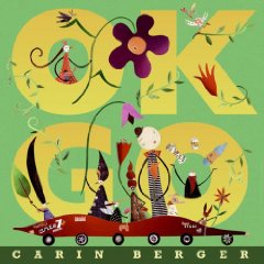
58. Go Get Carin Berger’s “OK Go” Today! OK? (And kids, enter her contest!)


okgoCarin Berger never deliberately set out to become an author/illustrator, but she found her true calling in picture books. She was awarded the Society of Illustrators Founder’s Award in 2006, the NY Times named The Little Yellow Leaf one of the top ten picture books of 2008, and Publishers Weekly called her “one to watch.”

And now’s a great time to watch.

Her latest title OK Go, a playful book about making greener choices, releases in bookstores today.

I had the opportunity to talk with Carin about her journey to publication (somewhat serendipitous) and her plans for the future (deliberately delightful). I shall follow PW’s lead and not only watch her, but predict the Caldecott will soon be calling.

Carin, how did you start on the path to becoming a children’s book illustrator?

I’ve always loved reading, writing, old paper stuff, children’s books, type and making things. I studied graphic design and spent almost 20 years working in the field. I worked my way down the (pay) food chain towards what I really loved: from very high-end annual reports and brochures to eventually designing book jackets for all the major publishers. I did jackets for poetry, fiction and non-fiction. I still do this and love it. I get to read manuscripts and can often use my own illustration or photography.

Anyhow, I had a daughter, and it turned out she was a sleepless wonder. (When she was little. Now she sleeps like a baby!) I spent much of most evenings hanging with her, waiting for her to fall asleep. I wrote the poems for Not So True Stories and Unreasonable Rhymes in those long hours, mostly to amuse myself.
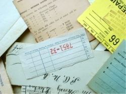
carinbergerpaperHow did you first get involved in collage?

As for collage, that was kind of serendipity. I thought I would do paintings and was experimenting with different painting styles, some which included collage, and then my friend gave me a magic box full of old letters and documents and ephemera that she picked up at a flea market, knowing I had a thing for that kind of stuff. And that was the beginning.

Once I had pulled together some sample illustrations and manuscript, a friend-of-a-friend agreed to rep it; and she, amazingly, ushered it into the world.

And was Not So True Stories and Unreasonable Rhymes your first manuscript?

Yes, it was my first manuscript, though I’d written a bit, for myself, before.
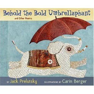
umbrellaphantWow. That’s a rare accomplishment and speaks volumes about your talent. Where did you go from that first success?

Not So True Stories was a quirky little book that got good reviews but sold…well, like a quirky little book. Chronicle Books graciously published my second book, All Mixed Up, another quirky and very little book. (It can fit in your pocket.)

I was then called by Greenwillow Books and asked to illustrate Jack Prelutsky’s book. A real honor. And, because it was the amazing Master Jack’s book, it received lots of nice attention. He was named the first ever Children’s Poet Laureate right when the book came out which meant that there was a shiny golden sticker that went on the front of the book, too. I’ve been working with Greenwillow Books for the last couple of projects.

How has your illustration style evolved from one book to the next?

As for the collage style, it has sort of evolved in a few directions.
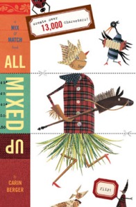
allmixedupAll Mixed Up, a mix and match book where the heads, middles and legs (as well as the alliterative poems) combine in various ways to make new characters, was born out of the idea of collaging the collaged illustration. I had originally conceived it as a game, but Chronicle preferred to do it as a book. The illustrations are similar, yet somewhat simpler than Not so True Stories, so that the mixing worked.

For Behold the Bold Umbrellaphant, I wanted to do a slightly different style than the books that I had authored, and also, because the poems are about a conglomeration of animals and objects (such as Ballpoint Penguins), I thought it would be fun to play that up and make it really obvious.

I collect old dictionaries and army/navy catalogues that have engraved images, and so I used those images and integrated them into the collage. To do this I actually scanned engravings from the book, played with them in Photoshop, printed out pieces and used them to cut and paste with.
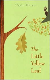
littleyellowleafThe Little Yellow Leaf felt like a really simple, nostalgic story and I ended up introducing a bit of paint (stenciling) to the collage to add another layer and also, at times, to age the paper.

Ok Go has a zillion funny little characters carousing throughout the book and feels much more like the art in the end papers of Not so True Stories and also in All Mixed Up. It was fun to change things up a bit and to do such playful art.

My next book, due out late next winter, is called Forever Friends and the art is much more similar to the art in The Little Yellow Leaf. I see it as a companion book to The Little Yellow Leaf because the bunny on the front cover and the bird on the back cover of Leaf are the characters in Forever Friends.

Your newest picture book OK Go is a playful book for the wee set, all about making greener choices. How did the concept for this book come together?

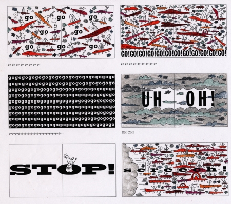
As best I can recall, it all sort of came as a whole piece. I liked the idea of introducing taking care of the environment to really young kids. I remember growing up in the 70s when “Give a Hoot, Don’t Pollute” was around and feeling very empowered to help make the world a better place. Here are some early sketches:
okgoinside

One of the biggest things I needed to figure out was how to emphasize the message in a powerful yet playful way. The gatefold came about because I wanted it to feel like a huge gathering or movement.

How do you choose which paper to cut for certain images? Does the paper speak to you?
carinbergerpaper2I have files of papers sorted by color—yellows/oranges, reds/pinks, blues/purples—and I also have files for some of my passions: polka dots, plaids, wood grain, buttons…
carinbergerpaper3I actually cut a vellum stencil of the shape I need and hold it over the paper to find a good section. Something with good gradations for example, that help the piece, say a car, look more dimensional. Clothing catalogs are great for plaids and buttons. And then I use a variety of old stuff, both really old ephemera like letters and receipts with great calligraphy on them and also bits and pieces that I find around: ticket stubs, laundry tags, etc.

Do the words on the paper hold any significance?

I do think about the paper I use, where it comes from and what it says. Not in a huge way, but in a quiet, just-to-amuse-myself sort of way. And in almost every book I make sure to include, somewhere, my daughter’s name, Thea. In The Little Yellow Leaf it appears on the page with the giant sun, and in OK Go I use her name and the names and initials of lots of friends to decorate the cars.

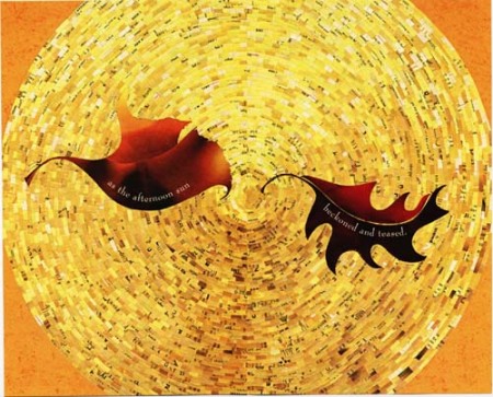
Speaking of the glorious sun in The Little Yellow Leaf, do you have any idea how many pieces of paper you used? Or how long it took to create that page?
leafsun

I always knew what I wanted to do with that illustration, but it took a little longer (well, w-a-y longer) than I thought it would. I spent probably close to a week on it. Actually, part of the reason it took so long is that I started from the outside and was working my way towards the center and I got pretty far before I realized that, because the sun is asymmetrical, it wasn’t going to work. I had to add another layer working from the center out. Ugh!

I have absolutely no idea how many pieces there are, and I can’t imagine anyone who would be nuts enough to count (though I’d be curious to know that)!

Circling back to your newest book, what kind of impact do you hope OK Go will have on green thinking among parents and young children?

There are some very simple things that kids can do to be more green and they are listed in the back of the book.

I think if you plant the idea early, children will live more careful, aware lives, and remind their parents to do so as well. Plus, what is more motivating than our kids to get us to take care of this planet and the environment?

But mostly I want kids to have fun with the book, and to be introduced these ideas in a playful, engaging way.

One last thought: all of my art is made with found and recycled materials, so maybe this will prove inspiring and enabling, too.

Indeed it is, Carin! So let’s use that inspiration for a contest!

Kids age 10 and under, create a collage with a green theme–reduce, reuse, recycle or whatever you can dream up! Email your illustration to tarawrites at yahoo (you know the rest, dot com) and include child’s first name and age.

With the help of Random.org, we’ll randomly select three winners.

The grand prize winner gets an autographed copy of  OK Go. The second and third winners will receive an All Mixed Up promotional mini-book. And all three illustrations will be featured on Carin Berger’s website and/or blog.

In your email, be sure to grant your permission for sharing the illustration and the child’s first name/age online.

One illustration per child. Enter now through midnight E.S.T., Tuesday, May 12.

Carin, thank you for giving us a glimpse into your beautiful world! I bet everyone is going to GO! GO! GO! get your book today!

okgo1

Take a peek inside OK Go or
Find OK Go at your local bookstore!

OK Go by Carin Berger
April 2009
Greenwillow Books

8 Comments on Go Get Carin Berger’s “OK Go” Today! OK? (And kids, enter her contest!), last added: 5/18/2009
Display Comments Add a Comment
59. Weekend eye candy

umbrellaWhere’s your soul taking you?
What’s inspiring me now– Check it out.

Highlighted in Doodlers Anonymous–the lettering of Sara Haking:  http://www.sarahaking.com/

Over at Kris’s color stripes, check out the letters book. http://color-stripes.blogspot.com/

I’m reading this book now: Animation from Pencils to Pixels: Classical Techniques for the Digital Animator by Tony White (Paperback - Aug 4, 2006)

I LOVE Book By Its Cover website. Check out the sketchbook of Jim Stoten over here: http://www.book-by-its-cover.com/sketchbooks/sketchbook-series-jim-stoten

And, finally, for my fellow Fairy lovers, over at Etsy, you will adore the fairy offerings at Spirited Woodland: http://www.etsy.com/shop.php?user_id=5600182


0 Comments on Weekend eye candy as of 1/1/1900
Add a Comment
60. A second look at picture book dummies

Reader Michael Johnson took issue with Bob Staake’s recent Picture Book Dummy. He writes:

I think that if the dummy remains as it is, it will mislead aspiring picture book creators into thinking they have, as Staake writes, “15 spreads… (and) a single page finale,” when they are more likely to have 14 spreads, a single page beginning and a single page finale. I’d hate to see a bunch of Drawn readers (or Bob Staake fans) show up at a publisher or agent only to be told that they’ll have to lay the whole thing out again.

I’ve attached a “corrected’ (if I’m right) version. It more closely resembles the children’s books I own - books from different decades, Caldecott winners, etc.

The revised dummy shows the flip-sides of the end papers as what they must of course be, i.e., end papers, too. The title page is the first of the 32 (non-end paper) pages, the publication information is on the flip-side, and the story begins on the facing page.

I assume there are books out there that resemble Bob Staake’s diagram, which shows printing on the backside of end papers, etc., but this revised version is closer to the books I’m familiar with.

Here’s Michael’s version (click to see the full size):

reviseddummy

And here’s Bob’s version again:

bookdummy2jpg

So who’s right? By my calculations, neither of them. Of course, they’re not wrong, but certainly neither guide should be treated as gospel.

For example, neither Where the Wild Things Are nor The Cat in the Hat, arguably two of the world’s most famous picture books, follow either of Bob or Michael’s guidelines.

A quick survey of the picture books on my shelves reveal books with 10, 12, 14, 15, 16, 17, 18, 21, 23, 27, and even 30 spreads. And of those, there are books with publication info at the front, publication info at the back, books with multiple title pages, books with no title page, books with blank pages, books that begin or end on a single page, books that begin or end on a double-page spread, and all manner of variations.

As it is with all things, there is clearly no one true method. These guides certainly help one understand the basic construction of a physical book, and how it affects page layout, but I’d think twice before letting any one set of rules dictate too strongly how to write your story.

To me it would seem that the best picture book dummies are picture books themselves.

10 Comments on A second look at picture book dummies, last added: 3/11/2009
Display Comments Add a Comment
61. Bob Staake: The Picture Book Dummy Made Easy

bookdummy2jpg

To serve as a reminder and guideline for how to think about writing a picture book, Bob Staake created this diagram, The Idiot-Proof Picture Book Dummy. Bob writes:

Of course there are execptions to the rule, but when we talk about a “picture book” we’re speaking of a “32-pager” (or depending on how liquored up your editor is) a “40-pager”. Think of it this way: you as the artist only have to worry about 15 spreads, a title page image, a single page finale and, of course, the cover.

2 Comments on Bob Staake: The Picture Book Dummy Made Easy, last added: 3/5/2009
Display Comments Add a Comment
62. Andy Smith designs with type

3245656356_cc5ea2d352

Visit Andy Smith’s Flickr stream for all manner of typographic goodies. Don’t miss his collection of book jacket designs.

(via Delicious Industries)

1 Comments on Andy Smith designs with type, last added: 2/20/2009
Display Comments Add a Comment
63. Some thoughts on Book Design

I'm a little sad that I haven't been able to post much on this blog aside from my weekly Blue Rose Girls posts, but I will soon, I promise!

In the meantime, here's my BRG post:


I was thinking recently about how hard it must be to be a book designer. I admire what they do so much, their thought and creativity that goes into the design of each book. I think I'm especially in awe of how covers of novels come to be--with pictures books, they already have an artist and images to work with and inspire them, but for novels they have to conjure up a design from thin air, sometimes. But what I think must be the hardest thing to deal with is knowing that ultimately their design is not "their own"--that they have to answer to so many different opinions. The editor has to be happy, the author has to be happy (even thought most authors don't officially have consultation or approval of the cover, of course we want them to be happy!), and in most cases, an entire jacket committee consisting of marketing, sales, design, and various editorial sorts have to be happy. And it doesn't stop there--we want the book buyers to also love the cover, and of course you're also trying to make the cover appealing to both the adult buyers (booksellers, librarians, teachers) and the kids, too.

And sure, as an editor, I sometimes think about all of these people while editing a text, too, but I also know that ultimately, the book truly belongs to the author, and although I may ask them to change something, they have every right to say no. When I bring a book to editorial meeting and then on to our acquisitions committee, sometimes (often) different people have different opinions. One person might hate a part of the book that was someone else's favorite part. Some people might dislike a plot twist that others think make the book special. It goes on and on. And so I've come to realize that when it comes time for me to edit the manuscript and work with the author on making the book better, I have to decide in my own heart and mind what I feel the book needs, regardless of whose feedback it goes against. Because I know that in the end, if the author can make it work (and of course they can!), the readers will accept it.

Designers don't have that freedom. They have to answer to all the people I've mentioned above. That's their job. And I know that in the past I've struggled sometimes with trying to balance the designer's vision with that of the author's--it's a shame when they aren't aligned. Personally, I trust our designers and their vision, and love working with them on cover designs. In some cases, I have an idea of what I want the cover to look like, but oftentimes I'll wait and see what the designer comes up with first so as not to taint their creativity. Sometimes I just have a feeling I want to convey. "The cover should be joyful, full of color and light" or "it should be thoughtful and quiet, have a very literary feel" or "I want to make sure that the cover has crossover adult appeal" and so on. And the designer takes this all in and works their magic. And although it might take a few takes, the designer never lets me down.

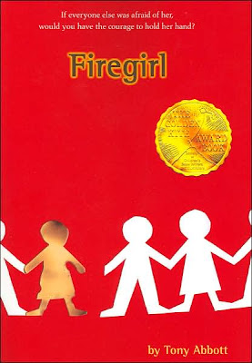
There have been times where I'm discussing a novel with the designer and telling them, honestly, that I have no idea what I envision for the cover. One example is for the novel Firegirl by Tony Abbott, which is about what happens when a new girl joins a 7th-grade class. The new girl is a victim of severe burns on her face and body, and because of her appearance, some of the class fear her. The only image that came to mind when thinking about the cover, which I knew would not be appropriate, was to show a photograph of a girl being burned. And so I put it completely in the designer's hands. She came back with an idea I found absolutely perfect. This is one of my favorite covers for a book I've edited. What do you think?
Another thing difficult about book design is that everyone has an opinion about covers. It's inevitable. We judge a book by its cover, after all! And in the case of picture books (as many of my fellow BRGs know) and some novels, you're working with an illustrator or author who is an artist, and sometimes also a designer themselves, and then the designer has to adjust how they work even more, and weigh everything with their own expertise, and their own knowledge about what works and what doesn't in regards to the market and our own jacket committee. It's not an easy task. I feel lucky to work with such talented designers. They rock! Here's a sampling of some recent and upcoming novel covers our designers have done that I especially love:


In somewhat related news, I'll be speaking at the Mid-Atlantic SCBWI conference in October and have been asked to talk about the process of how illustrators are chosen. I'll no doubt be polling our talented design team for some feedback and anecdotes, and I hope to be able to share more posts about book design in the future.

Here are a few blogs dealing with book design:

Mishaps and Adventures is the blog of an art director
Jacket Whys discusses children's and YA book covers
The Book Design Review discusses the cover design of adult books

What are some of your favorite book covers?

0 Comments on Some thoughts on Book Design as of 1/1/1900
Add a Comment
64. Some thoughts on Book Design

I was thinking recently about how hard it must be to be a book designer. I admire what they do so much, their thought and creativity that goes into the design of each book. I think I'm especially in awe of how covers of novels come to be--with pictures books, they already have an artist and images to work with and inspire them, but for novels they have to conjure up a design from thin air, sometimes. But what I think must be the hardest thing to deal with is knowing that ultimately their design is not "their own"--that they have to answer to so many different opinions. The editor has to be happy, the author has to be happy (even thought most authors don't officially have consultation or approval of the cover, of course we want them to be happy!), and in most cases, an entire jacket committee consisting of marketing, sales, design, and various editorial sorts have to be happy. And it doesn't stop there--we want the book buyers to also love the cover, and of course you're also trying to make the cover appealing to both the adult buyers (booksellers, librarians, teachers) and the kids, too.

And sure, as an editor, I sometimes think about all of these people while editing a text, too, but I also know that ultimately, the book truly belongs to the author, and although I may ask them to change something, they have every right to say no. When I bring a book to editorial meeting and then on to our acquisitions committee, sometimes (often) different people have different opinions. One person might hate a part of the book that was someone else's favorite part. Some people might dislike a plot twist that others think make the book special. It goes on and on. And so I've come to realize that when it comes time for me to edit the manuscript and work with the author on making the book better, I have to decide in my own heart and mind what I feel the book needs, regardless of whose feedback it goes against. Because I know that in the end, if the author can make it work (and of course they can!), the readers will accept it.

Designers don't have that freedom. They have to answer to all the people I've mentioned above. That's their job. And I know that in the past I've struggled sometimes with trying to balance the designer's vision with that of the author's--it's a shame when they aren't aligned. Personally, I trust our designers and their vision, and love working with them on cover designs. In some cases, I have an idea of what I want the cover to look like, but oftentimes I'll wait and see what the designer comes up with first so as not to taint their creativity. Sometimes I just have a feeling I want to convey. "The cover should be joyful, full of color and light" or "it should be thoughtful and quiet, have a very literary feel" or "I want to make sure that the cover has crossover adult appeal" and so on. And the designer takes this all in and works their magic. And although it might take a few takes, the designer never lets me down. 

There have been times where I'm discussing a novel with the designer and telling them, honestly, that I have no idea what I envision for the cover. One example is for the novel Firegirl by Tony Abbott, which is about what happens when a new girl joins a 7th-grade class. The new girl is a victim of severe burns on her face and body, and because of her appearance, some of the class fear her. The only image that came to mind when thinking about the cover, which I knew would not be appropriate, was to show a photograph of a girl being burned. And so I put it completely in the designer's hands. She came back with an idea I found absolutely perfect. This is one of my favorite covers for a book I've edited. What do you think?
Another thing difficult about book design is that everyone has an opinion about covers. It's inevitable. We judge a book by its cover, after all! And in the case of picture books (as many of my fellow BRGs know) and some novels, you're working with an illustrator or author who is an artist, and sometimes also a designer themselves, and then the designer has to adjust how they work even more, and weigh everything with their own expertise, and their own knowledge about what works and what doesn't in regards to the market and our own jacket committee. It's not an easy task. I feel lucky to work with such talented designers. They rock! Here's a sampling of some recent and upcoming novel covers our designers have done that I especially love:


In somewhat related news, I'll be speaking at the Mid-Atlantic SCBWI conference in October and have been asked to talk about the process of how illustrators are chosen. I'll no doubt be polling our talented design team for some feedback and anecdotes, and I hope to be able to share more posts about book design in the future.

Here are a few blogs dealing with book design:

Mishaps and Adventures is the blog of an art director
Jacket Whys discusses children's and YA book covers
The Book Design Review discusses the cover design of adult books

What are some of your favorite book covers?

4 Comments on Some thoughts on Book Design, last added: 9/5/2008
Display Comments Add a Comment
65. Guest Post: "Is There a Picture Book Designer in You?" by Jan Amenta

I recently finished painting watercolor pictures for one of my children's picture books with the intent of designing the book myself. It was the goal that made me willing to conquer the challenge of learning the page layout software Indesign Creative Suite 3 or CS 3 by Adobe.

I was comfortable using Adobe's Photo Shop having made examples of pages for a previous picture book project. In fact, I designed most of the pages, which led to the realization that I could design my books if I had the right tool.

Listening to other authors and self publishers, they seem to fall into two groups. Those that hired someone to do the designing and those who do it themselves.

Indesign CS 3 cost about $750 US and came with a video workshop and once I registered the product I took the free offer for a one month trial to http://www.lynda.com/ to access Adobe's library. I also bought Adobe Indesign CS 3 ClassRoom in a Book, with lesson files on CD that take you through the layout exercises. The internet was where I got most answers to my questions by researching on Google and elsewhere. Also, there are websites by Indesign professionals and internet groups that have a wealth of information. To get answers to hard to find questions I went to the http://www.adobe.com/. These are all key to understanding the Indesign CS 3 software.

Once I got the hang of it, and knew where things were, including what tools to use and how to use them, I could not believe how cool this software program was. For instance, to make a page in the book, I made a frame on a first layer, using File> Place, I added a picture, chose the text layer, made another frame and added the text. You can resize an object or picture right on the page, apply drop shadows, and ghost background images, and add gradients which is a gradual blending between colors. And there is another way to get pictures placed in a document and that is to open Adobe Bridge which is a separate tool that comes with Indesign. In Bridge you can look for files anywhere on your hard drive by opening Bridge right inside the Indesign workspace and view contents you need to bring into your document and then, just drag and drop the picture.

If you have basic knowledge of art software such as Photo Shop or Corel Painter, like to learn, and don't mind doing research you might be able to design your children's picture books yourself.

While you consider this as your option you should start by reading a few books on book design, especially picture book design. I found that looking at other children's books got my imagination going.

Before you start the design process you will need to decide where the book will be printed so you can get information from the printer on what their needs are.

You will need to know the template sizes for the interior and book cover. There are margins, bleeds and gutter sizes to know and what settings should be on or off just to name a few.

If this all sounds like it's too much then don't do it. Go another route to get your book designed and in print. There are plenty of good publishing services that have designing as part of their packages or you can hire a professional book designer.

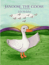
--Jan Amenta writes children's picture books under the pen name of J.D. Holiday. Her book, Janoose the Goose, is the first in her "Read-a-long with Your Child Storybook" series. Visit her website at: http://www.bookgardenpublishing.com/

1 Comments on Guest Post: "Is There a Picture Book Designer in You?" by Jan Amenta, last added: 8/12/2008
Display Comments Add a Comment
66. The Tyranny of the Spread

A few months ago I attended a seminar given by Edward Tufte on the visual presentation of data and information. Tufte is a Yale professor who has written (and designed) a number of books on presenting and analyzing information graphically. Here’s a link to his site:
http://www.edwardtufte.com
PowerPoint is one of Tufte’s pet peeves. He makes the case that people who rely on this presentation software begin to see the world in PowerPoint slide terms: a headline and a few bullet-points per concept. Not all information can be forced into this template without distortion or omission, a point he makes elegantly (if not succinctly) in his analysis of how PP presentations were, to some degree, contributing factors in the Columbia shuttle disaster. Here’s a link to that essay, for anyone interested in reading further: http://www.edwardtufte.com/bboard/q-and-a-fetch-msg?msg_id=0001yB&topic_id=1

His books are brilliant — I recommend them.

For writers, illustrators and designers of picture books, especially non-fiction books (without a plot-driven narrative to lead one from spread to spread) thinking in terms of individual spreads is both a gift and a trap. Like the PowerPoint slide, the spread allows us to present information in a very controlled context. We can choose words and images and define their relationship to the pages themselves to make create a compelling experience for the reader. Their can be a temptation, however, is to think of a book’s contents too much as a series of discrete chunks. Sometimes a single idea — one that might make the most sense presented all at once — won’t fit on two pages and has to be broken into a series of spreads. If the book's format dictates a head on each spread, this single concept may get awkwardly broken into pieces.

In making books I am always trying to find the balance between using the spread as a self-contained ‘unit’ of information and presenting a single, larger, cohesive story that works at the level of the entire book.


It’s interesting to look at some of the ways that what I —somewhat hysterically — called the ‘tyranny of the spread’ can be subverted.

In the book Move! (written with Robin Page, designed by Robin) a series of animals is shown, each moving in two different ways. The repetition of the animals, the anticipation of the second example (which requires a page turn) — even the use of ellipses in the text — all tend to blur the boundaries of a particular spread. The book was conceived as a kind of 32-page filmstrip.


In another collaboration with Robin (Sisters &Brothers) we use an even simpler technique, letting an image run off one spread and onto the next.


Robin Page's Count One to Ten is based on a traditional handmade Japanese folded paper book. It subverts the limitations of the spread by working as both a book and, when pulled open, as a series of panels that are visible simultaneously.


Lois Ehlert, in Color Zoo, and Laura Vaccaro Seeger, in First the Egg, ingeniously punch holes through the pages so that we see into the next spread. These books work in both directions — we can also look into the previous spread to see where we have been. In The Three Pigs, David Weisner makes the physical format of the book part of the story, so the reader becomes aware of the stucture of the book.

I’m sure there are many other examples and other ways of working within and around the limitations of the roughly 15 spreads in a typical picture book.


0 Comments on The Tyranny of the Spread as of 1/1/1990
Add a Comment
67. Quick Sketches/Ideas for Book Dummy


This book dummy stuff is wonderfully exciting, frustrating and mysterious all at the same time. Anyone know if any good links to other dummies, or dummy instructions? Please list here and I'll make a separate post for it--or even put a section for it on the side-scrolls of the blog if there are enough. Here is a link I found from Dav Pilkey's site. For one of his books he includes his entire book dummy, which I find incredibly inspiring. Also, Babette Cole is selling a DVD that explains her process for book making, which I purchased. I'll give a little review once I receive it.
Dav Pilkey's Behind the Pages
Babette Cole DVD

Suddenly my imac g5 is running like it has thick honey in it. It must have something to do with all the graphics I'm using and the generous 250 MB RAM included with the package (whoopie). I guess I'll be upgrading (cry) with more memory. I'm sure it will be well worth the purchase (she told herself). I'm tired of watching that little wrist watch count down every time I do anything to a graphic. At this rate I'll be well into my 90's before I get this sent off.

2 Comments on Quick Sketches/Ideas for Book Dummy, last added: 10/30/2007
Display Comments Add a Comment
68. Monday's Inspiration

I find inspiration in the oddest places. For a much needed break, I checked out a cute, little used bookstore nearby. Bookstores are sanctuary! Several books fell into my lap and inspired me. A book of poems by e.e. cummings. He wrote great words, such as, snowflake and rainbow mind. Don't you just want to illustrate those words? A book on botany came home with me--it will be great for my FFG research. And this very cool book--Beyond Time by Gwen Frostic. The date on the book is 1970 by Presscraft Books. The pages have colored rough edges with that handmade paper feel. But these woodcut illos are frickin' amazing! Did you ever see some art that inspires you into new directions? Here's a peek. I'm sure I haven't given the pages justice.
Oh, that tree spread, gives me chills. Yummy.

4 Comments on Monday's Inspiration, last added: 8/8/2007
Display Comments Add a Comment
69. New Blog

Chad W. Beckerman, the designer of the beautiful, creative, lovely-to-hold-in-your-hand, Last Apprentice books, has a blog Mishaps and Adventures.

After reading several blogs I have notice a need for blog about book design.
In particular Young Adult, Teen and Children's Book design. I will try and write about what I see as common trends good and bad as well as what makes a jacket successful. This is of course all just my opinion and if you feel like I might be leading you astray please by all means lets talk it out.

Let's see where this takes me.

I have become very interested in the design of the books I've been reading recently. I am going to checking here often.

0 Comments on New Blog as of 1/1/1970
Add a Comment
70. Learning How To Match Your Socks

Nights at the Circus (Oberon Modern Plays)I don't have a lick of artistic sense, visually. I can't match my socks in the morning, much less design a blog layout that is pleasing to the eye. 

Luckily, there are plenty of websites out there offering a free education into the art of book design. In this age of self-publishing, writers can use all the design help they can get. The aptly named Judging Books By Their Covers is a great place to start.

Then, the good folks over at the Book Design blog showed me a couple good sites about design while discussing one of my favorite writers at the same time--the dreamy, greatly-missed Angela Carter.

Finally, be sure to check out all the website design advice offered by our special guest, interactive storytelling guru, Josh Goldblum. Hopefully, after all that, we can match our socks.

Check it out:

"The final paragraph of her posting talks about her own experience as an author and the cover art for academic books. Interesting stuff, be sure to read it (and be sure to check out the link in the first comment to that post, which will take you to a fascinating site)."


Add a Comment
71. The Nitty Gritty Guts of a Book Dummy

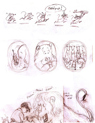
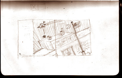
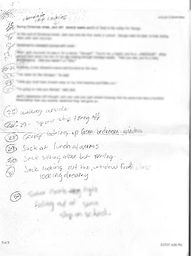
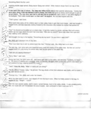
Since I am always pressed for time, opportunities to work on my own projects are few and far between. So, I've decided to make time. I'm hell bent on getting this book dummy done, even if it means adding a 25th and 26th hour in the day that didn't exist before. Everything posted below was done on a moleskin journal or scratch paper while waiting; lines, stop lights, drive throughs, etc. Instead of counting ceiling tiles, why not make use of the time we spend waiting for things in day to day life to complete projects that we can never seem to get to? The only way to get large projects like these done and on the desks of editors is to chip away - each chip counts!

As I've stated before, the polar bear story is being put on hold for a while since I found a book similar in plot and character (darn it darn it darn it!). So, my next story is "Something Weird At My Lunch", one which I ended up liking better anyway, so I guess it all works out in the end. Whether this book gets published or not, I'm really going to enjoy the process of putting the mock-up together and seeing the words and pictures come alive.


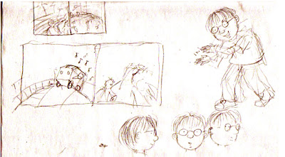
Thumbnail for a double page spread idea for pages 2-3 while waiting in Banana Republic. Moleskine journal.


Manuscript with notes on page divisions, illustration notes, and ideas for wordless spreads. These notes were written in while waiting for a friend at the mall.


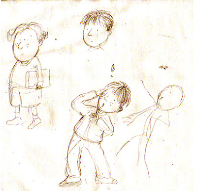
Character designs for main character -drawn at the gym.

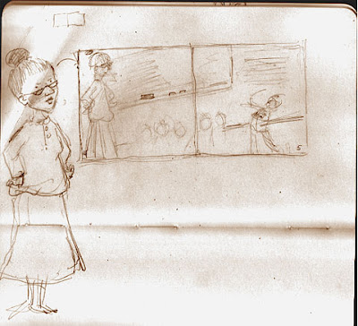
Double page spread thumbnail for pages 4-5. Possible character design for teacher. Moleskine journal.

6 Comments on The Nitty Gritty Guts of a Book Dummy, last added: 3/3/2007
Display Comments Add a Comment