May means graduation time, and New York City is filled with student exhibitions and senior work on display for the world to hire. So for the next few weeks, I’ll be snooping several art schools’ openings for new and inspiring illustrators, and bringing the best of the best right here to the blog.
I started with the School of Visual Arts’ MFA Thesis exhibition last night! I’d highly recommend trekking to Chelsea for both design and illustration. Details below:
All the student work was of exceptional quality (they ARE MFAs, after all), but here were my Top 5:
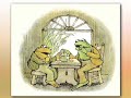
Today was a more wackadoo day in illustrator submissions than usual, so I thought I’d give myself a pick-me-up by highlighting three great illustrators who draw some super-cute animals. Enjoy!


1. Charrow / My first favorite recent find is Charrow, whose quirky illustrations exude a playful spirit and sense of humor. Her light watercolor and drawing technique feels breezy, like she just jotted down some animals, and they happen to be hilariously adorable. She’s also a frequent contributor to They Draw and Cook. Her Etsy shop is down at the moment, but when I checked it out a few weeks ago, it was easily my favorite part of her portfolio… be sure to check back for it soon!


2. Stephanie Graegin / Probably my all-time favorite illustrator submission ever is a little “mini portfolio” booklet from Stephanie Graegin. Her Renata Liwska-style woodland creatures, accented by limited color and unlimited sweetness, had both design and editorial drooling. Crossing my fingers that I see a book with her name on it soon!

3. Lizzy Hallman / If illustrator David Catrow’s art proves anything, it’s that there’s a place in this business for a little ugly-cute. And if my love of french bulldogs proves anything, it’s that I will always get behind ugly-cute! Hallman’s characters may have wonky eyeballs, but they make their expressions unique and humorous. And her color treatment? 100% sweet!
Filed under:
from the slush pile,
illustration sensations Tagged:
animals,
children's book,
drawing,

Time for a little spring cleaning, aka. link updating. If you haven’t noticed, down the column on the right are a bunch of fantastic blogs that I read regularly, and I try to occasionally go through and add/delete links so the list stays fresh with active bloggers. It’s a great place to turn to when I’m lazy busy here at Walking In Public!
I’m sure I’m missing blogs, though, so if you’re reading this and want me to add yours or a friend’s, add a comment below (note: I try to keep it to blogs only, not static websites).
Speaking of friends, can we discuss how amazing are Pratt student Sarah Mimo‘s hand-crafted clocks (above)? I’m astounded at her innovation and stunning detail . . . wow. Talk about a senior project that deserves buzz. Her new artist blog is full of more clocks, as well as some lovely textural illustrations, so make sure to head over there, pronto!
Filed under:
blog updates,
illustration sensations Tagged:
blog,
clocks,
current students,
links,
product design,
students at pratt 


While going through the slush mail today, I came across a pair of standout illustrators in a pile of recent UArts grads. Jim Tierney and Sara Wood, a young Brooklyn couple, have a fantastic approach to book cover design. Their masterful combination of type, hand-lettering and drawing makes both of their portfolios equally impressive.
Check out Sara’s D. H. Lawrence book cover series, and Jim’s interactive Jules Verne thesis (there’s a
video too!).


I put the cards up on the “Wall Of Stuff I Like” in my cube, right next to our other favorite hand-drawn type designer,
Kristine Lombardi. Lombardi’s cards have been up on our wall for ages. While her cards have more of a feminine, fashion style (although I do like her
Kids page!), they are the first thing that designers walking by are ALWAYS drawn to. Check out a great interview (including the below image of her promo card)
here.

These designers got me to thinking: where’s the place for hand-lettered type in children’s books? Before the age of thousands of freebie fonts on the internet (hey, it wasn’t that long ago!), hand-lettered display type was commissioned for book covers all the time. I recently worked on the anniversary edition for Jacqueline Woodson’s
The Other Side, and I was so impressed to discover that the handsome title was calligraphed by the original in-house designer.

And while I’m sure it took a lot more effort than downloading a font, there’s something careful, purposeful and yet whimsical to hand-drawn type. So it’s no surprise that it is experiencing a rebirth of magnificently hip proportions. Now, type everywhere looks like this:


It was Ed Emberley‘s birthday yesterday, so I think it’s time for a little celebration of my favorite step-by-step drawing master! Emberley is famous for his simple shape-drawing method, and I myself used to spend hours and hours copying every bit of his video, Squiggles Dots and Lines. His techniques are elementary, but now I have a whole new appreciation for his fascinatingly clear design sense. Plus, how much fun is it to make those little thumb-print people?

Thinking about ol’ Ed made me doodle some of my own characters in “Emberley” form:


And then doodle some more… (that’s my brain melting from the training session I was in, by the way. Oops!)

Happy Birthday, Ed Emberley! You’re my hero.
Filed under:
book reviews,
illustration sensations,
sketches Tagged:
birthday,
drawing,
ed emberley,
how to,
sketches,
step by step 


By:
Annie Beth Ericsson,
on 10/4/2010
Blog:
Walking In Public
(
Login to Add to MyJacketFlap)
JacketFlap tags:
picture books,
happenings,
exhibitions,
leo and diane dillon,
brooklyn,
bpl,
sophie blackall,
ted lewin,
pat cummings,
betsy lewin,
sergio ruzzier,
daniel salmieri,
peter brown,
illustration sensations,
drawn in brooklyn,
greenmarket,
paul o zelinsky,
megan cash,
libraries,
Add a tag

image: Sophie Blackall – Big Red Lollipop
As is now routine, I moseyed through the park and did my weekly grocery shopping at the Grand Army Plaza greenmarket on Saturday. This time, though, I wasn’t too loaded down with pickles and goat cheese, and actually had the energy to stop at the Central branch of the Brooklyn Public Library.
I’d been meaning to hit the BPL because, though I’ve always been a huge library supporter (it’s in my blood, thanks mom and dad), lately I’ve been in the bad habit of buying books instead. But with student loans looming this November (it’s been nearly 6 months already?!), it is time to tighten the finances and catch up on my reading – for free.
I was disappointed that I didn’t find anything super fresh and exciting in the YA section… but I guess it’s good that teens are checking them all out. Next time, I’ll have to bring a bigger list. I DID get the chance to see the Drawn In Brooklyn! exhibition of children’s illustration – and that, in itself, was worth the trip.
Drawn In Brooklyn! is a 4-month long festival of 34 local artists, celebrating the borough with the largest concentration of children’s book illustrators on the planet. In close proximity to Manhattan, illustrators can network with the publishing and art worlds first-hand… but then find both community inspiration and a bit of creative peace back here. No wonder Brooklyn is home to, well, almost everyone I admire.
 image: Peter Brown – Chowder
In the vast display of work in the Grand Lobby of the BPL, there were many, many familiar names, including personal heroes (Leo and Diane Dillon, Ted and Betsy Lewin, Paul O. Zelinsky), current favorites (Sophie Blackall, Peter Brown) and former professors (Pat Cummings, Megan Montague Cash). Also, a few illustrators I’d never heard of before: both Daniel Salmieri and Sergio Ruzzier‘s whimsical, quirky characters made me smile. Here they are below!
 image: Daniel Salmie
By:
Annie Beth Ericsson,
on 9/2/2010
Blog:
Walking In Public
(
Login to Add to MyJacketFlap)
JacketFlap tags:
book reviews,
animals,
obsessed,
design finds,
illustration sensations,
duly quoted,
kristiana parn,
lots of love,
nanette newman,
too cute,
Add a tag
 on Marshmallow tree3")
This past Saturday and Sunday was the kind of weekend that makes living in Brooklyn so picturesque – sun-dappled brownstones, bustling farmer’s markets, and a diverse mix of people enjoying the beach or the park – this is why I usually never want to leave my dreamy and romantic borough.
And the weekend was made even better because, everywhere I turned, I was discovering something new and free (or at least super-cheap)! A woodcut of Puffins that matches the other art in my room perfectly and an adorable round, white-glass bowl sitting abandoned on a stoop are just a few of the pieces I picked up on my travels.
And my favorite discoveries this weekend go to:
1.

The first is not technically a physical “find”, but I am completely enamored with illustrator Kristiana Parn, whose work I passed by at Grand Army Plaza on Saturday. Can someone please, please get this woman a children’s book, stat?! Because her animal paintings and prints are just fantastic.


2.

One of the best things about being poor in Brooklyn is that richer folk often leave perfectly good furniture and other items lying around on the street… especially in Park Slope/Windsor Terrace. But this little book of children’s sayings is easily the most hilarious street find I’ve ever encountered.
I’m not sure what the story is behind the 1974 book Lots Of Love, compiled by British actress Nanette Newman, but it is essentially a visual representation of “Kids Say The Darndest Things” – an uncensored take on anything from religion and romance to war and world peace. The quotes and accompanying illustrations, all done in the hands of real children, are surprising, insightful and would keep anyone rolling on the floor laughing.
Most of the sayings take a pretty critical look at families…
 0 Comments on Recent Finds as of 1/1/1900


 on Marshmallow tree3")


 0 Comments on Recent Finds as of 1/1/1900
Totally proud that you made the list of awesome mash-ups! You rock like always! Now I can’t wait to see my mouse book!