


 I’ve been working on this site for a little while now and decided it was time for a new logo. All I’ve really had until now is the Potato-Boy header with the How to Draw Stuff type. Although I kind of like that little guy he’s hardly a logo.
The other day as I was jotting down some reminder notes an idea popped into my head. Luckily I was sitting at my computer so I decided to work it up in Adobe Illustrator while everything was still fresh in my mind.
I took a few snap shots as I went to show you how I typically work through the development stage and added my some of my thoughts to the captions. Unfortunately a few of the shots are a little on the small side so the notes below don’t read as well as they could, but I think you’ll get the idea as you go through them… I’ll try to fix those later. Note to self- zoom in, enlarge art, and leave a little white space before taking snapshots.
I’m pretty happy with the look of this one so far but I’ll probably revisit it at a later date and make a few tweaks. Sometimes the ideas go quick (like this one) other times I need to let them rattle around inside my head a little bit before they come out. I’d think I’ll add something a little more cartoon-ish to that space above the type on the right so it looks more like it belongs to the Bob Ostrom Studio family, but that’ll have to wait until I’m finished with my next set of deadlines.
Click on the images below to enlarge…
Blog: inspiration from vintage kids books and timeless modern graphic design (Login to Add to MyJacketFlap)
JacketFlap tags: Typography, Designers, contemporary, posters, logos, Found design, USA, graphic-design, Add a tag
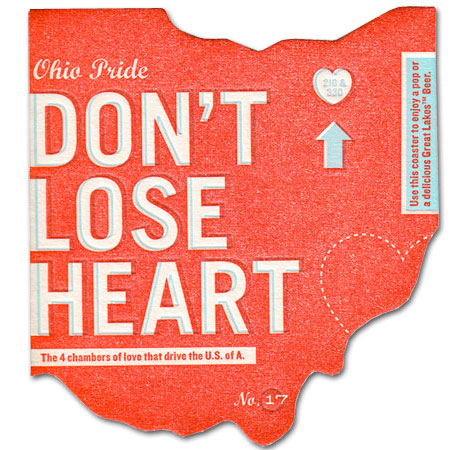
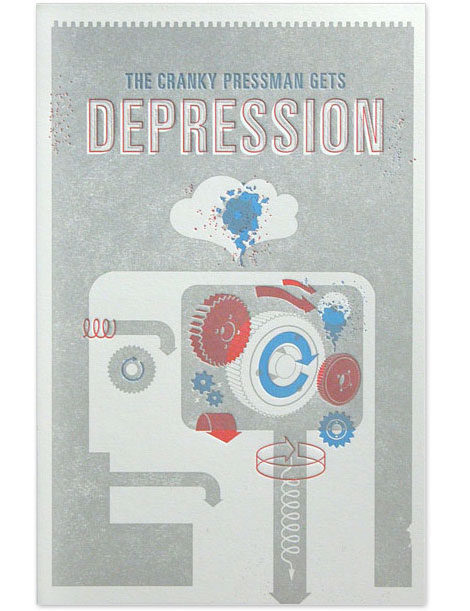
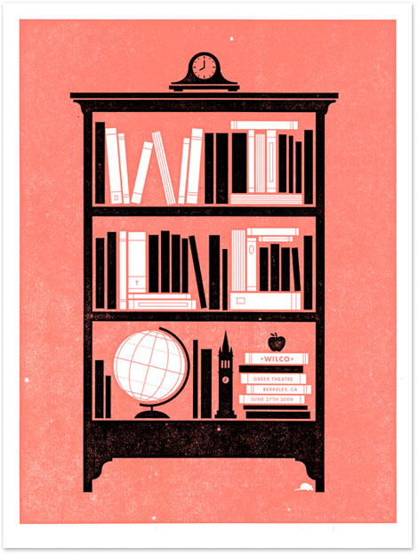
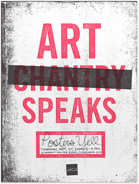
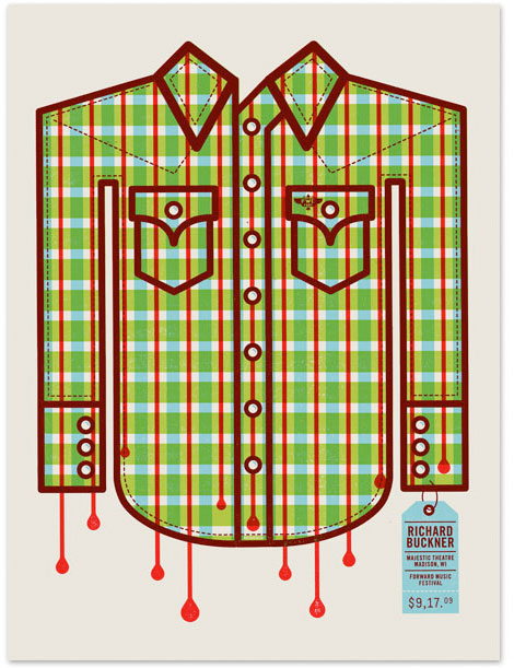
It’s great when you find that one designer that can wear various design hats. Such is the case with Philadelphia’s Mikey Burton. Looking through his portfolio, I’m impressed with the amount, style and conceptual range of his work. The edgy boldness of the letterpress prints is a nice balance to some of the quieter, more restrained logos.
I love that kind of can-do, all encompassing approach to design. Mikey does it well, and it would appear he’s having a blast doing it!

©2009 Grain Edit - catch us on Facebook and twitter
Blog: inspiration from vintage kids books and timeless modern graphic design (Login to Add to MyJacketFlap)
JacketFlap tags: 1960s, 1970s, logos, Found design, graphic-design, Scandinavian, Add a tag
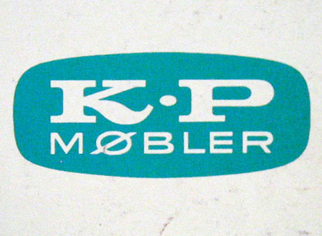
K.P. Jorgensen & Son Logo - Part of 1960s & 70s Scandinavian Logos Set
This made my day. Vancouver based designer Oliver Tomas uploaded an amazing collection of Scandinavian logos from the 1960s & 70s to his flickr account. Thanks Oliver!
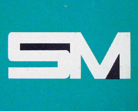
You can catch Oliver on twitter as well @olivertomas.
——————
Also worth checking: 60 Years of Finnish Book Design.
Not signed up for the Grain Edit RSS Feed yet? Give it a try. Its free and yummy.
——————
No Tags©2009 Grain Edit - catch us on Facebook and twitter
Blog: inspiration from vintage kids books and timeless modern graphic design (Login to Add to MyJacketFlap)
JacketFlap tags: illustration, stamps, 1950s, 1960s, 1970s, logos, Found design, ephemera, graphic-design, Bulgaria, Add a tag
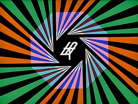
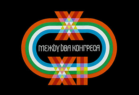
Television graphics
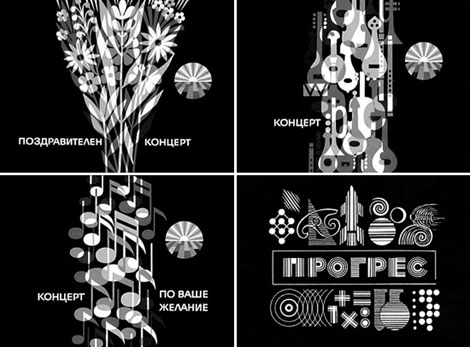
Absolutely stunning work from Stefan Kanchev (1915-2001) who was a Bulgarian graphic artist. During his prolific career he designed hundreds of logos, posters, stamps, book covers, labels as well as graphics for TV. Much of his work is inspired by Bulgarian folklore and traditions.
In 1994 Stefan Kanchev was recognized as one of the top ten designers of trade marks in the world along with Paul Rand, Saul Bass and etc. The title was awarded by the International trademark centre in Ostend, Belgium. His logo work will blow your wig back. I highly suggest you spend a few minutes browsing his archives.
Television graphics
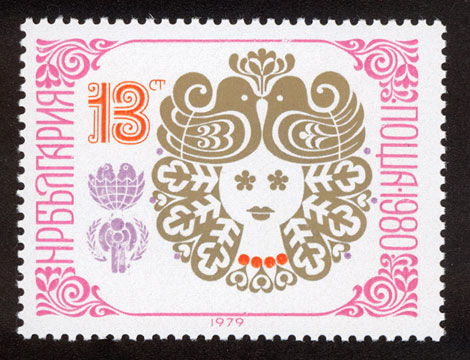
New Year 1980 stamp
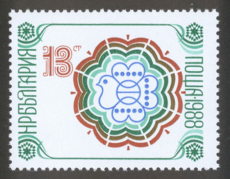
New year 1988 stamp
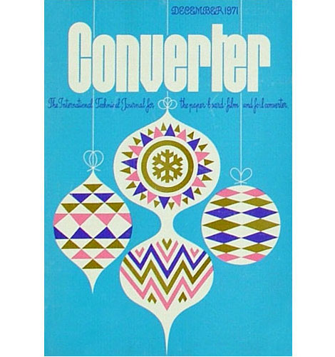
Converter Magazine Cover 1971
(via designboom and delicious industries)
——————
Also worth checking: Modern Stamps From Israel.
Not signed up for the Grain Edit RSS Feed yet? Give it a try. Its free and yummy.
——————
No Tags©2009 Grain Edit - catch us on Facebook and twitter
 By: John,
on 6/1/2009
By: John,
on 6/1/2009
Blog: DRAWN! (Login to Add to MyJacketFlap)
JacketFlap tags: Design, Books, Illustration, advertising, Cartooning, icons, logos, Add a tag
 I’m such a book junkie.
There’s a new one out for all you kitsch-mavens, advertising art gurus, and mid-20th-century style hounds. Warren Dotz and designer Masud Husain have just released Ad Boy: Vintage Advertising With Character, a compendium of cool brand identities culled from what must be a spectacular collection of ephemera. Although it is a followup to his previous book Meet Mr. Product: The Art of the Advertising Character, Warren says this one is quite different. Although I haven’t yet got my hands on a real live copy, there is a preview available on Amazon. The table of contents shows the book is arranged by subject matter: Mechanical Men, Scottish Plaid, Genies, etc.
I asked Warren if he had information on the creators of all these mascots, but he said it’s so hard to trace that he doubts if he has even 10% of the designers’ names. If any of you old retired illustrators and designers are the culprits and you read this blog - gee, a lot of us advertising and illustration historians would sure like to know who did what and when!
By: John,
on 4/17/2009
Blog: DRAWN! (Login to Add to MyJacketFlap)
JacketFlap tags: Juan Salas, Illustration, food, Art, logos, Add a tag


Artist Juan Salas has been creating characters from the logo on the packaging of Arturo’s, a fried chicken restaurant in Venezuela. He has currently created 100 variations, but plans on reaching 1000. While I cannot vouch for the healthiness of eating a thousand fried chicken dinners for one’s art, I can at least applaud his creativity: Transmutation: Los Primeros 100.
 By: Steve Novak,
on 1/29/2009
By: Steve Novak,
on 1/29/2009
Blog: Steve Draws Stuff (Login to Add to MyJacketFlap)
JacketFlap tags: logos, decent, high, ninja, nerd, gerbil, baboosh, duckie, flesh, five, school, guys, class, Add a tag

I'm a pretty decent guy. I've got my faults of course; I'm sort of boring, kind of shy, sometimes I don't shower into well after one in the afternoon, but overall I like to think that the pros heavily outweigh the cons when it comes to your friendly neighborhood Steven. I'm sort of funny sometimes, there are a few people out there worse looking than me, I'm patient, understanding, and if you can manage to get past the Alcatraz-like that I tend wall that I put up, I'm a pretty good friend as well.
That's right, go me! NERD HIGH FIVE!
It's because of one of these good things that I agreed to take five or six hours out of my day last Saturday and put together the six logos above for my wife. The kids in her class at school came up with table names (some of them pretty creative) and she asked me if I would make a logo for each table.
I of course pretended like it was going to be a pain in the rear end of the highest order...you know...to make her more appreciative of the efforts, but in all honesty it was kind of fun. There were some pretty creative names in there, that sparked a lot of ideas, so I can't complain all that much.
Some of them actually came out looking pretty good.
That's right, go me! NERD HIGH FIVE AGAIN!
(I really should stop with the nerd high five thing...I'm starting to look like a nerd).
Steve
By: John,
on 1/22/2009
Blog: DRAWN! (Login to Add to MyJacketFlap)
JacketFlap tags: logos, Arabic, type, Design, Add a tag

Via The Ministry of Type comes two Flickr sets devoted to showing the different between the original English and the resulting translation into Arabic of several retail identities and examples of consumer packaging.
I was struck by the playful and clever ways in which the originals were faithfully adapted to meet the restrictions of the Arabic letterforms.
 By: Paul Conrad,
on 10/9/2008
By: Paul Conrad,
on 10/9/2008
Blog: Sugar Frosted Goodness (Login to Add to MyJacketFlap)
JacketFlap tags: comic book, Paul Conrad, logos, Super Robot Monster, Add a tag
Here's a couple of logos I did for some comic book/graphic novel series;

One used and one- not so much.
Super Robot Monster
Blog: inspiration from vintage kids books and timeless modern graphic design (Login to Add to MyJacketFlap)
JacketFlap tags: out-of-print, Off our book shelves, 1960s, logos, identity, graphic-design, rare, BOOKS, Add a tag
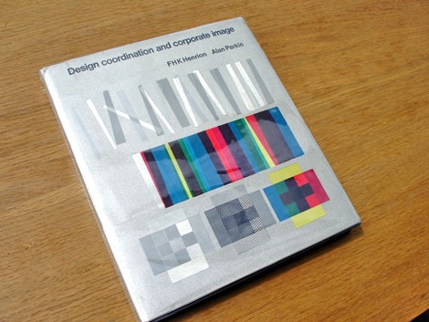
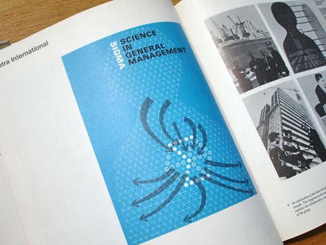
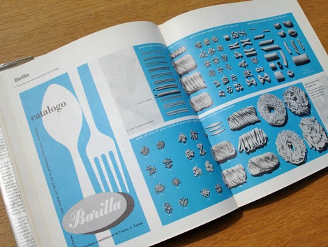
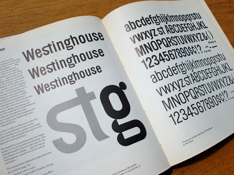
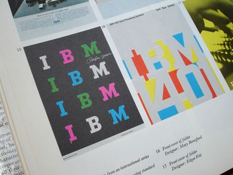
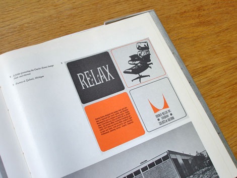
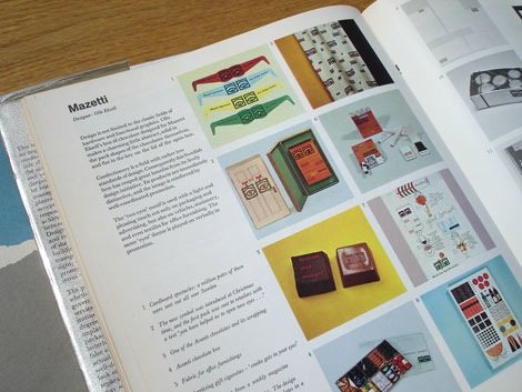
Design Coordination and corporate image - FHK Henrion + Alan Parkin c1967
This is an excellent book on the subject of corporate identity. All the big design guns are in here. The best part, for each case study the designer explains the problems he encountered and his thoughts behind the design etc.
Includes case studies by Dick Merricks, Metra International, KLM Royal Dutch Airlines, Barilla, BTR Industries, Watneys, Braun, IBM, Westinghouse, PAM, Olivetti, Celanese Corporation, Olympic Games Tokyo 1964, Clydesdale Bank, Mazetti, Pirelli, London Transport, Therma, Italsider, British Rail, Rohm and Haas, Herman Miller, Anker Bier, Lunch Bier, British Traffic Signs, Sainsburys, Steendrukkerij de Jong
Designers Include: Otl Aicher, Saul Bass, Lester Beall, Erberto Carboni, Eugenio Carmi, Wim Crouwel, Design Research Unit, Crosby, Fletcher, Forbes, Charles Eames, Olle Eksell, FHK Henrion, Yusaku Kamekura, George Nelson, Paul Rand, Willelm Sandberg, Giovanni Pintori and more.
Also worth checking:
List of Corporate Identity Projects
No Tags©2008 -Visit us at Grain Edit.com for more goodies.
Blog: inspiration from vintage kids books and timeless modern graphic design (Login to Add to MyJacketFlap)
JacketFlap tags: BOOKS, Off our book shelves, graphic design, out of print, 1960s, logos, USA, Add a tag
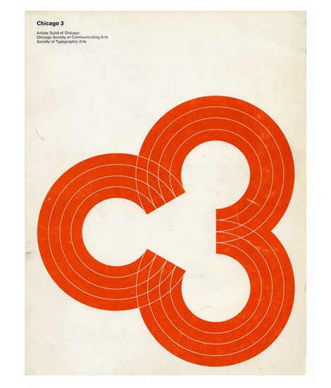
Cool cover for the 1969 Chicago 3 design annual. Consists of three “C’s” or if you look from left to right, the letter “C” and the #” 3″. The annual is a catalog of work from the Artists Guild of Chicago, Chicago Society of Communicating Arts and the Society if Typographic Arts.
No TagsBlog: inspiration from vintage kids books and timeless modern graphic design (Login to Add to MyJacketFlap)
JacketFlap tags: Designers, graphic design, contemporary, logos, Found design, USA, identity, Add a tag
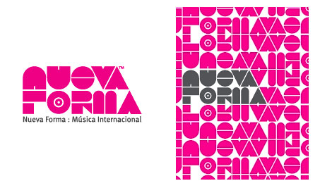
I’m digging Colorcubic’s identity work for Nueva Forma. You can check the rest of their portfolio here
contemporary, Designers, graphic design, identity, logos, USABlog: inspiration from vintage kids books and timeless modern graphic design (Login to Add to MyJacketFlap)
JacketFlap tags: Designers, graphic design, contemporary, logos, Found design, USA, identity, Add a tag
I’m digging Colorcubic’s identity work for Nueva Forma. You can check the rest of their portfolio here
contemporary, Designers, graphic design, identity, logos, USABlog: inspiration from vintage kids books and timeless modern graphic design (Login to Add to MyJacketFlap)
JacketFlap tags: Typography, italy, posters, logos, 1970s, graphic design, 1960s, Product Reviews, graphic design, posters, Product Reviews, 1960s, 1970s, italy, logos, BOOKS, reviews, Add a tag
Pino Tovaglia book - The rule that corrects emotion
In addition to this blog, I own a small design bookstore. As a bookseller, I find it hard to find publishers that consistently produce quality titles. Italian publisher Edizioni Corraini is one of a few publishers that I look forward to their new releases each year. If you own or have seen any Bruno Munari books, you are most likely familiar with their work. They have reproduced dozens of Munari’s books, many of which I own in my personal collection. In addition to the Munari collection, they have produced books on or by Martí Guixé, Enzo Mari, Aoi Huber-Kono (Max Huber’s wife),Taro Miura, Albe Steiner and many others. With this in mind, I was delighted when I received an email from them mentioning that they had been reading Grain Edit and that they would like to send a package my way.
I will cover the contents of the package in several posts. The first being the Pino Tavaglia book seen above.
1960s, 1970s, BOOKS, graphic design, italy, logos, posters, reviews, Typography By: Anette Heiberg,
on 1/14/2008
By: Anette Heiberg,
on 1/14/2008
Blog: Picture Bookies Showcase (Login to Add to MyJacketFlap)
JacketFlap tags: Anette Heiberg, explore, Add a tag
 By: Ginger*:)*,
on 1/14/2008
By: Ginger*:)*,
on 1/14/2008
Blog: Picture Bookies Showcase (Login to Add to MyJacketFlap)
JacketFlap tags: Snow, Ginger Nielson, explore, Add a tag

 By: Rebecca,
on 6/26/2007
By: Rebecca,
on 6/26/2007
Blog: OUPblog (Login to Add to MyJacketFlap)
JacketFlap tags: Literature, fiction, school, summer, education, read, A-Featured, Prose, rogers, A-Editor's Picks, july, jane, guide, Robert, McCrum, explore, Add a tag
Rebecca OUP-US
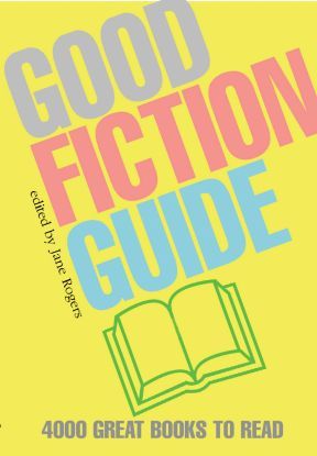 School is out for summer, July 4th is rapidly approaching, ice cream trucks are circling your neighborhood (at least they are in mine…), and you need a good book to read on vacation. Now is when the Good Fiction Guide, edited by Jane Rogers, comes in handy. The guide features subject essays and over 1,100 entries on writers ranging from Chinua Achebe to Emile Zola. Each subject entry features a list of fiction books you MUST read. To inspire you towards lofty summer reading goals I have excerpted a few below. (more…)
Good post, Steve. I love the Ducky logo - what an expression! What sort of business did you do that for, or is it a personal piece?
You're turning into a friendly guy? I didn't get that TPS report.
I think I like the friendly Steve better than the Emo Steve.
Nerd High Five!